
Statistics
We looked inside some of the posts by milliesteerviscom and here's what we found interesting.
Average Info
Notes Per Post
10
Likes Per Post
10
Reblog Per Post
0
Reply Per Post
0
Time Between Posts
4 hours
Number of Posts By Type
Text
17
Last Seen Tumblr Blogs


Fun Fact
When “GIF” was named word of the year in 2012, Oxford Dictionaries U.S.A. credited Tumblr for pushing the word.
Text
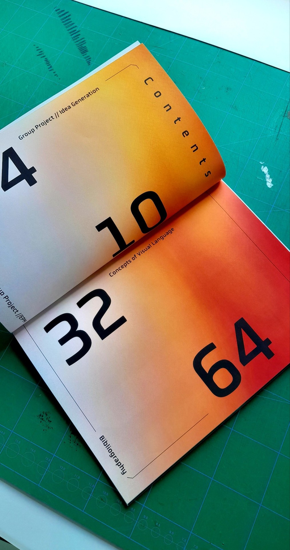
Process book final outcome for Year 2 Term 3
2 notes
·
View notes


Text


Final art book outcome and evaluation of unit > My overall evaluation of this unit is that I am proud of myself for pushing out of my comfort zone and trying something new, because making an art book and using traditional media to create a physical outcome is something I have not much tried on this course. However, I wanted to put more focus onto my book making and illustration skills applied to a meaningful concept, as this is the industry I am more likely to pursue after university. > I made sure to take on board the tutor’s feedback from the previous terms to include more research and develop my project earlier on by settling on my final idea sooner. This time I ensured that the outcome was more polished with more experimentation, which I think is what I managed to achieve. I am pleased with myself for going out and trying letterpress, which I have to admit I was hestitant at first because the process seemed complicated and daunting, however I found myself amazed by the method of printing letters in this way. Futhermore, I took frequent trips to the library to increase my knowledge on the topic. > The hardest part of this project for me was probably the fact that with digital work, I can simply redo it and have no repurcussions, whereas with physical pieces it is harder to hide mistakes, which are inevitable when doing lino printing on custom cut paper. However, I think the risk was worth it, as I can really see my skills and personality as a visual creative shine within this artbook, and the long process it took me to get here.
2 notes
·
View notes
Text
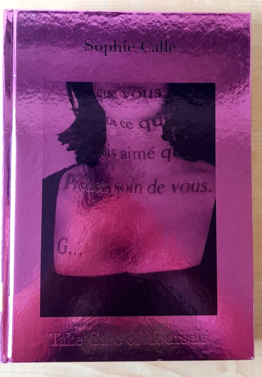
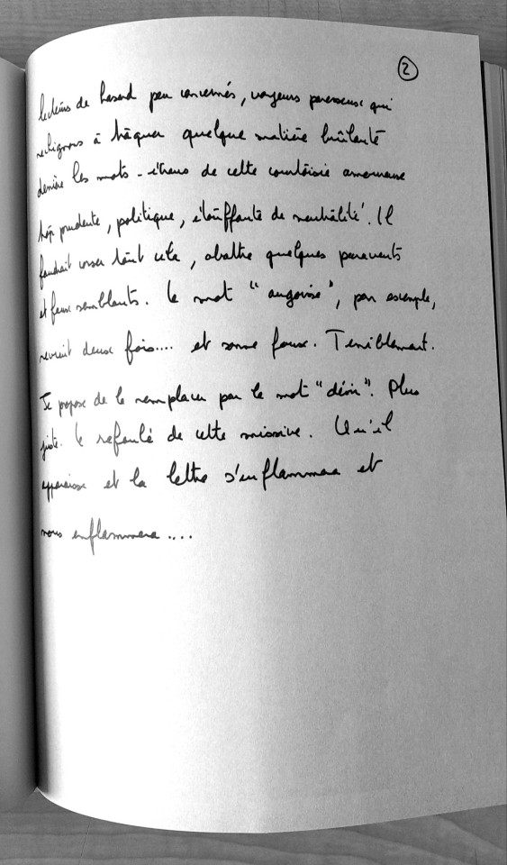

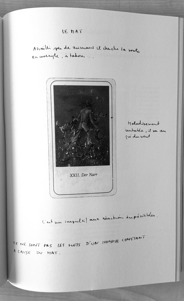
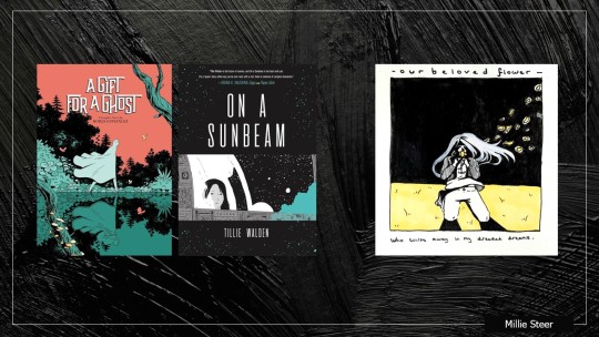
Sophie Calle - artist book research
This book was recommended to me by my tutor during a feedback tutorial, and I must say it really inspired my project for concepts of visual language. The main part that stood out to me was the raw emotions felt within the handwriting of participants, which is something I wanted to convey within my art book.
2 notes
·
View notes
Text


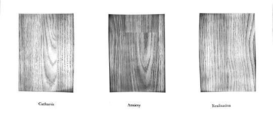
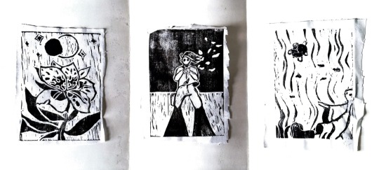
Background experiments for lino prints
> At first I printed onto fabric because my original idea was to manipulate it (such as ripping, cutting, crumpling etc.) however the outcome was more patchy and hard to see to the print due to the amount of absorption the fabric has, despite adding more ink than usual.
> I then decided to have a look at some paper and cardstock that would be good for printing in order to have a cleaner print at the end, and used glossy inks and watercolour to keep the conceptual backgrounds that go with the print and poetry.
>I put a lot of time into experimentation and practicing on different types of paper before printing on my backgrounds.
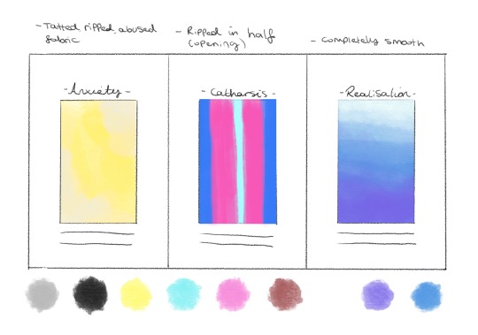
> As you can observe, some of the outcomes were weaker than others. I liked the ink background for the realisation prints because the glossy texture when it dried mimicked how water looks like. My favourite catharsis print was the circular swirls in the background, as it looks like it is ‘opening up’ while simultaneously having a glowing affect. The anxiety prints were most effective and evoked the same emotion on the red card, which I repeated several times to get the right amount of ink coverage.
2 notes
·
View notes
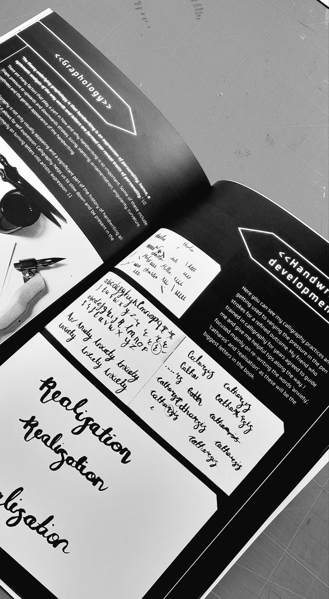
Text
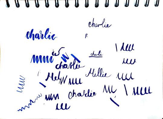
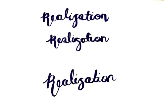
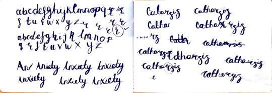
Calligraphy practice Here you can see my calligraphy practices and getting used to varying the pressure in the pen strokes for a refined outcome. My friend who trained in calligraphy for years agreed to guide me and give me helpful tips along the way. I focused mainly on re-writing the words ‘anxiety’, ‘catharsis’ and ‘realisation’ as these will be the biggest letters in the book.
0 notes
Text
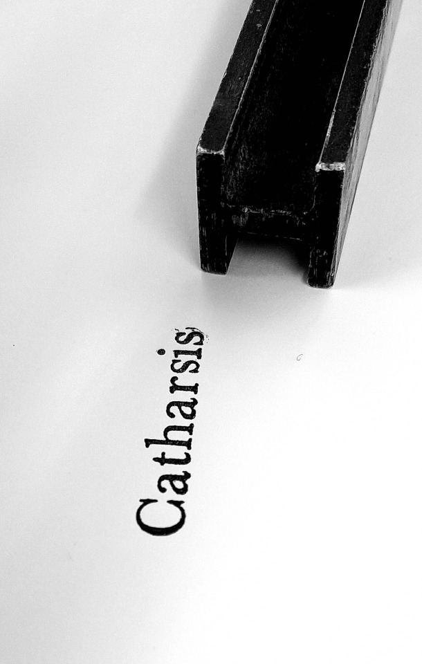
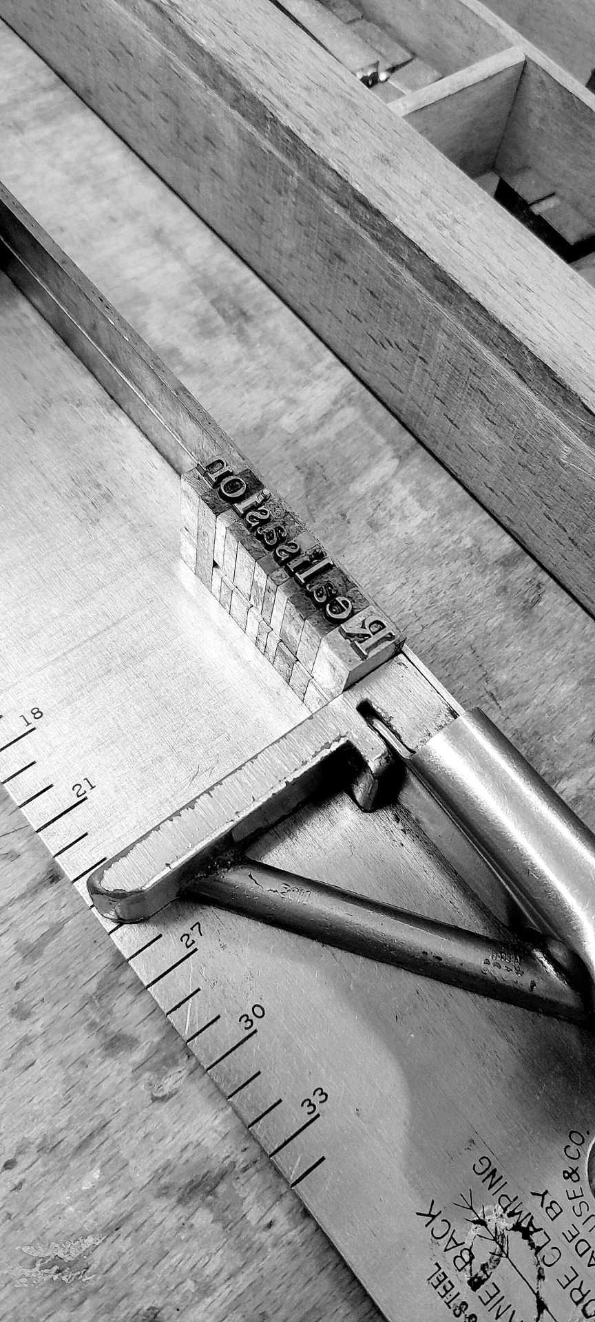
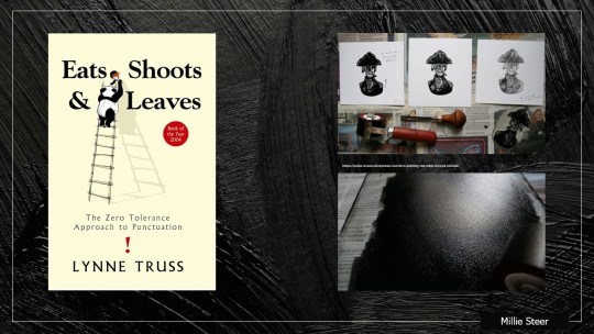
Attempt at letterpress
> After the feedback tutorial, I tried out letterpress for the main three titles of each illustration (catharsis, anxiety, and realisation). Although I still wanted to do handwriting for the final outcome, I thought letterpress was a nice way to showcase the titles with a typeface that looks more professional.
> In the end, I decided against using letterpress for the final due to technical difficulties, such as perfectly lining it up on the long page, and it being machine made rather than handwritten, which is more emotional and fits my concept more. Furthermore, the ink smudged which ruined the paper around it.
0 notes
Text
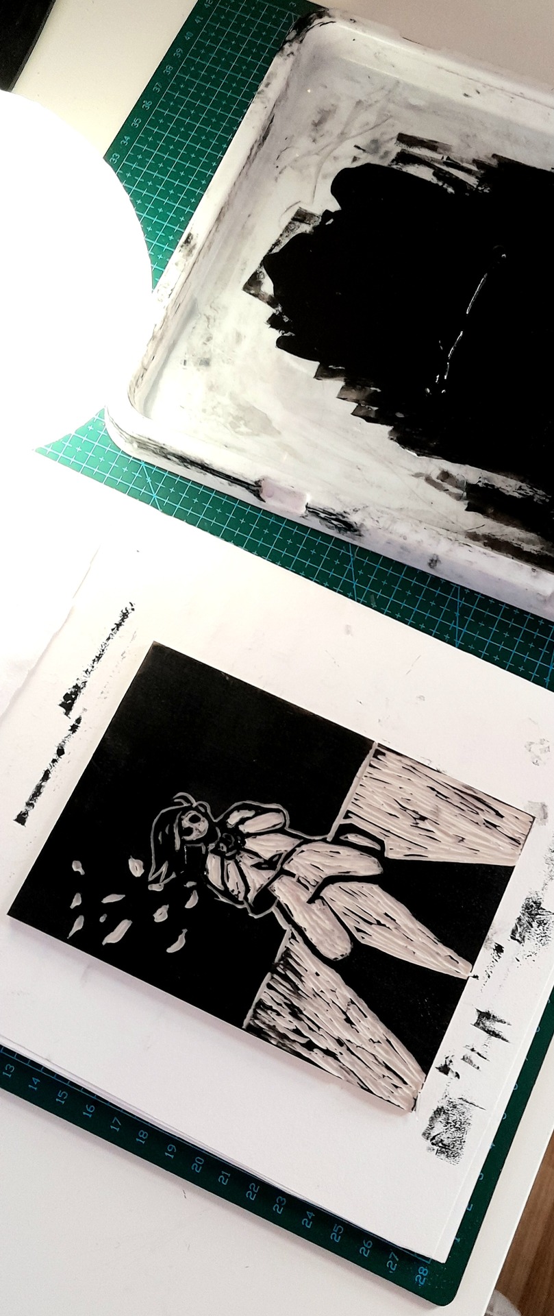
Lino printing first tests and carving
While sketching out and carving the three lino prints, I made sure to watch YouTube tutorials from experts in order to create a high quality outcome. The most difficult part of the process was getting the correct amount of ink onto the lino as it transfers differently depending on the material used to print on. As you can see, the fabric was a little too patchy due to the absorption of the ink into the material. Moving forwards, I will try out good quality printing paper as suggested in the feedback session.
0 notes
Text
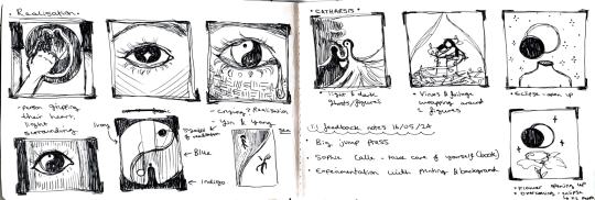
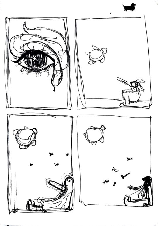
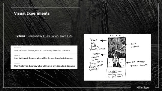
Illustration sketches - Realisation
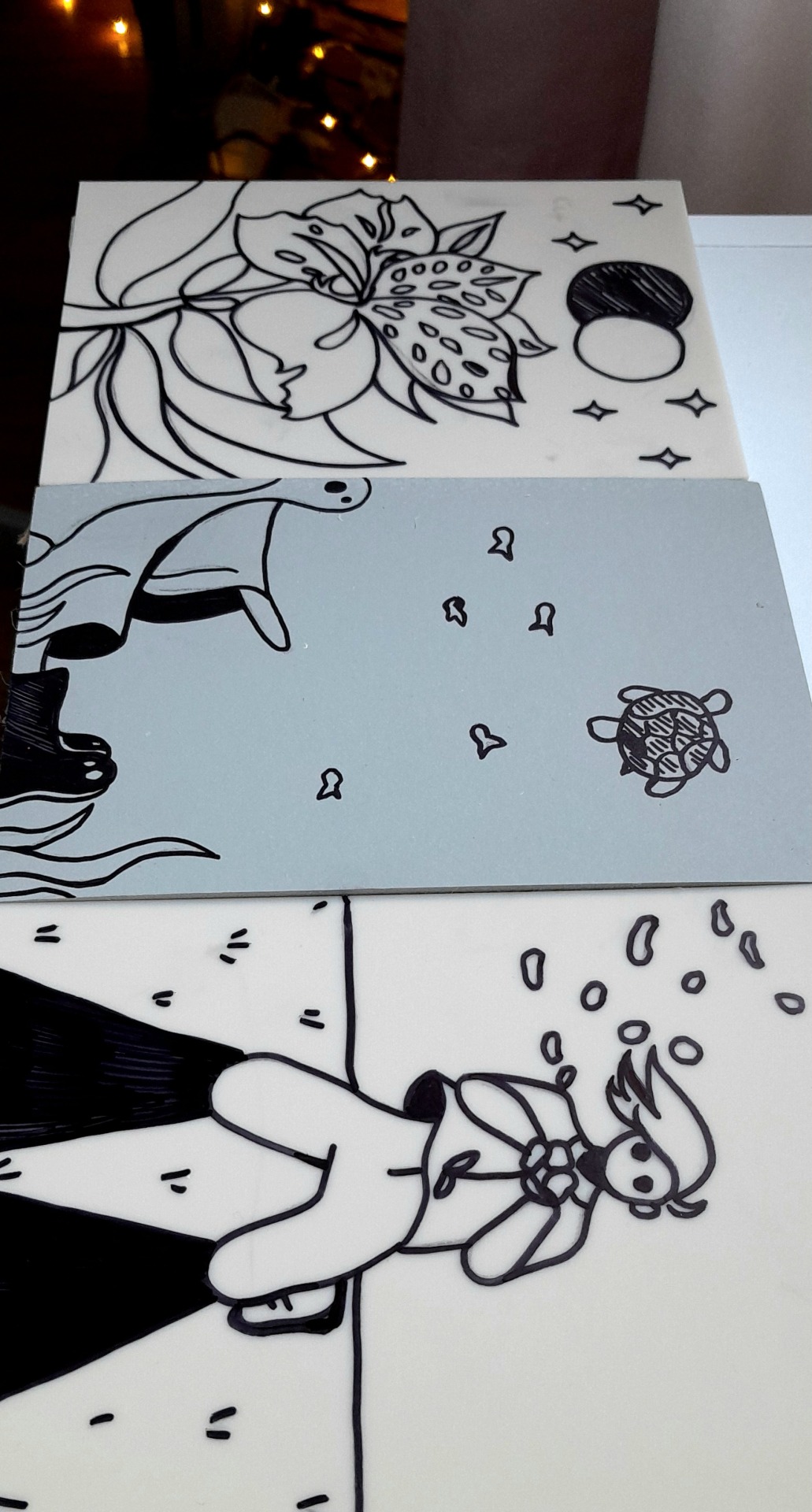
The scamping for realisation took a bit more time and experimentation before I was satisfied, because the imagery in this poem is much less vivid than the other two. I eventually picked the underwater concept with a ghost (our dreamer, depicted as their shadow selves) reaching out to a turtle, to represent the friend that drifts away. Turtles can live on both land and underwater, which is why I depicted it swimming upwards as if going towards land (and subsequently a different story to tell away from the ghost as told in the poetry).
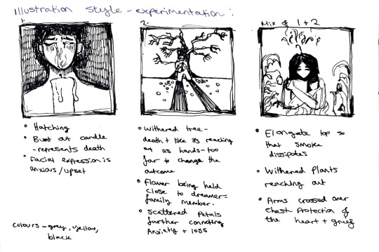
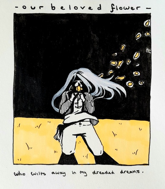
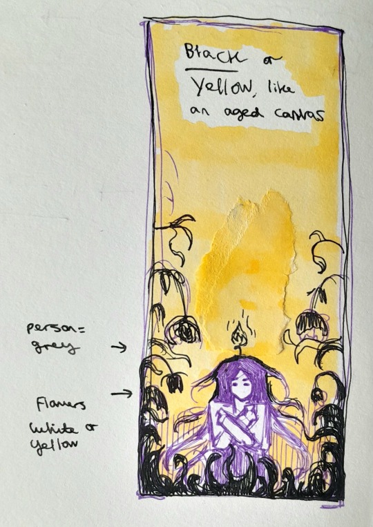
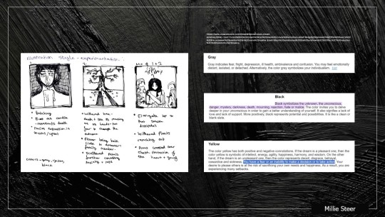
Illustration sketches - Anxiety
Anxiety is a strong emotion that can overcome our minds entirely, therefore I needed to showcase this through the black sky and heavy shadows depicted in my art. I developed the middle sketch in order to tell the story of the poem with an appropriate illustration style and brush strokes for lino printing (right). The piece shows a person (the dreamer) collapsed onto their knees, gripping a wilting flower, with petals that floats away into oblivion, the black sky (can also represent night time when we have dreams).

Illustration sketches - Catharsis For catharsis, the sketch I decided to use for my final shows a flower (alstroemeria - meaning motivation) blooming (opening up - like catharsis) with a solar eclipse emerging to symbolize the dark times passing. I had to consider negative space to represent these symbols in a way that would be pleasing to the eye.
0 notes
Text

Poetry for art book
These one line poetry sentences convey a story of the emotions and dreams experienced within each category for my art book. I wanted to ensure that each line flowed nicely to stick in the readers mind, with imagery and emotive language that fits the prints with them.
2 notes
·
View notes


Text
Colours in dreams meaning
> I found an interesting article that revolves around colours we experience within our dreams, and the emotions linked. Multiple colours had various meanings, for example yellow could mean ill health, or if a positive dream, could connotate intellect, energy, agility, happiness, harmony, and wisdom. 7 Below you can see the 3 colours from this article that I linked with each answer as numbered. These are used as the background for the final lino prints.
> After, I did some sketches of the how this might look in my art book. Each rectangle with the respectable title would have fabric tampered with and painted over in a certain way to represent the emotions conveyed.
0 notes
Text

Lino artist research > As I am doing lino printing as the main medium for this project, I needed to ensure that I had enough research on professionals who do lino printing so that I can learn useful techniques from them, and see what a successful lino print looks like.
0 notes
Text


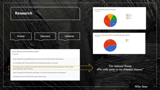
Cultural Probe - Primary source research
> Similarly to the survey, I wanted to do some research into the target audiences’ views on the topic, this time with a more detailed, open ended result. To achieve this, I conducted a cultural probe whereby I asked questions about a conversation that particularly stuck with the participant, and then allowed them to use the space provided to visualize this with their own shape language and colours to represent their feelings. > Before making this, I used a website from a professional who makes these to research how to make it successful (see my mini pecha kucha for evidence).
0 notes
Text
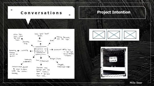
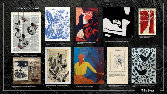
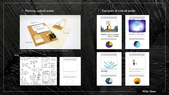
Mini pecha kucha slides detailing the new direction of my project > These slides detail that I will be making an art book that consists of 3 pages, with the theme of 'conversations we dream of'. Here you can see more initial research, sketches in my notebook, moodboard, and my thought process behind each illustration. > The book size is B5 as it perfectly fits 3 A6 prints in the centre of each section, while having room for text. The paper texture is cardstock, as I intended to use materials that will need to be held together.
0 notes