
Don't wanna be here? Send us removal request.
Statistics
We looked inside some of the posts by mp2ojakecutmore and here's what we found interesting.
Average Info
Notes Per Post
0
Likes Per Post
0
Reblog Per Post
0
Reply Per Post
0
Time Between Posts
23 hours
Number of Posts By Type
Text
17
Last Seen Tumblr Blogs


Fun Fact
Users from the US are the majority of Tumblr visitors.
Text
Creating Fisher's Portrait

I first started by doing the line work, again using my hand drawn picture as reference. I wanted to make him look tired but serious so I added some relatively subtle eye bags.


Flat colours next to the highlights I added. I used a different layer for this as to not tamper with my flat colour base.

I added shading, the light would be hitting him from the left. I used harsh highlights to replicate the look of bright studio lighting. I also did not want the shading to get lost when I added noise and grain to replicate the vintage photo look

A simple two toned background showing silhouettes of various scientific things like test tubes, gears and gas burners.
This is in contrast to his fiances background which shows her fashion sense and interest, this purely shows his work and how it consumes his life.

My final portrait. Black and white with only the faintest blue tint to the frame. Mr. Fisher would want to keep his image modern and clean so I think this suits him.
0 notes
Text
Creating My Blueprint

I started off by tracing my blueprint plan using a pressure sensitive pen in photoshop, I wanted to mimic a hand-inked look. I started off by tracing it all in black to make it easier to see.


I then used the invert tool and merged the adjustment layer and the layer containing my line work. This allowed me to turn my lines white without effecting the colour of my background.

I then found an appropriate blueprint colour and used the eyedropper tool to colour my background, It was starting to come together.

I thought I would add some texture and slight aging to my drawing, to make it seem like a real document. I used a free use texture from google and it looked great

I then added a border and a signature to the bottom right hand corner. This adds a personal touch to this piece, making it seem as if he was really proud of this baffling idea.

0 notes
Text
Blueprint
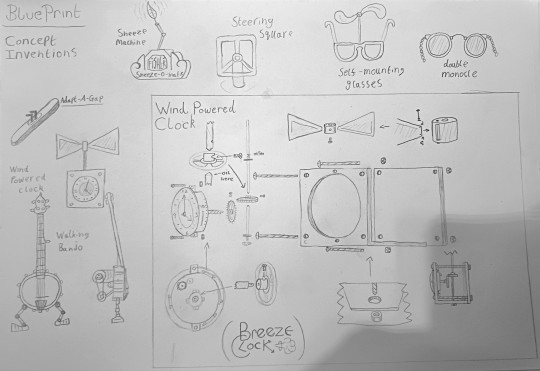
here is the plan for one of Fisher's most ridiculous inventions. A wind Powered clock. Of course wind power is a very viable method of driving something nowadays, however this invention was designed before the concept of wind powering a battery.
This clock's turbine drives the mechanism directly, which obviously means that without constant and accurate wind speed this will never ever work. Regardless, Fisher thinks this is the next big thing.
I was keen to draw the components of the clock as if the device was taken apart, various arrows showing a zoomed in showing key areas.
I think that when digitised and turned into a blueprint It will be the perfect companion to my other pieces.
0 notes
Text
The Workshop
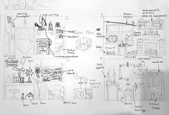
I sketched each wall of Fisher's room to show the ramshackle environment in which he spends most of his time, inventing.
Peeling wallpaper in the first image shows the lack of care he has for his home and how his life is so focussed on inventing he can't even paste his wallpaper back.
He has converted his gramophone to an electric motor by very dangerously hot wiring it to the ceiling lamp. To the right is a crumbling bookshelf.
The second image shows his main workspace, his toolboxes and desk being front and centre. A cork board is also seen, various letters and pictures are pinned to it.
The rest of the room shows the lack of care he has for his home further. A leaky boiler, broken vase and wardrobe full of scientific equipment.
0 notes
Text
Timeline
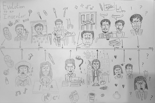
I decided a timeline would be a good way of showing my characters backstories.
From 1890 with the birth of these characters up to the current year 1927, It shows what these two have been through and maybe how they found each other and their current passion.
Fisher Timeline
1890: Birth
1895: Innocent, sweet loving boy
1900: Bedridden, hospitalised
1906: Finds a passion for tinkering with his leg brace
1910: Working, not seen for nearly ten years
1922: Signs a contract, he is ruined
1927: Trying to invent the next big thing
Fife Timeline
1890: Birth
1896: Choir girl, not a fan of singing
1902: School days
1908: Four years into her unfulfilling typing job
1915: Out of work
1922: Meets Fisher, get's back on her feet
1927: Doing her best to support her fiance's wild dreams
0 notes
Text
Making Mrs. Fife's Portrait!
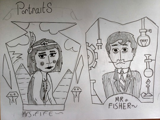
I first started out with the plan I had sketched out on paper. I wanted to show my characters in a more realistic style, with detailed eyes and more realistic proportions. I would like to show their emotions.
Tracing my character with the pressure sensitive brush tool, using finer line work that I have before to distinguish their advertising caricatures from their real selves.

I then added some base level colours, using high contrast to distinguish each part of her body. I knew I'd need shading to fully sell the stylistic difference

I used solid colours to add some smaller details such as her necklace and freckles and used a semi transparent black layer to add shadows without overlaying my line work or disturbing my initial colouring.

I then added my Egyptian inspired background with simple clouds and pyramids to tie it in with the frame and her fashion sense.

I then wanted to use some subtle colouration to replicate the slight green-ish tint of my carroll gibbons poster.

Here is my final portrait with some sepia toning and grain to both the photo and the frame.

Overall I am very content with how this portrait came out. I think it shows her personality well and is in keeping with the popular styles of the time.
0 notes
Text
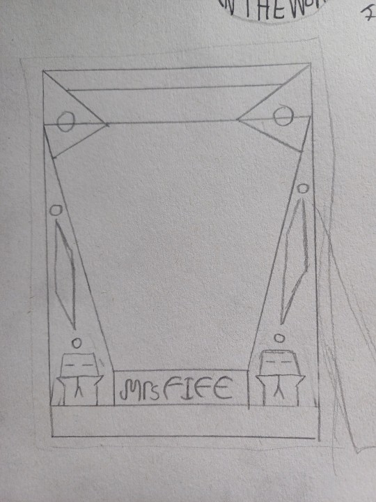
Creating My Photo Frames


When creating Mrs. Fife's frame, I wanted to keep the Egyptian look and link the time period's fascination with it back to her design. I think the snakes work quite well as a border decoration, as well as the jewel like polygons. I think maybe I would like to lean into a more subtle gold colour to represent the riches of king Tut's tomb.


I kept Mr. Fisher's frame design sleek and modern to reflect his status as an innovative inventor of progress (supposedly). I'd like to set him against a background of a lab.
0 notes
Text
Designing My Photo Frames
Here are my initial 2 ideas for my portraits I drew towards the beginning of the project. Whilst I like the idea of a deco frame and my characters posing for the camera, I feel like their personalities are not being shown here. Mr. Fisher is a failed but serious inventor and his fiance is constantly putting up with his shenanigans, making her tired and weary looking.


I sketched out some more designs for my frames, using some of my research to spice up how they look. I wanted to make Mrs. Fife's frame Egyptian inspired, so i mimicked the look of a canopic jar as the outline of the viewable image. I also want to set her against a faux egypt background, maybe making it very faint to look like she's sitting in front of a screen
I want to keep Mr. Fisher's frame modern looking, at least to the time period. He is an inventor, therefore He would want his image to be futuristic and representing progress.

0 notes
Text
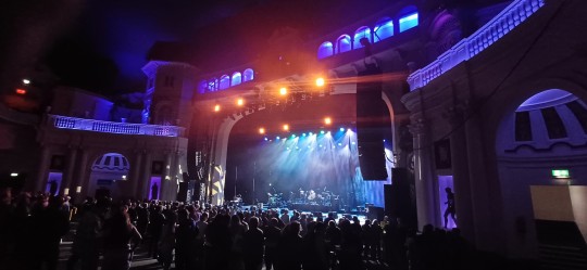
Thomas Somerford & The Astoria
When looking into potential artists behind the brixton academy venue I visited I found very little. Not even a photograph like leadora congdon. It's peculiar as male architects and artists were typically regarded higher in the days of the 1920s.
I know he designed a few other listed buildings such as the Temprance Billiard Hall, however this was built in 1914, a bit before art deco. Still a striking building!

The exterior shows some lovely glazed tile work, not dissimilar to that seen on Leslie Green designed London tube stations

It appears he had a fondness for domes as the brixton academy (formerly astoria variety theatre) has a huge one on the exterior

0 notes
Text
Brixton Academy
I have been to the Academy before to see bands like the dropkick murphys, however I never really appreciated the architecture on show here. The interior design has lots of intricate trim, columns and a rather golden look to it. The place opened in 1929 as a cinema and the design must have been a real statement.

In places it looked a little run down, but I can imagine because of all the bespoke parts and materials used to complete the look here, it would end up being very expensive to replace anything.

The stage itself looked rather grand, almost like the front of a building inside a building, real overkill. Even so this ,at the time, rather premium building was the perfect place to see who else but the Pogues!
0 notes
Text
Expression work and background ideas

I wanted to draw my characters a little more and pose them in different situations.
I drew a final design for Mr Fisher and his Fiancé Mrs Fife. I've always loved the flapper aesthetic and its Egyptian influence, an influence I will have to look more into. And I've always loved drawing sharply dressed characters, some of my favourite art I've ever done involves characters who have a sense of fashion.

I also wanted to try my hand at an art deco style background which I could use on my poster. I've designed deco/nouveau title cards for personal film projects before so I should be able to make my idea work!
A few of my previous personal designs used in mock films...

0 notes
Text
Creating My Poster
My First step was to digitise my characters, I used a pretty standard colour palette as I thought I could adjust the colours when I finalise my poster.

I then used the square tool and a blue-grey gradient to construct my background. I was able to adjust the angle of the gradient depending on which side of the screen the shapes were on.


Once I had done this I had a work in progress I was happy with, however it was suggested to me that I change the central text reading "The greatest innovations"... etc.
The warping I had used on the text looked like WordArt, a look that definitely did not it the era this is based on. I had the idea of encapsulating this text in a sort of badge/nameplate in which I could place the text in a more interesting and fitting way.
I also decided that the curved company name was a sound idea, just needing some better adjustments, It did not incorporate into the background very well.

I fixed these issues by using the same gradients to blend these new motifs into the background, adjusting said gradients so they would stick out. I am particularly proud of how the title looks.
I also added some script like text with the "In the western world" making it look almost like a footnote, as if the inventor is subtly humbling himself.
I adjusted the saturation and hue of my characters to more closely match with the text.

My next step was to trace the drawing of the invention. I wanted to frame it in the small white box near the bottom.


0 notes
Text
Speedy Locos
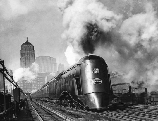
Speed was a key theme in art deco and the limits of transport were being pushed by streamlined locomotives like this.
They were symbolic of an era of change after WW1. There were plenty of posters and advertising the transport of the future.
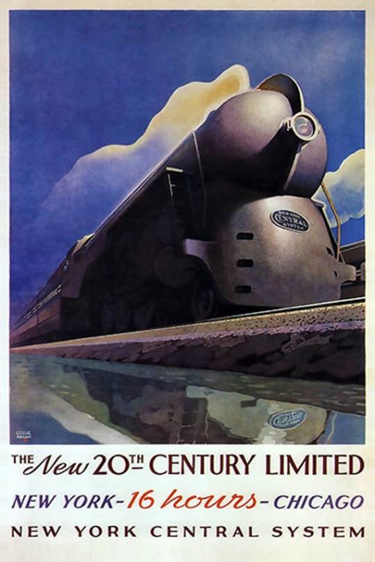

I love the use of a logo on the boiler of the train in the right image. I also like the colourful background and railway bridge

0 notes
Text
Deco Clock & Cabinet
I've procured only a few pieces of furniture, the first being my Great Great Aunties wardrobe that she left to me after reaching the grand age of 99. It has a lovely design, with a great curved central door. It's quite striking compared to a lot of cheap furniture today. This is what that was at the time, cheap furniture. She bought this when she moved into her house in the early 1940s. Deco was still being seen that late

The second is a clock I bought a few months ago. I'd say it's less deco more nouveau. Especially with the trim at the bottom, however the face still has that deco feel. I also loved the hand painted floral designs on this clock, possibly done from the factory!

0 notes
Text
Carroll Gibbons Poster

Here is a poster that would have been given out to record dealers in the 1930s, advertising Carroll Gibbons and one of my favourite 20s bands, The Savoy Orpheans.
This poster uses a variety of fonts, bold and script, to create an eye-catching poster. The blank space would have been for the dealer to write the newest releases in, however mine is miraculously unused.
0 notes
Text
Designing My Poster
My Initial Plan for my poster was to have my main character be the centrepiece of the whole image, however I decided I wanted to try and create an authentic art deco vibe and feel above all else. I designed a background on paper, I wanted to capture the feel of progression and innovation that art deco design was linked to. I mimicked a rising sun in the background of some symmetrical buildings.

I had previously made these final designs for my characters. I wanted to use these as they are presenting themselves rather seriously which would be perfect for an advertising poster

Whilst creating my poster I ran into the dilemma that my fonts and how I had arranged them looked a bit like WordArt, a typically very tacky and rubbish looking way of presenting type. So I decided to make a design change in the middle of making my poster.
It was suggested that I integrate my text and type by using a sort of badged design, almost like the name plate on the front of a locomotive, which would work wonderfully with the central circle.

I also wanted to include an image of one of the ridiculous inventions. I had previously sketched the idea of a pair of impractical shoe attachments for the soul purpose of not having to mind the gap on metro trains.
I decided to polish this sketch up and include it in a little window at the bottom of the poster, almost like a footnote, as if the inventor is embarrassed and knows his device is a bit crap.

I also designed a border for my poster to frame the image in and not seem like the composition is spilling out onto the page.

0 notes
Text
Codd-Neck Bottle
The codd-neck bottle was an extremely popular invention in the late 1800s-1940s and used a marble to seal gas and keep pressure in a bottle. It was widely used by soft drink makers to keep their beverages fizzy.
The inventor, Hiram Codd, was born in Bury st Edmunds, however most of his work was done in London. Still amazing to think that such a popular invention was created by someone so local. Japanese manufacturers still use the bottle design as a novelty!

My nana gave me and old bottle and the wooden opener that would go with it, she said she remembered everybody used to smash the bottles to get the marbles out. I can't imagine these are very common now if most of them were smashed.
0 notes