
Don't wanna be here? Send us removal request.
Statistics
We looked inside some of the posts by myzooklaudiapiechowicz and here's what we found interesting.
Average Info
Notes Per Post
3
Likes Per Post
3
Reblog Per Post
0
Reply Per Post
0
Time Between Posts
5 days
Number of Posts By Type
Photo
13
Text
4
Last Seen Tumblr Blogs


Fun Fact
25% of US internet users with an annual income of $80-100K use Tumblr.

Text
Why the artstyle change
Most if not all my previous projects were heavily character based where I would mostly desin concept art for characters, draw them from different poses and angles to show off the design and so on. But I already know how to do that and I didn’t want my projects to feel repetitive, and here the Zoo project comes in. In my art I mostly focus on drawing people, I very rarely draw animals of any sorts and I used to avoid backgrounds wherever I could. This project being focused on animals was already pushing me out of my comfort zone so I simply decided to roll with it and make my life even more difficult by trying to paint backgrounds and illustrations digitally.


Whenever I draw I tend to make characters be in the style of the previous illustrations but when it comes to backgrounds I shift towards painted backgrouds as making lineart for every single aspect of these would simply take way too long. So I simplyfy the process by painting them but I know that’s not my strong point. I decided to use this project to expand my painting abilities as working on them for an actual project would force me to do it, because in my own time whenever I think about working on my backgrounds I often end up just dropping it and shifting towards drawing characters as I normally would.
Like I mentioned drawing animals was already out of my comfort zone so I simply decided to push myself even further to actually work on inproving my art in the areas I usually avoid. But I must admit that I didn’t give this project my all. I related the previous project about the Penguin book to something I’m actually passionate about, that being Slavic Mythology and I enjoyed most of the pieces I made for that project, unlike with this one where I didn’t like the idea behind the it or the work I was producing because it wasn’t up to my standard of the drawings I made before that. Which is completely understandable as I was drawing in a way I wouldn’t have before, I was painting backgrounds which is something I avoided and I was drawing things I normally wouldn’t have so it made a lot of sense I didn’t like my work from this project because it just wasn’t as good as what I’m used to drawing. I already knew I wouldn’t like the stuff I’d produce for this project as soon as I heard the subject it was on so I feel using this as a stepping stone to work on my art instead of focusing on the project itself was a really good call especially that now a couple months later I can see the results.


These are some of the backgrounds I painted recently for my personal art, nothing college related but I can already see how much I improved at painting digitally from this Zoo project and it’s only been bit less than 3 months since then. And although I am still not completly happy with the work I made for this project now I see it as the little push I needed to work on the areas in my art that I would’ve otherwise just fall way behind other things. Like expected pushing myself out of my comfort zone helped me improve a lot in a short amount of time and I’m really glad I decided to do something different for this project. Even though I still have a long way to work and improve my backgrounds and how I draw animals I definitely do see this project as my start for working to actually improve in these ways.


0 notes
Text
Josef Herman


I can see in especially how Herman paints faces how his painting style realtes to my illustrations. He has a big focus on shapes over looks. The face doesn’t need to be pretty you just need to get the idea that it is in fact a face by looking at it. His style through that in a was is very minimalistic. Its easy to tell especially by looking at the top few illustrations that he’s avoiding details. For example the fact of the horse and the two women in the top painting being hidden behind a shadow. In his art it doesn’t matter how the subjects look, what matters is the message they send and for example like I said I interpret the top painting, the subjects being two middle aged to elderly women and a horse, but it might as well be two young women and a donkey, or even two men though I doubt it considering their traditional head scarfs and my background knowledge that Herman is a Polish man.
I can clearly tell how this artstyle is similar to what I produced for my final piece through how bulky the shapes are that he uses in his work. I tried t create my paintings in a similar manner, by using strong shapes to build up what I’m trying to show but unlike Herman I then went in and shaded these shapes to some degree making my work less impressionisticcompared to what he paints. Unlike him I added more detail, it gets the same point across but I wouldn’t be able to just put a shadow over a face and call it a day in my paintings.
2 notes
·
View notes
Text
Sergey Kovalenko


I can clearly see the link between how Kovalenko creates his paintings and my work this project. He creates shapes and objects withing his paintings by using very hard bold lines without spending too much thought on how his subjects work individually, more so how it looks all together. For example the bottom painting, picking it apart individually its just splashes of paint, The house in the middle is literally a combination of a squar and a triangle that creates the illusion of what a house is. The same thing with the trees around it, looking at them individually you can easily tell they were created by just one stroke of a brush while the background paint was still wet judging by how the deep indigo plended with the green creating brown patches everywhere. Individually the subjects in his painting look rather unappealing but taking a step back and looking at the picture as a whole the painting is quite beautiful. Looking at it as a whole creates the impression of a cold, summer sunrise with how the grass and the shadows of the trees look.
I wanted to create a rather similar effect with my paintings, although I didn’t go as bold and geometric as Kovalenko in his works, for my final piece illustrations I also used a rather hard brush that didn’t really bled the colours together, more so stacked them on top of each other to create an illusion of form to my subjects. And simirarily to Kovalenko I didn’t pay too much attention to the details more so looking at the bigger picture thats why most of the people as well as the buildings in my illustrations if looked at individually, look very underdeveloped in a way. As if I didn’t put enough work to making every single piece about these illustration look perfect when in fact like Kovalenko I focused on the message in these illustration. If it got the point across of what it is representing / symbolising in the story of Wojtek it was fulfilling its job as an illustration.
0 notes


Photo


This illustration I intended to have a very gruesome look to it, as it would depict an open battle. I based the illustration, especially the settings and the buildings on the Battle of Monte Casino in Italy, which is actually a battle Wojtek has served in which was reported by multiple soldiers from many different countries that also took part in the battle. This battle is also the cause for the logo of Wojtek carrying artillery missiles as that’s what he was spotted doing durning this fight. I wanted to include that part of the battle in the illustration by having some soldiers carrying those missles out from a truck thats standing by showing that this event might happen now.
I also specifically chose red as the colour for this drawing because it has an obvoious link to the violence and all the bloodshed that is definitely a big part of the battle. And like the first illustration I decided to not only use it as the background colour but some highlights too like the explosions on the hill as well as the fire arounnd the crashed plane.
0 notes
Photo

Finished outcome of the fourth illustarion. Here I also wanted to make this drawing stand out from the other three by using a lot of circles. The other three generally are made up from a lot of squares and triangles; the buildings in the first and third one, the crates and tents, even the dress in the first illustration. I wanted this one to stand out so here I used circles instead, for example the circular enclousure Wojtek is in as well as the round platform he’s on, also everyone in the zoo is wearing a round hat. I even carried this trend forward with how I drew water. I considered trying to draw the water more realistically similar to how I drew it in my final piece for the last project but instead I used this oppertunity to add more circle patterns into this illustration.
0 notes
Photo


I got some tips on how to improve the first sketch as well as some of my illustrations to help them send the overall message I am trying to potray through them. I especially like the changes to my first sketch because I didn’t try to put detail into it, only test out how to paint in photoshop. But this minor details really improved the look of the drawing and I’ll try my best to replicate these changes.
0 notes
Photo


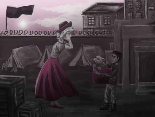
This was originally my 6th planned illustration but as I figured I’d run out of time I had to be more selective about which ones I’d wanna finish to tell Wojtek’s story and I felt this one was really important in particular because after the war he ended up in a zoo in Scottland and this specific illustration heavily links into the actoual theme of this ‘zoo’ project. I also specifically decided to make the colour for this illustration a rather peaceful shade of green to contrast the previous illustration showing the war with bright red background. It can immiediatelly tell the person looking at this picture Wojtek’s story has a good ending.
0 notes
Photo
The first two finished illustration. I really like the contrast between the bright colours in both drawings as compared to the black and white subjets in the drawings. On the second illustration I also made sure to use the colour as lighting on the bear and the soldier in the middle of the frame to bring even more attention to them and make them look eyecatching.
0 notes
Photo


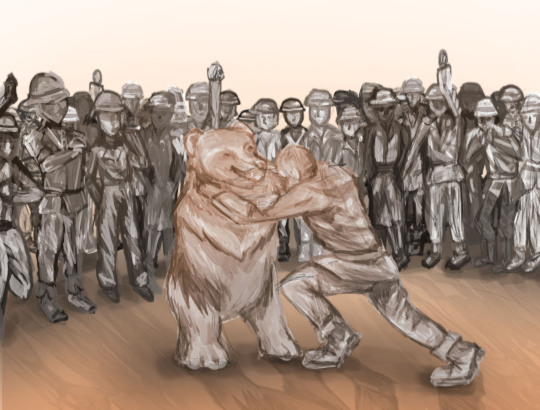
The finished outcome of the second illustration. I personally like this one a bit more than the first one as it’s way more simple and straight forward. It immiediately raises questions of why is this man fighting a bear, why are people cheering and those kind of questions are supposed to be what people think of if they would see this illustration in like a pamthlet or a picture book, and it would lead them to wanting to learn Wojtek’s story which was the goal.
1 note
·
View note
Text
Technical difficulties
I already assumed I set my target of 6 illustrations too high, but I had a lot of difficulties today with the macs that definitely sent me some time behind on top of me running out of that time before the deadline. I spent around 2 hours trying to find a working Mac as the first one I picked up couldn’t run photoshop because of scratched disc / not enough memory on it to run anything. I ended up swapping the Mac but the one I picked up wouldn’t let me log in even though my account wasn’t locked, so I swapped Macs with another student and finally logged in and was able to run photoshop, but I got ahead of myself as that specific Mac wasn’t able to run a Wacom tablet. I searched up some tips on how to get it to work but it required reinstalling the Wacom launcher but to do that on a school Mac I’d have to have an administrator login.
I did manage to get a working Mac in the end and started painting my second illustration but I initially planned on painting 2 illustrations today and looking at the progress I made in the first one I think I would’ve been able to do that if not these difficulties.
0 notes
Photo


Started painting the second illustration this time depicting Wojtek’s time spent travelling with soldiers where they’d treat him like one of their own. I read a lot about how they treated Wojtek; giving him cigarettes and beer as well as wrestling him for fun and I wanted to show that part of his life in one of the illustrations.
0 notes
Photo


Like I expected I am not happy with how this painting looks but I really like the contrast between majority black and white painting and then pink details. It makes the characters pop out a little more as well as the whole illustration looks more interesting. I also like how the black and white looks because I considered painting this full colour but doing this black and white, monochromatic style of painting gives it the vibe that it actually took place during WW2.
0 notes
Photo


I decided on painting every illustration in black and white but also making every one of them stand out by giving each specific illustration a colour to pop out of the page. For this first drawing I decided on a mangenta/ pink visible in the sky and the dress of the female character in the foreground. I already can tell I’m not going to like how this painting will turn out but still I think the additional colour to draw in the eye of someone looking at these illustrations will make them better looking regardless.
0 notes
Photo


The six sketches for my illustrations. I have this idea of painting them after all, I attempted doing lineart on the first illustration but I realised thats going to take forever, so instead I’d be painting these just like that photo on my soldier study sheet. I know I said I wasn’t satisfied with how my painting looked and especially hated the faces but I won’t improve if I just sit here upset that it doesn’t look as good as my expectations for it were. So I’m going to take this opportunity to improve my painting skills, I know my outcomes will not be as good as if I just coloured these drawings like I always do but at least I’ll get some practice in.
0 notes
Photo
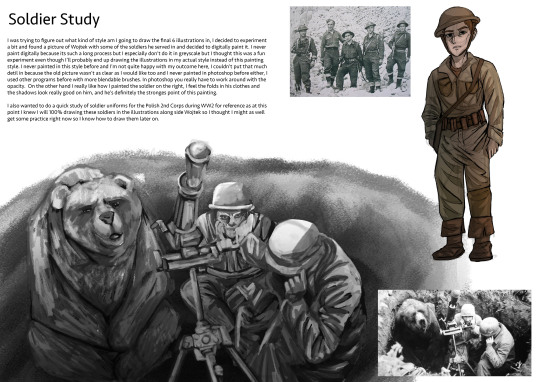
Finished sheet from the soldier study I did. I didn’t draw a lot of soldiers like I did with bears but this helped me figure out how I want to draw them and will definitely make it easier later on.
0 notes