
Don't wanna be here? Send us removal request.
Statistics
We looked inside some of the posts by nathanielv537 and here's what we found interesting.
Average Info
Notes Per Post
4
Likes Per Post
3
Reblog Per Post
1
Reply Per Post
0
Time Between Posts
7 days
Number of Posts By Type
Text
13
Last Seen Tumblr Blogs


Fun Fact
Tumblr has a 66 index score for customer satisfaction in the US.
Text
Course Reflection
What was hard?
Although not that bad, I found illustrator to be the hardest. I did improve in the end and I feel like I’ve mastered the pen tool however I still feel like there’s still so much to the UI and the workflow that it’s still a little jarring to me. But besides that I was happy with how I did in that software.
What did you learn?
I’ve learnt so much from this course. And I learnt it all by surprise, I felt like I was already pretty good at photoshop and such but the lessons were so extensive and I learnt even more which is amazing. I’ve learnt little photoshop tricks, I’ve enhanced my shortcuts and ingrained it into my muscle memory (faster workflow). I’ve became skillful with the pen tool, I’ve learnt more about InDesign and was extremely fascinated by grid typography and how prevalent it is in design. In summary I’ve learnt an amazing amount and I feel happy documenting all of this so that I could return to my notes in the future.
What would you still like to learn/practice?
I’d want to expand upon the world of InDesign and maybe illustrator as an extra. From most willing to least willing I’d go from InDesign > Photoshop > Illustrator. I would only want to do Illustrator last simply because it still feels somewhat new territory to me and I’d rather delve in it later. Other than that I will keep using Photoshop regularly and I will hope to be a better designer and apply my knowledge in InDesign work in the future.
Anything else?
I couldn’t be more grateful about how much I’ve unexpectedly learnt from this course.
0 notes
Text
Children’s Book Mockup
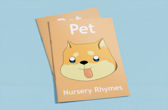


I’m super happy with how it turned out.
Created using a4-brochure-mockup-free-800x526pxfrom ZippyPixels.com
0 notes
Text
Log 11
This is the very last lesson and class and I found it to be nice and chill as it’s basically the finishing touches to everything.
Patterns

Starting off in illustrator we are going to draw something that can be repeated into a pattern.

In the canvas simply put down a small box and then next to it we will draw a shape.


Draw up a random curvy shape.

Select your pattern drawing.

With the selection tool (V) drag it into the swatches anywhere.

Now that we’ve done that we have the pattern drawing as a swatch. This means filling in a shape or such will use that pattern.
We can try the curvy shape for example.

You will also notice that when you move the shape, the pattern will stay in the same area like if it was a stencil cutout.

Upon double clicking the swatch pattern this menu will pop up. Here we can customize how we want the pattern to appear.

Here’s how I’ve changed mine.

Here’s my finished wallpaper we can use for the children’s book.

My export settings for the best quality.

Exporting the book

I’m exporting it as a pdf and I’m making sure to get the best quality.

Here in photoshop we have a mockup template. To change the image on the page you will need to change what’s inside the smart object.

Copy the appropriate pages and paste them into the smart object.
(Control + A, Control + C) (Control + Shift + V)

Reflection
I thoroughly enjoyed this lesson and it was very satisfying assembling the book together. Learning the patterns was very cool and I’m curious what other cool patterns could be made.
0 notes
Text
Log 10.5 (Children’s book)
This log is a continuation of log 10 and it will show the progress of the assigned homework.

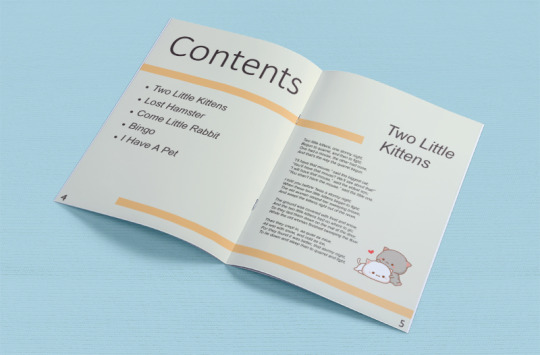
Starting of with a A5 document.

12 pages in total. Will have 5 songs.

To start I’ve chosen a color and applied it to the parent page.

I’ve made a cover that has a character style for the titles.

Columns.

Parent page for the cover and another for the inner book.


0 notes
Text
Log 10
This lesson we studied more about InDesign and looked at different aspects of the software from last time. My skills were improved from last lesson and hopefully they will improve again this lesson. I enjoy learning the little tips and tricks.
Pages
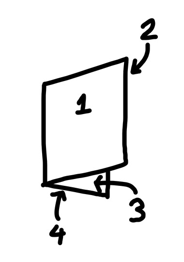
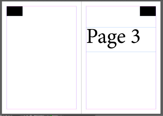
In the real world pages work exactly how you would expect shown from this diagram.
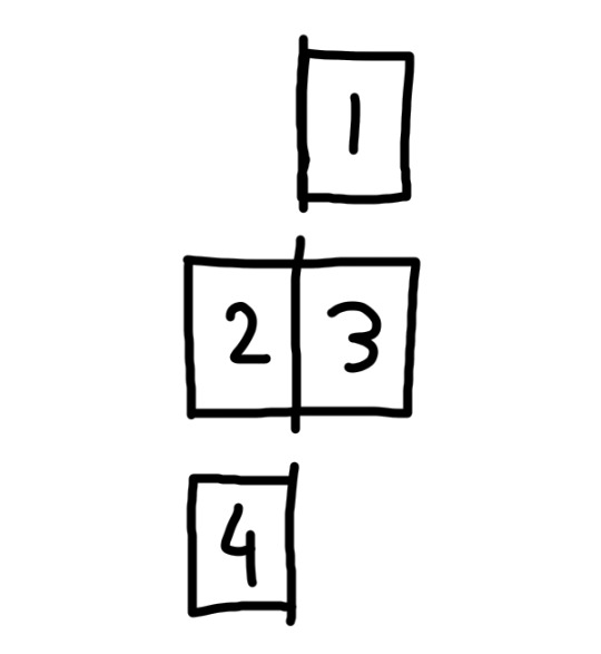
However in indesign this is what we will be used to looking at. Once you fully wrap your head around it, it will make sense. It didn’t take too long to understand it.
A good tip would be to think about how times you see the spine of the book in the middle and then think about how many rows of page(s) there are in indesign. It should be the same number.
Now I will make a book in indesign

Start of with an a4 document and get the pages tab open.
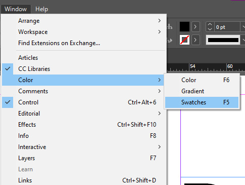
(If you can’t find a tab you need the window menu is always helpful)
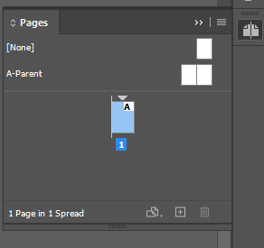
Right now we only have one page but we can add pages at the bottom right next to the bin icon.
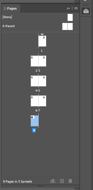
For the upcoming assessment I’ve added 7 pages.
(8 in total)
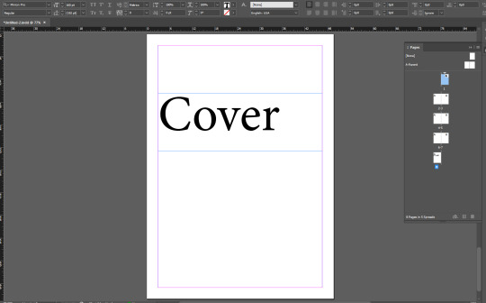
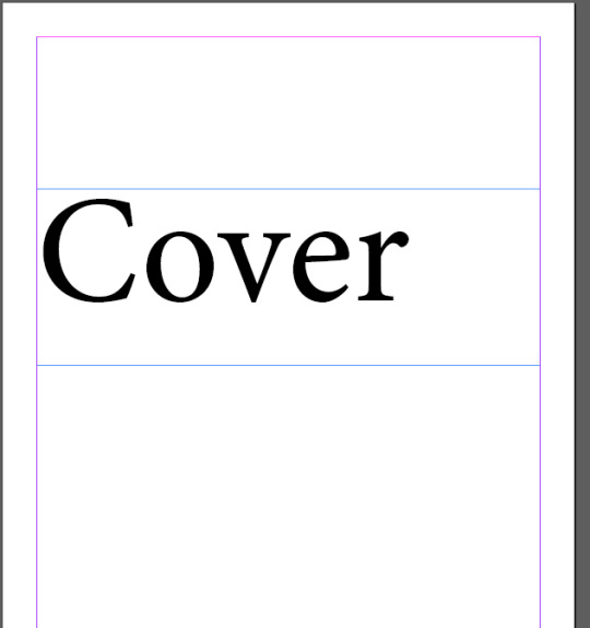
On the first page I’ve added a text that says “Cover” for the cover.
Next we are going to copy that text box and go to another page to ‘paste in place’
Shift + Alt + Control + V = (Paste in place)

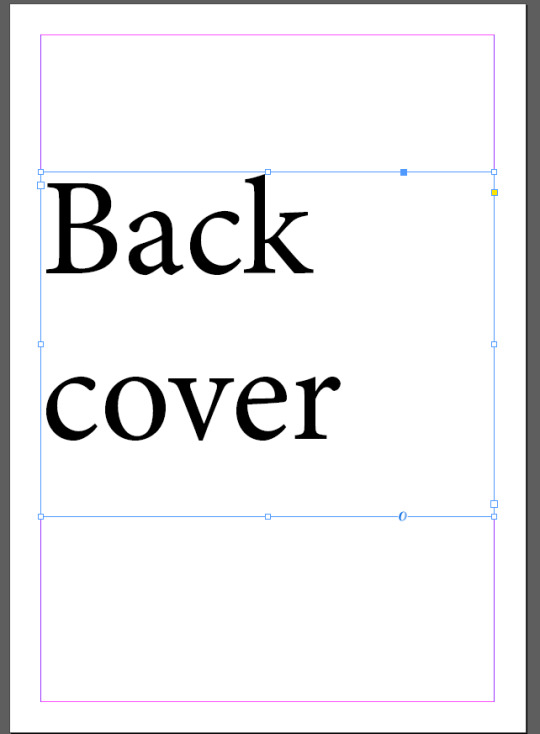
After pasting I’ve just reworded the text to the corresponding page to our book.
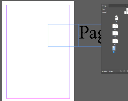
After some more pasting you’ll notice that the ‘paste in place’ feature won’t work for a page on the other side. So with the selection tool (V) just move it over while holding shift to constrain it horizontally.
Next is using the ‘parent pages’
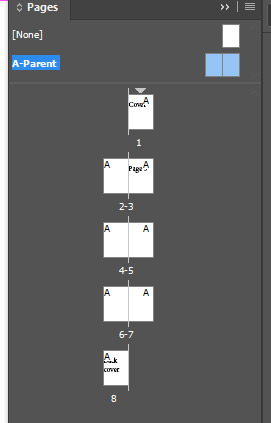
Double clicking A-Parent will let you work on the parent pages. Essentially working on these will apply whatever you add to all the pages. So this will help us here for page numbers as we know that will be a constant in all pages.


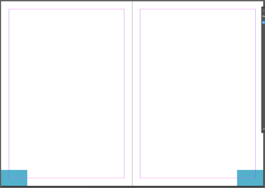
With a quick rectangle box and a duplication shortcut we have to boxes on the corners.
Color
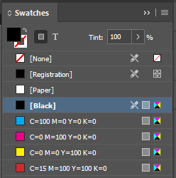
Here is the swatches menu. Though it is different to photoshop it is easy to learn and figure out.
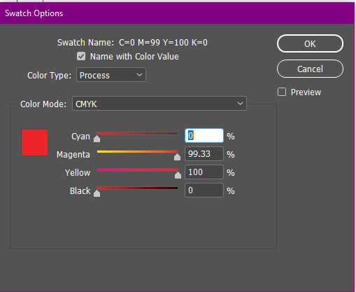
Double clicking a swatch will let you change it’s color. Or you may also add swatches to however many you’d like. Here I’m changing the red swatch with CYMK.
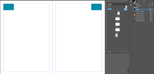

Here our cover has the parent page applied that contains our soon to be page number. But most books don’t have the page number on the cover right? Here’s how we can remove it without affecting the other pages.
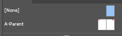
The [None] option at the top is exactly what is says... It’s a blank page so if you drag that over to the cover page...
All gone :)
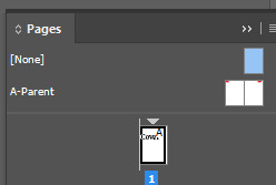
However if we wanted to and this was a mistake we can reapply the parent page by dragging it over the same way we did for the none page.
A document can have more than one parent page. Parent pages should be treated like presets that you can utilize to save time.
Example: Some of the pages in your book have a black background. So you can make parent pages that have white page numbers to contrast it specifically to the black background pages.
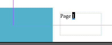
I’ve quickly altered the position of the page number boxes.

I’ve put an actual page number in the parent pages however... If it’s just with the text box every page will just say page 1... Here’s how to change that.
Select the number.
CORRUPTED SAVE
This post didn’t save and I lost the rest of this so I will do a summary.
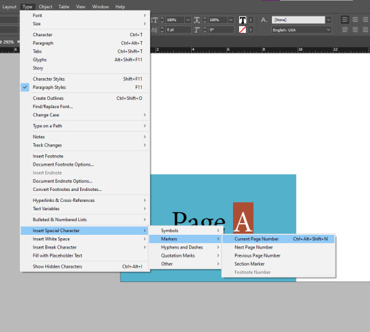
Click this in the type drop down menu. (Make sure it’s on the parent page)

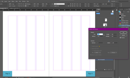
Customize margins and columns here.
I’ve learnt that columns are an essential to design (more on that later)
Swiss grid typography
Swiss grid typography is method of designing that you will find everywhere.
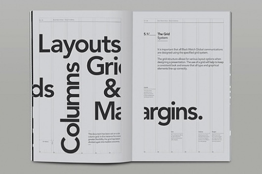
It’s a staple in design and it’s because it’s satisfying to look at, with or without the grid. You will find grid layouts everywhere nowadays.

Learning this almost blew my mind. It feels like I’ve adopted another way of looking at design that you cannot unsee anymore. This definitely helps me as a designer as I feel much more knowledgeable from this.
Reflection
The lesson was amazing. Learning about pages and everything else was easy and exactly how I’d imagined it. But also learning about how a lot of media is designed really topped the lesson and I felt was very educational.
And I feel super confident using InDesign now.
0 notes
Text
Log 9
Todays lesson was our first using InDesign. I have some experience using this software in high school so I’d rate my skills about 7/10.
I’ve learnt that:
“Whilst in Illustrator and Photoshop images are created, in InDesign they are assembled together.”
This is very helpful in learning the role of InDesign when designing something.

Using InDesign

When creating a new document you can select presets. This is the same on photoshop and illustrator. Here I’ll be using a4.

This is what an a4 page should look like. The pink edges are margin guides which can be adjusted.

We will use the type tool and drag it over from top left margin corner to bottom right margin corner. This creates a big text box.

After that, for the exercise we will fill the box with a placeholder text.

Unlike the other software’s if you want to pan around you need to make sure you are not in a text box so you can’t use space. Instead hold control and then click outside the text box and then you can pan with space.
Z as zoom will still be the same like other software’s.

Here we are creating titles for each paragraph with enter (similar to most writing platforms)

And then we will add the paragraph styles tab.

We can also click control to bring up the panel at the top to make things easier for us.

Here we have highlighted this text so that we can edit it’s font. Up at the top left we can change it by typing which one we want or selecting one from the dropdown menu.

So here I’ve changed the font, the font size, and the space between lines (leading).

After that I’ve created a paragraph style from the highlighted body of text by clicking the plus button.

When double clicking the paragraph style this menu will pop up.

With some tweaking such as un-hyphenating the text we can click ok and have our result.

Now after that if we press control + A (select all) and then click the paragraph style we’ve made.

It will transform the whole text to that style we’ve made. This definitely is a fast method if you were to change a lot of text. This way it is working smarter not harder.
Quick tip: pressing W will activate preview mode.

Back on our paragraph style I have adjusted the ‘space after’ which is optimizing the space after a paragraph or a header as such.

This is how it looks after that.
Another handy tip:

Whichever is most comfortable you can adjust what units you would like. I choose millimeters.

After that find one of the headers you want to adjust to size up.
We want to size up a header to make the page more appealing, a text hierarchy is what catches the eye.

Here’s what I’ve changed in the header paragraph style.

And here.

With our new paragraph style we can now apply it to the other headings.

How it looks in preview mode.

Character styles is almost the exact same as paragraph styles except its not directed towards bodies of text and such. Rather it is towards specific words.
Here we’ve made a character style and we’re presetting of a random word.

We may also rename it for good management.
Quick tip:

If you change a text that has a character style attached to it...

A plus will appear next to your character style.
If this was a mistake then you can undo (control + Z), however if it was intentional you could do this...

Redefine style will apply whatever you’ve changed to the text.

And now anything that has that character style will update.
This tip also applies to paragraph styles.

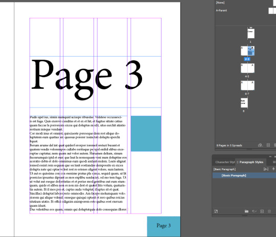
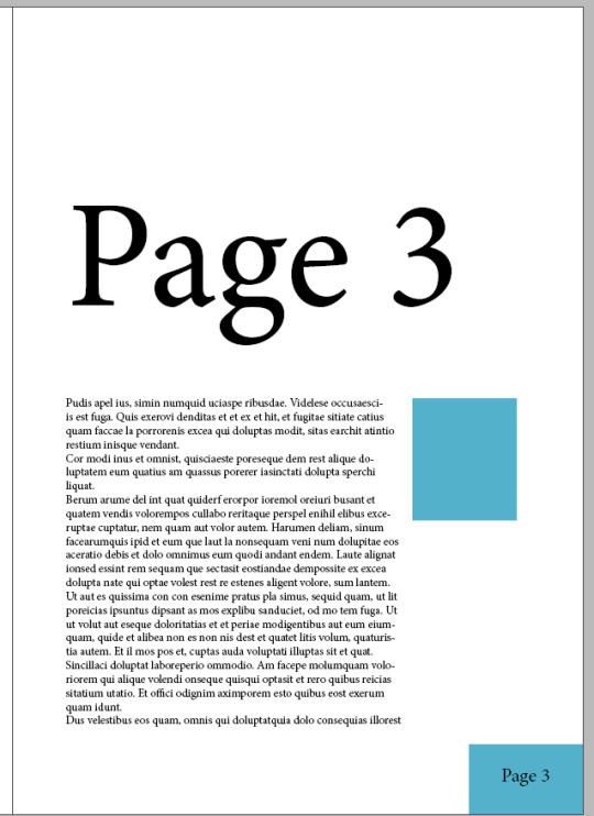
After that we are going to divide the text vertically. With main selection tool (V) select the text box and navigate up to the columns section.

Here’s how I’ve adjusted it.

Now it will look like this.

After the first main text body we have pasted this in the middle.
There’s a hole in the bottom of the sea There’s a log in the hole in the bottom of the sea There’s a bump on the log in the hole in the bottom of the sea There’s a frog on the bump on the log in the hole in the bottom of the sea There’s a tail on the frog on the bump on the log in the hole in the bottom of the sea

With that now selected I’ve made another paragraph style called “bullet points”

In paragraph styles we’ve selected bullet points but here it looks janky. This is what you can do to fix it.


Essentially you just indent it and then indent the first line the same value but minus.

I’ve also played with the spacing to make it look more like its own body.

Tip: Using shift + enter will make a new line of text without the bullet point.

This is what it looks like without using shift + enter

This is what it’s like with shift + enter. Much nicer.
Essentially it is helpful for cleaning up lines where they don’t look right.
Understanding InDesign images
An image in InDesign is very different to an image in illustrator or photoshop.

Here I’ve placed an image inside next to our document.
In photoshop and illustrator an image is simply just an image where you can easily move it around and such. However in indesign an image consists of the frame and the image content.
The circle in the middle of the image in indesign is where you place your mouse if you want to move the image but not move the frame.

Doing so will look like this. However moving outside the inner circle will move both the frame and the image.
With this logic what happens when you try to resize the image?

This happens...
So in order to avoid that you need to hold control while resizing.
(And hold shift to maintain the image proportions)

Much nicer.
This is drastically different than what I’m used to however once you understand it’s easy.
Understanding InDesign links

There is links tab we can open up.

To put it shortly every image has a corresponding link.

A link will tell you all its details.

Now if we open this very same frog image in photoshop theoretically if we make changes to the image it will change in indesign.

I’ve drawn the frog a hat :)

Now after saving that on photoshop (control + S). Hop back onto indesign and you will notice these changes.
These warning signs indicate that there’s been a change to the file.

Here you should update the link.

Looking good :)
Links are amazing to work with because as stated before indesign will function as the assembly of your work across different platforms. They will update as long as you save your work.
Now lets put our frog in our document.

However we can resize the frame so that there isn’t much empty space.
(Hold down alt to resize with a centered anchor point)

With the direct selection tool (A) we can move the image inside the frame.

Now the frog is perfectly centered in the frame.
(You can tap the arrow keys for precise movement)

This is where I’ve placed my frog on the document. Ideally we want the text to wrap around the image instead of behind it.

Find properties with the image selected and click on this text wrap option.

Looking great so far. Now all we need is to space the text on the right away from the image.

Open up the three dots.

Unlink the chain so you don’t accidentally alter all properties. And then adjust accordingly.

How about another frog?
With photoshop logic make a copy of the frog image by holding alt when moving. and directly select the image (not the frame). Then copy and paste that.

Now you can get rid of the other frog.


Create a circular frame over the frog.
(You can adjust the proportions the same way like in photoshop)

Copy the frog image and then delete it.

And then with the circle selected paste the frog into it.

Now we have another frog in a different frame.


Then do the same process except use the other wrap option.
Rule of thumb:


DON’T DO THIS
These two examples are what you shouldn’t have the text wrap look like as they are difficult to read.

DO THIS
This is a much better example of what to do as the text isn’t wrapping back up where it interferes with the persons reading.
FINISHED RESULT
I’m quite happy with how it looks :)
Reflection
This lesson has definitely made me more comfortable with InDesign, though I already knew some things the shortcuts and little tricks make me feel more like a quick designer who isn’t slow.
0 notes
Text
Log 8
Our last exercise finalizing our skills in illustrator was very fun, we got to choose any image we wanted and had to recreate them.
Illustration 1 - Silhouette

Here’s my sketch for my silhouette.


I’d say I did pretty well. I like the finished result better than the sketch. I implemented minimal anchor points and sketched them exactly right. I also got all the handles on constrained to the x and y axis except for one. The one handle that wasn’t vertical or horizontal was there to implement a 3d subtle look. So that the headband has that look where its a strip rather than a tube.
Illustration 2 - Shadows

For my second drawing I’ve decided to make a dogs head from scratch. This is a good start for my drawing and I will tweak it with the direct selection tool.

Much nicer.


This is my second drawing. I’ve used several techniques such as the pathfinder tool for the bottom right of the dogs face. I feel that I’ve basically mastered the pen tool (though I rushed some of it here). I’m super happy with the result considering it’s my own drawing from scratch.
Reflection
Overall I loved working in illustrator. It’s the program I’ve used the least but I’ve come to enjoy it and I feel the potential with it that I can do in the future.
0 notes
Text
Log 6
Last lesson before the mid semester break was pretty fun and helpful.
Photoshop tips and tricks


By pressing ‘X’ the foreground color will swap to the background color and vice versa, this shortcut is very handy for quick art.
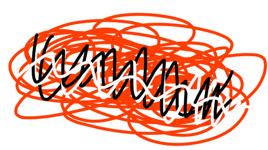
Here I’m going to use adjustment layers to change this color.
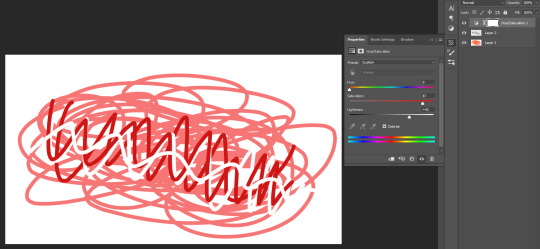
When adjusting hue and saturation, ‘Colorize’ will put every layer onto the same hue.
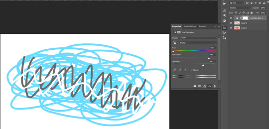
To better explain this is the result if you don’t tick colorize.
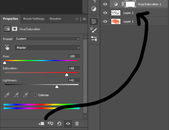
Another tip when using adjustment layers is that you can click that button to have the adjustments only apply a specific layer, which will be the layer below the adjustment layer. This helps when you don’t want to adjust every layer
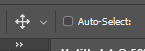

Here I am making a rectangle selection over my sketch. A quality of life tip is that you should keep ‘auto-select’ off. This is because it feels more natural to select what you want through the layers tab instead of clicking on the artboard. It’s much more efficient as you won’t accidentally select the wrong layer as much as you would with auto-select on.
Handy reminders:
- Moving a selection outside of the selected area will move the entire layer rather than what’s inside the selected area.
- Moving a selection inside the selected will move what is selected as to be expected.
- While holding ‘Alt’ when moving a selection it will keep the original selection in place and instead you will be moving a duplicate of the selection on the same layer.
- While holding ‘Shift’ when moving a selection your movement will be constrained to the horizontal and vertical axis.
- With a selection you can do the shortcut ‘Command + J’ and that will make a layer containing what you have selected.

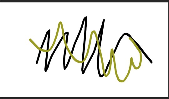
As a quick refresher we are going back to this image and recoloring different fruit
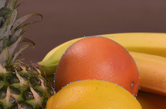
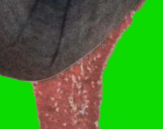
I’ve selected this orange with the pen tool and refined my path with the direct selection tool.
(Using alt to break the anchor points is very helpful)
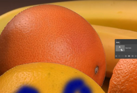
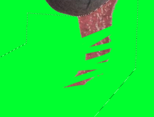
With the paths tab I’ve turned it into a selection.
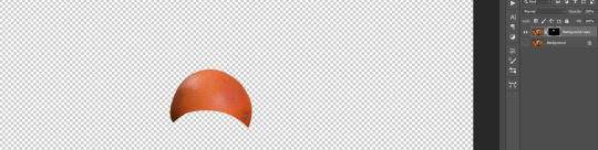
After that we can mask it, make sure that there is a copied background layer.
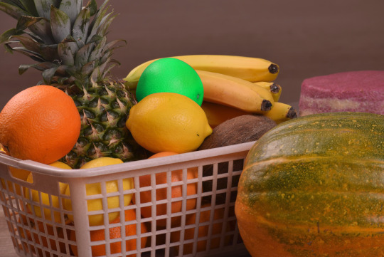
All that’s left is using an adjustment layer onto the orange and now we got a lime green orange :)
(or you could just call it a lime green)
Summary of first exercise
Essentially what was practiced was our skills in:
Selection tools, Masking, Layer management
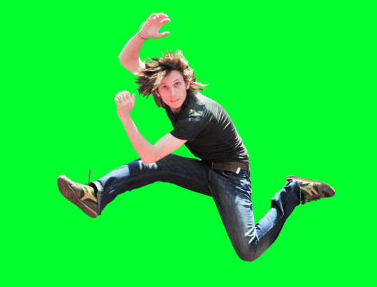
Exercise 2

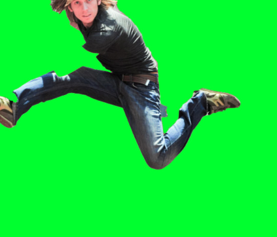
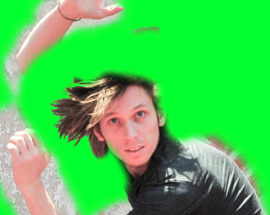
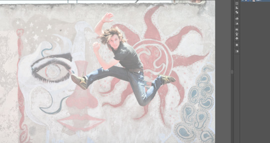
Here we have an image of a person jumping in a funny position. We are going to learn how to utilize smart objects so that we can combine the features of photoshop and illustrator.
First things first we will of course duplicate the background layer as we will be cutting out the jumping guy.

We are going to use the object selection tool as a starter to get somewhat of a shape. There are plenty other methods to do this however this feels the easiest.
I found that doing this sort of editing in photoshop is a matter of working smarter not harder.
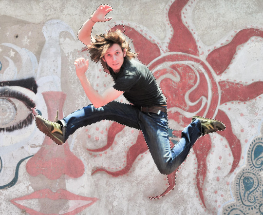
This is the selection... It’s not that good but it’s a good start to refine.
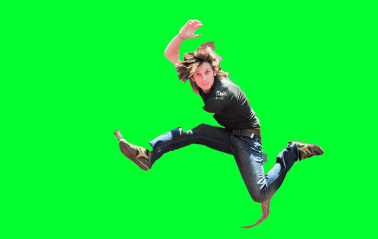
We have masked the selection and put it behind a very distinctly colored background to make it easier to see the edges.
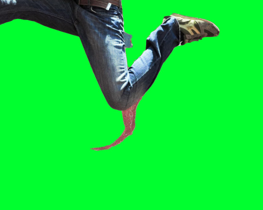
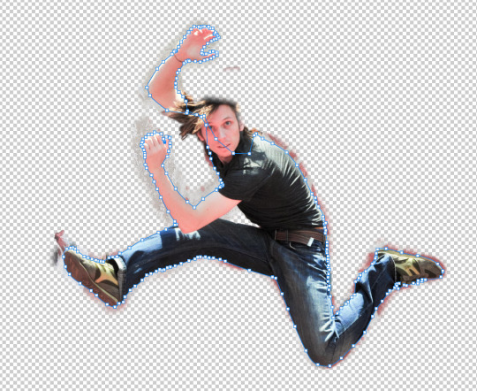
Lets start cutting of this weird part.
To be quick and efficient, we’re using the polygonal tool.


Note that when the black and white mask is selected, your two colors will change to black and white. To put it simply think of black to remove from the selection and white to add to the selection.
So with black as my foreground we “draw” (erase) the shadow away from the selection.
(I’m only using a small brush size for example)
Much nicer.
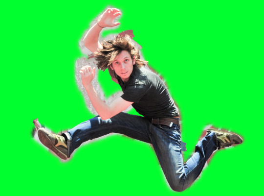
With that in mind we can also reveal what has been taken out of the selection with the white color. So here we are revealing everything that has been picked out by the auto select.
However the hair of this guy will be the hardest to extract. So I will use this helpful and special method.

To start we’re gonna take 2 more copies of the background.
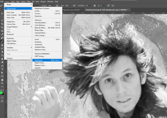
On that top background layer we will desaturate it with an adjustment. (It can be layer adjustment however this is just a one time adjustment)

Then with control + M we can bring up the curves adjustment. What we want is to make the hair very bold so that we can easily pick up on the edges.
Then with control + I we are gonna invert it. And then copy that layer (control + c)
(make sure the whole image is selected when copied)
After that hide the layer and then move onto the next one down.
With the next layer we will create a mask and then...
Paste it into the mask.

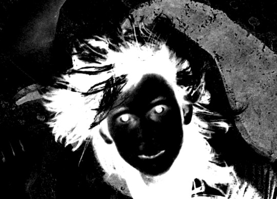
With just that layer showing this is what part of our hair selection looks like.
It’s another great starting point for getting the hair done.
After that apply the layer mask then create another one on that same layer with instead of white in the mask invert it to black.

With playing with brush tool this is our result, though it is only one segment of the hair it is good progress.
Another lesson when doing this work is that it often works together in steps that eventually build to the final result.
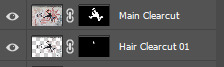
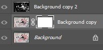
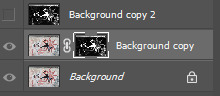
With file organizing this is how our photoshop project will look.
I’ve done a cut of the entire edge of the body.

Selection and then invert selection.

For the less noticeable parts I’ll just be using the polygonal tool.
Here I went with the brush tool method to get rid of the very very tiny details.
After some time (especially on the hair), this is the final extract.
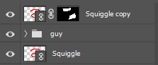
Moving to Illustrator
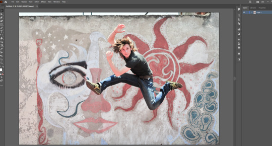
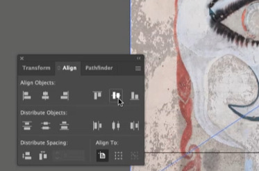
Tip: to make sure the image is aligned properly you can use the align tab.
Here I’ve dimmed the photo so that we can draw over it with clear vision.
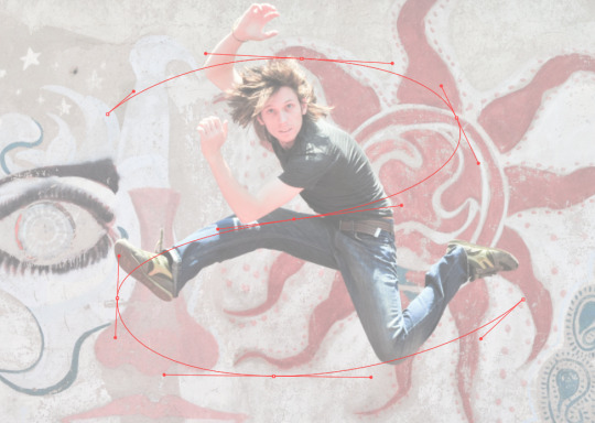
This is going to be the line that swerves around the guy to give a cool effect.
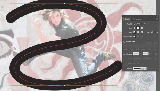
Added a thicker stroke and caps at the end to make it look more flowing.

Save as an illustrator file.
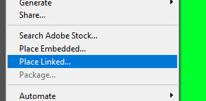
And then back on photoshop you should place linked instead of embedded.
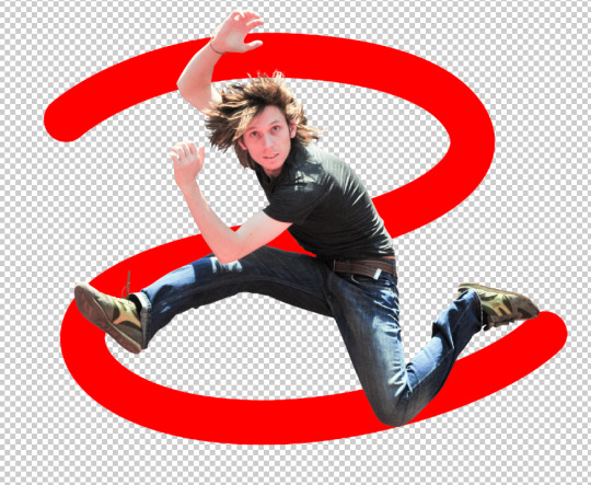

Make a copy of the squiggle and select which parts you want to remain in front of the guy. Then mask.

Looking good so far :)

This is my final result.. Super proud of it :)
Reflection
This lesson was pretty fun. Though I knew most of the techniques I was still surprised by some of the little skills that I learnt. I feel more understanding of bridging illustrator and photoshop together and I definitely feel like I can use this vital skill in the future.
2 notes
·
View notes
Text
Log 5
Our fifth lesson was interesting and fun. In photoshop, we focused in on layers, masks and selecting. The following exercises are things I am used to doing whenever I use photoshop, so I feel capable carrying out the lesson efficiently.
Brief Introduction

We started off with just a rerun of what to expect in the layers tab and the different types of selection tools. Afterwards we did an experiment using the brush tool that exemplified the use of layers.
Here we drew a line, then drew another one and adjusted the color of the second one.
Selecting and recoloring

The first proper task we had the goal to change the color of only the lemon in the center, the class decided pink. Before doing it I assumed we would mask the lemon and then layer adjust.
In the meantime before doing this we were taught how to utilize a selection to its full potential.

When something is selected you can do things that better your selection.
Click + Drag = Move selection box (after selection)
Control + Click + Drag = Move selection itself
Shift + Click + Drag = Apply selection
Alt + Click + Drag = Subtract selection
Space + Click + Drag = Reposition selection box (while selecting)

Getting back to the main goal we used the pen tool and worked our way around the lemon to get the best selection for our situation, we used this one because an auto selector wouldn’t have worked as well and a free form lasso tool and such wouldn’t have been as accurate.
After selecting the lemon we masked it to then applying a layer adjustment.
This is the final result. I’m pretty happy with it, although the pink is a bit too saturated that it doesn’t look a bit real nevertheless I’m still pleased with it.
Extracting a bird
The next exercise is taking an image of a humming bird and moving that bird into a different environment (a new background). This is will be done through precise selecting and masking.
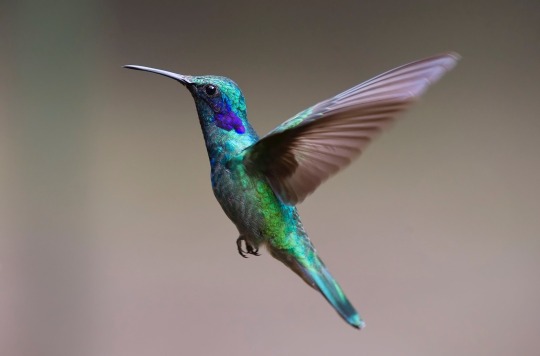

We started of with using the object selection tool which does a full analysis of the bird and selects it. This is a good starting point to work with however it isn’t refined enough so we will have to do more.

You can notice on the birds feet that you can still see some of the background, we will refine this with a manually with a brush.


Here we took a color of the background we want the bird in and placed it behind the bird so that when doing the brush technique you can get an idea if the edges will blend in with the background.
The brush technique

Essentially we are taking a brush and using the nearby color to get rid of the gray edge on the bird, this will soften the bird and make it less out of place.

Here I’m accurately cutting out the background from the wings using eclipse selection boxes.

This is my finished extract. I’ve found that more effort and time will result in a better and refined selection. I’m happy with what I’ve done considered I didn’t go too slow or too fast.

This is the final result. I’m super happy with how it looks on the background and I’m even more satisfied after seeing it done.
The lesson overall was great and I thoroughly enjoy the process of selecting and masking objects. Next time I would also want to get into effects and such to add more to just cutting and inserting objects.
0 notes
Text
Log 4
Fourth lesson was good. We moved from illustrator and onto photoshop, a software I am well versed in. I found no trouble this lesson as it is just like an introduction similar to how we got into illustrator.
What we went through
Color correction vs color grading
Though they sound similar they are two different subject matters.
Color correction is focused upon ‘fixing’ the color in a photo, in cases they are fixed to match another photo to have the same tone/palette.
Color grading is focused on style. It is done a vision in mind and has the goal of establishing a certain tone/mood.
The lesson on photoshop was directed at image adjustments, something I’m familiar with.
Curves

Something I know of but have no experience with. It was easy to understand and learn quick despite the complicated look of it.
Color
We went through three ways you can adjust color in photoshop.
Hue/saturation

Photo filter

Color balance

Exercises


Here I used color grading to my own liking, I went for a cold, bluish style.

Here I color corrected these photos to make them more pleasing to look at.
Homework
We were assigned to color correct 4 photos that we feel should need it. Two should be black and white and the other two should have color.
These are my color corrected black and white shots.

Here I went with a old polaroid looking tint. I started with a greenish color balance and played with the curved to give more depth. To finish I added the sepia filter.

Initially I went for a old school hallway with bright white lights but settled for a yellow light look after realizing it’s probably not a school. I started again with color balance and then moved onto light adjustment and curves.

Here I wanted to get rid of the yellow and make it look more ‘cleaner’ and new. I started with a bit of desaturation and then tweaking with the color balance.

Here I attempted to de-filter this photo and make it appear more ‘real’. I started with curves and then desaturated it, along with a bit of color balance.
Reflection
The lesson went well similar to how the first lesson on illustrator went. I knew what I was doing the whole time and enjoyed the easy work.
1 note
·
View note
Text
Log 3
The third lesson was the most advanced illustrator lesson of them all. We spent the time creating a cartoon penguin using all the techniques we’ve learnt and more. This is my penguin.

It was a long process but I feel was very worthwhile. I’ve learnt plenty of little bits like shading the feet, figuring out the pathfinder tool etc. Skills have definitely been brought up another level.
These are the new found skills that I can list off:
Joining together shapes
Using compound paths
Using pathfinder tool
Gradients
Color swatches
Global colors
Grouping
What I didn’t learn
I had forgotten to save the step process of my penguin in different files. Rather the completed version is all one file and there is no evidence of progress. This mistake is costly as I have no way of showing the inner workings of my penguin.
Reflection
In summary I had fun creating this penguin, It was difficult at some points so I was very challenged. I feel much more confident with illustrator and I feel I got all the basics down and dusted. The next step is remembering to file my work properly so it can be documented better.
0 notes
Text
Log 2
Second week went well, it felt like an extension of last week but more in-depth and I found it enjoyable. I’d say my skills have been amped up to 6/10 in illustrator. Though it’s mainly using the pen tool, I feel much more confident using the software.
In class we continued on using the pen tool and creating shapes. This time it was more difficult and demanding which was great. Below is my drawings on paper remade into illustrator.


The last one was the most challenging of them all. I highlighted the points to show how mine were done. I feel they were done the best way possible. You can notice how short the handles are which is a tip Toby suggested to make them more refined.

Above is the 4 types of points you can utilize in the pen tool. The last page of drawings uses a lot of the complex ones that you have to figure out and memorize overtime.
Overall I enjoyed creating these shapes, the demanding difficulty was exactly what I wanted last time and it was enjoyable making them.
The Homework
Everyone was assigned with a partner so that we can create a shape for them and vice versa. These are my partners drawings.


And these are my created shapes from those drawings. The shapes were challenging to do but in the end they enhanced my skills and experience.
Reflection
Lesson was basically perfect, had fun the whole duration. I’d say for next time I’m hoping to cover another tool or just expand upon the pen because I would not mind that.
0 notes
Text
Design Fundamentals Log 1
First week went great, went through skills in Illustrator, a software I’ve used but have little experience in. I’d rate my skills in illustrator 5/10 due to minimal knowledge. However I’d consider myself a 8/10 in photoshop and a 7/10 in InDesign.
From this course I want to expand my skills, and be able to work fast and efficiently with shortcuts and such.
The kind of artwork I want to produce would be detailed and explosive, with good contrast and color. I’m interested in ‘manga’ and ‘anime’ styled drawings and I’d like to implement that to my futures work.

Artwork I like based on the film/manga ‘AKIRA’
What I learnt in class
What illustrator can do better than photoshop and indesign:
Create scalable shapes, the shapes you create can be manipulated, illustrator specializes in shapes more than photoshop evidently.
Create interesting typography, illustrator again is much better making unique graphic typography. Photoshop would come in hand if you needed effects and such.

Helpful graph of each software’s ups and downs.
Raster vs Vector

On the left is a Rasterized image, essentially a rasterized image is a jpg that will always have the same dimensions. If you try manipulate those dimensions, the pixels in the jpg will become larger and more visible. Which is not desirable.
On the right is a Vector, vectors are the shapes made in a software that is capable of being expanded or stretched and still maintaining its high quality picture unlike the nature of a Raster.
In cases like this with minimalistic drawings, vectors are superior.

Here, an image taken in real life works better as a raster than a vector. Because a vector trace over the image doesn’t look as good as the default raster look as it has all the detail and color in it. In some cases a vectorized image of a real photo could look good for specific purposes.
Drawing with the pen tool in illustrator

This exercise was super easy getting the hang of, because of somewhat previous experience with the pen tool.

If I were to describe the feeling of drawing on paper to using the pen tool, I’d say it comes in like second nature once you get the hang of it. Both have their ups and downs such as with paper it’s quick and easy however it’s not as accurate as digital. The downside to digital is that it can take time, sometimes you have to undo over and over again, which can get tedious for some people.

When it came to curves with the pen, I still found it easy to handle, understanding the math behind it and the way it works definitely helps using it.
Shortcuts to memorize
UNDO = Ctrl + Z (the users best friend)
PAN = Space (hold)
PEN = P
SELECT = V
DIRECT SELECT = A
STOP DRAWING/PEN = Ctrl + Left Mouse Click
Reflection
Feeling very confident about the techniques covered, I felt like the exercise was easy so I’m looking forward to challenges next time. I found the information about each software’s specialties and the comparison of raster vs vector very helpful.
I’d love more exercises focused on a specific tool or feature to eventually we are asked to make an artwork of sorts, would be fun and engaging.
1 note
·
View note