
Statistics
We looked inside some of the posts by paintedfaebles and here's what we found interesting.
Average Info
Notes Per Post
278K
Likes Per Post
170K
Reblog Per Post
108K
Reply Per Post
212
Time Between Posts
4 days
Number of Posts By Type
Text
16
Note
1
Last Seen Tumblr Blogs


Fun Fact
Tumblr’s reach among the 26-to-35-year-olds in the US is 11%.
Text

Call for Submissions!
Cripplepunk Soliloquies will be a literature magazine for celebrating the lives and experiences of the disabled community. In the spirit of the cripplepunk movement, it will put a spotlight on the whole spectrum of our specific experiences with physical disability; whether it’s joyful, angry or melancholy, it’s welcome here.
We’re looking for fellow disabled artists and writers with works in any medium. Everything goes, as long as it relates to the disabled experience. Our hope is for this magazine to be an opportunity for our community to be able to unmask through their art.
Follow this link to submit writing
Or this link to submit art
Deadline: August 31st 2025
This is our first edition! We are planning on getting the funding for production from kickstarter. While we cannot offer financial reimbursement to contributors for our first edition, we will be putting proceeds towards being able to offer that for subsequent issues.
87 notes
·
View notes

Text
I want to try so many little hobbies. Candle making, soap making, basket weaving, wood carving, book binding, baking, weaving, I want to try them all.
93K notes
·
View notes
Note
What if there was a cow that could fly?
um. uhh um. fat bumbalbee
37K notes
·
View notes

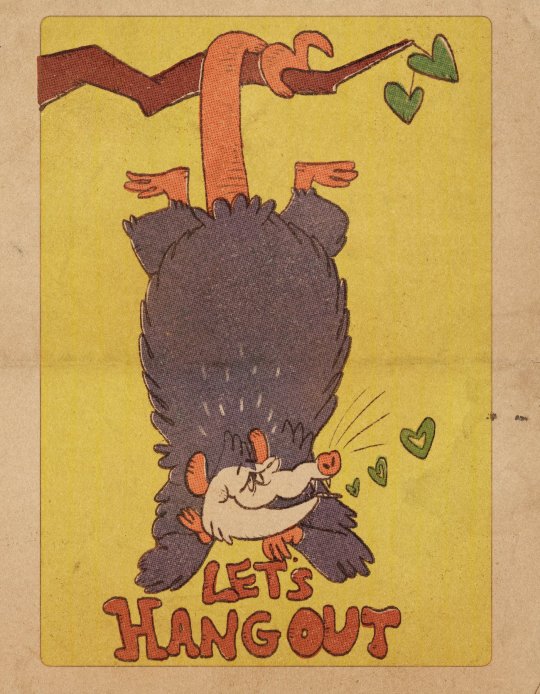
Text

Aurora Borealis Snake ✨🌌✨ Not my usual style but sometimes I just gotta go with the flow ya know? My brain seems to default to snakes whenever I do that. Idk why.
9K notes
·
View notes

Text

did you know jackalopes are my favorite cryptid
24K notes
·
View notes
Text
Something I try to keep in mind when making art that looks vintage is keeping a limited color pallette. Digital art gives you a very wide, Crisp scope of colors, whereas traditional art-- especially older traditional art-- had a very limited and sometimes dulled use of color.
This is a modern riso ink swatch, but still you find a similar and limited selection of colors to mix with. (Mixing digitally as to emulate the layering of ink riso would be coloring on Multiply, and layering on top of eachother 👉)

If you find some old prints, take a closer look and see if you can tell what colors they used and which ones they layered... a lot of the time you'll find yellow as a base!
Misprints can really reveal what colors were used and where, I love misprints...
Something else I keep in the back of my mind is: how the human eye perceives color on paper vs. a screen. Ink and paint soaks into paper, it bleeds, stains, fades over time, smears, ect... the history of a piece can show in physical wear. What kind of history do you want to emulate? Misprinted? Stained? Kept as clean as possible, but unable to escape the bluing damages of the sun? It's one of my favorite things about making vintage art. Making it imperfect!

You can see the bleed, the wobble of the lines on the rug, the fading, the dirt... beautiful!!
Thinking in terms of traditional-method art while drawing digital can help open avenues to achieving that genuine, vintage look!
65K notes
·
View notes

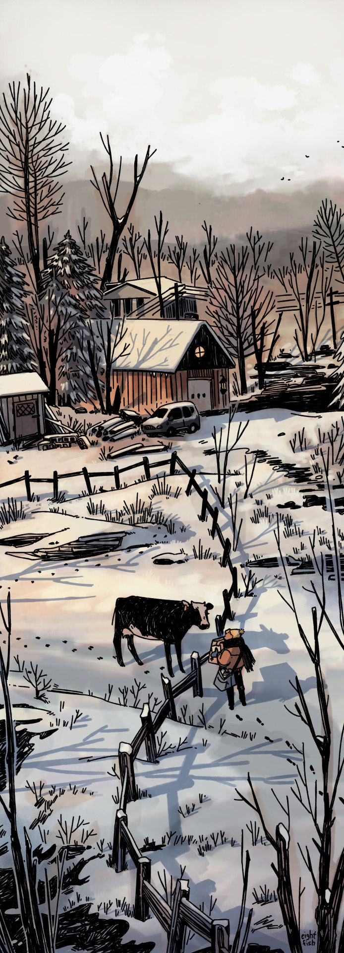
Text


some things drawn in a phone app (may 2024)
support me on: patreon | kofi | redbubble
117 notes
·
View notes

Text

Chris van der Windt, 1877-1952
Sleeping Cat, n/, drawn, 13.3x14.5 cm
Museum De Lakenhal, Leiden Inv. S 1333
3K notes
·
View notes

Text

I feel like I never see any fanart of marceline x flame princess, so I made some, so there!
#adventure time#gay#marceline the vampire queen#flame princess#digital illustration#digital art#my art#cute art#illustration#adventure time fanart
18 notes
·
View notes