
Statistics
We looked inside some of the posts by paupos-blog and here's what we found interesting.
Average Info
Notes Per Post
1
Likes Per Post
1
Reblog Per Post
0
Reply Per Post
0
Time Between Posts
7 days
Number of Posts By Type
Text
11
Last Seen Tumblr Blogs


Fun Fact
Tumblr’s reach among the 26-to-35-year-olds in the US is 11%.
Text
Final Project
The importance of the study about the History of Graphic Design is given to us by the author named Philip Meggs, addressing different aspects and points of view of other authors for a better understanding.
This awesome book made me realize how graphic design has evolved over time and has left its mark on the history, through engravings, texts, images that are applied to different artistic representations; all this done by designers that contribute to this evolution continues.
Something we should be proud of is the heritage left to us by our ancestors, the Sumerian scribes, the Egyptian artisans, the Chinese xylographers, the printers, etc; because they left us the necessary knowledge about writing, manuscripts about papyrus, ink, and illustrations. As time passes, more and more works are incorporated into Graphic Design. From here, I’ll be talking about some sections that are in Megg’s book, that made me understand history in general and history of graphic design more explicit because of its interesting level of information.
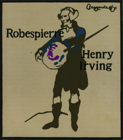
The Pictorial Modernism The European poster of the first half of the 20th century is a continuation of the announcements of the 1890s, but its course was powerfully affected by modern artistic movements and by the communication needs of the two World Wars. Influenced by cubism and constructivism, and yet aware of the need to maintain a graphic reference if their posters wanted to communicate persuasively with the general public, graphic designers committed to the poster walked the tightrope between the creation of images expressive and symbolic and his interest in the total visual organization of the illustrated plane.
The Poster In Berlin Lucien Bernhard (1883-1972), had taken the visual poster a step forward in the process of simplification and reduction of naturalism in the graphic language of forms; established a poster proposal by using plain colors, the name and the image of the product. Julius Klinger; his style ranged from floral art nouveau to two-dimensional decorative shapes in light, bright colors and simple and concise lettering. Bernhard developed a style of sans-serif letters, made in thick brushstrokes. He created a compact alphabet of unique characters in this genre. Bernhard was an innovator. His work should be considered as the logical conclusion of the poster movement. At the same time, the emphasis on reduction, the minimalist form, and simplification anticipated the constructivist movement.
The Poster Goes to the War The poster reached the zenith of its importance as a means of communication during the First World War (1914-1918).Typographic technology had been perfected and radio and other electronic public communication instruments had not yet acquired importance. In this global conflict, governments resorted to the cartel as the main form of propaganda and visual persuasion. The posters of the central powers (led by Germany and Austro-Hungary) and the Allies (led by France and Great Britain, which later joined the United States in 1917) were radically different. In Germany and Astro-Hungary dominated the design approach that continued the traditions of Viennese secession and Bernhard. Words and images were integrated and the essence of communication was expressed by simplifying the images in powerful forms and models. The war propaganda of Julius Klinger was reduced to simple war graphic symbols. On the other hand, Bernhard adopted a very Gothic approach in several of his war posters. The British posters called for the need to protect traditional values, the home, and the family.
The Maverick of Munich Ludwig Holwein (1874-1949) evolved along with changing social conditions. The Beggarstaff brothers were his initial inspiration and, during the years before the First World War, Holwein was pleased to reduce his images to flat shapes. However, unlike the Beggarstaff and his Berlin rival Bernhard, in his images, Holwein applied a rich range of textures and decorative models. Adolf Hitler affirmed that the propaganda, including to the poster, "must be directed to the emotions and only in a limited degree, to the call intellect". Hitler advocated propaganda where the content level was directed towards the less educated person of the public, using only simple forms, made on the basis of stereotyped formulas. Hitler was convinced that the posters used in Germany, even with the most artistic design, were less effective than the conceptually simpler, but more illustrative, work of England and the United States. Hitler had an almost spectral ability for visual propaganda. It was inevitable that the Nazi party entrusted Holwein with a multiplicity of posters since the evolution of his work coincided perfectly with the concept of Hitler's effective propaganda. Holwein turned to a military and imperialist style well delineated with solid, heavy forms and strong tonal contrasts.
The Postcubist Pictorial Modernism Paul Colin (born in 1892) is the most prolific and constant designer of the proposals of the art deco or the focus of the pictorial modernism of graphic design.
Joseph Binder (1898-1972) combined influences, including Kolomon Moser and cubism, in a style of the graphic design illustrated with a powerful communicative force. The seal of his work consisted in reducing the natural images to basic forms and figures such as the cube, the sphere and the cone, as well as using, from side to side, two flat color forms, one next to the other, to represent the parts of light and shadow of a figure or object. Art deco, this term, coined in the late sixties as the name of the popular geometric styles of the twenties, is the expression not of a movement, but of the general aesthetic sensibility of the decade. The influence of Cubism, Bauhaus, and Vienna mixed with the school of De Stijl, suprematism and love for Egyptian, Aztec and Assyrian motifs. As confident as art nouveau was a dominant design style at the turn of the century, art deco was a dominant design style in the decades between the two World Wars. An aerodynamic geometry, zigzag, modern and decorative, terms that expressed the simultaneous desires to interpret the modern era of machines and, at the same time, satisfy the passion for decoration.
In Germany, many graphic designers used color and plane to build graphics images. The British designer Abraham Games (born in 1914) was the last important graphic designer of the philosophy of graphic modernism. Games said: the message should be given quickly and vividly, in such a way that the interest that is subconsciously retained ... The discipline of reason conditions the expression of the design...The designer builds, coils the spring and the spring jumps. The spectator's eye is trapped. He sought the use of images and ordinary forms organized in a different way. European pictorial modernism was a proposal designed for the creation of graphic illustrations, aimed at the total integration of the word and the image.
A New Language of Form Graphic modernism was not the only important current of graphic design in Europe. While in England Kauffer explored the application of the planes of synthetic cubism to the poster, in Holland, and in Russia, a more typographical and formal approach to graphic design arose where artists clearly saw the implications of Cubism. With the invention of the pure form, visual art advanced beyond the threshold of the set of graphic images. A spirit of innovation was present in all the visual arts, ideas floated "in the air" and, by the end of the First World War, graphic designers, architects, and product designers began to energetically challenge the prevailing ideas about the form and the function.
Russian Suprematism and Constructivism Russian art exerted an international influence on the graphic design and typography of the 20th century. The Russian avant-garde had enough common features with Cubism and Futurism to coin the term cubo-futurism. Experimentation in typography and design characterized the books and newspapers of futurist artists, presenting works through the artistic, visual and literary community. Symbolically, the Russian Futurist books were a reaction against the values of Czarist Russia. The use of rustic paper, artisan production methods and hand-made aggregates expressed the poverty of peasant society. Kasimir Malevich (1878-1935) founded a style of painting of basic shapes and pure color which he called Suprematism.
Malevich created an elementary Geometric abstraction that was new, non-objective and pure; sought "the supreme expression of feeling, without seeking practical values, or ideas, or the promised land." A logical thinker with a lucid knowledge, Malevich realized that the essence of the artistic experience is the perceptual effect of color. Vladimir Tatlin (1885-1953) and Alexander Rodchenko (1891-1956), and 25 other artists in 1921 proposed an opposite point of view, when they renounced "art for art's sake" to devote themselves to industrial design, visual communication and the arts applied to the service of the new communist society.
Tatlin changed the sculpture to the design of a stove that would give maximum heat with a minimum of fuel; Rodchenko abandoned painting for graphic design and photojournalism. One of the first attempts to formulate a constructivist ideology was the pamphlet Konstruktivizm of the year 1922, of Aleksei Gan (1893-1942). Gan wrote that the three principles of constructivism are architecture, texture, and construction. Architecture represented the unification of communist ideology with visual form. The texture meant the nature of the materials and how they are used in industrial production. The construction symbolized the creative process and the search for laws of visual organization.
Who best carried out the constructivist ideal was Lissitky (1890-1941), painter, architect, graphic designer, and photographer.He developed a style of painting which he called PROUNS (short for "projects for the establishment - affirmation - of a new art") Lissitky called PROUNS "a state of exchange between painting and architecture". This describes his synthesis of the concepts of architecture with painting; It also shows that PROUNS pointed the way for the application of the concepts of form and space in modern painting to the applied design.
As a graphic designer, Lissitky did not decorate the book, he built it by visually programming the entire object. The typographic composition and the photographic images were used as construction material to assemble pages, covers, and posters. The format developed by Lissitky for this book is an important step in the creation of a visual program to organize the information. The vertical network of three columns used for the text, the horizontal network of three columns used for the cover and the two-column structure of the content page became an architectural framework for organizing the illustrated pages.
The Movement of Stijl In the Netherlands, the last summer of 1917 marked the formation of the movement and the newspaper De Stijl. Piet Mondrian (1872-1944) was a source from which De Stijl's philosophy and visual forms were developed.
Mondrian evolved from traditional landscape painting to a symbolic style, influenced by Van Gogh, which expressed the forces of nature. In the following years, he eliminated all indications of the representative elements and evolved from cubism to a pure geometric abstraction. Mondrian believed that in visual art, objective reality is achieved through dynamic movement in equilibrium. The plastic arts affirm that equilibrium can only be established through the balance of unequal but equivalent contrasts. The classification of balance through the plastic arts is of great importance for humanity ... The task of art is to express a clear vision of reality.
The De Stijl artists sought an expression of the mathematical structure of the universe and of the universal harmony of nature. De Stijl looked for the universal laws that govern the visible reality, but that is hidden by the external appearances of things. For De Stijl artists, beauty comes from the absolute purity of the work. De Stijl advocated the absorption of pure art through applied art. In the early 1920s, De Stijl's impact on architecture, industrial design and typography began.
The search for a pure art of visual relationships initiated in Holland and Russia had remained a major concern in visual disciplines during the twentieth century. One of the dominant trends in graphic design has been the application of this geometric sensitivity to give an order to the printed page.
Malevich and Mondrian used pure lines, shapes, and colors to create a universe of pure relationships arranged harmoniously. This was seen as a chimerical prototype for a new world order. Mondrian wrote that art "disappeared in the same proportion as life gains balance". To unify social and human values, technology and visual form became the goal of those who strived to achieve a different architecture and graphic design.
Meggs’ History of Graphic Design, 5th Edition. Megg’s, Philip.
1 note
·
View note
Text
Journal #10
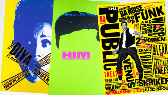
I consider Paula Scher one of my favorites artists in chapter 24 because she has been and still is a major force in graphic design. More recently, her typography has been seen in urban landscapes, on the sides of streets and buildings. Below are some examples of her posters
In 1984 she co-founded Koppel and Scher, and in 1991 she joined Pentagram as a partner. Throughout her career, the images of Paula Scher have become icons of the visual culture of New York City. She has developed numerous systems and brand identities, promotional material, packaging, signage and editorial design for a wide range of clients, including The New York Times Magazine, Perry Ellis, Bloomberg, Microsoft, the Detroit Symphony Orchestra, the New Jersey Performing Arts Center, the New York Botanical Garden and The Daily Show with Jon Stewart.
Her work has been exhibited throughout the world and is represented in the permanent collections of the Museum of Modern Art and the Cooper-Hewitt National Design Museum in New York, the Library of Congress in Washington DC, the Denver Art Museum, the Museum für Gestaltung from Zürich, the National Library of France and the Georges Pompidou Center in Paris.
0 notes
Text
Journal #9
Personally, I was interested in chapter 22, retro and vernacular design and the designers in that time.
In the eighties, the designs acquired a growing understanding and appreciation of their history, books, design magazines and exhibitions contributed to this awareness.
The retro design movement was born in New York and is based on a historical renaissance. It was based on an eclectic interest in the European modernist design of the first half of the 20th century; where there is contempt for the appropriate rules of typography, fascination with twisted and mannered types designed during 1920 and 1930 until after the Second World War.
The movement of vernacular design, denotes the artistic expression, ordinary and widely characterized technique of a local or historical period, with the paraphrasing of more ordinary previous graphic forms, such as the baseball card, the covers of matchboxes and commercial illustrations without No skill and way of printing from previous decades.
The designers Paula Scher, Louise Fili and Carin Goldberg, for example, rediscovered the first graphs of the 20th century, in many of their designs the typography moves in a central plane, it is figurative, animated and expressive.
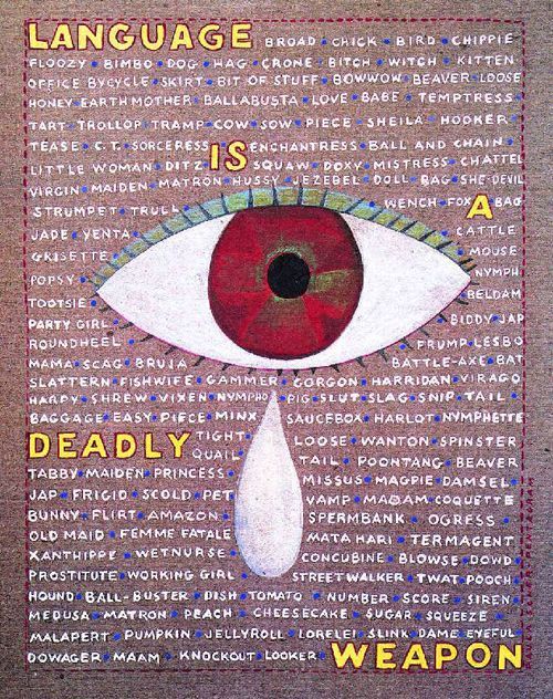
Paula Scher, “Language is a Deadly Weapon” 1994. Derogatory terms for women are presented to increase sensitivity to the effect of slang upon others.
0 notes
Text
Journal #8
While I was reading chapter 20, “Corporate Identity and Visual Systems” I felt like I wanted to know more about Paul Rand because the visual contrasts marked his work and I like the way their designs seem simple and elegant.
Paul Rand was a graphic designer who began his career in graphic design at age 23 working as a promotional and editorial designer for several magazines (Apparel Arts, Esquire, Directions Cultural Journal, and more) in which the covers broke with the traditional advertising design. A deep knowledge of the modern movement of Klee, Kandinsky, and the cubists made him understand that freely invented forms could have a life of their own. He had a great ability to manipulate the visual form (figure, color, space, line, value) and analyzed the content of the communication reducing it to a symbolic essence.
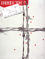
Cover Magazine Direction (December 1940) In his work, we will always be able to see the playful, the unexpected and the visually dynamic intermingled.
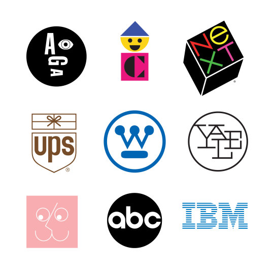
He devoted himself to independent design, highlighting the work in design of commercial trademarks and corporate designs, creating some of the most recognizable American corporate identities such as IBM (where he was named design consultant in 1956 because he was one of the first North American companies to give importance to the design for their communications and publicity), Westinghouse, United Parcel Service, American Broadcasting Company (ABC) and the most recent USSB (Satellite TV Service), recognized all over the world.
He used the common symbols and signs perceived as simple tools to introduce ideas in visual communications, so he defined design as the integration of form and function for effective communication.
0 notes
Text
Journal #7
This week I found interesting the new approaches to typography, photography, symbols into page design and layout.
The life and work of Jan Tschichold and Die neue Typographie (the new typography):
In his spare time, he studied calligraphy and learned a German translation of Edward Johnston's Writing & Illuminating & Lettering, which would have so much influence in Germany at the time. He also knew the work of Rudolf von Larisch on ornamental letters and began to be interested in the techniques for the creation of punches what ended up inclining him definitively towards the design of fonts. His knowledge of French and Latin, acquired in Grimma, helped him a lot to get into classical typography. Towards 1923 he became interested in Suprematism and Constructivism and got to know the first major exhibition of the Bauhaus in Weimar and the catalog that Herbert Bayer had designed for the occasion.
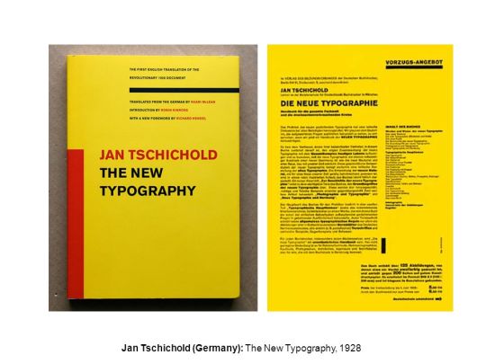
In 1928 he would design and publish his first book: Die neue Typographie, the first work on the principles of typographic design, which rejected decoration in favor of rational design planned for brief communication. Asymmetry was important and also the use of sans-serif type flushed to the left margin.
0 notes
Text
Journal #6
The first two decades of the 20th century were a time of incredible growth, that forever changed the cultural, political and economic aspects of human life. Dada was born in protest against war, its destructive and exhibitionist activities became more absurd and extreme after the war ended.
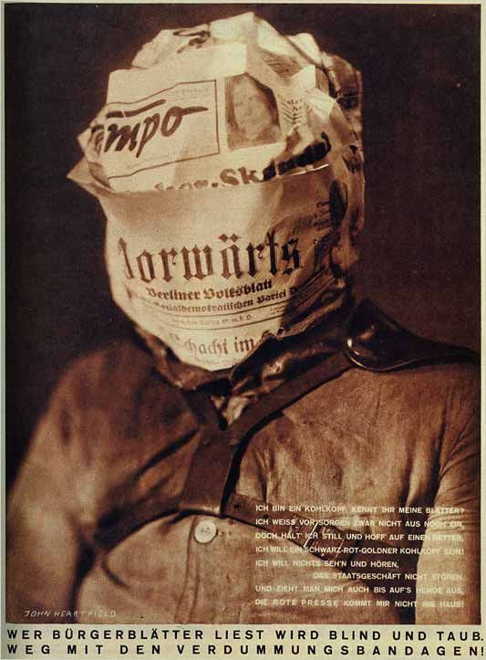
↑ Above, there is an illustration made by John Heartfield, who was recognized because he held strong political beliefs and used his artistic talents to promote social change and to raise the public consciousness. He used photomontage as a powerful propaganda weapon.
Surrealism had roots in Dada and poetry and came on the Paris art scene around 1924. Surrealism looked for ways to make new truths to reveal the language of the soul. It was not only a style, it was also a matter of knowing and thinking a way to live and to feel, it expressed poetic faith.
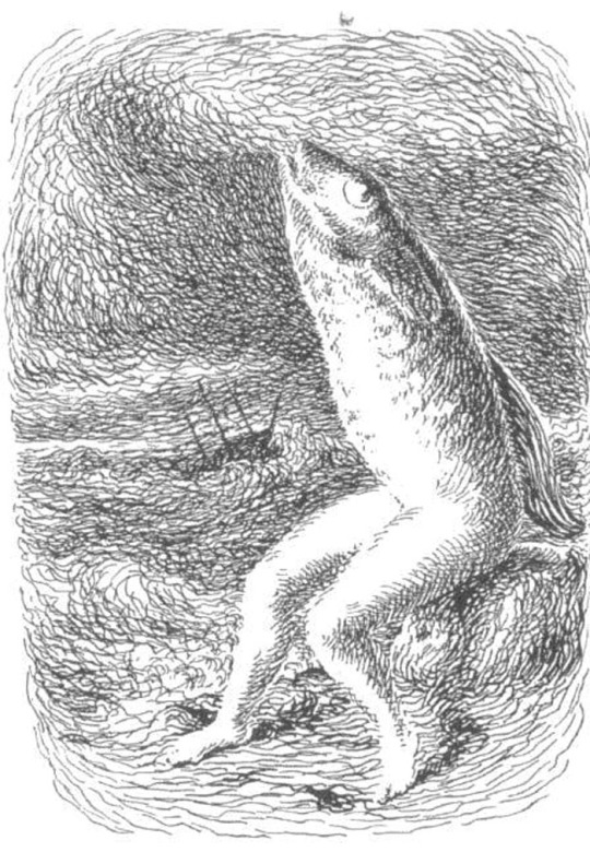
Numerous artists joined the surrealist movement and made influential changes in photography and illustration, including the German, poet, and painter Max Ernest; he used various techniques in his images.
↑ Above, there is an image which is an example of one of Ernest’s art. In some of his collages, he used a photomechanical printing technique to eliminate cut edges unifying the image. His surreal collages have had a strong influence on illustration and photography.
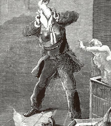
René Magritte was a significant Belgian surrealist, he rendered space color perspective and figures and careful naturalism.
↑ This illustration for “ Le Chants de Maldoror” created in 1937 was an unreal dreamscape. He used poetic dialogue between truth and fiction, reality and illusion.
One of my favorite artists of this movement is the theatrical Spanish painter Salvador Dalí, who influenced graphic design. His deep perspective style of painting inspired the future artists to bring vast profundity to art.
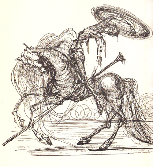
↑ Salvador Dalí, “Don Quixote,” 1965.
Surrealism showed how fantasy and intuition could be expressed in visual terms.
0 notes
Text
Journal #5
This week I found interesting The Vienna Secession in 1897. The key members of the group were painter Gustav Klimt architect Joseph Maria Olbrich, Josef Hoffmann, and artist/designer Koloman Moser.
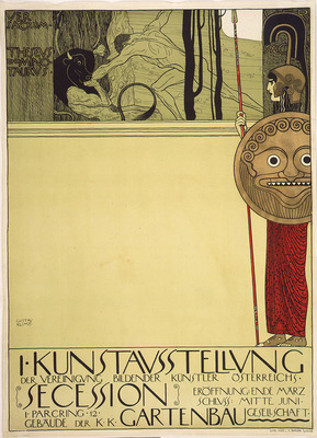
Gustav Klimt (Printer: Albert Berger, Vienna). This poster was made for the First Vienna Secession exhibition (1898). It is a symbolic depiction of the conflict between young and old and it is represented by the Greek myth of Theseus battling the Minotaur.
While the personal monograms of the Vienna secession artists show communal unity, various members specialized in one or more areas including architecture, crafts, graphic design, interior design, painting, printmaking, and sculpture.
Compiling, in the late 19th and early 20th century, pioneering designers in Germany, Scotland, and Austria broke with Art Nouveau to chart new directions in response to personal and societal needs. Their work was the foundation for design in the new century. Their artistic explorations and philosophies coursed through design activities in the decades ahead.
0 notes
Text
Journal #4
Personally, I’ve been feeling very comfortable reading this book because it includes very important topics and it’s been an easy way to understand how the graphic design is been evolving through the centuries. This week I found interesting chapter #9: Graphic Design and the Industrial Revolution, the inventors of photography.
Joseph Niépce was a French inventor began experimenting with Bitumen of Judea, a form of asphalt that hardens when exposed to light, things really started to happen. Coating a plate with this bitumen of Judea, he put the plate into the camera obscura and pointed it outside of his window.
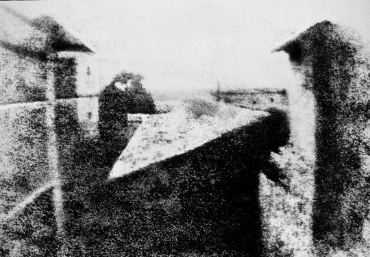
This photograph, View from the Window at Le Gras, was made by Joseph Nicéphore Niépce, in 1826. It is s the world's first successful permanent photograph.
Additionally, Louis Jacque Daguerre became aware of Nièpce’s experiments. Daguerre’s profession naturally made him curious about Niépce’s work. He approached Niepce to form a partnership to perfect his heliography process. Daguerre had a camera obscura with a sharper lens, which would reduce exposure times. His method consisted of treating silver-plated copper sheets with iodine to make them sensitive to light, then exposing them in a camera and “developing” the images with warm mercury vapor, this process is called Daguerreotype.
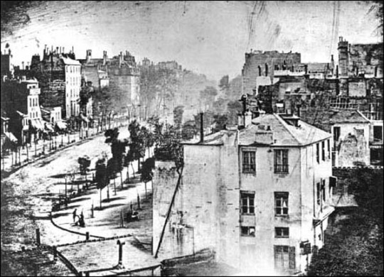
This image is a popular boulevard in Paris in the afternoon. Although it was taken at a time when the streets should have been filled with people strolling arm and carriages rolling by, the street looks deserted it was because the exposure time. Daguerre had successfully reduced the exposure times down to a reasonable amount of time and his process produced images that were richly detailed.
0 notes
Text
Journal #3
This week I found interesting chapter #07: Renaissance Graphic Design because I learned about relevant people during that period.
Nicolas Jenson from France, established a second printing press in Venice. He published about a hundred and fifty books and I think Jenson’s work is amazing because I like the way he designed Greek and Gothic fonts; he is recognized for being one of the greatest typeface designers of all the time and I really like the picture of the pages from Incipt officium beate Marie virginius secundum Romana curie (Little Office of the Virgin Mary) that was completed in 1475.
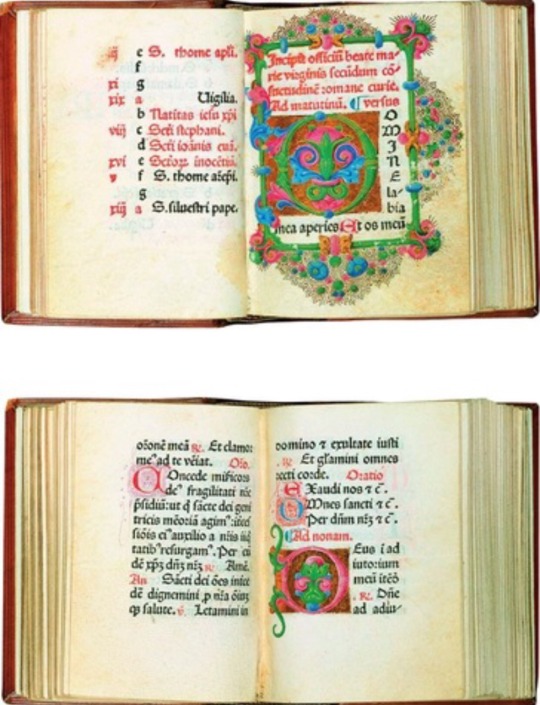
I think this pages show how the renaissance is characterized by floral decoration. It was also applied to architecture, furniture and manuscripts.
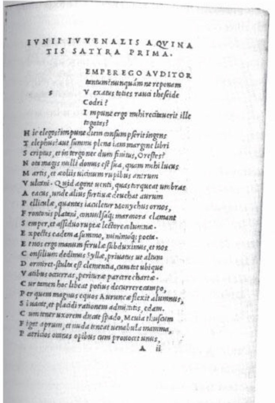
Additionally I believe Aldus Manutius was very important at that time because in 1501, Manutius published Juvenal and Persius, Opera, and it was set as one of the first books using Griffo’s new italic type which I consider a huge part of the continued progress.
Finally, I can say that books became an important material in the 17th century. Also, literacy increased and printers skills increased.
0 notes
Text
Journal #2
This week I found the first four chapters of Meggs, Philip B. Meggs' History of Graphic Design motivating. As a first impression, the four chapters seemed interesting because the content was a combination of images and information about topics that I have never read before.
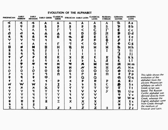
Personally, I enjoyed reading about the alphabet; it made me curious about what culture began to create the alphabet and how it evolved throughout the years. The Phoenician alphabet was derived from Egyptian hieroglyphics and scripts and cuneiform from Mesopotamia. Later, Greeks adopted and improved the Phoenician alphabet and changed five consonants to vowels. I found relevant the fact that Greeks applied geometric structure and order to the Phoenician characters, they renovated them into something more artistic and harmonious than it was before, but when the Romans adopted the alphabet from Greece they evolved it visually because they changed the shapes to something more sophisticated, more symmetrical and their inscription had linear geometric forms.
On the other hand, I think that the lecture of the chapter of The Asian Contribution was very attractive to me because the calligraphy similarly to the Egyptian hieroglyphics was also a purely visual language. Additionally, the innovations developed by the ancient Chinese revolutionized the progression of some human actions, just like calligraphy, paper, movable type, and printing. Nowadays, those inventions are meaningful and relevant to us, because thanks to those movements we have the opportunity to work with many of those tools.
https://youtu.be/LVHORoI-hSw
The link above is about the traditional Chinese identification stamp.
0 notes
Text
Journal #1
Hi there!
My name is Paula Porras, I was born and raised in Bogotá, Colombia. I’m currently living in Sunnyvale, California since 2015.
I really enjoy drawing, sketching, painting, and taking photos. It is something that I’ve been doing since I was a child, because I really like art in all its expressions. I found this class really interesting because I know I will learn a lot about Art History and it will be helpful for me to understand deeply the movements created at different times in history.
My motivation is that I have never taken a Graphic Design History class before, so I think it will be challenging but at the same time meaningful, because I’ll be learning about some topics I’ve always wanted to learn.
0 notes