
Welcome to my portfolio and thanks for coming by! More like my creative visual archive, this is where my processes, documentation and final outcomes can be found. Click on the posts and images to find out more about each project!
Don't wanna be here? Send us removal request.
Statistics
We looked inside some of the posts by pixiepew and here's what we found interesting.
Average Info
Notes Per Post
0
Likes Per Post
0
Reblog Per Post
0
Reply Per Post
0
Time Between Posts
2 days
Number of Posts By Type
Text
17
Last Seen Tumblr Blogs


Fun Fact
Hackers stole 65M passwords from Tumblr in 2013.
Text


Chemical Proof (WIP)
Design production (Y2)
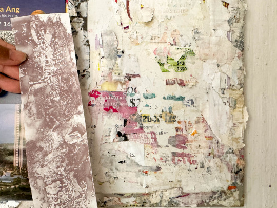
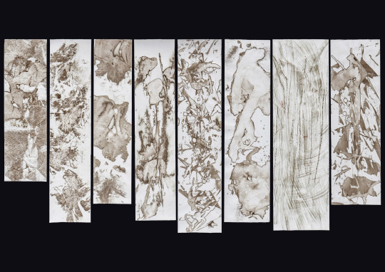
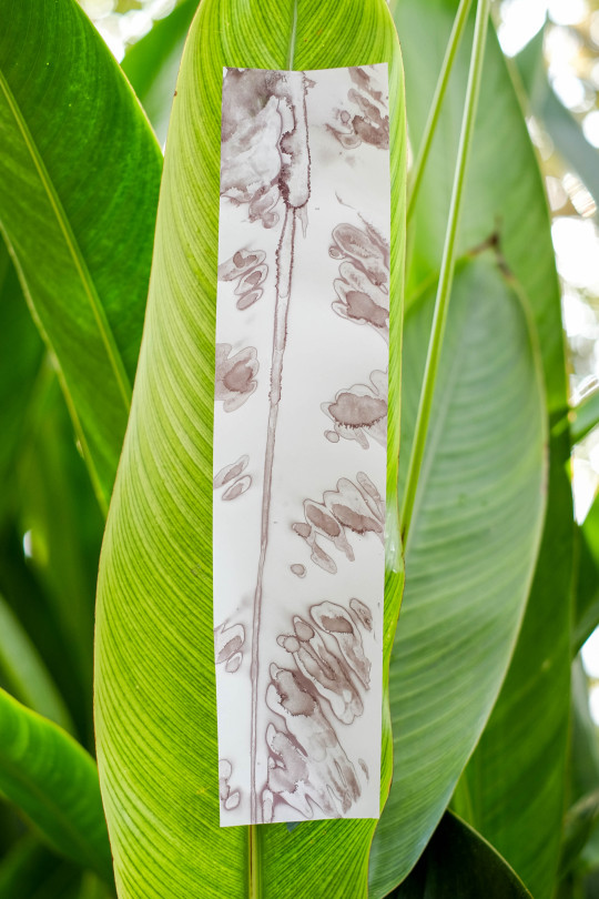
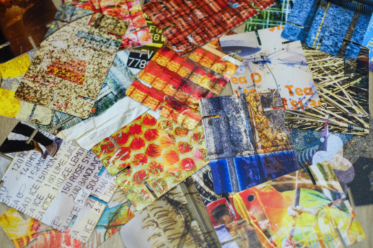
This semester, we are pushing the limits of conventional printmaking and exploring ways to innovate traditional creative processes. My original focus were receipts; the habit of collecting them only to throw them away makes them such an overlooked paper format. Have you ever noticed the print on receipts eventually fade away after a long time? What is the purpose of receipts then? I wanted to find a way to introduce purpose into receipts again, give them a new life apart from being proof of purchases and what not.
In my research and experimentation, I studied the process of thermal printing and deconstructed the structure of what receipts are made of (thermal paper). I don't have access to thermal printers (which are expensive too), but I (accidentally) found that alcohol sanitiser leaves a black mark on receipts. The alcohol's chemical composition can disrupt the balance of chemicals in the thermal coating, causing it to darken or change colour. Throughout my experimentation, I tried many different ways of applying the alcohol and using different surfaces and objects to create a whole new array of visual outcomes.

0 notes
Text
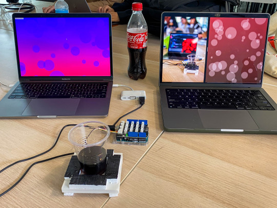

Making Workshop (Arduino)
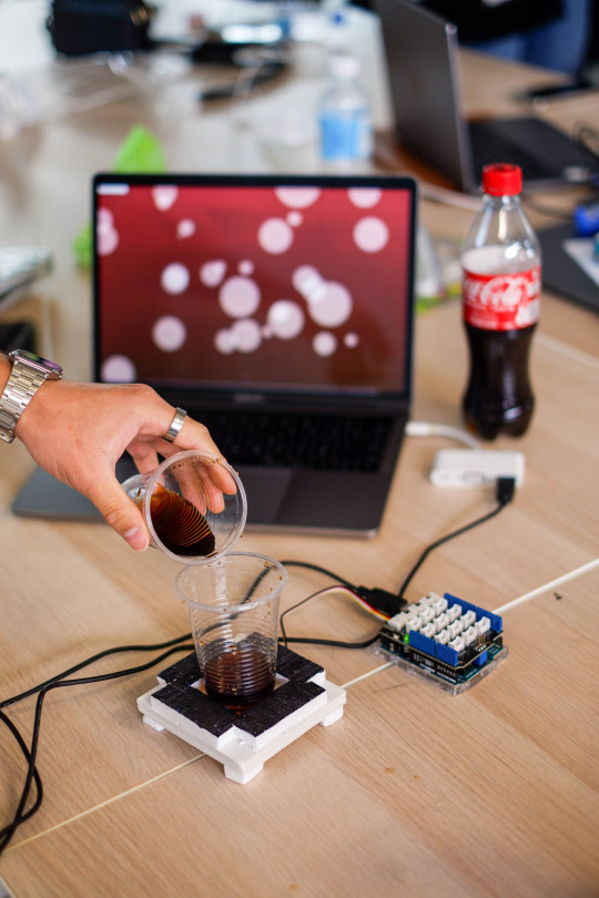
FIZZ (Arduino Drink Metre)
Computation in Design (Y1)
Based on the transparency of a drink, the light sensor could work as a drink metre to inform customers of when to stop pouring. It detects this based on the transparency of the drink; the more that is in the cup, the more opaque the drink is and the less should be more.
This concept is a simple use of an Arduino light sensor and the action of pouring a drink. We wanted to take a mundane part of the everyday routine and introduce a simple visual that can engages viewers as they perform the action. The contraption can be easily installed in water coolers. The parameters are flexible and can be adjusted interchangeably to create tons of variations.
0 notes
Text

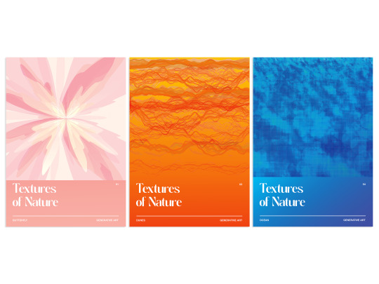


Textures of Nature
Computation in Design
This is a group project, a compilation of our personal interpretations of textures through abstract shapes and forms found in the world around us; from the jagged edges of rocks found in topography, to the movement patterns of ocean waves, to the shapes of butterfly wings. Despite the overwhelming number of ideas we had, we worked together as a team to find a way that can cohesively tie our ideas together, while allowing us to explore the theme individually. I suggested an exhibition-like approach, where we can still use the many different visual outcomes each of us have, all tied under one theme. Learning about textures of nature compelled us to look deeper into the world around us for inspiration and pushed us to try new methods in code creatively. I’ve learned that along the way, even if I didn’t achieve what I planned, sometimes the mistake can lead me to new, unexpected ideas.
All the outcomes have been done in P5.JS code, with inspiration from nature. Many of the variations come from our own research or trials in tweaking the code. The final results are a zine that folds into small booklet that combines all our results together, as well as A3 poster(s).
0 notes
Text
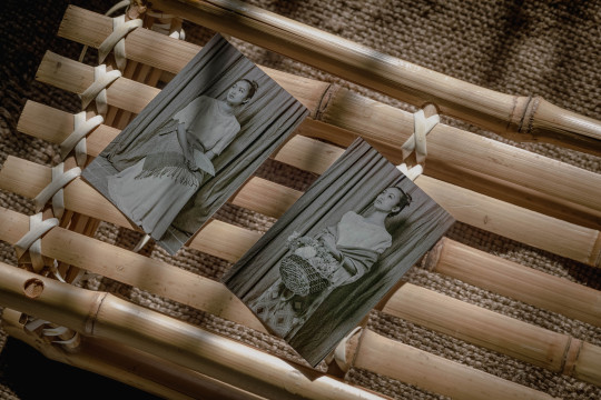
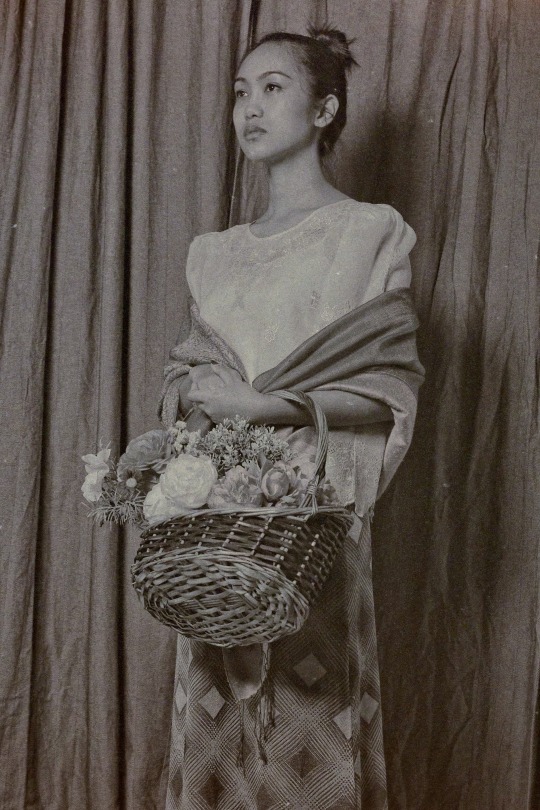
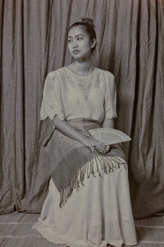
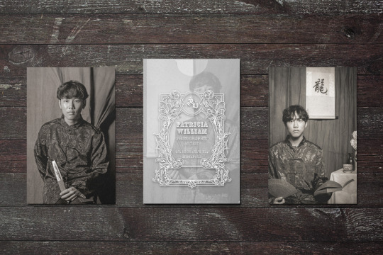

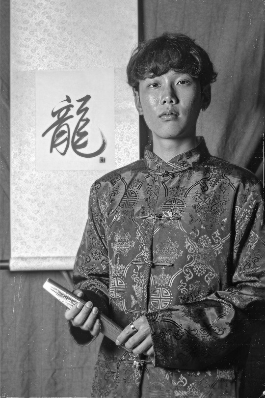
Carte De Visite Portraits (2022)
French for "visiting card", carte de visites (CDVs) are a type of small photograph mounted on a card as a means for people to exchange portraits of themselves or their families with friends and acquaintances. They were a popular method of documenting social networks, family connections, and personal appearances. In a way, they were the 18th century's version of KPOP photo cards and Instagram.
In order to create convincing CDVs, we had to study the photographic processes behind these cards. For example, due to the limitations of photography then, the exposure times went on for an extended period of time which meant poses had to be held for a long time. Part of the direction was to pose in ways that can be maintained steadily so that it would appear "clear". In my own editing, I made it a point to adjust it to look like a wet collodion photograph.
0 notes
Text


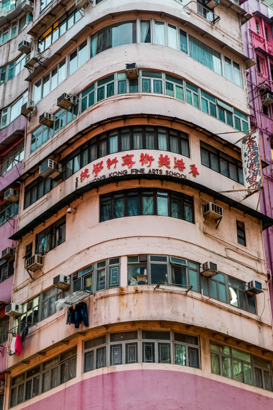
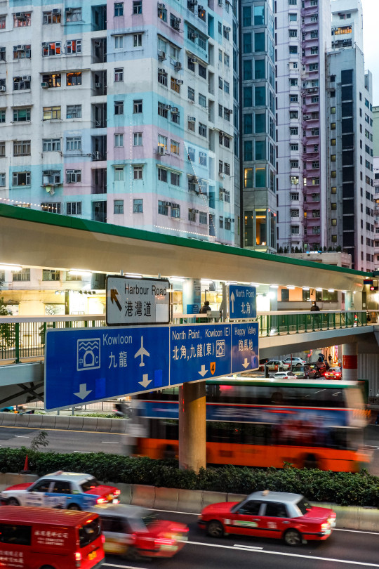


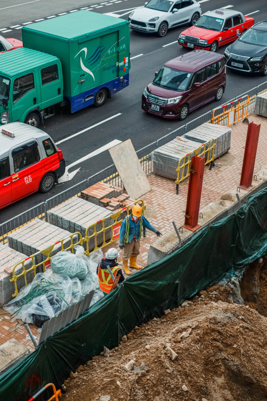
Hong Kong (2022)
Some of my photos from Hong Kong! This was one of my last few trips before my camera broke, but I liked the challenge of urban landscape there; it gave me so much to look at which meant I had to be more attentive to the way I frame and compose my shots. How people interacted with the environment felt different too, like it was busy but calm, a routine that they're all used to.
0 notes


Text

Bánh Mì Thįt by Star Baguette
This semester's typography & branding project (done in group, but these are my variations in progress).
Located along the shophouses of Geylang, Bánh Mì Thįt by Star Baguette is a hidden culinary gem that offers authentic Vietnamese cuisine in the heart of the city. Founded in 2018, this family-owned gem has become a beloved destination for locals and foreigners alike. The ambiance of its main outlet is inviting and warm, reminiscent of traditional bánh mì shops. What sets them apart is that despite their success, Bánh Mì Thįt remains a humble establishment that prioritises the experience of their customers. Being online has never affected their popularity, relying on word of mouth and good reviews. Their commitment to excellence and authenticity always keeps their customers coming back for more, like their motto; Strive for the best!
0 notes


Text

Easter Banner Progress! A very fun side project I did when I had time, thankfully I came across the open call for public art submissions. My main inspiration came from stained glass art in Catholic churches. Some of the requisites, apart from the assigned bible verse, included art that anyone would understand or appreciate. I used a myriad of vibrant colors to attract attention and emanate a warm feeling you'd see if you spotted a rainbow.
0 notes
Text


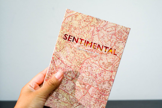
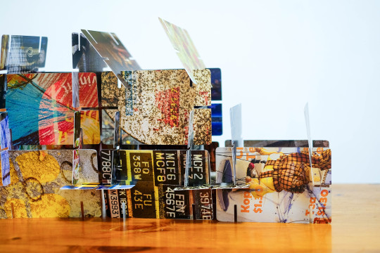
Sentimental
This card game is a personal reflection and learning journey about finding the identity of the Queenstown I know, based elements of my own childhood growing up, in the Queenstown that exists today. Home to some of Singapore’s earliest HDB estates, the development of the area marked a pivtoal shift from traditional kampongs to modern public housing. The idea of modernisation vastly changing the landscape of a neighbourhood draws a parallel to how the Queenstown that stands today has moved on with the times. But in my eyes, there are traces of its long history and my life then that still remain.
As players engage with the game, they bring forward their own perceptions of the neighbourhood’s identity, which reveal the subjective nature of how people experience and remember a place. This form of playing cards as a medium for my artefact is an intentional choice, allowing for the creation of personal narratives around individual memories, most especially my own. Every card is designed with picture overlays of textural elements that remind me of my childhood, each one bearing a myriad of colors and subjects. No two structures are ever built the same, always an ever changing visual landscape.
When you play this game, think of the many layers of history and lives that have existed in this neighbourhood. How did you perceive places you spent your life in, then and now? Are you able to find the traces of your past in the Singapore today?
0 notes


Text
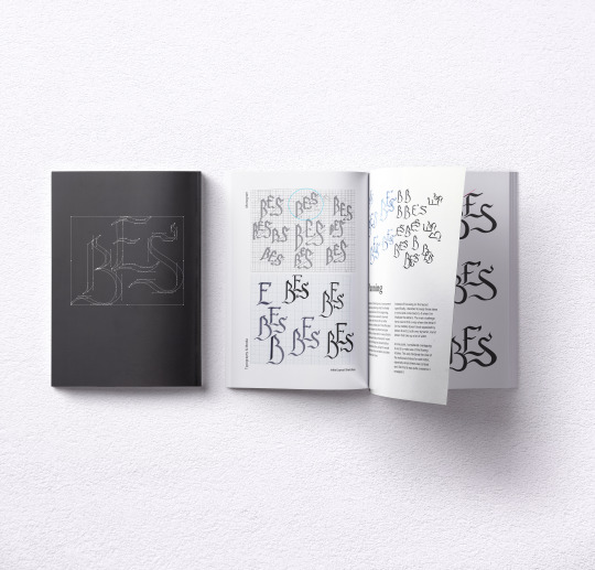


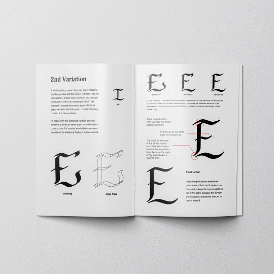
Baybayin Inspired Monogram
Drawing inspiration from a precolonial Philippine script, Baybayin holds a culturally significant and resilient place in the country’s history. Used by various indigenous Filipino ethnic groups for recording their beliefs, traditions and language prior to Spanish colonization , its name comes from the Tagalog root word “baybay”, which means “to spell”. It is an abugida: a writing system where every consonant-vowel (3 vowels and 14 consonants) combination is represented by different characters.
As a Filipino that has grown up in Singapore, my years away from my homeland have left an immense longing to reconnect with my roots. In learning to love my mother tongue, this monogram is a homage to a language rich in Filipino heritage and identity. From hand lettering to digitisation, every stroke is meant to reflect the flowing, graceful waves of Baybayin.
0 notes