Text


This was my final outcome!
What went well?
I really like how much I have developed this unit, I have really focused on making sure that I had experimented loads creating loads of imagery based on my article and I feel like this really helped me to lear lots of skills that will help me in the future I did image making, photography, image transfer, Lino-printing, pattern making, applying the pattern, I also did sewing into imagery. I feel confident in all of these skills which will really help me when it comes to making more magazine spreads in the future.
Even better if.
For my next time I will defiantly follow the process I took this time reading through my article really understanding it and then starting off before everything is to start developing on the image making which will then make you have all the resources when I comes to creating image making.
For this project I feel like the one thing I could have done more of throughout is researching more articles and doing a lot more research throughout the project.
0 notes
Text
Then after implementing all the different feedback I got into my outcome. We then had another last crit this was actually more helpful then I thought it was going to be as I got the helpful last feedback that helped me to push to get the outcome done and in my process book.
The feedback that was given was that they really liked my type face of fenon but maybe not throughout al the titles as it looks really good but only really big so maybe just stick with only on the main title "The makers movement "
Then another thing would be to maybe implement the yellow slightly more to make the whole magazine flow together.
There was a few more little tweaks that I changed and then it was ready to print.
0 notes
Text

So following this feedback I wanted to experiment with what Briony and my peers had said. Making a more structured layout of my magazine having a set text throughout and a set colour pallet throughout t make the magazine article/ spreads feel like a set.

These where the colours that I chose for throughout the magazine spreads, these where taken from the front cover and where put in the front cover with red representing courage, loyalty, success, fortune, happiness, passion all things that are needed to get into craft. Also the yellow gold representing wealth, power and intelligence.
0 notes
Text
So after being stuck for a few days on what to do, I thought the best thing to do was to ask those around me what they thought would make my magazine more interesting. My feedback was that all of my imagery was really good and that more of I would be good, but they said that the layout was just quite bland and that I needed to do something to make it more interesting. So taking this feedback I really wanted to maybe change up the colours or add in a more interesting font that reflects craft slightly more.
0 notes
Text


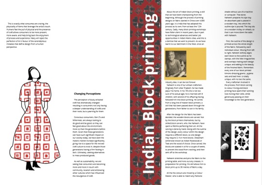

This is then my development looking at trying to making all of the spreads trying to make them look like the same magazine and look like the same articles. I did this by following several steps following a colour scheme, following a layout, by keeping the font the same the paragraphs the same size. But looking over this layout I know that it needs a lot more work, I like all of the imagery but feel like possible. I could more the layout around a bit maybe adding in the case study too two spreads as I feel like it wont be so out of place.
0 notes
Text
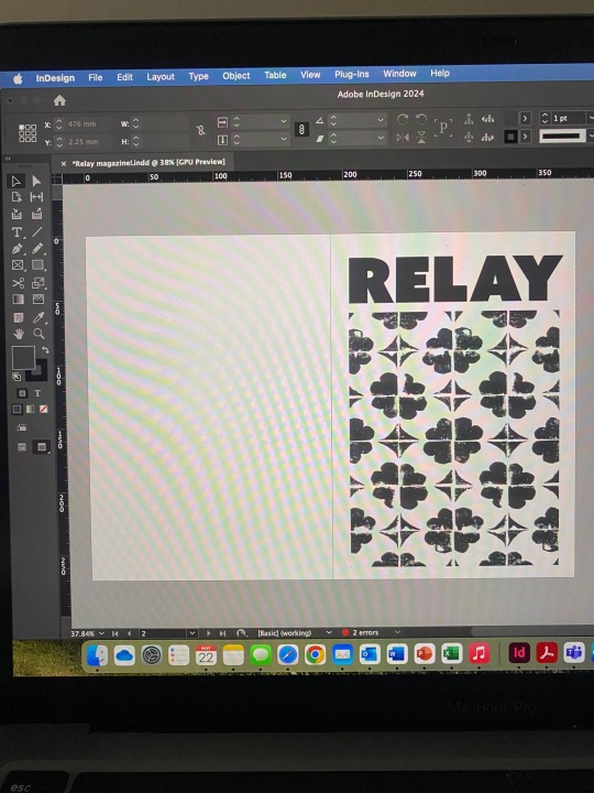
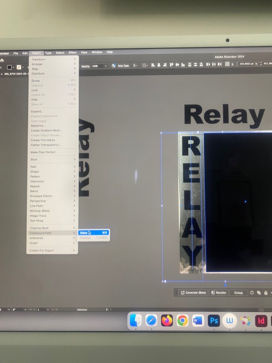
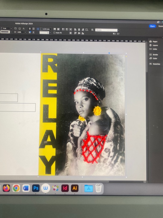
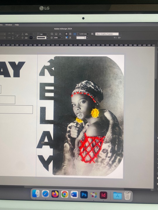

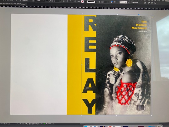
So after much deliberation of many different front cover designs and layouts. I had come to the conclusion that the last image was going to be my final front cover design having the yellow as the spine and having the title of the magazine on the side but running down so that it is easy to read and to know what magazine it is. I also was using this image with is a stock image that I manipulated buy printing it out and sewing into the image to create a pattern/ design. I chose to use the yellow of the thread for the spine and for the text. And going to use the red but slightly darker throughout the magazine.
0 notes
Text
So after being critical, I knew that I needed to make sure that I was being more deliberate with my imagery, I really liked the font of open sans that I was using and that the colour scheme that I was going to be using was a deep red and a deep golden yellow.
0 notes
Text
Crit
Then after I put everything down on the page it was time to be critical of what looks good, what imagery looks good. If I could manipulate the imagery at all to fit my text better. From my feedback and from asking my peers, we all really like the first imagery and feel like it would be more successful as a big/ a statement image.
0 notes
Text


So then after making all/ most of my imagery, I thought it would be a good idea to start putting my article and my ideas down on a page!
This is my starting out looking at layouts how my work is fitting the grids and what imagery will have to fit in with what text! Looking at how I'm adding in pull quotes etc to make my article interesting.
0 notes
Text
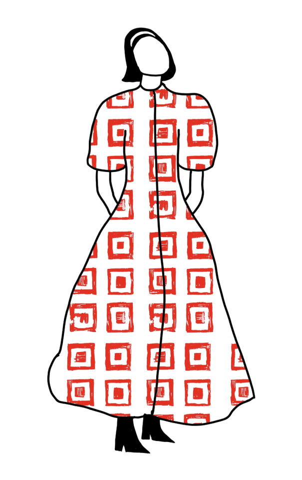

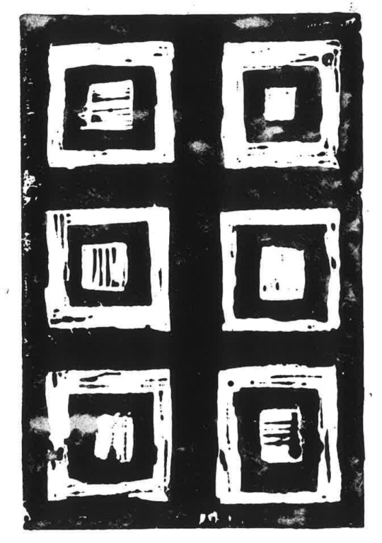
This was some development looking into using my patterned lino-printing to create patterns of clothing and to see what this could possibly look like in my magazine.
0 notes
Text


Image transfer!
Looking at materials and craft I wanted to look at making my art outcomes a little bit more broad looking into crafts and the making into fabrics which is a craft in its self figuring out a cool way to incorporate this into my magazine weather it is using it to show the pull quote or just to add a little bit of texture and uniqueness into my artworks for my magazine.
0 notes
Text

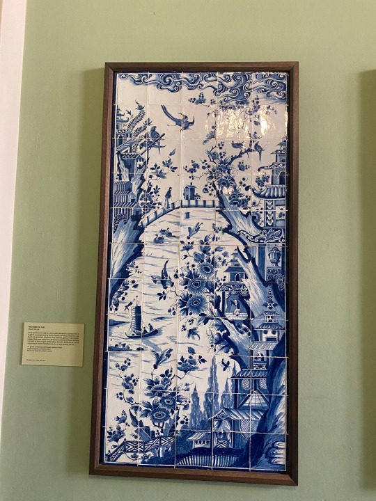


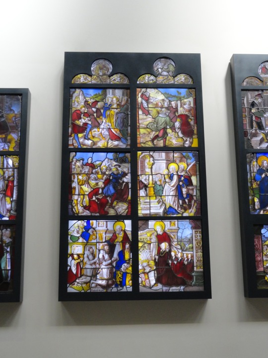


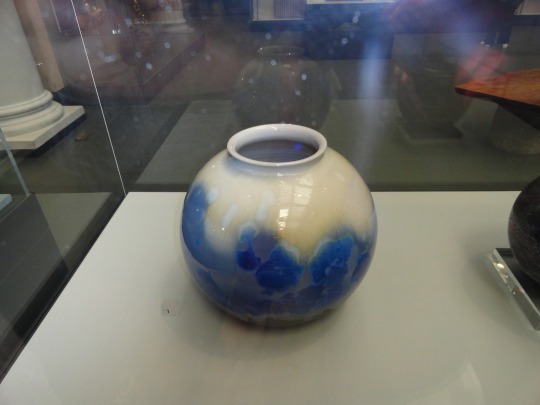

London trip!
The V&A. My aim for this visit was to explore around and see all the different crafts the you could see in the exhibitions to show that craft is everywhere and how important it is to know crafts so that it can be used in everyday life throughout into the future.
0 notes
Text

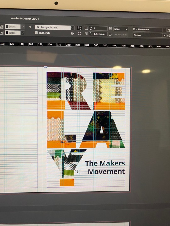
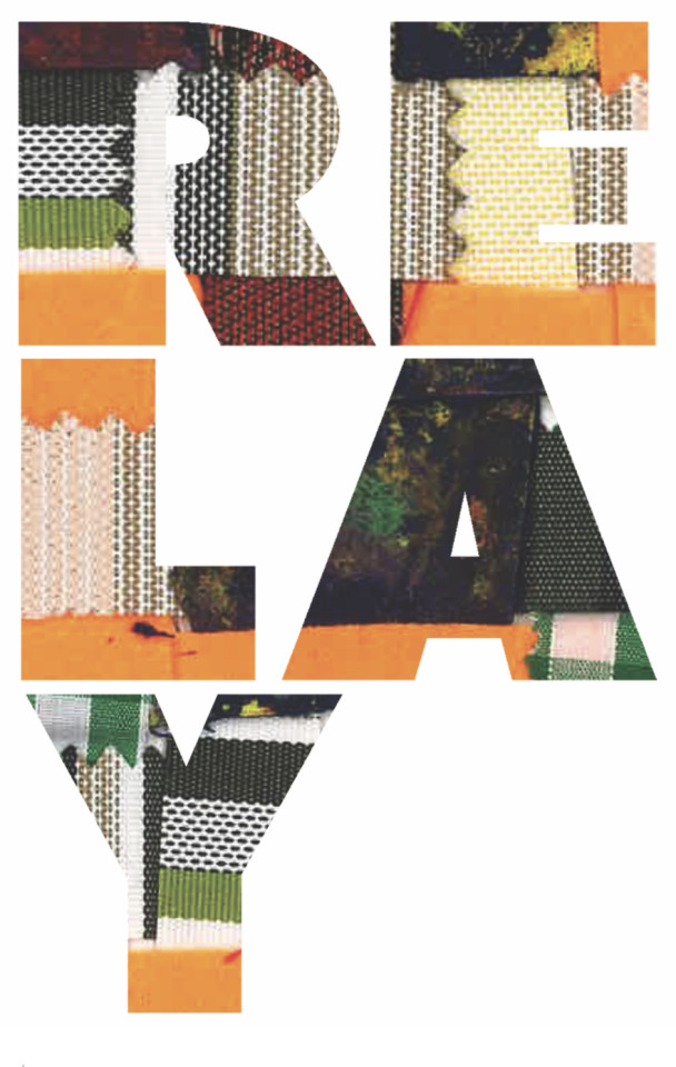

This was my experimentation of the title “Relay”
Seeing how I could show the contents of the magazine through the text/ the front cover and I really liked the example of these but really just didn’t really think that it looks right for the front cover and would like to continue to explore the outcome for the front cover of the magazine doing some more development work.
0 notes
Text

This is my development work of sewing into paper !
I really like this outcome but feel like l could further develop the outcome with thinking about what to add onto the photograph then also look at making my own photography.
0 notes
Text

This is the card I chose as I thought it was the most successful and had the least amount of creases in the paper, I also came to the conclusion that I prefer thicker thread as you can’t see the indents of the needle which changes the effect of the outcome.
0 notes
Text
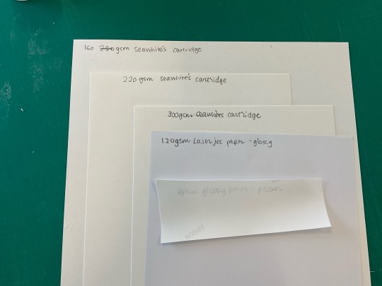
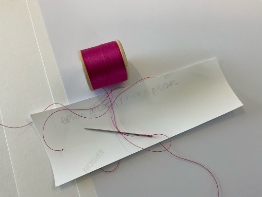
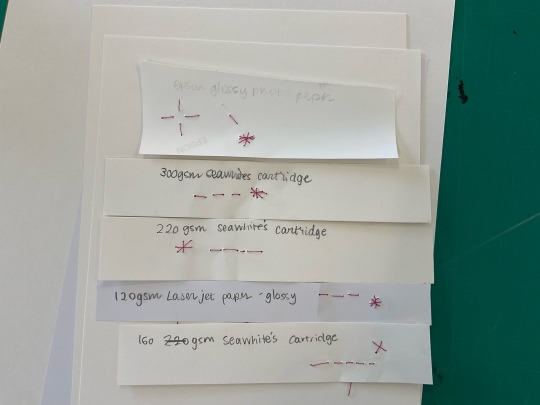


Then another piece of experimentation is looking into mixed media and I would like to experiment with sewing into photographs and I first tried it out on different papers this was to make sure with paper was better to use when sewing as I didnt want the paper to rip.
0 notes
