Don't wanna be here? Send us removal request.
Statistics
We looked inside some of the posts by poooooooower and here's what we found interesting.
Average Info
Notes Per Post
39K
Likes Per Post
31K
Reblog Per Post
8K
Reply Per Post
84
Time Between Posts
21 days
Number of Posts By Type
Text
15
Photo
2
Last Seen Tumblr Blogs


Fun Fact
Forty percent of Tumblr users are between the ages of 18 to 25.
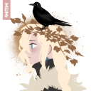
Text
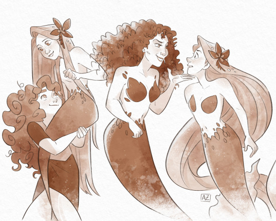
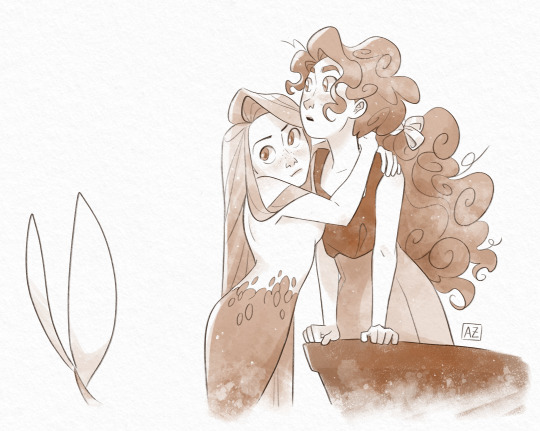
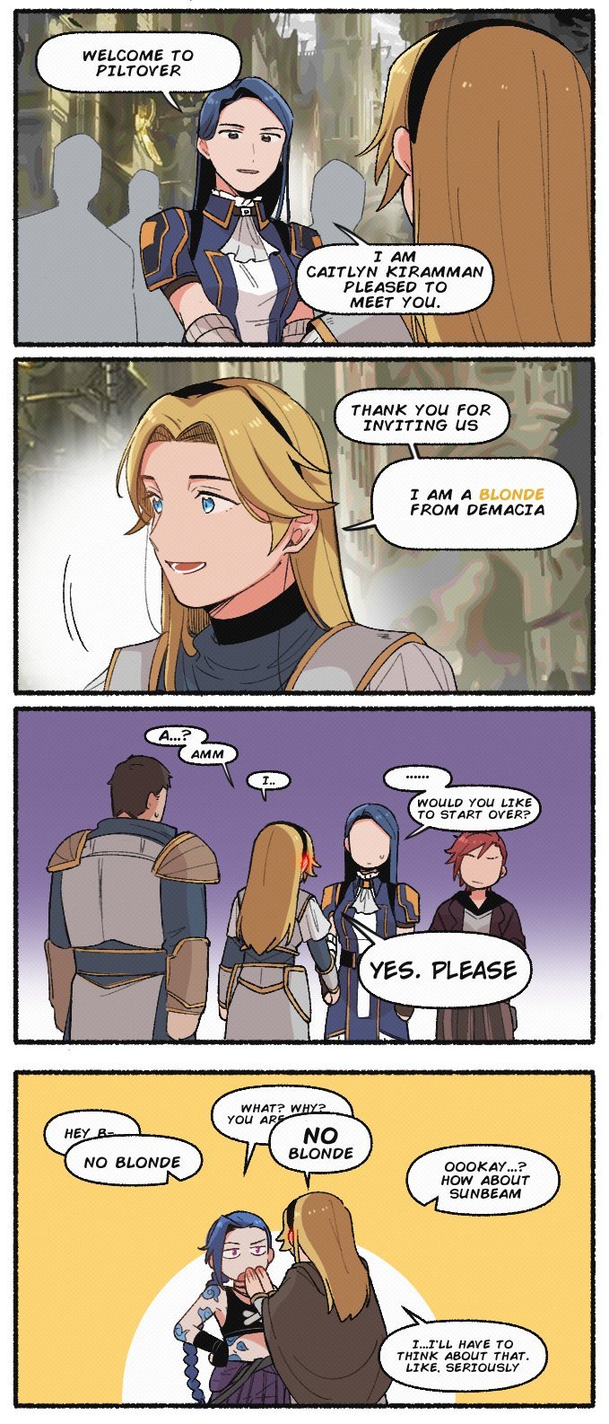
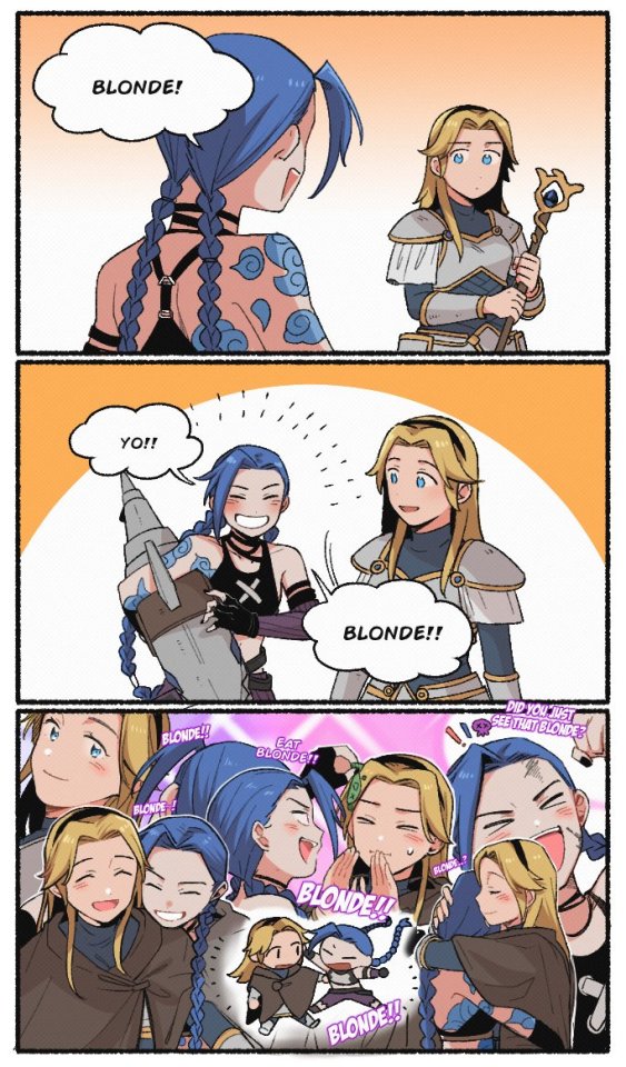
Augh augh


I LOVE THEM SO MUCH
I need to hear more about their PRANK WAR

Look at them fucken flirting and giving old sapphic couple vibes
316 notes
·
View notes

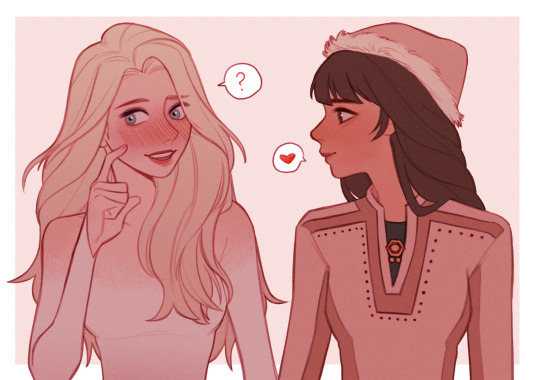
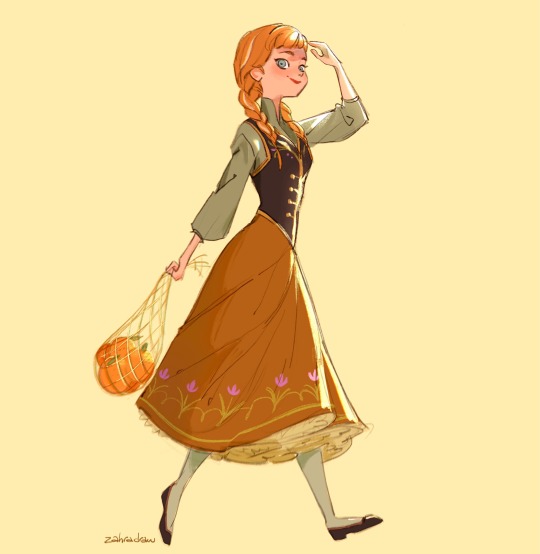
Text
The arts from all episodes of "Frozen Podcast" - Part 1:
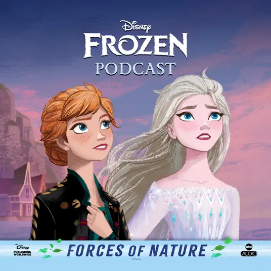
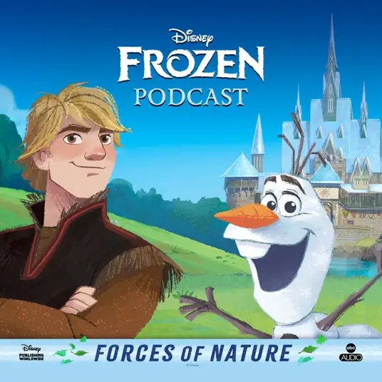
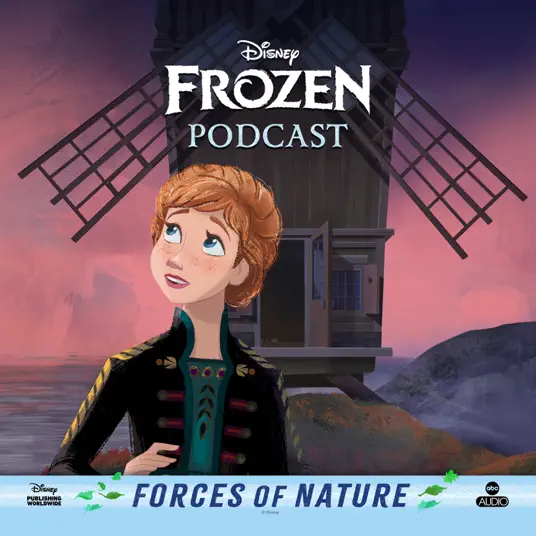
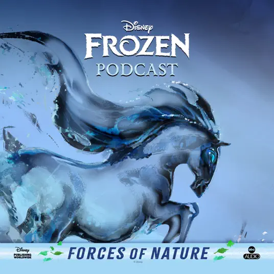
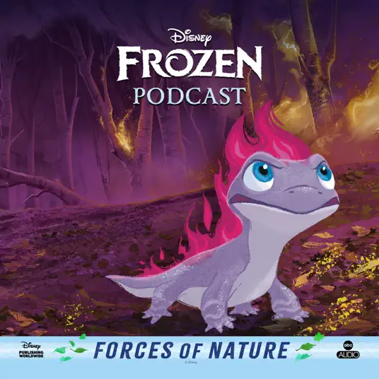
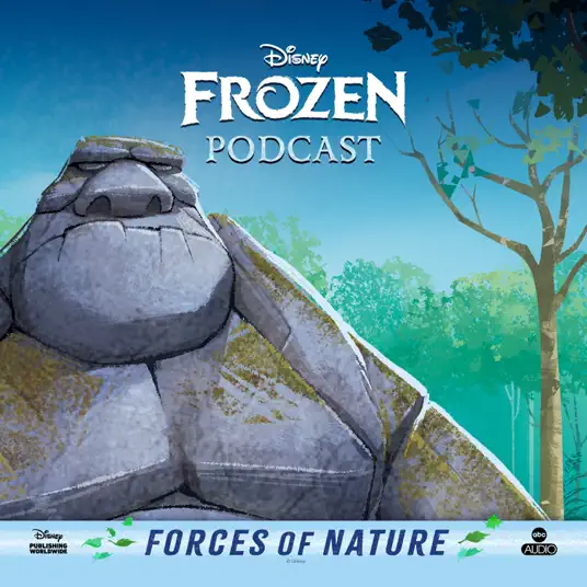
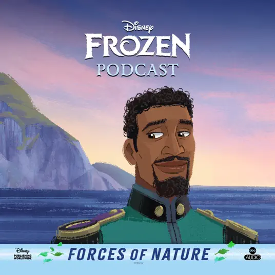
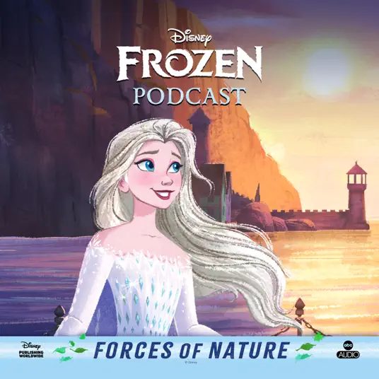
Part 2 link:
43 notes
·
View notes
Text
the ‘tism is hitting extra hard today so here are my personal ratings of disney’s merida designs (and some others).
merida concept art (matt nolte’s):


10/10 she’s iconic, love her so much. her hair and poses are so dynamic! they said that they wanted the audience to tell that she was athletic and sporty by looking at her design.
brave outfit (2012):

9/10 the original! it’s a basic outfit but i get it, our girl is a tomboy princess (and the creators said that she made her own dress to be more comfy while shooting, nice detail!).
Princess Glitter (official disney princess design) (2013):

it’s so bad, i wanna give you a zero, but that’s not possible, so i give you a 1/10. simply awful, disney should give scotland an apology for this. why did they sexualize her so much??? and her eyes are like an empty shell. she’s kinda scary tbh (this redesign caused a TON of backlash, someday i will talk about all the drama).
coronation outfit (redesign) (2013):

3.5/10 it’s the same dress and model, but they covered it by adding a cape and changing her pose. it’s deff better, she appears to have more personality than the first one, but the glitter and the yassified model had to go.
Dream Big Princess (re-redesign) (2015):

6/10 they finally tried to fix her, but were too scared to fuck up again so basicaly they ended up copy pasting the original movie model and gave her more accessories and details to the dress. i like it far better than the last ones, but when she’s on the princess lineup she looks out of place, which was the reason they changed her design in the first place! i also feel like her hair should be more messy. Love that they gave her back her bow tho.
2017-ish design

7/10 a slight improvement. i like the movement and that her dress is a lighter color, but she still looks out of place, specially because she is the only one in the lineup drawn with a different perspective, weird.
Ralph Breaks the Internet (2018)


7/10, i like that they committed to the messy hair, it gives her more personality, and her pijamas are very in character for her. the only thing that bothers me is her face, obviously all the princesses had to be drawn in the same style, but they didn’t know how to keep her face shape oval so they gave her HUGE cheeks. she looks like a chipmunk, it’s like they don’t even fit of her face anymore.
Ultimate Princess Celebration (early 2020’s) design:


6/10 the whole idea with this redesign was to make the characters outfits closer to their movie outfits, but in her case i feel like her original outfit is far too simple to fit with the “disney princess” vibe, they should have kept some of the details they changed. also, in the first photo, her curls look awful and her face is weird, idk how to explain it, i think they were inspired by it's chipmunk predecesor.
Disney Mirrorverse design (2022):


10/10 LOVE HER, finally someone was brave enough to draw her with muscles. the outfit is amazing, i love the kilt, the hairstyle and the boots, THE CAPE???. also, her bow looks super cool. i have no notes.
Create Your World design (2025):

7.5/10 her hair is much better and her face is normal again. somehow i feel that she doesn’t feel as out of place in the lineup, maybe they made her eyes bigger, i’m not sure. still miss the details, and she looks a bit pale, not in a skintone way but in a sickly way.
miscellaneous:

4/10 this feels mean, she has the worst design out of all of them, it’s not even close, AND they hid her alone in the back. you guys see what i mean when i say that she looks out of place still?


7/10 i actually really like these designs and the dresses are cute. they remind me of a paper doll, one of those you can change the paper outfits by putting them on top of a base model. i feel like this was what disney should’ve gone with when they wanted to redesign her back in 2013, a bit more femme and in a style that doesn’t clash with the other princesses, but without sexualizing her and taking away her personality.


8/10 cute, also drawn by matt nolte!
this just makes me appreciate even more all the fanart people make, you can tell when someone draws without passion. fanartists you are the FUNDATION of fandom, keep up the good work!
27 notes
·
View notes
Text
An update on what has been occupying my brain lately
5K notes
·
View notes


Text

★ - Want any gum?
Commission was made especially for @klecrone (づ ̄ ³ ̄)づ
Ao3 chapter:
https://archiveofourown.org/works/34069357/chapters/164728966
2K notes
·
View notes


Text
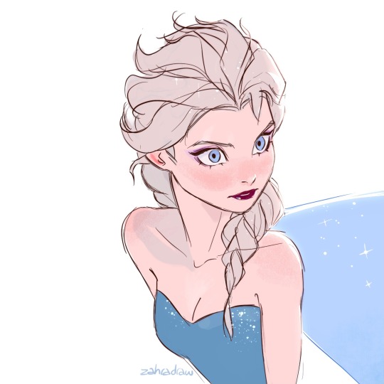
An Elsa sketch from a couple of weeks that I colored ❄️❄️❄️
433 notes
·
View notes

Photo

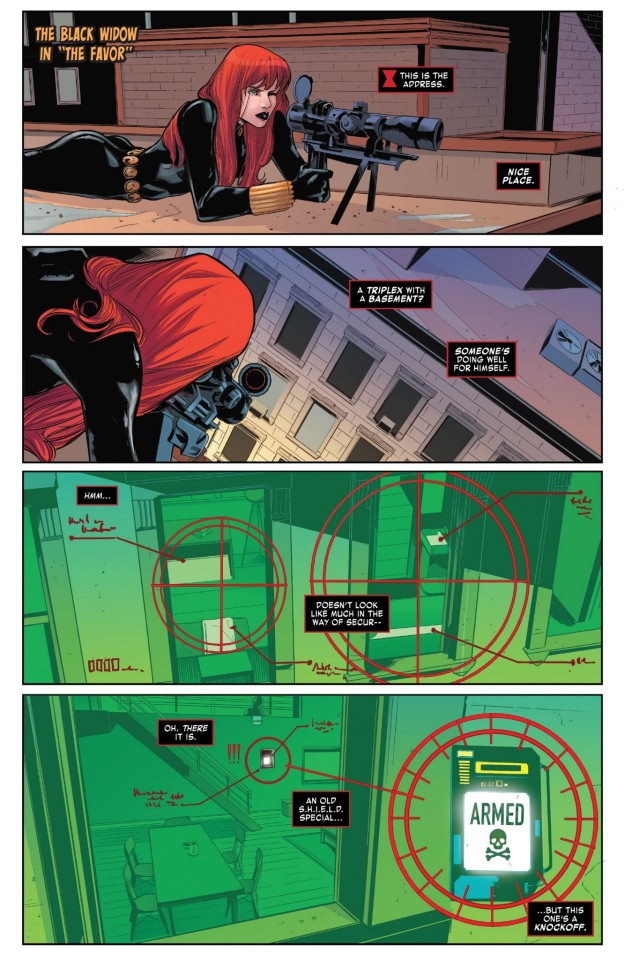
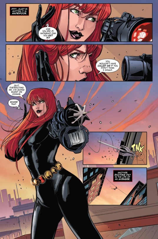
For a future reference, I need a continuation of this in Frozen 3
598 notes
·
View notes
