
Don't wanna be here? Send us removal request.
Statistics
We looked inside some of the posts by portfoliocreationblog and here's what we found interesting.
Average Info
Notes Per Post
0
Likes Per Post
0
Reblog Per Post
0
Reply Per Post
0
Time Between Posts
8 days
Number of Posts By Type
Text
12
Last Seen Tumblr Blogs


Fun Fact
1,644 Tumblr posts in 1 second.
Text
Going Live
I have spent a lot of time on my portfolio website. I think I have spent so much time looking at my website that getting feedback from peers and teachers has been a huge help at creating a well executed portfolio to have that outsiders perspective. I'm happy with my about page and how I've created the layout for the testimonials and a screenshot of my skills.

I'm also glad that my layout for the Case Study has a short introductory paragraph and headers and sub-headers to help guide readers through the content. The sketches for this project really highlight the research I conducted to understand the organization and their target audience.

0 notes
Text
Proof 2 of Portfolio Site
I did a lot of smaller content edits and imagery refinement during the easter weekend. This weekend I took a look at the mobile view of my website to determine how my content would be viewed from a phone. Any images that weren't in templates from Wordpress were showing up way too small so I had to take parts of the templates and break them apart. Below are some iterations of adding illustrative elements to my homepage.


0 notes
Text
Case Study Refined/Proof 1
Project title Creating a Brand for Dyslexia BC
Introducing the Project
Dyslexia BC is a grass roots movement focused on resources and advocacy for people with dyslexia in classrooms, workplaces and communities. Cathy McMillan, the founder and my client, is located in Victoria, BC.
The Challenge
Dyslexia BC’s previous logo was not helping them reach their ideal target audience and increase their brand awareness. Dyslexia BC needed a redesigned logo, brand standards and a business card. Stickers and buttons were created as promotional items for an advocacy event. An infographic in three different poster sizes was created for presentations.
The Approach
(Communicate 2 to 3 Key Insights from your research that enhanced your understanding of the problem. Describes what you discovered during your “discovery” and how you used insights to inform your design direction.)
The logo and branding needed to be accessible, empowering and educational. The organization’s main target audience is parents with dyslexic children and people with dyslexia.
I created a logo to visually represent reading and writing. These two activities define how people with dyslexia are impacted by their disability.
Dyslexia was first discovered using MRI brain scans that found dyslexic brains activate different areas when reading and writing than non-dyslexic brains. I used this concept to create a brain-like graphic on the business cards.
The infographic is for parent and teacher presentations. The Infographic visually shows how a dyslexic brain compared to a non-dyslexic brain activates the different areas of the brain while reading and writing. The infographic shows areas of the brain activated while reading and writing in a dyslexic brain and a non-impaired brain.
The Process
My process was sectioned into research, sketching, digital drafts and the final deliverables for the logo and business card projects.
I sketched many logo and the business card concepts and showed clean sketches to Cathy. We had weekly meetings to check in for each project draft.
A Key Learning
I got feedback that the second draft logo looked like a person reading with a dunce cap. The dunce cap is a negative symbol for older generations in the dyslexic community. To mitigate this issue, I added a rougher edge to the cone’s bottom which removed the cone shape from the logo.
Wrapping up the Project
For final deliverables, I sent her a zip folder clearly labelled with files to be used for web and print. We had a project wrap up meeting to see what we can improve for the process next time to make the process more efficient. After our wrap up for future projects, I sent her email notification reminders an hour before for our video calls.
The Outcome
I created a logo with variations, brand standards, business cards, stickers, buttons and an infographic for Dyslexia BC. I also exported the graphics for the client to use in Canva for social media posts and presentations. Dyslexia BC has a visual identity and brand to raise brand awareness and connect with their target audience.

0 notes
Text
Rationales Refined
Project Title Redesigning BC Ferries Logo & Branding Standards
The Challenge
For a university project, I had to redesign the BC Ferries logo and create a brand standards booklet. BC Ferries needed a redesign to connect the brand with their mission statement.
The Approach
BC Ferries’ stated mission is connecting people to coastal communities. This mission statement directed my design decisions. When I read their website’s and social media platforms’ brand messaging, I gained a deeper understanding of the current BC Ferries brand tone and voice. to understand other ferry and cruise ship brands from across the world, I created a mood board.
The Outcome
The logo visually represents a wave and a sun. The sun yellow and ocean green blue colour palette was inspired by the beautiful sunny views people see while riding the ferry. The brand standards includes the logo variations, colour palette details, and minimum sizes required for logo variations.
Tools
Illustrator, InDesign, Photoshop
Project Title Infographic of the Largest Trees in BC
The Challenge
BC has a number of old growth forests with massive trees. Often people are unaware of where these huge trees are located and how big they actually are. Using data from the UBC’s big tree champion list, I created this infographic for a university project to show the different attributes of these amazing trees.
The Approach
Trees have tree rings that show how old they are. I used this visual to design the pie charts. Trees can be identified by their bark. I used a variety of bark textures in the bar graphs. The overall concept is natural and organic.
The Outcome
I hand illustrated tree rings and bark texture onto basic graphs. I edited these illustrations digitally. The monochromatic colour palette is simple and direct with a natural feel. The background map emphasizes the natural coast line shapes. The heading font has a wood texture to resemble tree bark.
Tools
Illustrator, InDesign, Hand drawn illustration
Project Title Creating Branding For Learning Dyslexia
The Challenge
For a university project, I designed branding and a range print materials for a made-up company, Learning Dyslexia, to raise awareness about dyslexia. People with dyslexia are often undiagnosed and struggle in school for many years without knowing why. I chose to address the lack of awareness and education about dyslexia in elementary schools. I decided what print or digital items to create to best help the problem.
The Approach
People with dyslexia struggle with reading and writing. People diagnosed earlier in life have the best chance at succeeding in school. My target audience is parents and teachers of elementary school children. A portion of the parents with dyslexic children could also struggle with reading and writing because dyslexia is hereditary. I prioritized making an accessible website, easily readable content and dyslexia-friendly font choices. I reached out to Cathy mcMillian, the founder of Dyslexia BC, and Laura Richter, my high school teacher to learn more about the problem.
The Outcome
I created a logo with variations, brand standards, graphics, an icon set, two infographic posters, a brochure, a dyslexia screening test and a website. The brand's sans serif font has open counters, a high x-height and distinct lowercase letters to increase reading accessibility.
The posters were created to increase awareness of dyslexia in elementary school classrooms and daycares.
The brochure was created help parents or teachers learn the signs of children with dyslexia. The pocket size dyslexia screening test was created for parents to fill out the test for their children. The brochure and test help parents determine if they should consider getting their child diagnosis or not.
The websites navigation and written content are simplified to include the most important information for easy scanning and readability. The website has three adjustable coloured backgrounds to aid with easy reading.
Tools
Procreate, Illustrator, InDesign, Photoshop
0 notes
Text
Case Study Rough
The Project
Dyslexia BC is a grass roots movement focused on resources and advocacy for people with dyslexia in classrooms, workplaces and communities. Cathy McMillian, the founder and my client, is located in Victoria BC. Dyslexia BC’s previous logo wasn’t helping the organization reach their ideal target audience or help their brand awareness. As a freelance graphic designer, I wore many hats creating contracts, timelines, negotiated budgets, hosting meetings and designing for each project. We determined the organization needed a logo, brand standards and a business card. Stickers and buttons were created as promotional items for an advocacy event. An infographic was created for presentations.
The Process
For the logo and business card projects, I did research, sketching, digital drafts and the final deliverables. Once these elements and the branding standards were created, the infographic, stickers and buttons could go right into the sketching phase and followed same pattern as the others. The information for the infographic was provided to me. During the research for the logo, I learned reading and writing are the main activities people with dyslexia struggle with. I created an icon to visually represent these two tasks.
While researching about dyslexia, I learned people discovered dyslexia because people with dyslexia's brains activate different neural pathways while they were reading or writing. These brain scans were an overhead view of the brain. I used this concept to create a wave illustration brain-like graphic on the business cards.
The logo and branding needed to be accessible, empowering and educational. The organizations main target audience is parents with children with dyslexia and people with dyslexia themselves. The stickers and buttons were for event attendees and politicians coming to watch the speeches outside the legislature building in Victoria BC. The infographic was for presentations to parents and teachers.
I sketch a lot of concepts for both the logo and the business card before showing cleaned up sketches to Cathy. Cathy and I had weekly meetings to check in for each project draft.
A Key Learning
When creating the second draft of the logo, My client pointed out that the icon looked like a person reading with a dunce cap on. The dunce cap is a negative symbol for older generations in the dyslexic community. To mitigate this issue, I added a rougher edge to the cone’s bottom which removed the cone shape from the logo.
Once I have finalized the digital draft, I send her a zip folder clearly labelled with files to be used for web and print. We do a project wrap up meeting to see what we can improve for the process next time to make the process more efficient.
Dyslexia BC has a logo with variations and brand standards to use across multiple print and web media with light or dark coloured backgrounds. They have a business cards, stickers and buttons use at events. For presentations they have an infographic for explaining how reading and writing looks different in the dyslexic brain. I also exported the graphic elements for them to use in social media posts and Canva projects. When I attended the advocacy event in October, people who came to support Dyslexia BC enjoyed the new logo. I went to one of the presentations my client did for a school in Nanaimo and she mentioned how great working with me was and recommended my services if anyone needs a graphic designer.
Dyslexia BC has a a visual identity to represent an organization that someone will remember.
0 notes
Text
Rationale Roughs
Here are my three rationales for my portfolio projects.
1. Project Title: Redesigning BC Ferries Logo & Branding Guidelines
The Challenge: The BC Ferries branding was in need of an update. I created a logo and brand guidelines booklet for a university project.
The Approach: The company mission statement is to connect people to coastal communities. This statement directed my main design decisions.
What I did: The logo visually represents the mainland, the ocean and the island where these ferries travel. The colour palette uses colours found in the beautiful landscape where the ferries operate. The Brand Guidelines includes the logo variations, colour palette details, and minimum sizes required for logo variations.
Tools: Illustrator, InDesign
2. Project title: Infographic of the largest trees in BC
The Challenge: The BC has a number of old growth forests with massive trees. Often people are unaware of where these huge trees are located and how big they actually are. Using data from the UBC’s big tree champion list, I created this infographic for a university project to show the different attributes of these amazing trees.
The Approach: Trees have tree rings that show how old they are. I used this visual to design the pie charts. Trees can be identified by their bark. I used a variety of bark textures in the bar graphs. The overall concept is natural and organic.
What I did: I hand illustrated tree rings and bark texture onto basic graphs. I edited these illustrations digitally. The monochromatic colour palette is simple and direct with a natural feel. The background map emphasizes the natural coast line shapes. The heading font has a wood texture to resemble tree bark.
Tools: Illustrator, InDesign, Hand drawn illustration
3. Project Title: Creating a Website and Branding for Learning Dyslexia
The Challenge: I designed branding, print collateral and a website for a made-up company to help an issue in society for a university project . I chose to address the lack of awareness and education in elementary schools about dyslexia.
The Approach: People with Dyslexia struggle with reading and writing. Because people who are diagnosed earlier in life have the best chance at succeeding in school, I focused my target audience on parents and teachers of elementary school children. Because dyslexia is hereditary, it is possible that parents in my target audience could have dyslexia as well. I focused on making an accessible website and dyslexia-friendly font choices. I did interviews with a past high school teacher and the founder of Dyslexia BC to learn more about the reality of this situation.
What I did: I created a logo with variations, brand guidelines, illustrative elements, an icon set, two infographic posters, a brochure, a dyslexia screening test and a website. The logo was created from two shapes: a pencil and a staircase. The pencil signifying the tool used in writing. The staircase signifying step-by-step improvement and learning. The brand's sans serif font has open counters, a high x-height and distinct lowercase letters to increase reading accessibility. The posters were created for elementary school classrooms and daycares. The brochure was created for parents or teachers to be able to identify a child with dyslexia. The pocket size screening test for dyslexia unfolds into a two page booklet for parents to fill out for their children. The test and brochure help parents determine if they should consider getting their child diagnosis or not.
Tools: Procreate, Illustrator, InDesign
0 notes
Text
Identity & Mood Board
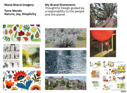

The first image is my mood board and the second image is my branding styles. For my imagery, I will create some mockups for work with photoshop on a plain white background. I will be creating some extra applications of my logo projects to show a wider range of logo application. I will be taking photos of the stickers and buttons for my freelance project with a plain white background with bright lighting. For my colour choices, I have a feeling these may change multiple times as I find colour palettes for branding evolves a lot during the process of creating branding.
0 notes
Text
Blog Post 5 - Ideal Workspace

The Schedule above is my schedule for the Portfolio Working Schedule to get a Proof 1 of my website finished by March.25
I would like to work full-time as a In-house designer, junior designer at a design studio or a remote designer working at a coworking space. I would like my company to have a passion for helping people or the earth. The company should value being as inclusive, accessible and sustainable.
Who are they?
MMGY Origins is a creative and marketing agency that has offices in Whistler, Montreal and Vermont. Their services include branding, websites, videos photography and campaigns for outdoor brands and products. The link to their website: https://www.originoutside.com/
How are they a good fit for you? How do they align with your own personal and professional goals? What might you learn? How will you develop further as a designer?
Branding projects are one of main services that this company provides which is my speciality. They also are focusing on brands in outdoor products which resonates with me as an avid outdoor adventure person. They are very direct with the companies connection to enjoying the outdoors and celebrating exploring nature. I would learn the challenges that come from doing design work in the outdoor product and outdoor company industry. There are likely trickier logo applications on water proof backpacks, water bottles and other products made from a diverse range of materials. I would learn more about the team structure within the company and what goes into bigger campaign projects.
How are you a good fit for them? What skills and unique qualities do you bring to the table?
I bring my passion for the outdoors and great thoughtful design work to their company. I have a passion for sustainable design and can help them incorporate this knowledge into projects that require a more Eco-friendly approach. I have an ability to handle multiple different projects at the same time and meet deadlines while focusing on the details. I have a strong willingness to take feedback and use this to improve any project I’m working on. I have ability to clearly communicate with clients about key pieces of the project and describe the design direction.
What are you offering to them, specifically?
My passion for sustainability and being active outdoors is a close connection with their company values. I am a good communicator to talk with clients and team members for projects. I am a kind, thoughtful person to talk to clients on Ean emotional level to get to the core meaning and importance of the project.
0 notes
Text
Blog Post 4 - Self-Audit
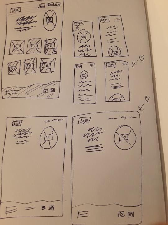
The image above is my low-fidelity home page website sketches and some mobile homepage website sketches. My main navigation bar links on my website will be About Me, Work and Play. The projects to showcase in the portfolio include Dyslexia BC Logo and Branding Collateral Freelance Project, Biggest Trees of BC Infographic, Alcatraz Island Website, BC Ferries Logo & Branding Guidelines, Document Design (if approved by two companies) and Learning Dyslexia Branding and print collateral.
There are some gaps in content I need for my portfolio. For the Dyslexia BC Logo project, I will need to write a Rationale and take photos of physically printed merchandise. For the Alcatraz Island Website, I will need to write a Rationale and make mockups of the website on a computer. The BC Ferries Logo & Branding Guidelines will need to have reformatted images and a logo photoshopped onto a ferry boat and a revised rationale. Document Design from work will need a rationale with a clear description of the role I played in the project and imagery from the document. I will need to update my Linkedin banner to reflect my branding Revision on my portfolio website. I will need to update my work experience with Fairwind Creative and add my green graphic design course that I took in the summer. I am going to use the Twenty Twenty Three template found on Wordpress.
My potential domain names include catearnold.com, CateArnoldDesign.com and CateRainyArnold.com. Catearnold.com will be the easiest way for someone to quickly look up my website URL even if they hear my name through word of mouth and they know I spell my name with a C! However this Url might be taken. CateArnoldDesign.com will give me a direct hint at the type of work I do. However, the longer URL is a bit harder for someone to spell out. CateRainyArnold.com adds my unique and memorable middle name that works well and this likely is a URL that’s available. This URL also connects well with the logo I’ve created. When saying my Url to someone, they may have to rewrite the K for Kate as a C and they might spell Rainy with an E instead of a Y. I think to catearnold.com or catearnold.ca if the first isn’t available is my best option as a straightforward way of finding my portfolio.
0 notes
Text
Blog Post 3 - Creative Brief
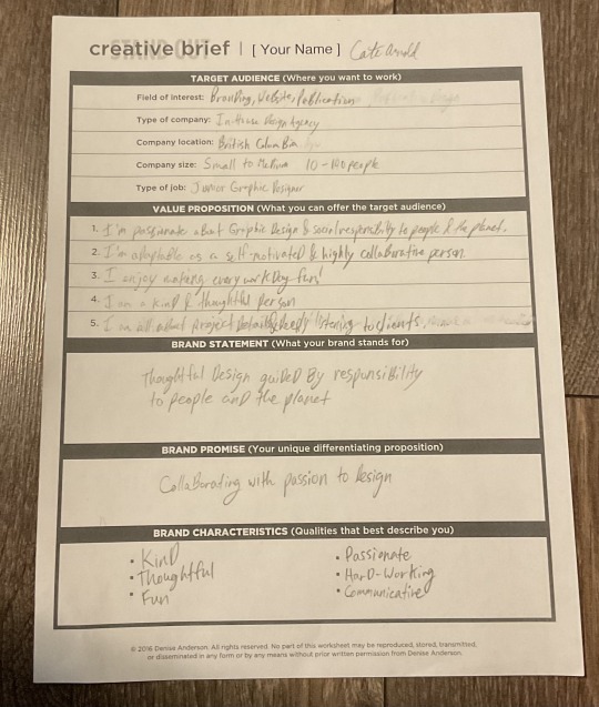
The process of sending out surveys to understand how other people see me compared to how I see myself was very insightful! I think when I look at myself there are certain things I do on a regular basis that I don't notice as they are normal for me to do all the time. This process showed me that people see me as thoughtful and kind. These are two things about myself that I've known for a long time and because of that I had forgotten about those qualities.
I also appreciate being specific about the target audience that I am aiming for. Although it's hard to gage what type of graphic design work I'd like to be doing, It's very helpful to know my top three choices and to keep that in mind while building my portfolio.
0 notes
Text
Blog Post 2 Inspiration

I really love the clear and easy to navigate layout of the website. I like the simple layout shown above with three work pieces displayed also acting as buttons. I appreciate that this designer included simple icons for the email and resume in orange. This designer included testimonials under the About Me section which I think is really clever placement for testimonials. They also have a page of their personal projects that works well to showcase their other artistic skills.
0 notes
Text
Blog Post 1 - Pixie Dust
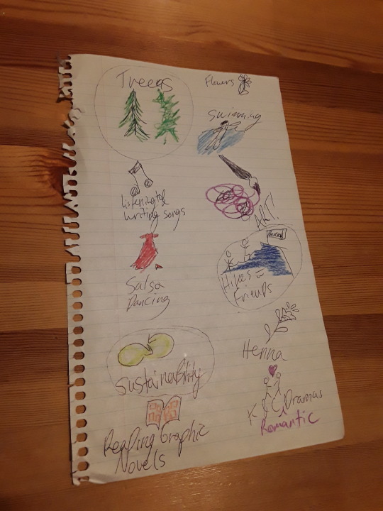
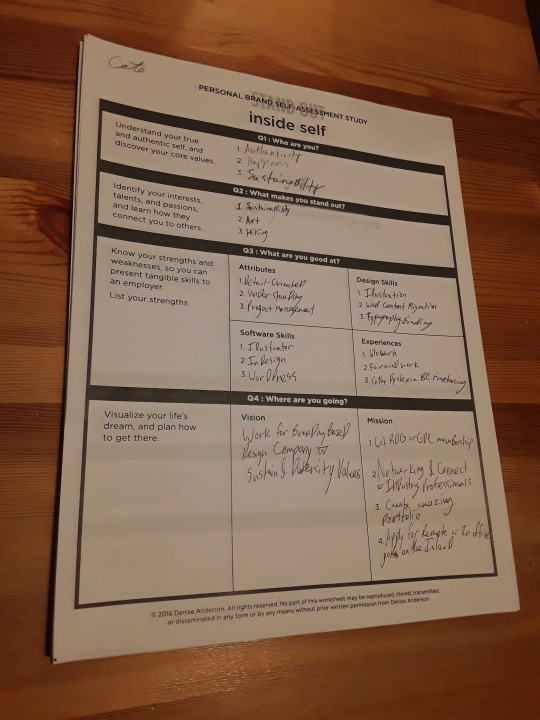
The process of starting with 20 words and taking away the extras words till 3-5 words remain was really insightful for me. I wasn’t surprised at what I came up with but I was impressed with how exactly this process described myself. There were some things that came up that I didn’t really realize I would like. This was especially true for the last part of the exercise. My main vision is working for a company with sustainability and diversity values doing branding work. I think when I work on many different types of projects, I forget about what I really love doing with graphic design. There is no denying that I love the challenge of creating branding.

0 notes