
Don't wanna be here? Send us removal request.
Statistics
We looked inside some of the posts by quinn-tessentials and here's what we found interesting.
Average Info
Notes Per Post
2
Likes Per Post
1
Reblog Per Post
1
Reply Per Post
0
Time Between Posts
5 days
Number of Posts By Type
Link
1
Text
16
Last Seen Tumblr Blogs


Fun Fact
Average visit duration of Tumblr.com is 10 mins and 25 secs.
Text
April Archive Activation
For the April archival activation, I wanted to further explore the theme of nostalgia, that my archive leans towards, and to me photos that have snapshot qualities feel nostalgic for me. For me snapshots have a nostalgic sense for me, because of growing up with disposable film cameras. I used to love running around taking photos and never knowing how they turned out, until we went to get the film developed.
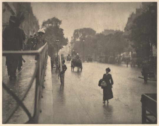
The Snapshot is a term that was derived from hunting and refers to a shot that’s quickly fired with little or no aim. In 1888 the Kodak Snapshot was invented and revolutionized photography. The Kodak Snapshot and Kodak Brownie Camera allowed people who had no prior experience photographing and amateur photographers, to take pictures. Some photographers, like Henri Cartier-Bresson and Robert Frank, built their whole photography methods off the snapshot qualities.
For Henri Cartier-Bresson he used the handheld Leica camera, and devised the Decisive Moment, which is “the simultaneous recognition, in a fraction of a second, of the significance of an event as well as the precise organization of form.” This realization for Bresson allowed him to capture Behind the Gare Saint-Lazare, Paris, 1932. Where the Decisive Moment is captured in the form of the jumping figure made the photo beautiful.

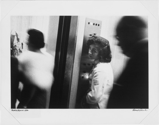
For other photographers, like Robert Frank, wanted the messy snapshot quality, or the Indecisive Moment. Frank once stated, “I’m not interested in taking beautiful photos…I don’t believe in beauty or aesthetics…I [believe] in real life.” We can see his indecisive moment captured in Robert Frank, Elevator, Miami Beach, 1955. Although he was criticized for his techniques, the influence of his “snapshot qualities” became popular in the 1960s.


0 notes
Text
Research Project Concept Map: Photography’s Ability to Create False Memories

0 notes
Text
Mind Map & Sources Worksheet

1. Reference Source (print or online)
Winton , Alexandra. “The Bauhaus, 1919–1933.” Metmuseum.org, www.metmuseum.org/toah/hd/bauh/hd_bauh.htm#:~:text=The%20Bauhaus%20was%20founded%20in,unity%20of%20all%20the%20arts.
2. Book in the Alkek Library
Original Bauhaus / edited by Nina Wiedemeyer for the Bauhaus-Archiv / Museum für Gestaltung. Location: Alkek Oversize, Floor 6. Call No.: N332.G33 O75 2019. Status: AVAILABLE
3. Book not in the Alkek Library
Lupfer, Gilbert, et al. Walter Gropius: 1883-1969: The Promoter of a New Form. Taschen, 2006.
4. Exhibition Catalog
https://www.moma.org/calendar/exhibitions/2735
5. Journal Article
Droste, Magdalena. Bauhaus, 1919-1933. Taschen, 2002.
0 notes


Text
5 Collections Gathered from Library of Congress
Collection: Farm Security Administration/Office of War Information Black-and-White Negatives
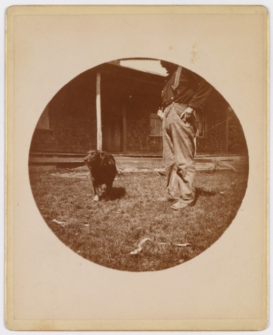
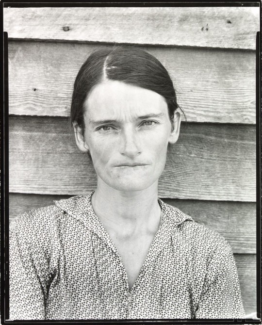
This collection is influential for me because, I was drawn to the documentation work of Walker Evans, Dorothea Lange, and Margaret Bourke White, and their different ways of documenting people who were apart of the Resettlement Program or farmers, and sharecroppers. Roy Stryker, the Head of the FSA, would give these photographers a list of what to go out and photograph and then collect them into an archive. Stryker had a strong command, in the photos he wanted but Walker Evans did not want to conform to aestheticizing the people suffering from the aftermath of the Great Depression. Stryker, Lange, and Bourke-White, all shot from dramatized angels, altered the photos to suit their own narratives that would evoke more emotion from viewers, but Evans shot from straight on with no distractions. Although Evans did slightly alter his phots, but it was only ever to improve the composition of the photo, and not to aestheticizing people’s pain. To Evans he believed the word “documentary” meant not tampering with reality. As a young woman, living in an age where altering photos to meet today’s beauty standards, remembering the lesson in my own photography, that to capture reality means to capture the world in front of me and think of terms of composition instead of aesthetics.
________________________________________________________________
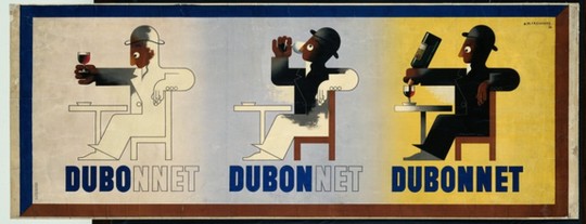
Collection: Posters: Artists Posters
This collection includes over 85,000 posters from the 19th century to the present day, and contains many graphic design styles as Art Nouveau, Russian Constructivism, Art Deco, Bauhaus, etc… As a Communication Design Major, there is a lot I can learn from looking at past graphic designer’s work. Especially from the Artist A.M.Cassandre. His Posters were interesting in their visual styles but also in their clever word play. I would like to take that creative aspect of think of the whole image and put that into my own Design Styles
________________________________________________________________
Collection: Daguerreotypes
This collection includes over 700 daguerreotypes where many of them are images of portraits but also includes early architecture and outdoor scenes. I enjoy looking at daguerreotypes because of the history of photography. As a photographer myself, I can learn from that history and implement my findings into my own work. Daguerreotypes often were used to be documentary and describe one’s likeness but at the same time does not tell us about what that person is like on the inside. But Albert Sands Southworth used daguerreotypes more like calotypes. Were the use wasn’t intended to capture the likeness of someone or something but was used in an artful way. One that which relied on posed lighting and subject, that imbued the scene with longingness and emotion. In my own photography I will implement that use of wanting to describe and capture a scene but imbue that scene with emotion that will resonate with the viewers.

________________________________________________________________
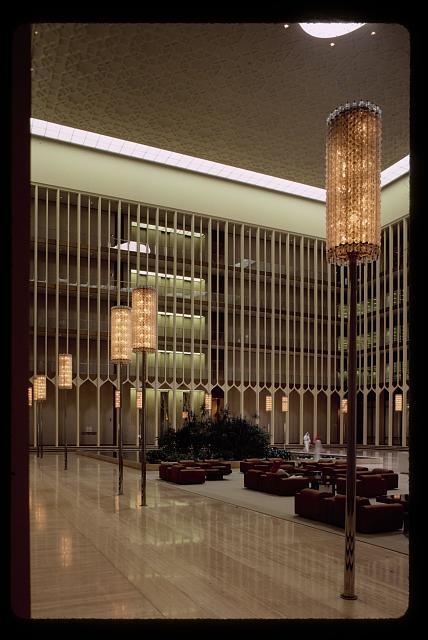
Collection: Korab Collection
This collection includes 800 photographs by Balthazar Korab that documented 19 architectural projects by Eero Saarinen. In my own photography and art, I am drawn to photographing architecture. From viewing this collection, I can learn how architectural projects were documented and photographed in the 1950’s-1960’s and implement that retro aspects into my own photography and post processing.
________________________________________________________________
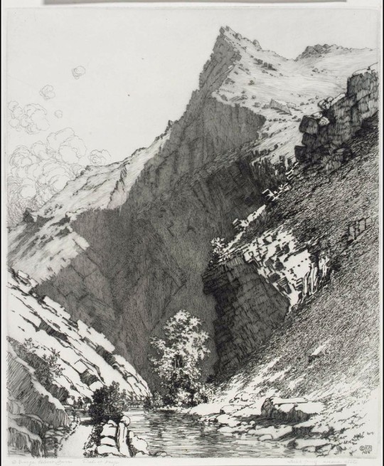
Collection: Fine Prints
As an artist I am fascinated and intrigued by many different mediums. The newest flicker of inspiration has been Print making. When viewing this collection, that only has stroked the fire within me to learn more about the process and eventually try my own hand at it. The ability to make detailed realistic or illustrative potential of the fine print making process intrigues & fascinates me. When I viewed this print from George Elbert Burr, where the print looks almost like a picture, it spoke to me in a way where I was in awe of the time and effort this must have took to capture such a picturesque landscape.
1 note
·
View note
Text
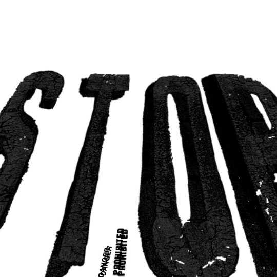
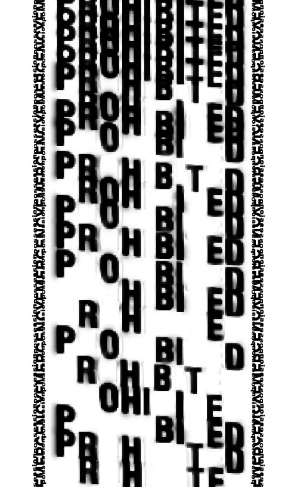
Artist Statement: I seek to explore the harsh and loud text of warning signs and signs that told you what you can and cannot do, found on Mill St, San Marcos, Tx. I will explore this by repetition and movement, and texture.
5 photos of street/walk (Including 3+ photos used within my final composition)
1.) I used the “prohibited” text from the handicap parking space.

2.) I used “emergency” text from the emergency clinic in my final composition.

3.) I used the “hazardous” text found on the dumpster in my final composition

4.) I used “End” in my final composition.

5.) I also used “Possession” found at the bottom of the picture, in my final composition.

8 thumbnails


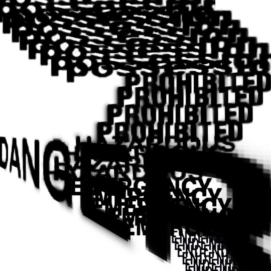


4 Roughs
After experimenting with the text, I was drawn to the repetition in my thumbnails, and decided to further explore it in my roughs.
1.) I was originally playing with the text on a square canvas so i needed to extended to fit the 11x17 margins.
2.) I also experimented with having the “Prohibited” be less readable, by increasing the amount used.

3.) Next, I extended the canvas and from feedback in class, I decided to try removing letters from “prohibited” to make the word less read-able.

4.) After I was content on the readability of “prohibited” was corrected, I focused to the scaling of the the wording “emergency”, and decided to move the word over to the left a bit so the “end” words didn't have a awkward ledge.

Final Composition
In my final composition I decided to clean up some of the pixelization around the word “Danger” but leave the pixelization elsewhere because I enjoy the texture the pixels bring to the overall image.

0 notes
Text
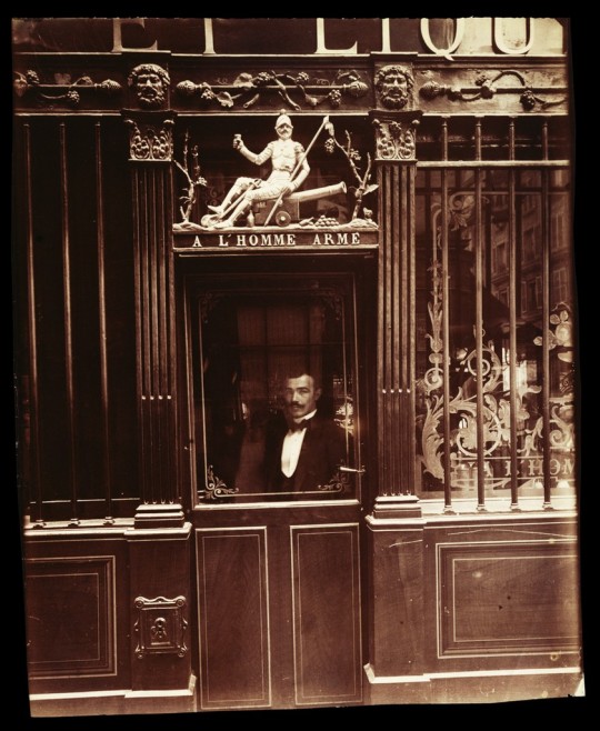
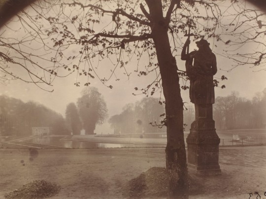
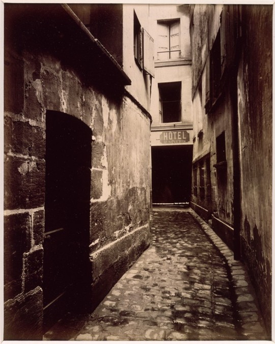
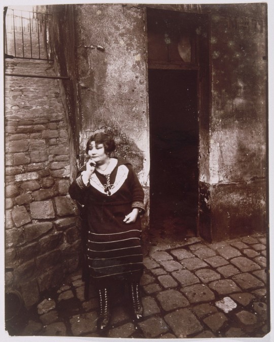
March Archival Activation
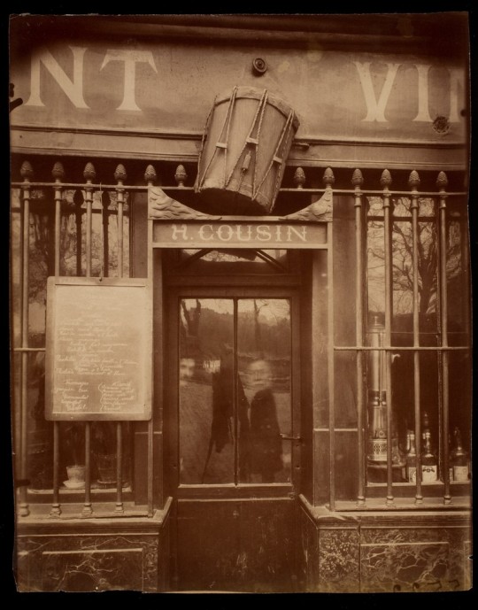
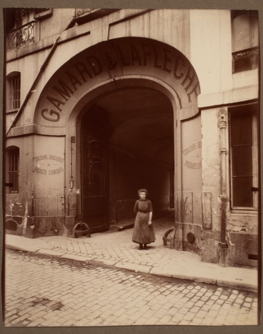
For March’s archival activation, I was drawn to the photographer Eugene Atget’s work. I had just recently learned about him in my history of photography class and wanted to learn more about his documentary style of photography. Documentary style of photography can be defined as, realist, absolute clarity, pure, and no artifice. Atget’s work is often aligned with the work of Walker Evans due to the nature of seemingly pure, un-altered photos, but while Evans viewed photography as art and often altered his scenes slightly to improve the composition. Evans thought of documentary style photography was keeping the truth in photos but keeping beauty, composition in mind, and removed politics from his photos.
Eugene Agtet began his career as a photographer later in his life at the age of 40. He worked a few decades before Evans, at the turn of the 20th century. Unlike Evans, Agtet never viewed himself as an artist, and merely a man who would take “documents” of his daily life, often included political tones of differentiation of class issues in France but would never altar or change the scene he was capturing. His photos also captured the pre-modern & modern France at the time. He would sell these documents to whoever would buy them. His studio was named “Documents pour Artistes” meaning “Documents for Artists”. This only further pushes his idea that his photos were only documents, not art. His work caught the eyes of the surrealists, especially Man Ray, who’s studio was on the same street as Atget’s. Man Ray & other surrealists adored his work for the dream like tones his photos contain, and ended up publishing Atget’s work, but Agtet insisted that they don’t include his name for “…These are just documents I make.” After Atget’s death, Man Ray’s assistant, Berenice Abbott collected Atget’s documents and published them in a book in 1930. After the book’s publication, it began to alter the perception of Agtet from a social documentarian into an artist and then was aligned with the work of Walker Evans.
I, like Man Ray, was drawn to the dream-like qualities of Atget’s work that speak to the subconscious but further research into Agtet unfolds a fascinating story of a man who never saw himself as an artist, but only after his death, his work took on new meaning for artists around the world, that differed completely from Atget’s original intent of these photos.


0 notes
Text
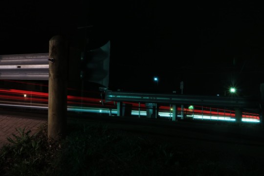
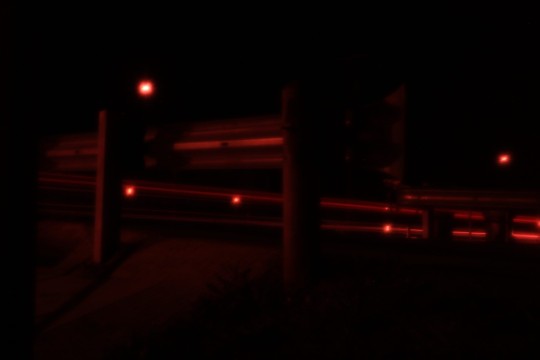
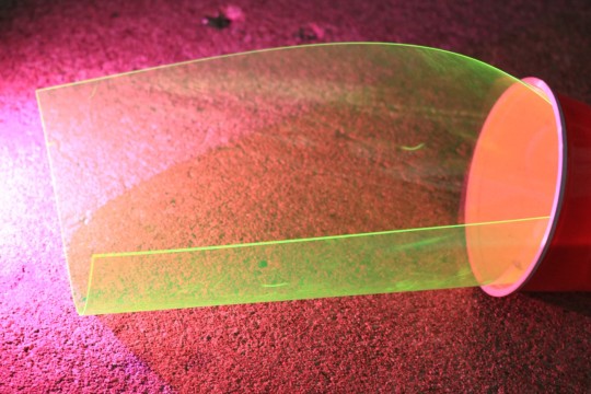
Color Gel Photo
Final 4 photos:


-----------------------------------------------------------------------------------------------------------
Experimentation Photos:


0 notes
Text
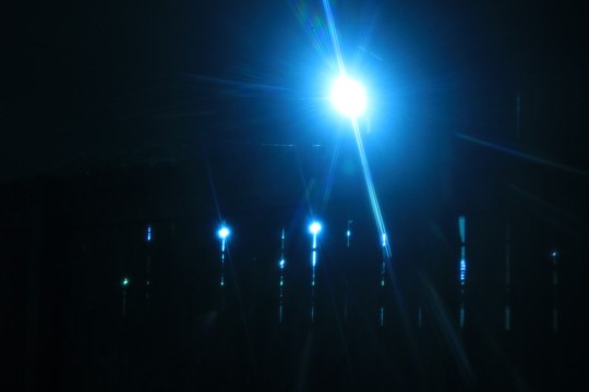
History of Blue
Blue is a fluid color that, over its relatively newer history, has garnered many different meanings. All colors have their positive and negative connotations. For blue, its often a representation of the ocean and sky which can symbolize freedom, intelligence, and loyalty, but it also has its negative associations like depression, sadness, coldness, and lack of emotion. In my research I aim to uncover the history of blue and how it came to be associated with these positive and negative symbolic qualities, and how these qualities impacted cultures all around the world.
Blue is a relatively new color to humans. In an article titled The Color Blue: History, Science, Facts, by ColorTech describes that in ancient Greek texts, odd color descriptions could be found and the word “blue” didn’t even exist in those times. Colortech goes on to provide an example, “In the Odyssey… Homer makes hundreds of references to white and black, but colors like red and yellow are only mentioned a few times. The color blue… is never mentioned. Instead, the author uses descriptions like "wine-dark" to describe blue items such as the sea”. To the ancient Greeks, blue, “was not important enough to deserve its own descriptor”.
Even as English developed, Blue, was the last of the primary colors to be notated in English text. To us, living in modern life, we automatically see the sky as blue, but “One theory suggests that before humans had words for the color blue, they actually saw the sky as another color”. The article goes on to explain the “theory is supported…if you never describe the color of the sky to a child, and then ask them what color it is, they often struggle to describe its color. Some describe it as colorless…. It seems that only after being told that the sky is blue, and after seeing other blue objects over a period of time, does one start seeing the sky as blue”. This theory leads us to asking the question, “When was blue invented & when did humans began seeing blue as a color?” For this answer we must look back at the evidence left by history. “Cave paintings from 20,000 years ago do not contain any blue color… [but around] 6,000 years ago humans began to develop blue colorants.” Lapis, a rare stone mined in Afghanistan became popular among Egyptians. They combined lapis with calcium and limestone to create blue pigments. “It was at this time that an Egyptian word for “blue” emerged.” Through trade these blue pigments & dyes began to circulate through different cultures around the world. Although because of the rarity of lapis stone, these dyes were expensive. Thus, only the rich and royalty could afford them. So, Blue remained rare to the majority of the world, but although it “slowly became popular enough to earn its own name in various languages.”
Blue’s modern history began widely known when in 431AD, the Catholic Church “decided to color-code the saints, and Mary was given a blue robe… Because Mary stood for innocence and trustworthiness, the color blue was seen as a positive light. This same…blue was adopted by militaries and police to convey a similar essence of trust.” Because of this, navy blue became associated with authority, a need for different shades of blue that expressed its original more peaceful and calm meaning. Thus, new colors such as “Robin's egg blue and pale, powder blue were developed” to restore the subdued meaning of blue.
In the western world in recent modern times, the meaning of blue was once again altered and color has been used to describe one’s gender, like blue is for boys and pink for girls. This connotation can be linked to the post-World War II baby boom. “It came about as a marketing scheme, as manufacturers could sell more clothes if some were distinctly for boys, and others were distinctly for girls.” We can see the effect of this scheme had on society, by looking at how color is being used in modern gender reveal parties. Where expecting parents use colors like blue or pink to assign their unborn baby a color. In an article titled Sexism in Colors- Why is Pink for Girls and Blue for Boys? by Maleigha Michael they state, “Assigning colors to babies enforces a role that they are supposed to grow and fit into. [That] There are only two colors, also enforcing that there are only two genders you’re allowed to claim”. Color being used in such a way to define ones being, has politicalized the color.
When looking at the color blue in a purely political way, we can see the beginning of Blue, being affiliated with politics began from the news broadcasts covering the 1976 election. Blue was assigned to democratic states and Republican states were yellow. It wasn’t until the early 2000’s that Red was used to define republicans, when during the Presidential Election of 2000, George W. Bush verses Al Gore, “…as the conversation about the disputed election continued, referring to states that voted for George W. Bush as "red states" rather than "Republican states" (and those voting for Democrat Al Gore as "blue states")… and it never went away. Instead, it became a staple of political discourse”. Due to this political split and blue (and red) being radicalized, that has affected American culture and the colors once again took on another meaning.
Throughout blue’s relatively new history as a color, has had “many associations—metaphorically “feeling blue” as depressed, musically singing “the blues,” politically progressive “blue states,” or optimistic “blue sky” goals. But what effect does the actual color have on us”? The physical effects of blue can lower heart rate, possibly the reason why most humans associate blue with the feeling of calmness or relaxation. Darker shades of blue improve the brains thought process, while lighter shade of blue improve concentration. For these reasons, blue is often used in corporate offices to promote productivity. In an observational study from Japan, it was found that the use of blue lights may be a way to prevent suicide. “In recent years, Japan has experienced an increasing number of suicides at train stations as people jumped in front of oncoming trains. After blue lights were installed at 71 Japanese train stations between 2000 and 2010, a data analysis revealed an 84% decrease in the number of suicides (Matsubayashi, Sawada, & Ueda, 2012).
Starting as a color that was insignificant to ancient Greek scholars but then due to the ancient Egyptians and their ingenia, blue became a physical and tangible color that circulated the globe. Slowly, Blue has evolved to take on new meanings and associations. We can see how mass media and marketing has had an impact on blue and its associations with politics and gender, and how corporations take advantage of blue’s effects on humans mental and physical levels, with its use in their advertising, branding, and in corporate spaces to imbue a sense of trust, relaxation and promote productivity. Blue, though seemingly insignificant to the ancient Greeks, has grown to be integral to modern life today.

Todd Hido, Homes at Night, #2552-B
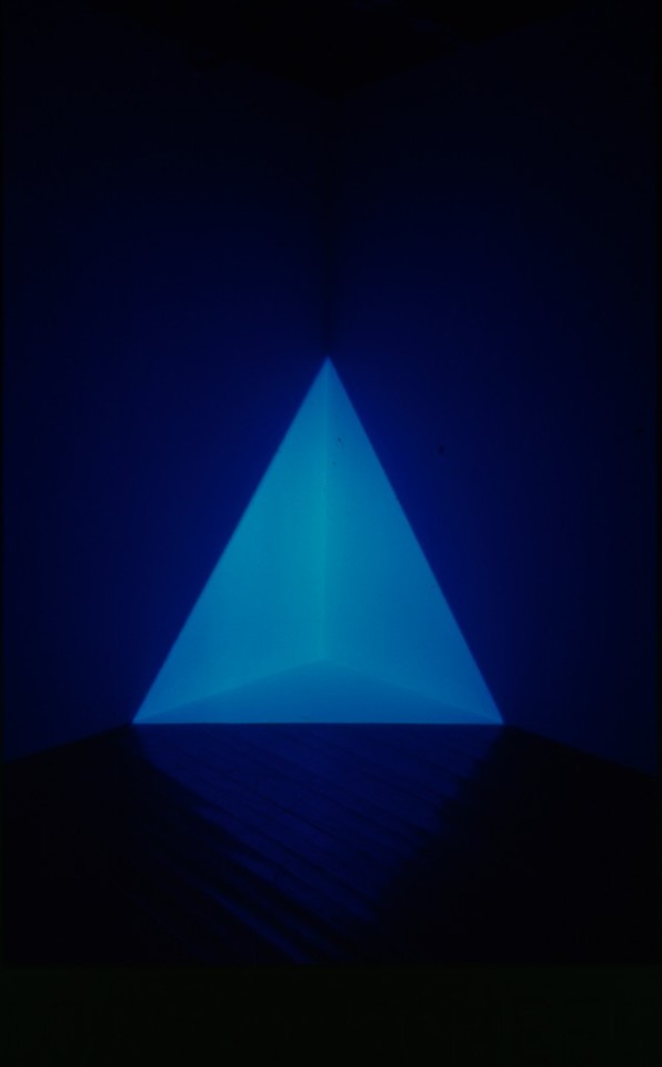
James Turrell, Gard Blue, Exhibition: Into the Light
Sources:
Does the installation of blue lights on train platforms prevent suicide? A before-and-after observational study from Japan Matsubayashi T, Sawada Y, Ueda M (USA, Japan) Journal of Affective Disorders. Published online 11 September 2012. doi: 10.1016/j.jad.2012.08.018 , 2012
Bump, P. (2021, November 25). Red vs. blue: A history of how we use political colors. The Washington Post. Retrieved March 6, 2022, from https://www.washingtonpost.com/news/the-fix/wp/2016/11/08/red-vs-blue-a-brief-history-of-how-we-use-political-colors/
Kelly, D. (2019, February 12). The psychology of color - blue. Medium. Retrieved March 6, 2022, from https://medium.com/@davidkellyuph/the-psychology-of-color-blue-5da101e1306c
The meaning of the color blue. Super Color Digital. (2021, August 20). Retrieved March 6, 2022, from https://www.supercolor.com/blog/the-meaning-of-the-color-blue/#:~:text=What%20is%20the%20association%3F,stability%2C%20faith%2C%20and%20intelligence.
Meaning of the color blue: Symbolism, common uses, & more. Colors Explained. (2022, January 18). Retrieved March 6, 2022, from https://www.colorsexplained.com/color-blue-meaning-of-the-color-blue/
Michael, M. (2018, June 25). Sexism in colors – why is pink for girls and blue for boys? UMKC Womens Center. Retrieved March 6, 2022, from https://info.umkc.edu/womenc/2018/06/25/8369/
Shimbun, T. Y. (2008, December 10). Blue streetlights believed to prevent suicides, street crime. The Seattle Times. Retrieved March 6, 2022, from https://www.seattletimes.com/nation-world/blue-streetlights-believed-to-prevent-suicides-street-crime/
Staff, S. S. (1143, January 1). The Color Blue: History, science, facts: Dunn Edwards paints. Dunn. Retrieved March 6, 2022, from https://www.dunnedwards.com/colors/specs/posts/color-blue-history#:~:text=Scientists%20generally%20agree%20that%20humans,began%20to%20develop%20blue%20colorants.
1 note
·
View note
Text
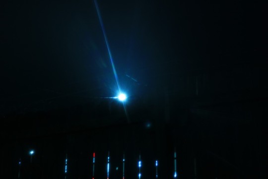
Color Walk
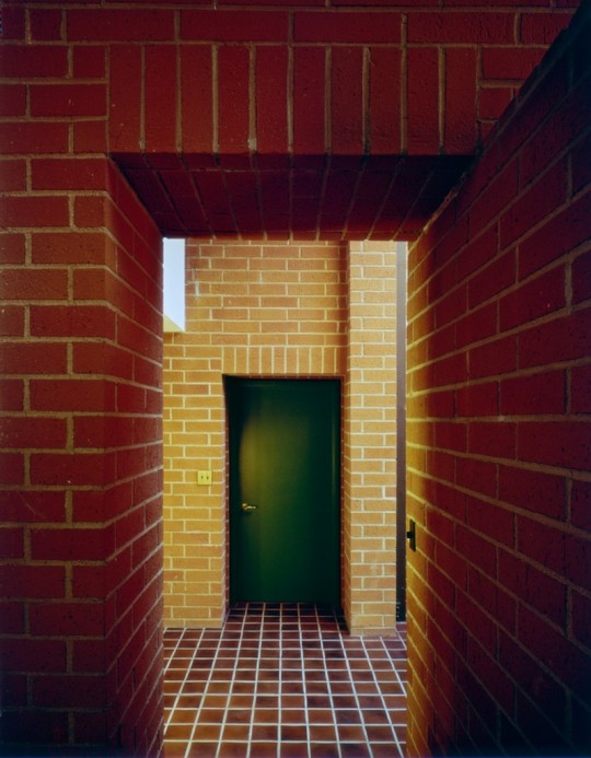
During my walk along Mill Street, here in San Marcos, I found myself being drawn towards objects and colors that evoked the sense of nostalgia. I took my walk around dusk time, and I stumbled upon a scene that felt familiar to me. This photo reminds me of the days at my grandma’s house and she’d leave the porch light on during the evening while my brother and I would play in the backyard, waiting for her to call out to us that dinner was ready. The cool hues of blue in the shadows, green door centered in the frame, surrounded by orange and yellow from the light provided a feeling of comfort for me. In the scene I captured in my first photo, I feel as though the colors are emotional, it makes me long for memories and my childhood, but I also wanted to try to capture these same colors of Yellow, Blue and Green, that give me relaxation & nostalgia, but in a Phycological sense.

In order to do that on my walk, I peaked in a storm drain outside my house. I chose to take this because the physical space was small and cramped but I wanted to try to make the space feel larger but still almost suffocating in a way. In my mind this reminds me of a room you could see in a post-apocalyptic dystopian society. The grimy nature of the environment, the blue, green, and yellow hues & saturation only add to eerie sickly feeling.

In the grimy atmosphere of this storm drain the colors had a psychological effect, because of the litter that was filling the ditch. I focused on the empty soda can, because the thought of littering is what is making our planet, our space, sick, but I also wanted to make sure that no labels were able to be read, giving a sense on anonymity because humans we are the cause of our planet’s destruction and in that idea, we are anonymous. The scene is overwhelmingly blue and feels sad to me. The yellow pops out at you from the sober scene, in the form of an empty lays chip bag, which is also adds to the sickly feeling I felt looking into this ditch filled with trash

0 notes
Text
Archival Activation
In my own work as an artist and photographer, I enjoy taking pictures and painting architecture of suburban/ urban landscapes. So, during my research in Artstors archives, I found myself looking through & being drawn to the subcategory of Architecture & landscapes. While I was scrolling through the archive, I saw a photograph taken by Julius Shulman, of architect, Frank Lloyd Wright’s, Getty Research Institute. This photo with its cool exterior & shadows but warmth emanating from the windows, gave me a sense of nostalgia. That I had seen this place or that I could envision myself/ my memories there.

I was already familiar with Todd Hido & William Christenberry’s work. Hido especially influenced my own photographic works. There’s magic in both of their work. While Hido had the intention & wanted the viewers to be able to cast their own memories into the photographs that took. Christenberry took more indexical photos. Cataloguing the same structures and buildings from his rural hometown in Alabama, revisiting and photographing how the structures change or decay, over the span of several decades. Although Christenberry’s intent wasn’t for the photos to feel nostalgic, the structures still feel like distant memories to me. I knew immediately I must include their work, that has inspired my own photography & art, into my own archive.


My initial realization of wanting this archive to feel nostalgic, ultimately led me to search out other photos in Artstors archive that also give me those feelings of nostalgia.


0 notes
Text
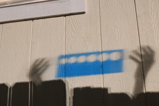
Collage
I titled this collage Bubble Gum Pop. I used the triad color scheme with different arrays of pinks, yellow-oranges, and teal blues. These colors with their bright feel make me feel happy and bubbly!

I titled this one Sandy Shores. I used monochrome & complementary color schemes of shades of blue transitioning into greys with blue undertones. These colors make me feel very calm and relaxed as if I was relaxing on a beach.

0 notes
Text
Paint it Black
1.) In the beginning there was only darkness. The pitch-black nothingness of reality. Whether due to some unknown scientific force like the Big Bang or a god-like higher being, our existence, universe, and reality itself began. Which after millions or billions of years, my own existence began, in the pitch-black nothingness of my mother’s womb. After I was brought into this world, and grew into a human with my own thoughts, my own desires, the color Black remained a constant source of gravity. Its where I came from and was the first thing I knew.
2.) Throughout the history of art, black as a color, has mostly been associated with negative connotations like evil and death. I don’t agree with blacks use in that way. To me, Black has power. It is elegant, cool, and strong.
3.) We as humans fear the darkness, the mystery of not knowing. The black that shrouds us at night is nothing to fear and is simply no more than a curtain or blanket that provides us relief and tranquility, as if we are stored away from the overexposure of the harmful rays of the day.
4.) I love the color black. Maybe love isn’t the right word. Obsessed? Infatuated? Dominated? Captivated? Nonetheless, black defines existence itself.
5.) I am transported or to say transcend to different realities, time, and space through the alluring thoughts of black. As if I’m floating, observing the history of everything from inside my mind.
6.) Black is where we began, it’s the starting point of all. Maybe humans have used black in such negative ways because our own human fears of nothingness and from our questions that can’t be answered. The answers to those questions, lays buried under the shroud of black, one could say we, as humans, fear being kept in the dark.
7.) Not all questions need to be answered. Not all questions should be answered. But if we are pestered for those answers, only one answer is applicable: Black.
8.) When I think of my captivation by black, I wonder why that is? Am I so fond of the color black because it was the first thing, I knew in my mother’s womb? Did my mother’s love and adoration permeate through the black and that is why I am so attached to black? I guess this is another question that will remain unanswered.
9.) Aren’t we, as humans, so fictitious? We base our reality on only what we have observed. We are such interesting beings. Searching for answers at all costs. Unable to remain still and always searching for a way to escape the dark.
10.) Why do we not take the time to stop and appreciate the starting point. We came from the black nothingness. There’s nothing to fear in the darkness itself. Its our own weakness as humans that we fear, the fear of what we do not know. Black is our mother. We were born from her womb. Have we forgotten the shelter and safety it provides us? Black is constant. It is the gravity that defines everything and yet nothing at all.
0 notes
Text
Camera Obscura
Creating a camera obscura and viewing the world through it, was really an interesting experiment. When you put the box on your head, your senses are dulled and besides the suffocating darkness surrounding you, you have the faint glimmer of light projecting the outside world onto the piece of parchment paper. To me, it kind of felt like the metaphor people say when they’re passing on, as if I was seeing the light at the end of the tunnel. My physical and mental experience felt conflicting. I physically felt the overwhelmed by my vision being inverted, intense claustrophobia, and my breathing stifled by wearing a face mask. My body couldn’t wait to remove the camera obscura. While, mentally, I was in awe of the magic that the world was being shown to me in a hazy upside-down dreamlike vision.
I chose to observe the building of JCM from the beyond the trees in the grass. The details of the buildings themselves were difficult to see but the definitive shapes, colors and shadows still appeared strong. The trees meshed to weave these tangled jagged dark figures and the shadows cast onto the ground, from these trees, looked as if they were faint spider veins coming toward me. I think the claustrophobia I was experiencing effected my view, because if it weren’t for the rich blue sky, the scene could almost be compared to a nightmare.
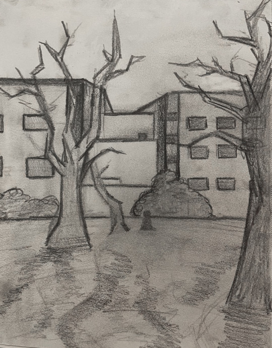
In my first sketch, which I titled, Literally Obscure. I wanted to draw the literal world that I was seeing. The shapes of the architecture, nature, and faint shadows laid upon the ground. No emotion, symbolism, or feeling. Just the picture before my eyes.
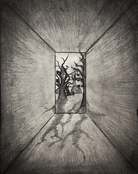
In my second sketch, which I titled Camera Obscura Claustrophobia. I drew the world through what my senses were experiencing and how I was feeling. I framed the vision I saw, in a small rectangular box in the middle of the page to express the claustrophobia I was feeling. I then surrounded the boxed scene with dark shading and the perspective lines as if the outer edges were a tunnel like the metaphor I mentioned earlier. With the spider like shadows creeping into the tunnel.
The experience was fascinating because this camera obscura changed the way I saw the world. An ordinary blue-sky day on campus, turned into an alternate eerie dimension by putting a simple camera obscura made from cardboard over my head. Photography is relatively a recent invention just in the past 200 years. This has made me compare myself and how I keep memories, photos, an index, if you will… to the people who since long have passed, and how they kept their own index before and during the very beginning of photography’s birth. This semester I am taking History of Photography and we recently went over the origins of photography, and how before photography the only way to capture an index was by paintings, which the was mostly for the wealthy, the common people couldn’t afford to have their portraits made but with the invention of the daguerreotype, calotype, and carte-de-vistes, changed that. The common people could afford to have their likeness or family’s likeness captured onto a keep sake. They valued these indexes so much that some even brought the physical image to be captured along side them in another photo. These photos were special to them. It’s so easy now to just document everything, that it almost makes nothing really special. I personally have over 40,000 photos on my phone. Why? I’m simply a hoarder and never gave it any thought of how easy it is to capture something that I may never even look at again.

0 notes
Text
Claude
Using my phones reflection I drew the images that depict different scenes from my desk. My mouse and keyboard. and my two desktop monitors and my empty Starbucks drinks.

0 notes


