
Don't wanna be here? Send us removal request.
Statistics
We looked inside some of the posts by rachullllleigh and here's what we found interesting.
Average Info
Notes Per Post
594K
Likes Per Post
339K
Reblog Per Post
255K
Reply Per Post
203
Time Between Posts
4 months
Number of Posts By Type
Text
5
Note
1
Photo
2
Last Seen Tumblr Blogs


Fun Fact
In Q3 of 2020, 31% of US users access the Tumblr app daily.
Text
FOR GOOD FORTUNE |DO NOT SCROLL PAST THIS BAY LEAF| REBLOG IT AND SHARE THE WEALTH !! !
Wealthy and healthy 2022
__________________________________________________

Follow @cosmicguide here on Tumblr for more like this and emoji spells ✨💓
3K notes
·
View notes
Text


Here are some Goddesses from my Goddess series, go check out my instagram @racheleigh.art
#goddess#themorrigan#artemis#nyx#hecate#hekate#persephone#hades and persephone#greek mythology#ancient greek#greekgoddess#triplemoon#triplemoongoddess#babd#stag#constellation#stardust#pomegranate#digital art#procreate#art#my art
18 notes
·
View notes
Text


My attempts at Disney princesses on procreate
3 notes
·
View notes
Note
Do you have any tips for drawing round ladies? :D
Hiya anon!
Well, I’m still learning myself, but here’s a few tips I usually keep in mind!
1.) “Fat” is not just a big belly!

Fat distributes everywhere, but not necessarily equally! Like at any weight, every body is different and has an unique shape! Some keep a hourglass shape, some become more pear-like, some are shaped like teardrops or apples… but the basic thing is, fat doesn’t just choose one place where it WON’T gather. It may not be as visible in some area compared to another, but in real life, it’s reeeeaaaaalllllyyyy rare to just find a person whose fat only stores in their bum, thighs and tits, leaving their waist, arms, neck and etc slim. Keep the body pleasant and thick all around, not just in the places where the weight-gain is the most imminent!
Keep the round shapes in mind!
2.) Rolls! Folds! What are they?


What are they? Not something to be afraid of, that’s for sure!
Basically, don’t hesitate to give your characters fat rolls. Skin folds, stretches and moves along with the body, and so does the fat under it! However, a lot of people who draw rolls tend to give the character many super small ones — this is not how rolls work! Usually, the thicker the person, the thicker the rolls — they increase in size, not necessarily in number.
Rolls are the most preminent in places where the body moves the most, AKA the joints. Fat folds over itself and creates creases and ‘rolls’.
3.) HOWEVER….
(No references here, sorry!!!)
When we age, our skin loses its elasticity and it can’t keep the rolls and folds thick and perky. In our youth, our weight can be held up way better than in our elderly days due to the stength and adaptivity of our skin which disappears as we age. Thus, fat tends to droop lower with older people, and the rolls appear thinner. This can also happen if someone who has had a LOT of weight packed up suddenly losing a big chunk of it — the skin can’t adapt and will begin to “droop“ down and lower. Make sure to keep such factors in mind when drawing and planning how the weight of your characters should be carried!
And then, a lil tip that;
4.) Study references and real life!
If you yourself pack some weight or have access to internet, libraries or just life on the street, you will see how bodies at different weights and shapes work and move. Use references, see for yourself — try to find how fat distributes and especially, HOW IT FOLDS! Folds and rolls seem to be one of the biggest problems many have while drawing thicker characters, and that’s ok — we’re taught as a society that fatrolls are inherently bad and disgusting, therefore there are not many situations where we’d find ourselves just… staring and studying how the fat in our bodies works and moves. You’ll learn quickly, though!
I’m still learning myself, but especially since every body is different and the weight we pack acts in unique ways, it can be really challenging to find the ‘absolute’ right way to draw thicker characters. Don’t give up! You’ll get the hang of it eventually!!
14K notes
·
View notes
Text
Drawing Faces (A Collage of Tips)
Hey hey! We just drew a cute sketch of one of the alters in our system (Ava) and, since we’re really happy with it, we’ll share some proportion and facial construction tips that will hopefully help you with drawing too.
Picture for example above, explanation/details are below each picture.

The center of the eye almost always lines up with the corners of the lips (approximately–some people have slightly smaller or larger lips). If you’re confused about the size of the mouth, but the eyes look great, just draw a line down from the center of each eye and you’ll have the exact size of the mouth you need!

It’s approximately five eyes that go across the face (depending on your style, play with this a little). The head wraps in a circle, so if the end eyes go over that’s cool, especially when drawing the face at an angle or in a semi-realistic style like this.
The key part is that one eye width is in between both eyes. This helps remain as a guide for typical eye-to-eye distance. Then, if you have a character who has wider or closer together eyes, you can change that consciously!
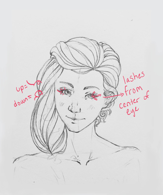
Enticing eyelashes have movement! They essentially work like arrows from the center of the eye. Upper eyelashes curve in the opposite direction of the lower eyelashes (directions are on the left side of the above picture).
Just make sure they curve, no one has straight eye lashes (unless you’re deliberately using that for stylistic effect)!

Hair has lots of movement too! Drawing arrows to start getting a sense of direction can be a great place to start. Start the arrow where the hair is attached to the head or pinned (like with a clip or hair tie) and then fan out from there.
Draw hair in sections/chunks that vary in size. See how some are thin sections and others are thicker? Typically on the edges of hair it’s thiner (like by the face, edges of the hair/outline) and in the center of sections it’s thicker.
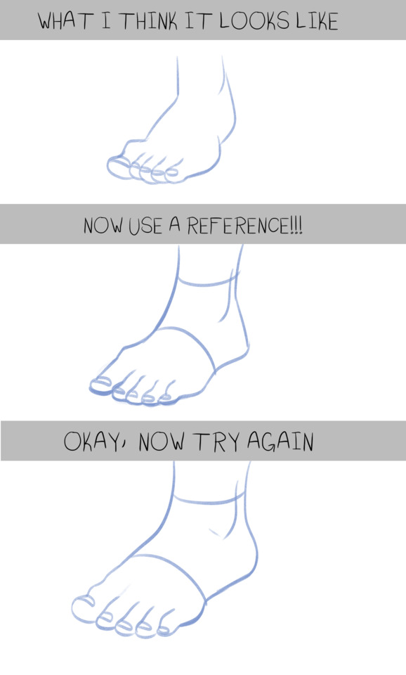
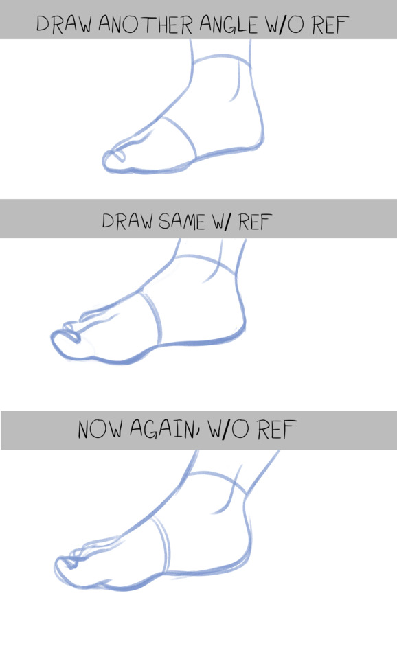
As always, don’t be afraid to use references so you can see how hair falls on the shape of a human head!

A little neck trick: There is a V of muscles that connects near the collarbones and all the way up to under the ear. Make sure this V is something you draw (even if you erase it because your character has a thicker neck). The thinnest part of the neck cannot be thinner than this V.
Also, shoulder muscles start pretty soon after the neck, so see that thick red line on the side? That’s where the V and the shoulder muscles (the ones that get really sore on all of us) coming around the back connect. This gentle V will add a much more realistic look to the necks you draw and help the head look properly supported!
Best wishes with your drawing!
-Arien (& Bael)
16K notes
·
View notes
Photo


Been doing studies using this thing I put together. I’ll attach the blanks here if y’all wanna give it a shot too! It’s been helping me a bit!!
11K notes
·
View notes
Photo
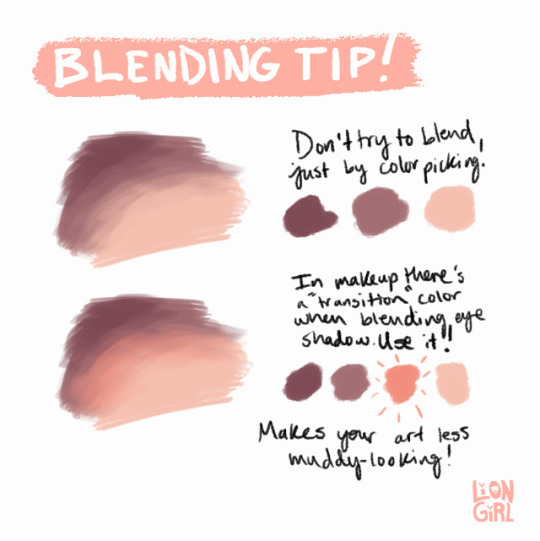
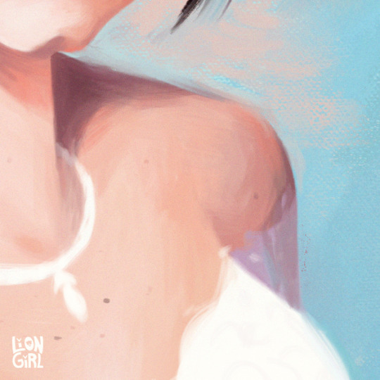
A tip for blending when painting digitally: use a transition color! I quickly made this when my brother asked for art advice while I was working on a painting for my best friend. (I was watching a lot of makeup videos to pick out her gifts).
80K notes
·
View notes
Text
shading colour tips
hey yall its me the Art Mom™ to help you shade pretty
rule 1: DO NOT SHADE WITH BLACK. EVER. IT NEVER LOOKS GOOD.
red- shade with a slightly darker shade of purple
orange- slightly darker and more saturated shade of red
yellow- i think like..a peach could work but make it a really light peach
green- shade with darker and less saturated shade of blue or teal
blue- shade with purple
purple- a shade thats darker than the purple you’re using and maybe a little pink (MAYBE blue)
pink- darker shade of red
white- a really light lavender or blue..or i guess any really light colour??
black- okay listen dont use pure black to colour anything unless you want to leave it with flat colours because you cant really shade black lol
grey- a slightly darker shade of purple or blue (less saturated)
brown- slightly darker and less saturated shade of purple or red
aaaaand thats all i got lol. let me know if there is anything i should add to this list!!
469K notes
·
View notes