
_________________________ Post Graduate Diploma - Interactive Digital Media Griffith College - Visual Communication Module Documenting what inspires/interests me. Each week will have a different colour theme, and each post for that week will have a subtheme. _________________________ Week 1 : Black Week 2 : Grey Week 3 : White Week 4 : Yellow Week 5 : Orange Week 6 : Brown Week 7 : Red Week 8 : Pink Week 9 : Purple Week 10 : Blue _________________________ Sub Themes : 1. My Work/Images 2. Found Work/Images 3. Logos 4. Typography 5. Website/App Design _________________________
Don't wanna be here? Send us removal request.
Statistics
We looked inside some of the posts by ray-on-viscomm and here's what we found interesting.
Average Info
Notes Per Post
0
Likes Per Post
0
Reblog Per Post
0
Reply Per Post
0
Time Between Posts
16 hours
Number of Posts By Type
Photo
17
Last Seen Tumblr Blogs


Fun Fact
Mobile US users spent an average of 115.8 minutes on Tumblr app monthly.
Photo
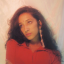
Week 10 - Blue 5. Website Design
For this week’s blue theme, I chose to use the Ryanair website. It was the first website that came to mind for blue. Obviously Facebook was there as well but I’ve used their logo for this week’s blue post so wanted to steer clear of overusing it. Ryanair’s brand colours are blue and yellow, and it’s seen on all of their brand merchandise. From their planes, to uniforms and as far as their website. I think it’s important for brands to be consistent in their colour scheme. It helps the user recognise them. It gives the brand identity.
The blue symbolises trustworthiness, and confidence. As well as tranquility and peace of mind which is a big part of their motto and brand message. The blue also reminds me of the sky in which they fly, and the yellow, the sun. That might not be what they were going for but that certainly how I read it. Sun and sky, a flight to a nice sunny holiday.
0 notes
Photo

Week 10 - Blue 4. Typography
IKEA is a Scandinavian furniture manufacturing company, which was created in Sweden. The blue and yellow colours come from the Swedish flag. Which I think is extremely clever. The reimagined use of this colour scheme in a smart and savvy way. IKEA has been a company in which has supported many redesigns. They experimented with their logo in the 1950’s and it’s been ever changing since, but it is now at home with this blue and yellow colour scheme. This redesign was done in 2019 and brought a slightly darker shade of blue, it gives the logo a bit more of a serious feel and seems more solid and professional. Something that can possibly be said about their furniture and manufacturing product today? The blue isn’t too serious though, it still evokes a pleasant and light hearted reaction. The lettering of the word IKEA is in the same shade of blue, and it is enclosed inside a yellow ellipse. The design is extremely recognisable and suits the brand. Although many feel it is quite outdated. Similar designs have appeared throughout the logos history. The designs show big bold lettering and strong emphasis on shape and colour. The wordmark part of the logo is a custom typeface in bold. It seems to be a sans serif at first but if you look closely, there are small almost impossible to instantly recognise sharp serifs this adds playfulness and sophistication to the font even though it is a bold typeface.
0 notes
Photo

Week 10 - Blue 3. Logo
Today Facebook is a household name, one that speaks for itself. Their brand is big enough not to just rely on a logo. They’re product does the talking. The typeface for the logo is sharp, and it is a custom typeface design. It is lowercase which is unusual for a brand. It’s not in your face, and it’s trustworthy. Something which the brand has struggled with in the past. The interesting thing in which people may not know is that there is a very important reason as to why the blue and white were used for the logo. The company owner, Mark Zuckerberg suffered from a thing called deuteranopia - red and green colour blindness. However he could differentiate and distinguish the colour and shades of blue that most of us cannot detect. The blue colour works well and it is well proven also. It symbolises high tech, and it’s clean and spacious. It embodies professionalism. It also stands for youth and purity, which it strives to be in its approach in the professional sense.
0 notes
Photo
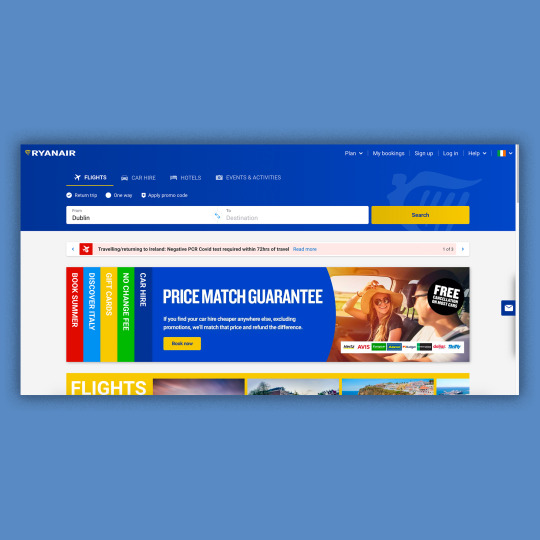
Week 10 - Blue 2. Found Work
This magazine cover is from Sports Illustrated. It’s the April 2020 Cover, and I love it. The design is extremely smart and it perfectly captures the modern world at the time of release.
The link to the article can be found here:
https://www.si.com/sports-illustrated/2020/03/25/coronavirus-cover-podcast-ed-letter
I think the blue works wonders on the cover, it conveys sadness for me. Maybe that’s just because I love sports and I’ve experienced this same image while watching some on tv. Empty stadiums, empty seats, no crowd/audience. Stillness. Sadness. Depressing. Eerie.
I think the designer has done a great job with the cover. It’s a simple image, but it speaks volumes. “HOW DO YOU ILLUSTRATE SPORTS WITHOUT, WELL, SPORTS?”
It captures this question perfectly. I think this cover will go down in the history books in terms of famous magazine covers.
0 notes
Photo

Week 10 - Blue
1. My Work
This is a painting of mine that I did back in 2018. After leaving college, I painted this for a family member who lived across from this view, Dalkey Island. It worked well for this week’s colour scheme, and will hopefully help with the overall design of the blog in terms of blending into next week’s green. We’ve discussed things in class that relate to the painting. Things we had to consider for our photography assignment.
Things like, considering the rule of thirds, splitting the canvas/camera into 3rd’s to create a foreground, middleground and background. You can see this in the painting. I’ve actually taken this photo myself but I think it may be on a hard drive that’s in my old home unfortunately and with the restrictions I can’t get home to find/get it. But in the photo, I was considering this aspect as well as being mindful of the horizon line. These are all things that we considered in the photography assignment that we submitted for the module.
0 notes
Photo

Week 9 - Purple
5. Website Design
This website design is from one of my Web Authoring assignments. The Content Management Systems one, where we were tasked to create a blog website using Wordpress. The Viscom module ties in so much with the Web Authoring module, they really go hand in hand, and I’d really love to be able to work on things like this using both of these skills in the future.
So for this website, this was just a snippet of my homepage. While creating the different aspects of the website, the design elements were really crucial in succeeding with the finished design. I used Unsplash for the image seen here and added a gradient on it using blue and purple. The blue which is always seen by technology and high tech companies today, and the purple to convey a sense of creativity, and independence. The 2 juxtaposed nicely and obviously the colours compliment each other nicely so I think it worked out well. On top of this I added button which were more saturated in colour but utilised the exact same gradient. These colours were a staple of the entire website, and worked well with their burst of colours considering the site was predominantly white in design.
0 notes
Photo

Week 9 - Purple
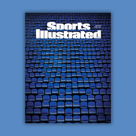
4. Typography
Cadbury is a famous British Chocolate brand, world renowned by this stage. It was established in 1824.
You can see some of their previous logos and typefaces here:
The bones of this typography was founded way back in 1921, when the brand logo changed to just text and is similar to today’s one. A script typeface was used and it was extremely popular. It’s funny because it is actually the signature of the owner that eventually became the logo and brand identity of Cadbury. So all of those previous designs were exceeded by this signature. Sometimes going back to the roots and staying simple is the better choice, and this is certainly the case for Cadbury. They eventually removed unnecessary characteristics of the signature to make the lettering even simpler. This was mainly because it would make it more legible when used on packaging which can always be a problem for brands. Several curves were removed, and eventually the ‘s was removed also. The design and typeface then became purple, a successful choice that was then changed to gold. I can understand the change though, it just added another element to the design and the colours work really well with each other. And it allowed the company to use the purple as the primary colour on all of their packaging once again. The purple and gold colour combine to create that sense of excellence and royalty. Which some may Cadbury is in the chocolate and confectionary world.
0 notes
Photo

Week 9 - Purple
3. Logo
The famous livestreaming website has an instantly recognisable logo and one which is extremely true to the brand identity and profession. Since 2009, it’s gone through 2 major revamps. In 2011 it changed its logo to this:

Then in 2012 it changed again because it didn’t garner much attention, and I think this is because it looked dated and clunky in my opinion. It changed to this:

Then in 2019, the deep dark purple was replaced by a much lighter one and they added the icon above the lettering, or the favicon as it’s known.
The wordmark was strong and it was successful once it switched to the purple colour, but I think the logo only got stronger with the icon added into it. The brand can now be memorable and recognisable on all devices. Web or mobile. The icon is true to its image as well. The wordmark and icon are interchangeable, they can be used together and/or separately and I think it’s extremely successful. I love the placement of the icon, as you can see directly underneath it on the wordmark, that the shape of the icon would fit right into seamlessly. It just seems to be an extension, and it works really well
0 notes
Photo

Week 9 - Purple
2. Found Work
I love this film poster. It’s colourful, extravagant, simple, and eye catching, all things that could be applied to the band Queen, on which the movie is based.
I think it’s a good balance between cast, colour, and information. Half of Rami Malek’s face is shown, which I think works really well as it takes the viewer a second to realise it. For me anyway, I instantly see Freddie Mercury, and then Rami Malek next, which I think the designer was going for. By zooming in close to his face, and only showing half, it adds a huge amount of drama, and gives it a serious intensity. And you’d expect the same from the movie. The reflection in the glasses is really well done also, it just gives the viewer that little extra bit of information. There are plenty of elements that could be looked at further and I’m sure there are more things to dissect but I just thought the poster was extremely striking and worked really well for this week’s post. Also the fact that we’re going to be designing our own Movie poster has been a huge influence on me as I’m constantly researching film posters to try and get inspiration.
0 notes
Photo
Week 9 - Purple
1. My Work
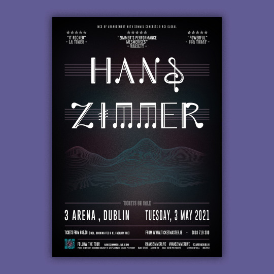
As part of a recent project, we were assigned to create a music poster. Choosing a musical act, the genre, and additional information was our own creative decision. We were instructed to only use shapes and forms, and to concentrate on typography. We were not allowed to use photographic elements.
For this assignment, the focus was on typography, so I wanted to create my own custom font. I had ideas for a font based around musical symbols (quavers, beam notes and crotchets etc) which can be seen here:

I created this typeface, seen below, based on those shapes and forms. As I continued designing the type, it instantly became a serif font. I realised I would need to use and pair it with a musical act that would suit the modern twist on the classical typeface. This is where I got the idea for a poster for Hans Zimmer. He is a modern composer with roots buried in classical music. He is known for integrating electronic music sounds with traditional orchestral arrangements.

A time lapse of the process of the Typeface Design can be seen here:
vimeo
After creating the typeface, I tried to incorporate Staves, which are the 5 parallel horizontal lines on a sheet of music where the musical notes are placed to indicate the pitch. So I added them behind the main text, and used similar stave lines throughout the rest of the design, not as obvious, but hinted upon. These are coloured using the palette and the opacity was turned down to filter them further into the background.

Hans Zimmer is known for writing over 200 scores during his career to date (original music written specifically for film). So I wanted to create a poster that resonated with that background of film, so I decided to base my design on the movie Interstellar, which Zimmer wrote the film score for. So my design was based on the colour palette of the movie and soundtrack album, which can be seen here:

The background is made up of painted brush strokes with a gaussian blur added, and a custom vignette added to feather out the colours. Then I added noise to create the galaxy effect to tie the background into the movie. The contrast between the black and galaxy colour worked well and captured the mood of the artist’s genre of music perfectly. Next I wanted to add a soundwave effect as the main graphic, but I decided to create a custom dynamic wave line to mimic the soundwave (and spotify code) that would also work with the space theme. I added a gradient in line with the colour palette also. I played with adding more elements like a silhouette drawing I did (from the movie poster), and maybe adding a Spotify URL code but it cluttered the design and took away from the poster and the effectiveness of the dynamic soundwave. I also added the QR code to take you to his website using InDesign, and then added the radial gradient to tie it into the design. I also created the star shape used for the critics quotes using photoshop.

The sans-serif typeface I used for the other text was named ‘Gobold’, and I used the different family of fonts to add hierarchy to the design and readability of the poster, while changing the weight, kerning, height, spacing and leading. I tried adding different colours to the text but the white worked well and was the best contrast against the off-black, never ending galaxy of the background.

0 notes
Photo

Week 8 - Pink
5. Website Design
Here’s an extract from some of Pretty Little Thing’s branding and marketing strategy:
“As PrettyLittleThing.com is a clothing website for young, fashion conscious 16-25 year olds they have to have a fashionable, on trend clothing and accessory range in order for them to succeed in the competitive digital market. Leaving the customer with a genuine perception of value, this helps the marketers to do their job effectively so that they can engage with consumers and convince them to buy from PLT.“
With their target audience, the colour pink has been synonymous with females, especially this age. So I think the choice of the very obviously pink and in your face bright pink colour does well for the websites identity. The white of the site serves as the perfect background colour and allows the pink to pop out of the screen.
The colour stands for sweet, playful and cute, something which the company seem to push for their summary of their brand and products. The colour of pink is actually the colour of universal love for oneself and of others so it works extremely well with their branding. Why not love yourself and treat yourself to some clothes or accessories? I think it’s extremely successful in targeting a specific audience
0 notes
Photo

Week 8 - Pink
4. Typography
Probably the best selling doll of all time, it’s name, brand, colour, and products became memorable. The wordmark logo has pretty much always stayed the same, except for the use of different typefaces. Take a look:

If you look closely, it’s actually come full circle, it has landed at the door of its original design all those years ago. After all the redesigns, it stayed true to the brand identity and remained memorable and instantly recognisable. It returns to its roots now with the exact same typeface being used once more over 60 years ago.
The bright pink works wonders, in the cursive custom typeface. The capital is on the baseline and the other letters are slightly elevated, giving emphasis to the first letter, but the eye flows nicely through the rest of the word because of its script/cursive nature. The typeface is cute and playful, all of which are really important for the Barbie company and brand. It has slowly become more and more saturated to my eyes, but maybe that’s not true, I’m not sure but it would make sense if it did. There are so many competitors out there for their brand now, so the extra saturation would capture the viewers gaze and once they recognise the brand, they’d be the buyers first choice. It has to stand out first and foremost, which it certainly does
0 notes
Photo

Week 8 - Pink
3. Logo
Airbnb has become a huge force in the holiday and accommodation sector. But their logo hasn’t always been this clean and crisp. This is their previous one, safe to say I’m not a fan. The blue with the white are more reminiscent of the sky and clouds for me. Yes, that reminds me of holidays, but not so much accommodation:

This logo has been up for debate all online, with some serious controversy being discussed about the actual logo and not the wordmark part of the logo. People have their own interpretation of the logo but here is what I see...
The logo element, looks like an A to me (Airbnb and Accommodation?), and has a loop on the inside of it. This loop is in the shape of a location pin, or possibly even a human head, thinking about their next accommodation destination. It also looks like a heart upside down, it is not instantly recognisable but this could be seen as the warm nature of accommodation on the site or even the warmth that the company has towards its customers.
The logo was developed by London-based DesignStudio in 2014 and it was named Belong Together. Shapes, typography, colour and space all go together in combining a really successful logo that perfectly portrays the company it represents
0 notes
Photo

Week 8 - Pink
2. Found Work
This is just an album artwork that I really enjoyed. It’s from LANY, and it’s called Malibu Nights. I really like the band and their songs, and I think the album captures their sound and genre quite well. Their songs are often very dreamy and the subject is often about relationships and enjoyable experiences. The album cover seems to be an image of a beach, with a bit of a mountain in the distance. The image itself is extremely hard to see at first, until inspected with more detail. They’re from LA, so I guess the photo is of Malibu lagoon state beach, somewhere that’s really important to them and they mention in a few of their songs. The gradient of deep red to deep pink is really nice and I think it works well. It gives it a feeling of transience and mystery. The saturation of the colours completely distract from the original image. It captures the viewers eyes and I’m sure this was a trick for selling the album. It kinda reminds me a bit of a section of the instagram gradient.
Pink can stand for romance, charming and sensitivity, some elements that the band arent afraid of touching upon in their songs and albums
0 notes
Photo

Week 8 - Pink
1. My Work
This is a photo I took of my brother in our old home before it was sold. The funny thing is that he grew up their from the moment he was born. And to mark the occasion, the week he was born, my Dad planted this cherry blossom tree for him. 20 years on, here he is, standing beside it, surrounded by the cherry blossom tree, the same age as him. I thought it was a nice photo to take before we left the house for good. It’s a nice memory to have, and I even made him put on a jumper that resembled the colour of the tree.
Luckily he didn’t have a brighter pink jumper, because I think it would’ve taken away from the frame of the tree. The pink of the flowers on the tree are so prominent and frame the subject, my brother, well. The duller pinkish coloured jumper worked well because it separated him from the tree and pushed him further into the background of the image. I actually went on to begin to paint from this image, but havent gotten around to finishing it just yet!
0 notes
Photo

Week 7 - Red
5. Website Design
Kit Kat, instantly memorable for their crunchy chocolate bar, but I also associate the colour red with it. Their packaging, their advertisements, and even their website all are predominantly red in colour.
Their trademark red colour is poweful. It’s an unusual choice of colour for a chocolate bar in my opinion but it works. I’m not sure if that’s just because I’m used to it now at this stage or not. But regardless, it’s worked for so long, and there’s no need to change it drastically. The red colour symbolises excitement, youth, and energy. It attracts vision and shows passion for their product.
I’m not sure the red colour actually works for their website though. I think it swallows up the content too much. It’s like an endless red and then the blocks inside the website just look unrelated and floating in the red space. Not for me
0 notes
Photo

Week 7 - Red
4. Typography
I love the coca cola logo. The wordmark is made of a beautiful script and cursive typeface. I’m usually not really a fan of the handwritten-esque wordmark for brands but this is just perfect. It’s simple, elegant and effective. A lot of the time wordmarks that are in this style aren’t properly legible and just get lost. I find myself struggling to maneuver through the word but not this one. This handwritten element has proved effective and now, it’s an eternal element of the design. Props to the typeface designer on this one.
I love the disconnect between the baselines of each word, it works so well. It gives the design something extra. It would normally create an unusual space but this is made up and home to the extra cursive elements of the 2 capital letters.
I think this font and typography has essentially made the brand its recognisability. It adds elegance and beauty and I’d be extremely surprised if it ever changed in the future.
0 notes