
Statistics
We looked inside some of the posts by ray5367375 and here's what we found interesting.
Average Info
Notes Per Post
40
Likes Per Post
20
Reblog Per Post
0
Reply Per Post
20
Time Between Posts
6 days
Number of Posts By Type
Text
11
Last Seen Tumblr Blogs


Fun Fact
Tumblr has 411 employees.
Text
Week 10 Finale
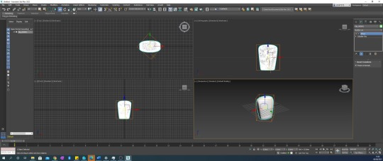


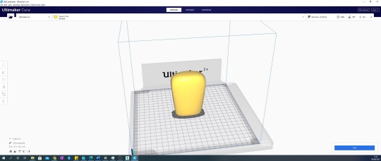
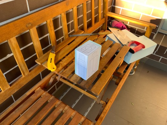
this week was pretty straightforward forward especially preparing a scanned digital model for 3d printing. i did something similar to 3d scanning in my hsc design project, i wish i knew about some of the smoothing tools within 3dsmax back then.
the procedures used cura a 3d printing slicer program that converts cad models to gcode machine commands. I had use Cura for regular 3d printing in the past so i thought it was a breeze.

-i believe i have a hide the learning objectives of the course. i think. although i feel like a beginner to 3dsmax still, i can see myself returning to this program in the future. other valuable skills developed with engineering drawings and how to figure out missing dimensions on a general assemble drawing.
-the course was not overtly difficult but it was definitely a unique enjoyable experiences. what went wrong was the Lockdown again. staying home all day really executed my motivation to do anything on time. i fell behind and my loss of motivation didn’t help.
4 notes
·
View notes
Text
Week 9 muggl’n tyne
Andrew simpson case study:
His video really did help actualise the importance of iterative design and physical prototyping. the context of the cup handle where tools such as 3d printing and scanning can help rapid prototype. similar to my modelling process is the the primary experimentation in the physical form and later refinement in cad. such a as the ergonomics of the cup handle is highly similar to the need of a comfortable and firm grip my moisturiser bottle needs.
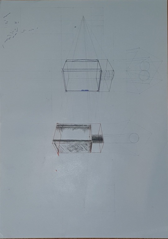
this week felt much more directed and focused. we actually we the recreate and evolve out physical model designs. we began in importing trample picture/photos in the X Y and Z axis. this was an interesting way to capturing the form where we’d extrude/subtract. modify the points to fit within the profiles. i felt this process was unnecessary tedious especially as my design had most of the feature reflected. my first couple of attempts did not end well. the picture below shows the background images deleted/hidden form view. i thought this would better show the true form but no.

after many hours and a bit of googling, i finally achieved a 3d model of my bottle design that closely resembles the foam model. however there was one difference being there are more geometries faces. i accidentally “welded” some edges to get her and this decreased the polygons into some large triangles. I have to admit that i could have never imagine the even more complex geometry in my head. a happy accident some could say.
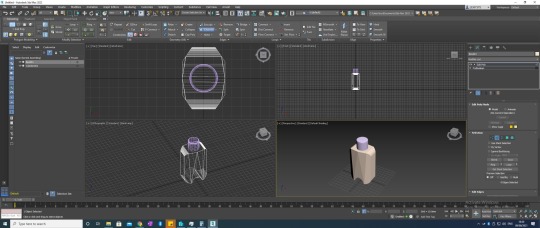

i didn’t bother with rendering the model but you can still sort of make out the geometry despite hiding the wireframe view. i’d say overall this week was a success. used the ribbon tools more but i still feel i don’t full understand them. like there was a glitch were i wanted to gently fillet all the edges but this ended up breaking the model in preview. i don’t know what’s going on.
0 notes
Text
Week 8 digital integration
this week we we introduced to Autodesk 3DsMax CAD software. i had never use this program before and it was very confusion and overwhelming. after playing around with it and following the weekly tutorial activity sheet, i soon came to the realisation why this type of program was important. I have used other cad programs such as fusion360 and can say they are build very differently from each other. i found the user layout of 3dsm very unintuitive and poorly layer out. there were new jargon i had understand. i originally though this feel a little like Blender… later finding out of course! cause the program is targeted to 3D animators.

i used experimented with stacking modifiers to create weird forms. such as a inverse teapot, planet with deformed ring and some melted blog using the FWD thingy. i originally thought that the four “view ports” were unnecessary and overwhelming but with organic forms it is impossible to snap to any points…. so they turned out very useful, similar to rhino too. An unusual thing i cam across was a Teapot in the “primitive” which refers to all basic shapes. why is a relatively complex form grouped together with basic cubes and spheres? Rob shed some light on this and turned out to be a homage to CAD history.
following the work i soon watched the autodesk tutorial and challenged myself to recreate a household object. this was quite a challenge and i definitely spent way too much time banging my head trying to think of was to manipulate the forms. usually i’d combine different layer into a group object similar to photoshop but i found my way of thinking defaulting back to fusion360 where i’d combine the different forms into one object. This turned out to be my poor modelling as i later learned of the “edit polly” action.


although the cad model isn’t a accurate replica, i eye balled it… the basic form were there. one really frustrating this i’d like to rant about is the changer tool. just give me a fillet tool, it would’ve been so much easier, but now i’d have the click and drag to get a fillet instead! Why 3dsm! and why are the lines like sketch up where it is little segments instead of a continuous curved edge!? so painful selecting every simple one. after this challenge i’d say i felt a lot more confident in my abilities in using 3dsm. i think i realised that it’s benefit is a much more efficient too at forming and manipulating organic forms.
2 notes
·
View notes
Text
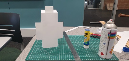
Week 7 foam models
this week was a very informative.
Due to the covid outbreak in my area, at the beginning of the week a challenge i had to overcome was thinking of a reasonable excuse to leave my home. We were instructed to acquire a list of material for friday’s class and the only place to get blue foam was the DFL shop an hour away. the goods were secure and i wasn’t finned.
the tutorial exercise used a orthographic template to help visualise how much foam to remove. i had naively started to hand draw the orthographic views when i realised i needed more than one paper template. this would be tedious to draw so i hopped onto illustrator and drew up the shapes in preside millimetres. then printed the A4 file at 1:1 scale. this meant if i accidentally ruin a template (which i ended up doing), all i would need to do is press print again. i pretty satisfied with this decision but i can’t help feel that by using technology i am not enhancing/refine my orthographic drawing skills.
using a scalpel knife the shapes were cut out and some of the pieces spay glued onto the foam. luckily i was using a branded product and it didn’t seem to melt the foam. my mates weren’t so lucky.
with the saw a block was cut out then with the box cutter blade fully extended, the foam was slowly whittled away until it resembled a block close to the size of the template.
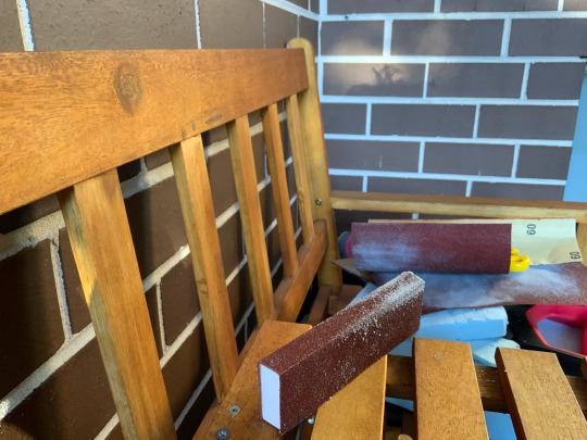
midway through whittling and sanding the first model i realised i needed a additional tool. a sanding block, which would provide greater control in creating smaller details. so i found a scrap piece of mdf and spay glues pre-cut sandpaper to 3 of of the sides. i’m my opinion this was a brilliant move.

.
as the sanding progressed engender further, a problem arose where the already glued on templates had to sanded away. because of the digital template, i could just hit print and i’d have another one to compare geometries.
the sanding process was very dusty and the foam particles was stick to my clothes. i felt relief that i had heeded the email’s advice and wore a industrial breathing mask and goggles. i’d hate to breathe in that stuff and get silicosis or have that stuff in my eyes. likewise i hade decided to the sanding in the front porch where the wind would “take care” most of the dust.
the image below show the first and second model side by side. i felt like i had complete 90% before i decided it was not good enough. this is because there are deep crater-like holes where foam is missing and hindering the accomplishment of a smooth surface. the cause i feel is that i had not changed the box cutter blade at the beginning as it was dull… and i was too aggressive in the whittling process removing too much foam by compress and not letting the blade do the work slicing.

when i was finishing the second model i discovered that the direction of the sanding mattered. I had to always sand away from the edge. this is because if sanded the other way, it would take relatively large chunks out compared to the foal being compressed when sanding downwards. It was too late and the model was somewhat not good enough.
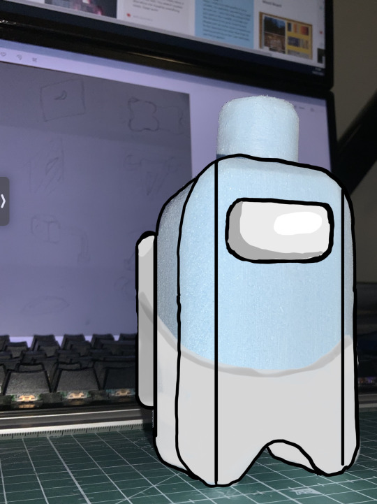
this meant i would start my third model. but because i had “honed in” my foam sanding skills with the last two, i felt i would experiment with eyeballing it. certain compromises had to be made to the original design. the last model was somewhat successful although in my opinion the “natural” curves with asymmetrical radii is not appealing. especially the significantly more rounded top edges and the semi-circle cutout becoming a gothic archway instead. these changes made the form look suspiciously similar to the Among Us characters so hence the first picture.

overall i had ample opportunity to fine my bottle design and modelling skills. it was really messy but an enjoyable experience. Would i make blue foam models at home again? NO. i’d insist on using uni maker space resources instead because… dust management ;)
the original designs in the renders did to call for chamfered edges but holding the first model made me realise the edges are too sharp… so that was a last minute ergonomics design choice.

6 notes
·
View notes
Text
Week4


test
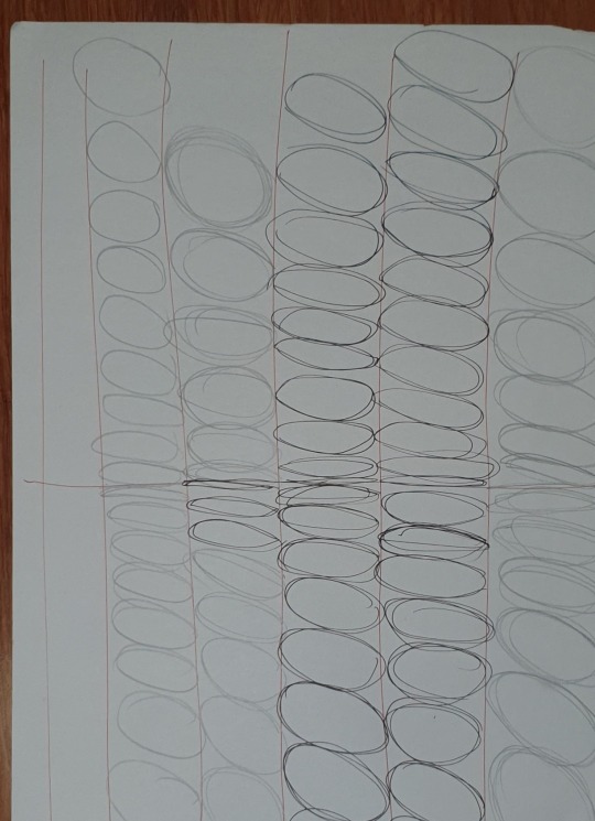
this week the task was alla bout learning to draw two point perspective. it wa svery teadious. we were told that we should be able to draw perspective without the guide lines.
the second part took many attempts. the only part that i am not satified with the the “circle” cut out. we were supposed to use an ellipse guide but i could’nt find one. this was the friday night before the lockdown began so i couldn’t just go buy one in time. i just ended up free handing it. it looks pretty terrible. the most annyoing challenge i came across during this excsise where the relative porportionate locations between the viewing point and the parrallel horizonlat guild lines. i repeated the same mistake twice where the angled likes were too close togeter making some sufaces unidentifiable. this was very frustrating as each page took atleast half an hour. i resolved the problem by strentching the porportions like moving the angled top view and the viewing point to the very edge of the page. this just barely worked. otherwise everything else seemed pretty straight forward it’s just intuition with the repeat applicitions of the exercise instructions on other parts. especially the proportions of the shape the the chopped off corner.
at the very start we were to construct the geomentry from the net templet provided. i used a craft knife which proved efficient compared to wesly who used scissors. however he chose to use uhu when sticking the bod together while i stuck with scotch tape while did not end well. it wasn’t sticky eneought and it was very fragile. my shape got crush on the commute home late that evening. lucky i had already taken photos.
2 notes
·
View notes
Text
Week5

this week’s exercise was the first one back in lockdown. i admitt i didn’t have a smooth experiece transitioning back into online tutorials. i found motivation was a significant letdown.
the exercise begal with “loosening up” where we had to freehand draw circles. i got a bit annoyed at myself for not being able to draw a goddam circle, even going fast.
then moved onto rough sketches of curved geometry, trying to understand how the light would reflect off. i fount this difficult to wrap my head around. i tried but never made progress so i just moved on as i was beginning to fall behind.
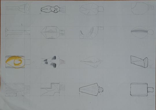
then moved onto concept design brainstorming in a grid and 1:2 scale. although the breif said not to modify the lid, i proceeded anyways which resulted in some intersting designs. after this we were encouraged to demonstate shading and inserting curved vectors so that the eye can better distiguish the nature of the geomentry. as i had not understood this. i used pen, felt tip, copic markers, pencil standing... nonoe of it looked anything near decent. i just gave up. like how the grid is not symtrical but it still did prserve original 2:1 dimensions. i was in a rush to catch up, i didn’t really care as long as i had my concept sketches on time.
i rember asing what makes a geometry inherrnantlt feminine and masculine. the answer i got was one with more curves and the other more harsh angles. this information didn’t seems to help the cocept sketches.
next we were to draw a two point perspective with a chosen final design. i wen for a simple form with 30 degree chanfers along the y axis and roughly 5mm fillets along the z axis. i drew two views on the same sheet. although i wanted to change the angle... the two vanishing poinds whould have been off the page of somewhere in A1 maybe A0 paper. i was too lazy to get another piece of paper and carefully line it up. furthermore i didn’t have eneough phisical space to do that on my desk. so i just moved on realising it was futile.
u thought i could make the bounding box more clearer but my ignorance got the better of me. i had used a red inked countain pen and the archol based ink on the A2 cheet did’nt wan’t dry so when i pulled the steel ruller away it left a ugly smudge mark in the page.
this week was not as enjoyable as others, partly due to lockdown again.
6 notes
·
View notes
Text
Week6


this week was flexi week i thought i could slack off. so i left this to the last minute. friday night i had managed to muster the motivation get off my lazy ass and do something. that something was a few ours of “research”... being procrastination and endless scolling on tiktok and instagram. this research provided guidence as to what is expected yet it also filled me up with dread. late afternoon the next day i finally came around to watching the 8 or so videos. ther wern’t very long or hard to follow. i appreciated that them were proken up into short videos. but i know i will be comming back to these in the future so i downloaded them all, stched them together into one video and reuploaded so that i could put chapters in. for copyright reasons this video is unlisted.
i began to follow the tutorial, step by step, stopping and starting. it was teadious but the end result was someting i was proud of. i have never used photoshop this way, i had never used photshop this intensely. there were a few occations where i got stuck and my pannels weren’t identical to Robs... that was solved by some quick googling. no proplems. after completing the tuturoial on photoshop i thought i’d draw my designs on ProCreate on my iPad. here is when i realised that a stylus was a godsen and worth the investment. it was so much more ergonimc to use and ther ewas much finner controll of the tools.
procreated has some special feature that isn’t built into photoshop, beinng the the timelapse feature.
when it came to deqing the three differnt bottle design i wondered if i could get away by putting all the highlight and shadows int thier own layer. it seemed to work expect whem i applied the blurr filter, i just couldn’t get it right so i left it around 10% compared to the tutorial’s 30% on PS.
overall i really enjoyed this weeks exercise. nothing too challenging for a new experience.
youtube
6 notes
·
View notes
Text
Week 3 (stream of consciousness reflection)
this week’s exercise was to orthogonally draw the geometry in the exercise. i thought it was going to be a difficult challenge at first but i thoroughly enjoyed it. at first there was some confusion with the “strange marking” on the page. it took a few moments to work out to exact dimensions of each face but we all got there eventually. the exercise was relatively straight forward until the realisation that the geometry was not symmetrical. this was a minor set back. next time i’ll make sure to calculate the dimensions of each face before committing to paper. another confusing aspect of the geometry was raised by Gabrielle where the isometric view distorted the faces. as the majority of the dimensions weren’t labeled we became unsure if the slanted face was tapered in the both the X and Z axis or whether is was only the vertical one. eventually and under the advisement of Tom, it was all agreed that the geometry only had one axis of influence onto the slanted face as the likelihood sketching such a complicated form first time was unlikely. unknowingly form the beginning i had stuck with a minimum 10mm margin between each face and the border. this turned better than expected as i could now appropriately position the drawings. as you can tell from one of the pictures i became confused about how the front head on view of the narrowing geometry would look. i mistakenly invented it but luckily this was picked up by Tom and corrected quickly. unfortunately i had applied too much pressure when drawing that line which resulted in the incomplete removal of the graphite when erasing. later i compensated this visual error by increasing the line weight and contrast of the proper vectors as well as adjusting the levels in photoshop. this challenge was finding the perfect balance with the highlights whites of the paper and the shadow darkness of the line… this did not turn out very good. the next challenge experienced in this exercise was the labelling dimensions of the technical drawing. we were instructed to only label only the essential dimensions, only enough so that the readers are able to calculate the rest. the problem was that with the new auxiliary view of the AA cross section. i ended up deciding that i would transfer all the dimension over to the new drawing. When it came time to draw the arrows and secondary lines, i used a t-square which i found out that the table was not straight… as the margins did not line up. this was very frustrating… there was little i could do about it without starting over so i just gave up and moved on. this week’s exercise was a new experience, it was not as challenge and the last but i found genuine value and satisfaction in the work below.


0 notes
Text
Week2 (stream of conscience reflection)
Week 2
this week we dove into drawing 3d geometry orthogonal you. I chosen a can of grey spray paint.. a unique random object from the bottom of my bag. i did not prepare before the class so i guess this will have to do. the exercise began off with making a paper box but the bottom unsealed, that would be able to be placed over it.. following the instructions, i left a 10mm margin on each side so that the box would end up bigger/scaled up a bit. I hadn’t yet realised the point of this part of the exercise so i had taken my time is ruling the line and cutting out the net with a craft knife. one thing i realised is that despite accommodating tabs into the net… glue sticks aren’t suited to this sort of application. i wanted to avoid the mess of using UHU so i thought i’d try a UHU branded glue stick. it didn’t want to stick at all, maybe it’s too late to get a refund😜. i had spent way too much time on it for it to not help out very much in completing the drawing. this meant that unlike last week, i was not able to finish the whole exercise within the tutorial… which meant i would procrastinate and forget to finish and upload for week 2.
the next step was to sketch out a rough view of the different faces we would draw being front, top and side views. with my chosen product being mostly a symmetrically round cylinder i had trouble deciding which face would be which. in the end with the advice from tom, the front face was designated as any view looking at the spray nozzle head on.
i had already began thinking about the orientation of the technical drawing whether portrait as my product was tall and could perhaps been drawn at 2:1 scale or landscape at 1:1 scale. ultimately i decided to stick with a landscape. this resulted with the drawings close together on the left side and a whole bunch negative space on the right. i should’ve planned it out more.
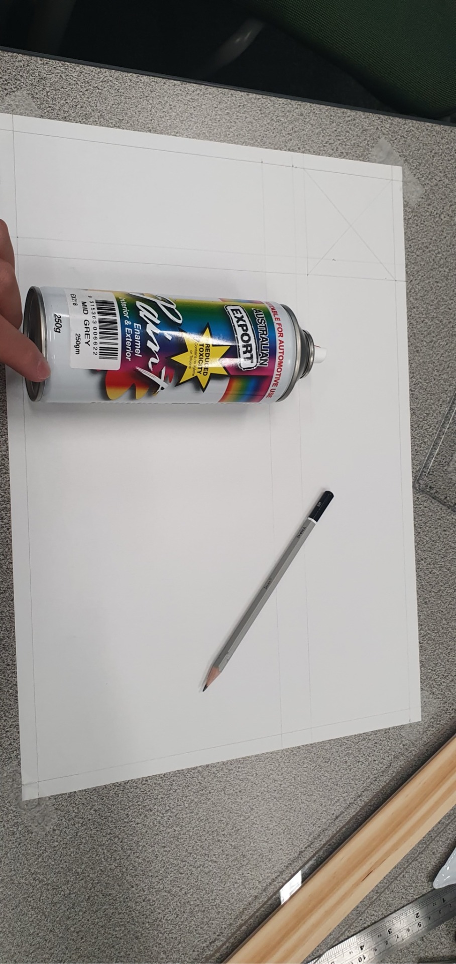

interestingly i had to use callipers to get the dimensions too the small plastic bits.. i was unsure how much detail/what parts to include. for simplicity sake i rounded the measurements so it would be easier with the ruler. some of the geometry i had no idea how to measure so i eye balled it and simplified the geometry. like the big round part under the nozzle. with all the construction lines so close together… this time i though it would look cleaner if i had erased them. this did not work so i had to resent to adjusting the levels and contrast in photoshop. in summary… it worked out so i’m satisfied.

2 notes
·
View notes
Text
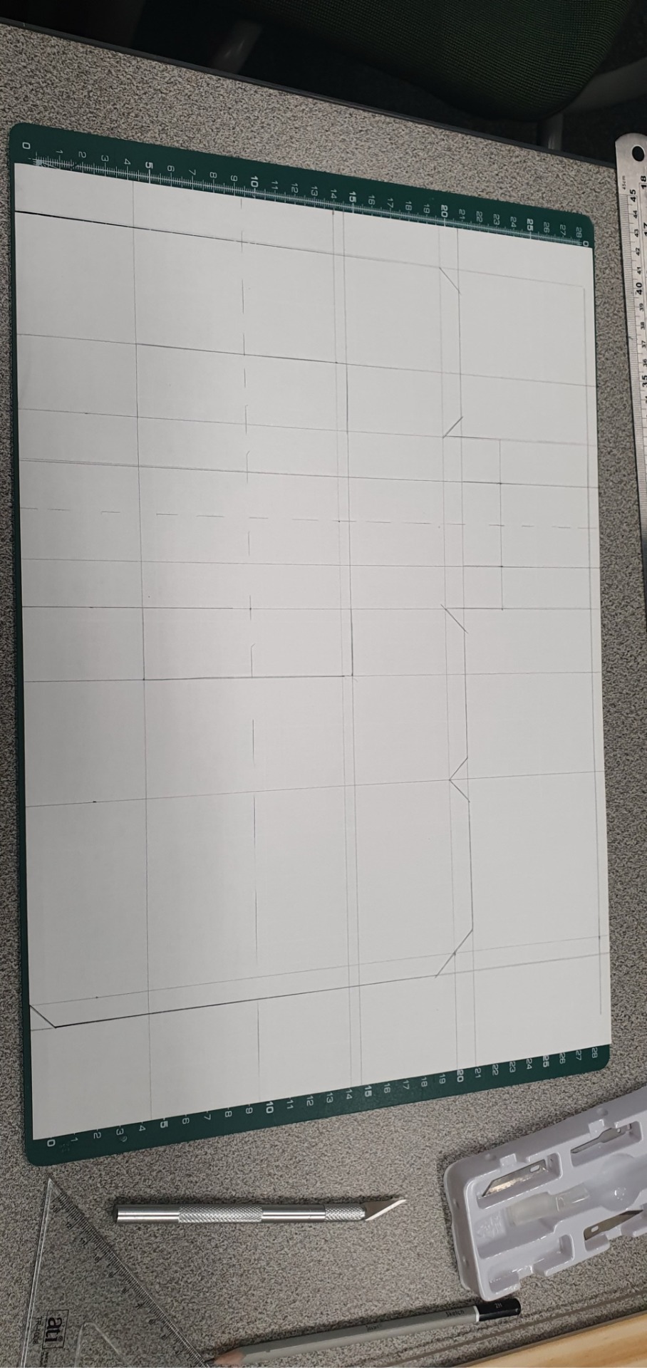
Week 1 Technical Drawing

the exercise started off with the star of david looking one. at first i felt unsure of how to start. originally i began drawing the figure not properly laid out with a 10mm margin off the left side of the page... but feedback from Gonz suggested i restart completely and with a 2H pencil. Using the T-square i followed by laying down some construction lines. i then realised that the star of david is two inverted vertically offset equilateral triangles. this meant that all internal angles of each equilateral triangle are 60° which happens to be the same as one of the triangle set quakes. with this realisation i stared with the compass drawing a circle of Ø132mm and at the intersection with the construction centreline i combined the use of the 60º set square with T square in order to achieve the precise angled line and the 8mm perpendicular offset. for the second figure i first put special focus on the 45º intersecting construction line. this did not end up well as i had to later correct the slight offset hence the heavier lines. based off the 45º construction line i used the 45º set square to proportionally draw the outer offset lines. by this time i was feeling pretty confident which lead onto my next mistake where i misinterpret the radius of the inner curve as the diameter. this mistake was caught by Rob as i was using the wrong circle cut.
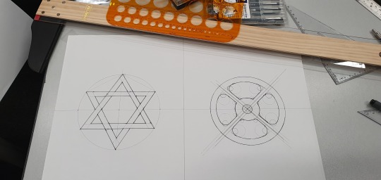
I chose not to remove the construction geometry to show mistakes i’v made apart of the the learning process. following i decided to go over it with a 0.5 fine liner pens. i was overly confident and did not carefully observe that the star of david triangles are overlapping. this was another mistake that was final and was permanent.
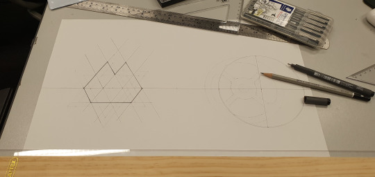
for the third exercise i realised it had a lot in common with the first exercise. so i began with using the set square to draw the grid then followed up with the fine liner pen... which then led onto the next exercise which was to repeat the same shape.

Planning ahead i decided to extend the existing grid so i didn’t have to redraw everything separately. i was lazy... and it worked out! the next steps were to cut out the shapes. with everything compactly arranged and aligned to the same grid it meant could just use the metal ruler and the craft knife to go... slice slice slice. three general cuts and i would’ve been done. Guess what... it worked out! Not long after Rob dropped some cryptic suggestion about not using scissors.
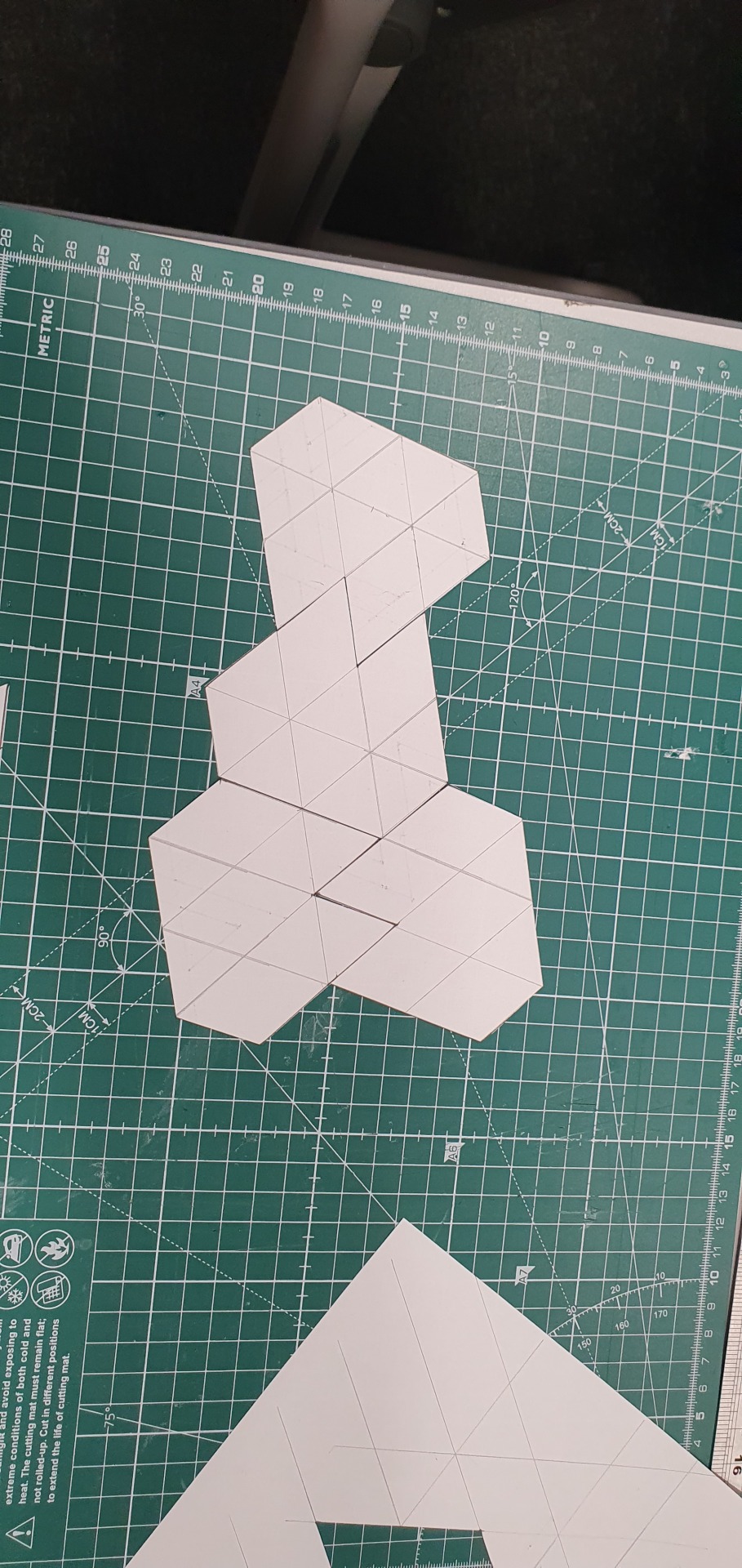
the final result of using the the craft knife and ruler is that all the shapes fit together pretty well and with minimal gaps. job well done i guess.
10 notes
·
View notes