Art Writer and Editor. Previously Profiles Editor at Prefix Photo, and Managing Editor at www.thisistomorrow.info
Don't wanna be here? Send us removal request.
Statistics
We looked inside some of the posts by rebeccatraviswriting and here's what we found interesting.
Average Info
Notes Per Post
3
Likes Per Post
3
Reblog Per Post
0
Reply Per Post
0
Time Between Posts
5 months
Number of Posts By Type
Text
5
Photo
7
Link
5
Last Seen Tumblr Blogs


Fun Fact
Forty percent of Tumblr users are between the ages of 18 to 25.
Text
Wall Drawing #1 and Wall Drawing #2: A Conversation between Sean Weisgerber, Daniel Griffin Hunt and Rebecca Travis - written for Peripheral Review magazine, April 2022.
The context behind this article for Peripheral Review was the simultaneous showing of two new Wall Drawing installations by artist Sean Weisgerber - one at Open Studio, Toronto, and one at The Plumb, Toronto. To connect these two works and the two different sites they occupied, we had a conversation in front of Wall Drawing #1 at Open Studio, travelled together to the Plumb, and finished our conversation in front of Wall Drawing #2.
#Interview#Conversation Piece#Peripheral Review#Installation#Wall Drawing#Sean Weisgerber#Art Market
0 notes
Text
Care and Repair: a catalogue essay for the exhibition Pink City, Green Branches by Yael Brotman and Libby Hague
In 2021 I was delighted to contribute my essay Care and Repair about Yael Brotman and Libby Hague's exhibition Pink City, Green Branches to their exhibition catalogue.
Check out the PDF of the catalogue HERE.
#Essay#Catalogue Essay#Exhibition Catalogue#Printmaking#Installation#Care and Repair#Yael Brotman#Libby Hague
0 notes
Photo


My profile on the long-running and fascinating Lofoten International Art Festival, hosted on the remote Lofoten archipelago in the northern Norway, is in issue 42 of Prefix.
In addition to this, congratulations to Prefix Photo on being the ‘gold winner’ in the 2020 National Magazine Awards!
#Prefix Photo Magazine#Prefix Toronto#Profile#Lofoten International Art Fair#Biennale#Biennial#Art Festival
1 note
·
View note
Text
Sylvia Grace Borda: Shifting Perspectives (artist monograph, published by Heritage House and Surrey Art Gallery)
Delighted that the artist monograph ‘Sylvia Grace Borda: Shifting Perspectives’, published by Heritage House and Surrey Art Gallery, and featuring my essay ‘Two Geographies’, is now available through the Heritage House website.
A free download of the publication can be accessed on the Surrey Art Gallery website, here.


#sylvia grace borda#Catalogue Essay#exhibition catalogue#artist monograph#photography#surrey art gallery#essay
0 notes
Photo


In issue 41 Prefix Photo you can read my profile on Side Gallery in Newcastle-Upon-Tyne and the fascinating work of the Amber collective.
0 notes
Photo


In Issue 40 of Prefix Photo you will find my book review of John Akomfrah, Signs of Empire, and my profile piece on the digitization of the Robert Frank Collection at the National Gallery of Art, Washington DC.
0 notes
Photo

Profile on Trevor Paglan’s ambitious but currently lost in space project ‘Orbital Reflector’ in Issue 39 of Prefix Photo.
0 notes
Link
Interview with Randy Grskovic for the Spring 2019 issue of BlackFlash Magazine.

1 note
·
View note
Text
Gallery Text | Sarah Sands Phillips: Idyll at General Hardware Contemporary

The Wall is a Body.
“Natural materials express their age and history, as well as the story of their origins and their history of human use. All matter exists in the continuum of time; the patina of wear adds the enriching experience of time to the materials of construction.” – Juhani Pallasmaa
In 2013, Sarah Sands Phillips returned to the family home where she had grown up, and took a number of photographs of light entering spaces. Beams licking corners, throwing shadows, flickering across thresholds and highlighting bowed walls. The resulting images are not a recording of space in the traditional sense; rather they capture fleeting moments of luminescent abstraction, glimmers of present action in rooms connected to past memories. The photographs, as with much of the work in Sands Phillips multi-faceted practice, became subtle documents and expressions of time. For the exhibition Idyll Sands Phillips returns to these photographs as a source material for paintings. Rather than focusing on their ethereal light forms, the Idyll paintings respond to a material element evident in the imagery – the physical make-up of the building’s aging interior walls.
The walls in question were constructed using lath and plaster, a technique seen predominantly in pre-war homes, in which plaster is layered over a structural framework of closely fitted, lateral wooden slats. As the plaster is squeezed through the negative space between the slats, it forms overhanging ‘keys’ on the structure’s reverse that allow it to cling to its wooden armature. Lath and plaster has long been discontinued to make way for more efficient construction methods, and as such, is a technique set in time.
Sands Phillips employs a similar process of material layering to create the surfaces present throughout Idyll. Strata of oil paint are built up on stretched linen and canvas supports, with its gently smoothed application akin to that of a lath and plaster wall. Her chosen colour palette recalls a light and shadow spectrum, but is also reminiscent of the body – grey matter and peachy flesh tones, vein-like blue. Into these carefully prepared surfaces, Sands Phillips carves linear suggestions of rooms that reveal subtle colourations from underlying layers, continuing a process of mark making through erasure present throughout her practice. The resulting minimal compositions appear as spaces etched at the peripheries of memory, perhaps something dreamt. They are non-places without a sense of time, a setting with the potential for future action to occur, whilst also seeming as though somewhere remembered from long ago.
In his book Eyes of the Skin, Architecture and the Senses, the Finnish architect Juhani Pallasmaa (Eyes of the Skin, Architecture and the Senses, Materiality and Time, P.3) makes a case for the physical and sensory pull of organic building materials, as opposed to the cold plasticity of manmade constructions. The simultaneous attraction and fallibility of these natural materials is that they visibly age and change, and in this they relate to the body. The walls in Sands Phillips’ original photographs had billowed and bulged, bloated over time. The lath and plaster process is laborious and physical, corporeally composed of a skeletal frame and soft, porous materials. Look up the etymology of ‘idyll’ and you will find that it originates from the Greek for ‘form’ or ‘shape’. In definition, it denotes a picturesque scene, but one – like our bodies, memories, and those walls – that is ultimately temporary.
June 14 – July 15, 2018, General Hardware Contemporary, 1520 Queen Street West, Toronto. Gallery hours: Wed – Sat, 12 – 6 pm.
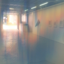
Exhibition installation photo: Laura Findley
#sarah sands phillips#Solo Exhibition#gallery text#general hardware contemporary#painting#abstractpainting
1 note
·
View note
Photo

My book review of Rosa Barba: From Source to Poem is included in the current issue of Prefix Photo magazine.
0 notes
Link
As conflicts continue to rage across the globe and society’s patriarchal structures find themselves under increased scrutiny, Golub’s bleak manifestations of brutality, hyper-masculinity and the misuses of power are as difficult to confront now as ever.

0 notes
Link
‘Art in the Open’ offers valuable insight into the journey an artwork goes through in order to reach public space, as well as the figures behind the organisations (many of them women) that have enabled such projects to happen over the last four decades. Perhaps more importantly, it asks us to consider what exactly makes a public artwork successful.

0 notes
Text
Jiri Ladocha: Transparent Opacity
Sheldon Rose Gallery, 11/30/17 – 18/01/18.
Text by Rebecca Travis

The sight of broken or cracked glass often invites a sensory reaction. When passing a shop front or car windshield with cracks rippling across its surface, it’s hard to not to imagine the sound of whatever impact caused spidery lines to radiate out from its shattered epicentre. There’s something paralysing too, about watching a glass object fall, slow-motion style, before it meets its inevitable demise. It is a material that comes with a cautionary warning - when whole it is fragile, to be handled with care; in fragments it is sharp, damaging, something to be wary of, perhaps swept away and quickly disposed.
Glass occupies a strange status between high and low value. We surround ourselves with it, in our architecture and interior designs both for function and decoration. It becomes vessels for all manner of things: beverages, flowers, cigarette ash. And yet, it still seems somewhat precious. Perhaps this is due to its alchemical journey between physical states, from mineral powder, to molten liquid, to brittle solid. It allows us to magnify and see more clearly, protects us from the elements, and refracts and reflects light, causing surprising spectral effects in the most banal of domestic spaces. It’s a material so fused with our daily lives that it’s easy not to think much about it at all.
Jiri Ladocha’s new series of sculptures and photographs puts glass - broken glass - front and center. By encouraging us to study this material closely, Ladocha at once tells us what we already know - demonstrating completely what it is at surface value and how it behaves – but also, by offering time to consider its many intricacies, he invites us to see beyond mere material and think of glass as something other. The longer we gaze at its varying textures, layers and scores, the more the lure of this unique material casts its spell.
As with much of Ladocha’s practice the glass sculptures, which are the origins of these prints, began following a fortunate accident - an ordering mix up leading to a surplus of glass sheeting. Unwilling to let this material go to waste, and seeing that one pane had already accumulated a crack, he began to work with it in his studio, breaking it down further, chipping away at its edges and layering it several strata deep to create uniquely interesting abstract compositions with an utterly beguiling quality of line. A real departure, though, comes via this series of brand new scaled-up photographs. Double scanned and then enlarged to 40” x 40”, these images take the glass surface to a newly immersive and transformative level.
From the elemental, water-themed title of the first sculpture series, it is evident that Ladocha has already identified how these layers - revealing tonal varieties of the glass’ natural green hue - come to look more liquid than solid. In the photographs this effect is even more pronounced. Alongside producing this work, Ladocha spent much time at Georgian Bay, studying the play of light on water and in photographs such as Transparent Opacity #2 this fieldwork really shows. In this composition, quietly intersecting lines etched into the glass cast shadows and throw fine, ephemeral refractions of white onto layers beneath. The eye is drawn initially to a portal-like opening in the centre where the glass has been chipped away into an organic, negative form, the outline of a lakeshore perhaps, or an eddy in flowing water, with many more rippling movements revealed in the inner layers of the glass’ rough, bitten edges.
The enlargement of line in the photographs encourages a consideration of the actions taken to make such compositions, and, despite careful study, it often remains somewhat ambiguous as to whether the marks are the result of incidental accident or attentive process. As opposed to Michelangelo Pistoletto’s performative mirror smashings, Ladocha’s work inspires thoughts of an altogether more mindful treatment of material, the glass being nibbled away rather than bombastically shattered. Transparent Opacity #3 feels almost ‘drawn’ - like an aerial view of a crude map, with hairline cracks denoting paths and larger chips as contours or buildings. I am reminded of Robert Smithson’s Broken Glass Map (Atlantis) (1969) unashamedly beautiful and otherworldly in its aqua-hue, but brutally dangerous too, with shards held upright and glinting. Ladocha’s photographs offer a less confrontational, more meditative study. They are works that invite closer inspection, rather than keeping us at a distance.
These are, notably, the first photographic works in Ladocha’s oeuvre. When asked whether he otherwise considers himself primarily as a sculptor, he pauses before replying:
“I wouldn’t say I am a sculptor, but I am inclined to be three-dimensional.”
This may seem a curiously vague statement, but an inclination towards the three-dimensional is certainly apparent in Ladocha’s stretched canvases. They would appear as traditional supports for paintings but for various additions to the under-workings of the wooden stretcher, creating a sculptural armature over which the fabric is pulled taut and forcing elements of relief into its surface. In some instances this push for three-dimensionality is quite extreme, as in the silver-leafed works Quiet Gods, Thor and Quiet Gods, Friga. Here, the attraction of a gossamer sheen is interrupted by cylindrical outcrops as if some magnetic force has been applied to draw objects at speed to it from behind, leaving inverse craters from impact upon its otherwise smooth exterior. A further pair of works in this vein but painted with multiple layers of graphite power and medium are astonishingly matte and convey a weighty appearance similar to that of steel. They simultaneously have the feeling of being contemporary and deeply ancient, an artefact conjured from another place and time.
A quieter sculptural edge is leant to the quadriptych The Four Directions, with subtle interventions lightly lifting the edges of each of its painted or metal-leafed rectangles away from the flatness of the canvas plane. With its angelic white support and combination of purist primary colour with gold, white gold and silver leaf upon elegantly proportioned panels, this work hints at a Modernist play upon the traditional religious altarpiece. It is here that we see the influence of Ladocha’s birth city, Prague, one of the few European capitals left intact following the wars of the twentieth century, and therefore rich with lavish Baroque, Gothic and Renaissance architecture. Ladocha has lived in Toronto since 1968, but Prague is a place to which he often returns, both figuratively through his artworks and, more recently, in person. Gold and silver leafing has been employed by Ladocha for many years and is both a call-back to the opulent decoration found in many of Prague’s impressive interiors - particularly churches - and a means by which to imbue a sense of spirituality into what could otherwise be a purely formalist reading of his minimal compositions.
Ladocha’s practice may be seen as one of many contradictions. Simultaneously his works can feel coolly minimal and unabashedly decorative, reverentially serious and knowingly playful. He is unafraid to be seen in these different lights, and throughout his lengthy career, has often played against the grain of whatever is à la mode in favour of working to his own idiosyncratic beat. His influences are myriad, a sense of Slavic Romanticism blending with European and American strands of Modernism, Russian Expressionists and Art Nouveau, Dvořák and classical Jazz. The antonymic title for this exhibition Transparent Opacity in one sense acts as a descriptor of the physical qualities that are heightened and subverted in Ladocha’s process-driven works, but also touches upon his natural inclination to shift in style and artistic direction, every now and again rapidly changing course in ways that are never predictable and often surprising.
0 notes
Photo

Commissioned gallery interpretation text for Sylvie Bélanger’s exhibition [email protected], at Birch Contemporary 30 April - 4 June, 2016
#commission text#gallery interpretation#essay#white cube#photography#installation#contact photography festival#sylviebelanger#birchcontemporary
0 notes
Link
It seems that Florine Stettheimer was a woman forever in good company, from her female-centric family life to the creative salons she hosted for like-minded contemporaries, including Marcel Duchamp and Georgia O’Keeffe.

0 notes
Photo

Pleased to announce that the current issue of Prefix Photo includes my review of Andrew James Paterson’s book Collection/Correction, ed. by Jacob Korczynski and published by Kunstverein Toronto and Mousse Publishing, Milan.
#Prefix Photo Magazine#Prefix Toronto#Book Review#Andrew James Paterson#Mousse Publishing#Kunstverein Toronto
0 notes
Link
Whether rooted in fact or fiction, uniting de Andrade’s works is the study of socially constructed hierarchies and their stubborn fixture in the face of rapidly changing contemporary culture.

0 notes