Statistics
We looked inside some of the posts by reflectionsofeloise and here's what we found interesting.
Average Info
Notes Per Post
47
Likes Per Post
26
Reblog Per Post
17
Reply Per Post
4
Time Between Posts
3 hours
Number of Posts By Type
Text
16
Photo
1
Last Seen Tumblr Blogs


Fun Fact
The Tumblr office adopted Tommy, an 11-year-old Pomeranian.
Text
Yes! this is so awesome, you've done such a good job encompassing Basquiat’s style. The idea of an interactive website works so well, really satisfying to scroll through!
Project 3 : Ask Me Anything
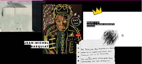
https://maurakurnianto.wixsite.com/basquiat
Here is what my zine currently looks like, I decided to do an interactive zine.
My subject of choice is Jean-Michel Basquiat. At first I was only drawn to his art style and the story behind it, but his take on the art industry fascinates me. His journey to being recognized in the art industry was not easy and I decided to dig a little deeper for this project. I have to say, he’s now one of my favourite artist!
Click the link above and let me know what you guys think!
17 notes
·
View notes
Text
Your composition is prime! Love that all the pages flow together with the same style, really appealing to the eye
FINISHING THE ‘ASK ME ANYTHING…’ ASSIGNMENT

I had a specific vision in mind, keeping the same typefaces, background colour, and moustache illustrations in order to keep the uniformity of the zine, but also including a different cut out of Dali’s artwork in order to keep it from being stale. Overall, designing the rest of the zine was a relatively smooth process, after the struggle of having to write the rest of the interview.
4 notes
·
View notes
Text
I really enjoy seeing people’s development, it must've sucked knowing you wanted to restart again but your final zine is awesome. Your layout choices are so appealing, everything balances out really well!!
Week 12/ ASK ME ANYTHING
This week I finished my ‘Ask Me Anything’ project.
Having already finished my ask me anything project, in this post I will only address the lecture which recapped what we have done throughout the whole course and it sure was a journey.
This last lecture was enjoyable because it really showed how far we as a cohort have come since early march. I hope that one day I will once again hear a lecture delivered from Andy and Karen.
This project was undoubtedly my favourite assignment we have been given across all subjects this semester. I’ll be the first to admit that this project started off very rocky. In the beginning, my five possible subject were Alan Fletcher, Modernism, De Stijl, Art Nouveau, Art Deco and Walter Gropius. Out of this five, I chose to focus on Alan Fletcher, a founding member of Pentagram. I did all my research on him and had answered the five questions I had written. I had even made up part of a zine mock-up in one of my sketchbooks. I was ahead of task and ready to start making my design digitally. I decided to take a week off of working on this assignment to finish others since I was already ahead here. During this time, I discovered Wes Wilson, a poster artist who specialised in the psychedelic posters of the 60s. Being a huge fan of The Beatles, I had found that he designed their last concert poster. I had always loved this trippy aesthetic but studying one of these poster designers never occurred to me when I was making my list of 5. I made the decision to change my entire subject because I was so keen to learn about Wes Wilson and really wanted to make his work the main focus of this project.
After going ahead and researching Wilson, I began to design the end product of my assignment. Since Wilson was always about breaking the rules and doing something new, I decided to experiment with a newspaper layout for my final presentation. This was difficult from the beginning as I wasn’t sure whether to set it up like a modern day newspaper or one from the 1960s. Another challenge I had was that newspapers are all about the words. There is so much information packed into a newspaper and my answers weren’t long enough for this. However, I pushed through and created a newspaper mock-up, later scrapping it.


So, now I was back to the drawing board and then (I know this sounds cheesy but) I remembered the reason I am in this course. To make a zine. Ok hear me out, that’s not the ONLY thing I want to get out of studying Communication Design but I remember being at the Open Day last year, hearing a past student talk about and show her zine and that’s when I knew I wanted to study design. So not long after I found myself scrolling through Pinterest at 'minimalist zine layouts’ and my inspiration grew. I knew that I wanted to make a minimalist design to contrast the busy and colourful posters Wilson created and loved the popular feature of zines that is to only print in one colour over a coloured sheet of paper. I knew I couldn’t do this when presenting his work but that is why I made all the text and photographs blue, adding transparency to create different tones. I’ve been talking a lot here so now I’m just going to add a few progress pictures so you can see how I got to the end.


The final version of my zine is available on issuu here.
Unfortunately due to COVID-19, we weren’t able to actually make the zines but this didn’t stop me from printing the pages out on my dodgy printer and stitching them together. While the printing itself and the quality of the paper are definitely not ideal, It was so exciting to see my design come together in the real world. I’ve never saddle stitched a book before so that didn’t turn out perfectly either but I guess that sums up this semester, not perfect but cool nonetheless.
So that’s it I guess. 'Ask me Anything’ is done. This was by far my favourite project. I loved looking into historical designers and unpacking how they were so revolutionary. Seeing how everyone else in my class developed their assignments was so interesting too. It amazes me how different we all are as designers, the different things we take inspiration from and the people we look up to and this project has made me grateful that I have been able to spend a semester with such talented people.
3 notes
·
View notes
Text
I love your choice of colours; they're so mysterious and a bit murky, enhancing what I perceive Dali’s work to be - a bit creepy. You’ve successfully used a grid layout too to separate the sections.


Assignment 3: Ask Me Anything!
An interview with The Persistence of Memory artwork, exhibited at MoMA New York City.
The contrast of the “serious” brochure layout, text and funky, dark imagery helped create a vision for the end product. Colours are similar to those from the artwork itself, blue, yellow, brown and white. I wanted to keep it as serious as I could while still trying to incorporate imagery and graphics. The Persistence of Memory to me has this “very proper” attitude about it, so I wanted to show that through the exhibition brochure as if it was from MoMA.
Inspirations for brochure designs by MoMA are shown above. They gave me great insight into the types of styles and layouts MoMA uses within their brochure and hand out designs.
1 note
·
View note
Text
Wow! I love that you’ve explored many different ways to lay out your texts; diagonally, following the curve of the circle, different size, etc! Especially love the look of the white text over the blue circle too.
Final Zine !!
5/6/20
After changing the design of my zine several times, I finally finished it! I am glad that it looked way better than it did before thanks to Shayna’s feedback. Fingers crossed for a better score than the last project :)
5 notes
·
View notes
Text
.·。.·゜✭·fin.·✫·゜·。.
I can’t believe how quick this semester has gone by and what a weird (and now especially sad) time of our lives! I wish I could’ve experienced this class in real life. I think I skipped about 5 classes purely from lack of motivation, which is pathetic and makes no sense because without iso I definitely would've been waking up early in the morning to commute to uni...anyway, I'm super grateful for Shayna and her continuous positivity through the semester, it still was fun and interactive and THOUGHT PROVOKING! I’ve come out of this course asking so many more questions, and having so much more knowledge that I know I’ll be using in the future.
I hope everyone has stayed safe during this semester and wishing to see you all again in the future woo time to PARTY!
0 notes
Text
"Ask me anything!"
This is my final zine: https://indd.adobe.com/view/55858726-9fb1-4077-889f-a3b6763a93ce I’ve made it somewhat interactive so that the artwork I’ve mentioned in my questions can be viewed on Richard Bernstein’s official catalogue (when hovering and then clicking on that section of the question). I didn't want to include the actual images in the zine itself because I felt they'd be distracting and perhaps counteractive within my design. If this submission was to be physical I would've printed the images and stuck them in myself as fold out flaps that blended in with my design, but opened as the images.
After reviewing the course with the WK12 Lecture I’ve come to realise I failed to truly explore typefaces for my zine. I just stuck with a simple sans serif, left aligned and didn't play with composition at all. I guess for the heading I hand drew it but I definitely could’ve tried further explore type and the way I can communicate it.

I wanted to explain further the choices behind this cover. Richard Bernstein was known for his mixed media collaging. Some of his Interview magazine covers included halo like backdrops behind the stars. I’ve appropriated this concept by making a coloured backdrop that outlines him, highlighting his use of gorgeous, vibrant colour in his work, as well as proposing the idea that he himself was a star! The title Richard Bernstein is splayed across the rectangles; portraying how he broke boundaries with his work, he didn't stay inside the box. The colour of the background was ink dropped from the image of the man himself, and the coral colour is an introduction to the energetic colours to come.
✿♥‿♥✿
1 note
·
View note
Text
WK12 LECTURE
~ notes ! ~
SUMMARIES:
Communication as a visual code. Gang symbols, the way Italians use their hands to speak. How keyboard emoticons are created using unfamiliar characters… I am a huge fan of “Japanese keyboard faces,” I love using them as instagram captions, here are a couple; இ_இ , 。·:*:·゚★,。·:*:·゚☆ (ಥ﹏ಥ) .。.:*☆ , (⊙︿⊙✿) .
What is design made of?… hand printing in caves, using clay tablets to scribe messages. Relating these historical literacies to our contemporary uses; typing using a touchpad keyboard on an iPad. The old technology becomes enfolded within the new.
What is writing?… how the ancient writing styles were affected by the tools and materials. Brush and ink produces a different style to chisel and stone. Books were a form of luxury.
Early printing technologies: block printing, clay movable type, xylography, Gutenbergs invention ~ blackletter and how it’s still used today.
What is a grid?… tablets were used as a kind of brick, and therefore a unit of architecture. Moving from scribal works, humanist hand movements, to a mathematical approach to forging letterforms.
Bauhaus… a different approach to teaching students that is still influential today. Interdisciplinary; covered a range of different crafts and art forms; woodwork, painting, dance, etc.
Who decides design? The designer? The designer of the software (Adobe)? How much does this software influence your design decisions? How does the media shape these messages?
Post-modernism. Why we design? Design in activism. What is next for design?
Further look into the idea of decolonising design.
WE NEED TO CELEBRATE AND CITE MORE FEMALE CREATIVES!
0 notes
Text
Graphics #4


Developed page 2 and 3 from that sketch to this imagery that adheres to the same style I previously had going on.

Because the graphics on my pages are quite fluid, I needed the text to still be easy to read, and not conform to the shapes because otherwise I felt the zine could look a bit too experimental. I’ve set all the text to be directly in the middle of the page, and left aligned as this is the way English is usually read; from left to right.
I am happy with the minimalism of my graphics as I feel it suits the style of Bernstein’s; big deposits of bright colours with a some sort of focal point ~ not tooooo much was going on. BUT! I do refer to some works of his which I feel would benefit if I actually provided the images. If we weren't in isolation I would've printed this zine and collaged it myself including fold out flaps for the audience to uncover the artworks I've referred to... Digitally, I could possibly create an interactive pdf? and provide links for the audience to click on to then view the art!

also an update on my cover.. working much better. Will explain the stylistic choices in my final post of my zine
1 note
·
View note
Text
WK11 LECTURE
~ notes ! ~
What’s next for communication design? How can design help humanity?
The Eyewriter; Low-cost, creative technology to enable graffiti writers and artists with paralysis to draw using only their eyes.
It is impossible to observe every image uploaded onto the internet.
Moviebarcodes show every frame in a movie reduced to its average colour; essentially viewing an entire film in a single image.
Still finding patterns in design; parametric design. Metapolator is a software that provides the means for people to create their own typefaces within the use of parametric design.
Pixelweaver interprets data on the internet into colours and pixels to be turned into clothing apparel.
This person does not exist. Faces are created from zero pixels; using an algorithm that generates pixels, and another algorithm that looks at those pixels and confirms it looks like a human → https://thispersondoesnotexist.com. I don’t want to believe this is possible it’s so strange!
AI is used everywhere, these aren’t examples of science fiction, but displays how we can use software that already exists to generate and interpret data, essentially producing the future of design.
0 notes
Photo


Collaged Typeface
Creating a typeface using magazine prints! I think this was part of the WK09 workshop but I failed to participate, I did still spend a couple hours sifting through old magazines to find letterforms. I’m fascinated with how many letters I was able to create with the use of the human body: A, D (a hair bun), F, R (part of an ear), P, T and X. I also found quite a few letters in architectural elements: E, H, I and L, U and Z all being from windows... These letterforms sort of play into an earlier activity; architexture?
0 notes
Text
WK10 LECTURE
~ notes ! ~
Why our design choices have changed over time. Design in activism.
The act of taking an already made urinal and calling it art: Marcel Duchamp 1917, the start of conceptualism (post-modernism). An artist could claim that something was an artwork; no longer needed to take the form of traditional art, I.e a painting or a sculpture. Objects are no longer defined by their functionality, but used to be taken in context.
A different type of collage! Mimmo Rotello, instead of glueing different materials upon each other, would find advertisement billboards and tear away at the layers; an opposite collage.

https://www.bukowskis.com/en/lots/843651-mimmo-rotella-serigraph-and-collage-signed-in-pencil-and-numbered-xxvii-xxx

https://claudiapalmira.com/mimmo-rotella/
Desktop computers were introduced in the latter of the 20th century; another mean to designing.
An artwork is born as an idea, and remains as such … doesn't have to turn into an actual piece.
1958: The peace symbol start off as a campaign for all governments around the world to disarm their nuclear weapons, and was later adopted as the peace symbol.

https://www.reddit.com/r/todayilearned/comments/4dqnwr/til_the_peace_symbol_is_comprised_of_the/
1978: the rainbow flag designed by Gilbert Baker to be something that everyone can instantly understand and has still been adopted by the LGBT+ community as a symbol.
Tibor Kalman for Adbusters created this work essentially as statement that Calvin Klein uses (abuses?) the human body as an object of such,; a piece of meat, to advertise their clothes.

https://www.pinterest.es/pin/81346337003864507/
The Guerrilla Girls was an anonymous art collective founded in the 80s, where females would fight fire with fire and take out advertisements to replace them, campaigning against the under representation of females in the art community; galleries, etc.

https://www.artsy.net/article/artsy-editorial-turn-complaints-art-guerrilla-girls
COLORS magazine broke boundaries with design and social context, opening up new debates and conversations to be had. Super interesting to see such controversial design published to the masses with printed billboards all over Italy. → https://www.vogue.co.uk/gallery/benettons-best-advertising-campaigns
Sometimes the purpose of design is not to show support of one side or another, but to generate a conversation.
0 notes
Text
Graphics #3
One of my questions for Bernstein revolved around computers in the 80s (inspired by the week 9 lecture!) I had this idea to have a retro computer spewing out some colours and text.

Found this cool image https://www.pinterest.com.au/pin/274156696036101522/ and cut it out on Photoshop to play with!


Took a while to figure out a good placement so that my text could fit nicely on the pages with the graphics, but I'm super happy with the colours so far!
0 notes
Text
Graphics #2
Moved on from painting to Illustrator, where I selected some GORGEOUS bright colours ~ inspired by Richard Bernstein’s personal choices in his works, and started creating weird gradients.

This technique of using points and lines was sort of working, but it was taking to long to figure out so I went hunting for a tutorial and found this one, teaching how to use a gradient mesh https://www.youtube.com/watch?v=8hJlffeGkmo, in conjunction with the direct selection tool to place the colours in the mesh I created.

and being happy with these colours and this reflective-ishness, I moved on to creating the front cover.

I really fancied this photo of Bernstein, seemed like an appropriate front cover image but it was really low quality, which took away from the fullness of colour. (https://www.morrisonhotelgallery.com/photographs/Xrh11n/Richard-Bernstein-NY-1969)

Found this other image (https://richardbernsteinart.com/richard/about.html) which is higher quality, and not as dark, which suited the colours and the theme more, as I found black to be too harsh of a contrast.
Next came the title! I wanted to follow along that Interview magazine style.

https://www.pinterest.com.au/pin/564075922059249454/ , https://www.pinterest.com.au/pin/250020216785835280/ , https://www.thesloaney.com/events/fashion-illustration-gallery-richard-bernsteins-cover-art.html
Using my Wacom and this free brush set https://www.brusheezy.com/brushes/51128-free-photoshop-marker-brushes-24-deadbeat-marker , I tried my very best to draw something legible, yet still messy.


Definitely need to keep working on the typeface but here's some colour options I'm playing around with for now (▰˘◡˘▰)
9 notes
·
View notes
Text
Graphics #1
I enjoy painting so I really wanted to try to paint a funky disco ball for my zine. Found this awesome tutorial for this abstract style that I’ve seen around on instagram https://www.youtube.com/watch?v=o4BiGuNu1CE!

I started off with a heavy base and attempted to recreate this reference image https://www.dreamstime.com/stock-image-shiny-disco-ball-headphones-image15622541.


However... I struggled to get the colours right and gave up in the end because I realised this abstraction wasn't as vibrant and shiny as I’d have liked it to be, so back to Illustrator I go!
0 notes
Text
Visual Inspiration
Regarding the visuals and graphics of my zine I am heavily inspired by bright colours and reflective materials.


For researching different ways I could portray this graphically, I found inspiration from these posters by @sergeposters on instagram (https://www.instagram.com/sergeposters/)


6 notes
·
View notes
Text
Initial Research
https://www.vogue.com/article/richard-bernstein-starmaker-bookWhen formulating questions and answers for Richard Bernstein I was inspired by the comments made in these articles!
“He was great at glossing the gloss,” said his friend David Croland, a fellow artist and party regular, and onetime boyfriend of both a Warhol Superstar (International Velvet, nee Susan Bottomly) and Robert Mapplethorpe. “Stars are glossy to begin with. That’s why they’re stars — they shine a little brighter. And Richard made them shinier.”
Painted over photographs nearly entirely
https://www.nytimes.com/2018/09/07/style/richard-bernstein-interview-andy-warhol-book.html
~
Colours = electricity
took center stage nearly every night at Max’s Kansas City and Studio 54 in the ’70s
Coated in layers of neon paint and makeup, and silhouetted in white (a technique later lifted by the artist Richard Phillips for his “Most Wanted” portrait series), the stars seemed to jump off the page. As Grace Jones put it, “Richard’s art made you look unbelievable…You didn’t have to go in already made up for him. He did the makeup on you. And it was magic.”
https://www.wmagazine.com/story/richard-bernstein-artist-interview-magazine-covers-book/
~
Bernstein’s work came to embody the era’s unchecked appetite for glamour, drugs, and rock ‘n’ roll.
Bernstein achieved these idealized portraits by doctoring photographs the old-fashioned way. After serving as art director—and often the photographer—on a shoot, he’d apply collaged elements, paint, colored pencil, pastel, and Wite-Out to the portrait to achieve his signature, gauzy aesthetic. Puffs of airbrush gave his subjects otherworldly auras and the dewy glow of eternal youth.
https://www.artsy.net/article/artsy-editorial-forgotten-legacy-richard-bernstein-andy-warhols-favorite-artist
~
also these additional research sources:
https://richardbernsteinart.com
https://www.catawiki.com/l/36293025-richard-bernstein-the-beatles-naked-1968
http://www.artnet.com/artists/richard-bernstein/the-beatles-Tc-9J3JezqxQgnEpiWyMYw2
https://www.britannica.com/story/how-did-the-rainbow-flag-become-a-symbol-of-lgbt-pride
https://www.anothermanmag.com/life-culture/10481/richard-bernstein-the-man-behind-interviews-most-iconic-covers
https://www.anothermag.com/art-photography/11916/the-andy-warhol-cover-artist-who-inspired-coach-for-ss20-richard-bernstein
https://www.nytimes.com/2018/09/07/style/richard-bernstein-interview-andy-warhol-book.html
https://www.wmagazine.com/story/richard-bernstein-artist-interview-magazine-covers-book/
https://www.artsy.net/article/artsy-editorial-forgotten-legacy-richard-bernstein-andy-warhols-favorite-artist
https://www.interviewmagazine.com/art/jeffrey-deitch-on-the-richard-bernstein-portraits-that-canonized-new-york-citys-highlife
https://www.businessinsider.com/vintage-photos-of-the-glory-days-of-studio-54-2017-4?r=AU&IR=T
https://observer.com/2002/11/richard-bernstein-19392002/amp/
https://en.wikipedia.org/wiki/Richard_Bernstein_(artist)
https://ew.com/article/2011/05/07/candy-darling-in-a-haunting-documentary/
https://www.vogue.com/article/richard-bernstein-starmaker-book
https://www.hollywoodreporter.com/news/why-being-gay-70s-new-york-la-was-magic-guest-column-1205565
https://i-d.vice.com/en_us/article/d3em4k/photographer-richard-bernstein-starmaker-warhol
~
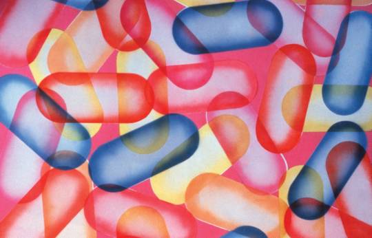
From these sources I gathered that Bernstein was a loved man and had endless fun during his prime, but was also troubled my drug abuse; even painting pills and such as his subject matter:
https://www.vogue.com/article/richard-bernstein-starmaker-book
Bernstein knew the stars, partied with the stars and painted the stars. I appreciate his work for its use of colour and outrageousness. He is most known for painting Interview magazine covers (Andy Warhol’s magazine), for 17 years. I will use this as a focus in my questions and answers as it relaters the most to communication design; and therefore can be related to it’s influence for today’s designers.
0 notes