
"Wisdom puts light in the eyes, And gives gentleness to words and manners." - Ecclesiastes
Don't wanna be here? Send us removal request.
Statistics
We looked inside some of the posts by revivewisdom and here's what we found interesting.
Average Info
Notes Per Post
0
Likes Per Post
0
Reblog Per Post
0
Reply Per Post
0
Time Between Posts
1 month
Number of Posts By Type
Text
15
Photo
2
Last Seen Tumblr Blogs


Fun Fact
Tumblr has a 66 index score for customer satisfaction in the US.
Text
Write In Primal Terms
Make a website a caveman could understand 🍌
Hey, thanks for visiting the blog! Quick heads up — this is a micro-post in a long running series called Your Website Sucks — Let’s Fix That. If you find what’s written here useful, check it out!
People care about what they want. Not always what they need.
Don’t waste your time convincing people why they need what you have to offer. Ask yourself: “why should they care?” Then lead with how you’re offering improves their life.
Find what primal desires your website can connect with. Here are just a few:
Survival
Protection
Freedom
Comfort
Pleasure
Relationships
Success
Likability
More here!
Another way to think about this is in the context of storytelling. People respond to situations they can imagine themselves in. Or put another way, things a caveman would understand.
How does this change your website? Tweak you language in a way that communicates the value you bring.
If you find it hard to communicate this, check out some folks who I believe do this well. Here’s some primal language in action:*

Norn

The Sill

Breather

Petal

Anywhr
* Special thanks to Miguel Ferreira of HeyNishi for curating these amazing examples of primal language.
Thanks for reading! Want to learn more? Subscribe to my personal newsletter:
https://medium.com/media/6684692494ad3cb7e3cde9870363d7c6/href
This series of articles is constantly evolving and always open to improvement. If you have any thoughts don’t hesitate to reach out. Feel free to drop me a note at [email protected]
Need help with your website? Check out my portfolio, or give me a shout!
Cheers, 🍻
- Josh @kraahkan
Cover photo by JOHN TOWNER on Unsplash
from Stories by J.D. Lindsay on Medium https://ift.tt/3f6X28a
0 notes
Text
Audit Your Website
Shortcut your success by getting metrics on your website 📊
Hey, thanks for visiting the blog! Quick heads up — this is a micro-post in a long running series called Your Website Sucks — Let’s Fix That. If you find what’s written here useful, check it out!
There are no shortage of tools to audit your website. These websites are great as they provide personalized metrics on how to better improve your site’s speed, SEO, and much much more. Best of all — they are all free.
In this section I’ve compiled my favorites — the ones with the most actionable results. Run your website through all of these tools, and then jot down the actions it recommends you to take.

Pingdom is a great start to auditing your website
Be advised — take each recommendation with a grain of salt. Some tools may throw out warnings as a result of small, unimportant errors. But (for instance) if each tool tells you your images are unoptimized, listen!
PageSpeed Insights Google’s scores are perhaps the most important, as the results directly impact your website’s SEO.
Website Grader A very simple tool. If you’re only looking for a basic look of what you need to improve, use this.
Pingdom — A very popular tool with multiple test locations (test your site from multiple of these locations so you get an idea of how your website loads overseas).
Woorank — A tool specifically designed for you to take action that will move you up in Google.
Unfurls — If you are at all interested in having your website shared on social media, make sure you meet the standards of this tool!
With most of these tools, don’t stress about achieving the “A+” rank. Very few websites are able to achieve that. Focus on improving what you have, as moving from a “C” — to a “B” is a lot of effort.
Thanks for reading! Want to learn more? Subscribe to my personal newsletter:
https://medium.com/media/6684692494ad3cb7e3cde9870363d7c6/href
This series of articles is constantly evolving and always open to improvement. If you have any thoughts don’t hesitate to reach out. Feel free to drop me a note at [email protected]
Need help with your website? Check out my portfolio, or give me a shout!
Cheers, 🍻
- Josh @kraahkan
Cover photo by Chris Ried on Unsplash
from Stories by J.D. Lindsay on Medium https://ift.tt/2UlyoZk
0 notes
Text
Talk About What Actually Matters
Understand your website visitors 👀
Hey, thanks for visiting the blog! Quick heads up — this is a micro-post in a long running series called Your Website Sucks — Let’s Fix That. If you find what’s written here useful, check it out!
Understand your ideal customer better than they know themselves.
Good writing comes from understanding your audience. Know who you’re talking to, and you can speak with relevance.
How do you know you’ve achieved this? Understand your ideal customer better than they know themselves. Once you achieve that, you’ll be perfectly positioned to speak to them persuasively.

One great way to understand your website visitors is a tool like Hotjar
Beyond the Principle
To start, get in the mindset of your average website visitor. Ask yourself: “why should I visit this website?” If your website offers something of value, the answer is easy.
Of course, offering value is not straightforward. And communicating value can be just as difficult. Start with simple questions:
Who is the product/service for?
What is their main struggle/problem?
How will we help them overcome that difficulty?
What does their life look like afterwards?
By asking yourself the right questions, you can narrow down what your customer will best respond to. And with practice, you can generate solid copy for your website by simply answering good questions. For instance (for my own business)…
Who is the product/service for? Small businesses and creative folks.
What is their main struggle/problem? Building a website is hard.
How will we help them overcome that difficulty? Gorgeous designs, great writing, and competitive pricing.
What does their life look like afterwards? Beautiful website that sell on their behalf.
If you’ve answered these questions well, the answers will be short and simple.

Other examples of good questions from Justin Jackson
Going Further
What else? Look at the writing on your website, and eliminate anything that isn’t relevant to a potential customer. It’s common sense — only keep things that are useful!
For those who want to take this approach further — get in your audience’s frame of mind Ask yourself — “Why do people visit your website?” It’s usually for multiple reasons: to see what you’re about, where you’re located (address), to find a contact form, to compare you with a competitor, and if you’re lucky — to do business with you!
Brainstorm all these reasons, and make sure your website makes each intent easy to fulfill. A common frustration for website visitors is not being able to find what they want. Your website is a first impression, and must be a friction-less experience.
Thanks for reading! Want to learn more? Subscribe to my personal newsletter:
https://medium.com/media/6684692494ad3cb7e3cde9870363d7c6/href
This series of articles is constantly evolving and always open to improvement. If you have any thoughts don’t hesitate to reach out. Feel free to drop me a note at [email protected]
Need help with your website? Check out my portfolio, or give me a shout!
Cheers, 🍻
- Josh @kraahkan
Cover photo by NOAA on Unsplash
from Stories by J.D. Lindsay on Medium https://ift.tt/2YHOTSm
0 notes
Text
Don’t Get Compromised
Three things to do to keep your website safe & secure 🔐
Hey, thanks for visiting the blog! Quick heads up — this is a micro-post in a long running series called Your Website Sucks — Let’s Fix That. If you find what’s written here useful, check it out!
For too long, security has not been a priority for website owners. This is no longer something anyone can afford. Google has started cracking down, and if you don’t take care of basic security, they will rightfully penalize you in search results.
The good news — the simple things you might not be doing don’t take long to fix. Taking care of the basics makes it much more difficult for your site to be compromised, and ensures that in worst case scenarios you will still have copy of your website.
For a small site, you can take care of the basics without any outside help. Here’s where I recommend you start:
Sort out Passwords
None of the next steps matter if your website isn’t protected with a good password. While you’re doing this, make sure your current passwords aren’t out there in the wild. A well designed password is useless if it’s already in possession by a potential intruder.
(Always create passwords that are both secure and easy to remember. There’s no point in a password you’ll forget.)
If you already have a myriad of passwords to remember, I highly recommend using software for aid. Here’s a couple to consider:
1Password
LastPass
Google Passwords

I personally use LastPass
Use SSL
If you don’t have SSL on your domain, Google is visibly marking you as insecure. Fixing this is easy, as many technologies like Let’s Encrypt have emerged to make the whole process much easier.
Using Cloudflare is my recommended solution, since it’s quick, painless, and improves a whole lot with a simple install. Analytics, better speed, traffic monitoring… In my estimation, the bevy of features it adds make it a must have.


Create regular backups
Security isn’t only about the safety of your website visitors. It’s also about the future of your site. Websites get hacked all the time, with Wordpress owners accounting for the largest percentage. For website owners not keeping regular backups, you risk losing your entire website. Nobody wants to rebuild a site from scratch.
If you’re on Wordpress, hosting solutions like Flywheel and Siteground make this easy. There are plenty of plugins to help with this too.
My rule of thumb? Always have (at least) two backups. When protecting the life of your site, redundancy is good!
If you have trouble choosing a backup solution for Wordpress, I highly recommend this article to find the the best solution for you.
Don’t get intimidated
For those new to the website world, don’t be intimidated by any of this. If you take care of the aforementioned details, you’ll be covered even for the worst of scenarios. If you need help with any of this, drop me a line.
Thanks for reading! Want to learn more? Subscribe to my personal newsletter:
https://medium.com/media/6684692494ad3cb7e3cde9870363d7c6/href
This series of articles is constantly evolving and always open to improvement. If you have any thoughts don’t hesitate to reach out. Feel free to drop me a note at [email protected]
Need help with your website? Check out my portfolio, or give me a shout!
Cheers, 🍻
- Josh @kraahkan
Cover photo by Joshua Sortino on Unsplash
from Stories by J.D. Lindsay on Medium https://ift.tt/2V77unt
0 notes
Text
Whatever You Do, Make It Beautiful
Your website’s design can elevate your work 🔥
Hey, thanks for visiting the blog! Quick heads up — this is a micro-post in a long running series called Your Website Sucks — Let’s Fix That. If you find what’s written here useful, check it out!
Make your first impression count! That’s a mantra often repeated for face to face interactions, and it importance certainly applies online.
Every small decision you make builds a persona. And every design decision on your website builds an impression. Even if a first time website viewer doesn’t convert, an enjoyable experience creates a positive experience that may drive them back later.

I find that beautiful & simple go hand in hand. See Open Habits
Where to start
For a beginner, the best way to improve is from looking at the best. Creating a website is a long process, and it’s easy to lose sight of the end goal. Don’t let this happen. The best way to create something awesome is to have a picture of success.
Don’t be afraid to look at what folks are doing in other industries! It doesn’t have to be a specific design that inspires you, it can be the more essential things: writing, fonts, colors, layout, etc. All of these work together for an awesome web experience.

Beautiful landing pages don’t have to be complicated. Take LucidDreamBot
These sites are how I look for ideas when designing websites. If you’re thinking about a redesign, I highly recommend these collections:
HeyNishi Knock-out websites with a knack for copy-writing. If your website’s writing is boring, look for inspiration here.
One Page Love Great websites done in one page. Many websites can accomplish as much in one page as they do in half dozen.
Land-book If I had to pick one, this collection is likely the most consistently beautiful. Really great stuff!
My Own Personal List If you know of a kickass website, let me know! I love bookmarking beautiful websites.

Beautiful websites communicate a lot while sacrificing little. See Rob Walling
Whatever you do, have a vision of success. Find website designs from all sorts of industries, and see if they would work well for you brand. And stayed inspired. Inspiration is a well for creativity.
Thanks for reading! Want to learn more? Subscribe to my personal newsletter:
https://medium.com/media/6684692494ad3cb7e3cde9870363d7c6/href
This series of articles is constantly evolving and always open to improvement. If you have any thoughts don’t hesitate to reach out. Feel free to drop me a note at [email protected]
Need help with your website? Check out my portfolio, or give me a shout!
Cheers, 🍻
- Josh @kraahkan
Cover photo by Gatis Vilaks on Unsplash
from Stories by J.D. Lindsay on Medium https://ift.tt/32YrH2m
0 notes
Text
Pay Attention To The Competition
Your website shouldn’t reinvent the wheel, so look to the stars 🔭
Hey, thanks for visiting the blog! Quick heads up — this is a micro-post in a long running series called Your Website Sucks — Let’s Fix That. If you find what’s written here useful, check it out!
Whether you’re an artist, writer, or business — you’re always in competition. It could be for people’s money, but it’s always for their attention.
Competition doesn’t feel like a gift. It’s great for the customer, but is often more work for you. You’ve got to stand out, differentiate yourself, and make yourself heard among many other other voices.
Despite this, it isn’t all bad. Websites are a window into your competition’s strengths and weaknesses. If you pay careful attention, their websites are an opportunity to discover your weaknesses and improve.
A shortcut for success
A competitor’s website can be a roadmap for success, or an example of what not to do. By observing what other folks are doing online, you can learn from their mistakes and take note of their strengths.
The easiest way to get started? Look at what your competitors are bragging about. If you have similar (or better!) metrics, say so!
Also be sure to read between the lines. Be aware of what your competitors aren’t talking about — it might be an opportunity to set yourself apart.

Other folks like Mukund Mohan can explain this in great detail.
To improve your website, search the websites of folks who have “made it” and deconstruct them. Find local examples close to your domain, and global winners. Treat them as potential models of success, and ask yourself the following:
How do they phrase the problem they are trying to solve?
What “better life” are they offering in relation to the problem?
Are there specific keywords/phrases they are all using?
What metrics do they talk about?
Here’s some more…

Despite everything I mention here, heed the advice in this excellent article.
Figure out what you do best, and state it in a concise and positive way. You don’t always have to make direct comparisons (although it can be great for SEO). Just make sure you’re focusing on your strengths rather than someone else’s faults.
More broadly, this is advice is about looking beyond yourself for help. Talk to people just a few steps ahead and get their insight. Mentors are an amazing shortcut.
Thanks for reading! Want to learn more? Subscribe to my personal newsletter:
https://medium.com/media/6684692494ad3cb7e3cde9870363d7c6/href
This series of articles is constantly evolving and always open to improvement. If you have any thoughts don’t hesitate to reach out. Feel free to drop me a note at [email protected]
Need help with your website? Check out my portfolio, or give me a shout!
Cheers, 🍻
- Josh @kraahkan
Cover photo by Kristopher Roller on Unsplash
from Stories by J.D. Lindsay on Medium https://ift.tt/2UCKsq5
0 notes
Text
Use Beautiful Typography
Don’t use the default font 🤵
Hey, thanks for visiting the blog! Quick heads up — this is a micro-post in a long running series called Your Website Sucks — Let’s Fix That. If you find what’s written here useful, check it out!
An eye-catching font is an easy win for your website. There are so many beautiful web-friendly fonts to make use of. And in the land of typography, it doesn’t need to be fancy to be effective.
In design, every choice you make is a chance to set yourself apart. For a business, it’s your chance to differentiate from the competition. And for artists: that’s at the heart of what you do.
You don’t need an in-depth knowledge of typography to make a great looking website. Typography has gotten more accessible, and there are many excellent resources for those willing to learn (here’s my favorite).
What follows are five of my favorite fonts that I regularly use, due to their readability and distinct styles. Whatever you choose, I highly recommend using a font that reflects the personality of your brand.
Want to curate your own fonts? Do it! Browse Google Fonts, or use creative tools to find the perfect pairing.
The fonts…

Roboto is compact and highly readable.

Montserrat has a bold but approachable feel.

Raleway is elegant with a distinct style.

Open Sans doesn’t sacrifice readability for aesthetics. My most used font.

Playfair Display is simply gorgeous, great for styled titles.

Work Sans is another highly readable font with a solid aesthetic.
Thanks for reading! Want to learn more? Subscribe to my personal newsletter:
https://medium.com/media/6684692494ad3cb7e3cde9870363d7c6/href
This series of articles is constantly evolving and always open to improvement. If you have any thoughts don’t hesitate to reach out. Feel free to drop me a note at [email protected]
Need help with your website? Check out my portfolio, or give me a shout!
Cheers, 🍻
- Josh @kraahkan
Cover photo by Karl Fredrickson on Unsplash
from Stories by J.D. Lindsay on Medium https://ift.tt/35tvm7R
0 notes
Text
Avoid The Worst Stuff
Don’t let your website fall prey to common problems ❌
Hey, thanks for visiting the blog! Quick heads up — this is a micro-post in a long running series called Your Website Sucks — Let’s Fix That. If you find what’s written here useful, check it out!
There are a lot of bad websites. Even more mediocre ones. Why?
As the modern web grows more complicated, the number of ways to fail has increased. Navigating these potential problems is tricky. And a website becomes bad when it takes on too many of these issues.
Here are just a few:
Slow loading times
Obnoxious popups
Uninspired writing
Buried contact information
Dozens of useless pages
Lack of mobile support
Dense company jargon
Bad photos
Ugly colors
Unclear pricing
Boring company history
There are so many….
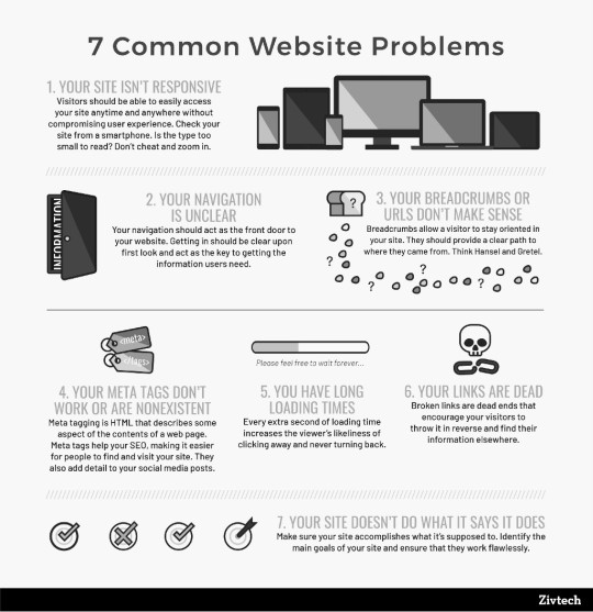
Courtesy of Zivtech
The truth is, it’s not enough to want to create a great website. Even if you know what success looks like, it’s easy to fail. Although it’s important to aim at greatness, you must be aware of what failure looks like. That’s where this list comes in.
Consider these issues a checklist of what not to do. An anti-checklist. This series offers a lot of the solutions, others you will have to research for yourself.
Once you’ve eliminated all of these issues, you’re site will be in a much better place:
(This is a personal list of mine that is by no means finished. It’s constantly evolving, and if you see something that’s missing — do send me a message! Would love to hear from you: [email protected])
Slow loading times
No obnoxious popups
Uninspired writing — never write something boring
Buried contact information
Dozens of useless pages
Missing metadata
No minification
Lack of mobile support / responsive design
Dense company jargon
Lengthy contact forms
Inconsistent design patterns
No favicon
Quickly moving carousels
Uncompressed or ugly photos
Broken links
Unreadable and inconsistent fonts
Poor grammar
Ugly colours
Big banners
Unclickable buttons
Lack of whitespace
Unclear pricing
Boring company history
Thanks for reading! Want to learn more? Subscribe to my personal newsletter:
https://medium.com/media/6684692494ad3cb7e3cde9870363d7c6/href
This series of articles is constantly evolving and always open to improvement. If you have any thoughts don’t hesitate to reach out. Feel free to drop me a note at [email protected]
Need help with your website? Check out my portfolio, or give me a shout!
Cheers, 🍻
- Josh @kraahkan
Cover photo by Benjamin Davies on Unsplash
from Stories by J.D. Lindsay on Medium https://ift.tt/35a8kU4
0 notes
Text
Define Your Conversion
Before you design a website, get clear on your goal 🎯
Hey, thanks for visiting the blog! Quick heads up — this is a micro-post in a long running series called Your Website Sucks — Let’s Fix That. If you find what’s written here useful, check it out!
Why make a website in the first place? Many folks know intuitively, but it’s important to know for yourself.
Here’s a couple common answers you’re likely to have:
“To get more customers”
“To share my art”
“Grow an email list”
“Showcase my portfolio”
Many more…
The answer is likely personal, and it’s important to define it. However, if your answer doesn’t go beyond what listed above, it’s not enough. You need something better.
All of the above desires are great. But they’re not specific enough to get any results. “Getting more customers” isn’t a plan, it’s a goal. If that’s where the planning for your website ends, you’re doomed to fail.
It’s time to define success
Every successful website is built around a call to action. Or put another way, a conversion. It’s most often a button representing the action we’d like a potential customer (or website visitor) to take. It’s your definition of success.
(Those of you already versed in these terms — forgive any minor inaccuracies. I’m keeping it simple).

A few well designed social CTAs
Let’s say your an artist — people looking at your portfolio is not your conversion. You want your audience to take action: buy your album, see you on tour, etc. A better conversion might be to “join us on social media”, or “subscribe to my newsletter”.
No matter your context — build your website with a specific action in mind. Getting a customer doesn’t end with them visiting your website. It’s a phone call, email, booking… however your business operates. So many websites aren’t clear on prompting their visitors to take the next step. Make it easy!

Hotjar gives you the tools to track the success of your call-to-action
Here’s some good call to actions:
Sign up for my email list
Send us an email
Call Now
Book now (If your budget allows for it, I recommend directing them here)
More in action here
Consider your call to action your last word, final note, or the end all. It’s the entire point of your website. If something on your website doesn’t contribute to convincing folks to click a call-to action, axe it.

Call to actions should be bright, so they draw a user’s attention.
There’s a lot more to say on call-to-actions, so if you have some time I recommend studying from the best. The best way to learn is with great examples in mind.
Thanks for reading! Want to learn more? Subscribe to my personal newsletter:
https://medium.com/media/6684692494ad3cb7e3cde9870363d7c6/href
This series of articles is constantly evolving and always open to improvement. If you have any thoughts don’t hesitate to reach out. Feel free to drop me a note at [email protected]
Need help with your website? Check out my portfolio, or give me a shout!
Cheers, 🍻
- Josh @kraahkan
Cover photo by Andrew Coelho on Unsplash
from Stories by J.D. Lindsay on Medium https://ift.tt/2WQii9X
0 notes
Text
Tell A Compelling Story
Don’t let your website be boring 😴
Hey, thanks for visiting the blog! Quick heads up — this is a micro-post in a long running series called Your Website Sucks — Let’s Fix That. If you find what’s written here useful, check it out!
When you talk about yourself online, don’t bore people with needless details. Everyone’s a stranger, so don’t waste their time.
When it comes to your website, most people stick around for about 15 seconds. If you want them to stay, give them a reason to. You need a hook.
Talk about what’s unique about you
A timeless hook for any website is a great story. Don’t know where to start? Try something personal: talk about your past, present, and future.
If you find it difficult to summon a story, try asking yourself some interesting questions. Write what occurs to your first:
Where did you come from?
What challenges have you overcome?
What victories have you had?
What drives you?
What goals do you have?
What’s in store for the future?
Truthfully answering is key. Once you have the basics down, look beyond. To tell a compelling story, talk about something primal. Put simply — talk about what other people can relate to: struggles and victories.

Great storytelling by RxBar
It doesn’t always come easy
Struggling to come up with anything compelling? Don’t overcomplicate it — a bio doesn’t need to be longer than a few sentences. Make sure your framing what you say in an honest and positive light. It’s not worthwhile to fake the personal.
But of course, this isn’t easy. Telling a story about yourself requires self-awareness. If you find yourself unable to tell your story, cover the basics with a template. It’s a start!

Stamatic has a great About page.
Don’t worry about nailing your bio on a first attempt. Your life is constantly changing, and your story isn’t yet finished. Periodically updating your website is a chance to evaluate your past, present and future. Focus on communicating something authentic today, and leave perfection for the future.

Flywheel does a fantastic job at showing off their company’s history
Thanks for reading! Want to learn more? Subscribe to my personal newsletter:
https://medium.com/media/6684692494ad3cb7e3cde9870363d7c6/href
This series of articles is constantly evolving and always open to improvement. If you have any thoughts don’t hesitate to reach out. Feel free to drop me a note at [email protected]
Need help with your website? Check out my portfolio, or give me a shout!
Cheers, 🍻
- Josh @kraahkan
Cover photo by Philippe Toupet on Unsplash
from Stories by J.D. Lindsay on Medium https://ift.tt/2OnSe3S
0 notes
Text
Leverage Your Strengths
Make a website unique with your strongest asset: YOU 😎👈
Hey, thanks for visiting the blog! Quick heads up — this is a micro-post in a long running series called Your Website Sucks — Let’s Fix That. If you find what’s written here useful, check it out!
Many folks prefer to hide behind business jargon and the anonymity of their brand. There’s certainly a place for this.
But for those struggling to to connect with their audience — don’t be afraid to show your face and communicate your story. Showcasing yourself is a chance to differentiate.
In practice, this can range from a full bio, a short blurb, or infusing yourself and your sensibilities into every part of your brand!
Need a better reason? You already know it — people like honesty, and they respond to authenticity. When you put at least a little of the personal side on display, it immediately sets you apart.
(This tip is one of the simplest, but most effective. Leveraging your strengths in any context is an easy win.)
If you’re a business, it’s often not just you. Your team is as important to customer success as your are. Any website that doesn’t spotlight them is missing out.
More importantly, putting you and your team out there communicates that you are real. Spotlight them — happiness attracts!

A simple example of how to showcase your team
Of course, don’t overthink this. You might not feel comfortable putting yourself out there. Take small steps, do what feels right, and perhaps revisit this later. There are other easy wins for your website if this is a big commitment.
At its core, putting yourself out there is about honesty. Don’t pretend to be something you’re not, even online.
I’ll end with a couple examples of how you might showcase yourself online:

Alexander Lam’s bio is his website. And it works!

Rob Walling’s homepage is short, to the point, and a great model for anyone’s bio.

Tim Ferris’s credentials are impressive, and his bio is a great model for those with an accomplished career.

Love what Ethan is doing with Kanbanmail. It’s honest and to the point.
Thanks for reading! Want to learn more? Subscribe to my personal newsletter:
https://medium.com/media/6684692494ad3cb7e3cde9870363d7c6/href
This series of articles is constantly evolving and always open to improvement. If you have any thoughts don’t hesitate to reach out. Feel free to drop me a note at [email protected]
Need help with your website? Check out my portfolio, or give me a shout!
Cheers, 🍻
- Josh @kraahkan
Cover photo by Graham Holtshausen on Unsplash
from Stories by J.D. Lindsay on Medium https://ift.tt/2LuFtl6
0 notes
Text
Use Awesome Media
Bad images (and video) kill a website 📸
Hey, thanks for visiting the blog! Quick heads up — this is a micro-post in a long running series called Your Website Sucks — Let’s Fix That. If you find what’s written here useful, check it out!
Finding good photos on a shoestring budget used to be next to impossible. Now it’s easier than ever! Thanks to amazing websites like Unsplash, no website needs to have terrible photos.

Originally a simple Tumblr blog, Unsplash has become an incredible resource for folks online.
Keep in mind that particular stock photos have become overused. If you browse the web extensively, you’ll immediately recognize some of Unsplash’s more popular stock.
(If you’re a perfectionist like me, it can be overwhelming to find the perfect photo. If you’d like a great one without all the fuss, check out my curated collections).
Additionally, if you want something truly unique — branch out! There are hundreds of less popular (although still great!) free stock sites that guarantee something special. Here are a couple of my favorites:
New Old Stock Incredibly varied vintage photos, perfect for websites with a particular aesthetic.
Free Nature Stock Royalty-free nature stock from the talented Adrian Pelletier. Lots to choose from!
Pexels Like Unsplash, but different content.
I’ll also highlight two amazing stock video sites. Do take a look if you need stock video:(But make sure your videos are compressed before using them on a website)
Pixabay Also a great source for stock photos, they have a large library of video.
Coverr If you want to liven up your website with a video cover, I can’t recommend this site enough.
With all of this said, if you have the budget to invest in a photographer or videographer — I highly recommend it. Having media unique to you is yet another chance to stand out. That’s the name of the game.
If you do use free stock, be sure to give credit where it’s due. I’ll admit I haven’t done this consistently myself, and it’s a 2019 resolution of mine to get better at it. Hope you’ll commit to the same.

Unsplash makes crediting easy. Try it!
Thanks for reading! Want to learn more? Subscribe to my personal newsletter:
https://medium.com/media/6684692494ad3cb7e3cde9870363d7c6/href
This series of articles is constantly evolving and always open to improvement. If you have any thoughts don’t hesitate to reach out. Feel free to drop me a note at [email protected]
Need help with your website? Check out my portfolio, or give me a shout!
Cheers, 🍻
- Josh @kraahkan
Cover photo by Jeremy Bishop on Unsplash
from Stories by J.D. Lindsay on Medium https://ift.tt/32wPnJA
0 notes
Text
Improve Your Writing
Go beyond spell check for a better website✍
Hey, thanks for visiting the blog! Quick heads up — this is a micro-post in a long running series called Your Website Sucks — Let’s Fix That. If you find what’s written here useful, check it out!
The quality of your website’s writing is a multiplier for success. And in 2019, there’s no shortage of resources to help you improve.
Of course, learning to be a great writer doesn’t happen overnight. But a small change each day can make all the difference.
Take the tools presented here as that “small change.” They’re micro apps designed to fit into your workflow, elevating your writing day by day.
Hemingway
Have a paragraph that’s creeping above 100–200 words? Maybe your blog post is getting too wordy? There’s an easy solution.
Hemingway spots inefficiency in your writing and keeps you on point. Whenever you’re writing and intuit a problem, copy the whole section into Hemingway for instant help.

An example of Hemingway in action
Typely
Sometimes you need a second opinion. Typely is not shy of critiquing your writing. It provides useful stats such as reading level, reading time, and much more. As a complex alternative to Hemingway, Typely is fantastic.

A couple of the metrics Typely updates in real time.
Grammarly
Essentially a glorified spellchecker, Grammarly’s free plan doesn’t offer much. But if you’re interested in a dramatic change, it’s premium plan is certainly worth a look.
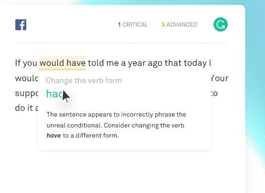
Grammarly’s UI is certainly a looker
I recommend double checking all of your website’s writing in at least one of these tools. Investing in quality copywriting is a choice you’ll never regret. Your website will read more clearly, and you’ll be able to communicate much more in fewer words.
Thanks for reading! Want to learn more? Subscribe to my personal newsletter:
https://medium.com/media/6684692494ad3cb7e3cde9870363d7c6/href
This series of articles is constantly evolving and always open to improvement. If you have any thoughts don’t hesitate to reach out. Feel free to drop me a note at [email protected]
Need help with your website? Check out my portfolio, or give me a shout!
Cheers, 🍻
- Josh @kraahkan
from Stories by J.D. Lindsay on Medium https://ift.tt/2MxraPu
0 notes
Text
Make It Visual & Fun
Your website should be a positive first impression ⭐
Hey, thanks for visiting the blog! Quick heads up — this is a micro-post in a long running series called Your Website Sucks — Let’s Fix That. If you find what’s written here useful, check it out!
Humans are visual creatures. And with the number of boring websites online, you can easily set yourself apart by being visual.
There’s no shortage of ways to do this. Have a look at the link if you’re in need of ideas. But in this article I’ll focus on one of the fastest.
Implementing icons is an easy win. They’re a fun visual aid which immediately make your website easy to scan. Like using bullet points, icons make anything you write digestible and more engaging.
Libraries like IcoFont make doing this a breeze. Here’s how I use them on my portfolio:

From my portfolio
Icons can be visual flair in endless contexts. Categories, buttons, labels — get creative! They make your content easily scannable, and interesting to look at.

I also highly recommend Fontawesome
If you’re creating something personal — a great alternative to icons are emojis. They’re more universal, and great for speaking to your audience in a casual context. Plugins like Emoji CSS enable your website to display them anywhere (even traditionally unsupported platforms like Windows 7).
The research on emojis is also surprising* (they’re more than funny pictures):
- Looking at a smiley face seems to be equivalent to seeing a human face in real life.
- They improve enjoyment, and the perceived richness of your messaging.
- 92% of people use emojis.
Doubting the professionalism? Don’t fret, brands across the globe appreciate the power of emojis.
That said, this isn’t a universal. If your business requires absolute professionalism, perhaps steer clear (icons are just as good). And if you suspect your specific audience isn’t a great match, don’t sweat it.
*Special thanks to Neil Patel for curating the sources for the emoji studies.
Thanks for reading! Want to learn more? Subscribe to my personal newsletter:
https://medium.com/media/6684692494ad3cb7e3cde9870363d7c6/href
This series of articles is constantly evolving and always open to improvement. If you have any thoughts don’t hesitate to reach out. Feel free to drop me a note at [email protected]
Need help with your website? Check out my portfolio, and give me a shout!
Cheers, 🍻
- Josh @kraahkan
from Stories by J.D. Lindsay on Medium http://bit.ly/2WD6fQD
0 notes
Text
Your Website Sucks, Let’s Fix That
A path to improvement for website owners 🔨✨
(Want to skip to the tips? Scroll to down to the final heading for an index of all micro-projects)
Complex problems 🤔
There are a lot of bad websites. Even more mediocre ones. Why?
As the modern web grows more complicated, the number of ways to fail has increased. Navigating all of the potential issues is tricky.
A website becomes bad when it has too many of these problems. Some are obvious, others more subtle:
Slow loading times
Obnoxious popups
Uninspired writing
Buried contact information
Dozens of useless pages
Lack of mobile support
Dense company jargon
Bad photos
Ugly colors
Unclear pricing
Boring company history
There are so many….
Any of these sound familiar? I bet they do, almost everyone has been frustrated encountering these.
At best, websites with glaring issues scream mediocre. At worst, bad websites scar visitors with terrible first impressions.
Maybe you’re a website owner with these problems. Don’t worry — it’s not a unique situation. Large businesses and successful creatives around the world suffer from terrible websites.
These problems take talent to navigate. Designing a website requires knowledge from multiple domains (programming, writing, design, etc.) and many folks underestimate the skills required. And unlike popular belief, you can’t always do it yourself.
Although hard skills can’t be learned overnight, you can teach yourself a surprising amount in a short time. And if you need help, just ask!
Let’s be real — your website could be better. It might not be terrible, but it almost certainly has real issues. Let’s fix that.
(Need a web designer? I’m available for hire on redesigns and new builds.)
The way forward 🏃♂️🏃♀️
Solving these issues can seem difficult. Where do you start? Some problems are so glaring that they ruin the entire experience, where others are more subtle.
It doesn’t have to be this way. Many businesses are killing it. It’s not expensive either. You can DIY for next-to-nothing, or hire a designer for whatever your budget may be.
Before we begin, make sure you know what a good website looks like. Particularly if you are doing this yourself. There are so many ordinary websites, it’s important to know how to stand out. You may be surprised by what’s possible!
Here’s a couple places to browse:
HeyNishi Knockout websites with a knack for copywriting. If your website’s writing is boring, look for inspiration here.
One Page Love Great websites done in just one page. This is my own personal preference when designing budget websites, so I highly recommend a look. Many websites can accomplish as much in one page as they do in half a dozen.
Land-book If I had to pick one, this collection has the most consistently beautiful pages. Really great stuff.
My Own Personal List If you know of a kick-ass website, let me know! I love showcasing beautiful stuff.
Once you have some ideas of what you’d like to change (or if a complete redesign may be necessary), it’s time to create an actionable plan.
How to create a great website 🚀🥇
To start, you need a roadmap! Not just a tedious checklist (these can be helpful), but a personalized plan for success. That’s where this series of posts comes in.
Over the next few months, I’m publishing a series of articles detailing micro-projects: small tasks designed to improve a specific weakness of your website. You’ll be able to take these projects at your own pace, and start with what you feel confident in. A couple ways you can leverage these:
Use and copy into a blueprint for a redesign of an old website.
Use to inform an ongoing effort of improvement.
Implement in a few critical areas that need improvement, and then get back to your business.
Creating something awesome takes commitment, but it’s worth the effort. The pace and breadth of this project is up to you. The choice is yours.
(This series of articles is constantly evolving and always open to improvement. If you have any comments, questions, or suggestions don’t hesitate to reach out: [email protected]. I’m available to chat.)
Kickass Website Design (The list)
The full list, will be isn’t out yet, but will be soon! (Links coming as they are published).
Want to get these tips in your inbox? Subscribe to my personal newsletter:
https://medium.com/media/6684692494ad3cb7e3cde9870363d7c6/href
Need help with your website? Check out my portfolio, or give me a shout!
Cheers, 🍻
- Josh @kraahkan
from Stories by J.D. Lindsay on Medium https://ift.tt/2SSlJcH
0 notes

Photo

What is work to others, but feels like play to you - that's your superpower.
0 notes