
Don't wanna be here? Send us removal request.
Statistics
We looked inside some of the posts by revocounerculture and here's what we found interesting.
Average Info
Notes Per Post
0
Likes Per Post
0
Reblog Per Post
0
Reply Per Post
0
Time Between Posts
3 minutes
Number of Posts By Type
Text
17
Last Seen Tumblr Blogs


Fun Fact
Average visit duration of Tumblr.com is 10 mins and 25 secs.


Text
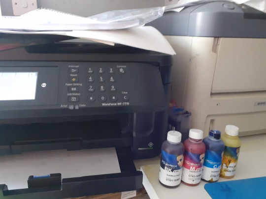


Sublimation printing
As an alternate to screen printing, sublimation printing meant I could printt more intricate designs withouut the time screens take to setup. The process involved printiing designs onto sheets that are then heat pressed onto fabric. The cemicals in the inks then turn to gas and fuse with te fabric. The issues I had with this is that: the designs were limited in size, they were almost too clean when printed, and I wanted to have a more imperfect look and because of te nature of this printing process, you can only print on polyester feabrics witch I preffered alot less to cotton. When printed however, It was helpful to be able to have the designs realised to see how they would look on colthing.
0 notes


Text
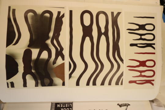
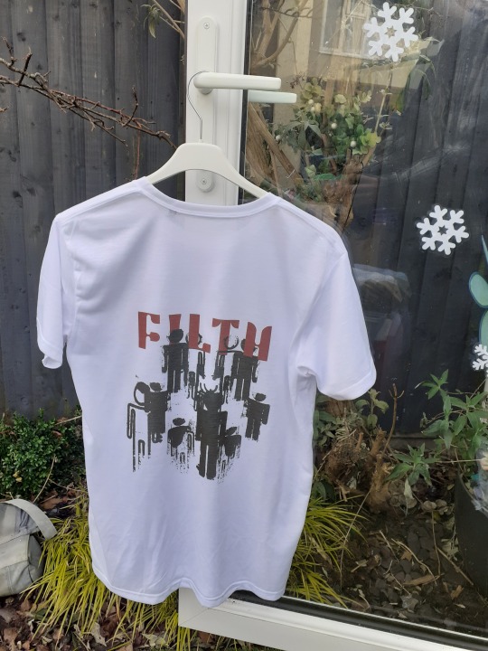
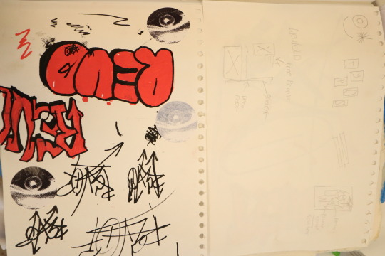
More logo experimentation
I wanted to look at manipulating type to create another possible logo that looked warped and imperfect. I made these by printing out texxt, then scanning it and moving the printed text out as it scanned.
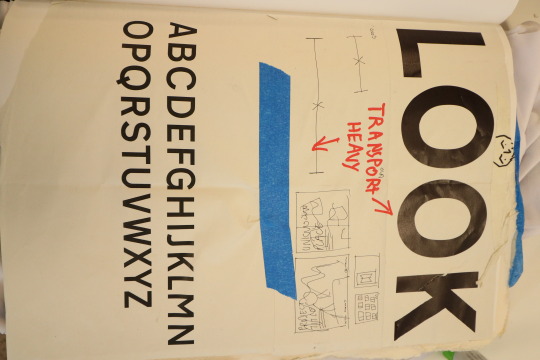
The font choice for this, and alot of other designs is Transport Heavy, the font used on roadsigns. I chose to use this as while it is a very clean and legible sans seriff font, It represents authority and conformity. To link this back to my ressearch, it could be sseeen to reperesent part of the modernist wold and the industrial revolution, and distoring it to use in this experiment, and in a non typical way for the shirt designs goes against that. Using a font that can be found usually to give instructions an dictate actions on a design meant to encourage non conformity and self expression.
0 notes
Text
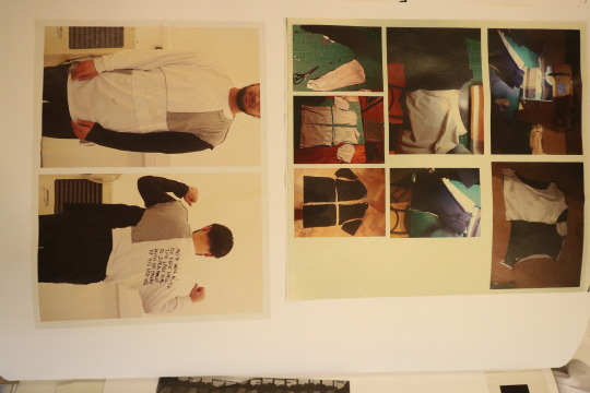
Creating a prototype.
To ensure I could carry on with this cconsept, I made a prototyppe of it with old tshirts, I cut them up into section and then sewed tem back together. Immidatly the problems present where that if they sizes weren't the same, pieces wouldn't line up and even if they are the same, ifferent fits affacted how they connect and lienup. This is managable however if the shirts I print onto are the same size and fit. This was useful to do as It showed where the challanges for creating an outcome will be in terms of sewing.
0 notes
Text

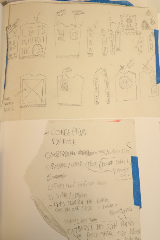
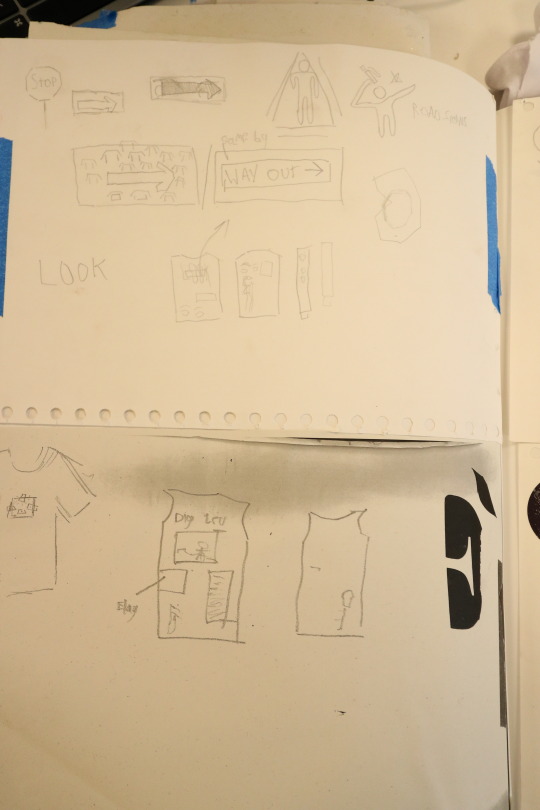
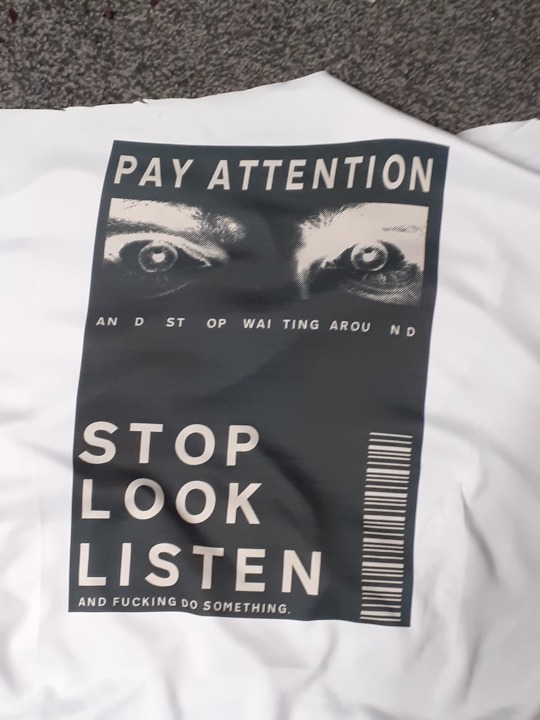
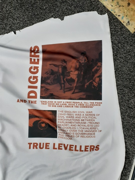
Planning design.
For the designs, I wanted each design to have a meaning and point to them. So to do this, I wrote down ideas for designs based on the subject first. These can be seen in the sketches. additionally, because of how I want the designs to be made, each one could be different, however I do wat an overall synergizing style.
0 notes
Text

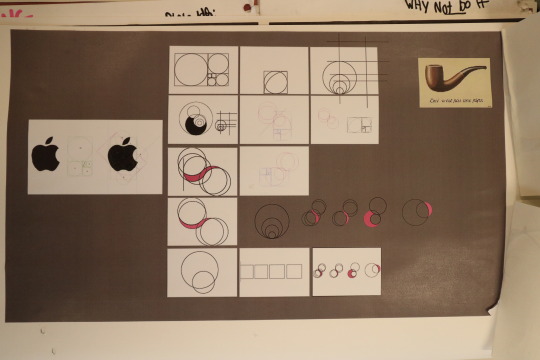


Design + logo planning
creating and then printing a logo based on the golden ratio and circles, usiing the contruction lines as part of the logo itself to further the idea of deconstruction.
0 notes


