
Don't wanna be here? Send us removal request.
Statistics
We looked inside some of the posts by rowanblanche-unit1 and here's what we found interesting.
Average Info
Notes Per Post
1
Likes Per Post
1
Reblog Per Post
0
Reply Per Post
0
Time Between Posts
21 days
Number of Posts By Type
Photo
13
Last Seen Tumblr Blogs


Fun Fact
When “GIF” was named word of the year in 2012, Oxford Dictionaries U.S.A. credited Tumblr for pushing the word.
Photo


Turn-around sheet including 3 designs of 2 characters. Each design has a overall look to them with different aspects so, what weapons and clothes but the general pixel faces and helmets stay the same to differentiate the two while also looking similar.
The premise of the animation was to create a animation of a point and click game, I decided to take inspiration from Oldschool runescape which is one of the largest point and click MMOs. It’s one of my favorite games so I would easily picked this, I also took a certain clip from a Youtuber having a fight with another youtuber and decided to re-create something similar with my own twist with added Anime cut-scenes where they over-dramatically shout the move they are about to do. The main animation would still look like a game but would have intermission scenes inbetween. I also thought it would be pretty funny.

Sketch of one of the characters shouting his move. The difference in detail on the face area is the most predominate change compared to the turn-around sheet and how it looks in-game. In the game view they have 2 black triangle blocks with a square mouth but in the cutscenes they have alot more detailed faces to give off more dramatic effect.

Colored and Digitized version.

The background was just pure imagination and some elements added in. In runescape they is a certain area where pentagon like shapes are drawn on the floor with demons walking around the area. The mountains in the back just gives the image depth and were completely random.

The difference between the colored and sketch version is that the details are more noticable and the drawings on the floor look less like a walk-way and more like markings. Alongside the mountains they is also a Volcano to give off more fantasy vibe.

One of the special attack sequences on the character. This will remain as a static image because its a cutscene between the actual movement and is just their to give off more action. It would also be hard to animate the movement of the attack due to lack of experience.

Switched position and added in background to show how it would look in the animation.

Added cutscene that will give an intro to one of the characters where a more confidence pose is shown to make the characters look over-confident and has an high ego (like the Youtuber I based this off).

Colored and added in background. The colored cutscenes also have an blurred out background to give a depth of field, so he doesn't look like hes stuck to the background but in front of it.

Head base for animate part. I decided to change how one character looked with a simple edit in his face. I prefer how this looks and gives the character a rogue-like vibe and he’s quiet and patient like a Ninja or Samurai.

First part of the animation where the character is shown walking to the main scene, the background is just a example of where he would be positioned in the finished animation.


Some of the heads look off and thats because I decided to use a base head for all of the frames rather then just trying to re-draw the head over and over. I don’t know why I didn’t think of this before drawing out all of the movements, but thankfully I managed to have one cycle animation looped once more. This means that the animation follows a certain movement with no miniature inconsistencies, like it would be in real life, but this is based for a game so perfected sequences in movement is how it would be. So instead of drawing 12 frames for example I’d draw 6.

0 notes
Photo


Task of the lesson was to have a digital render of Sofa by coloring in empty parts, adding texture and shading.
I went for a Light colored sofa because it’s just my general favorite, I was going for like a Lizard scale type texture to put in.
0 notes
Photo

Rotoscoping
The task was to produce a Rotoscope animation based on something we filmed ourselves with active movement. Drawing a frame-by-frame animation based on each movement I made. To do this is using software Adobe Flash that allows to split a video/film into 1 frame, allowing you to make a digitize animation based upon it
0 notes

Photo

Rotoscoping
What is Rotoscoping?
Rotoscoping is a form of animation that uses real life footage then drawing over each frame to create a digitized animation of a real life capture.
How does it work?
By hand drawing over motion capture footages frame by frame.
What are the Advantages/Disadvantages?
Advantages are its easier to capture body movements and other forms of movements by first videoing it then simply drawing over it. Other then watching how it moves then try replicate it through memory which would make it less realistic in a way
Example images of Rotoscoping

0 notes
Photo


Street View 2 Point Perspective
To start on creating the 2-Point Perspective I had to draw 2 Vanishing points in the middle of the page that are located on the left and right most side which would connect to each other in a triangular shape. Then place lines going down the middle line and 2 more lines close to the middle line on left/right ride which would give a very basic base to make a 2-point perspective drawing.
Sketching phase my initial idea would be a futuristic street that is very white and clean, so the buildings are based off that era of designs. It wasn't later into the sketching process I decided to go for a different idea which would be an outside corner of a space station. What took away most of my time was making sure the lines are straight, I like to draw in a Sketchy style were lines are messy so I was taking the whole drawing process slower. Which didn’t give me enough time for additional details I wanted to add in. What changed initially was hexagonal windows are now window shutters, Walk-way to the door, Circular bases under the station (which are meant to be thrusters)
The Photoshop process was mainly about completely re-creating the lines, I would go over all the lines on a new layer with brush tool and shift-clicking so its straight, and then remove the sketching layer. To keep things easy to edit I made new layers for Lines, Colors and Shading which made the whole process easier to manage. I wanted a very grey look because most space stations depicted by most sci-fi movies are mainly dark grey to light silver which also would make it easier to know its of metallic material (opposed to light blue or green).
For the glow and Light effects I used pen tool to select certain areas then fill them in, in the designated colors. To make them look more like lights also added in a Gaussian Blur and changed the opacity of the colors so they more resemble lights, I also had to take into consideration of the shading around light areas. What I would change is the shape of the lights, because lights don’t enclose they expose outwards.
0 notes
Photo


Drawing/Sketching Character.
Week 06 Task
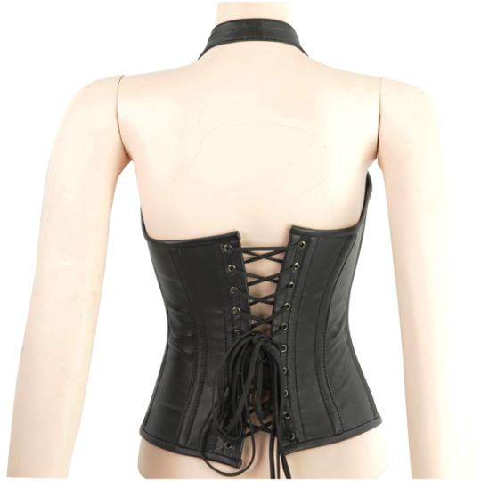
The task was to pick 2 things that would be merged into one, I got a Vampire, Big Cat type of person, a Vampire with Big Cat features. To portray the character is both vampire and has jungle cat features I dressed the character with a mixture of Victorian Gothic style and modern style vampire clothes. So tight pants, Corsets, Large boots, Lace gloves with finger claw addons. Then you would have to digitize it within Photoshop and color it in and can also use Dodge/burn to apply shading.
The corset design was based off most Victorian corset designs and I looked at many different angles of corsets to see how they looked in different perspectives. Because corsets are very tight around the body, the hip shape would be a profound shape and would also apply a push-up to the chest area. The texture of the corset is a mix of plain black and a Leopard pattern.

The pants are very basic tight type of leather pants and would be a silver-black color scheme to them.

The boot design is more drastic then the other type of clothing choices, I wanted to do something pretty spiky and Gothic and was based off a existing design I looked up.

I like the look of these because they have a Gothic/Steampunk vibe to them so I waned to give my character something similar but the heels and back-part being a lot more drastic, with added length and spikes.
The lace gloves I got the idea of because in my mind most female vampires from the Victorian era would be wearing lace gloves, initially they were going to be a transparent with a design on them but now I’ve decided they would be more opaque and fitting to the corset theme, Like the ones in the image below. The reason with the talons/claws on the fingers was because I’ve seen video games where people would have like “finger armour” that would only cover the finger because I thought it would be a easier alternative then drawing the infamous fingers that always look wrong.

For the facial details I had to incorporate cat features, so I gave the character the straight-line cat eyes, I also added in prominent fangs which can also be associated with jungle cats because they also have two large prominent front-teeth with vampire also having two larger teeth but would be more concealed inside the mouth, so making them visible with mouth closed could also be because of the feline features.
For the hair I decided to go with something more modern with half-shaved style, my inspiration for the hair design was based off a video game character called “Sombra”.

The things I would improve on is finer lines, less sketchy drawing and making it look more refined so in turn its easier to digitally color in because of the messy lines I had to fill in a lot of lines and completely redo certain areas so it would look better. I would want to also improve the time it took to create and the characters form, The back view character’s waist is bigger then the character’s in the front view so copying the overall shape of the character within the turn-around sheet I would also have to improve. It was the first time doing a turnaround sheet so I definitively think I did well into translating the different perspectives of the character. Going over digitally wasn't difficult but required a lot of time because of filling in gaps/lines and redoing certain areas, I used multiple of layers for different things. Instead of using the layer mask to go over the lines, I created layer named “Lines” which were I’d go over the previous hand-drawn part then in the layer mask erase the drawn lines so all that is left is the digital line. I also had a layer for color because removing lines would open up spaces that would need to be re-brushed on and magic wand tool didn’t fully select every part of the line and left small gaps around the edges.
For the side-view I couldn’t draw a decent looking face so I decided to cover it up with a mask, I was continuously practicing on the back of the sheet but I couldn't replicate one good sketch onto the character itself and was taking too much time to try draw the side-view face. so that I would want to improve on.
Doing the turnaround sheet made me overall better at drawing things like Shoes and faces alongside with hair, I normally draw characters in full-Armour/body suits and also gripping on a weapon or something as a way to cheat on not drawing feet/hair and hands properly.


0 notes
Photo


Week 5; Random Characters
For today finishing off Characters inspired by previous drawings, Because my drawings were more complicated shapes and had to base it around the initial body provided I decided to gather inspiration from other sources of simpler characters.
Q3; You would find 1:1 Body proportions mostly in little kids cartoon shows because it makes the character look more innocent and cute like a baby would since they also have pretty much a 1:1 Body proportion due to their large heads
Q4; For the third character I used a visual reference of colors from Skeletor and the hood idea came from a Character called Tali from the Mass Effect Franchise, the other two characters were just spontaneous imagination.
Q5; I
0 notes
Photo


Task; Body Drawing
For this task the subject was to draw Body on the proper proportions of 7.5 Heads and the draw the character you previously drew for the Evil/Cute head drawing. I took inspiration of the previous head and made the character more evil. This was good practice in drawing hands/feet (my only weakness) and proper perspectives of how they look, they still look off but I definitely see an improvement to previous attempts where I end up just covering up the hands/feet with an object.
Also had a draw a character the size of 2 heads so I drew a character that was made up of his own head as a lower body, they was no specifics so I draw more of a creature then a humanoid character.
0 notes
Photo


Task; Draw Character Head
The task was to draw a characters head of the subject or Cute or Evil, I don’t really draw neither types, I’m very neutral on how I draw characters so to represent “Evil” I just gave the character menacing eyes which could be taken as evil. The main focus of the character was a type of Parody of Aang (From the Last Airbender) but with a more metal and adult twist.
0 notes
Photo


On the first day of the lesson we had to Draw things from memory, the first thing we had to draw was a pistol from memory. I’ve played lots of games so I’m well acquainted with military weaponry so drawing a pistol from memory was difficult at all, I missed a couple of details but the overall idea was done correctly.
The second thing we had to draw is the side view of a Rhino’s head, Now I do not remember the last time I ever saw a Rhino so In my mind I had no idea where the horns were located and what they mouths looked like, I actually ended up drawing a Side view of a Triceratops instead.
The third thing we had to draw was the Map of England, I don’t really look at the map of England at all and last time I did Geography based on the map of England is long lost, All I knew was that they are certain areas that branch off like Plymouth and Wales, So I struggled with that one
The fourth thing was a Bicycle, Like the map of England I don’t really attune myself in the image of a Bicycle but because people occasionally use it to exorcise in the morning my memory of one is a lot more clearer then the map of England so it wasn't that hard at all.
The last 2 Images were 8 different logos we had to draw from memory, they were all popular logos so remembering them wasn't hard, the only one I couldn’t do was Subway because I’ve never been nor cared about Subway so I don’t really see the logo. I also got Mercedes wrong because I was basing it off the Ornament they put on cars which for some reason I thought they put a M on the Ornament instead.
0 notes
Photo


We Were tasked to making up our own Logo design using 4 different options. I picked the PRIDE Car Manufacturer design. Because some car manufacturers associate themselves with animals like Jaguar or a Horse (Ferrari) I decided to go with this approach as well.
Because of the name PRIDE I instantly thought of the Lion, because its known as the King of the Jungle and majestic type of animals and pride is associated with that.
What I fount hard was drawing out a Lion in a simplistic way, because they are mostly identified by their manes it was hard to replicate that without getting to complex. Also the angle of the Lion I couldn’t figure out which looked better a Side view or a Front view of the Lion’s face. The placing of the Lion’s head too was hard to come up with also, I tried different variations of locations to put the Lion’s head.
The Pride text was easy as itself because it was clear that it should be in all-caps, the font wasn't easy since I had to draw the font out so I just left that out and just worked on spacing between each later.
0 notes
Photo


As group we was lead to a Gallery event that showcased pictures on the Era between 1950s-1970s.
The reason I picked the car one because it just had a nice composition and I’m kind of interested in 1930s-50s type of cars like Chevrolet and Mercedes Benz. I also like the DOF effect presented where the blur is on the very front side of the road like your looking from this position the photo was taken.
The reason I picked the Portrait of the mourning woman because it stood out from the rest of the photographs. They all had the type of sad mood to it but they all had completely different subjects like a family in a room or people smoking outside. This one gives off a clear impression that the person in this photo is mourning a dead person, may it be her husband or a family member. the DOF is also very strong which I personally think it makes the main target stand out alot more.
0 notes