Graphic Arts Contextual Journal- MODULE 1 Creative Arts Practice Bath Spa University
Don't wanna be here? Send us removal request.
Statistics
We looked inside some of the posts by roxannespenceleygraphics and here's what we found interesting.
Average Info
Notes Per Post
8
Likes Per Post
8
Reblog Per Post
0
Reply Per Post
0
Time Between Posts
5 days
Number of Posts By Type
Photo
2
Text
9
Link
6
Last Seen Tumblr Blogs


Fun Fact
Hackers stole 65M passwords from Tumblr in 2013.
Photo
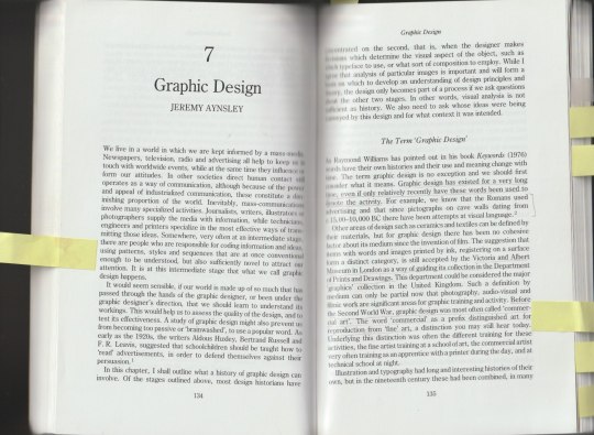
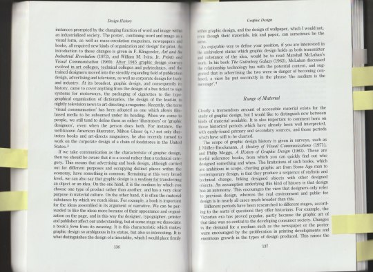

I read Design History- a students’ handbook by Hazel Conway.
Here are a few pages taken from Jeremy Aynsley’s Chapter which hones in on Graphic Design. I found this a very useful source as it suggest’s other books to read, referring to their topic. This is a book I will refer back to if ever in need, it highlights 8 various design topics throughout the book
1 note
·
View note
Text

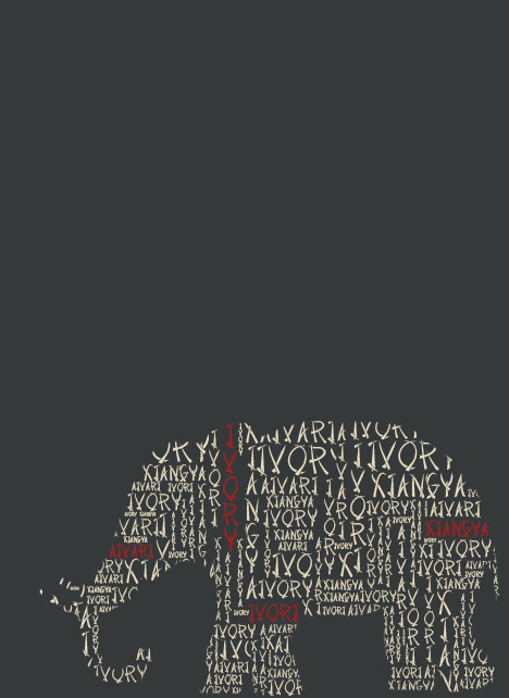
These are my final compositions I made for the 2021 poster. All 3 designs use the same green and blue/grey. I sampled these colours from the tones of an elephant. Originally they were on a white background however this didn't allow a large enough contrast between the typeface and the background. The colour of the font is an ‘off-white’ to reflect ivory. Overall I’m very happy with my final poster designs, I believe they convey the message and imagery of tusks as well as ivory. A topic that can sometimes be taken on in a uncomfortable manner, representing the pain and death that is a result of the ivory trade. I wanted to approach this with censored outlook, the posters could be displayed in any location regardless.
1 note
·
View note
Text
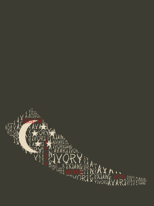

Here is another composition I made, however this time I incorporated the Singapore moon crescent and stars taken from their flag. I like this layout as it helps to enforce the idea in a clear comprehensible way. I purposefully positioned the tusk lower down the page, as I think the empty, bold colour of the background allows the eye to be drawn to the tusk.
0 notes
Text
Ivory - Tusk


For my 2021 composition I looked at Singapore banning domestic trade of Ivory. In Singapore they speak four different languages: English, Aivari, Malay and Mandarin. I experimented with using various different words however in the end I decided to focus on ‘Ivory’. Using the colour red, to represent blood, to highlight the four languages translation of ivory. A prominent idea I wanted to explore was using typography in order to create imagery.
0 notes
Photo
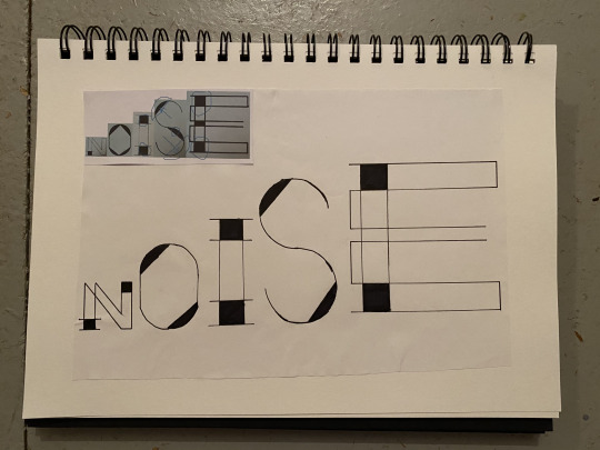

A1 Typographic Poster- Noise
This poster originated from focusing on the letter ‘n’. I began by refining the letter, creating various design using only ‘n’. Then using the word ‘noise’ I wanted to create a typeface that works together. Taking inspiration from the art nouveau movement, and various graphic artists I feel confident with my final design as it developed with a new sense of rhythm and movement.
1 note
·
View note
Link
0 notes
Text
Principles of Design
Balance- Take into account the visual weight of objects, colours, texture and space. Symmetrical balance uses elements on one side that are similar to those on the other side. In asymmetrical balance, the sides are different but still look balanced. Radial balance involves elements arranged around a central point and may be similar.
Emphasis- Part of the design the catches the viewer’s attention. This can be achieved by making an area stand out by contrasting with other areas using size, colour, texture, shape etc
Movement- The path the viewers eye takes through the work of art, often to focal areas. Directed using lines, edges, shape and colour.
Pattern- Repeating an object or symbol over the work of art.
Repetition- Works with pattern to make the work of art seem active. This can often give unity to a piece of work.
Proportion- A feeling of unity when all parts relate well with each other.
Rhythm- is created when one or more elements of design are used repeatedly to create a feeling of organised movement. To keep rhythm exiting, variety is essential.
Variety- The use of several elements of design in order to hold the viewer’s attention, to guide the viewer’s eye through and around the work.
Unity- The feeling of harmony between all parts of the work, this creates a sense of completeness.
1 note
·
View note
Text

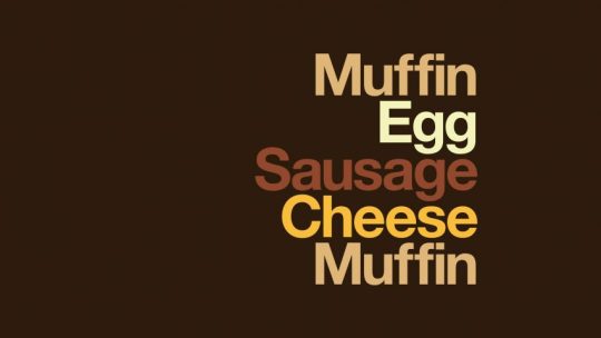
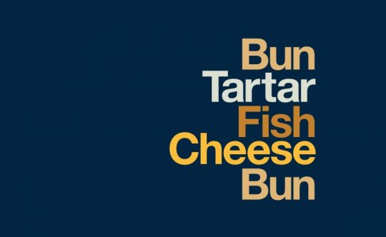
Advertising agency Leo Burnett teamed up with designer David Schwen to create these designs for McDonald's. It has a focus holy on typography.
This is a very simple yet clever design. It breaks-down all the components that their brand uses in each popular dish. There is no need for imagery as our familiarity with the ingredients means we can visualise in our own heads. The colour chosen for each word corresponds to itself, for example green for lettuce. Its almost obvious to do this however it really increases the impact of each piece.
1 note
·
View note
Text


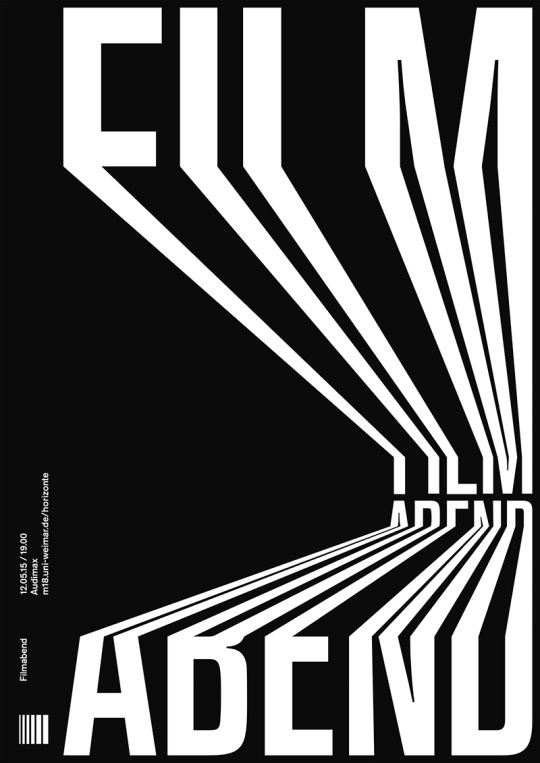

Here is a selection of posters designed by Robin Weissenborn in 2015. They were awarded in an international poster competition. At the time the designer was studying at the Bauhaus university.
I think Robin has an intriguing style, where he is manipulating the letter’s whilst still able to read clearly. This gives us a sense of movement through the words, it leads your eye where it needs to go. There is no use of colour incorporated in his designs however I think this is for the best. The contrast in colour allows for an easy and impressionable interpretation.
1 note
·
View note
Text
Poster Inspo


These are a few designs from the artist Xtian Miller. I am interested in these as he has decided to not use bold colours, rather allowing the shapes to give a striking impression. I am particularly interested in the first example, I would like to try this technique using inks.
1 note
·
View note
Text
2021- Typographic Poster
Here is a list of various events taking place in 2021 that took my interest. I am going to take inspiration for a typographic poster design from the ban of Ivory trade in Singapore that will take place on the 1st September 2021.
March 8th – A murder trial is scheduled to begin for the four police officers involved in the killing of George Floyd.
April 19th – Raúl Castro plans to resign as First Secretary of the Cuban Communist Party, ending 62 years of rule by the Castro brothers in Cuba.
May 26th – The second-shortest total lunar eclipse of the 21st century will occur, lasting just 14 minutes and 30 seconds long.
June 10th – Annular solar eclipse.
September 1st – Singapore plans to prohibit the ivory trade on this date.
December 4th – Total solar eclipse
Unknown Dates
Costa Rica is planned to become a completely carbon-neutral nation (date set by President Óscar Arias) and ban "single use" plastic products (date set by President Luis Guillermo Solís)
The European Union will abolish daylight saving time.
Pantones colours of the year- Ultimate Grey and Illuminating
( https://www.theguardian.com/fashion/2020/dec/11/ultimate-grey-and-illuminating-pantones-2021-colours-of-the-year-spark-hope-and-despair )
0 notes
Link
0 notes
Link
0 notes
Link
1 note
·
View note
Text
Jamie Reid is a British artist best known for his décollage covers of the Sex Pistols’ albums Never Mind the Bollocks and Here’s the Sex Pistols, as well as their singles “Anarchy in the U.K.” and “God Save the Queen.” A self-described anarchist, Reid’s cover art helped define the aesthetic of the British punk movement with its faux-ransom-note letters and iconoclastic defacements of pop culture and nationalistic images.
Born in 1947, Jamie Reid comes from a very politically active family. Keen to highlight political leanings like nuclear weapons, racism and the criminal justice system, Jamie Reid has produced a series of powerful contemporary political art prints.
https://artrepublic.com/collections/jamie-reid
http://www.artnet.com/artists/jamie-reid/
0 notes
Link
0 notes
Link
0 notes