Don't wanna be here? Send us removal request.
Text

This is a friendly design. Well color combination and minimal.
0 notes
Text
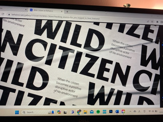
I found it on www.enhance.net and I was surprised why I have never thought smaller fonts can be highlighted by the larger ones. It looks very smooth and informative.
0 notes
Text

Cinema is the place where I judge film posters. Imagine I'm going to the cinema without knowing what to watch and I'll choose the movie by its poster. The poster needs to be really interesting to catch my eyes amongst many of the posters.
0 notes
Text
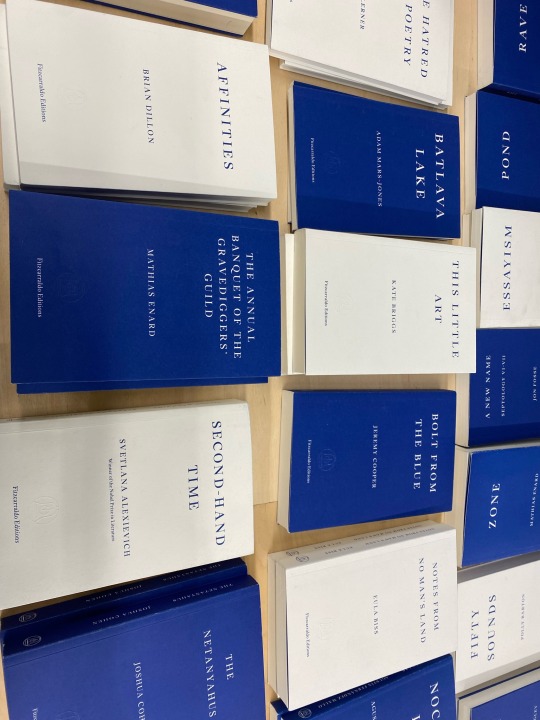
Blue and white go well together all the time. I was in a book store and saw these books were alternated between blue and white. Visually, it was easily look at them and I felt like I was at ease.
0 notes
Text
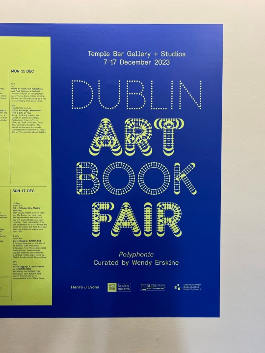
I just ran into this exhibition when I was strolling around in the city centre. I was really immersed by this poster. This is not that much illustrated. But the typeface, and the choosing of colours are interesting.
0 notes
Text

Src: Color Index by Jim Krause
I learnt about appropriate use of colours and how to create color combinations.
0 notes
Text
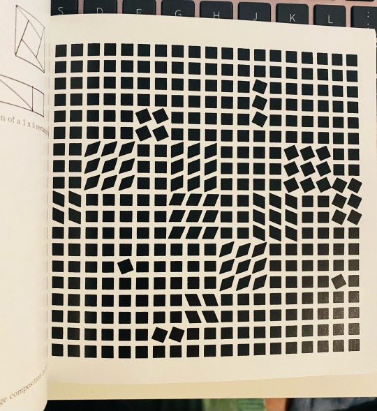

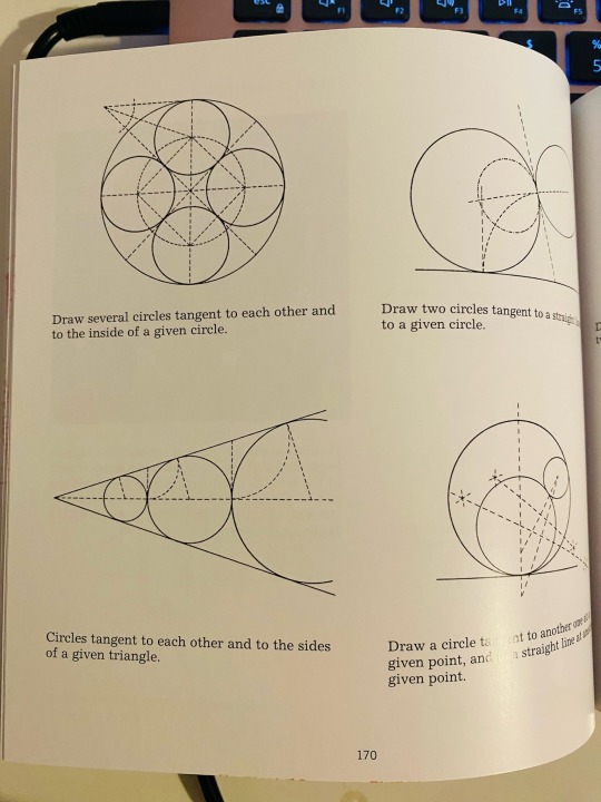


Src: Square Circle Triangle by Bruno Munari
Square Circle Triangle, this book was really helpful for me to understand the use of shapes. For example, just by using one shape, it is possible to create a complex and dynamic design. The atmosphere of the design can be totally changed depending on the position, angle of the compositions. In the first photo, it’s shown that many squares are creating different vibes
0 notes
Text

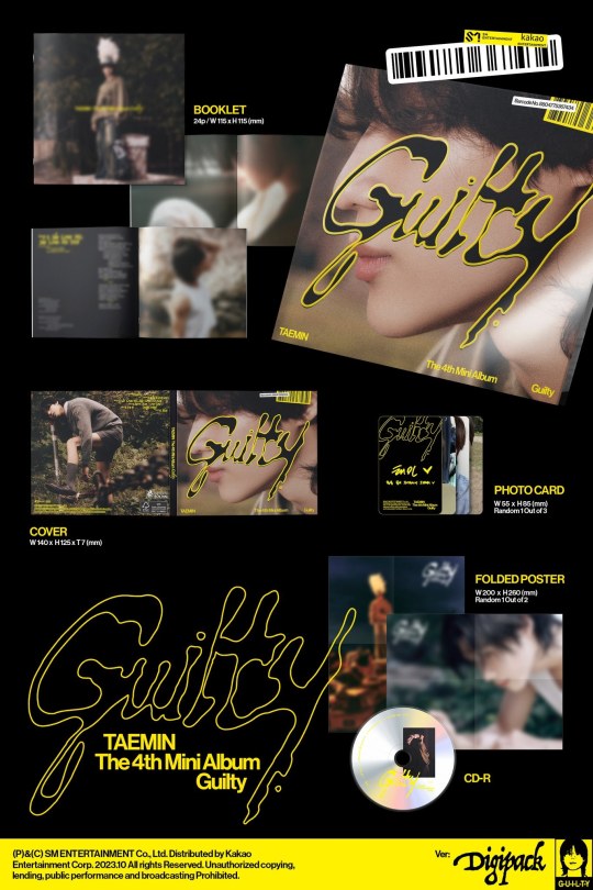
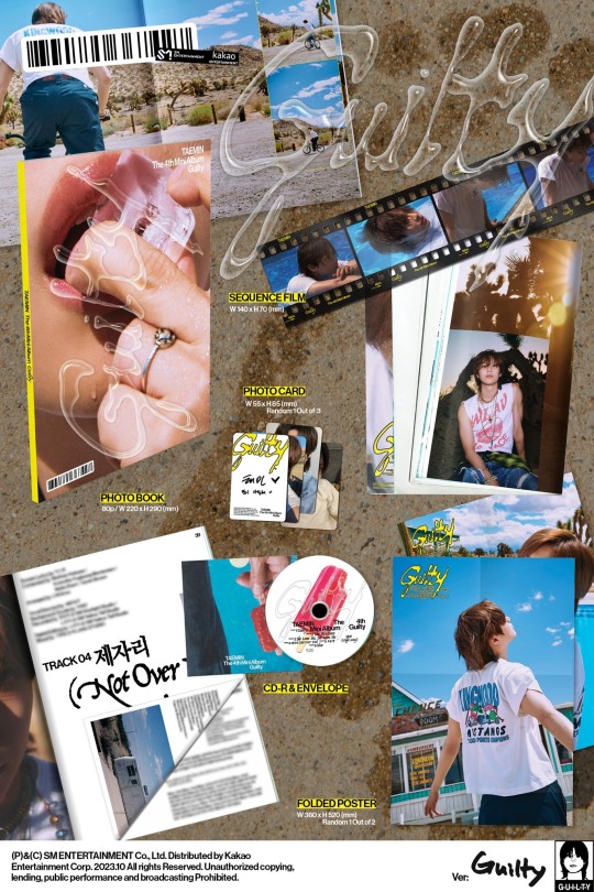
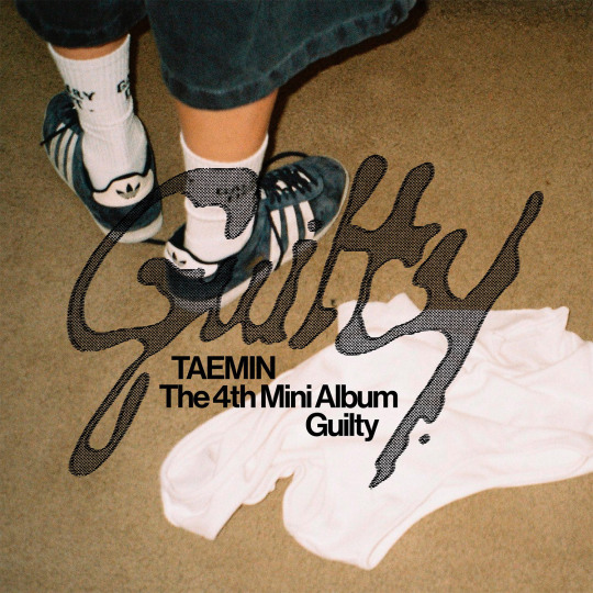
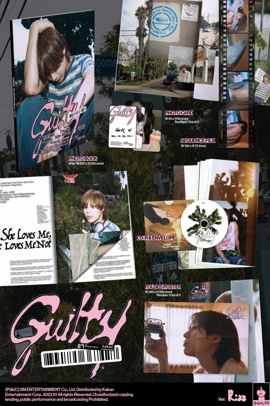
So, here is one of my favourite artist's album design. I've been into K-pop since I was really young. Especially I like the band called "SHINee". Every single concepts of them feels exquisite to me.
And this album, "the guilty" is one of their member's latest album work and it will be released in November. If you look at the works, you can see lots of different versions of the same typography. In some photos the typeface looks solid and in others it looks transparent. I like the idea that they made the font look as if it is created from the water splashes.
Photo source: SHINee official website
0 notes
Text
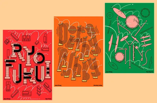
Source: Amanda & Erik: Jazz Along
I find this design really interesting. It caught my eyes immediately because 3 different bright colors contrasting on a beige background. Shapes are interestingly used to create typographs and each picture has showing different style. It feels chaotic as well as well organized at the same time.
0 notes
Text
I just encountered this art work through my Tumblr account.
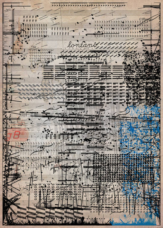
Frank Lepold, ["Lontano", notenblatt], n.d. [published online on March 23, 2022]
709 notes
·
View notes
Text
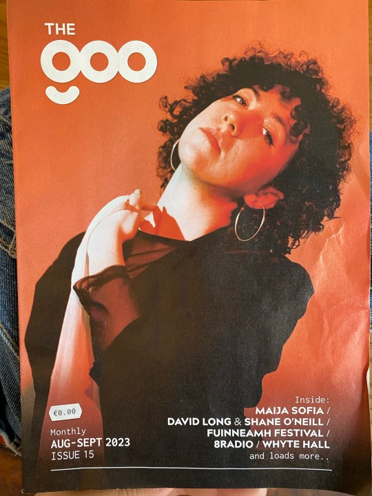


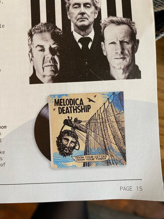

"The Goo is Dublin’s newest print magazine dedicated to music and clubbing and provides a comprehensive What’s On listings guide along with an exciting array of features, interviews, reviews, previews and human interest stories illuminating the vibrant entertainment scene in Dublin." -> https://hkm.ie/
-The Goo
The very last photo is illustrated by Tomi Ungerer, and its complement of colors adds more tension to the picture. I feel like looking at a very complex design. I like the idea that he uses metaphor in his design, illustrating himself as the "Moon man". He is using a red hue to highlight the human from the moon and the background.
0 notes
Text
When I look at this photo it feels so calm. Like I'm having a cup of tea in this field. The color of the sky and the foggy gray color combination creates an aesthetic scenery.
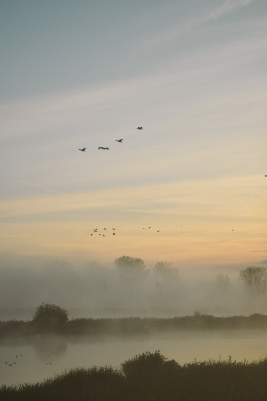
autumn mornings
5K notes
·
View notes
Text
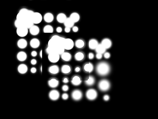
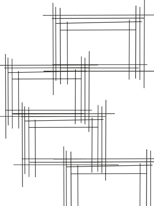
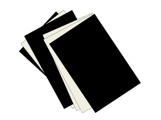
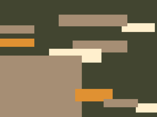
I made this designs for my Visual communication classwork.
In the first image, I used dots to make rectangles by using white dots on the black ground. It feels like I am looking at a dull light bulb in a rectangular frame.
In the second image, I tried to be more abstract. While I was creating the rectangles with a bunch of lines, I was thinking of the Japanese traditional Shoji door.
The third image is made with a beige and black color overlaying each other.I think this design looks more minimalist.
So, for the last image, I used a color combination, and it should give a warm feeling by looking at the warm colors. warm ivory #ffefcd natural #A58E74 apricot #E09132 fern #424530
1 note
·
View note


