
Statistics
We looked inside some of the posts by samarakviscomm and here's what we found interesting.
Average Info
Notes Per Post
1
Likes Per Post
1
Reblog Per Post
0
Reply Per Post
0
Time Between Posts
5 days
Number of Posts By Type
Text
17
Last Seen Tumblr Blogs


Fun Fact
There are dozens of funny blogs to kill time on Tumblr.
Text
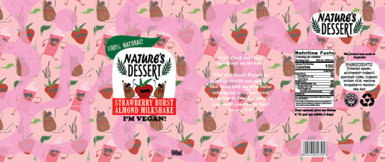
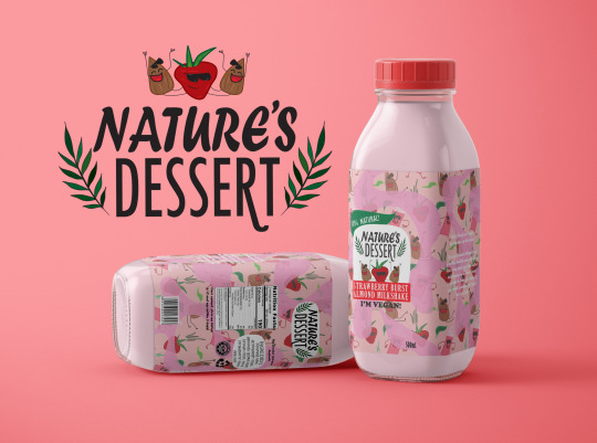
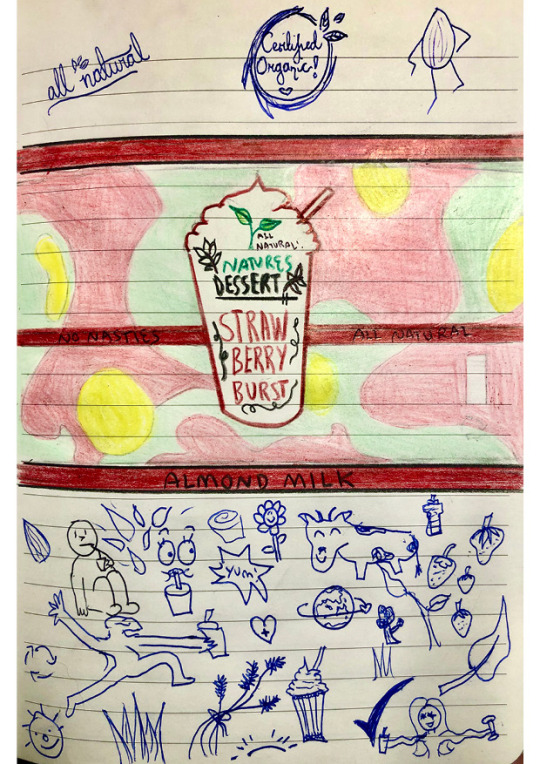
THE COMPLETED LABEL + MOCKUPS!!
||Week 13||
It is now week 13 and our drink packaging process is coming to an end. Was pleasantly surprised to recieve some last minute feedback from my tutor this morning so I was able to make some final adjustments.
Here is the final label I have created along with two mockups. What a journey!

0 notes
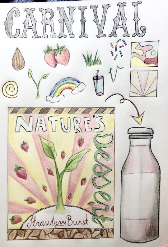
Text
EXPERIMENTATION
||week 13||
The early stages of developing my label + a semi-final version


0 notes
Text
EXPERIMENTATION
||Week 12||
Trying to take some of my initial sketched-out ideas and putting them into illustrator! Now I’m just playing around with how I want the background to be before adding the specific details such as barcodes, nutritional info, etc.
These are very rough at the moment but it’s a start. I’m also fiddling around with my photoshop mockup file I purchased - after a bit of searching I think I’ve finally figured out how to properly use it! The mockup’s looking pretty horrid at the moment but that’s not the point...hahaha


0 notes
Text
💛STUDIO BRIEF #10 - Repeat Pattern in Illustrator💛
||Week 11||
The final studio task! Woohoo!
For this week’s studio brief, we were instructed to create and document a repeat pattern in Illustrator that fits with our beverage brand. After watching this in the tutorial I figured this would probably come in very handy as I wanted to incorporate patterns into my label.
I had quite a bit of fun with this and ended up spending a bit of time coming up with some funny little characters.
MY PATTERN


0 notes
Text
💛SELF-DIRECTED BRIEF #10 - Mock-Up Hunting 💛
||Week 11||
Submission date is getting closer, so during the tutorial our tutor gave us a link to a website where we could find a mockup to display our work on.
After browsing, I figured I would just pay for one as it would be less of a hassle than spending ages searching around for a free one that was exactly what I wanted, as well as good quality and easy to use. The page didn’t specify that the prices were in USD though so after checking my bank account I had been charged about $10 more than it said...oops.
WHAT DID I GO WITH?

I decided to go with this simple glass bottle mockup.
WHERE DID I FIND IT?
I found my mockup on the Creative Market website our tutor provided us with in this morning’s tutorial.
Creative Market: https://creativemarket.com/
My Mockup: https://creativemarket.com/creatsy5/2591458-Glass-Bottle-Mockup-Set-v.3
WHY DID I CHOOSE IT?
I went with this mock-up as it was basically what I had visioned from the start: A tall glossy/glass milk bottle. After searching around for options this one really stuck with me as it had flat surfaces each side - I figured this would make the layout of my label a bit nicer as well as easier having a separate part for the front, back and sides.
It came with multiple bottle layouts to choose from, all of which are able to be customised along with the lid colour, bottle colour, background, finish (matte/glass etc.) and sizing.The thing that ultimately lead me to choose this one over a similar one however, was the fact that it came with a guide. I’m sure my future self will thank me for this hahaha.

0 notes
Text
EXPERIMENTATION
||Week 11||
Sketching up some quick ideas for the layout of my drink packaging.
The main element I was trying to get an idea of was the background pattern. I know I want a combination of organic, pastel coloured shapes. After doing a bit more visual research on images, I decided that I would like to put a bunch of little sketches in these shapes - I have done a few rough ones underneath the label itself. I plan on putting these in the organic shapes at a slightly darker tone; for example if it were to be in the pink section, the sketches would be red/dark pink.
As well as this I’m exploring different ways of displaying the logo/drink name in front of this background - I think that placing it in a big white outline of a milkshake is a good idea. I was concerned about how I could make it a bit more obvious the drink was actually a milkshake and I think this is a good way to do so, and by having it plain white it will contrast nicely against the eventful and colourful background.
1 note
·
View note
Text
💛SELF-DIRECTED BRIEF #09 - Label Anatomy Diagram 💛
||Week 10||
Here I look at what kind of a label I will need for my beverage packaging and what sorts of individual design components I will need to find/create. To do so, I have created a ‘Label Anatomy Diagram’!
Here I have used a drink from the brand ‘Nutty Bruce’ as an example as it was somewhat similar to the drink I’m creating so I figured it would be most relevant to look at when considering my own beverage packaging.
LABEL ANATOMY

0 notes
Text
💛STUDIO BRIEF #09 - Label Imaging Group Case Study Search 💛
||Week 10||
During the tutorial we got into groups, and each found & shared a case study example of label imaging.
SHPIN’S WINE
https://blog.tubikstudio.com/case-study-wine-brand-identity-design/


I chose to have a look at this brand because it really stands out from majority of wines on the market who take on a sophisticated, elegant, ‘fancy’ approach. I love the way that this one has a really authentic feel and has really rough sketched-out illustrations accompanied by a similarly simplistic brand logo which also appears to be ‘hand drawn’.
The article tells us it started as a small family business and expands on the brand story stating that “The concept of the brand is based on the idea of a family as a core: everything and everybody is interconnected in it; it is a single entity in which all elements complement and emphasize each other.” It also explains that the ‘rough’ and ‘sketched’ appearances of the images are based on the grapevine and all its “features and unique multi-faceted forms: flexible twisting vines with their rough texture, twisted and whimsical tendrils, free and lush growth.”
Overall I really love the whole idea behind this brand. It appears novel, youthful and somewhat humorous but also manages to look classy with its black&white colour palette and having the “merlot” in a contrastingly sophisticated font. The story behind the brand really adds to its value as well.
0 notes
Text
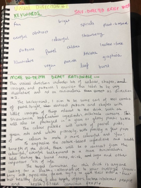
💛SELF-DIRECTED BRIEF #08 - Imaging Research💛
||Week 9||
Now that I know what visual direction I will be pursuing, this week I looked at determining and developing my own imaging style. We were instructed to do so by doing some visual research and collecting new image references.
I have decided to take my research to pinterest as it is an easy way to collect and organise a range of images. Here is the link followed by a preview screenshot:
https://pin.it/mVBsEXs

As you can see I am really looking a bit more into the specifics of what kinds of colours, shapes, patterns and image styles I want to use for my drink labelling. I continue to focus on bright, eye-catching colours and using them to form abstract shapes and images. I am starting to consider drawing the background for my label with little cartoon like sketches and putting them into illustrator and then placing my logo, symbols, drink info and others over the top.
0 notes
Text
💛STUDIO BRIEF #08 - Logo Development Process💛
||Week 9||
This week we worked more on our logos and capturing our logo development process.
The first image shows some sketches I made in week 9 with ideas for what I wanted my logo to be. I wanted it to appear hand-drawn and I’m much better with a pencil and paper than I am with illustrator so this made the process a lot easier once I went to actually create it digitally!
Then, you see the development of turning these sketches (or similar) into vector logos using illustrator and experimenting with different fonts and colours, until I reach my final logo design!
INITIAL SKETCHES

FINAL LOGO DEVELOPMENT
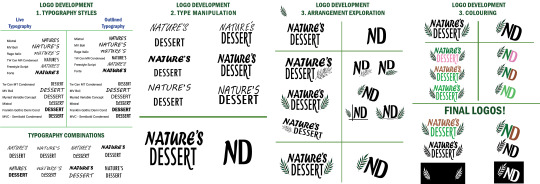
for god knows what reason the final logo doesn’t wanna cooperate and show up when I save it as a jpeg even though its there!? so I’ve included a screenshot of it as well.

0 notes
Text
💛SELF-DIRECTED BRIEF #07 - Logo Research + Visual Development💛
||Week 8||
This week we were instructed to do a bit of research on existing logos as a source of inspiration for developing our own beverage brand logo. We then generated some sketches for different versions of our logos in order to get a general idea as well as looking into potential typefaces appropriate to our concepts.
VISUAL RESEARCH

I found these logos which have similar elements to what I envision my ‘Nature’s Dessert’ logo to look like. This includes the different fonts for each word, simplistic in nature, a handlettering look and the integration of a simple image.
I did this research after already generating some sketches, but either way I’m still at the beginning stages so this will help inform how i progress with my initial logo ideas.
SKETCHES AND TYPEFACE IDEAS
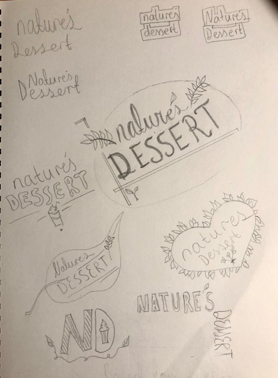
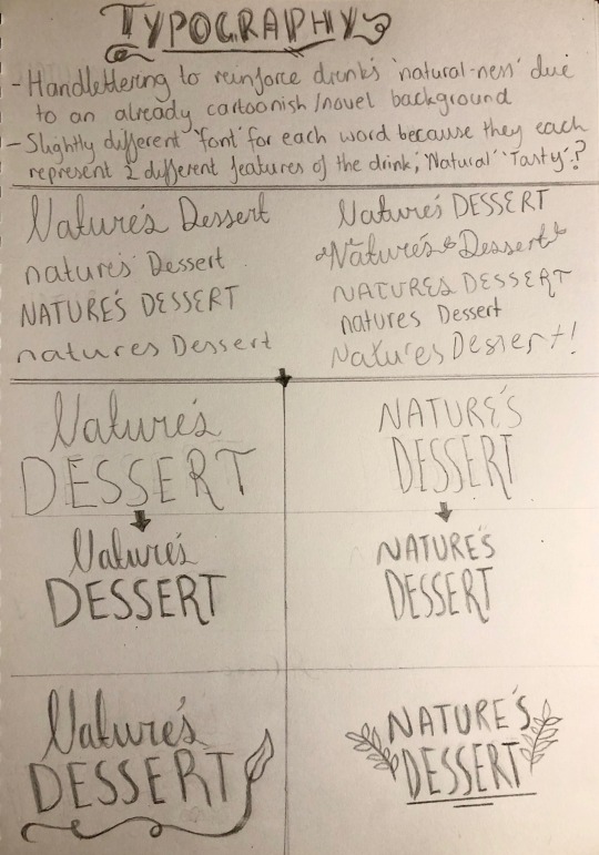
For my beverage, initially I wanted to have all ‘fun’ typography. But, after considering it within the context of all the other elements of the packaging (images, symbols, barcodes, drink name, etc.) this will probably make it look too crowded and messy. So, I want to go with something more simple but still with a bit of novelty about it.
The first picture I’m exploring different visual ways of presenting my logo, or its ‘layout’, and in the second picture I focus moreso on the type/font itself. I really like the bottom two I narrowed it down to, but at the moment I’m leaning more towards the one on the right. I like the idea of it just being typography with a little bit of imagery tossed in there to emphasise the brands ‘identity’.
#logodevelopment#logo#logodesign#brandidentity#branddevelopment#typography#handlettering#thedesignprocess
0 notes
Text
💛SELF-DIRECTED BRIEF #06 Pitch Presentation Documentation💛
||Week 6||
~^*WHAT DID YOU TRY? *^~
I began the task by first downloading Loom straight after the week 6 tutorial when it was suggested by my tutor. Then I took to InDesign, where I began designing my slides!
I had no idea where to start so I basically began by creating a ‘framework’ for my presentation, experimenting with the layout and what I would like to include. This was relatively easy and only took a bit of trial and error. Following this I was able to insert the necessary texts & images in their ‘allocated’ positions and only had a bit of fiddling around to do with sizing and colours.
When it came to recording, I stuck with Loom and figured out how to open my slides in Acrobat in full screen mode.
~^*WHAT DID & DIDN’T WORK? *^~
What I found extremely helpful was briefly creating the framework for my slides before really jumping into it. It really gave me some sort of direction to follow instead of chucking in a bunch of images and text and thinking “well.. now what?”. Here are images of the layout I went with (each x2).


It took a few trials to get to to the final layout however. I initially was going to use slide 1 to give a description of the drink itself so peers had an idea of my overall concept to help them make more informed choices when voting for a visual direction. This didn’t last long once I decided that would take up too much space&time I could use for more important things. See my scrapped idea below.

Another thing that worked was using Loom to record the audio! It was so easy to download and navigate many thanks to Loom. I was worried it would be an annoying process to work out how to use the program.
What didn’t want to work though was my presenting skills. I tried to just dot point a few ideas and speak from the top of my head to sound more like I was talking to an audience. Only took a couple of takes for me to realise this was much harder than I thought, so I then wrote a very rough ‘script’ to go off when recording. This was very helpful.
Another annoying side note of what didn’t work was the fact that in Acrobat I couldn’t hide my cursor from being visible. But I just moved it to the side and kept it still.
~^*WHAT ADVICE WOULD I GIVE OTHERS? *^~
The advice I would give is to 100% start off simple when creating your slides even if its just a few random text boxes in a certain arrangement! What began as an “Oh I should probably start my presentation but don’t have the mental energy to put much effort into it tonight” actually ended up being such a great head-start when I finally sat down to power through it.
As for the recording, this may sound strange, but what I found useful was to make a lot of dramatic hand gestures at my laptop when I was talking. Feels silly waving your hands at your screen, but really helps you to sound more as if you were talking to an audience rather than having the dreaded robot-monotone voice if you’re reading mostly from a script as I was!
~^*THE FINAL PRODUCT! *^~
Woohoo! (minus the voice recording)


0 notes
Text
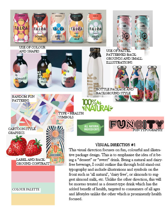
EXPERIMENTATION
VISUAL DIRECTION #1
Some more in-depth experimentation of specific fonts, label ideas, symbols, images, etc. from last week! Liking the direction it is headed so far.
VISUAL DIRECTION #2

I will admit I did this one very quickly and roughly for the purposes of having something to support my ideas in my pitch presentation because I had already sketched up some nice ideas for my first direction (see above). But the overall ideas - illustrative background, minimalistic logo, etc. - are presented, so there you go.
0 notes
Text
EXPERIMENTATION
VISUAL DIRECTION #1

VERY rough sketched of logo/label design ideas from the other week for visual direction #1... to be continued
0 notes
Text
💛SELF-DIRECTED BRIEF #05 Design Process Advice Post💛
||Week 5||

To all my fellow procrastinators&perfectionists, here’s a bit of inspo for your Monday arvo
I, along with many people I know, will often put off design-related tasks because we’re waiting for the ‘perfect’ idea to jump out at us from nowhere.
But what I have learnt, is that it is not very often this happens. More often than not, the ‘perfect idea’ is something you DEVELOP through the DESIGN PROCESS - not some magic lightbulb idea moment. Even the simplest, most ‘insignificant’ ideas are a start which can eventually grow and lead you to your idea of perfect. No need to start big, grand, or mindblowing!
Get designing ;)
0 notes
Text
💛STUDIO BRIEF #04 Words And Images + SELF-DIRECTED BRIEF #04 Feedback Document + Implement💛
||Week 5||
STUDIO BRIEF: To recieve feedback and use this to adjust & refine our moodboards to develop a second version of each.
SELF-DIRECTED BRIEF: To document and implement feedback.
Below are the two updated versions of my moodboards after taking advice from my tutor ways to improve them. Having forgotten to complete and bring them in during the tutorial, I was unable to recieve personalised feedback so I payed close attention to others’ moodboards and the feedback they were given and used some of the advice for my own updated versions. My mum was interested in what I was doing so I showed her and had a brief discussion and was able to use some of her constructive criticism.
VISUAL DIRECTION #1;
My tutor instructed some of my peers to add more elements that were specific to the packaging itself and graphic ideas they visualised in their heads. This included adding things such as typographic choices,images and colour palettes. Here I added a few more images that I believe really captured the graphic/design choices I am visualising in my head as well as more examples of fonts. Overall, however, I didn’t make too many changes to this moodboard.
VISUAL DIRECTION #2;

My mother and I agreed that compared to my other direction, this moodboard originally may have been lacking some pictures and ideas specific to the actual labelling/packaging itself - similar to the constructive criticism given to peers by my tutor. I implemented this feedback by exploring some illustrations, both artworks and those used in existing drink packaging, to help inspire my vague ideas to become more accurate in what kinds of imagery I want on my drink. I also explored what kinds of drink packaging are out there similar to my beverage concept and colour theme.
0 notes
Text
💛SELF-DIRECTED BRIEF #03 Draft Design Rationales + Keywords 💛
||Week 3||
As part of the studio brief I integrated a draft-draft rationale and some keywords into my moodboard. Here are some updated, more in-depth versions.
DIRECTION#1 - Illustrative, colourful, glass, abstract
DIRECTION#2 - Natural, earthy, minimalistic, healthy

0 notes