
Statistics
We looked inside some of the posts by savps-blog and here's what we found interesting.
Average Info
Notes Per Post
0
Likes Per Post
0
Reblog Per Post
0
Reply Per Post
0
Time Between Posts
5 days
Number of Posts By Type
Text
17
Last Seen Tumblr Blogs


Fun Fact
Women make up for the other 50% of Tumblr’s audience.
Text
MEADOWS Festival - Final Instagram Posts (Part 1)
*split into two parts due to Tumblr’s video embedding limit*
vimeo
vimeo
vimeo
vimeo
vimeo
0 notes
Text
MEADOWS Festival - Final Instagram Posts (Part 2)
*split into two parts due to Tumblr’s video embedding limit*
vimeo
vimeo
vimeo
vimeo
vimeo
0 notes

Text
MEADOWS Festival - Instagram Posts Development
Last but not least, was my Instagram posts. To maintain consistency between these, my trailer, and my animated poster, I decided to use the individual clips from my trailer as the Instagram posts for the festival.
To create the clip for each post, I went into the comp of each clip from my trailer, and changed the composition size to 1080x1080 pixels. Since the comp size was now different to the original 16:9 ratio, I also decided to change the random seed of each background animation, to ensure that I still had well-fitting animations within this new form factor. I went through each clip, and adjusted the random seed to ensure there was a good balance of animation visible in the clip relative to the type that was being shown.
For Scenes 9 and 10, I did have to adjust the type to be on four or five lines, just so that the ‘glass’ type would fit within the new 1:1 ratio, but this wasn’t too much of a chore. I simply changed the text so each word was on a different line, and then adjusted the glass effect and surrounding strokes accordingly. I also slowed down the rotation of the circular type in Scene 8, in order to stretch out the rotation over the clip’s 10 second duration.
Once I had made all these changes, I exported each clip to it’s own H.264 MP4 file, ready to be uploaded to Instagram. I made changes to and exported every clip from my trailer, apart from the very first and last scenes, the latter of which I modified to be the same as the rest of the clips before it; showing the date of the festival with the cherry blossom petals falling behind the text, without the mask of the type applied to the background animation.
Final Instagram Post Outcomes:
Finally, everything was complete! I probably could have done more with these Instagram posts, but honestly I think they fit in really well with all of the other elements I’ve produced for this project, and work well as Instagram posts in general.
Unfortunately I can’t embed all of the videos, due to Tumblr limits on video embeds within one post, so instead I have provided the link for each Instagram post to be viewed on Vimeo.
https://vimeo.com/414772448
MEADOWS Instagram Post Final 1 - MP4
https://vimeo.com/414772497
MEADOWS Instagram Post Final 2 - MP4
https://vimeo.com/414772558
MEADOWS Instagram Post Final 3 - MP4
https://vimeo.com/414772602
MEADOWS Instagram Post Final 4 - MP4
https://vimeo.com/414772652
MEADOWS Instagram Post Final 5 - MP4
https://vimeo.com/414772713
MEADOWS Instagram Post Final 6 - MP4
https://vimeo.com/414772753
MEADOWS Instagram Post Final 7 - MP4
https://vimeo.com/414772792
MEADOWS Instagram Post Final 8 - MP4
https://vimeo.com/414772838
MEADOWS Instagram Post Final 9 - MP4
https://vimeo.com/414772889
MEADOWS Instagram Post Final 10 - MP4
0 notes
Text
MEADOWS Festival - Trailer Development
Moving on from my completed Animated Poster, I then began working on finalising my trailer. You may remember my post from a month or so ago where I began experimenting with animation in my trailer, and honestly I haven’t done much since then. Having finished my animated poster though, I now have some sort of foundation to work with when it comes to creating my scenes for the trailer.
Since we were now no longer expected to complete our trailer, and also in the interest of getting the trailer finished in the little time I had left, I decided to keep my shots simple, and to stick with the formula I already had made within my animated poster; using ‘glass’ type surrounded by a pink stroke, with the falling cherry blossom petal animation playing beneath, on top of a dark grey background.
I kicked off the trailer with a 5 second shot of the dark grey background I used within my animated poster (which I was also using here) that corresponded with the subdued, minimal part of my soundtrack. I then created 7 comps that focused on each letter of the ‘glass’ type as the soundtrack began to build up. Following that, I created a clip of circular ‘glass’ type that read ‘MEADOWS’, which played upon the soundtrack reaching it’s climax. This clip was then followed by another which showed the dates for the festival in the same ‘glass’ type, but this time along two straight lines. At the end of my trailer, once the soundtrack had been reduced to it’s bare elements again, I placed a simple clip of white text on the dark grey background, that communicated all relevant details (date, address etc.) of the festival in an easy to read format.
For the trailer, I had decided to keep my falling blossom petal animation simple too, but I wanted to include some variance within the animation in each clip, rather than just having a repeating animation playing behind each shot. For this, I decided to randomise the seed of each animation, so that the composition of the falling blossom petals was different in each clip; and I also rotated each background animation +45 degrees throughout the duration of the trailer, so for example, the second clip’s animation is rotated 45 degrees, the third clip’s animation is rotated 90 degrees, and so on. I’l admit this wasn’t really the variance in the animation I had envisioned when first planning my trailer back in March, but with the limited time left, I felt it was suitable and worked well enough.
vimeo
MEADOWS Trailer Draft
I was really chuffed with how this draft of my trailer turned out, but I felt it still wasn’t quite there yet. At the time though, I wasn’t sure of what to change, so I left the trailer for the night, and came back to it the next morning with fresh eyes to spot what errors I needed to fix and what could be improved.
The next day, I came back to my trailer draft and watched through it a number of times, noting down what errors needed to be fixed and what scenes could be improved upon. The first thing I noticed was that, especially in the shots with the singular letterforms in the frame, some of the outline strokes were overshooting past their intended end points. This was a simple, but tedious fix, that involved manually adjusting the path of each stroke in every clip and changing the positioning of points along each path, and also adjusting the handles for a bunch of curves. I also needed to fix the stroke ends and joints in every scene, as these were all set to be butt caps and miter joins, which in some clips, produced square curves and stroke ends that felt very out of place within the context of my trailer. So I manually went through each and every clip and changed each and every stroke to have a round cap and a round join, which you might imagine took quite a while.
I also felt that scene 9, where the circular ‘MEADOWS’ type is shown, was lacking a bit. It was smacking me in the face that I needed to animate the type so it rotated whilst the background animation was playing. I was a bit weary of how it would turn out, but I gave it a go, and it actually looked quite good and worked well. I had keyed the text to rotate 360 degrees over the course of the clip, but this made the rotation feel way too fast, so instead I halved the rotation to 180 degrees, which felt much more comfortable. I also rotated the text -90 degrees so that at the beginning of the clip the ‘M’ at the start of the type was on the left side of the frame, rather than at the top, which felt much more natural compared to it’s rotation in the previous (above) draft.
Keyed rotation for Scene 9′s spinning ‘MEADOWS’ type
I also felt that my final scene was really lacking, and didn’t match up with the rest of the trailer too well; so I decided to ditch much of the white type, leaving only the festival’s website and social handle, which I moved to the bottom of the comp. I then took the date from the previous scene, and moved it to this final scene, as I felt the date reveal was better suited for the end of the trailer rather than just before the end. I wanted the final scene be cohesive with the rest of the trailer, but different in that it matched up well with the first scene, which was completely blank. For this, I used the shape of my typography to create a mask over the falling petal animation playing in the background, that made it so the animation would only play within the typography, and not over the entire background. I was quite happy with how this turned out, and felt that it was a good balance between bringing consistency to the final scene in terms of how it matched up with the other scenes.
Lastly, I needed to change the type in Scene 10, since I had moved the date type to my final scene. For this I simply decided to write ‘A BRAND NEW MUSIC FESTIVAL’, to give the audience an idea of what ‘MEADOWS’ actually is, rather than being ominous and only showing the name and date within the trailer. I changed the typography, and made changes to the glass effect and outline strokes to match up with the new type.

Final trailer composition
Final Trailer Outcome:
And just like that, my trailer was complete! It took a lot longer than my animated poster, and involved much, much more experimentation to figure things out and get them right, but I managed to get it done in the end; and honestly, I couldn’t be happier with how the trailer turned out. I feel that I’ve done the best I can do with this trailer, and I’m really pleased with myself that I managed to actually complete it, since of course we were no longer required to do that because of the current pandemic. Anywho, below is my final MEADOWS trailer in all of it’s glory.
vimeo
MEADOWS Trailer Final - MP4
0 notes
Text
MEADOWS Festival - Animated Poster Development
We’re right around the corner from the revised course deadline now, and I’m here just updating the last of my blog posts with my development for the remainder of the project. It’s been roughly a month since my last blog post; I’ve since moved flat, found a summer internship, and completed the MEADOWS Motion Graphics project! If you’d told me a month ago that I would have done all of that, I would have called you crazy.
Anyways, from here on out I’ll be ditching the weekly post formula I’ve previously been using, and instead in each blog post I’m going to give an overview of the development for each my three final outcomes, before posting my final outcomes seperately afterwards in order to ensure they’re easily viewable seperate from my regular postings.
Animated Poster Development:
My first order of business was to revisit my animated poster and get it completed before moving on to my trailer and Instagram posts. In theory I should have had this completed by our formative assessments, but since I had to redo my concept, I was a bit behind on it.
In the end, I decided to stick with the format I already had; animation playing in the background, with my ‘glass’ typography layered over the top. But of course, since I had changed my concept from the ‘blob’ to falling cherry blossom petals, I needed to change the animation that would loop in the background. I’d already experimented a bit with my new falling petal animation during my work on the trailer, so all I really needed to do was drop the CC Particle World effect I was using into my poster comp, and make some changes to the effect until I felt it was perfect.
In terms of what I had changed, I first made some adjustments to the producer that was creating the particles in the animation. I kept it above the frame out of sight, but I changed the Z position to -1.00, and the Z radius to 2.00; I did this because I felt that the animation was a bit too flat, and by changing and increasing the Z position and radius, it gave the impression of depth within the animation, which I felt looked much more natural. Since the animation was now being viewed with depth, it also gave the impression of different sized petals, which again felt much more natural. Cherry blossom petals in nature would never be the exact same size, so the depth having this effect on the size of the petals felt much more realistic.
I then made some slight changes to the physics. You may recall that in my early experiments with the CC Particle World effect, I had lowered the velocity and gravity to give the petals a very gentle movement when they were falling, but when the clip was rendered out of After Effects, it was actually still very fast. For this animated poster, I brought the velocity down to 0.05, and the gravity right down to 0.005. I also bumped the resistance up to 0.8 so that the petals wouldn’t fall so heavily but rather would float gracefully down the frame.
Next I made some changes to the particle itself, changing the rotation speed to 45 degrees, and setting both the birth and death size of the particle to 0.750. The lower rotation speed would give the petals a more natural feeling ‘twirl’ as they fell down the frame, and I equalised the birth and death sizes because the depth within the animation already gave the impression of different sized particles, so if I hadn’t kept these values the same, each particle would be a wildly different size.
Recently, I also discovered there was a ‘random seed’ value within the CC Particle World effect, which when changed, would randomly realign the particles on the frame. As you’ll see in my upcoming blog posts, I changed this value quite frequently to try and get a good balance in my comps between the petals and the type. For this poster, I set the random seed value to 1810.
Lastly, I changed the duration of the particles to 30 seconds to ensure they wouldn’t fade out whilst the animation was playing, and made some further changes to the birth rate. I wasn’t happy with how particles were fading in during the animation, and so I set the birth rate to 3, and keyframed the effect to set the birth rate to 0 a few frames later. I then dragged the effect to the left so this keyframe change would occur before the comp started, and then extended the clip right to the end of the composition. I did this so that all the particles you see in the animation would be ‘born’ before the clip had started, and whilst it was playing, no new particles would be born, therefore stopping any new particles from fading in, and giving the impression of falling cherry blossom petals with no new particles ruining the effect.
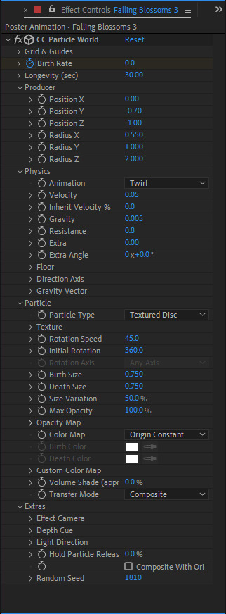
CC Particle World values for my Animated Poster
With my falling cherry blossom petal now complete, I made some small changes to the colour scheme on the poster to bring it in line with the new concept. I changed the background colour to a dark grey to complement the pinks of the falling petals, and I also changed the stroke colour around my ‘glass’ type to a deep pink, again to complement and match up with the colours of the petals within my comp.
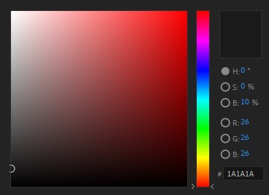
Dark grey background colour values
Deep pink stroke colour values
Final Animated Poster Outcome:
With those changes all made, my animated poster was finally complete! I exported the poster using Adobe Media Encoder to two different formats; a H.264 MP4 file and a still JPEG file, both of which can be found below.
vimeo
MEADOWS Animated Poster Final - MP4

MEADOWS Animated Poster Final - Still JPEG
0 notes
Text
TEAMS Meeting with David (24/3/20)
It’s been a couple weeks since we last spoke, and since then the situation surrounding the COVID-19 pandemic has rapidly changed. The UK is currently in a nationwide lockdown, and it’s looking like I’m going to have to move out of my flat in the coming week. It could be a lot worse so I’m grateful that I’m in good health at least.
Over the past week, all of our studies have been moved online to Microsoft Teams, where for many of our courses, meetings with our tutors are now being held. This past Tuesday, David held meetings throughout the whole day to check in with all of us on the Sound + Vision course and offer any information he could on what would be happening with our project and it’s associated deadlines. It was very bizarre to be speaking with him about everything in this context, I feel that it still hasn’t really hit me that we’re in the middle of a pandemic. I had a few questions about the course, and David was happy to answer, but he also reinforced the fact that for now we all need to be focusing on ourselves and making sure we’re okay, before we even think about work. It was a very compassionate stance to take and I really appreciate him being so caring in that regard.
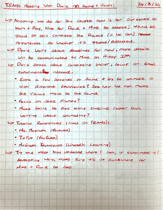
Notes from our Teams meeting with David
At this point, I’m not really sure when I’ll be able to get back to working on our MEADOWS project. I’m hoping that once I’ve completed my move, I can return to some sort of normal and start getting all of my projects done. What a bizarre time we’re living in.
0 notes
Text
University Shutdown
Unfortunately, as of the 14th of March (end of Week 8), the decision has been made by the university to close all of the university’s buildings in response to the COVID-19 pandemic. I completely understand why this decision has been made, but it’s honestly come as quite a shock. There’s now so much uncertainty not only surrounding the Sound and Vision course, but our entire degree program. This shutdown will no doubt be a major disturbance to this course and university life in general, and I have a ton of worries and questions about what’s going to happen now. Presumably measures will be put in place for us all to work from home, but it’s still sad to know that many of the projects we have running may never be properly completed, and I may not see my classmates again for a very long time now. I’ll miss the studio. Sadly I’ve not really had a chance to work on my MEADOWS materials since we last spoke. A lot is going on right now and it’s all changing very rapidly; I can only hope that fairly soon I can return to some sort of normal, and finish what I started with this project.
0 notes
Text
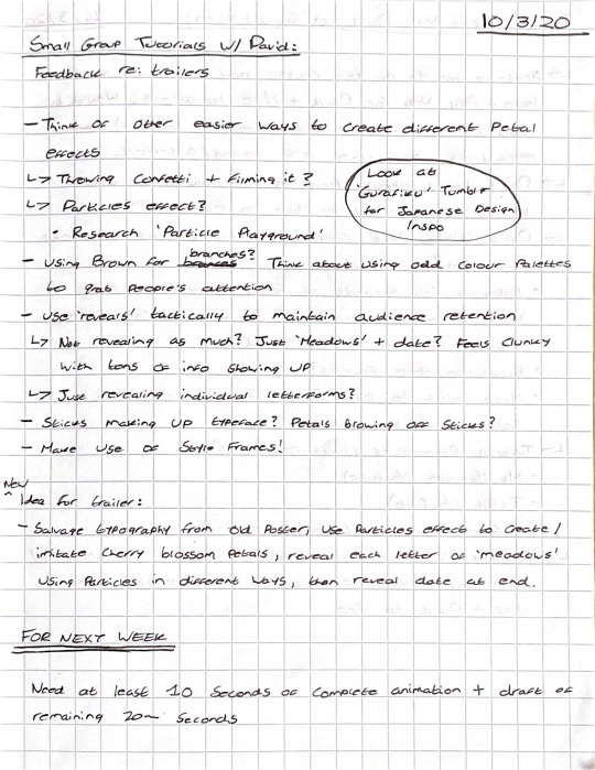
Sound + Vision: Week 8
Our studio session this week was a relaxed but focused one. We were to work independently this week and begin to design the assets to be used within our trailers, whilst David ran small group tutorial sessions where he would be giving feedback on the animatic’s we had produced toward the end of Week 7.
Group Feedback Tutorial:
I had opted to take one of the earlier group tutorials with David so that I could get some feedback on my animatic from him and my classmates before I moved forward with designing any assets for my trailer. Generally everyone liked the idea and thought it was an effective concept, but David in particular had some feedback regarding the finer details of the trailer. His main concern was that each scene would feel too much the same as the last, and he wanted to ensure that I’d be able to retain my audience by creating some variance within the animation in each clip. For this, he suggested thinking of other easier ways to create my petal effects (at the time I was planning to create the effect of petals within After Effects using CC Particle World) that would allow for greater variance in the visuals, such as filming myself throwing confetti. David also suggested making use of my text ‘reveals’ tactically in order to not bore my audience, for example, not just revealing information in each clip, maybe only revealing part of a word or not even revealing it at all. Some ideas for my type also came up within the group; it was suggested that perhaps I try using sticks to make up the type, which would strengthen the connection between the typography and the animation playing within the background.
Overall, a very positive tutorial. I knew that I needed to work out the finer details of each shot in my trailer, but I wanted this to come naturally to me as I played around with each video rather than planning it beforehand. My process doesn’t really involve much planning, but rather I experiment and develop a solution from those experiments.
Trailer Animation Drafts:
Fresh off of my group feedback tutorial, I dived straight into After Effects and began to make a start on my trailer. I used the composition for my animatic as a base for these early drafts, because the timings for each clip were already in place here, allowing for me to easily know if certain animations would fit in different places within the composition.
As I briefly mentioned earlier, I was planning to use an effect within After Effects called ‘CC Particle World’ as the backbone to all of my animations. David had told me of this effect last week, and in today’s session I wanted to start playing around with it to see what I could come up with. In the start, I followed a Youtube tutorial that showed me the basics of the effect and what each variable did, just so that I could get to grips with it fairly quickly. Once I had gotten familiar with the effect and how it worked, I began working on a source layer for the particles.
I created a new square (540x540) composition, and made a new shape layer within the comp. I adjusted the path of the shape to give it that petal shape, and then I applied a deep pink to light pink vertical gradient over the top of it. This petal was very simple in terms of detail, but I didn’t want to go too crazy with it because in the actual animations, each petal would be relatively small and the audience wouldn’t be able to make out any fine details, so I kept it super simple in the interest of saving myself time.
Petal ‘Particle’
With my particle made, I created a new comp for the second scene, which is where I’d be experimenting with the effect. I grabbed the text from my initial poster drafts to use as a placeholder for now, and centred it within the comp. I dropped the blossom comp on top of the text layer and then created a new white solid layer, which is where my particle effects would live.
I spent the remainder of our session in the studio just playing around with the effect to determine how I wanted it to behave, and what options I had in terms of creating some variance in how it animated. To begin with though, I tried to make a simple animation of the petals falling down from the top of the composition to the bottom. I gave the particles a birth rate of 10 and set their longevity to 3 seconds (same length as the comp). I moved the producer above the top of the comp, so that you wouldnt see the particles being produced, but instead, they would fall into the frame. In terms of the physics, I set the animation to Twirl, as I wanted the petals to behave like falling leaves and this was the closest animation to that; I gave them a very low velocity of 0.50 and set the gravity to 0.100 so that the petals would fall very slowly and gracefully. Lastly, I set the birth and death size of the particles to 0.300 so that the size of the petals would remain consistent across the animation.

Layers within my experimental ‘Scene 2′ composition
vimeo
MEADOWS Trailer Animation Draft 1
To say I was happy with the animation was an understatement, I was absolutely chuffed with how it had turned out. Albeit, it wasn’t perfect yet, but it was exactly along the lines of what I had planned and thought about using for my trailer. I still had to make a lot of refinements to the effect to get it animating perfectly, such as reducing the birth rate of the particles, and slowing down the velocity much further, among other changes; but this got me really excited to continue working on my trailer and helped me to get out of the bummed out rut I had been in since my formative assessment presentation. I knew now I’d be able to make something miles better than what I had before, I just needed to play around some more, and continue to refine it until it was perfected.
0 notes
Text
Sound + Vision: Week 7
Following our formative assessments, I’d spent a lot of time over the past week rethinking the concept behind my visual materials for the MEADOWS festival. Mike and David were absolutely right in much of what they said, and I was determined to improve upon what I already had in-line with the feedback they had given me. One of the big issues was my concept, and I’ve decided to take the visuals in a different direction. Informed by the percussive, almost Japanese nature of my soundtrack, my visuals will now be focusing on the cherry blossoms that bloom in the Meadows in Spring, which is when my festival will be held. I’m hoping to salvage the typography used within my previous concept and to adapt it to this new one, but of course, if it doesn’t work well I’ll be finding a different solution for the typography. At this early stage, I’m not certain how I’ll be incorporating blossoms into the animation within my visual materials, but I’m quite excited to play around with this.
Trailer Pre-Production:
Anywho, this week we had a pre-production workshop with David in order to make a start on our trailers for the MEADOWS festival. I was actually quite excited to get started on my trailer, it was a good opportunity for me to begin developing a new concept for my visuals and I was very keen to see where I could go with a fresh direction. David kicked off the workshop by showing us his process for planning and creating a music video for MIAOUX MIAOUX within After Effects, which was actually incredibly interesting to see. I always enjoy seeing how other people work, and then trying to implement parts of their process into mine to see if it makes me work more efficiently.
Whilst presenting his process for planning motion graphics, David handed us all a quite comprehensive hand-out that gave an overview of the pre-production and production stages of a motion graphics project. This hand-out ran through different steps in the production process, such as scripting, storyboarding, animatics, scheduling, animating etc, and gave us some rough guidelines for how we should go about working in each stage of the production process.
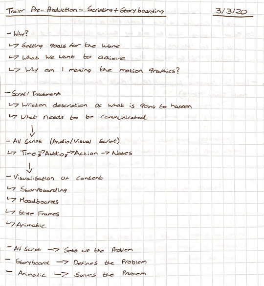
Notes from David’s presentation of his working process for motion graphics
We were also given templates by David for the production outline, script, and AV script. The outline is exactly that, an outline of the concept behind my motion graphics. The script is a description of what would actually be happening within my motion graphics; and the AV script is an even more detailed version of the script, and outlines what’s happening within the motion graphics, at what time, whilst what audio is playing, etc.
For the remainder of the workshop, David had asked us to first fill out our production outline and script, then he would give us some quick feedback on our plan before we moved on to filling out our AV script. My primary concept for my visuals was now to salvage the typography from my pre-formative outcomes, and bring those in to new visuals that focused on cherry blossoms, which are informed by both the cherry blossoms that bloom on the Meadows in the spring, as well as the Japanese-percussive style of my soundtrack. Within my outline and script, I planned to animate cherry blossom petals in different ways, and then to use these animations to reveal different pieces of text with details of the festival, such as times, location, acts etc. I also wanted to time and coordinate these animations with different sections of my sound, in order to bring a greater cohesion between my visuals and my soundtrack.
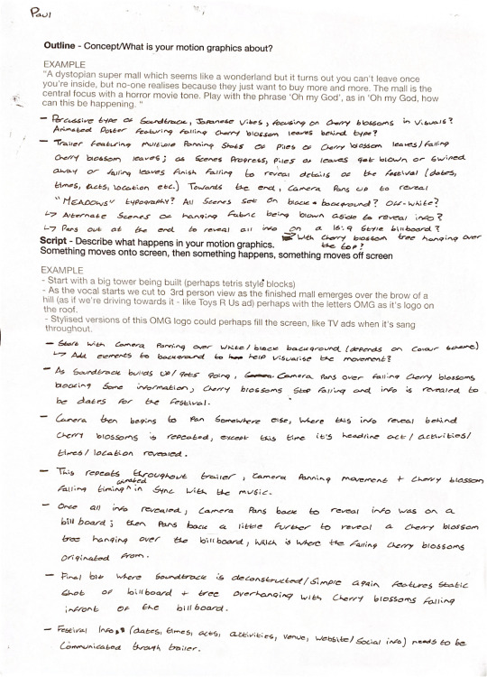
Outline and Script for my MEADOWS trailer
I then ran through my outline and script with David. He quite liked my new concept which I was super relieved to hear. David suggested that I try and make my shots dynamic rather than just panning for each and every shot as this may not hold the audience too well. He also remarked that I could try and end my trailer by cutting to my final scene rather than panning back as I initially planned. I’m glad that David had commented on the panning, as I hadn’t really thought about retaining the audience through the duration of the trailer, so I’ll be sure to include some variance in how I animate the different shots in order to keep my audience engaged.
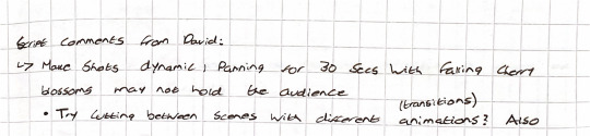
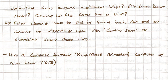
Feedback from David on my Outline and Script
Towards the end of the pre-production workshop, I began working on my AV script. It had been specified that our trailer was to be 30 seconds long, and my soundtrack had roughly 5 second sections that I could time my animation with, so I split the time column of my AV script into 0-5 seconds, 5-10 seconds etc. Next I wrote some quick notes under the audio column so I could tell what sound would be playing at different points in the trailer. I matched these different parts up with the times I had just wrote down, to create a sort of map of how my soundtrack would build up, reach it’s climax, and recede back down again. Alongside these times and audio notes, under the action column, I then wrote what I planned to happen on screen at each section of the trailer. For this I mainly used my script and made some slight changes to a few sections based on David’s feedback. Finally, for the notes column, I wrote down a few details for each section regarding things I wasn’t sure of yet and would figure out whilst I was designing the trailer. I did this to ensure I didn’t forget about certain or smaller details that I might need to amend later on during the production stage.
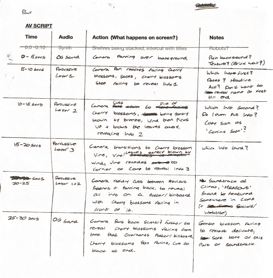
Completed AV script
Right at the end of the workshop, David had asked us all to produce an animatic for Week 8 that would act as a draft of our trailer. This ‘draft’ would help to work out the timings for each scene, whether parts of the soundtrack fitted well with certain scenes, etc.
Storyboarding, Soundtrack Editing & Animatic:
The next day, I began drawing up a rough storyboard for my trailer using a template provided to me by David. I used my AV script to fill in the details of the scene, such as timings and scene details, and then I began to draw rough sketches of what I planned to happen in each scene. I had split each scene to coincide with different parts of my soundtrack, and in total at this stage I had around 6 scenes, with 2 or 3 of those scenes incorporating multiple shots. These scenes were all based on the idea I had to use cherry blossoms to reveal information about the festival throughout the trailer.


MEADOWS Trailer Storyboard
Before moving on to creating my animatic, I first needed to make one last change to my soundtrack. The current version of my soundtrack was double the length of time we had allocated for the trailer, and so I needed to rearrange the elements within my sound to shorten it’s length so that it wouldn’t run longer than the trailer itself, and also so that it would sync up with the timings I had designated for the different shots and scenes.
I jumped back into Audition, and began moving around the different elements within my soundtrack in order to shorten it’s length. I quite liked where my soundtrack was at and how it sounded, so I decided not to make any drastic changes to it’s structure. Rather I simply halved the length of each element within the soundtrack and repositioned them; this made the soundtrack feel like it was running a bit quicker than it should, but the main character of the sound was still there. I tightened up the position of each element, and exported the sound out of Audition. Given this new draft fits well with my trailer, I shouldn’t have to make any further changes to it, and thus this will be the final version of my soundtrack.

Trimmed down soundtrack structure within Adobe Audition
https://clyp.it/0npb4mru
Link to hear MEADOWS Soundtrack Final
With my soundtrack ready to go, and my storyboard completed, I then set about creating an animatic for my trailer. For this I decided to simply scan in the sketches on my storyboard, drop them into Premiere Pro, and time them accordingly with my soundtrack. At this point, I wasn’t too sure of the ideas I had on my storyboard, and so I didn’t want to jump the gun and start designing different elements before I had first gotten feedback on the idea itself, and how it flowed with the soundtrack. The animatic indeed looked quite rough, but it worked well at communicating how different scenes and shots would be displayed within the trailer according to the timing of different elements within the soundtrack.
vimeo
MEADOWS Trailer Animatic
0 notes
Text
Sound + Vision: Week 6
This week we had our Formative Assessment tutorials with Mike and David. In our tutorials, we each had to give a mini-Pecha Kucha going over our projects and where they were at so far, after which Mike and David would give verbal feedback as well as an indicative grade so we could get an idea of where we stood with each learning outcome at this point.
Formative Assessment:
My formative assessment tutorial felt rather bittersweet. I presented my Pecha Kucha, which I definitely could have done better. I tripped over my words at a few parts, and accidentally kept speaking over my sounds as they were playing, but overall I felt I presented my project pretty decently. The verbal feedback I received from Mike and David is where my tutorial began to feel like a double-edged sword.
Fortunately they both loved the direction my soundtrack had taken. They loved how I’d focused in on a particular sound, and manipulated it to create a quite ambient, atmospheric soundtrack. Mike noted that my soundtrack sounded very percussive, and quite Japanese, which he suggested as a theme to perhaps implement into my visuals. He also commented saying that I needed to tink about how the festival was informed by my soundtrack; if my soundtrack is percussive, does this mean my festival is purely a percussion music festival? etc etc. David also mentioned that my soundtrack was a bit too long, which even before formative assessment I thought was the case. This was no problem though, as I could quite easily restructure my soundtrack to trim it’s length down to 30 seconds, which was the required length.
However, the feedback in regards to my animated poster was not so great. Mike was very vocal in that he didn’t like the direction my animated poster I had taken, and in particular he felt it’s supporting concept was very weak. David agreed with him, and they both suggested that I scrap what I had and start over again, instead looking at over ideas I had at the beginning of this project. It was honestly super disheartening to hear this, I’d worked super hard on the animated poster, and whilst they both appreciated that it was technically impressive and that it worked well as a poster in itself, it was quite a bummer to hear that this perhaps wasn’t the right route for my visuals. Mike made a good point in that I had developed my visuals before my sounds, when in-fact the brief asks that the visuals are informed by our soundtracks, and this is where I had made my big mistake. It wasn’t all negative criticism of my visuals though, Mike and David were both very keen on some of my earlier ideas, and suggested furthering my line of inquiry into cherry blossoms, and exploring how they could become part of the visual identity, as they tied in very well as a concept to my soundtrack.
My indicative grades at Formative Assessment were A, B, and C, for learning outcomes 1, 2, and 3 respectively. Obviously these are not bad grades by any means, but I really do try and strive for the best within my work, and this just wasn’t going to cut it for me.
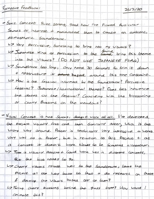
Formative Assessment feedback and indicative grades from Mike + David
After my tutorial, I was feeling really bummed out that I had to scrap most of what I had done so far. I’d worked really hard on the visual side of the project, and to throw it all away felt like such a waste. Once I’d thought more about my formative feedback though, I knew that Mike and David were right in what they said. This was my problem, that I had focused too much on the visuals, and tried to use them to inform my sounds, when I needed to be working the opposite way, developing my sounds and using those to inform my visuals. That’s why my concept had become so weak, and ultimately why it needed to be scrapped.
I had a quick look over all the visual elements I had made so far, and I think that I can salvage some elements to transfer over to a new concept, such as the translucent text. I’ve decided I won’t be working on this project for the rest of the week just so I can clear my head and think about my next move. For now I feel like I just need to have a good think about the project over the next few days, and figure out where I went wrong, and how I can fix it. Hopefully by next week, I’ll have a new concept to roll with, and I’ll be able to get started on the trailer, as well as getting started on redoing the animated poster.
0 notes
Text
Sound + Vision: Flexible Learning Week
This week is Flexible Learning Week, also known as a reading week, which means we don’t have our usually scheduled classes, so there was no Sound + Vision session this week. Instead, we had the week free to work on our projects and to get our soundtracks and animated posters finished for Formative Assessment which would be happening in Week 6.
Soundtrack Development:
Before going any further with my visuals, I decided to return to my soundtrack and get it to a relatively complete state early on, just so that I could have extra time to experiment with it as I don’t have a lot of experience within sound design. For my soundtrack, I was originally using Audacity for audio editing, but I felt that Audacity was a bit simple and wouldn’t be able to do what I was aiming for, so I downloaded Audition, which is Adobe’s audio editing suite, and played around with it for a bit in order to learn the basics of the program.
Once I’d figured out everything, I brought my fire kindling/stick break sound into Audition, and began to edit it. I knew that I wanted to use this sound as the foundation of my soundtrack, so initially I just tried to make some corrections and adjustments to the sound to make it a bit better. My first priority was getting rid of the wind blowing noise present in the background of the clip. To do this, I used the ‘DeNoise’ effect, editing the effect to shift the sound’s focus to higher frequencies, which is where the noise of the actual sticks breaking was, and to reduce the amount of noise by 90%. Reducing the noise by 100% made the ‘crackling’ sound dulled down and muted, so I dropped this value by 10% to ensure that the crackling still had some impact. I then duplicated the sound clip, and slightly overlaid the beginning and end of each clip, to form a longer sound clip. I did this just to give myself a bit more flexibility when I’m building my soundtrack, incase there are parts of it which might require the sound to be longer than the three or four seconds it originally was.
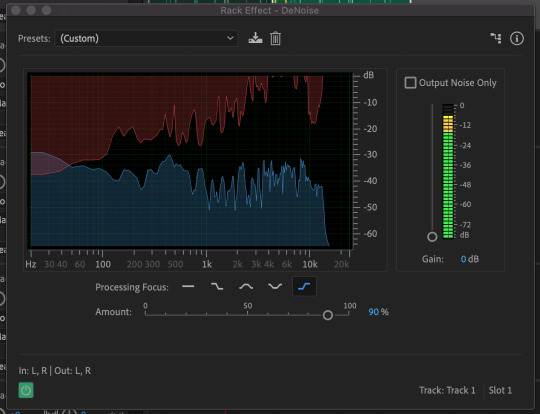
Using DeNoise to remove background noise from my soundtrack
Duplicating and overlapping the sound-clip to create a cohesive, longer sound
https://clyp.it/r0rl5xx2?token=556242b858db38e11e3a25f000463f6b
Link to hear my base sound clip
With my base sound clip cleaned up, I set about creating my soundtrack. I spent a lot of time playing around with this, because I was still learning to use the Audition software as I was editing the soundtrack. I first experimented with a number of different compositions and effects, trying out different effects on each sound clip and layering them in different ways, but nothing felt quite right. Eventually though, I started getting some satisfactory results. I didn’t realise at first, but Audition actually has presets you can use that will apply a number of effects with customised settings on to your sound clips, in order to achieve certain sound effects. I began experimenting with these, and once I applied the “Weaponized Effects” preset onto my sound clip, it started to produce some interesting effects. The preset had made my sound clip sound very percussive, almost like a chime or one of those music boxes that you turn with a crank, which I thought was quite fascinating. It still wasn’t perfect though, I made some tweaks to the preset by removing the Echo effect, adding in the Multiband Compressor effect to reduce the harshness of the sound once the preset had been applied, as well as making tweaks to the Notch Filter effect by using and editing different presets within the effect itself.
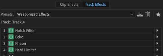
Weaponized Effects Preset, with all it’s underlying effects
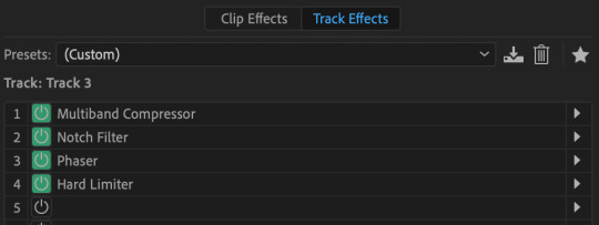
Weaponized Effects Preset after I had made some tweaks to the underlying effects
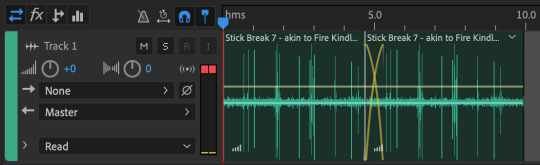
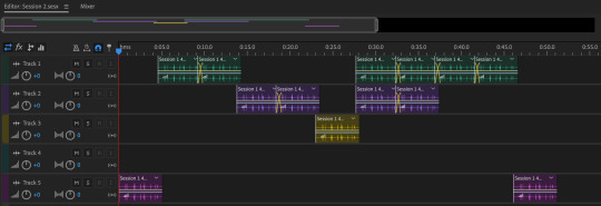
Through experimentation, I had found that the Notch Filter effect was able to change the tone of my sound clips, meaning that I could assign different ‘tones’ to individual layers in order to build a musical composition. Notch Filter also had some presets within the effect itself, and by using these and applying different presets to each audio track, I was finally able to produce something that sounded like a real soundtrack. Using these different Notch Filter presets, I began to build my soundtrack using four different audio tracks. Audio Track 1 utilised the E Minor Chord Notch Filter preset, Track 2 used the A’s and E’s preset, Track 3 used the Minor Thirds from C preset, and Track 5 used the DeEsser preset (Track 4 was used for experimentation and thus is empty).
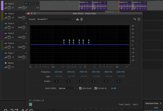
Using the Notch Filter effect on different audio tracks
The structure of my soundtrack consists of these four different audio tracks. By arranging the clips in a certain way within the composition, I’ve built the soundtrack to start off very subdued, then to slowly build through repetition and changing the notes, then the soundtrack reaches a climax where multiple notes are played at the same time to provide a stronger sound, before it slowly retreats again to a single note, and then finally sounding subdued once again. I’m really really chuffed with how this version of the soundtrack turned out, I think it sounds brilliant, especially for my first time using the Audition software. I think I’ve made it a bit too long at 51 seconds long, but I can always come back and trim the soundtrack down at a later date. For now though, this works perfectly.
MEADOWS Soundtrack Draft 2
https://clyp.it/pyukqnuf?token=e32910c383693199894670549ebacc34
Link to hear MEADOWS Soundtrack Draft 2
Animated Poster Developments:
After wrapping up my soundtrack, I went back to developing my animated poster in order to complete it for our formative assessment next week. I was pretty happy with where the animation was at this point, so for this round of developments I focused on adding text to the poster.
In my original animated poster sketch, I had planned to implement large-scale type into the poster, which I still very much wanted to do, but now I’ve also decided that I want the type to interact with the animation in some way, rather than just having the type sitting behind the animation. But I don’t want to animate the text itself, as I feel that it will create too much of a clash within the poster. As a compromise, I’ve decided to place some effects on to the type to give it translucent, distorting properties, much like glass. In order to give the text this glass look, I used the Caustic effect, and added extrusion depth to the type using the Cinema 4D renderer. After tweaking the settings of the Caustic effect for a while, I had a outcome that I was happy with. You’ll notice in the video below that as the animation moves underneath the type, it becomes slightly distorted as a result of the effects of the type. I also added an orange stroke to the type just to make it a bit easier to see on the poster, but as you can see below, I had a problem with this.
Up to this point, I had been using Adobe Media Encoder to render all of my video clips from After Effects, but unfortunately for some unknown reason, whenever I rendered the below clip through AME, the orange stroke on the type had turned black. I couldn’t figure out what was causing this, I tried changing settings in the composition, the effects themselves, and in AME, but the problem still persisted. Eventually I worked out that if I rendered the composition with After Effects itself, it rendered the colour of the type stroke correctly, so I started rendering all of my clips exclusively through AE. Draft 5 was rendered through AME before I discovered a solution for the issue, Draft 6 and thereafter were all rendered through AE.
vimeo
MEADOWS Animated Poster Draft 5 (with AME rendering error on text stroke)
vimeo
MEADOWS Animated Poster Draft 6 (AME render error on text stroke fixed)
I was really really happy with the poster at this point, and felt that it was all coming together. I just needed to add a bit more information on to the poster regarding the festival, when it would be taking place, where it was located etc. I first tried out adding more of the translucent bubble type to the poster just to see how it interacts with the animation when it covers the entire composition. I wrote “MEADOWS 2020 COMING SOON”, and watched the animation play, and I was really happy with what I saw.
vimeo
MEADOWS Animated Poster Draft 7
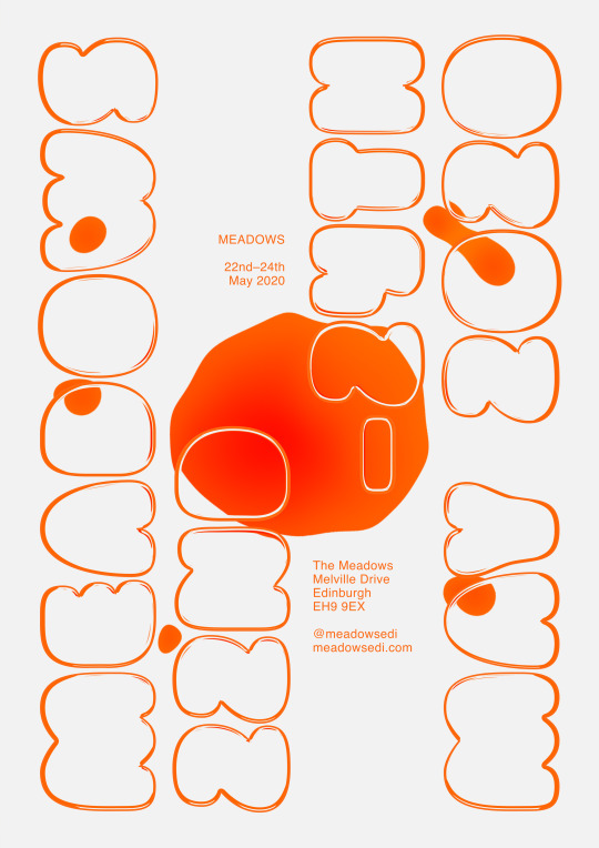
I then changed the translucent bubble type to read “MEADOWS 22nd–24th MAY 2020″; I used a fictional date for the festival that could change, but I think suits my visual direction thus far, the colours all have a very spring/summery feel and I thought it was important to have the timing of the festival reflected in the direction of the branding. I also added some smaller type above and below the main blob in the center of the poster. This type is purely just to inform the viewer in the clearest way possible, giving the name, date, location, and social/website info.
vimeo
MEADOWS Animated Poster Draft 8 (Final) [Moving]
MEADOWS Animated Poster Draft 8 (Final) [Still]
With this 8th draft, I felt that the poster was finally complete. I could have probably made some miniscule improvements to it here and there still, but I was extremely happy with my final outcome. I’d spent so much time on it, and it was very rewarding to have it finally completed. Finishing this off has given me a lot of renewed excitement for developing the trailer and instagram posts, and I hope that they turn out as great as this did. A very productive, successful week all in all leading up to formative.
0 notes
Text
Sound + Vision: Week 5
Pecha Kucha:
This week, we were each asked by David to give a Pecha Kucha presentation to him and the rest of our class, detailing how our sounds and visuals for the MEADOWS project were coming along. Just in-case you don’t know, a Pecha Kucha is a presentation format where you only show 20 slides, each for 20 seconds, allowing for you to communicate your message in a concise and straightforward manner. I had volunteered to go first in the running order of presentations, because I prefer to get it out of the way when it comes to presenting things in front of an audience.
Within my presentation, I gave a quick run-down of how I started the project, my initial sound recordings, extracting sounds of interest from those recordings, developing/story-boarding initial visuals, learning to animate in After Effects, developing more visuals for my animated poster, and finally, developing the first two drafts for my animated poster. I went slightly over my allocated time to present, but apart from that I felt that the presentation went well! Everyone seemed to like where my project was going, and I got some good feedback on the strengths and weaknesses of my project.
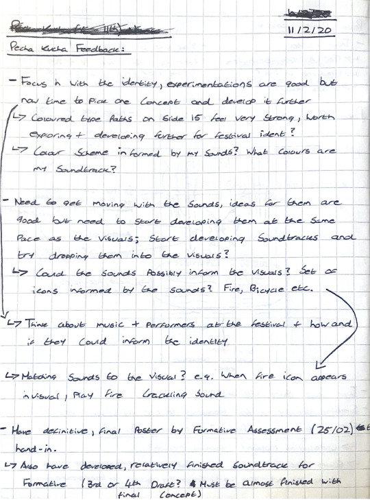
Feedback from David + my peers on my project from our Pecha Kucha session
The two main bits of feedback on my project from our Pecha Kucha session was that I needed to ‘focus in’ with the visual identity, and that I needed pick up the pace in relation to my soundtrack. David thought that I had a lot of interesting visual developments, but he made a good point that I needed to pick a concept and start running with it. I feel that I often have this problem with some of my projects where I can’t decide which idea to develop, but I’m glad that he mentioned this because otherwise I probably would have still been stuck deciding which of my developments to move forward with. David’s point about my soundtrack was also very valid, I feel that I’ve been a bit caught up in the excitement of learning After Effects and I’ve focused too much on the visual side of the project; but now that he’s made a point of how I’m lacking in the soundtrack department, I’ll definitely be making more of an effort to develop my audio at an even pace with my visuals.
Animated Poster Developments:
Fresh off of our Pecha Kucha presentations, I returned back to my animated poster to make some further refinements to it’s design. For now, I’ve chosen to focus in on the animation itself, and to get it to a point where I’m really happy with it, before I start adding other elements on to the poster. I feel that the design of the poster will work better if the type, it’s position, and it’s scale is informed by the animation, rather than the other way around; I think designing it in this way will make the poster and it’s elements feel more cohesive, so I want to really nail the animation before I start adding in any type to the poster.
vimeo
MEADOWS Animated Poster Draft 3
In this third draft of my poster, I’ve again changed the colour scheme of the animation. In this iteration, I’ve placed a red-to-orange radial gradient over all of my blobs, and I’ve animated the positioning of this gradient using keyframes so that the gradient sort of moves with the blobs as they rotate and move around the composition, in an effort to make the gradient feel more natural on the blobs. The reason for this colour change is to try and bring my visuals more in-line with my soundtrack. If you remember, in Week 2, I had recorded an interesting sound of sticks breaking that sounded like a fire crackling, which at this point, I think I want to base my soundtrack off of, or at least use as a primary element within my soundtrack. As such, David had given me feedback in our Pecha Kucha session that my sounds should inform, or at least go with, our visuals; so in order to bring greater unity between my visuals and sounds, I’ve given my blobs a ‘fire-like’ red-to-orange gradient that is informed by the ‘fire crackling’ sound I recorded in the Meadows. Compared to the colour schemes I’ve already tried, this one is easily my favourite, using a gradient on the blobs gives them a more natural feel, and the colours pair really well with the off-white I’m using in the background.
vimeo
MEADOWS Animated Poster Draft 4
Thinking about my stick breaking sound, which sounded like fire crackling, had given me the idea to try putting my animation on a dark background, and adding an outer glow to all the different elements in order to give the animation a ‘fire-like’ glow. I think this draft looks brilliant, and that the glow works really well with this type of animation, but unfortunately it’s not the kind of look I had in my head when I was making this draft. My animation looks more like the sun at sunset rather than a fire, which obviously won’t go too well with my soundtrack, so I’ll probably scrap this line of inquiry; I’m still glad I made this though, as it could be a possible line of development for other parts of this project, such as an Instagram post or a scene in my trailer.
It’s been a good week for reflecting on my project, looking at what’s going well, what needs improvement, and getting feedback from my peers. Now that I know what areas of my project need attention, I can get to work on further developing and finalising both my animated poster and soundtrack over the course of Flexible Learning Week (Reading Week) for our Formative Assessments in Week 6. I feel that the project is going really well so far, but I’ve still got a long way to go before it’s anywhere near finished.
0 notes
Text
Sound + Vision: Week 4
Studio Poster Design Session:
In our class this week, we had a half-day session with David where we began to design and develop our moving image posters for the MEADOWS festival. David had asked in Week 3 that we prepare assets, such as photographs, videos, graphics, type etc, that we could use to design our posters with. For this, I had prepared some kinetic type animations that I showed in my Week 3 blog post.
I started off by sketching out a plan for my poster. Typically, when designing things, I’ll write out some sort of plan, and then just dive in and experiment until I end up with something that works, but for this, David was insistent that we each drew up some sort of initial sketch to work out the layout of our posters, as well as what visual devices/information elements we would include within the design. I was reluctant at first as this wasn’t how I usually worked, but after a little while I gave it a go, and I have to say, it actually proved quite helpful.
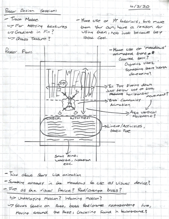
Draft poster layout/notes from studio poster design session
The concept I wanted to communicate within my poster was the sense of ‘community’ about the Meadows, and how the Meadows acts as a sort of ‘hub’ for the people living in and around it, people visiting from further afield, etc. If you remember my blog post from Week 3, I mentioned how I was really interested in the work of Studio Feixen for Vlow! 2016, and how the animated liquify effect was something I was interested in using within my own work. With my animated poster, I wanted to bring these two things together to use as a visual device. For this visual device, I planned to create a central living/moving liquid blob that would be a metaphor for the Meadows, with smaller blobs of liquid (acting as a metaphor for people) appearing around the larger blob, and then orbiting around/colliding with the large blob, before fading out again in order to create a clean loop for the animation. I thought this would be a pretty simple but effective way of communicating how the Meadows brings different and diverse people and elements together in one place, and so with my concept and a plan in place, I set about designing and animating my poster.

MEADOWS Animated Poster Draft 1
It may have taken me the entirety of our poster design sesion with David, but after following a number of tutorials and guides online, as well as a bit of experimenting on my part, I had managed to create the above animation. The animation itself makes use of multiple shape layers, the turbulent displace and fast box blur effects, as well as a number of position and scale keyframes for the smaller blobs. I was super super happy with the animation when I first rendered it, and felt that I had a made a huge step in the right direction in terms of my vision for my animated poster. Granted, the animation wasn’t perfect and the poster itself was far from finished, but I was still super chuffed with what I had made.
Poster Refinements:
Later in the week, after our poster design session with David, I set about making some refinements to my animated poster so that I could have a relatively complete draft for our Pecha Kucha presentations in Week 5.
MEADOWS Animated Poster Draft 2 - Background Typography
I started off the second draft of my animated poster by developing some type to go behind the animation I had created a few days prior. For this type, which is based on my sketch plan, I kept it very simple with just three pieces of type. One large “MEADOWS” aligned to the horizontal top and vertical middle of the composition, and a small “@meadowsfest” and “meadowsfest.com” in the bottom left and right corners respectively. With the type in this second draft, I wanted to use the type as a indicator/visualiser of how text might interact with the animation, and therefore affect the balance of the composition. At this point I hadn’t really though of what text elements I might include on the poster, so I thought it was better to use some placeholders for now so I could focus on developing the animation itself.
vimeo
MEADOWS Animated Poster Draft 2
For the finished second draft of my MEADOWS animated poster, I had made some small changes to the animation before overlaying it on top of the type I had prepared for this draft. I increased the scale of the animation, then I rotated it slightly to have the more interesting blobs ‘interact’ with each other over the type, creating a more interesting viewing experience, and lastly I changed the colour of the animation to a dark, deep green, which I felt paired better with the strong black of the background type than the bright blue I had previously been using in the animation. I had also changed the colour of the background from a pure white to an off white that I felt reduced the harshness of the background on the eyes, and paired better with the black and dark green now in the composition of my poster.
Week 4 has been a great week for my project; having finally made a start on my animated poster, I now feel like I’m really getting going with this project, and I’m excited to keep working and developing both my soundtrack and visuals further and further. For now, I’ll be working on my Pecha Kucha for Week 5, which I feel will be a good point for me to reflect on what I’ve done so far, and to work out what’s going well and what needs further improvement in my project.
0 notes
Text
Sound + Vision: Week 3 (cont.)
[Week 3 post split into two seperate blog posts because of Tumblr limits on the number of embedded videos in a post.]
Further Animation and Development (cont.):
For the second animation, I wanted to extend the end of the video and do something with the rings that would allow the animation to perfectly loop. For this, I extended the length of the composition by three seconds, and set the rings to shrink down in size until they had completely dissapeared.
vimeo
Millenium Animation Experiment 2
I’d now found a decent way for the rings to fade out of the video, but I still needed some way of the first ring coming in at the beginning of the video. Rather than just having it fade in at the start, I played around with the Trim Paths effect to try get the first ring to be ‘drawn’ in to the composition. I had a bit of trouble with this, because I had filled each ring with a white fill, just so that they would layer on top of each other properly when they moved away from each other. I tried to compensate for this by having the fill fade in, and having the stroke around the ring slowly grow in size to match the others, but it didn’t quite perfectly fix the problem. Still though, it looked good enough for an experiment.
vimeo
Millenium Animation Experiment 3
For my last experiment with this animation, I wanted to use Trim Paths at the end of the animation to see if I could get all of the rings to evenly be ‘drawn’ out of the composition. I’d managed to get it done, but again, it looked quite janky because each of the circles had a white fill to them. The left-most circle also glitched half-way through it’s transition out of the composition, but I couldn’t figure out why this was happening. In any case, I’d managed to create the animation and was able to now visualise how these rings would look if they were ‘drawn’ out together.
vimeo
Millenium Animation Experiment 4

Notes made whilst creating the above animations, to help me keep track of how they needed to be animated
Week 4 Preparation:
For our poster design/animation session in Week 4, David had asked that we prepare materials to be used within the class in the construction of our posters. Off the back of our After Effects workshop, I was really keen to try and animate some type again, so I researched a few different methods of animating type that I might be able to utilise.
One method that I found involved creating simple type within Illustrator, and animating it within After Effects in such a way that the type starts as a single dot, expands to multiple dots, and actively draws itself, before fading out at the end of the animation. For this, I first needed to create some type using strokes in Illustrator.
Prepared custom typography from Illustrator
I then had to split each letterform into two distinct parts that would be drawn within the animation, and I had to create extra paths coming off of each letter that the ‘drawing’ animation would follow in After Effects. This was pretty time consuming to work out and perfectly line-up, so I only managed to draw out the paths of the first two letters before our Week 4 session.

Prepared custom typography from Illustrator, with extra ‘drawing’ paths
Unfortunately, I wouldn’t have enough time before our Week 4 session to animate the entire word, but I decided that I could at least animate the first letter. I took the file into after effects, and set about animating it; using a combination of trim paths and transform effects I was able to animate the letter well enough that it actually looked pretty decent. The animation wasn’t perfect but for my first time messing with this effect, I was pretty happy. This was also the first time I had dived into After Effects’ speed graph, which controls the speed of certain animations and is incredibly customisable. I used the speed graph to accelerate and deccelerate the ‘drawing’ of the letter at certain points, to give it a more natural motion as it drew out loops and lines.
vimeo
Drawn ‘m’ Animation
For me, this was an incredibly successful week. I’d learned a lot about After Effects, and begun the process of fully engrossing myself within it and learning how to create all manner of animations. I had a number of successful experiments this week, but I definitely need to develop some of these further, as they’re looking quite janky at the moment, but they have a lot of potential to be used in other areas of the project if I develop them further and perfect them.
0 notes
Text
Sound + Vision: Week 3
After Effects Workshop:
This week, we began our foray into After Effects. David spent the morning with us on Tuesday showing us the ropes of the program, and helping us to animate a few basic designs to help us get to grips with AE.
Before we got started, David showed us a few examples of work by designers and studios to give us a glimpse into what’s possible with AE. One example that really stuck in my mind was Studio Feixen’s work for Vlow! 2016. The animated poster features marble-like liquid shifting pieces of text around the poster. I really loved the look of this effect, and it’s one that I aim to learn and somehow employ within my identity for MEADOWS.
vimeo
Studio Feixen - Vlow! 2016
David started off by teaching us the absolute basics of AE; where things are in the program, what different tools do, the importance of keyframes, where we can find effects etc etc. Once we’d had a quick rundown of the program, we set about learning the program through playing with it. For the majority of these practice compositions, I used my website logo, as it was immediately available for me to use.
Firstly, we practiced using keyframes by simply moving our image across the composition. I played around with different paths, and ended up having my image move in from the bottom left corner to the bottom right corner, where it then grows in size until it fills the majority of the composition.
vimeo
AE Test - Movement & Resizing
We then looked at what you can do with PSD files imported from Photoshop. AE is actually able to import PSD files complete with the different layers that are present in that file. These layers are then able to be manipulated within AE. For this test, I seperated the tongue from the bird in Photoshop, and imported the resulting file into AE, which I then animated so that the bird’s tongue comes out of it’s mouth and moves around a bit.
vimeo
AE Test - Importing + Manipulating PSD Files
We then looked at creating and manipulating shapes within AE, as well as applying textures on to our compositions. We also looked at importing AI files from Illustrator, and how those can be manipulated within AE, very similarly to what we looked at with PSDs. Lastly, we looked at creating type within AE, and how it can then be manipulated and animated. For this last exercise, I typed up “The Meadows”, and animated it coming in from the left side of the video, and then slowly being deleted as if someone was actively typing in the video, which then does a perfect loop back to the start of the video. I was pretty happy with this outcome, and actually quite chuffed that I was able to create it in my first day of using After Effects. I’ll definitely be holding on to this last clip as I feel that it’ll come in handy later when I’m trying to design my motion poster.
vimeo
AE Test - Creating, Manipulating + Animating Type

Notes made in David’s After Effects Workshop
Further Animation and Development:
I left David’s AE workshop on quite a high after I managed to successfully animate text and images with the program, and I was dead keen to animate some more things, so I immediately headed back to the studio, and set about animating the four rings I drew up in Illustrator last week.
For the first “Millenium” animation (as I’m calling it), I animated my four rings as I storyboarded them last week; starting off with one ring in the centre of the composition, which then moves to the left and reveals the three other rings. They all then move across the screen until they are evenly dispersed across the composition.
vimeo
Millenium Animation Experiment 1
[Week 3 post split into two seperate blog posts because of Tumblr limits on the number of embedded videos in a post.]
0 notes