
Welcome to my GDES assignment, hopefully you won't be bored.
Don't wanna be here? Send us removal request.
Statistics
We looked inside some of the posts by scottyscottindc and here's what we found interesting.
Average Info
Notes Per Post
44
Likes Per Post
25
Reblog Per Post
19
Reply Per Post
0
Time Between Posts
7 days
Number of Posts By Type
Text
12
Video
1
Last Seen Tumblr Blogs


Fun Fact
Tumblr Inc. is using 66 technologies for its website.
Text
Straddle This! Autostraddle Website Relaunch
I thought for our final blog post, I would write about the relaunch of my personal favorite web magazine, AutoStraddle.

The users visiting AutoStraddle are typically college educated young adult women, between the ages of 18-29. Though there are younger users still in high school, and older users beyond 30 years old, they are the minority.
The website feels much more modern, interactive, and colorful, like the crowd that they try to appeal to. AutoStraddle even provided users with a breakdown of the new site, and how to use its features!
My favorite part of this whole site is the responsiveness when you resize the window. The 'article blocks' jumble up into different configurations to fit properly into the site! It looks very cool, and though admittedly it does not seem to add to the design much, it doesn't take away from it besides the longer loading time.
Great Job AutoStraddle!
19 notes
·
View notes
Text
Paralax...In or Out?

A few weeks ago I did a post on KitKat's new marketing site. In addition to analyzing the site, I also reflected on another site that drew my attention that was featured in one of Ellie's tumblr posts. They both featured a relatively new type of web design called paralax. Paralax is a technique in which the creator uses CSS to "make different layers on the page move at different rates." While at first it is tantalizing and engaging, it has become to be misplaced and used inappropriately, perhaps similarly to Comic Sans.
In the above mentioned post by Ellie, the artist used his site to tell a story to the user, appropriately directing his/her attention to where he thought most appropriate. Likewise, the Kit Kat site did so quite well also. Unfortunately for both, and for paralax in general, the lag time for the sites were distracting depending on how fast your computer or connection was. This lag time, though, is not a terrible issue: what is a terrible issue is that many sites and publications have begun to use paralax inappropriately and without relevancy.
Some sites use paralax design to be more innovative, hip, and attempt to be engaging. Yet, sometimes these good intentions are not executed properly and in actuality only result in hiding information, distracting users from more important details, and add nothing to the delivery of the information.
Paralax has immense potential, as we have seen through its transformation of interactive web designs. This can only be possible, however, if the paralax features are appropriate and add to the overall message of the organization and site.
1 note
·
View note
Text
On Deciding Serif vs. Sans Serif for KiLo
I've been trying to get a grasp on all of this typography mumbo jumbo, and I've got to admit that it is extremely confusing. I mean, how much does a web font have to do with the message you're trying to convey? According to Kent Anderson from the scholarly kitchen (and many others) certain fonts greatly affect how users accept and perceive information! We're just going to briefly touch upon serif and sans serif fonts in general.
Serif fonts have letters with short lines at the top and bottom, they appear formal, classy, quaint, engaging or traditional and are used in classical or elegant designs. While easiest to read in print, serif should not typically be used for the web since its actually easier to read sans serif online.
Sans serif fonts are, as the name implies, letters without the serif. These fonts are informal, playful, youthful, and accessible, and as stated above best used for digital media.
My debate is that my brother's company, KiLo, wants to have a classical look, but very modern and hip. His art emphasizes that out of grunge can come beauty, and he wants his site to reflect that. Therefore, I think that a sans serif font would be best. But, and to tease for an upcoming blog I might even choose a Geometric, Realist, or Grotesk font!
2 notes
·
View notes
Video
vimeo
I have to admit that I am now addicted to the blog, The Fox is Black. Just recently, they featured a newanimated short by Persistent Peril about the history of the Barbican, a neighborhood in London.
The Barbican utilizes a complete video game theme with graphics and sound effects to draw in the watcher, and educate without boring them. Retro video game aesthetics have become a new hip method of delivering information because of their simplicity and engaging design. Although you are not interacting with the video, you feel as if you are since the video mimics an older game which almost all watchers can identify with on some level. Especially since the Barbican is a trendy neighborhood, the intended appeal with 8-bit video games is very relevant to many young adults still reliving their youthful days playing NES or relishing its newfound popularity.
1 note
·
View note
Text
Transitions and Usability
Just came across this great article by Smashing Magazine about new transitions and how they influence user experience on websites!
I absolutely adore this trend in smooth transitions between different parts of the site. It brings the illusion that the web is more physical, and allows the user to see where they are in the site in a way that not even navigation can effectively do.
Take this smooth transition, for example.

It ensures that the user realizes that they are missing potential key details, and allows them to register that they only need to scroll up to find this information. The transition also reminds the user of the physical world with its non-erratic change, it shows you the way rather than jarringly placing you at the Contact page.
1 note
·
View note
Text
Starry Night
Browsing The Fox is Black, I found a great article about a new pendant light that projects the constellations on the walls and ceilings of the room it is in! The Starry Night by Anagraphic utilizes the clever and simple beauty of having the night time sky in your own home. The constellations are visible, and the creators even 'mapped' out the visible constellations by drawing lines between the stars to form the constellation on the inside of the lamp for user convenience.
The lamp is hand crafted, and utilizes an LED light to illuminate your room with the stars of dreams. The use of the LED provides for direct light to the space the pendant light is above, and display the stars!

1 note
·
View note
Text
On the topic of icons...
Since we're talking about icons for the next project in class, I thought I would show off this great posting from Imgur today! Following the link, are a series of icons and descriptions on logical fallacies used typically in arguments.
http://imgur.com/gallery/mBWBD

This is my favorite example from the group. It is unique from most of the other icons, in that its image is much more abstract and indirectly linked than the others. The icon does not seem to pertain to the logical fallacy, however, upon thinking a bit longer it is clear how the Loch Ness Monster would apply. The Loch Ness Monster existence debate would certainly include logical fallacies from both ends of rationality.
Even though this image is unique from its counterparts, it retains the similar style of a simple symbol within a black box. The image clearly represents water, and the Loch Ness Monster (though perhaps if you didn't know what it was you might guess a dinosaur). The artist did this minimally, and creatively.
1 note
·
View note
Text
From Mundane to Sexy
Smoke Detectors aren't that interesting, they just aren't. Most of the time people don't even notice them, until they run out of batteries and chirp all night or when a pizza has been sitting in the oven too long and starts to smolder. But for obvious reasons, smoke detectors are extremely important as they can literally save your life, your loved ones' lives, and your home. Still, most people don't experience and value smoke detectors as they should. Enter the Nest Project, who have already re-envisioned the thermostat.
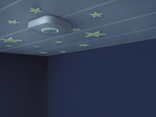
The new Nest Protects are sleek, proactive, and interactive! The exterior of the detector is modern and aesthetically pleasing, a needed improvement on the older designs that have seemingly foregone redesigning. The detectors can also respond to the urgency of the situation: before the alarm goes off, the detector will announce it to you so that if its just a smokey kitchen you can wave to it to signal the alarm to not sound. If the situation is more pressing, it will immediately sound the alarm. The Nest Detector can be accessed through your smart phone, so that if there is a fire while you are away, you will know immediately!
This is an amazing piece of work. While it is a bit pricey at $129, it will certainly catch a wide fan base with its new outlook on smoke detectors. I look forward to seeing the Nest Protect in homes across the nation!
2 notes
·
View notes
Text
Give Me a Break!

Thanks to Ellie, I've decided to look around and find some cool and interactive web sites using CSS. I stumbled across the Awwwards, a site that aims "to discover and promote unique digital experiences that are useful, innovative, intuitive and beautiful". What I found was the amazing and funny new Kit Kat site.
The site progresses by scrolling downwards, and exposes new information using what appears to be CSS, javascript, and jquery. KitKat has caught on to the digital age, and plays on the idea of constant updates in 'revealing' the new 4.4 Kit Kat. The graphics are amusing, as they are what one would expect of new Apple products, or newer technology, including "a taste sensation that will have you up in TheCloud". My personal favorite, is the video at the end. The speaker's tone is that of a presenter on "Ted Talks" and amuses the viewer with irony and unexpectedness that delights.
5 notes
·
View notes
Text
Oh Beer and Design
The other day I stumbled upon this website, Oh Beer.

Oh Beer is an app that helps the user decide on which beer to get by accessing information on beer quality, taste, and other user reviews. It is especially wonderful for beer enthusiasts who want to try as many new beers as possible. There is even a section where users can locate the brewery to find new and tasty beers!
The website uses textured yellow to make the page more interesting, while maintaining its simplicity. The page also has an interactive (though a little pointless) feature where the user may easily rearrange beers and an iPhone with the Oh Beer! app. Though I am not a fan of the interactive feature because it has no function or reward, I do like that its moveable and does delight the user at first. The later illustrated animations below are also simple and fun, pulling together the three most important aspects of the app. What I like most about the animations are their simplicity and that they do not distract the user.
The creators of Oh Beer! did an amazing job, keeping a simple design that is interactive and fun. This design is very hip, and definitely appeals to yuppy professionals looking for their next yummy beer!
1 note
·
View note
Text
Vector Graphics and Responsive Web Design
Quick shout out to Hannah Harry for introducing me to this great site!
I've been dabbling in Illustrator to create vector graphics for my upcoming project in GDES rather than pixel based images I could create in Art or Photoshop. Vector graphics are better to use for websites because, unlike pixel based images, the images do not blur when enlarged or zoomed in. This is because programs to create vector graphics use mathematical expressions of sorts (points, lines, curves, polygons) to represent images. All vector images can be enlarged or minimized without sacrificing quality because the mathematical expressions allow it to be scaled.

Vector graphics are becoming more and more important with the changing size of screens used to access and view the web. From iPhones to tablets to computer monitors and even smart boards, images must be able to respond to the different sized screens without sacrificing quality.
5 notes
·
View notes
Text
Robin Davey and Moving Images
Robin Davey is a fantastic designer and animator, working to change how we interact with our traditional print sources in the digital age. He worked with WiredItalia, a magazine, to create animated gifs for users to choose from that categorize the type of user they are. Ranging from geek to globetrotter, the user categories are available online to help customize articles that are shown to users. His animations are funny, quirky, and engaging. By bringing in moving images to websites, designers can entertain the user while still providing the true purpose of the website. These short, repetitive, simple, and pleasing gifs transform a boring page or category into a delightful space for the user to appreciate without overwhelming and stimulating the user, detracting from the actual purpose of WiredItalia.
1 note
·
View note
Text
Glass Window Bridge

The dark blue, cold, deep, and violent side of the bridge is the Atlantic Ocean, while the turquoise, warm, shallow, and calm side is the Caribbean Sea. The Glass Window Bridge image is inspirational to me because of the beauty and energy caught within the picture, how it seems so strange and paradoxical to have such different waters and tones in one image. In person, its even more beautiful and shocking, especially considering the actual only separation between the two sides of the image is a 6x10 feet boulder. I love the unexpected and ironic, as Frank Chimero spoke of...delight is the perfect combination of surprise and clarity. This is a truly delightful and inspirational image, and I want to create surprising and beautiful things such as this.
4 notes
·
View notes