
University of Westminster / Photographic Arts student / Design and Lifestyle
Don't wanna be here? Send us removal request.
Statistics
We looked inside some of the posts by soft922-blog and here's what we found interesting.
Average Info
Notes Per Post
3
Likes Per Post
3
Reblog Per Post
0
Reply Per Post
0
Time Between Posts
5 days
Number of Posts By Type
Text
12
Photo
5
Last Seen Tumblr Blogs


Fun Fact
There are dozens of funny blogs to kill time on Tumblr.
Text
Research Methods - Major Project 1
The first steps are always looking for inspiring material. It could be anything, but it necessary needs to be printed material, not only an online image. Why this? For me, it is of fundamental importance to touch the materials, feel the texture, smell pages and inks of publications and printed work, because it takes me back to an idea of reality and concreteness that we are loosing nowadays.
I went to exclusive bookshops and museums shops because they are the two locations where it is always possible to find independent publications or artists. This is the same research process I adopted last year, the difference is that my idea of the final result is clearer now so I know a little bit better what I am looking for.
The next step was looking for materials, even to just have an idea of all the possibilities the paper world offers to us. I went through 3 of the major paper shops in London: the London Graphic Centre, which was particularly good for calligraphy materials. As I wrote in the major project proposal, I would like the final result to be a marriage between different kinds of visual art: photography, graphic design, calligraphy or types, drawings. The second place I visited was Quill London, which again is really good for brushes and for calligraphy, but it also has a vast range of uncommon papers that happen to be used for writing and printing, from wrapping paper of different weights to organic paper or recycled paper. They also have papers infused with perfumes. The last stop was Hay: founded in 2002, ‘label of the moment’ Hay specialises in stationery and furniture that celebrates Danish design from its peak era during the 1950s and 60s. Their Gold Phi scissors have gathered something of a cult status, but there are other tools to achieve a simple and minimalist desk at their beautiful mini market in Selfridges.
I am still deciding if I’ll print and bind the magazine myself or if I am going to have someone doing it for me: it all depends on the quantity of the material and its variety. Because If I could print it myself, including different types of paper, handwriting and types, obtaining a handmade feeling in a modern frame, then it would be okay to have someone binding it. But this is something I will understand further on.
1 note
·
View note
Text
Pilot Project - Major Project 1
Since I embraced the same project-path last year, I really felt like I needed to focus on the research first, something that last year I left a little bit more behind in comparison to the creation of the project itself. I have made my Pilot Project as a mood board with all the elements I want to include in the actual publication; it is more like a map of the different aspects of my magazine, regarding both materials and contents, and how I would like to develop them.
Aspect: the theme I discovered being appropriate for my idea is what I like to call not only minimalism. I reckon that I have a passion for cleanness: black and white, sharp edges, modern fonts. Yet at the same time, I like flows of handwritten words, graphics, imprecisions that find a harmony within cleanness. The main palette is going to be basic colours such as black, white, greys and nudes side to side with bright reds, pinks and blues. This two groups of colours will respectfully represent the two styles which are going to coexist in the publication.
Materials: the papers I am going to use will also reflect this duality we found in the description of the aspect of the magazine. I want to use thick 290/300gr uncoated paper as a basis, but I would also like to include different textures to reflect the different topics: transparent paper, which is almost like plastic and can be used as a transaction between arguments or as an actual piece of paper; wrapping paper at its natural brownish colour, it could be new wrapping paper or used, depending on the topic; marble paper, which I will be doing by myself to give, again, that feeling and idea of the handmade. I would also like to use coloured paper, like a deep black, and I would like to scan textures (like fabrics) and use them on normal paper to give different effects.
Photography: the photography is going to be, hopefully, all film. Ranging from 35mm to large format or medium format, depending on the needs. I would like the pictures to mainly be black and white and printed in two different ways: both directly on the normal paper (so in a digital way), and printed in the darkroom, scanned as a picture on paper and reprinted on the uncoated page.
0 notes
Text
Something to take inspiration from: King Kong
Starring Peter de Potter, India Menuez, Nicola Formichetti and The Garden, King Kong magazine has only one rule: that there are no rules.

Over the last few years, there's been a lot of talk about the future of print magazines. Would they be swallowed up by the internet, or come to be enslaved to advertisers? Obviously, we think not – and we’re not the only ones. Totally unfazed by any whispers of uncertainties is King Kong, an entirely independent fashion magazine who have just debuted its first issue – a 430+ page tome with no less than four covers.

Inspired by the Guerrilla Girls, the Berlin and London-based magazine features iconic actress and Yves Saint Laurent muse Catherine Deneuve, artist and Miu Miu campaign girl India Menuez and musician Brooke Candy as cover stars, with a further spot going to an editorial by guest fashion director (and Dazed alumnus) Nicola Formichetti. The magazine is dedicated to “pushing the boundaries of art and fashion”, and gave only one direction to its contributors: that there was no direction. Instead of working to a set of rules or restrictions, the photographers, stylists and artists recruited were free to go wherever they chose.

Inside, features include an editorial captured on the streets of Russia by Dazed contributor Masha Demianova, a shoot by rising South African star Kristin-Lee Moolman which used clothes scrounged from skips, musical duo The Garden shot in the now-closed George and Dragon and much, much more. There’s also a heavy-focus on the arts, with content straddling the line between the iconic (Allen Jones, Ulay, Peter De Potter) and the emerging. Click through the gallery above for a sneak peek, and pick up your copy in locations worldwide, including IDEA at Dover Street Market and Artwords.

1 note
·
View note
Text
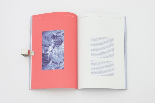
Something to take inspiration from: Flaneur
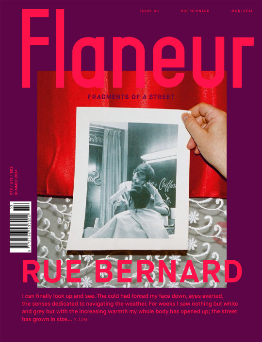
Flaneur is part literary magazine, part culture journal, part serialized, interdisciplinary art object. The Berlin-based creators describe the publication as a "vessel." Each issue focuses on a specific street in a specific city across the globe, then explores each locale through idiosyncratic interviews, photo essays (with off-kilter layouts), poetry, illustrations, and even more abstract stylistic devices. "I don't think that Flaneur actually really is a magazine," Grashina Gabelmann, the co-editor-in-chief, told me. "I think it's just that we chose to present these streets in the magazine format."
Created in 2013 by Ricarda Messner (now the publisher), Flaneur is about to release its fourth edition, focused on Rome. While past issues have featured streets in vibrant, artist-hubs like Berlin, Leipzig, and Montreal, the Italian capital was a change of pace for Messner, Gabelmann, and Fabian Saul (the other editor-in-chief). Rome is full of history, but the city's present state felt stagnant and dry to the team, as well as the locals they spoke with while putting together this issue. As a result, they picked the most tourist-y and obnoxious street in the ancient city to be its nucleus: Corso Vittorio Emanuele II.
"How cool would it be to take the most annoying street where everyone thinks there's nothing left to discover, and then find something new in it?" explained Gabelmann.
The Rome issue features a photo essay where two photographers walked down Corso Vittorio separately and documented it with disposable cameras. It also includes an account of an experimental performance piece the editors organized in Italy in which they asked locals to "donate" water to a Roman ruin—the idea being to make the city less dry. But even when heavily conceptual, Flaneur never feels patronizing, nor does it fetishize the cities it focuses on.
I recently talked to Messner and Gabelmann about the newest edition, and how the publication has grown over time. Baudelaire would be proud.
What inspired you to create a magazine? Ricarda Messner: It was always pretty clear to me when I graduated that I always wanted to do something on my own. I never really knew what I would end up doing, but I always just had this feeling that I didn't see myself in this nine to five job. And then I came back from New York and the plan, the love, didn't work out. I was inspired by movies.
I always loved mixing also disciplines with each other, you know? And this is also what the magazine reflects. It has photography, it has architecture, it plays around with different layers. It made sense to me to try the concept with one-street-per-issue in a print format.
What inspired the one-street-per-issue theme? Messner: It had to do with returning to Berlin and rediscovering a town that I never really liked before. New York was my thing, and I always envisioned myself there. Then I was back again in Berlin, and I knew I had to have a closer look at it. I remember that I was looking out the windows at my parents' place a lot because it was so quiet compared to New York. I kept thinking about how my neighbor must have a completely different relationship to the street I spent 12 years of my life living on, and was now staring at out the window once again. And there was something interesting about taking something concrete—literally and figuratively, in this case—but then exploring it through a variety of forms with a sense of freedom. In the end, the street is being used as a storyteller with Flaneur. And that's the thing: When you walk down a street, you can't sum it up.
How has the magazine evolved since it began? Messner: Maybe two weeks ago, G and I sat down to discuss what we're learning from issue to issue—what we're really doing here, or what this thing is. We're realizing more and more that we're not a classic or traditional magazine, and we're also not going to communicate this. It should be clear from opening the front page.
Grashina Gabelmann: We didn't want to go with a travel guide approach where you end every article with a shop listing, address, map, etc. As I got more involved, I realized this was not the direction I wanted to be going in. It's not very interesting, and I think Ricarda felt that way as well. And then when our other editor Fabian came in, Flaneur got its literary twist. Fabian is integral to the conceptual and abstract aspects. He studied philosophy. So he brings in this literary, artistic feel.
Can you tell me about this upcoming issue, number four in Rome? Gabelmann: Rome was really a strange, unique experience. Berlin and Montreal are cities that have a strong cultural network. There's money and support for artists there, and both attract young people who make art. Leipzig has a weird underdog thing, which I think you can feel by reading our issue on it. But Rome is this ancient city that has such a history of art and culture, and it's really struggling to be modern. It was the first city where we felt that people actually needed our presence—even if that sounds patronizing or dickish.
Messner: Well, we offered some Romans a platform to talk about their home to people outside Rome.
Grashina: Yes, not to belittle anyone, but we did offer this. We organized a performance piece in Rome, and this one man described to us how the city is so fucking boring, so dry, and you can't even touch the ruins. There's no way of interacting with the city. It's like a live, sprawling museum, and Romans feel really trapped, in a way. He said something like, "I really want to turn the city into lakes so we can actually do something with the ruins." And so we said OK, yeah, let's do it.
Within two weeks, we had this performance planned. We printed out all these posters and signs that said something like "Rome is a boring and dry; Romans want water," and put them around the ruins. Then we made a little model—like a mini ruin—and put water in it with fish and had that in front of the ruin. We asked every passerby, "Hey, don't you want this to be a lake? How much water do you want to donate to turn this into a lake?" There was a fountain right next to the lake, so every time someone signed the petition, they had to take water from it and pour it into the ruins to symbolically start the lake. So we got people to pour in water, and then people were wearing bathing suits and towels and it became this public celebration and performance. The reactions from the Italian people who helped us were so overwhelmingly positive. They said, "Hey, we haven't done anything like this in months, or even years. We really haven't had the motivation or drive."
Messner: This project is documented in issue four. We videoed everything, so, we'll have a little documentary online, and an article in print. We'll include the posters and the scribbles and the behind-the-scenes details of creating this performance piece.
On the back of the book, the abstract or manifesto makes it clear that you guys aren't trying to capture the essence of a street or say, "This is it. This is Rome all summed up." Can you expand on that idea? Messner: You have to have this kind of mentality, because we're not from Rome. We only spent two months in Montreal—and even less time in Leipzig. What can we tell them about their city, after all? It's more about the discussion and the constant exchanged ideas related to an experience in a certain place. The artists who contribute work for Flaneur come from many disciplines and countries, and they are really free to create whatever they want.
How have people from each city responded to the Flaneur issues focused on their homes? Messner: In Leipzig, I felt like the initial response was, "Oh, these hipsters are coming and they're fucking ruining our town." They'd flick through the magazine and say, "Oh, I would have done this differently."
Gabelmann: Well, like, yeah, then you make a magazine. But anyway, their attitude to the final thing really matched our experience in the city. Our actual contributors were super happy with the result, but I think we sold 20 magazines at the launch party—not a big success. I don't know about Rome, but I think they will be proud.
You've had four issues now on four distinctly different streets in four cities. Why did you choose those specific streets in each city? Gabelmann: We had never been to Rome before, so we behaved like newborn children there. It was a very different approach, compared to the Berlin issue, which was very personal. Close to the Coliseum is the old political center of Rome. Basically from there to the river is a main traffic spot and it's busy. It's a street filled with both Romans and tourists all the time. So Fabian and I were in Rome for a week in the summer to find our street, and we had a really difficult time picking one at first.
At the end of the week, we met an architect and he said to us, "Oh, Corso Vittorio has something from every epoch of architecture and it's interesting." And we had no idea which street he was talking about. He replied, "That's impossible, you have to pass that street to go anywhere." We googled it and realized we were on that street three times a day, every day. But since it's so hectic and all the points of interests are on little side streets, we never looked it up and actually took in the street. So that was the initial interest: How can a street that's so busy and so important be that easy to ignore? At first, most Romans were irritated and asked us, why would you choose to represent Rome with that ugly street? And then on second thought, they were like, "Oh, OK, actually that's pretty interesting." Think of it this way: I'd love to do Broadway in New York. How cool would it be to take the most annoying street where everyone thinks there's nothing left to discover, and then focus on that place and find something new in it?
What do you think has succeeded most about Flaneur so far? Messner: Well, it's independent and I can also give the contributors and designers freedom to come up with crazy things. This is kind of my prime goal as a publisher: to offer this independent platform for these creative people to go wild with, for as long as possible.
Even our designers Michelle Phillips and Johannes Conrad [both of Studio Y-U-K-I-K-O] come to these towns with us, and this is why every issue of Flaneurlooks different. They each have their own design voice, plus you can see that we play with the medium as well—there are fold-outs, different sorts of paper, and various art styles and mediums in each issue that make sense just for that issue.
Gabelmann: I think another big thing is that we don't go to Rome and interview an artist about his work, and then publish some photos of his work that's been in galleries, alongside the interview. But rather, we meet that artist and then come up with a concept with him on the street—like that performance piece—which is specifically conceived for Flaneur.
I always think about one of my first lectures at university where the professor explained that a magazine is just something that holds something. Like, a gun has a magazine case. A magazine is a vessel. I don't think that Flaneur actually really is a magazine. I think it's just that we chose to present these streets in the magazine format.
1 note
·
View note
Text
Proposed form
I would like to present a printed magazine. This is the starting point. Then there are two parallel ideas:
to create two numbers, or the magazine and a smaller version of it which might be like a travel guide, or the magazine and an agenda with interesting news about the art world around London and Italy, which is where I am from.
to create the magazine and an online platform, like a website, where all the talents featured in the magazine have a profile and could be researched and contacted. Like an agency for models, just it is going to be for artists.
Also, I would like to include unique prints with each magazine, prints that would be different from number to number and from magazine to magazine (in the sphere of the possible of course), to give the audience that feeling of authenticity and handmade that really runs out world nowadays.
0 notes
Photo


Sarah Marchetti X Benedetta Giannessi by me / @itsnopeanyway
0 notes
Text
“It’s exhausting and it hurts”: Brown Girl In The Art World

In this poetic text and photography work, produced for The Royal Standard’s current exhibition, Black Blossoms, Rene Matić candidly describes her experiences as a contemporary artist and a Queer, woman of colour.
Do you remember catching sight of your mum after losing her in the supermarket? That soft landing when you see her down the aisle and you are safe. This is the way it feels when seeing another brown girl in a room full of white people… Safe.
My favourite poem is by a great friend of mine, Jemima Khalli. Someone who gives me that safe feeling.
“There is an awareness within us of one another tying eyes when we cross footpaths and sinking into where we are – women of colour”
“When you are a woman of colour you are a part of something so so soft. A link in a chain. Hand in hand, always”
When you are a woman of colour you are a part of something so so soft. A link in a chain. Hand in hand, always. Being 6 years old, alone down the cereal isle in Aldi is how it feels, for me, to be alone in a room of white people.
Actually, that’s a good way to describe the art world: A room of white people.
The other day I went to my first symposium that my wife had organised on “artist-led spaces.” I have just become and artist in an artist-led space so I felt as though this may be something I could resonate with.
I am the only person/artist of colour in the artist-led space that I am involved in. I was also the only person of colour amongst the 20-plus people that were in that room, sitting opposite a panel of white people.
“Small electric shocks of anxiety keep pulsing through my veins”
I sit and observe, I’m uncomfortable as I am the only person not having a conversation. Small electric shocks of anxiety keep pulsing through my veins as time goes on and still no one has even dared to make eye contact with me. The coffee encourages the anxiety and I am left thinking about how if someone was to talk to me perhaps we’d spark a real good conversation and exchange Instagrams. Networking, the dream.
Melissa Harris-Perry is the author of a book called Sister Citizen. She’s also a professor in political science. She’s the definition of a boss ass bitch. In the book, she references research called “the crooked room.” They would take someone and put them in a dark room and when the lights are turned on, all the angles of the room are crooked and everything is tilted differently. Sitting on a movable chair, the person’s responsibility is to find the upright. It’s basically asking how dependent are we perceptually on the things that we can see when figuring out what is up and down.
“Harris-Perry describes being a black woman in America as being in a constant crooked room”
Most people are field dependent and they would get themselves tilted in that chair as much as 45 degrees, but perceive themselves as straight up and down because they are inline with the crooked images all around them (lol society).
Harris-Perry describes being a black woman in America as being in a constant crooked room. Society presents to us a series of crooked images that makes it hard to figure out what the true upright is.
Mate, this shit is like being a woman of colour full stop. But lets talk about the hashtag ART WORLD which I am now describing as a crooked room of white people which I have snuck into and am standing in the corner. The art on the walls is exploring the identity of the white male. To the field dependent people aka the majority of the (art) world, this room is upright, they can stand peacefully even though its only at 45 degrees, because their chair is inline and adjusted perfectly to allow them to view the ceramic pot that’s been made by the white boy and his mum. The work “explores his identity and their relationship” — stuff that those people can really resonate with. They stand alongside it comfortably while discussing last weeks PV, wine in hand. Meanwhile the person of colour is well aware that the room is at a 45 degree angle and the blood is rushing to their head and they gonna pass out while wondering what the relevance of this shit is. Is it just to take up space so there’s no room for PoC? Prolly.
“And to Basquiat, I apologise, as we are still tired of seeing white walls, with white people, with white wine”
And so what happens when the room is upright to the minority? The wine starts to spill from the glasses of the white people. The work on the walls is too political, too girly, too angry, too black, too scary, too confronting. I spot a woman of colour across the room and I am safe. BUT everyone else has lost their shit so we go back to the comfortable 45 degrees. An example of the journey back to the 45 degrees is when Tate Liverpool had Glenn Ligon: Encounters & Collisions along side Jackson Pollock: Blind Spots. I sat in the gallery and watched people walk straight past Ligon’s carefully curated show exploring race, gender and sexuality in visceral, vibrant ways. They had come to see Pollock, and Ligon’s show was “too political” for them. Apparently some white gallery visitors actually complained about the use of the word Nigga in one of his paintings.
Last night I went to a PV in someone’s flat (hold tight it’s 2016). A caucasian exhibition in a caucasian home. I didn’t speak to anyone. Some guy legit came up to my wife and I and only introduced himself to her and started a conversation. Must be nice. I spent my time looking out the window, the world was still beautiful. The more I make art the more I fall in and out of love with everything. I’m just trying to work out what the upright is. It’s exhausting and it hurts. To women and to artists like myself, you are not weak for struggling. This stuff is real hard. And to Basquiat, I apologise, as we are still tired of seeing white walls, with white people, with white wine. We will get there one day.
Rene Matić
This text, entitled Brown Girl In The Art World I, has been produced for Black Blossoms: the current exhibition at The Royal Standard, Liverpool.
0 notes


Text
Paper research

Newspaper paper: Low resistance to tearing and pulling, permeable and absorbent.

Normal paper: Little absorbent and little transparent, quite resistant to tearing, smooth and absorbs well the ink

Letter paper: Little absorbent and little transparent, quite resistant to tearing, smooth and absorbs well the ink

Wrapping paper: Resistant to tearing and bending, very thick compared to normal paper.
0 notes
Text
Something to take inspiration from: Fireflies

Published biannually, Fireflies is a magazine centering on film that’s part-homage, part-career retrospective, part-symposium. Each issue highlights and celebrates two film directors through a collection of personal essays, interview with the filmmakers and creative interpretations. Created between Berlin and Melbourne, Fireflies hopes to expand the notion of film criticism beyond reviews.

0 notes
Text
Subject concepts and aims, first ideas
The key words for this project, gravitate around concepts like space and place, the idea of a platform for young artists of all kind where everyone has a corner and happens to be taken in consideration by other artists, students, curators and so on and so forth. Another concept is the variety of the design, which eventually is not a concept but more a goal: I want to create a styling which is coherent to my idea of minimalism, yet is, at the same time, innovative and involves the audience and their curiosity. To do so I am engaging with different materials, types of paper, layouts, and fonts, as well as different kinds of art, from photography to graphics to typography.
This project is, actually, a more vast idea than just a university degree project. I would like to develop this magazine in order to launch it in the editorial world. It was not born as a street magazine, moreover like an independent publication that could come out three times a year because it requires good quality materials in both contents and forms. I would like my magazine to be authentic, to feel handmade, like if someone spent hours and hours behind every number.
0 notes
Photo


Sarah Marchetti X Benedetta Giannessi by me / @itsnopeanyway
0 notes
Photo


Design ideas - Paper styling: dark paper, marbled paper and teared paper
0 notes
Text
Design ideas: transparent paper
Tracing paper is paper made to have low opacity, allowing light to pass through. It was originally developed for architects and design engineers to create drawings which could be copied precisely using the diazo copy process; it then found many other uses. The original use for drawing and tracing was largely superseded by technologies which do not require diazo copying or manual copying (by tracing) of drawings. The transparency of the paper is achieved by careful selection of the raw materials and the process used to create transparency. Cellulose fiber forms the basis of the paper, usually from wood species but also from cotton fiber. Often, the paper contains other filler materials to enhance opacity and print quality. For tracing or translucent paper, it is necessary to remove any material which obstructs the transmission of light.
Today it has turned into an actual type of paper which can be used in between paper pages or as the base for drawings, photographs or texts.


0 notes
Text
Something to take inspiration from: Oh Comely

Oh Comely is a magazine that makes people smile, full of quiet moments and stories. Read it with a cup of tea or a toddy. It inspires people to be creative, talk to their neighbours and explore new things. There are adventures that capture the feeling of being free, stories from people with tales to tell, recipes to warm your heart, and crafty things to make. All these things, wrapped up in beautiful words, illustration and photography.


0 notes
Photo


Ana Strumpf is many women in one. She is an illustrator, an interior and product designer, trend forecaster and mother of Max and Noah – her 1.5-year-old twins. She has owned a design and fashion shop while she was still in college and nowadays has a monthly design column in Vogue Brazil. All of that is only a fraction of her story.
One of her artistic outlets is drawing on magazine covers. She was in New York when this happened (she lived there from 2010 to 2014) she used to do meetings via Skype during which she would draw doodles on magazines. As she started liking the result, she started posting pictures on Instagram that people also appreciated. “It was a way to give new meaning to these magazines that would be thrown away otherwise.” Then, some friends who owned a gallery in São Paulo invited her to exhibit the covers and as a result, they got more attention.
0 notes
Text
Something to take inspiration from: The Gourmand
A Gourmand is a person who takes pleasure and interest in food of all kinds and The Gourmand is a new food and culture journal that binds inspirational words, images and ideas with the humble and universal subject of food.
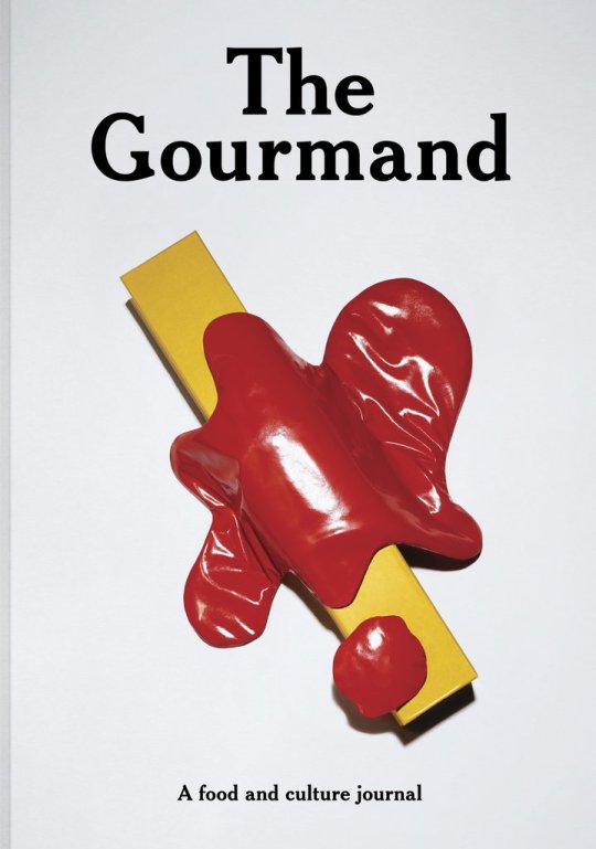
Based in London, The Gourmand is inspired not only by a true passion for food and dining but by the exciting influx of new restaurants, bars, cafe’s, stalls and ingredients that are increasingly available to us. The Gourmand was born as a means to share this exciting cultural shift and to celebrate food as a catalyst for creativity.


0 notes