
Statistics
We looked inside some of the posts by soupsquared and here's what we found interesting.
Average Info
Notes Per Post
149K
Likes Per Post
91K
Reblog Per Post
58K
Reply Per Post
97
Time Between Posts
4 days
Number of Posts By Type
Photo
4
Text
12
Note
1
Last Seen Tumblr Blogs


Fun Fact
Women make up for the other 50% of Tumblr’s audience.
Photo
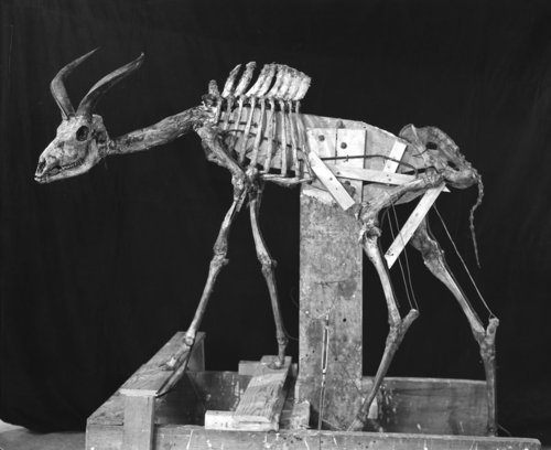
KUDU SKELETON:
Armature for young male greater kudu, mounted for kudu group, February 1931.
The American Museum of Natural History
1K notes
·
View notes
Photo
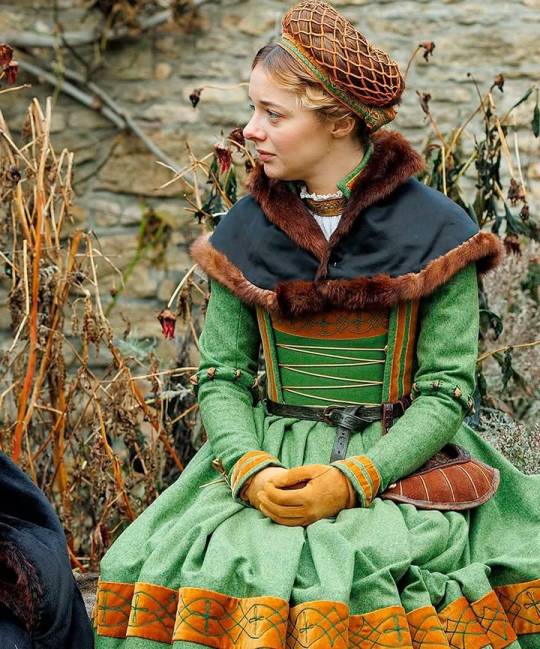
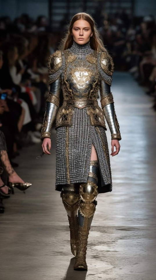
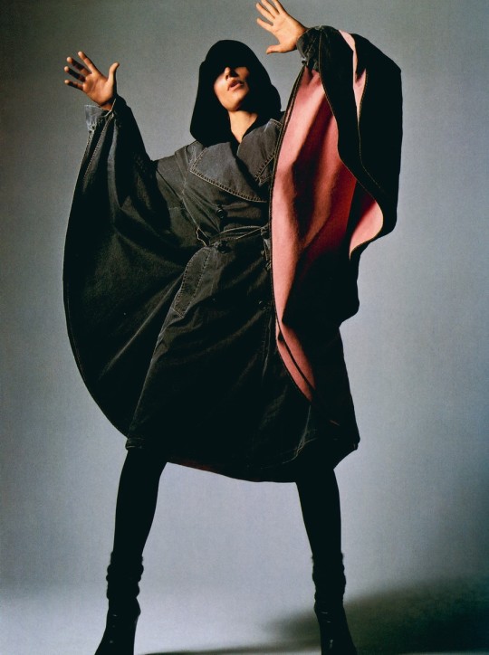
Ellie de Lange wore this elegant fur mantle as Jenneke in the beautifully costumed 2024 miniseries 𝑾𝒐𝒍𝒇 𝑯𝒂𝒍𝒍: 𝑻𝒉𝒆 𝑴𝒊𝒓𝒓𝒐𝒓 𝒂𝒏𝒅 𝒕𝒉𝒆 𝑳𝒊𝒈𝒉𝒕. While many costumes were created specifically for that production, this piece was likely made for the equally lavish 𝑭𝒊𝒓𝒆𝒃𝒓𝒂𝒏𝒅, where it was worn by a lady-in-waiting. See more at Bit.ly/Acces217
215 notes
·
View notes


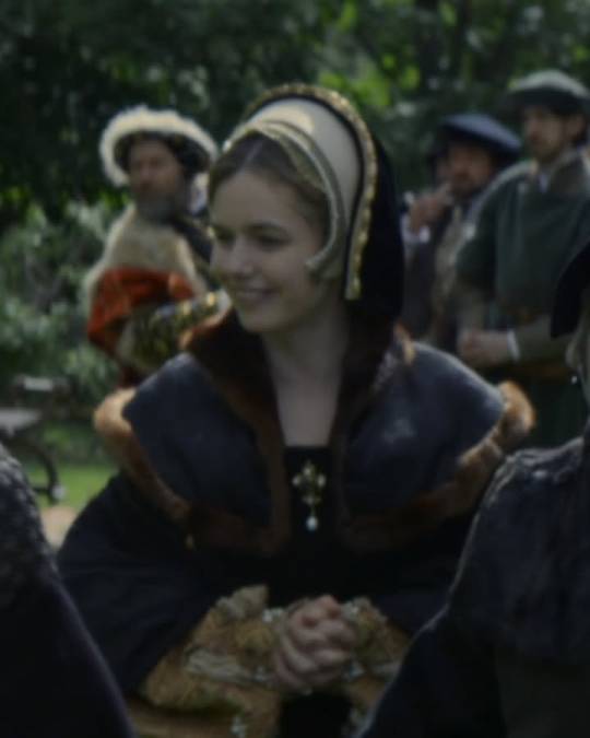
Text
Mia Wasikowska on the Crimson Peak set, photo by clionafurey
5K notes
·
View notes
Text


In preparation for the production of Queen Christina, Greta Garbo sat for a costume test in July 1933 with cinematographer William H. Daniels.
512 notes
·
View notes
Text


Athiec Geng , Nyaueth Riam , Chol Mabior, Faaby Fall , Tass Sarr by Karolina Pukowiec for Vogue Polska September 2024
750 notes
·
View notes
Text

Once you care a little about lettering and fonts there’s no coming back
(Top to bottom fonts are: anime ace, back issues, minceraft regular, white rabbit, vcr osd mono, and determination snas
36K notes
·
View notes
Note
could you please do a tutorial on how you do your risograph style drawings? they look so cool 😭😭


19K notes
·
View notes


Text
Something I try to keep in mind when making art that looks vintage is keeping a limited color pallette. Digital art gives you a very wide, Crisp scope of colors, whereas traditional art-- especially older traditional art-- had a very limited and sometimes dulled use of color.
This is a modern riso ink swatch, but still you find a similar and limited selection of colors to mix with. (Mixing digitally as to emulate the layering of ink riso would be coloring on Multiply, and layering on top of eachother 👉)

If you find some old prints, take a closer look and see if you can tell what colors they used and which ones they layered... a lot of the time you'll find yellow as a base!
Misprints can really reveal what colors were used and where, I love misprints...
Something else I keep in the back of my mind is: how the human eye perceives color on paper vs. a screen. Ink and paint soaks into paper, it bleeds, stains, fades over time, smears, ect... the history of a piece can show in physical wear. What kind of history do you want to emulate? Misprinted? Stained? Kept as clean as possible, but unable to escape the bluing damages of the sun? It's one of my favorite things about making vintage art. Making it imperfect!

You can see the bleed, the wobble of the lines on the rug, the fading, the dirt... beautiful!!
Thinking in terms of traditional-method art while drawing digital can help open avenues to achieving that genuine, vintage look!
65K notes
·
View notes
Text
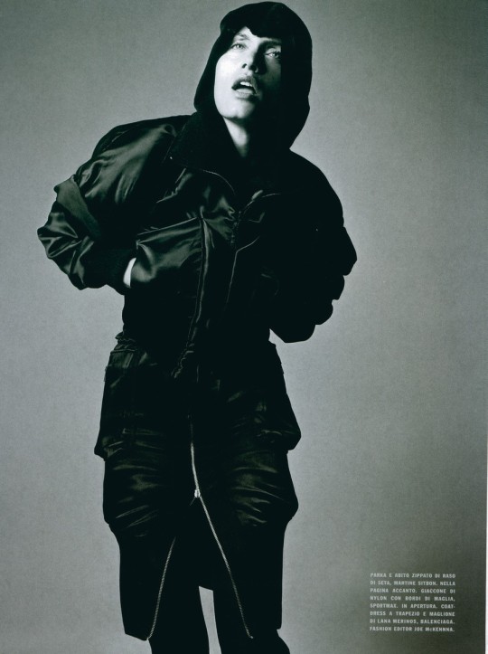
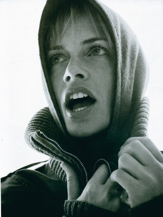
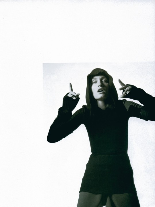
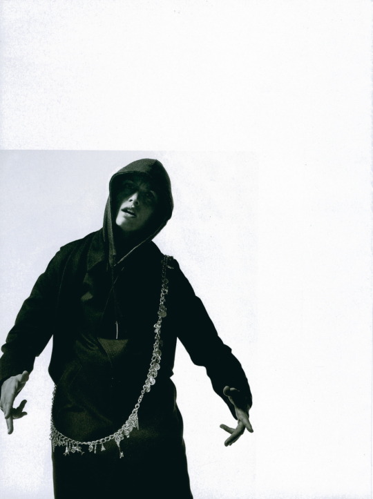
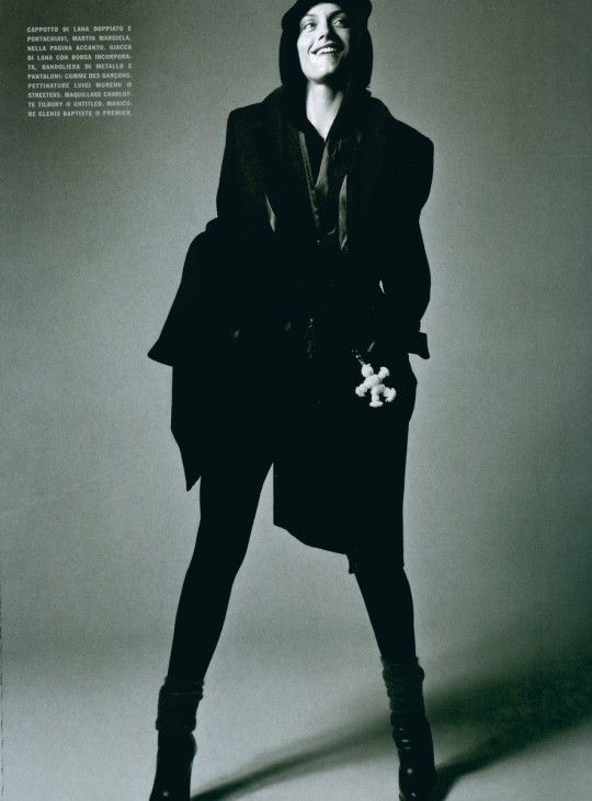
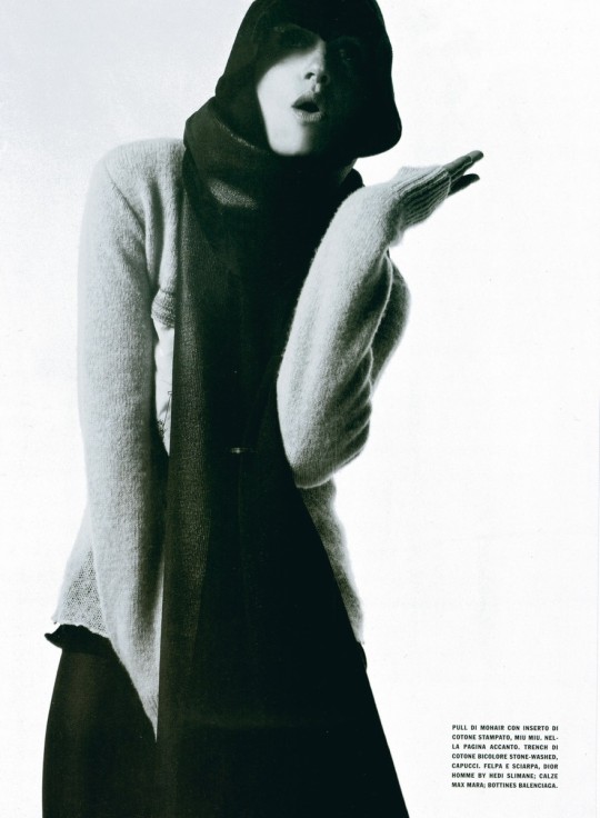
VOGUE ITALIA September 2003 editorial photographed by David Sims and styled by Joe McKenna
108 notes
·
View notes


Text


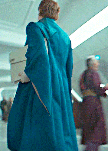


GENEVIEVE O'REILLY 𝒂𝒔 MON MOTHMA | Andor: A Star Wars Story Season 2 Second Arc (Episodes 4-6)
466 notes
·
View notes
Text


Accessorising the new cotehardie a little, as a treat. I don’t know why all these turned out so serious 😂
Also holy shit, all of this is entirely handsewn (including the not-visible shift and hose). Reenactor goalpost reached o.o
4K notes
·
View notes