
Statistics
We looked inside some of the posts by strangecares and here's what we found interesting.
Average Info
Notes Per Post
1M
Likes Per Post
748K
Reblog Per Post
706K
Reply Per Post
782
Time Between Posts
13 days
Number of Posts By Type
Photo
12
Note
1
Text
2
Video
2
Last Seen Tumblr Blogs


Fun Fact
Tumblr was acquired by Yahoo for $1.1B in 2013.


Photo

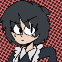
I’m still alive, just working and going through some depressive swings. I apologize for the absence. So until I have bigger things to post, have this little robot pal!
19K notes
·
View notes

Photo


Sunny adventure … !
Beware of cute cats ! ! !
2K notes
·
View notes
Note
(If you haven't answered this before) how do you do shading?
i havent !! and. i cant say this is gonna be any help but heres some of the things i try to keep in mind when im shading stuff

so youve got your flats on your initial drawing, the thing thats getting the business

then youve got find out where the light is coming from ! your light source is gonna determine where all the highlights and shadows are cast, and while it doesnt have to be EXACT, its generally a good rule to keep it pretty consistent through the drawing - sometimes youll probably have to deal with multiple sources, and each ones gonna be casting its own light and shadow ( and color by extension )

the intensity and sharpness of your shadows generally also reflects the brightness or closeness of the light ! basically if you wanna make something look BRIGHT, you gotta make sure the shadows are dark enough to get the idea across

so the actual shading part - the way i shade is by getting a brush on a very low opacity, picking the color i want for shadows and then layering the strokes over and over until i get about the darkness i want ( because im LAZY and i dont actually work with complex backgrounds a bunch, i can usually get away with drawing the shadows directly on the locked flat colors layer so theres nothing to clean up after )

afterwards i clean it up a little if i need to, add highlights while keeping in mind where the light is coming from, and start on the Detail Work ( it also might be helpful to keep in mind that highlights dont always go on the EDGE of things, but rather where the curve of something is - where the light would catch. this can help add a little depth and make flat things look rounded out ! )

and THEN its basically me zooming into the drawing at least 200%, putting another layer over the top of everything, and going over the outlines with a tiny brush so the harsh black is mostly gone ! there shouldnt be anything along the edge thats darker than the darkest part of the shadow ( with exceptions like the eyes and nostrils )
and thats mostly it ! i picked red for the shadow color, but picking your shading ( and flats ! ) based on the colors in your background can go a LONG way into making it seem like your character is actually in the environment

reflective light is also an important thing to keep in mind when choosing shadows and highlights - light and color doesnt always just hit an object and stay there, and even in the shade there could be light bouncing back from stuff like water or grass creating smaller, subtle highlights along the edges of things close by
not everything reflects the same way either ! something like a piece of wood is going to react differently than say, a metal ball

so you get your light source, basic highlights and shadows, not bad ! but then theres ALSO the light reflecting from the rest of the environment along the edge of the ball, and then finally the color from both the dragon and the ball reflecting a bit on each other
honestly though these arent RULES of drawing and more just guidelines i work with sometimes, and maybe your style of shading and highlighting looks completely different than this and thats ok !! - im still figuring a bunch of stuff out about light and reflections myself, and the great thing about art is that you can do whatever the hell you want with it

35K notes
·
View notes
Photo

LIMITED EDITION: BLACKLIGHT JOURNAL 3 GIVEAWAY
I’ve been contemplating this a lot for a little while now, and I’ve finally decided that I’m going to go through with it! I’m going through with giving away a copy of the limited edition Journal 3 (blacklight), due to the celebration of all you lovely people out there who follow my blog (all 13k+ of you! Thank you so much!), and just the fandom in general for being fantastic! And I know that many are really wanting to have a copy, but the price is really high to buy one. So, I thought: why not give one to a fellow faller for free and bring some joy?
I’m still working out some stuff (I have a copy pre-ordered already since October/November, but I’m not sure if changing addresses and all will make me lose the pre-order so I may have to re-send the journal out to the winner. Which I probably will just stick with that since it’s gonna be a while before I announce the winner of the giveaway. And who knows if there will be copies left to order by then. But that’ll just let me make sure the journals in a good condition before I send it back out, I guess?).
Rules:
• You must reblog to enter! You can reblog up to 5 times, and please be courteous of your followers! (No likes will count, sorry. Reblogs only.)
• 1 (ONE) winner will be selected for the giveaway. Just one, and no more.
• At the moment I will only be shipping the journal to residents in either the US or Canada, due to high shipping costs (especially since this journal will weigh more, it’ll definitely cost more to ship out of the country…but things may change in the future, as you have over a month to enter the giveaway.) I’m sorry, but I’ll already be spending so much on the journal, and with shipping it’ll be even more (especially as a college student who should be saving their money for tuition…but I really want to give away a copy!)
• Giveaway ends on March 31st, 2017 at 7:59 pm EST.
• Winner will be chosen by a random number generator on after March 31st, 2017 at 8:00 pm EST. I will be announcing the winner sometime afterwards (no later than April 1st due to conflicting plans). So again, you’ll have until 7:59 pm EST on the 31st to get your entries in!
• Winner MUST be 18+, or must have parent permission to give me your address so the journal can be sent to you.
• You don’t have to follow me, but it’s encouraged. I’m a blog with Gravity Falls content, so feel free to follow if you want to!
• If you’re not entering and just want to signal boost, feel free to tag your reblog with #no entry and you will not be entered. Though if you want to enter for someone else that’s fine — just make sure they’re fine with giving me their address!
• Winner will have 48 hours to answer back. If no reply, I will pick another winner.
9K notes
·
View notes
Text
Notes for a young character designer
Dear E.
Thanks for your email.
I don’t work at Cartoon Network any more. But I’m going to give you a very quick portfolio review in hopes that you find it helpful! Here are some things I noticed when looking at your stuff - lessons I learned from brilliant people while working on AT for two years:
1) AVOID SYMMETRY. Humans are organic, randomly shaped animals. Perfect symmetry rarely exists in nature and if it does, it’s conspicuous - it’s the exception rather than the rule. Find interesting ways to throw your characters off-balance.
Don’t repeat objects in twos - (buttons or rips or whatever) - it feels prescribed - cluster things in threes or fives if necessary.
2) AVOID CONCAVITY - I don’t know what else to call this. But it’s those lines that go “in” rather than “out”. You are using inward sloping lines to describe many of your characters. As an exercise, try using outward, rounded, voluminous lines to draw EVERYTHING. Humans are fleshy lumps connected together by other fleshy lumps. Each mass is either in front of or behind other masses and as a designer, it’s your job to tell the animator where it is. As a designer, you are providing a technical blueprint for the location of masses.
Only occasionally allow a concavity to connect two convexities. Look at the work of Robert Ryan Cory (spongebob), Tom Herpich (Adventure Time) or Phil Rynda (AT / Gravity Falls) - master character designers - for examples of this. If you need to, trace a couple of their drawings and you will see what I mean.
3) AVOID GRAPHIC DETAILS - Some shows use a graphic style; it’s very appealing and looks clever when done right. But in animation, everything needs to move in space - so if you use a graphic element - it needs to correspond with an actual 3D thing that can move. Therefore it is better to start with a voluminous style and then revert to graphic elements where appropriate. Art directors will look for this. Do not jump straight to graphic representation if you do not yet know what you are representing.
Look at the work of Tiffany Ford and Jasmin Lai for amazing examples of volume expressed graphically.
4) STUDY JAMES MCMULLEN - To truly understand volume, and fully respect your subject, you should read very carefully High Focus Figure Drawing by James McMullen. Slow down and think about drawing “around” your subjects. It’s a truly meditative experience when you get there. Think about the weight and mass that your characters, props and effects are experiencing. Many students from SVA - Tomer Hanuka, Becky Cloonan, Rebecca Sugar, James Jean - studied under McMullen’s philosophy and you can see this common richness in their work.
Jeffrey Smith, a top student of McMullen’s now teaches life drawing at Art Center. These are two of the best illustration schools in North America - anyone who is interested in drawing living things, should probably read his book. Also look at the work of Andy Ristaino or Danny Hynes - two other character designers’ whose work is seething with volume.
I hope this is useful and I hope you have a wonderful career.
Warmest,
Matt
30K notes
·
View notes

Photo

If this dream wasn’t happening would it still feel real ?
3K notes
·
View notes

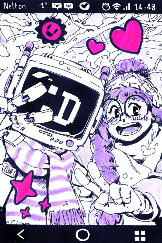
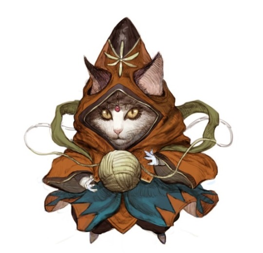
Text

American Shorthair Knight

Abyssinian Bard
Norwegian Forest Cat Shaman
Persian Scholar
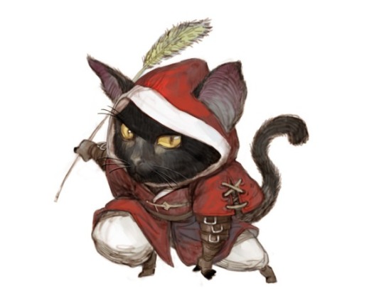
Bombay Assassin

Sphynx Fighter

Scottish Fold Warrior

Bengal Archer
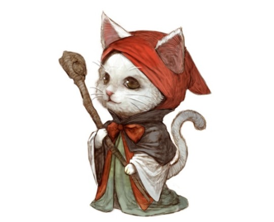
Turkish Angora Healer
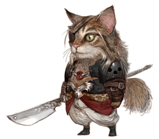
Maine Coon Berserker
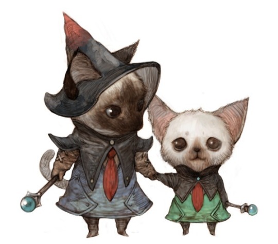
Siamese Magician

Russian Blue Thief
Kyoung Hwan Kim - Army of Wool
more by Kyoung Hwan Kim
377K notes
·
View notes


Photo

Being bitter and negative is boring and I dont want to do it anymore
122K notes
·
View notes
Photo
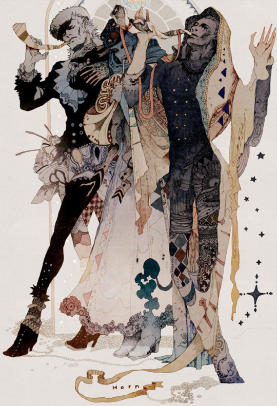
Akiya_kageichi - https://twitter.com/Akiya_kageichi
18K notes
·
View notes