
Statistics
We looked inside some of the posts by summahlongleythirdyearresearch and here's what we found interesting.
Average Info
Notes Per Post
0
Likes Per Post
0
Reblog Per Post
0
Reply Per Post
0
Time Between Posts
11 days
Number of Posts By Type
Photo
14
Last Seen Tumblr Blogs


Fun Fact
There were a total of 171.5 billion posts on Tumblr in 2019.
Photo

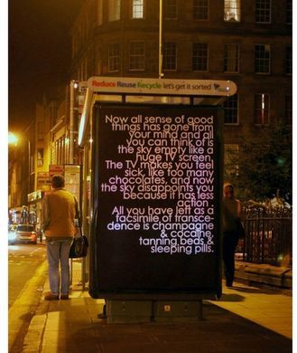

Robert Montgomery - Billboards
I think what I didn’t quite understand about Montgommery’s work until recently is that despite his work being large and very obviously text work and trying to convey a message, the actual writing isn’t forcing something down your throat there’s still a subtly to his writing that is optimistic. Some of it is very obvious what the message is but some is more vague and open. This is what is successful because it’s not screaming something at you so it’s more approachable.
0 notes
Photo


Robert Montgommery - Insitu Light Poems
Montgommery’s light pieces are some of my favourite pieces of work but especially when they are places in environments outside of the gallery. They are placed in galleries too but when they are in these environments they take on more of a narrative, they are really quiet and gentle despite being so big. Again they make me think of a quiet, contemplative, romantic scene from a film. The photography is also important for this because of the misty morning air in the first two images.
0 notes
Photo
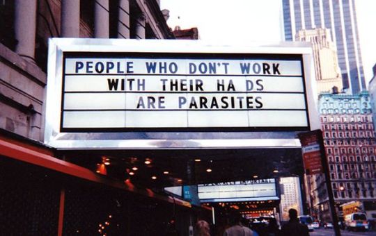


Marquees 1993
‘Picture it. New York City, 1993. Pimps, pushers and prostitutes ruled 42nd Street. The Disneyfication of the entire Times Square District was already on the horizon. And just before the old movie theaters were torn down, artist Jenny Holzer temporarily took over the marquees with her ‘truisms’. Sadly – or luckily, depending on your point of view – these oneliners were only up for a couple of months before work began to turn the entire neighborhood into ultra-safe tourist playground.’
This is again Holzer bridging the gap between art and the public, the truisms seem ever more poetic considering the looming destruction of the sites and the transformation of the area. It’s like a swan song of 42nd Street
0 notes
Photo


Inflammatory Essays (1979-82)
‘A number of the ‘Inflammatory Essays’ were first published in book form by the artist as Black Book Posters in 1979. These took the form of paragraphs printed on green paper. In the ‘Inflammatory Essays’ street posters, Holzer offset the texts on as many different colours as the printer could supply.
’In Jeanne Siegel’s article and interview with the artist Holzer stated: ‘From the beginning, my work has been designed to be stumbled across in the course of a person’s daily life. I think it has the most impact when someone is just walking along, not thinking about anything in particular, and then finds these unusual statements either on a poster or in a sign.’‘
What I tried to do, starting with the Truisms and then with the other series, was to hit on as many topics as possible. The truism format was good for this since you can concisely make observations on almost any topic. Increasingly I tried to pick hot topics. With the next series ‘Inflammatory Essays’, I wrote about things that were unmentionable or that were the burning question of the day.
’Her intention was to ‘write things that were very hot - in tone and subject matter - to (hopefully) instill a sense of urgency in the reader. I wanted the reader to jump, at least, and maybe consider doing something useful.’
0 notes
Photo

Truisms (1978)
During her time at the Whitney Museums independent study programme, New York, in which there was a lot of Western and Eastern literature philosophy on the extensive reading list. She felt these could be simplified into short phrases that everyone could understand, these were called her Truisms. She posted these around lower Manhattan, where people scribbled on them and she would stand by and listen to people’s conversations about them.
The participatory and underground element were very important to Holzer. In the same vein as Basquiat poetic graffiti, I’d like to take some of my own work into the public domain like this. It’s an interesting way to bridge the gap between fine art, literature and poetry and the public. It confronts people who wouldn’t normally visit fine art galleries, either because they don’t like it, don’t have access, feel ostricised by the piety of the industry, etc, in a direct way that is familiar and in their own space.
I also think these were a useful tool for Holzer as she uses these again and again in future works, they’re almost like a starting base or bank of material that she can return to and manipulate to her newer ideas. This is what I want to continue building up over the Summer to use in third year and the future.
0 notes
Photo


LED’s (1989-current)
The LED’s are doing a very similar thing to her projections but are a more malleable. The projections can be changed in form by the environments whereas the LED’s can be changed with more of the artists control.
They have an almost dystopian, blade runner-esque feel which is really when combined with the content of the text. If it is political or social commentary it has a feeling of foreboding, and is sort of like a warning. But if its with more personal text its like a metallic love letter. Either way they may you feel like your in a futuristic, dystopian world which is a really exciting environment to be a part of.
The link to scrolling news headlines and LED signs used in shops for adverts and nightlife is also obvious which just adds more layers to references modern society and appropriating that medium to tell an alternative narrative through it.
0 notes
Photo


Jenny Holzer - Projections (1996-current)
Holzer’s projection despite being large and boldly plastered across billboards retain a quietness and allows the viewers to contemplate the text. They create a site-specific experience that it emotionally engaging but aesthetically interesting as well. Many of the images of the projections look like stills from a Stanley Kubrick and have the aesthetic of an old Hollywood thriller.
The way the text bends across the buildings affects the legitimacy which means that the outcome of the work is determined by the environment so she has a certain amount of the work that is out of her control.
I like how she uses her own and other people’s texts, both serious, political, archival and heartfelt and emotional. It almost puts both on the same level. The text isn’t also really obvious what its about, its quite poetic so the reader can interpret the words in different ways allowing different people to have a slightly different experience.
0 notes
Photo

University of Brighton Masters Show
How A Heart Breaks - Alexander Jace Kelly
You could say this piece was technically not as advanced as some of paintings in the show but it has a far more emotional impact. Amongst a lot of work that is cryptic, vague and has to be examined which you may not understand or connect with, this piece is impossible to not connect to. The text that is directed to one person, about something that is very personal but yet relatable to everyone, is so effective because of it simplicity. Its raw and honest and refreshing from the experience a lot of people have in galleries of feeling confused, and maybe not intellectual enough to understand the work, it is easy to understand this. I think eliciting some kind of emotion and allowing the viewer to connect to the work and their ow experiences is what great art does because experiencing emotion is what makes people human and I find it rare for art work to create that emotion in people in the same way, for example, music does. The use of spray paint on roughly painted and the smeared background reminds us of graffiti on an urban surface, taking us out of the white cube environment which additionally contrast the rest of the show. The immediacy of spray paint reflects the immediacy of emotion and realisation of a relationship being over and reflects the raw and emotional nature of the statement.
0 notes
Photo

University of Brighton Masters Show
Ways of Seeing - Lucy Delano
This piece was very effective and interesting in the show for me, it referenced and re-staged an event when a 17 year old student set down a pair of glasses in the MOMA to test out the theory that people will try to artistically interpret anything if its in a gallery setting. They did and the event get tweeted 45,000 times. This point and critiqued has already been perfectly made by this event so Delano, instead of trying to make a better way of saying this, has just re-staged it to draw attention to the story. It was recreated in a very sleek way which references parquet flooring like that of The Louvre. Interestingly your unsure of whether you can step on this flooring so it ironically makes that ironic event into a fully formed art piece in which the student was originally trying to critique. The piece also can with a handout that explained the event rather than her piece in her Masters show, making something for people to take away and creating a thought piece after they’ve left the gallery. Also if you take a picture of the piece in the Masters show you suddenly realise you are becoming a part of that storm that followed that in itself became a modern art piece.
0 notes
Photo

University of Brighton Masters Show
It feels like home - Elizabeth Eade (Fine Art)
This can have so many interpretations, at first I thought of it in an environmental sense because of the earth that has been upheaved and placed on something man made as if its being transported somewhere. Then we I spoke to a friend about the environmental view of this piece they suggested that it could represent how tacts of environmental politics can be paraded and displayed not in a completely truthful light. But then reading the title of this piece I see it also as a piece about feeling homesick and trying to take your home with you. The use of material, the earth from a specific place, the thick rope and red ends which is quite an emotive colour is really well done and tactile. Although I thought using something else instead of an appropriated white cube-esque platform would have worked better.
0 notes
Photo


Richard Long
I also like Richard Long’s drawings mostly for their aesthetic. His entire practise is interesting because he does many different things that could seem unrelated, poetry, documentation, sculpture, interference with the natural landscape, photography, and here drawing, but they all retain similar motifs and ideas throughout. He is continually working with found materials and the landscape, including using, what looks like, scavenged wood here primarily for his drawings. He is also repeatedly using mans imprint or trace on natural objects and spaces, and always working with a minimalist approach throughout.
I find this interesting because I struggle with sometimes thinking I have to stick to one thing or style and do it well, for risk of not getting good enough at something or feeling/seeming like I’m lost and frivolously switching between ideas and approaches. But Long’s work always seems cohesive because it’s all coming from the same person who consistently has the same interests and motivations so therefore they will always be a consistency throughout the body of work.
0 notes
Photo


RIchard Long
‘Several of his works were based around walks that he has made, and as well as land based natural sculpture, he uses the mediums of photography, text and maps of the landscape he has walked over.
In his work, often cited as a response to the environments he walked in, the landscape would be deliberately changed in some way, as in A Line Made by Walking (1967), and sometimes sculptures were made in the landscape from rocks or similar found materials and then photographed. Other pieces consist of photographs or maps of unaltered landscapes accompanied by texts detailing the location and time of the walk it indicates.’
I think what Richard Long is trying to do in his land art sculptures is create a man-made interference in the natural landscape. His sculptures a normally quite geometric, circles, lines or spiral patterns, that are a clear contrast to the organic forms or the landscape. This exaggerates the interference and makes us contemplate on mans journey through and mans influence and effect on the natural landscape. The shapes also reflect the kinds of journeys Long explains in his written work. They are often about a journey from one point to another, a line, or a round trip, eg. a circle, and the spiral patterns reflect any kind of path made on a journey.
He also then brings the outside terrain and elements inside of the gallery by using rock, flint etc. reminiscent of the shapes he created in his land sculptures on site. Accompanied by the written works that are printed on the wall, the viewer gets a sense of the landscape and journey through the language and also a taste of the environment through the sculptures in the gallery. But of course, the elements are now controlled and the geometric shapes he creates govern the work far more than in the original natural environment where the landscape would completely govern the outcome of the work.
I find Long’s sculptures both inside and outside the gallery a bit too Modernist for my preference but an interesting contemplation on peoples connection with nature and time and peoples interventions on the natural landscape. What makes his work interesting for me is the personal aspect that is brought to the act of walking and journey through his writings, and how this imposes a sense of connection with the landscape in the sculptures. As well as his use of natural and hard materials in conjunction with sometimes quite sensitive language.
0 notes
Photo


Richard Long
In this piece he uses a few words at the end of a line that sometimes don’t fit exactly with the sentence structure eg, ‘Lying by the campfire a frog hops onto my leg sparks and satellites’ and ‘A boy beating a drum as he walks up the footpath yellow butterflies’.
This is an interesting techniques because the additional words on the end clearly fit with the overall narrative but their just added on rather than being written as a fully coherent part of the sentence using connectives etc. This gives the impression of fleeting memories, or things quickly noticed and vanished, or how in our mind the memory of an event isn’t linear or clear, it’s skipping and sometimes meshes together.
0 notes
Photo


Richard Long
I liked his text pieces that are more narrative rather than descriptive eg, the ones that are about the features in the journey rather than the quantity of time or length. This is because the narrative style inspires the reader, the short length is enough to keep the readers attention and gives evocative information and story in a succinct and direct style.
The pieces inspire the readers to explore nature themselves and go on these journeys that are clearly very emotional and personal to the artist. Or if not inspired to go on these trips, they create a romantic and sentimental story in their minds that is creating an emotion in the audience. This is something that text art can do so well because language is something that is so ubiquitous in everyones lives, and its so personal because we all use it and interpret language in different ways.
So using language in arts allows the reader to absorb the information without giving too much visual stimulation, therefore allowing the reader to create the imagine and story in their own mind, bringing their own memories and interpretations to the work. This text work makes it so intimate and has the ability to connect with people in such a tender way like Richard Longs short narratives do.
0 notes