
Don't wanna be here? Send us removal request.
Statistics
We looked inside some of the posts by superfelmlyhistoryofgd-blog and here's what we found interesting.
Average Info
Notes Per Post
26
Likes Per Post
19
Reblog Per Post
7
Reply Per Post
0
Time Between Posts
5 days
Number of Posts By Type
Photo
12
Last Seen Tumblr Blogs


Fun Fact
Tumblr Inc. is using 66 technologies for its website.
Photo


The Bob Dylan and MADMEN posters were designed by Milton Glaser. These posters remind me of the Beatles poster. They are similar because of the solid shapes and solid colors that fill the shapes. There is a lot of contrast in the colors and forms and they all are posters.
0 notes
Photo


Victor Moscoso was famous for his trippy music posters. They remind me of the gratefuld ead bears, they are always very colorful pictured on crazy colorful background with elaborate patterns. This reminds me Moscoso posters, becauase of the music subject and colorful and trippy designs.
0 notes
Photo


Everyday on my way to my internship, I walk past this sign. The word “Channelside Directory” is in a font that is super similar to fonts used for design in the Art Nouveau movement. Here is a poster designed by Adolfo Hohenstein in 1901. The crossbars are both very high, and the x-height is very tall. I do not know exactly why Channelside chose this as their font, but it interests me to look into it further.
0 notes
Photo


Dan Friedman’s teaching technic and my beginning design teacher’s was the same. He must have inspired Professor Gridley for she had us use a single font, and ordinary copy, and follow a list of rules to create a layout using a single grid. By just changing size, position and scale you create a hierarchy throughout a page, that is what both Dan Friedman and Professor Gridley were/are teaching their design students. As soon as I saw this photo of the weather layouts on page 499, I was so excited to learn we are still doing those same things today to teach design.
0 notes
Photo


The poster on the right was made by Josef Muller-Brockmann. He used the golden ratio grid, famous from the greeks (pictured on the left). the focus of the design is on the overlapping words “der” and “Film”. That focus point would be where the spiral centers on the golden ratio grid. I found this grid on a funny instagram account and thought of this poster.
0 notes
Photo


On the left is a photo of posters during the industrial revolution. On the right is a poster I saw when I was in Zurich. The posters in the industrial revolution were very text heavy and plain. Posters now play with typography and image to capture somebody’s attention. I found it interesting how far poster design has come since when they first started showing up.
0 notes
Photo


This “1702, Philippe Grandjean, Romain Du Roi” shows how letters were constructed using a grid. Below is a photo I took of the original sketches for the font “Univers”. Each letter was carefully constructed using a grid to create an alphabet that is cohesive no matter the order they are placed in.
26 notes
·
View notes
Photo


Above is labeled “Geoffrey Troy, 1529 “Champfleury””. It is showing the different aspects of a letter and what it relates to in nature. For example, the “K” is relating this form with the human figure. This would make sense why a lot of the names for the anatomy of type are parts of the body, for example the term “arm”, “eye”, “spine” etc.. Here is a project I worked on where we made an object completely out of letters and numbers from a specific family. Afterwards, we had to point out different anatomy that make up the different letters. This relates the to “Champfleury” because the letters are broken down into different parts, most of which that relate to the body.
0 notes
Photo


Marinetti’s “Zang Tumb Tumb” is a concrete or sound poem that uses words to represent the sounds of war, and designed these words around a page. I am not sure it Paula Scher’s poster for th epublic thatre was inspired by this, but when I saw Marinetti’s poem, I instantly thought about this poster. Scher’s poster even says “Bring Da Noise”. By playing with the weight, size and orientation of font, it creates movement. Noise is in the air and travels from the soundmaker to the ears, some noises are loud some are quiet. This is why these layouts both have fonts going in different directs, shapes and different sizes.
0 notes
Photo
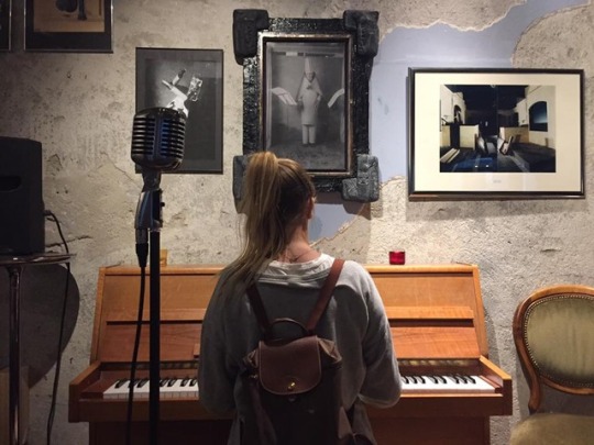

This is a photo of Hugo Ball at the Cabaret Voltaire doing a performance piece dressed in construction paper and making noises that do not make sense. Dada started during World War 1, and it actually began in this Cabaret. Because DADA went against society, it was not accepted by the public. The Cabaret Voltaire was a place people could express their work openly. The other photo is me playing the piano in the Cabaret Voltaire in Zurich. there were photos of different performances all over the walls, the stage and a bar that still serves drinks today. They did not change the voltaire very much since it began and there are performances still performed today. When I was there I could sense the history from the building, it was a really cool stop and I am glad me and my friends made our way over so I could make these connections when we learn about this time in history and art.
0 notes
Photo


This summer I was fortunate to go to the Museum für Gestaltung with the graphic design travel course here at UT. When we were talking about The Art Nouveau movement during history of graphic design, Professor Perry showed us poster designs by Jules Cheret. When I saw those posters it brought me back to this specific museum in Zurich. We were given a behind the scenes tour of original prints of posters during the art Nouveau movement. Here is a pic of me designing my own poster based on this time period, they had elements from posters digitized so you can move them around and combine the designs to make a personal poster to go in the Museum für Gestaltung. There will be more posts about my europe trip relating to this class, stay tuned!
0 notes
Photo


The first photo is called “Hercules and the Hydra”, it is a copper plate engraving that was designed around 1460 CE. Below is pottery I made in my wheel throwing class in 2016. I was reminded of a process called Mishima that potters use when I saw this copper plate engraving. Copper plate engraving was where they engraved the positive forms into a copper plate, then filled it with a substance and scraped away the excess so that the positive forms are filled and the flat part that was not engraved is the original color of the copper plate. Mishima is when your scrape in a shape into the clay, fill it with engobe and scrape the excess away. That way the positive shape is the of the engobe, while the color around it is the clay because we scraped the excess away.
0 notes