
Don't wanna be here? Send us removal request.
Statistics
We looked inside some of the posts by szymonbcu and here's what we found interesting.
Average Info
Notes Per Post
0
Likes Per Post
0
Reblog Per Post
0
Reply Per Post
0
Time Between Posts
2 days
Number of Posts By Type
Text
17
Last Seen Tumblr Blogs


Fun Fact
Tumblr was attacked by a cross-site scripting worm deployed by the Internet troll group GNAA on Dec 3, 2012.
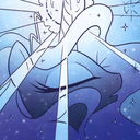
Text
Evaluation
In this project I wanted to show my designing ability to use and create a Formula One racing magazine. As it was the last project I wanted to put my designing skills to use and also mix it with something that i quite enjoy myself which is Formula one. I enjoy watching it, I find it quite relaxing yet exciting and nerve wrecking at the same time. This was the kind of energy I wanted to put into this magazine.
Main purpose of the magazine was to be educational, to explain to an outsider in an easy, non confusing way. Which is why I decided that I wouldn’t have too much detail on the pages, because the more you go into the details of F1 the harder and more complicated it gets which would take me way too long. I also wanted to show that a race magazine doesn’t have to be so dull or made old school, I tried to show that a magazine can feel young and modern in this old school racing world.
First weeks I spent looking for inspiration, past magazines, online magazines, and designs I could work with throughout this module. I wanted to start designing as fast as possible so I don’t have to worry so much about the text yet. First few weeks went great, because I have done some work, I have designed my badges and a few designs which were ready to use in a magazine. I have also learned a few things about the tools in photoshop such as filters, warmth or contrast and brightness. These are some skills that I will be using next year as I found them so interesting and helpful when making new designs, but also because of the variety of designs they can give.
Towards the end of the project I was close to finishing my designing and the magazine which left me with the blog posts which I found quite dull due to being stuck at home, but they did help me understand a few things such as what a blog should look like next year and what professional writing is.
I feel like I have learned a lot of new skills that I will like to carry on developing and found quite a fun path way, because it allows me to do something I’m good at and find easy which is just a perfect mix. There is also a lot of things I’d like to improve, because I did fall behind this module which I am not happy about, but it’s something I will be able to work on and learn from it. Overall I am really happy with this project and I think it was one of the better ones and if I not some issues I feel like I could’ve came out with a professional outcome and a lot of knowledge and experience.
0 notes
Text
Interview Page
For these two pages I decided to design something very simple and old school to focus the attention on the questions and answers. I feel like the design worked reasonably well and even though it is not something high class I think that it matches nicely with the rest of the magazine and I hope that the information on it will interest the reader. I have used two different images of the driver back in his driving days to create some sort of a climate that takes us back to the 80s and 90s of racing. I have used a simple flag in the background just to kill the dead black space and give it some more life. On top of that I have added red lines on the edges of the images to make them stand out a bit more. I will have to wait and see how it looks after I add text, but at the moment I’m happy with this. What I could improve is just to maybe play around with the shape or position of images although editing these was really not easy as these images are old and pixelated.

After adding text I started to have more hopes for this double page. Text nicely killed the empty space and it gave the page some sort of a flow, because everything attracts your attention on the similar level, there are no images that stand our or are too flashy which was the goal as I wanted the audience to focus on what Lionel had to say and what his experience and tips can do for the future drivers.

0 notes
Text
Fashion side of Motor racing.

For the design of this page I decided to use the most iconic piece of clothing when it comes to racing. That said I looked at a variety of racing jackets made by the original F1 teams but also designers such as Prada or Balenciaga. The design I decided to keep similar to the previous ones which would be a mix of pillars and rectangle backgrounds that were going to work around a racing jacket collage. After some thought I thought I’ve used too many jackets and because of that the page feels crowdy and I am missing space for text which is not ideal. I will try to reduce the amount of jackets or try to squeeze them in one space so I actually have some space for writing.

I decided to have two separate pages, one for the text and the other one for the collage. Overall idea looks quite good, but I still think that there are just too many jackets, but I quite like the design on the left because it looks neat and matches with the jacket vibe. I will carry on reducing the amount of designs and try to make the page look neat rather than messy.

After sorting out the jackets and making the page look neat I decided to add text to see if the page looks reasonable for it and I was quite positively surprised as I think the design came out quite well, I haven’t used many filters on this page as I tried avoiding editing the jackets too much as it could be difficult to realize what writing or images they’ve got on them. But that is something I could do on an extra double page on which I could just show me designing skills. Overall I am quite pleased with these pages and I hope that they fit well with the whole magazine when it is fully done.

For this double page I decided to create a page that could relate to the racing fashion theme so I created a variety of edits of McLaren’s racing suits and edited them so they can fit my magazines style. I have used a variety of filters with which I had a lot of trouble because it was hard to position all of the images right as there were so many background elements. I mostly worked with saturation, vivid light and luminosity filter which became one of my favourite ones during this project. I don’t think I’d like to change anything on this page because I really like the look of it and I feel like it keeps the flow of the magazine. I am really happy with the fact that I’ve learned how to turn one simple image into multiple different ones and making it work at the same time.
0 notes
Text
Drivers Page development

I have started the drivers page with an idea of mixing their racing teams colours, but I quickly realised how bad they looked together and I didn’t feel like there was much connection between them. I tried working on making borders around racers and filling them with a checkered board which again.. looked really poor. The layout of it is quite awful aswell, because I don’t know how I will fit and text in this limited space.

I started playing around with the background first as I still had hopes for the racers in their boxes. I changed it to a faded grey background which I slightly edited to make it look like its a light bulb at the top where it’s just an image fill option. But I still feel like the font and the boxes don’t work and I still don’t feel like I got enough space for text.

I gave this design a last chance with inserting each drivers team logo and adding text to see the results which resulted in disappointment which led me to dropping this background and moving back to the black and red which I decided to go throughout the magazine to give it flow between pages. I quite liked the idea of logos as I thought they looked quite neat, but not so sure on this design page.

I decided to start over with a new background layout, new models and new logos. Immediately I decided that I need to spread these three drivers between 3 pages to give each driver a page each. I also decided to fully get rid of the logos as I thought they just didn’t work on this page, but I might think about using them later on. Other than that I think that the models match the colours and the layout decently, but I think that if I spread them across three pages I will get a way better result.


After all the feedback from the teachers and previous designs, I have made something that I thought looks quite smooth and worthy of the drivers page. I have created a small rectangle block on which I would base my filter edits and so I did and the result came our really well and I’m really happy with how they look. I decided to make the fourth page a design page for all three drivers and make it fit the previous few pages so I made a full pillar with photos of drivers which I edited into luminosity and monochrome and then went over their edges and signatures with a brush tool to make them look slightly thicker on the red background. Overall I am very pleased with these pages and I can’t wait to put text on them. I don’t think there is anything I’d like to change here, but my mind might change after I add the text.


I think that the text really fits these pages and co operate with them well. I have mainly focused on giving the reader a story of how they got into the sport and what they’ve achieved. I tried avoiding talking too much about drivers as the magazine is mainly about sport.
0 notes
Text
Track double page

I have created another double page with a mix of different colours, in this case sky blue, grey and black. On this page I decided to focus on the track and creating a simple background for it to not take the race tracks spotlight. On the left side I edited a simple image of the map of Silverstone and its turns and on the right side I have created a nice mix between the background rectangle and the start line of Silverstone. I quite like the mix of the colours, because they are completely different to the ones from the previous page, which ended up in me creating a nice warm to cold contrast of colours on double pages. To create the effect on the right side I have used a variety of filters and hue options to give the image a monochrome feel and then add the cool and chilly colour on top of it.

After adding text I realized that the bottom part of the page looks quite empty and that is definitely something I’d improve if I had more time, but it still matches my idea of a simple explanation and lack of text overwhelming. Overall I think the pages work well together, especially with colours and its structure. I decided to place the map sideways so it allowed me to give it nice proportions rather than making it squeezed and it allows the reader to turn their magazine and look at the map from a different perspective.
0 notes
Text
F1 car double page

For this page I thought of changing the theme and adding some of the McLaren livery colours which are orang and blue. I thought that plain colours would be quite boring so I used faded versions of them which allowed me to play with different hues and colour settings. I have used symmetrical shapes to keep the clean touch of the magazine and I decided to place the pillars behind the orange rectangles to use them as base for my designs and text. I have edited an image of an F1 car from the birds view and edited it with a saturated filter which I slightly darkened to make it stand out on the orange rather than blend with it. I really like it because it’s giving the page a warm layout to the black background and the blue fits with some of the car parts.

After adding text and labels for the car parts I decided to keep the writing short on this as I didn’t really want to get into the engine and specific parts so I decided to give the reader a clear message of what a Formula One car is and what its main aspects are called. If I could add something it would be the black background again, I’d like to add something that’s see through to not make it look so plain, but other than that I am quite happy with how the page looks, it’s a nice break from the black and red and this orange and blue adds a warm and relaxing feeling to the page.
0 notes
Text
Interview with Lionel Sifleet.
I have managed to get in touch with an ex kart racing driver Lionel Sifleet who was kind enough to answer a few of my questions which I hoped were good enough to explain to the audience what this sport is like as a driver. Interview was very quick and honest and in which Lionel answered a few questions with charisma, but was also tough and spoke from his experience. The answers have been written in bullet points which I will try to transform into sentences which will go onto the magazine interview page.


0 notes
Text
What is Formula One page

For this double page I wanted to create a few large designs which could cover a lot of space, but also leave enough space for the text. As I said before I stuck with the red and black which allowed me to keep playing with filters, because after testing them out with different colours, none of them worked as well as a mix of red and black, red gives dark images nice tone to them, but doesn’t get rid of the dark colour and contrast of the image. I tried mixing British F1 drivers with some trophies, I have spent a lot of time editing different trophies, but neither of them really fit the style of driver designs, which is why I will get rid of the trophy and replace it with something or someone that could go well with the theme. I am also not a fan of the tyre mark in the middle, but I will either try working with it and kind of improve it or leave it completely.

After some thinking I completely replaced the trophy design with Lando’s interview pose, which fits the theme quite nicely as it portrays different poses and emotions shown by the drivers such as focus, happiness and excitement. Again I used luminosity filter on the designs and kind of toned down their contrast and brightness so they look slightly more monochromic and so they kind of match the black edges, main purpose of it to get the dark, black colour inside of the red to make it stand out a bit more.

After inserting text about what Formula One is, explaining simple rules and the way things work around there, I started liking this page a lot, I think it works smooth and I think that the black and red don’t make white too hard to read. I also like the fact that the text matches the luminosity filter and fits with the white shades of the designs. If I could improve anything on this page I would probably try to edit something inside of the red rectangle, but have its opacity and fill turned down so it looks kind of see through. Other thought was to add some sort of columns on the side instead of just black solid blocks, which I think could work, but I would have to keep it in the dark theme. Overall I think that this page came out great and even though it still have some parts that could be improved I am still very happy with it.
0 notes
Text
What is formula one page

I found a few good looking designs that I decided to use for the next to pages which I am still unsure if I’d like to have text on them or use them as visual pages. I created a simple idea and layout, but unfortunately I don’t think that the colours worked well together. I have used four different designs which I tried mixing together, but something just didn’t work. I have put some text to see how it would look with it, I used information about F1 on it as I wanted it to be the first info page, but I wasn’t impressed with the result.

I tried fixing this design by changing the background on the left page, that I thought looked quite interesting and climatic for the page so I decided to stick with the flag design for this page and next few pages aswell. I have also decided to get rid of the Ferrari logo on the red rectangle as I thought it was a little bit too much and made the page look quite full and overwhelming. Overall I still thought that the mix of red and black backgrounds was clashing too much so I will try to design something that goes better together and gives the page some sort of flow.

I completely deleted the background of the page and replaced it with just plain strong red to make it look important and alerting. Also I decided to make all the designs one/similar colour to make them co operate with each other. I have cropped two of the designs to a rectangle and made them same size and placed them in the middle of the pages to make the page look symmetrical and high class. I have placed Lewis Hamilton on the left in front of the checkered flag as I thought that his winning pose looked quite good and matched the theme and purpose of the flag. I have used a luminosity filter on the designs to give this racing magazine a new modern approach that’s outside of F1 company. The design looked quite well, but I started playing a little bit with contrast and brightness of the designs and I lightened them up to make them stand out more on the red background.

After some final touches I decided to switch the designs around as I thought Lewis looks better on the other side, because then he is pointing his fist to the middle of the page rather than outside, this was just my personal idea. I have also played with the gamma and contrast a bit more and I managed to bring a few colours to both designs such as the orange on the Orlen logo on the car or purple on Hamilton’s helmet. Overall I am quite pleased with this design, because I think it represents my style of designing quite well and is simply eye pleasing, although it is quite bright. I have also learned a few skills such as how to use filters, cold and brightness and contrast setting on Adobe Photoshop. I’d like to carry on with the red theme, but I will try to use some other colour palettes to not over use the colour.
0 notes
Text
Page layout ideas
I have looked at a variety of different magazines before, but I don’t think I have actually considered the layout which will help me to draw the eye and keep the magazine well designed and smooth. I have looked at sports magazines on stackmagazines.com to get an idea of what other sports do to attract their customers. I am mainly looking at solid, symmetrical and smooth layouts as I’m trying to keep the magazine organized and clean to make it match the sport I am presenting.


Available at: https://www.stackmagazines.com/sport/best-independent-sports-magazines/
After looking at a variety of different magazines and pages I started working on my own layout pages which I would like to use and develop as I go along. I tried keeping it simple and kind of my style with solid blocks in the background, highlighting the main images and making them stand out even more.


I’ve made these to use as a starting point for my pages, I don’t think that some of these are necessarily good, but I feel like with the imagery I design and text space I will need I should be able to work with them and rearrange them in a way that will fit the style.
0 notes
Text
Front and back page
I decided to use images of Lewis Hamilton and work with them in order to create my front and back page for the magazine. I chose him as he is the top World and British driver at the moment so I think that using his figure to attract the reader is quite a good idea. I will keep my colour palette quite dark with a few light touches which will mainly be white, but the rest of it I am considering making black and red as it goes very well with the well known Ferrari livery colour and I think it’s quite a good idea a huge amount of people who don’t know Formula 1, still know the black and red Ferrari car not just from F1 but from a lot of different racing sports.
Unfortunately I have not taken that many screen shots of me working on the back page as I thought that it is not as important as the rest of the magazine, but I still put a lot of focus into the front page as it will be the first thing a customer sees. I decided to keep it simple and use the colours that work well together and mix them with my design layout which worked really well with Lewis Hamilton’s winning pose. In order to create that pose I had to combine three different images which had different settings on such as opacity, sharpness, inverted etc and then I put them all on top of each other and slightly moved them by a few pixels to the left and right which on top of all the previous settings, also gave it a nice 3D glasses effect. On the background I used a simple red rectangle which was slightly tilted to the right and on top of it a merged a see through checkered flag to give it more of a racing and competitive feel.


The back page came out quite nicely giving you a nice ending to the magazine with a smiling champion of the world. To get that nice black and red filter I have used a luminosity setting which allows you to monochrome the image and allow the colours behind it to go through the image.
Overall I am really happy with these and I think that they look quite eye pleasing or at least the colours work well together. Making these taught me a few new skills on photoshop such as how to use filters and how to play with its colours and how to manipulate all of them together to get a new interesting outcome. Now that I have started with this colour pattern I’ll carry it on throughout the rest of the magazine with a few exceptions which will give a reader a break from the same shade.


I decided to name the magazine apex as I think it fits the theme of the magazine quite well. Apex stands for ‘the middle point of the inside line around a corner at which drivers aim their cars’, which long story short means drivers knowing their racing lines to perfection, because every inch on track and speed you loose will cost you time. I decided to use a font which could show the speed and the movement of the sport so I decided to use a font with its letters being streched into a triangular shape making them look like they’re moving really fast. I feel like if I had more time I would’ve maybe mixed this font with something else or work on the colour of the inside and the outside of the font.
0 notes
Text
Looking for magazine info
In order to fill my magazine with necessary information I will have to find reliable sources and mix them with my knowledge to give my magazine slightly younger take on how the sport looks like from the outside. I will mainly be using Wikipedia, F1 Official site to look for drivers biographies, history, achievements and interesting facts, I will also be structuring a lot of it with my own knowledge.
I will firstly look into what F1 is and give the reader a few key points which make F1 an official and fair sport, on top of that I will try to explain a few rules. Next I will research into the track and the car itself and give the reader a simple diagram and labelled images to give them an understanding of how it all works, during that I will include a variety of key words which are essential to know if you want to understand F1.
As I’m focusing on British F1 I will use the next few pages to talk about current British F1 drivers (Lewis Hamilton, Lando Norris and George Russel). I will give a rough explanation of who they are, what they’ve achieved and give people idea that the British racing scene is quite strong globally.
I’d like to use a few pages for just design imagery to kind of draw the eye away from the information and text and give the reader a slight rest and treat them with some of my designing skills, I will be mostly aiming for designs that fit the style of the magazine, colour palette and that are eye pleasing.
Near the end I’d like to take a turn from F1 racing and focus on its fashion and drivers perspective side. I have looked at a variety of vintage, old school racing jackets and I would like to make a collage or a mix of all of them together to show what has changed over the years and what turn it took.
0 notes
Text
Brief
Szymon Okon
Fashion & Textiles Foundation
‘Apex’ Magazine
I’d like to introduce outsiders to the motor sport which I always liked from the young age. Formula One. I would like to educate others in a simple, straight forward way about what the sport it, introduce them to British drivers, show its fashion and talk about racing experience in an interview with an ex racer.
My idea is to create a short magazine filled with my designs and edits which I’d like to be eye catchy and eye pleasing for the reader. As I’m keeping the magazine simple I will try to avoid too much text, because I don’t want it to overwhelm the page.
I will start with creating a variety of designs such as my badges and start creating collages and mix them together in order to get an idea of where I can take this magazine.
My final goal is to create a visually pleasing magazine with information that explain what this motorsport is without getting a headache.
0 notes
Text
Main font examples and consideration.
I started to look at some fonts which I could possibly use for my main title or just headers and I stumbled upon a few racing related fonts and I think that the only one I actually was ready to use was the third font which looked just like a smooth stencil and I thought that it matched the style quite nicely because it matches the whole theme of it being smooth and precise like most of the things in this sport. I was thinking of using more than one special font but I think that it would just bee too much and I would just make things difficult for myself.

After looking some more I decided to find a font similar to the actual F1 font which works really well for their magazines, streams, tv broadcasts so I thought that I should use it myself and I personally really started to like it. The font is smooth, easy to read, gentle and circular which I think is important because blocky text just wouldn’t look good with either ideology of the magazine as it’s all about precision and speed and wouldn’t work the the design either as I will try to make the designs match with each other and work well with the text on a given page.

Available at: https://www.dropbox.com/s/e5wrz81xmurwdwu/F1-Font-Files-with-important-Message.zip?dl=0&file_subpath=%2FF1+Font+Files+(with+important+Message)%2FFormula1-Regular.otf
0 notes
Text
Magazine Background ideas
So in order to start my magazine I have started looking at a variety of different racing magazines to see their approach on how they use racing related imagery and modern day design to present their work. I found it quite crucial as I wanted my magazine design pattern to be quite modern as I think that the old school racing magazines are just dull, they have all the knowledge you need, but a lot of the time they are white and grey just filled with text and containing no designing pattern on them whatsoever. So this is something I will be focusing on making which is a modern design racing magazine.

After looking at a few modern magazines I have noticed that the mostly used colours are red, white and black which I am more than happy to use for my layout of the magazine. All three colours go well with each other which will allow me to have a thought through colour palette which I will probably keep throughout the magazine.

I will also try to have at least one double page with just the design on it as I just think that it is quite eye pleasing and it’s a nice break from having text on each page. These pages also allow you to show off your designing and editing skills so I think it’ll be quite important for me to have at least on double page.

By looking at these I am also getting an idea of what a professional magazine should/could look like and I will be taking inspiration from the magazines I have found in order to make mine look professional, but at the same time make sure that it has this young student factor to it which will be a lot more editing and working with colours to make the text stand out and make sure that both text and images are attracting the eye at the same time. Although I think that it would be good to have some really good designs mixed with text to see the outcome.

Available at: https://corp.formula1.com/formula-1-launch-the-official-formula-1-magazine/
0 notes
Text
Racing cat walk
Marcelo Burlon, 2015

Tommy Hilfiger 2018

GmbH 2018

Available at: https://www.redbull.com/gb-en/6-times-motorsport-has-influenced-fashion-designers
0 notes
Text
Badge design ideas and making
As I’m focusing on racing I decided to create a few badges to go with my theme and if I decided to use badges for my final outcome I would probably use these and carry on working on them.

The first few badges I designed are focused on showing where I’m from, because as I thought badges can be quite close and sentimental to the driver as they represent him, show what his personality and interests are like. The first badge idea represents a swallow bird which is the logo/crest for our city and our multiple sports teams. I have created a few simple shapes as I didn’t want to butcher the circle badge. I have covered the back of it with a variety of checkered boards to make it look like a finishing flag. In terms of the swallow bird I have drawn it with a mouse using a brush tool, in order to make it I used fast movement to create nice, controlled lines and after drawing them I smoothed them to make the bird look more detailed. As I used a lot of black I figured that it would be a good idea to give the bird some sort of an outline to make it stand out so I decided to make its outline to whatever the second colour of the checkered board is which in these cases is white and yellow. Overall I am quite happy with these and I think they could look great on a jacket or other similar piece of clothing.

The other idea that popped to my head was just my home postcode which I wanted to put on a simple rectangle flag, I didn’t really want to overdo the badges as they were not meant to be a piece of art but just something that shows who someone is, something about them. This badge represents my home land and home city which for me would be quite important to have on a racing jacket as it shows my roots and where I'm from.

This design was inspired by the F1 podiums on which the top 3 drivers of the race can celebrate and feel relief after a long, stressful and tiring race. I thought of it not so much as a badge as it didn’t really have and background to it, structure or design, but I quite liked the message behind it because it kind of shows what sort of reward you get for actually trying in this sport and there is nothing better than winning and feeling what you have just achieved. Other reason why I like this design is because I can have it either filled or only have an outline of it which allows me to carry on experimenting with it in the future if I decide to carry on making badges. If I could improve it I would probably try giving it some sort of a background and play with the outline of the design, for example change its colour and make it quite thick so the driver really stands out.

In order to make the previous design I have used a digital sewing machine which had to be operated by the teacher so unfortunately I didn’t get to learn how to use it just yet. The machine overall is quite quick which depends on the setting of it and as I planned on just having the design on a piece of fabric I used a low setting which have roughly done the design. The process took between 4 to 5 minutes which is really fast when it comes to sewing so I quite enjoyed having my badges done by it as it allowed me to do something else in the background. The machine has to be watched by a member of staff at all times so that has covered health and safety part of the process for me.

The design came out quite nice for only a 5 minutes job, it came out clean, just how I drew it on Adobe Photoshop, but the first thing that came to my head when I took it out was that I should definitely try it on a higher setting to actually make the edges thick and layered to make it look like a real badge. Other than that I was quite pleased with it and was looking forward to using it if I choose to use badges.

I’ve had a few more ideas, but I didn’t go through with them as I thought they were too basic and boring so I will either use them in the future and develop them or just leave them for now.
0 notes