#Data Analysis
Explore tagged Tumblr posts
Visit Tumblr Blog
Explore Tumblr blogs with no restrictions, modern design and the best experience.
Last Seen Tumblr Blogs


Fun Fact
In Q3 of 2020, 31% of US users access the Tumblr app daily.
Text


step 1: develop hyperfixation on coding with R
step 2: ??!!??!? (for three weeks straight)
step 3: fully interactive LCARS inspired website that does CGM analysis for the minuscule audience of diabetic star trek nerds
#step 4 no profit i do this for the love of the game#it’s still a work in progress#im steadily losing my anonymity on here but whatever#lcars#star trek#star trek tng#R#rstudio#programming#diabetes#cgm#dexcom#data analysis
213 notes
·
View notes
Text


It's almost like something happened in 2020-now that is causing these problems.
#covid 19#coronavirus#covid pandemic#there's still a pandemic#still coviding#mask up#sars cov 2#brain fog#data analysis
27K notes
·
View notes
Text

Bad Numbers.
55 notes
·
View notes
Text
it's so fucked actually that lumon repurposed the security room into the family visitation center. not just because it supports the illusion that lumon isn't watching as closely, or because the innies now have no clue where and how to reactive the overtime contingency if they ever needed to,
but because it's overwriting the room where dylan performed his (physically demanding!) act of rebellion, a sacrifice he agreed to out of deep (platonic) love for his friends, with a room where he's rewarded for being a Good (Obedient) Worker with getting to know his outie's family. with each visit he'll make, burying in his mind the place that represents the connections of solidarity he found down here as an innie underneath reminders of the connections that "actually" matter, the reasons he's here in the first place — the connections his outie has. the people (including three kids!) who directly rely on him keeping this job.
lumon isn't just separating dylan from the rest of the team by giving him a perk that the others can't have (because they don't have a family, huh. looks at devon) and encouraging him to keep it secret "for his own sake". they're trying to drill into him that his loyalty has been misplaced. that he's been selfish. that he has to choose one group of people or the other; choose which version of himself gets to be loved.
and innies aren't made to be loved.
#severance#severance season 2#dylan george#data analysis#severance spoilers#posts from the severed floor
777 notes
·
View notes
Text


Armitage III: Dual Matrix (2001)
#armitage iii#scifi anime#cyberpunk anime#future city#cyberpunk#sci-fi anime#cyberpunk gif#scifi gif#cyberpunk aesthetic#japanese anime#anime#futuristic city#anime gif#anime edit#gif#gifset#data analysis#scifi aesthetic#anime aesthetic#japanese cyberpunk
799 notes
·
View notes
Text
Data analysis makes brain go brrrrr.
75 notes
·
View notes
Text
Presenting the results of my latest hyperfixation
Tam Lin is a Scottish folktale, usually presented in ballad form, dating back to at least the 16th Century. It has been summarized and re-told by different people over the years, including Overly Sarcastic Productions. It is the subject of a one-act opera, and was the inspiration for a 1970 movie that updated the story to the present day.

The fairy queen yells at Tam Lin in every version analyzed except for the Anais Mitchell version. Her version is an outlier in many respects, since the entire parade is left out, Janet simply grabs hold of Tam Lin mid-conversation.
Another oddity is Pentangle's version, which was written for the movie and consists of a jumble of images meant to complement scenes from the film, without a coherent narrative.
The biggest surprise to me is how few versions mention Janet seeking an abortion, something that I had always thought of as a central part of the story.
One thing I wish I could have looked at in more depth is the balance between versions that describe Tam Lin's transformations before he goes through them, and versions that describe them as they happen. As they happen is more common, but some songs will do the entire sequence twice.


Going into this, I had two versions prominent in my mind: Anais Mitchell's pop-folk version that leaves out much of the story, and Anne Briggs' very traditional (and very long) version. Because of this, I thought perhaps we would see a decrease in the complexity of the story over the years, but that's not the case, it's basically flat. I think a better comparison might be to separate into traditional and revised versions, although that is something of a judgment call.

There were so many minor discrepancies I couldn't even keep track of them all, but these four stood out because they are so oddly specific. Even the main character's name and the setting aren't consistent across versions, if they're even mentioned at all. Some versions don't even give the main character a name!
My data collection process leaves a lot to be desired, as well as the way in which I decided which events were major or minor, and which things to leave out altogether. This was mainly just a fun way to explore different versions of my favorite folktale, listen to a lot of different people sing different versions of the ballad, and rotate the whole thing in my brain.
291 notes
·
View notes
Text
since there are so many data nerd phannies i decided to make a compilation of all the spreadsheets i could find - lmk if i missed any or if you want me to add any additional details <3
last updated: 30/06/24
actively updating spreadsheets
dan and phil uploads from 2021-2024
dan and phil’s upload schedule from all their channels with days and dates
amount of days in between videos in each channel
pie charts of days of the week they upload
made by @ahappydnp
everything dan and phil related
all of dan and phil’s video links from all their channels from all their accounts (including super amazing project, snapchat, vine, tiktok and more)
all of dan and phil’s radio shows, including reuploads and playlists, as well as the dan vs phil, fan war and internet news if available for each show with misc clips and written recaps
all of dan and phil’s liveshows, including some written recaps and the app where it was originally posted
all of dan and phil’s vyous including the question they were answering
all of dan and phil’s collaborations and video features (even if they were in the background), including the channel they were originally uploaded on
all of dan and phil’s interviews
all of dan and phil’s merch, including originally shop links and links to the phandom wiki which has further information
all of dan and phil’s professional photos as well as some fan photos, including the event, photographer and platform
the dates and statuses of each of these videos (lost, archived, unlisted or public)
made by @stillarchivingdnp
dan and phil 2024 upload stats
each of their 2024 videos with channel, upload date, upload time in uk, length, sponsor and editor/s (if applicable) with an accompanying colour-coded calendar
(for amazingphil videos) whether dan featured and (for dapg videos) whether it was gaming/talking and who tweeted it
interactive part where you can see the time period between two videos
averages, maximums and minimums for times between uploads, upload times and runtimes with accompanying graphs
percentage of videos with other editors, with pie charts for all channels and each channel
made by @dnpbeats
all or nothing: dan vs phil season 2
all of the games for season 2, with the year they played them and the results with and without all or nothing coming into play
how often all or nothing came into play and who suggested it
the general impact of all or nothing
made by @organized-chaotic-disaster
dan and phil saying “i love you”
when dan and/or phil said ily
the video and timestamp from when they said ily and whether it was prompted
pie chart of dan or phil saying ily
made by @ahappydnp
games where one of them decides the winner
date and link for each video
overall winner with the winner for each round
breakdown of the amount of times each of them have won each round and the percentage phil has won
made by @dnpbeats
dan and phil 2024 upload schedule
upload date for each video, with the day of the week and approximate time it was uploaded in cst, including the most common and second most common upload day for dapg
days between each upload, including the longest gap, shortest gap, average gap and first and second most common gap for dapg
a colour-coded calendar displaying the upload schedule for dapg and amazingphil
made by @kat-aa
completed spreadsheets
all or nothing: dan vs phil season 1 with a great accompanying document with further details and analysis of the data
all of the games they played, with the year they played them and the results with and without all or nothing coming into play
how often all or nothing came into play and who suggested it
the general impact of all or nothing
made by @organized-chaotic-disaster
youtuber tours
(not necessarily dnp but it includes them!)
120 different tours, including the creators, names, dates, countries, links (if available) and producers (if applicable)
each tours’ venue capacity range, average and total attendance
individual tour show breakdown with city, state, country and additional notes
data on each venue’s capacity, number of tours, and which youtuber went to each venue
data on each country’s amount of shows, broken down into states and cities
made by @stillarchivingdnp
gamingmas 2023 schedule
all gamingmas video titles from 2023
the time each video was uploaded in gmt
made by @cactuslester
spreadsheet screenshots in posts
listening trends in all or nothing
scatter graph for the correlation between track number and number of listens
analysis of the data
made by @serendipnpipity
analysis of dnp’s letterboxd ratings and movies with part 1 and part 2
(pt 1) rating distributions for all the movies they’ve rated, including details about which movies one rated higher than the other, and which movies they rated the same
(pt 1) a list of their five-star movies
(pt 1) a list of movies one logged but not the other
(pt 1) cute little misc notes about the specific movies and dates
(pt 2) ratings broken down into genre, studio and franchise with accompanying bar charts
made by @philsrosesweatshirt
views on post-hiatus dapg videos after specific time frames
i believe this is a work of progress!
video titles with the dates and months, along with details of whether they were sponsored or had external editors
view count after 24 hours, 48 hours, 1 week, 2 weeks, 3 months and 6 months
made by @goldenpinof
favourite dnp tour song statistics
years phannies started watching vs the year they joined the phandom represented in a bar graph
favourite dnp tour song in a donut pie graph and a bar graph
favourite song vs year joined represented in a bar graph
made by @serendipnpipity
terrible influence: the tour trailer video analysis
all the videos that appear in terrible influence with additional notes
the list sorted by date, view count and channel specifics
timestamps provided for each clip, both in the video and where they appear in the trailer
made by @emojackolantern
#yes i was thinking abt making a spreadsheet for this...#but i thought that was too ridiculous#dan and phil#phan#phil lester#amazingphil#daniel howell#dan howell#danisnotonfire#spreadsheets#excel#data analysis
384 notes
·
View notes
Text

here is the sheet. it's an excel spreadsheet so it will download to your computer. this is really important for all the people who constantly say "democrats and republicans are the same." if they're not willing to do the work to either prove or disprove that notion, they're NOT someone ANYONE should be taking political advice from.
#politics#data analysis#voting records#bipartisan analysis#representation effectiveness#Democrats#Republicans#legislation tracking#political myths#factual analysis
236 notes
·
View notes
Text
About Reblog Graphs
Have you ever clicked on the "reblog graph" button of a post? I think they're one of the... well, maybe not greatest features on tumblr ever (polls are probably better), but they're still pretty darn neat.

I want to show some cool patterns I noticed on some recent posts of mine, but first I'll explain how reblog graphs work so you can more easily follow along.
This is pretty long with a bunch of pictures, so click the cut to read more.
How reblog graphs work
If you've never done so before, I invite you to click the notes button on this or any other post and then the icon with four circles. You will then see a bunch of dots connected by lines.
For example, if you click the graph for the "blorbo in Elvish" post, you get something like this:

Now, let's zoom in a bit. You can do this by using the mouse wheel and clicking and dragging around the graph until it's showing what you want. (I don't know how it works on mobile, but presumably it's similar to using Google maps?)
This next screenshot is the bit in the lower right of the graph shown above. However, the graph may not always display in the same way because reblog graphs are re-generated each time you click the "reblog graph" button.
Here you can see that I'm viewing the root post, which is the original post made by me. It's indicated by a circle with a dot inside. You can also see that six people reblogged that post. Each reblog shows as a dot with a line connecting it to the post it was reblogged from.

Now here's a cool thing about reblog graphs: they're interactive! You can click on any dot and see the post it represents and the reblog chain that led to it.
For example, clicking this dot that has several lines emanating out from it shows that it is "2 reblogs deep" and was posted by @cycas.

Got it? Close enough? Cool, now let me show you some neat things I noticed. :D
The Swedish Chef poll and very popular bloggers
My polls tend to average between 500 and 2000 votes, depending on subject matter. The Swedish Chef poll, however, took off and eventually garnered over 22,000 votes. How did that happen? A very popular blog reblogged it about five days in.
Initially, the graph looked like this. (This is the first 200 reblogs.) There's nothing unusual here. You can see that the root post had several reblogs, and that there's another cluster developing around a post by @zagreus. There are also several reblog chains where just one person reblogs someone else's reblog. Some of these chains peter out, while others find their way onto the dash of more popular bloggers, creating clusters.

A quick note about "popularity"
Yes, yes, it's all about "popular." However, it's not just about having a bunch of followers. What's more important is that the "popular" person reblogging your post has followers who are specifically interested in your post.
For instance, if I, @sillylotrpolls, make a poll about LazyTown, it's probably not going to get very many reblogs because my followers aren't here for that. However, if @silly-lazytown-polls reblogs the poll, that reblog might then get quite a lot of reblogs itself. It's not that silly-lazytown-polls has more followers than sillylotrpolls, it's that it has more followers specifically interested in LazyTown content. Make sense?
Back to the Swedish Chef poll
The poll eventually got over 5,000 reblogs. Since you can only add 200 reblogs to the graph at a time, you can roughly see how a post spread over time.
With 600 reblogs loaded, a new cluster bursts onto the scene. This is @bunjywunjy, who reblogged the post from @beecreeper who reblogged it from @soggypotatoes who reblogged the original.
Bunjywunjy didn't add any tags or comments, so I didn't even notice at first because it didn't show in my activity feed. However, I did notice a sudden uptick in notes on the post, which caused me to investigate. It had been five days since I posted the poll, and usually polls that are going to take off do so sooner than that.

By continuing to click the "load more reblogs" button I can see how the post further spread, especially from bunjywunjy's post.
When the post reached @beggars-opera (whose icon I am somewhat proud to announce I identified on sight), they added a screenshot of @stylishanachronism 's tags which said:
# all of these are incorrect it's the 'meat's back on the menu boys!' scene
This would become the dominant version of the post as it further spread. Interestingly, this was the only reblog of stylishanachronism's reblog. Literally thousands of people loved their tags and agreed with them, but they quite plausibly never saw it unless they specifically went looking.
By 3,200 reblogs, you can see even bigger clusters developing. @thebibliosphere shows up 10 reblogs deep, and leads to yet another cluster via @teaboot (12 reblogs deep).

Eventually, with all 5,371 reblogs loaded, the reblog graph looks like this:

Like I said: neat. :D
Cool, but if you've seen one, you've seen them all - right?
So what prompted this (extremely long) post was actually the reblog graph for my poll on inspirational LotR quotes.
Here's the reblog graph with 200 reblogs loaded:

And here's the graph with all 1,890 reblogs loaded:

It's just one big cluster around the root post. I've never seen that before!! Almost everyone reblogging this post saw it either because they follow this blog, saw it in the #lotr tags, or because their non-influencer friend reblogged it. (Or maybe it was in some kind of algorithm/the explore feed, but I have nearly zero experience with those.)
And this wasn't just a small post. This poll got over 15,000 votes and more than 4,000 notes. That puts it in the top 10 polls for this blog.
What does it mean? I have no idea. I would really like to know! But really, I got nothing. If you have a theory for why this particular poll should result in a reblog graph like this, I would very much like to hear it.
Orphan clusters
To round things off, I'd like to show another interesting facet of reblog graphs: orphan clusters.
This blog's current undisputed poll champion is the fmk wheel poll. That's not really a surprise, as it combined sex with a fun game where you just had to tell everyone what you got, which meant either a reply or a reblog. So it spread pretty far.
However, if you look at the graph, there's something odd going on.
This is with just 200 reblogs loaded:

Notice how some of the dots don't connect to the root post? That's because somewhere along the chain, a reblog was deleted.
This cluster in the bottom left got pretty big! This screenshot is at 800 reblogs loaded. The missing link is from a blog called @gendertaliban that doesn't exist anymore, as near as I can tell. That makes it impossible to trace the full path of any of these reblogs.

In conclusion
This concludes today's deep dive into a tumblr feature you probably never paid any attention to. Admittedly, there's not a huge use for it outside of determining which of your mutuals is an "influencer," and they get quite difficult to navigate after loading about 1000 reblogs, but I hope you enjoyed staring at dots and lines with me. :)
#data analysis#tumblr#reblog graphs#data visualization#not a poll#admin#yes I KNOW I keep saying I'm going to come up with a proper 'misc' tag#there will come a day when I properly categorize and tag my 'admin' posts#today is not that day
52 notes
·
View notes
Text
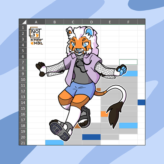
=SUBSTITUTE(myFursona,"fox","lion") :: full body (midi) (2025)
He's broken into my spreadsheet
#fursona#spreadsheets#oc art#artwork#digital#furry#oc#art#digital art#furry fandom#anthro#my oc#data#partly shaded#original character#furry art#furry community#anthropomorphic#full body#excel#trans creator#LGBT creator#furries of Tumblr#full colour#queer creator#data analysis#huoin camvas#gnot oc#queer artist#digital artists
22 notes
·
View notes
Text
"The myth of cosmopolitan cities: why large urban areas are more segregated..."
10 notes
·
View notes

Text
the spreadsheet really doesn't lie and it's outing me lol
I was looking at the graphs, and I noticed that the top romantic ship was merthur, at 75 fics. the second ship is at 44
"Oh" i thought to myself, innocently, "the number must be padded by a lot of oneshots, that's too big of a jump to be actually correct. My Merlin phase wasn't that bad"
So I did the obvious thing, and added the ship wordcount to the graph, so that the count can't be padded with oneshots and it actually shows that time read.
...

Okay so maybe it was that bad lol
19 notes
·
View notes
Text
you know in all the posting about irving and helly’s friendship after last ep, i haven’t seen anyone mention yet that he was one of the two people who first saw her, who watched her (through the screen, on the other side of the wall) as she woke up for the first time, confused and scared and burning with anger. and then he was the one who brought her back; he was the one she first saw (holding her in his arms), as she was confused and scared and freezing. he was there for her start, and she was there again just in time for his end.
#severance#severance season 2#helly r#irving bailiff#i hesitate to call it a father-daughter thing because imposing familial roles on helly's relationships feels gross to me#(lumon tried to force them into that found family model and. well. razor to her throat)#but there are interesting parallels to draw there. he's there for your birth and you outlive him.#helly's one interaction with ''her'' father was him giving praise and love that was laced with cruelty and never even meant for her#then irving literally almost drowns her and yet she knows (or will very soon) that it’s the purest act of love#fucked up huh#…i also wonder if the reason helena focused on appeasing/bonding with irving over dylan#(who i'd argue helly had more of a developed friendship with in season 1)#is because she sees irving in that way. because having lost her father’s approval she’s seeking it from someone she can slot into that role#data analysis#severance spoilers#posts from the severed floor
133 notes
·
View notes