#DataTot
Explore tagged Tumblr posts
Visit Tumblr Blog
Explore Tumblr blogs with no restrictions, modern design and the best experience.
Last Seen Tumblr Blogs


Fun Fact
US Tumblr user growth rate is estimated to slow down to 4.1%.
Text
can't sleep? ☁️
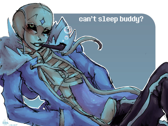
quick sketch I did to prove I draw better than in 2022. old version bellow
slumber sans by @ Slumbertale_au on twitter.
also, happy b-day to me I guess??? lol

#datatot art#artists on tumblr#my art#art#sans#slumbertale#sans au#sans art#undertale au#sans undertale#undertale#utmv au#utmv
23 notes
·
View notes
Text
2379
2379 bis 2385 Die Sternenflotte Analysiert weiterhin die wirtschaftliche Krise auf Cardassia Prime die durch den Dominion-Krieg hervorgerufen wurde, sowie die große Zerstörung der letzten Kriegstage wo das Dominion den Planeten Bombardiert hat. Dadurch sind große teile des Planeten zerstört worden. Auf Cardassia Prime leiden mehr als 800 Million Cardassianer und die Regierung hat nicht die Mittel um sich von diesen Krieg zu erholen. Zugleich lehnt sie die meisten Hilfsangebote der Föderation ab. Eine bemerkenswerte Ausnahme von dieser Haltung ist das Andak Projekt, ein Projekt finanziert von der Föderation welches sich zur Aufgabe gemacht hat, die Landwirtschaft von Cardassia Prime wiederherzustellen. Unter Führung von Keiko O'Brien stößt das Andak Projekt auf Widerstand. Bestimmte Gruppierungen wie "wahre Art und Gul Mace" oder der konservative Block der Regierung wollen es nicht genehmigen. Nur durch den Einfluss von Regierungs-Berater Elim Garak, einen jungen Befürworter der Demokratie-Bewegung auf Cardassia Prime. Wird Keiko O'Brien erlaub das Projekt durchzuführen. Die Arbeit ist nun im gang, und es werden in den kargen Wüsten von Cardassia Prime Kulturpflanzen angelegt um die Bevölkerung ausreichend zu ernähren.Hauptlieferant von Landwirtschaftlichen Maschinen und Know How für das Andak Projekt ist das im Sol System beheimatete Unternehmen BioGEN. Das Unternehmen betreibt auf dem Mond Ganymede eine Agrarstation zur Erzeugung und Belieferung von Stationen und Kolonien mit Landwirtschaftlichen Produkten und Maschinen. Auf der Ganymede Agrarstation sind duzende Landwirtschaftliche Flächen unterhalb von riesigen Glaskuppeln angelegt worden sowie große Entwicklungsabteilungen für den bau der Modernsten Agrar Maschinen untergebracht. Durch riesige Spiegel in der Umlaufbahn des Mondes Ganymede sorgt BioGEN dafür genügend Sonnenlicht für die Agrar Kuppeln bereitzustellen.Experten des Daystrom-Instituts gehen davon aus, dass ohne weitere erfolgreiche Projekt wie das Andak Projekt, die Cardassianische Union, in weniger als drei Jahren zerfallen könnte.
2379.03.22 Im März des Jahres ändert sich das politische Gleichgewicht im romulanischen Reich, Com. Data stirbt und die ENTERPRISE-E wird schwer beschädigt.
2379.04.01 Nach dem herausragenden Erfolg der Sovereign-Klasse wird die neue Grissom-Klasse eingeführt.
2379.06.03 Zur Mitte des Jahres hin zeichnet sich an Favorit bei der kommenden Wahl zum Föderationspräsidenten ab.
2379.01
2379.02
2397.03
2379.04
2379.05
2379.06
2379.07
2379.08
2379.09
2379.10
2379.11
2379.12
#CardassiaPrime#Ganymede#BioGEN#GanymedeAgrarstation#ElimGarak#GulMace#KeikoO'Brien#AndakProjekt#STH#Cardassianer#Romulaner#EntE#DystromInstitut#DominionKrieg#DataTot#tot#STH2370er
0 notes
Text
Building a Donut Chart with Vue and SVG
Mmm... forbidden donut."
- Homer Simpson
I recently needed to make a donut chart for a reporting dashboard at work. The mock-up that I got looked something like this:

My chart had a few basic requirements. It needed to:
Dynamically calculate its segments based on an arbitrary set of values
Have labels
Scale well across all screen sizes and devices
Be cross-browser compatible back to Internet Explorer 11
Be accessible
Be reusable across my work’s Vue.js front end
I also wanted something that I could animate later if I needed to. All of this sounded like a job for SVG.
SVGs are accessible out-of-the-box (the W3C has a whole section on this) and can be made more accessible through additional input. And, because they’re powered by data, they’re a perfect candidate for dynamic visualization.
There are plenty of articles on the topic, including two by Chris (here and here) and a super recent one by Burke Holland. I didn’t use D3 for this project because the application didn’t need the overhead of that library.
I created the chart as a Vue component for my project, but you could just as easily do this with vanilla JavaScript, HTML, and CSS.
Here’s the finished product:
See the Pen Vue Donut Chart - Final Version by Salomone Baquis (@soluhmin) on CodePen.
Reinventing the wheel circle
Like any self-respecting developer, the first thing I did was Google to see if someone else had already made this. Then, like same said developer, I scrapped the pre-built solution in favor of my own.
The top hit for "SVG donut chart" is this article, which describes how to use stroke-dasharray and stroke-dashoffset to draw multiple overlaid circles and create the illusion of a single segmented circle (more on this shortly).
I really like the overlay concept, but found recalculating both stroke-dasharray and stroke-dashoffset values confusing. Why not set one fixed stroke-dasharrary value and then rotate each circle with a transform? I also needed to add labels to each segment, which wasn’t covered in the tutorial.
Drawing a line
Before we can create a dynamic donut chart, we first need to understand how SVG line drawing works. If you haven’t read Jake Archibald’s excellent Animated Line Drawing in SVG. Chris also has a good overview.
Those articles provide most of the context you’ll need, but briefly, SVG has two presentation attributes: stroke-dasharray and stroke-dashoffset.
stroke-dasharray defines an array of dashes and gaps used to paint the outline of a shape. It can take zero, one, or two values. The first value defines the dash length; the second defines the gap length.
stroke-dashoffset, on the other hand, defines where the set of dashes and gaps begins. If the stroke-dasharray and the stroke-dashoffset values are the length of the line and equal, the entire line is visible because we’re telling the offset (where the dash-array starts) to begin at the end of the line. If the stroke-dasharray is the length of the line, but the stroke-dashoffset is 0, then the line is invisible because we’re offsetting the rendered part of the dash by its entire length.
Chris’ example demonstrates this nicely:
See the Pen Basic Example of SVG Line Drawing, Backward and Forward by Chris Coyier (@chriscoyier) on CodePen.
How we’ll build the chart
To create the donut chart’s segments, we’ll make a separate circle for each one, overlay the circles on top of one another, then use stroke, stroke-dasharray, and stroke-dashoffset to show only part of the stroke of each circle. We’ll then rotate each visible part into the correct position, creating the illusion of a single shape. As we do this, we’ll also calculate the coordinates for the text labels.
Here’s an example demonstrating these rotations and overlays:
See the Pen Circle Overlays by Salomone Baquis (@soluhmin) on CodePen.
Basic setup
Let’s start by setting up our structure. I’m using x-template for demo purposes, but I’d recommend creating a single file component for production.
<div id="app"> <donut-chart></donut-chart> </div> <script type="text/x-template" id="donutTemplate"> <svg height="160" width="160" viewBox="0 0 160 160"> <g v-for="(value, index) in initialValues"> <circle :cx="cx" :cy="cy" :r="radius" fill="transparent" :stroke="colors[index]" :stroke-width="strokeWidth" ></circle> <text></text> </g> </svg> </script>
Vue.component('donutChart', { template: '#donutTemplate', props: ["initialValues"], data() { return { chartData: [], colors: ["#6495ED", "goldenrod", "#cd5c5c", "thistle", "lightgray"], cx: 80, cy: 80, radius: 60, sortedValues: [], strokeWidth: 30, } } }) new Vue({ el: "#app", data() { return { values: [230, 308, 520, 130, 200] } }, });
With this, we:
Create our Vue instance and our donut chart component, then tell our donut component to expect some values (our dataset) as props
Establish our basic SVG shapes: <circle> for the segments and <text> for the labels, with the basic dimensions, stroke width, and colors defined
Wrap these shapes in a <g> element, which groups them together
Add a v-for loop to the g> element, which we’ll use to iterate through each value that the component receives
Create an empty sortedValues array, which we’ll use to hold a sorted version of our data
Create an empty chartData array, which will contain our main positioning data
Circle length
Our stroke-dasharray should be the length of the entire circle, giving us an easy baseline number which we can use to calculate each stroke-dashoffset value. Recall that the length of a circle is its circumference and the formula for circumference is 2πr (you remember this, right?).
We can make this a computed property in our component.
computed: { circumference() { return 2 * Math.PI * this.radius } }
...and bind the value to our template markup.
<svg height="160" width="160" viewBox="0 0 160 160"> <g v-for="(value, index) in initialValues"> <circle :cx="cx" :cy="cy" :r="radius" fill="transparent" :stroke="colors[index]" :stroke-width="strokeWidth" :stroke-dasharray="circumference" ></circle> <text></text> </g> </svg>
In the initial mockup, we saw that the segments went from largest to smallest. We can make another computed property to sort these. We’ll store the sorted version inside the sortedValues array.
sortInitialValues() { return this.sortedValues = this.initialValues.sort((a,b) => b-a) }
Finally, in order for these sorted values to be available to Vue before the chart gets rendered, we’ll want to reference this computed property from the mounted() lifecycle hook.
mounted() { this.sortInitialValues }
Right now, our chart look like this:
See the Pen Donut Chart - No Segments by Salomone Baquis (@soluhmin) on CodePen.
No segments. Just a solid-colored donut. Like HTML, SVG elements are rendered in the order that they appear in the markup. The color that appears is the stroke color of the last circle in the SVG. Because we haven’t added any stroke-dashoffset values yet, each circle’s stroke goes all the way around. Let’s fix this by creating segments.
Creating segments
To get each of the circle segments, we’ll need to:
Calculate the percentage of each data value from the total data values that we pass in
Multiply this percentage by the circumference to get the length of the visible stroke
Subtract this length from the circumference to get the stroke-offset
It sounds more complicated than it is. Let’s start with some helper functions. We first need to total up our data values. We can use a computed property to do this.
dataTotal() { return this.sortedValues.reduce((acc, val) => acc + val) },
To calculate the percentage of each data value, we’ll need to pass in values from the v-for loop that we created earlier, which means that we’ll need to add a method.
methods: { dataPercentage(dataVal) { return dataVal / this.dataTotal } },
We now have enough information to calculate our stroke-offset values, which will establish our circle segments.
Again, we want to: (a) multiply our data percentage by the circle circumference to get the length of the visible stroke, and (b) subtract this length from the circumference to get the stroke-offset.
Here’s the method to get our stroke-offsets:
calculateStrokeDashOffset(dataVal, circumference) { const strokeDiff = this.dataPercentage(dataVal) * circumference return circumference - strokeDiff },
...which we bind to our circle in the HTML with:
:stroke-dashoffset="calculateStrokeDashOffset(value, circumference)"
And voilà! We should have something like this:
See the Pen Donut Chart - No Rotations by Salomone Baquis (@soluhmin) on CodePen.
Rotating segments
Now the fun part. All of segments begin at 3 o’clock, which is the default starting point for SVG circles. To get them in the right place, we need to rotate each segment to its correct position.
We can do this by finding each segment’s ratio out of 360 degrees and then offset that amount by the total degrees that came before it.
First, let’s add a data property to keep track of the offset:
angleOffset: -90,
Then our calculation (this is a computed property):
calculateChartData() { this.sortedValues.forEach((dataVal, index) => { const data = { degrees: this.angleOffset, } this.chartData.push(data) this.angleOffset = this.dataPercentage(dataVal) * 360 + this.angleOffset }) },
Each loop creates a new object with a "degrees" property, pushes that into our chartValues array that we created earlier, and then updates the angleOffset for the next loop.
But wait, what’s up with the -90 value?
Well, looking back at our original mockup, the first segment is shown at the 12 o’clock position, or -90 degrees from the starting point. By setting our angleOffset at -90, we ensure that our largest donut segment starts from the top.
To rotate these segments in the HTML, we’ll use the transform presentation attribute with the rotate function. Let’s create another computed property so that we can return a nice, formatted string.
returnCircleTransformValue(index) { return rotate(${this.chartData[index].degrees}, ${this.cx}, ${this.cy})` },
The rotate function takes three arguments: an angle of rotation and x and y coordinates around which the angle rotates. If we don’t supply cx and cy coordinates, then our segments will rotate around the entire SVG coordinate system.
Next, we bind this to our circle markup.
:transform="returnCircleTransformValue(index)"
And, since we need to do all of these calculations before the chart is rendered, we’ll add our calculateChartData computed property in the mounted hook:
mounted() { this.sortInitialValues this.calculateChartData }
Finally, if we want that sweet, sweet gap between each segment, we can subtract two from the circumference and use this as our new stroke-dasharray.
adjustedCircumference() { return this.circumference - 2 },
:stroke-dasharray="adjustedCircumference"
Segments, baby!
See the Pen Donut Chart - Segments Only by Salomone Baquis (@soluhmin) on CodePen.
Labels
We have our segments, but now we need to create labels. This means that we need to place our <text> elements with x and y coordinates at different points along the circle. You might suspect that this requires math. Sadly, you are correct.
Fortunately, this isn’t the kind of math where we need to apply Real Concepts; this is more the kind where we Google formulas and don’t ask too many questions.
According to the Internet, the formulas to calculate x and y points along a circle are:
x = r cos(t) + a y = r sin(t) + b
...where r is the radius, t is the angle, and a and b are the x and y center point offsets.
We already have most of this: we know our radius, we know how to calculate our segment angles, and we know our center offset values (cx and cy).
There’s one catch, though: in those formulas, t is in *radians*. We’re working in degrees, which means that we need to do some conversions. Again, a quick search turns up a formula:
radians = degrees * (π / 180)
...which we can represent in a method:
degreesToRadians(angle) { return angle * (Math.PI / 180) },
We now have enough information to calculate our x and y text coordinates:
calculateTextCoords(dataVal, angleOffset) { const angle = (this.dataPercentage(dataVal) * 360) / 2 + angleOffset const radians = this.degreesToRadians(angle) const textCoords = { x: (this.radius * Math.cos(radians) + this.cx), y: (this.radius * Math.sin(radians) + this.cy) } return textCoords },
First, we calculate the angle of our segment by multiplying the ratio of our data value by 360; however, we actually want half of this because our text labels are in the middle of the segment rather than the end. We need to add the angle offset like we did when we created the segments.
Our calculateTextCoords method can now be used in the calculateChartData computed property:
calculateChartData() { this.sortedValues.forEach((dataVal, index) => { const { x, y } = this.calculateTextCoords(dataVal, this.angleOffset) const data = { degrees: this.angleOffset, textX: x, textY: y } this.chartData.push(data) this.angleOffset = this.dataPercentage(dataVal) * 360 + this.angleOffset }) },
Let’s also add a method to return the label string:
percentageLabel(dataVal) { return `${Math.round(this.dataPercentage(dataVal) * 100)}%` },
And, in the markup:
<text :x="chartData[index].textX" :y="chartData[index].textY"></text>
Now we’ve got labels:
See the Pen Donut Chart - Unformatted Labels by Salomone Baquis (@soluhmin) on CodePen.
Blech, so off-center. We can fix this with the text-anchor presentation attribute. Depending on your font and font-size, you may want to adjust the positioning as well. Check out dx and dy for this.
Revamped text element:
<text text-anchor="middle" dy="3px" :x="chartData[index].textX" :y="chartData[index].textY"></text>
Hmm, it seems that if we have small percentages, the labels go outside of the segments. Let’s add a method to check for this.
segmentBigEnough(dataVal) { return Math.round(this.dataPercentage(dataVal) * 100) > 5 }
<text v-if="segmentBigEnough(value)" text-anchor="middle" dy="3px" :x="chartData[index].textX" :y="chartData[index].textY"></text>
Now, we’ll only add labels to segments larger than 5%.
And we’re done! We now have a reusable donut chart component that can accept any set of values and create segments. Super cool!
The finished product:
See the Pen Vue Donut Chart - Final Version by Salomone Baquis (@soluhmin) on CodePen.
Next steps
There are lots of ways that we can modify or improve this now that it’s built. For example:
Adding elements to enhance accessibility, such as <title> and <desc> tags, aria-labels, and aria role attributes.
Creating animations with CSS or libraries like Greensock to create eye-catching effects when the chart comes into view.
Playing with color schemes.
I’d love to hear what you think about this implementation and other experiences you’ve had with SVG charts. Share in the comments!
The post Building a Donut Chart with Vue and SVG appeared first on CSS-Tricks.
😉SiliconWebX | 🌐CSS-Tricks
0 notes
Text
Blog US Air Force Saves Millions With DataToting Bags Signal Magazine
SNPX.com : http://dlvr.it/NTJdLs
0 notes
Text
hi ¡ im data and im a (very slow) artist
my strawpage: https://datatot.straw.page/
im in my late teens and im learning english
feel free to dm or ask :D but no requests pls
fandoms: transformers, vampire hunter d, fate grand order
my favorite characters are optimus and prowl 🌸
i hope you like my art ¡
1 note
·
View note