#DesignPalette
Explore tagged Tumblr posts
Visit Tumblr Blog
Explore Tumblr blogs with no restrictions, modern design and the best experience.
Last Seen Tumblr Blogs


Fun Fact
Tumblr has 411 employees.
Text
Pantone là gì? Khác biệt giữa màu RGB, CMYK và Pantone Color
Pantone là một công ty hàng đầu trong lĩnh vực màu sắc. Với hệ thống màu sắc tiêu chuẩn, Pantone giúp đảm bảo rằng màu sắc trên các sản phẩm in ấn, thiết kế đồ họa và thương hiệu được phối hợp và tái tạo chính xác trên mọi nền tảng.
Có rất nhiều màu sắc với các sắc độ khác nhau và việc mô tả những màu sắc này bằng từ ngữ không phải là việc dễ dàng. Để giải quyết vấn đề này, hệ thống màu Pantone đã xuất hiện và trở thành một chuẩn mực màu sắc được tin dùng trên toàn thế giới.
0 notes
Video
youtube
The only Color pallet generator you will ever need! Your Complete Guide ...
#youtube#Color#Color pallet#Color pallet generator#Colors#Color theory#Color selection#graphic design#graphic design tools#Graphic design resources#Color pallets#DesignPalette#Design resources#design thinking#design hacks
1 note
·
View note
Text
🎨 The Magic of Colors in Interior Design: Exploring Emotional Impacts ✨
Colors hold the key to unlocking the perfect interior design. 🏡 Their power lies in their ability to shape emotions, alter moods, and redefine spaces. 🎨 In this captivating journey, let's dive into the world of color psychology, unveiling how different shades influence our minds and feelings, guiding us through a design wonderland. 🌟
The Enchanting World of Color Psychology 🧠🌈
Color psychology is like a palette of emotions, revealing the hidden effects of colors on our minds and perceptions. 🧙♂️ In interior design, it's like wielding a magical paintbrush. 🖌️ Each color brings a unique energy that can energize or soothe, transform our sense of space, and even make us feel warmer or cooler.
Warm Colors: Vibes of Energy and Warmth 🌞🔥
Imagine red, orange, and yellow – the warm color trio that ignites excitement. 🔥❤️ Red brings the heat of passion and social fun, making it perfect for lively living rooms and entertainment areas. 🛋️🥳 Orange offers a warm and enthusiastic embrace, creating inviting kitchens or cozy reading nooks. 💃📚 Yellow, the embodiment of sunshine, adds optimism to kitchens, breakfast nooks, and creative spaces. Balance is key to keeping the coziness intact. 🧘♀️🔥
Cool Colors: Tranquility and Chill Vibes 🌊❄️
Think blue, green, and purple – the cool colors that wash over us like a calming wave. 🌊💆♂️ Blue whispers serenity, making it your go-to for peaceful bedrooms and bathroom sanctuaries. 💤🚿 Green brings nature's balance and harmony indoors, making it a refreshing choice for bedrooms, home offices, and relaxation corners. Purple hints at luxury and sparks creativity, making it an alluring pick for artistic spaces or cozy sitting areas. These colors even have the superpower to make tight spaces feel breezy. 🚪🪟
Neutral Colors: Timeless Canvas for Creativity 🎨⏳
Neutrals like white, beige, and gray are the blank canvas of design, ready for your creative masterpiece. 🎨🖌️ White symbolizes purity and cleanliness, often gracing kitchens and bathrooms. Beige and gray set the stage for timeless elegance, seamlessly pairing with any style and awaiting your personal touch. 🏰✨ These neutrals create a versatile backdrop for accent colors to shine.
Accent Colors: Pop of Wow and Focus 🎉🎯
Accent colors are the spotlight of design, injecting personality and pizzazz. 🎉💃 Bold and vibrant, they shout "look here!" Whether through art, furniture, or accessories, these colors throw a spotlight on specific areas or elements, creating visual fireworks that tie the entire design together. 🎨🌟 Use accent colors in statement furniture, artwork, throw pillows, or even an accent wall for maximum impact.
In the captivating realm of interior design, colors blend creativity and emotion, sculpting spaces that speak to our hearts and minds. 🎨💓 Colors aren't just eye candy – they're emotional enchanters. By understanding the dance of color psychology, designers can summon spaces that elevate spirits, spark creativity, and offer relaxation galore. The symphony of colors transforms mere rooms into enchanting havens that sing to our souls. 🎶✨ Choose your colors wisely, and let the magic unfold in every corner of your home. 🏡✨
#I-Dzine#Interior Design#f&b renovation#f&b renovation contractor singapore#f&b renovation contractor#f&b interior design#f&b interior design singapore#restaurant renovation singapore#restaurant contractors#InteriorDesignMagic#ColorPsychology#DesignInspiration#HomeDecor#ColorfulSpaces#EmotionalDesign#InteriorAesthetics#DesignPalette#DesignEnchantment#HomeMakeover#ColorfulVibes#PersonalSpaceMagic#DesignSorcery#DesignWithEmotion#DesignJourney#ColorAlchemy#CreativeHues#DesignWizardry#ColorMoods#DesignMagic2023#DesignWonderland
1 note
·
View note
Text
Vi presenterar Neular – ett revolutionerande byggmaterial designat för att harmonisera innovation med hållbarhet. Tillverkat av 100% återvunnen och spårbar plast, erbjuder Neular en enkel övergång mot en cirkulär ekonomi, där varje planka bidrar till att minska plastavfallet och klimatpåverkan. I en värld där miljöansvar blir allt viktigare, utgör Neular det perfekta valet för framtidens byggindustri.
Vad gör Neular unikt?
Neular kombinerar kvalitet och hållbarhet utan kompromisser. Däcksplankor, odlingslådor, bullerplank och bryggdäck är bara några tillämpningar där Neular visar sin mångsidighet. Varje enhet är konstruerad för att motstå extremt väder, UV-strålning och förhindra mögel och röta. Den långa livslängden och minimala underhållsbehovet hos Neular gör det inte bara kostnadseffektivt, utan också miljövänligt.
Neular erbjuder långsiktig ekonomisk besparing. Till skillnad från traditionellt trä som kräver konstant underhåll, ger Neular en bestående lösning för både nya konstruktioner och renoveringar. Dess motståndskraft säkerställer att dina konstruktioner förblir i toppskick med minimalt underhåll, samtidigt som de står fast mot naturens påfrestningar.
Mångsidig och Anpassningsbar
Oavsett om det handlar om privat eller offentligt bruk, erbjuder Neular produkter som är klottersäkra och enkla att underhålla. Materialets robusthet och hållbarhet gör det idealiskt för lekplatser, offentliga anläggningar och marina applikationer där tryckimpregnerat virke blir utbytt mot återvunnen plast. Den senaste Neular “Unlimited” serien möjliggör färganpassning och tillhandahåller en oändlig designpalett.
Ta Steget mot en Hållbar Framtid
Vår nya video visar en inspirerande berättelse om hur engagerade skolbarn förvandlar plastavfall till framtidens byggmaterial. Genom att välja Neular i dina projekt visar du ett starkt engagemang för hållbar utveckling och miljömedvetenhet.
Utforska AlfaBryggans Neular-produkter och bidra till en grönare planet. Besök vår e-handel för mer information och se hur du kan göra skillnad. Låt oss tillsammans förvandla plastavfall till funktionella, hållbara konstruktioner och säkra en bättre framtid för kommande generationer.
#Neular#hållbarhet#återvinning#byggmaterial#cirkulär ekonomi#plaståtervinning#hållbar byggnad#lång livslängd#minimalt underhåll#miljövänligt#ekonomisk besparing#klottersäker#marina applikationer#AlfaBryggan#framtidens byggande#grönare framtid
0 notes
Photo

Finalizing selections for our new residential project... 🤍🤍 texture and tone! . . . #designbyaire #airearchitecture #modernarchitecture #residentialdesign #residentialarchitecture #contemporaryarchitecture #aireinteriors #residentialinteriors #zahahadid #1000museum #designpalette #finishpalette (at One Thousand Museum) https://www.instagram.com/p/CFS7UkGswGT/?igshid=4w5wpk1qs7zb
#designbyaire#airearchitecture#modernarchitecture#residentialdesign#residentialarchitecture#contemporaryarchitecture#aireinteriors#residentialinteriors#zahahadid#1000museum#designpalette#finishpalette
0 notes
Photo
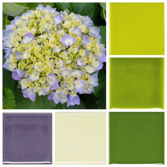
Found so much palette inspiration in the garden this weekend! 🌻🌺 #paletteinspiration #designpalette #greentiles #purpletiles #modwallstile http://bit.ly/2IvFtjc
0 notes
Text
#BrandPrismaFlagshipStore
Prisma opens their flagship store at Tirupur An article by Nabamita Chatterjee | February 9, 2017 @ goo.gl/jjpx0P #BrandPrisma #DesignPalette #Tirupur #media4growth #HappySharing #HappinessDesigned
1 note
·
View note
Photo

Finalizing selections for our new residential project... 🤍🤍 texture and tone! . . . #designbyaire #airearchitecture #modernarchitecture #residentialdesign #residentialarchitecture #contemporaryarchitecture #aireinteriors #residentialinteriors #zahahadid #1000museum #designpalette #finishpalette (at One Thousand Museum) https://www.instagram.com/p/CFS7HrHsyQ7/?igshid=1uvj7nzttzqrm
#designbyaire#airearchitecture#modernarchitecture#residentialdesign#residentialarchitecture#contemporaryarchitecture#aireinteriors#residentialinteriors#zahahadid#1000museum#designpalette#finishpalette
0 notes
Photo

Finalizing selections for our new residential project... 🤍🤍 texture and tone! . . . #designbyaire #airearchitecture #modernarchitecture #residentialdesign #residentialarchitecture #contemporaryarchitecture #aireinteriors #residentialinteriors #zahahadid #1000museum #designpalette #finishpalette (at One Thousand Museum) https://www.instagram.com/p/CFS69bEMNtZ/?igshid=1lk2bgd87zx9x
#designbyaire#airearchitecture#modernarchitecture#residentialdesign#residentialarchitecture#contemporaryarchitecture#aireinteriors#residentialinteriors#zahahadid#1000museum#designpalette#finishpalette
0 notes