#FinancialCharts
Explore tagged Tumblr posts
Visit Tumblr Blog
Explore Tumblr blogs with no restrictions, modern design and the best experience.
Last Seen Tumblr Blogs


Fun Fact
The KCSC sent more than 20K requests to delete posts related to prostitution and porn to Tumblr from January to June 2017.
Text
How FTSE Chart Reveals Hidden Gaps and Breakout Zones
The FTSE chart offers a dynamic snapshot of how the UK’s premier stock index behaves across time. As markets evolve daily, weekly, and monthly, this visual tool provides clarity that raw numbers or single-day summaries often cannot. With every candlestick, line, or volume spike, the FTSE’s movement becomes more than a data point — it becomes a story.
Momentum in Real Time
Unlike static tables or lists, the FTSE chart captures velocity. Whether markets trend upward on positive sentiment or dip in reaction to macro events, these shifts appear immediately on the visual interface. Market participants often track these fluctuations to observe momentum, particularly during times of heightened news flow or economic data releases.
Intraday moves, for instance, may show sudden directional changes — a sharp upward candle during morning trade or a pullback into afternoon sessions. These visual trends, spread across time intervals, can often signal deeper shifts in sentiment.
Historical Traces and Long-Term Patterns
Beyond the short-term moves, the FTSE chart provides a clear view of long-range behavior. Weekly or monthly charts offer insight into multi-year cycles, revealing how economic expansions, policy changes, or global events shape the index’s path over time.
These longer-term views frequently reveal repeated formations — channels, consolidations, or inflection zones — that highlight areas where momentum has stalled or surged before. Such visuals help frame the broader narrative of how corporate health, geopolitical tension, and currency movements influence large-cap UK equities.
Sector Rotation and Index Composition
One of the subtler elements embedded in the FTSE chart is the impact of sector rotation. As money flows between areas like energy, financials, and healthcare, the chart may reflect that movement in the form of directional bias or hesitation.
For example, during periods when commodity prices spike, the FTSE often mirrors that strength due to its weight in energy stocks. The chart may show extended rallies that align with such periods. Conversely, weakness in banking or telecom can sometimes cap the index, and that deceleration shows up as flattening or sideways ranges.
These shifts are not always tied to singular events — they often play out over weeks, gradually appearing in trendlines and momentum slopes on the chart.
Volume Signals and Breakout Zones
Another powerful layer on the FTSE chart comes from volume. Sudden surges in trading volume can precede breakouts or major directional moves. When plotted alongside price action, volume often acts as a confirmation tool, indicating conviction behind a move or lack thereof.
In recent months, multiple sessions have displayed volume spikes near major chart zones — whether at resistance levels or during reversals from local bottoms. These moments, while subtle, often mark critical pivots in the broader price structure.
From Local Lows to Record Highs
The current shape of the FTSE chart tells a compelling story of recovery and resilience. After periods of economic uncertainty and muted price action, the index has recently crossed significant resistance zones and ventured into all-time high territory.
This journey is mapped visually through higher lows, upward-sloping channels, and well-defined breakout points. The chart acts as a living canvas of this evolution — a testament to both corporate performance and broader economic recovery across the UK and beyond.
A Broader Reflection of Sentiment
While data points like GDP growth, inflation, or employment rates carry their own weight, the FTSE chart often reveals how such data is digested by the market. It becomes a real-time mood board for macro perception.
From euphoric rallies to cautious consolidation, the chart captures the market’s internal dialogue without the need for interpretation. The shape of the trend, the pace of the move, and the context of volume combine to offer a pure form of sentiment analysis.
The FTSE chart stands as one of the most powerful visual tools in the financial landscape. Its real-time nature, historical scope, and technical clarity make it more than a graphic — it becomes a reflection of how markets think, react, and evolve. Whether viewed over hours or months, its lines, gaps, and curves tell a continuous, unfolding story of the UK’s corporate landscape and global market dynamics.
0 notes
Text
Increase your data visualization using Iconadda’s free graphic assets
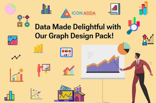
An important aspect of modern design is data visualization, and the right graphic elements bring everything together. We offer a series of free graphic assets to help display data in an attractive way in IconAdda . Our SVG graphics provide a simple solution for your design requirements, whether you design dashboard, infographic or business presentation.
Why choose our free graphic resource? Completely free: The graph elements in Iconadda are all independent, making them ideal for both individual and professional applications. Superior SVG format: Regardless of the size of the screen, our SVG property remains clear and scalable. Various collections: Our free illustrations, free icons and free stickers meet all your data visualization requirements, from pie charts and bar charts to line maps and infographic. Easy to customize: Change styles, colors and sizes that fit your design requirements.
Popular graphic assets Bar graph icons are ideal for presentations and reports. Pie chart are great for dashboards and infographics. Line map stickers are good for modern user interface design. Infographic elements: Increase your visual story.
How to download free SVG Graph features? Downloading free SVG graphics, icons and stickers is easier than IconAdda: Go to our site IconAdda . Go through the Graph asset category. You can immediately download the desired feature by clicking on it.
Increase your photos with IconAdda Iconadda is your Go-Context for high quality SVG graphics because of our growing library with free graph elements. See it and use our free illustrations , stickers and icons to increase data visualization!
Get it now to make facts beautiful!
#GraphDesign#DataVisualization#GraphIcons#ChartIllustration#AnalyticsDesign#InfographicAssets#DataDrivenDesign#GraphVectors#BusinessAnalytics#FinancialCharts#DataIcons#StatisticalGraphics#InformationDesign#VisualData#GraphIllustration#EconomyGraphics#LineChart#PieChart#BarGraph#CreativeData
0 notes