#I barely had time to draw digitally so I just doodled in my sketchbook instead
Explore tagged Tumblr posts
Visit Tumblr Blog
Explore Tumblr blogs with no restrictions, modern design and the best experience.
Last Seen Tumblr Blogs


Fun Fact
In 2020, 27% of US Tumblr users had an annual household income of over $100,000.
Text
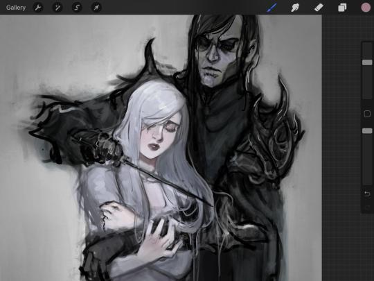
Sketchbook dump time!!

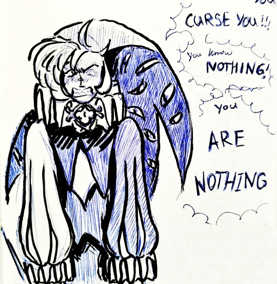
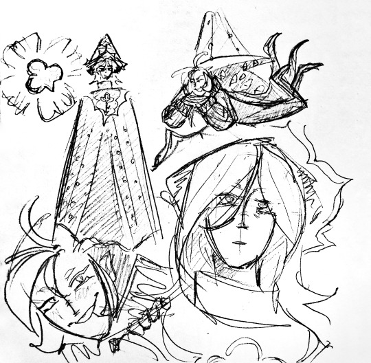


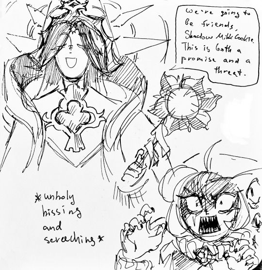
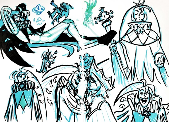
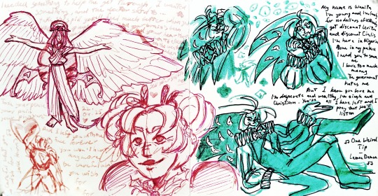
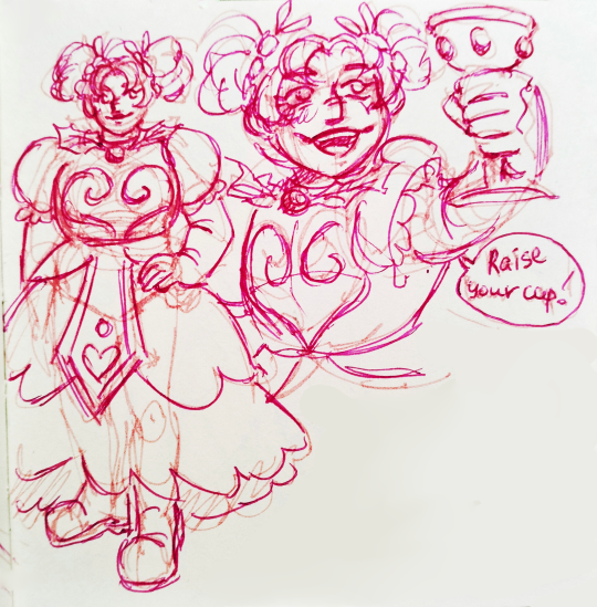
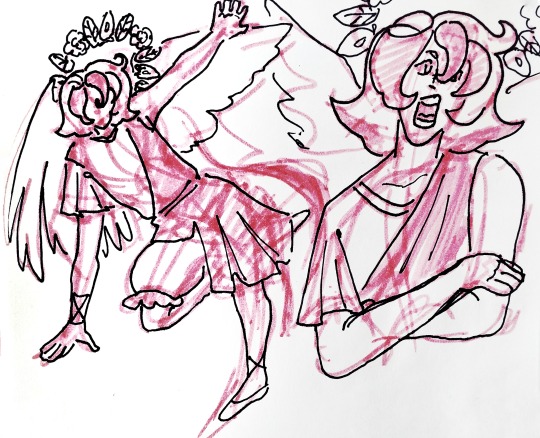

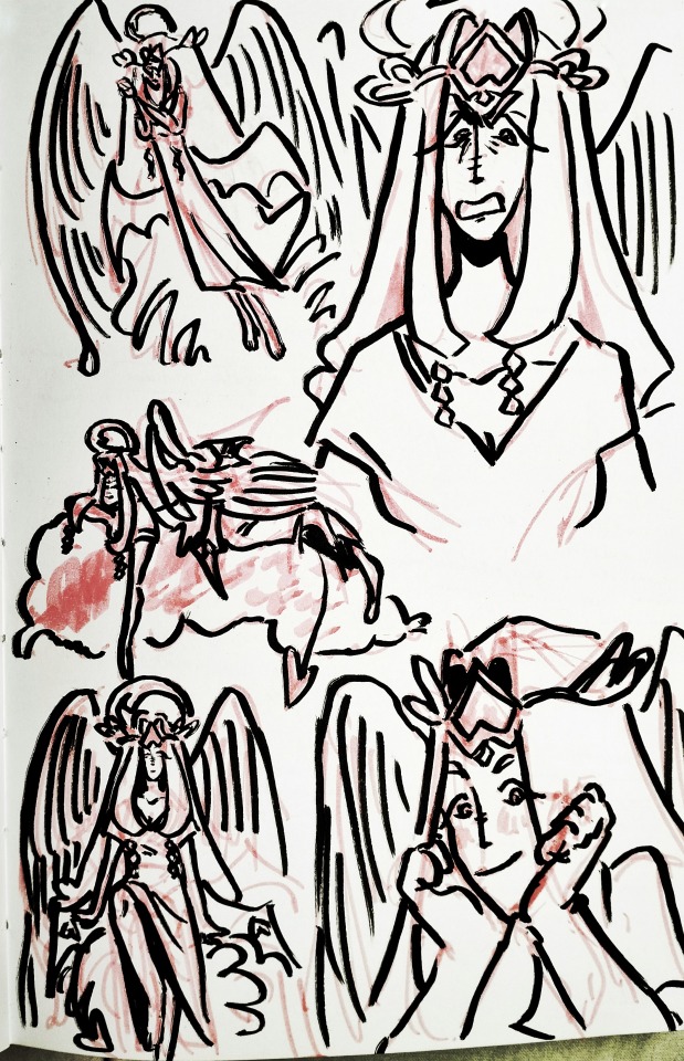
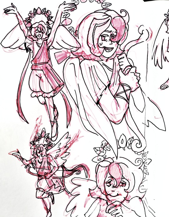


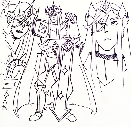
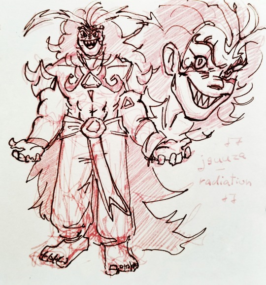
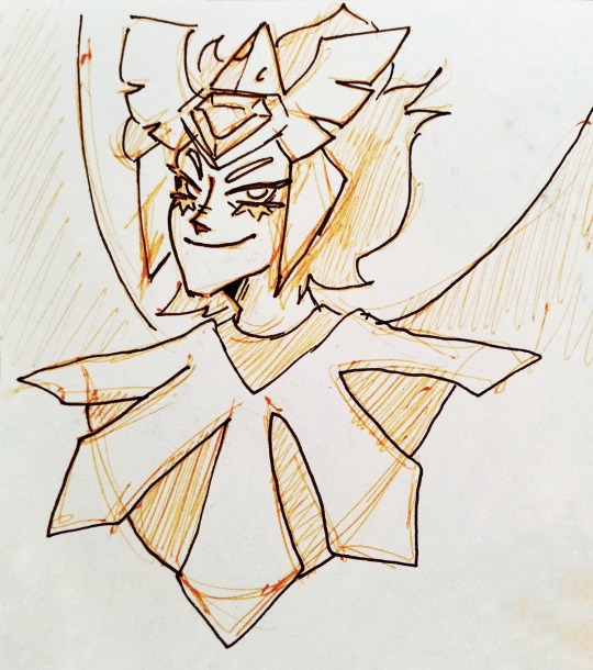
#I barely had time to draw digitally so I just doodled in my sketchbook instead#later on I'll add separate posts for rottmnt sketches and oc sketches#my art#crk#cookie run kingdom#shadow milk cookie#pure vanilla cookie#truthless recluse#candy apple cookie#eternal sugar cookie#hollyberry cookie#pavlova cookie#dark enchantress cookie#white lily cookie#silent salt cookie#dark cacao cookie#burning spice cookie#golden cheese cookie#i think that's all of them
124 notes
·
View notes
Text
Coloring in grey scale
So, hey, this is somewhat of a tutorial for those curious about some of my coloring and blending. I made this especially for anyone younger than me and is exploring digital art, but this is also for others who are curious about what I do. I love reading other artist’s comments and looking at their WIPs, so why not.
Another reminder: if you’re looking for my artwork, please follow @rainbow-illness and not this blog. All of my finished stuff goes there; usually, my works in progress (WIPs) or Angry Doodle Corner go here. Sometimes I use this blog to repost my art, but that is my official art blog, no this one. Not unless you like nonsensical posting and metal, then have at it. If you have any questions, don’t be afraid to hit me up, I love talking about art.
So I can’t always sit down and talk about my processes and how I go about doing them, but I was able to sit down and take some screencaps while I was working on my iPad Pro. Using the iPad is actually my first choice to draw on because of the convenience of carrying it around like a sketchbook, whereas my laptop isn’t always easy to carry around--it’s a big laptop. While I use my iPad, I also like to go back and correct things, recolor, re-proportion, or spend more time privately working on a drawing. I have my iPad with me, all the time, so I’m out in places usually like Starbucks doing this. I also struggle with pretty bad PTSD and agoraphobia, so having my iPad out with my headphones on gives me an excuse to put my mind elsewhere to calm down. My family just usually looks at me and goes “oh, she’s working on her art again”; I did this as a kid, too, only with sketchbooks.
I do not have a Cintiq either, though I would absolutely love one. This laptop is capable of using a stylus, but I think I need a better one to do it with. All I’m using is a cheap Wacom Bamboo tablet that I’ve had for five years, that’s it. Everything I’ve done on this blog has been on a small surface. So if you’re just dabbling into art, don’t beat yourself up for having the small stuff, I’ve worked with small stuff and still do. The only thing I have that’s not small is, well, the space and processor on my laptop are much faster than any other laptop I’ve owned, bought especially for graphic design classes and my artwork.
So, that being said lemme just forewarn some of you guys. My artwork is all done in two to three layers! Yes, you read that right! Why? When I was 16, I didn’t have a Wacom tablet to mess with, so I had to use a mouse and learned from there. When I turned 18, I got my first Wacom tablet while working my first official job and the family computer didn’t have a good processor. So when I got my first official laptop, it was basic and not made to run anything beyond the web browser and such, it could barely handle Photoshop. It did, however, run Paint Tool SAI with no issue (which is why I still prefer it over anything I use), it just couldn’t handle more than five layers. After losing my drawings constantly and not being able to do anything in the prized software I’ve been eyeing since my Sophmore year of high school, I found a workaround with it.
And that’s what I’m going to write about here. With that in mind, no, you do not have to limit your layers! I’ve taken traditional art classes so my first instinct is to literally paint over my stuff like I would on a canvas. If you don’t want to do that, you don’t have to! Yes, I am nuts.
That being said, let's do this.
If you haven’t taken traditional art classes, that’s cool! I’m going to be using some art terms you haven’t heard of, but you definitely will when you take your first ever drawing class. These terms are foreground, value, negative space, contour, and weighted line (I’ve seen it called line weight too). For the more experienced art students who are likely groaning over that stupid contour practice from that book “Drawing on the Right Side of the Brain”, I’m sorry, guys. Newbies, you are going to know this.
And you are going to hate it. While I still hate it and, yeah, my eyes are rolling into my skull right now just even talking about it, there are some useful practices in here that I... actually use. Who would have thought? At least we’re not talking about still lives.
Anyway, here’s what I’M going to say that some art teachers will not tell you but I want anyone to read this to know:
- Do not obsess over your drawing to look exactly like your reference. Just don’t. Forget this completely, worry about it later or don’t even worry about it at all. This is your style, your interpretation.
- Digital art is hard. Art is hard! Practice makes perfect and you learn over time just by studying (looking at) other pieces of art. It took me like well over 10 years to find my own little niche and I’m still playing around with coloring styles. I have a lot.
- If you’re just starting to draw with a tablet of any kind, play around with it. My first official program was a cheaper version of Paint Shop Pro and when I first got it when I was 14, I sat around and experimented on layers to see what it would look like. Explore!
- When you start drawing figures or faces, try not to think of it as, well, face or a figure. Reduce it to basic shapes, like squares, triangles, and circles.
Greyscale can establish light source, value, scale, and negative space.
I don’t always use greyscale for my art, but when I do, I appreciate it because it makes my life easier. For example, Alphonse Mucha’s pieces here from his “Slav Epic”.
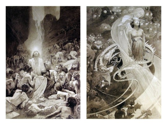
Chances are, you’ve seen Mucha’s art nouveau on prints, fanart, fabrics, and all of that. But Mucha did so much more and he is a huge influence on me for a reason. By the greyscale we see here, we can see foreground/subject with each illustration. Mucha is using value (that’s shadow) to emphasize this, in addition to negative space (background) to draw you in, just by using black and white. Notice how the other subjects don’t have such a powerful contrast and light source versus the other, especially the woman on the left. Mucha made his art pop by his understanding of contrast.
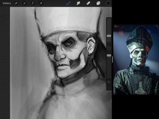
For this first part of this entry, I’m going to be using Papa Emeritus II from “Ghost”... who is a good example of how to draw faces, too. Huh. Regardless of what drawing program you’re using, keep your opacity low, at 50%.
Simplicity at its finest
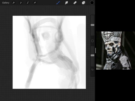
Instead of focusing a lot on Emeritus’ face, I’m going to focus on the negative space behind him. I’m using this to define his figure. This is a good picture because of the stark contrast, though, it’s a little tricky because it is really contrasted and you can’t see where the light source really is. But that is okay! I am going in and just using this negative space, the contour of his head and torso. Before I even think of a face, I want to softly go in and use black (or grey) to fill up that negative space. Keep it simple and work your way up.
After I lightly fill in the negative space around him, I can start lightly going in and establish his face by blocks of shadow. And this is why Emeritus II is such a good example for this kind of work. I don’t usually start going in and drawing eyes, I rely on the shadows of the face to see where their eyes, ears, lips, and such lie.
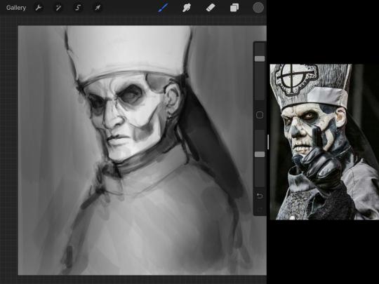
Here’s another example (though, it’s old):
This is in my maroon style underpaint, which is what I post most of the time. For their faces, I just used basically eye sockets to start working on their faces, like Papa Emeritus II down below. Again, this dude is a great example.
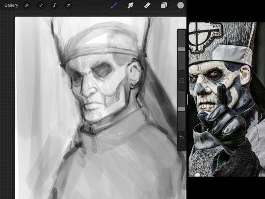
Here is where it may get a little funky. I created a new layer and set that layer to Multiply, still keeping that opacity low. Since I have no light source and I just want to create a really dramatic lighting, I made a vignette with a simple airbrush tool.
With that little vignette, you can create a new layer (unless you’re me, I just merge it down because of that constant fear of nonexistent software crashing) and I’m using the color pick tool to go back and forth to start using greys to really get into Emeritus’ face, especially his wrinkles. I’m painting over it constantly, switching back and forth between a paintbrush tool and color pick tool to blend. Again, keep your opacity low... unless you’re me and you’re feeling adventurous. You’ll also notice here that I have more than one photo reference. I use several for a lot of my art, so I encourage you to do the same. I had no idea what his jaw looked like, so I grabbed a second photo. Now that I have a better idea of where his hat ends on his forehead and how his nose looks, I start doing a weighted line.
Weighted line and Contour
Now is the dreaded talk. Of contour.

Welcome to Drawing I hell. This cursed image is from the book “How to Draw on the Right Side of the Brain” and if your teacher does not talk about this in your first drawing class, I am going to eat my hat... I have a hat lying around here somewhere. ANYWAY, the contour line exercise is basically you just using a neverending line for a drawing. I don’t know who drew this (and tbh, thanks a lot for every single boring assignment I’ve done in drawing classes), but this guy used contour lines for his drawing. I’m having war flashbacks over here, but I managed to find an art teacher’s page talking about different types of contour. My god, they are evolving.
Going back to our dear friend Papa Emeritus II, I used weighted line to start adding in little shadows to his face. Weighted line goes hand in hand with contour; it is a great technique to not only add details, but add little bits of shadows.

This is a simple example; the thicker line is adding to the shadow of the apple, giving it value!
Papa Emeritus II is such a good reference... I used him as inspiration for King Melwas here.
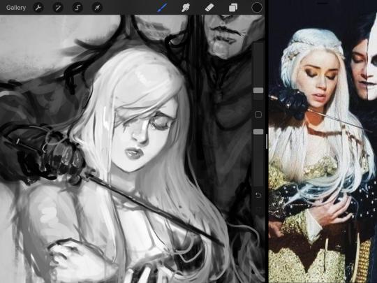
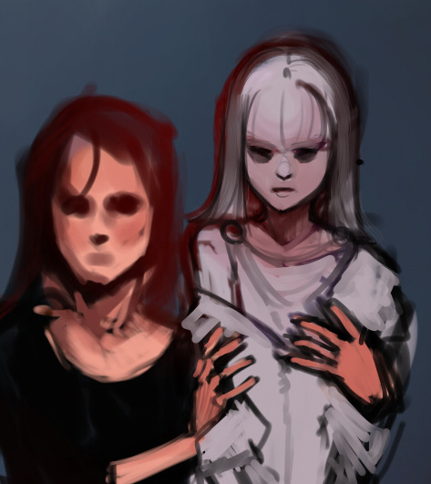
Gwenhwyfar is also a good example of weighted line. Gwen is essentially a very, very pale character. In contrast to Melwas, who is in darker clothing, Gwen is soft, she is the focal point in this drawing. For the little pieces of her hair, the corner of her lips, eyelashes, and her fingertips, I used a weighted line to establish these things, otherwise, Gwen is so pale, she’ll easily be washed out completely.
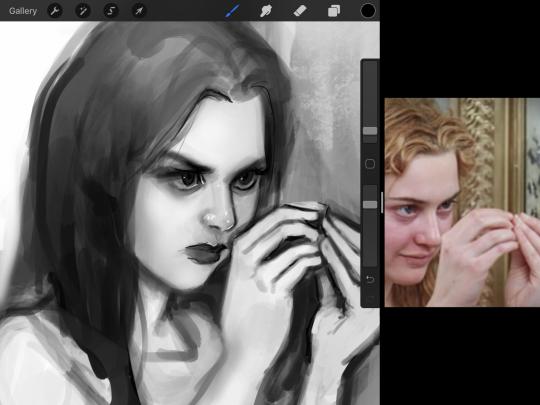
This drawing of Alice, which I’m still messing around with, is another example of how effective a weighted line can be with depth. The lines I added into her face, eyelashes, creases, hair, and fingers add those little details since everything I’ve done before like Papa Emeritus II was so soft with a low opacity on the brush settings.
Layer masks and curves
There are two ways you can color greyscale images.
You can do this by going into Layer > Adjustment Layer > Curves (this is how it looks like in Procreate).
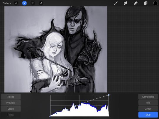
This gives you a neat ol’ base color! I am playing around in the blues, adding soft hues of blue in their figures and the white in this picture can either turn blue, cream, or even green. You don’t have to use Blue, you can use any of the other colors. For me, I’m always drawn to blues. Another cool thing to play around with is Color Balance, which is underneath the same function as Curves.
But if you don’t have any of these, you can add a new layer, and do Multiply.
The only drawback to this, of course, is how destaturated (the lack of color) it looks. And yes, that’s an issue you will have and I did run into this while doing this. How I combat this is using additional layer masks. Believe it or not, Alice here was once at a grey scale, looking even more desaturated than Gwen.
For Alice’s face, I went in and use:
- Soft Light because she needed more peach and roses in her skin. Omri’s original drawing gave her a light rose blush so I wanted to do the same.
- Overlay to mask out the black lines from the greyscale I had.
- Lighten which I used to make her lips pinker, her apron’s shadows lighter, and parts of her hair brown.
The same went for Gwen, who is, again, very pale. But while she’s supposed to be pale, I didn’t wash her out completely. To add more saturation, I used a combination of Soft Light over my Multiply layer and Overlay to start working at the highlights on her hair, nose, and shoulder.
This little walkthrough isn’t as visual as I like, but with limited software like Fire Alpaca, GIMP, or Paint Tool SAI that don’t have the abilities of Photoshop in terms of color correction and playing around with colors, I really encourage you, readers, to play around with these tools. Using the color picker back and forth, especially after using layer masks, gives you an ability to mix and blend colors. The reason why I work with greyscale or a maroon under paint is that you can create brilliant colors and make a new palette; the trick is to constantly mess around with them. I never go in and flat out color anything, with the exception of things like “angry doodle corner” which is basically what I call my lazy drawings, drawings where I’m just honestly goofing off with.
So in summation...! Or me trying to summarize this.
Experiment and explore with layer masks and adjustments. Whoever says that using these tools isn’t real art, they’re wrong. And please don’t ever be afraid of using references of any sort! Alphonse Mucha is saved ten times over on this computer.
#my art#tutorial#i think#an attempt was made#digital art#procreate#ipad drawing#ipad pro#Alice madness returns#alice liddell#american mcgee's alice#alice asylum
8 notes
·
View notes
Text
Starting an art blog...
Yo, time for my first post on this blog. How to start this... well maybe by writing down the reason behind it. This evening I once again tried to draw a character from reference and it was painfully obvious that I again had no idea what I was doing. I can't construct figures properly, I only have a very limited understanding of anatomy, perspective and every other art fundamental out there. Usually I would just slide back into drawing something very simple that doesn't need much understanding of any of it to look somewhat decent but here is the thing: I'm endlessly tired of doing that, I am not improving by doing that and I never will. Most people would say I'm a loser. My family only consists of my father and grandma. I'm single after I got dumped by my boyfriend in early 2020 after 10 years and I do not have a career in a field that makes me feel fulfilled. My hobbies used to be Video Games and Anime but both industries are in an absolutely terrible state these days that I can barely find anything in it that gives me enjoyment anymore. You might say my life crumbled apart everywhere. Well... maybe but I don't feel like that is the case, I still feel optimistic that I can turn things around. To some extend I was always interested in drawing, it's just that there have always been things in the way so I couldn't really dedicate myself to it but since there isn't much else left maybe now the time has finally come to get serious and learn art properly. I can't say I have an endgoal. I don't know if I would want to keep it a hobby or go professional. All I know is that I want to be good at it and that I want to spent me life doing art. I've been wanting to do it for a long time now but I can't push it aside any longer. I often think I should give up on it. Today was one of these moments when I completly failed to nail the anatomy of the character I wanted to draw, but whenever I think I should just give up a certain feeling will follow right away: "If I give up on art I am basically already dead." There isn't really anything else in life I want to focus on. I have no interest in building a family. I have equally little interest in dedicating myself to any soulless career field out there. Other hobbies don't sound attractive either. So no matter how I look at it, I have to sit down and spend a very long time in agony learning those art fundamentals until I have gotten somewhat decent and start making the art that I want to make. Only to never be satisfied with my skill level and contine to learn until my last breath. Funny isn't it? Well this might sound a little negative but I wouldn't be here if I didn't enjoy creating art. It's just the part where I have to do studies instead of just drawing what I enjoy that's seriously painful. So this is me, a 29 year old woman who just wants to become a decent digital artist, nothing more. I won't post daily. I have no interest in pressuring myself. I also don't care if this blog gets follows or not. This is basically just for me to keep track of my long journey. If there is something to post I will do just that. May it be my drawings, studies or just thoughts and struggles. It all goes here. Well that's it for my first post. I will now proceed to doodle something into my untouched sketchbook before I go to sleep, maybe some hands I think.
0 notes
Text
Procreate review: A digital artist's treasure trove for just $10
New Post has been published on https://appradab.com/procreate-review-a-digital-artists-treasure-trove-for-just-10/
Procreate review: A digital artist's treasure trove for just $10
During the coronavirus pandemic, setting aside time to pursue creative projects has become one of my favorite ways to spend free time and manage stress. I typically enjoy working with physical media — watercolor, oils, acrylics or simple sketching with pen or pencil — and the idea of going digital was intimidating. But while looking for new ways to draw on my iPad, Apple’s Procreate app caught my eye.
Like
Wide range of tools
Useful for everyone from beginners to professionals
Easy to learn new styles like animation
Don’t Like
$10 price tag
Two different apps for iPhone and iPad use
Large number of tools can be overwhelming for beginners
The digital illustration app costs $10 (£10, AU$15) to download (with no in-app purchases), and its suite of art tools and creative features make it well worth the money. Procreate offers an accessible experience whether you’re a design professional, a seasoned digital artist or a beginner to the world of digital drawing. One downside: The app is only available on iPadOS and iOS.
Read more: Best iPad for 2020
I’ve been using Procreate for a few months, and there are still features I’m learning to use that improve my artwork. The app’s tools, such as quick shape, blend mode, layering, alpha locks and clipping masks, add a new level of professionalism to your art. This is why we’ve awarded Procreate a CNET Editors’ Choice award for 2020.
Discover the latest apps: Be the first to know about the hottest new apps with the CNET Apps Today newsletter.
Toto, I don’t think we’re using Microsoft Paint anymore
Procreate is packed with so many tools and features that I’ll barely scratch the surface in this review.
There are countless ways to customize your iPad’s ($239 at Back Market) gesture controls to make the app work best for you. For example, you can set it so that you tap four fingers to immediately populate the copy and paste options. You can also use three fingers to scrub the screen and clear a layer.

A sketch I did on Procreate and a look at a subset of brushes.
Shelby Brown/CNET
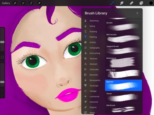
One of the biggest perks of Procreate is its massive library of 150 brushes. The range of brushes available in the app fit just about any creation you could possibly have in mind. You can stick with basic sketching, inking, drawing and painting, or you can explore airbrushing, calligraphy, charcoals and spray paints. Under each category of brushes, you’ll find a half a dozen or more choices. For example, if you choose Sketching, you can select from seven different pencils and three different pastel textures. Take it a step further by tapping the brush again and further customizing the properties of the tool.
Read more: 10 Procreate app tips for budding iPad artists
I also love using the app’s layering feature while I’m drawing. It makes editing in the future much easier. You’ll just have to remember to put your work in piece by piece. You can find extra light and color editing features for each layer as well. Just tap the little “N” next to the checkmark that selects the layer.
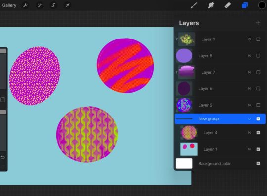
Here’s what grouping layers looks like with some basic doodles.
Shelby Brown/CNET
To stay organized, or if you want an added level of security to a section of art, you can combine layers into groups. Simply tap a layer and you can select either Merge Down or Combine Down. Merge Down makes two layers into one, for example, if you had Alpha Lock on to protect line boundaries in a layer, it will turn off. Combine Down forms a new group, but still keeps each individual layer’s specifications active.
Procreate also makes it easy to learn new skills by making the technical aspect of digital art less intimidating. When I first opened the Procreate app, I saw that it had animation features, but almost immediately wrote them off as too complicated for a novice like me. But with a few taps in the app, I was able to create a rudimentary animation of a ball bouncing across the screen. It was barely two and a half seconds, but I was really proud of it! Now, I’m really excited to see what else I can make.
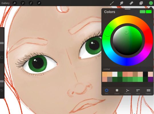
A face sketch I started on Procreate.
Shelby Brown/CNET
To ease the digital illustration learning curve, Procreate has a helpful handbook, forums and YouTube videos to help you along the way.
iPad is the new canvas
Procreate is an iPad-only app. There is a version for your iPhone, called Procreate Pocket ($5, £5, AU$8). But the apps are separate, so you can’t swap back and forth between your phone and your tablet.
I use Procreate on a third-gen iPad Air, but you can find the full list of compatible devices on its website.
The Apple Pencil isn’t required hardware for using Procreate. But if you’re planning to pursue digital illustration, your fingers will thank you for picking one up. I can only speak for myself, but without a stylus, I couldn’t get the same level of detail. I use a first-gen Apple Pencil. If your device isn’t compatible with the Apple Pencil, the app supports some third-party stylus models. You can find the complete list on its website.
Read more: The best Apple iPad apps of all time
Should you try Procreate?
There’s a lot going on in Procreate and it can seem overwhelming, but the more you use the app, the easier it gets. Having fun is the most important part.
If you’re even mildly interested in digital art and have $10 to spare, I’d recommend trying Procreate out. Explore the app, doodle, write your name with different brushes. You can also upload blank coloring sheets to a canvas and experiment with the tools that way, so you’re not creating a brand new work on your own.
If you’re more in the market for a digital coloring book, however, you might check out the Lake app (free, with in-app purchases), instead of shelling out $10 for Procreate. And if you want to get an idea of how much you might use Procreate before investing, Autodesk Sketchbook is a free app that has an impressive set of tools, too — not as many as Procreate, but enough to give you a taste.
There are dozens of ways to customize Procreate to help you discover or improve your art style.
For more on drawing, check out five online drawing classes you can take right now and all the best apps for drawing on your iPad.
0 notes