#I can see where the foreground and background of the parallax effect begin...
Explore tagged Tumblr posts
Visit Tumblr Blog
Explore Tumblr blogs with no restrictions, modern design and the best experience.
Last Seen Tumblr Blogs


Fun Fact
Post activity is at the highest at 4:00 pm EDT; notes peak at 10:00 pm EDT.
Text

Hm. I think I broke the passage screen
#rain world#ignore the liberal rain world mod#I can see where the foreground and background of the parallax effect begin...
0 notes
Text
Coding the website
Seen as I am new to coding, I had a video call with Kat and Liv where she gave us a short summary of what the different tags do, how to set up our folders and she showed us the code for the header in order to give us a head start.

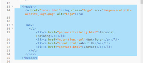
We specified the font in the css folder so that it would be the same font throughout the whole body.
In the css file we could also specify the colour we wanted the header, height and width. We added the logo image so also specified the size of that in the css folder.

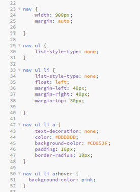
This is where we also created the navigation bar which will link to the other pages.
I added a hover tag to mine too where the colour will change when you hover over the link as I thought it would make it look more aesthetically pleasing.

This video call with Kat really helped as I feel like it gave me a much better understanding of setting up the code and gave me the confidence to want to start doing the rest by myself.
Homepage
To begin, I created the Homepage, for this I needed the header which I had already created, the main section and the footer.
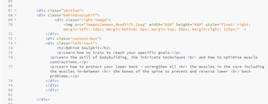
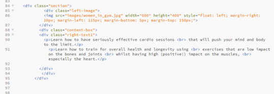
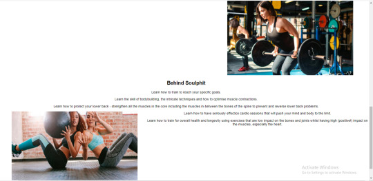
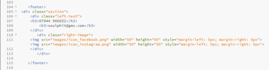
Then there was four sections in the main part of the code, the first section included a left image and right text.
This part was fairly simple, as it was the first thing on the page too, it meant it was positioned where I wanted it and nothing could overlap it.
The services box was something I struggled with for a while with trying to position the images exactly where i wanted them, but in the end I managed.


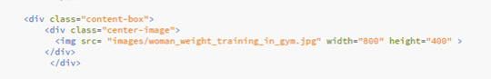
Then there was two more content boxes with one right image and left text and one left image and right text.


Problems I came across:
Like I said before, I came across a problem when I could get the images of weight and leaf to go side by side.


When I did manage to get them side by side, I came across a new issue which was getting the headers to go underneath each image.

A problem I came across in the last two sections was being able to position the text next to the image, when I would use the same code that I used for the image at the top of the page to make them align, the text would jump up to the top of the page next to the top image rather than staying in the content box iI had placed it in.
I then managed to sort it out on the right image but it took me a bit longer to figure out what I had done wrong with the left image that meant it wouldn’t work, but I got there in the end.


Personal Training
On the navigation bar on the header you can click the tabs that will then send you to a seperate page with more information on that specific area, which I liked together when creating the header, which I can design later in te different html files e.g ‘personaltraining.html1.
In the design we were given, the header and footer is the same on each page, so I could just copy and paste the same header and footer code that I had on the homepage, this ensures that the header and footer stays the same throughout each page, and makes the user experience for the user easier so they can click between each page.
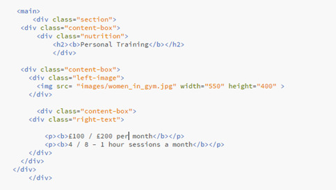
Then there was the main section of the personal training page that I needed to code, I split this off into three ‘sections’ which then contained seperate content boxes inside them.
The first section just contains an image to the left and text to the right.

This section was fairly simple and I didn’t come across any issues.
Then it has a ‘specialties’ box that just contains some centered text.


Finally there was a content box containing some centered text and a centered image, I used two separate content boxes for this as I struggled to place the image where I wanted it when I just used the one content box for both text and image.


Problems I came across:
I didn’t come across many problems with the personal training page, I was able to copy a lot of it off the homepage as it contained the same sort of layout, and it was easy to place the pictures as there was only one in each content box so I didn’t have the difficulty of trying to place them both equally.
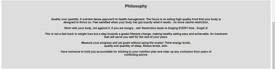
Nutrition
The nutrition page was very similar layout to the personal training page so i could copy a lot of the coding I’d done already and just change the images and text.

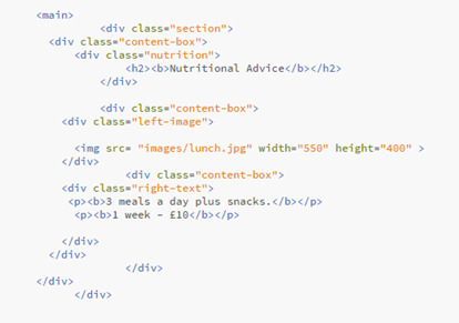
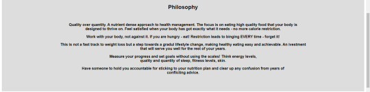
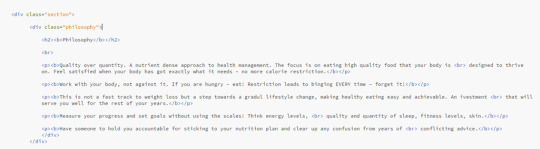
Problems I came across:
Because the sentences in the ‘philosophy’ section were quite long, I did come across a problem where the text was going off the page, this is where I learnt about the <br> tag, which moves the sentence underneath so it doesn’t go off the page, it makes it look better positioned with bigger margins at the sides.
Before.

After.
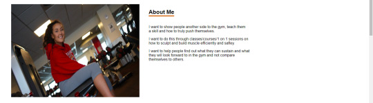
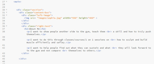
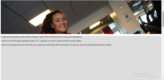
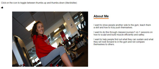
About Me

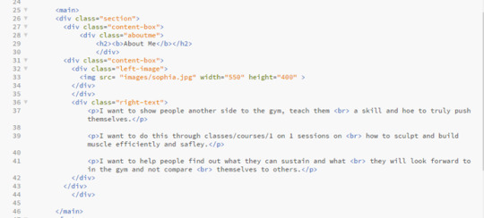
In the design that Kat gave to us there wasn’t actually a ‘About’ page, it just had an ‘about me’ button on the navigation bar. So that it wasn’t just a blank page when you clicked it, I copied over the text from the ‘about me’ section on the homepage and put this into the ‘about me’ page, formatted in the same way that the nutrition, personal training and contact page is, with the header at the top in the centre at the writing the the right of the image.
Contact
The contact page was very simple, it just had one image and a bit of text next to it, it was the same as the personal training page and the nutrition page so I was able to copy the code from that again.
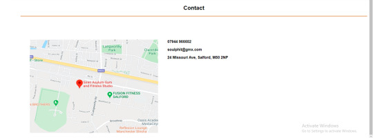

I didn’t come across any problems with this page as it was fairly straight forward.
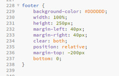
Footer

Problems I came across:
On some pages the footer would sit perfectly and on other pages the footer would overlap the bottom content box, for example on this picture here it overlapped. This was harder to figure out because the code was the same on all of the html pages so it was unusual that it didn’t sit the same in each page. To fix this I had to play around with some of the coding in the CSS file to get it in the right place on each page.

Experimenting with the coding
After finishing the coding for the design that Kat gave us, I copied a second version of my code so that I could experiment with some other features and see what I could do.
W3 Schools is a really useful website that can help you with the coding for the majority of features you want to add onto your website, so this is the website that I used to help me with most of it. If I didn’t use W3 Schools then I would use a YouTube video, this is more helpful when you want to find out in more detail why each line of code does what.
Parallax scrolling
Something I wanted to try and include in my code is parallax scrolling, this is a web design technique, in which the background moves at a slower pace than that of the foreground. This results in a 3D effect as visitors scroll down the site, adding a sense of depth and creating a more immersive experience.
I used W3 schools to try to embed this into my code.

When I tried to copy from W3 website, it didn’t work on my website, it just scrolled through the website as it would with a regular website without parallax scrolling. I think the images in my website wouldn’t be big enough anyway, as the design we were given had the images small and to the side, I think if I tried to use them in parallax scrolling then it would stretch them to look blurry and morphed, but if I was to create a website again in the future then I think this is something that I would want to include because I think that it makes the website look a lot more professional and clean cut.
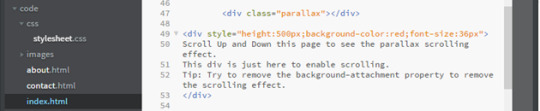
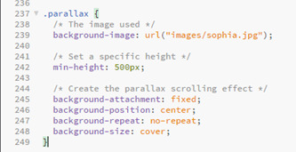

After making a few alterations I did manage to make the code work on the website.

Fading the buttons
Another feature I wanted to add was a fade background on the hover on the navigation bar. This was fairly simple, I just needed to add a transition of 2 seconds onto the css on the hover, making the brown fade into a grey when you hover over it, I changed this on the whole website so its the same on each page.

Transitions between html pages
I felt the transition between each page was very jumpy so I wanted to see if there was a way that I could ease in the pages when flicking between on the navigation bar.
I used a video tutorial to help me with this.
https://www.google.com/search?q=transition+between+html+pages&oq=transisition+between+html+&aqs=chrome.1.69i57j0l7.8173j0j7&sourceid=chrome&ie=UTF-8#kpvalbx=_NFvBXoftIYqr1fAPyoaFqAo32

When I actually embedded it onto my website I ended up not liking how it looked, it made the website look more like it was running slowly. If I was to create a website again though then experimenting with more transitions would be something I would like to do because I do feel like it can make the click from page to page a lot smoother.
Toggle Like and Dislike
Click on the icon to toggle between thumbs-up and thumbs-down (like/dislike).

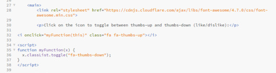

I thought this would be a good feature on a website seen as if customers see that the person has a lot of likes on their page it means that they would feel more inclined to use them than if they had more dislikes. Its like if something has loads of good reviews you are more likely to use it, it will boost the website and hopefully get it more interaction.
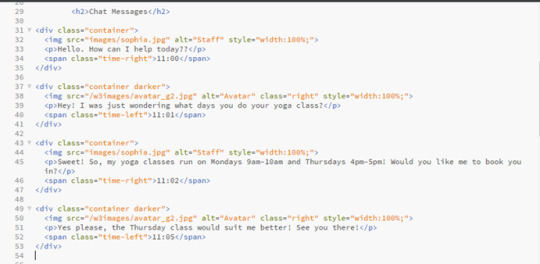
Chat Messages
I actually really liked the idea of added a chat to the website, I think it makes it a lot more personal and it also helps the user get instant feedback if they have any concerns, rather than perhaps waiting a while for an email or text back, plus then the customer doesn’t have to go to any extra lengths to message. I also think this would be more professional than texting.

I added in the little icon of a picture of the ‘staff member’, and gave an example of how the chat can be used. I think its really effective and if I was to create a website like this again or expanding on this website itself then its definitely something i would want to include.

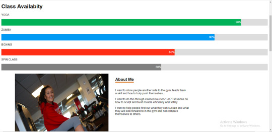
CSS Skill bar
I thought this would be a good feature on a website like this because it would make the customers experience on the website a lot nicer as they wouldn’t have to look around everywhere for booking onto their classes and if there is space left. Its also more likely that the customer would book a class because they’d be scared that they class would book up, creates a sense of urgency within the customer without them realising, but helps the owner as their classes would be getting booked up, so I think it would be a good feature to include.
I changed the names to make it more fitting to what this website is about.


0 notes
Text
William Jack Lynch DD1410 VFX1
Shot 1: windowclosepush
The window green screen set extension shot: The footage received was in an unusual format; 1280 by 1080 pixels. After reading the shot into Nuke and changing the project settings to 1920 by 1080, I could apply a reformat node and set it to distort so that it would be stretched to the correct size and not look squashed anymore.
The first step to begin keying the shot was to rotoscope each major element in the scene starting with the objects closest to the camera for better organisation. I did a loose rotoscope on the Christmas tree, the candlestick and the window frame itself.


The next task was to key each individual element that I had rotoscoped. I then plugged the source pipe of a new Keylight node into the reformatted read and then plugged the out matte into one of the rotos, I then could proceed to key the rest of the shots checking the key is clean using the alpha channel to see any grey areas. After keying each element that I had rotoscoped, I could merge all three keys together by plugging the A pipe of a merge node into the key and the B pipe into the candle key, adding another merge node and plugging the A pipe into the other merge and the B pipe into the window frame key. A great deal of data was lost during the rotoscoping so to retrieve it I used an outer key. I plugged the background pipes from the rotoscopes into a new key light, creating an outer key which provided a perfect key.
There were four stickers on the glass so I used a tracker node to track each of them. I averaged them to one track that I applied to a background image that I colour corrected and rescaled to fit behind the window frame. I found an image of some dirty glass and applied that to the tracks. The background colour of the glass was black so I merged the outside picture and the dirty glass with a screen overlay so the glass would become transparent. In After Effects I created a basic snow falling element using the built in plug in called CC Snowfall, then merging the 3 background elements and applying all of the trackers was quite simple. The result was realistic and the keys were very clean.
Shot 2:Laptop screen replacement shot
This could be approached with two obvious methods of tracking. The first method is the pixel tracker where a tracker node would be applied and create four trackers and set to track each corner of the display.
The second method of tracking is with a planar tracker. Here, the hand going over the screen is rotoscoped out and then a loose rotoscope around the screen and border of the display and then tracked. The planar tracker method is much more accurate as it takes into account everything inside the mask and not just the small trackers on the corners.

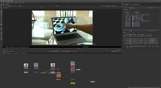
I decided to use a point track with this particular shot. So the first thing I did was to create a track node creating four trackers and placing them in each of the four corners of the screen. It is important to remember to place each one in the correct corner to save time later. Tracker 1 is positioned in the bottom left hand corner, tracker 2 in the bottom right hand corner, tracker 3 goes in the top right and tracker 4 goes to the top left corner.
After the track, you can apply the data to a corner pin node and plug that into the replacement image. At this point I could have simply merged them together and that could have been the final shot. In the case where nothing goes over the screen this is all that is required however because the hand moved in front of the screen, the screen had to be keyed which resulted in taking a lot of the colour out of the background. To fix this a shuffle copy is applied and then a merge followed by another merge. In between a colour corrections and light wrap can be applied to produce a realistic final composition.
Shot 3:Tears of Steel Green Screen Shot: The Old man
This shot was challenging but not because of the key but to orchestrate the background to move in the same way as the original shot because in the original the camera was moving back. I first separated each element of the man by rotoscoping his head, body, hand, legs and feet. I keyed each roto separately, managing to pull a good key although not perfect. I would have liked to spend more time learning how to achieve better keys on this shot.
I then colour corrected the man to match with a street background that I had found online but when I played the sequence back the man appeared to float away. One way to fix this is to motion track a point on his feet and apply that trackpoint to the background and then manually keyframe the scale. However this would be tedious and not so accurate. After experimenting for a while trying to work out the settings and configuration I came up with a solution.


The Solution was to track two different points close to the talent’s feet making sure that the translation rotation and scale was ticked on both trackers. This would save the data for the rotation and scale as well as the translation. This is exactly what I tried to achieve.
The first thing I attempted was to average track1 and track 2 to create a new tracker, then parent the averaged track to the background image with a transform node; this did not work at all. It did not apply the rotation or scale movement and it was the same as parenting just track 1. I then saw on the tracker node settings panel that you could export the tracking information in many ways. One of the ways was Transform (match-move), by creating the transform match move node I could plug it into the background image and it would move exactly how it should.
An issue that I found using this method was that being unable to reposition the green screen element. If I did change the position or scale then the man would not stick to the background. In the end the solution for this was not as good as I would have liked however the way I repositioned him was at the end of the node tree with a Translation node. This did not give me the flexibility I would have liked but I'm pleased with the key and the track and the outcome looks good.
Shot 4 : Tears of Steel Shot - Robot
Here I had to rotoscope the bridge handrail and add C-3PO. I had a lot of fun working on this shot it was probably my favourite part of the project. The first task was to rotoscope the bridge handrail so that the robot could appear behind, standing on the bridge like the stand in actor. This took a while as I rotoscoped more than necessary not realising the size of the robot.
After rotoscoping I used the same technique as the previous shot (the old man) with the tracking to make C-3PO stick to the background by using two trackers on the handrail. However when played back C-3PO looked unrealistic because he appeared too close to the handrail. In real life there will be some parallax between him and the foreground and background so I tracked the handrail in the background of the shot on the other side of the bridge and averaged all three tracks effectively pushing C-3PO back further away from the camera creating that parallax. The C-3PO motion now matched the other actor. I colour corrected C-3PO and applied and very subtle light rap to make it look like C-3PO was part of the scene.


So the shot was almost complete but for the girl standing behind C-3PO. In Photoshop I cloned stamped the girl out. It was not a great removal but I figured because C-3PO was covering most of the girl then it would not be noticed.
I attached the clean plate to the shot using the corner pin data that I had gathered from planar tracking the handrail. I did a basic rotoscope of the girl and then applied that to the clean plate so only the part where the girl is got painted out.
Shot 5 : Colour Correction - Car shot
This shot was fairly simple, however I did learn some important techniques whilst colour matching the car to the background. First of all I had to import the three elements provided: the background shot, the car element and the mask element for the windscreen. I merged the car and the background together and then applied the windscreen mask as a matte to the same merge so that the car would look like it was behind the snow on the windscreen.

I began matching the white and the black points with the snow scene, this was very easy and straightforward due to Nukes built in tools that allow you see the brightest and darkest points. I used a curve tool to analyse this but the most difficult part was matching the colours. Something that helped was to go into each different colour channel; red, green and blue, and try to match them by using the multiply, lift and gain sliders for each colour. The colours in the final shot matched and the final composition was believable.
So far with this module, learning visual effects, I have learnt a lot. Prior knowledge of Adobe After Effects and an awareness of basic visual effects terminology has helped me tackle this project with confidence. Having gained the fundamentals of each technique in the lectures my ability in Nuke has accelerated quite quickly as I experiment with new techniques, tools and nodes
After using After Effects for many years and becoming quite proficient, switching over to Nuke at first was difficult even though I fully appreciate how powerful it can be.
At first it was quite frustrating because I knew what I wanted to do and I knew how to do it in After Effects but once inside Nuke I had to learn where the tools were and how to get the same effect. Also using Nuke at first was quite frustrating because it seemed to over complicate some simple tasks. Now I have been converted and really enjoying its power compared to the limited and basic processes of After Effects. Whilst Nuke can be quite complicated at times it is superior to After Effects when it comes to compositing visual effects shots.
In conclusion I feel that I have progressed very well in this visual effects project and learnt a lot so far in this first module not just in Nuke but I have improved my problem solving skills as well as my learning skills.
References
Street: http://thepics.info/abandoned-street/
c3po : http://disney.wikia.com/wiki/File:RedArmC-3PO-Fathead.png
Snowy streethttps://maylanascloset.com/2014/01/
0 notes