#Javascript Charting Components
Explore tagged Tumblr posts
Visit Tumblr Blog
Explore Tumblr blogs with no restrictions, modern design and the best experience.
Last Seen Tumblr Blogs


Fun Fact
Tumblr was created by web developers David Karp and Marco Arment.
Text
Angular- which has emerged as a powerful framework for front-end development was designed to address the issues faced in single page application development. Currently, Angular is the best choice of most of the front-end designers for creating an interactive dynamic application. It is the crossed platform supporting language which requires Also, most of the coders prefer Angular because JavaScript is the main pillar behind its development. And, the most famous MEAN stack development requires all the JavaScript technologies to completely develop your whole application which comprised of MongoDB, ExpressJS, AngularJS, and NodeJS. Thus, they don’t need to learn various languages for the entire development. Learning AngularJS can be very beneficial for those who are willing to mark their presence in front-end or complete full stack development. Anyone can go through Angular Training for learning AngularJS so that they can create interactive designs, templates and dynamic contents for their application. The only requirement is a basic understanding of common web technologies like HTML and CSS. There are multiple AngularJS libraries freely accessible over the internet after utilizing them you can include cool and interactive features like charts, navigation, popups etc., in your web application. Here, I’m discussing a few libraries through which you can easily drive front-end development making it outstanding and effective for the end-users. Let’s explore them in-depth: PrimeNG PrimeNG has a massive collection of UI components for your Angular program. It is an open-source package registered distributed under the MIT license and created by PrimeTek Informatics. It comprised of 80+ components for promoting your UI design easily. For mobile page development, it offers enhanced user experience with touch-optimized elements fulfilling your responsive design need. Its interactive customizable templates allow you to start web designing journey in very less time. Currently, PrimeNG is used by more than one million developers. Its impressive functionalities make more than 500 government, private and other non-profitable organizations to adopt this package for the development. Material 2The material is the official component library of Google. It is developed on Angular and TypeScript. It is comprised of various components for as per material specifications. Whether it is about form-controls, navigation, layout, buttons and indicators, popups, modals, or data table- you will have a complete access to these resources. Thus, you can optimize and organize your content according to your objective. Anyone can leverage this complete package over the github with the comprehensive, modern user interface which runs across the internet, mobile phone or a desktop. NG-Lightening This package holds native angular components and directories. It is created from Scratch in TypeScript over the Lightning Design System CSS framework. If you are facing any interoperable issue like cross-domain, and you want to implement Salesforce Lightning Design System (SDLC) icons- don’t worry. It will assist you with a clone of multiple sprite files such as symbols.svg to which you can access locally on your system through the server. These stateless resources are dependent upon their input properties so that you can achieve an enhanced performance and flexibility to use. NG2 ChartsIf you are dealing with the issues for base charts, NG2 chart is the best option. It offers a complete package to serve varieties of charts including line, polar area, doughnut, pie, radar, bar. It offers various properties, events, colors to effectively include interactive charts in your Angular application. You can easily download this package from Github, here where it is registered under the MIT license. Onsen-UI Onsen-UI is another open source framework licensed under Apache 2.0 written in JavaScript. It assists developers in hybrid app development including HTML5, Cascading Style Sheets (CSS) and Javascript like web technologies.
This package comes up with tabs, side menu, navigation and bunch of other valuable components like lists and forms. It supports iOS and Android material designing with attractive styling to achieve better performance result. The best part about Onsen-UI is that it can support both iOS and Android without any trouble with same source code. Fuel-UIFor those who want new and incredible UI patterns, this library is one of the best options. Fuel-UI is one of the evolving UI components which can be implemented with Angular 2 and Bootstrap 4 project applications. It presents varieties of components, directives, and pipes to utilize your work in the easiest way. For including alert boxes, scrolling effects, popups, tags, bars, navigations, tabs etc., in your template you can simply integrate this library. It also offers directives like animations, highlighting tools, tooltips with multiple pipes to cover the most critical and technical aspects of the development.Thus, you can see how Angular is taking front-end development to another level through its massive set of libraries.
0 notes
Text
2025’s Must-Have Tools for Data Visualization & Analytics
Big data is entering people’s lives. Although obtaining data is not a big problem, many people do not know how to draw conclusions because there is too much data. Therefore, I am here to provide 4 useful big data visualization tools to help you understand the data.
1. Datawrapper

Datawrapper is an online data visualization tool for making interactive charts. Once you upload the data from the CSV file or paste it directly into the field, Datawrapper will generate a bar, line or any other related visualization file. Many journalists and news organizations use Datawrapper to embed real-time charts into their articles. It is very easy to use and produce effective graphics.
2. Tableau Public

Tableau Public perfectly grafts data operations with beautiful charts. Its program is easy to use, companies can use it to drag and drop large amounts of data onto the digital “canvas”, and create various charts in a blink of an eye.
3. Chart.js
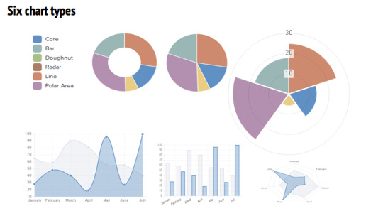
Chart.js is a free open-source JavaScript library for data visualization, which supports 8 chart types: bar, line, area, pie (doughnut), bubble, radar, polar, and scatter. Chart.js renders in HTML5 canvas and is widely covered as one of the best data visualization libraries.
4. D3.js

D3.js is a JavaScript library for manipulating documents based on data. D3 helps you bring data to life using HTML, SVG, and CSS. D3’s emphasis on web standards gives you the full capabilities of modern browsers without tying yourself to a proprietary framework, combining powerful visualization components and a data-driven approach to DOM manipulation.
0 notes
Text
What is React and React Native? A Beginner-Friendly Overview
In the fast-paced world of modern web and mobile development, what is React and React Native are two of the most powerful and popular tools used by developers. Both were created by Meta (formerly Facebook), and while they share similarities, they serve different purposes.
If you're new to the world of JavaScript frameworks or wondering how to choose between them, this article breaks down what React and React Native are, their key differences, and where to go deeper.
⚛️ What is React?
React is a JavaScript library for building user interfaces, especially for web applications. It lets developers build reusable components that manage their own state, making web UIs easier to develop and maintain.
✅ Key Features of React:
Component-based architecture: Build encapsulated UI components.
Virtual DOM: Improves performance by minimizing real DOM manipulation.
One-way data binding: Makes data flow predictable and easy to debug.
Ecosystem support: Works well with tools like Redux, React Router, etc.
🔍 Example Use Case:
Creating a dynamic web dashboard, where components like charts, tables, and forms are all interactive and data-driven.
📱 What is React Native?
React Native is a framework for building mobile applications using JavaScript and React. Instead of rendering to HTML and CSS, it renders to native platform UI elements (like Android and iOS views).
In short, you can use React principles to write mobile apps, and React Native compiles them into real native mobile code.
✅ Key Features of React Native:
Cross-platform: Write once, deploy on both iOS and Android.
Native performance: Uses native components for smoother UI/UX.
Hot reloading: See changes in real-time during development.
Third-party plugin support: Access native device features via libraries.
🔍 Example Use Case:
Building a mobile e-commerce app that runs on both Android and iOS using the same codebase.
🆚 React vs React Native
While both use JavaScript and share React's core principles, their output targets are completely different: React is for web apps, and React Native is for mobile apps.
Want a detailed side-by-side breakdown? Read our in-depth comparison: 👉 React vs React Native: Which One Should You Use?
🛠️ When to Use React vs React Native
Scenario
Use React
Use React Native
Build a website or web dashboard
✅
❌
Build an iOS/Android mobile app
❌
✅
Use JavaScript for UI development
✅
✅
Render HTML and CSS
✅
❌
Access camera, GPS, native features
❌
✅
🚀 Final Thoughts
React and React Native empower developers to build fast, scalable, and engaging applications across platforms. Whether you’re building a web app with React or a mobile app with React Native, both tools offer robust performance and developer-friendly features. Not sure which one to choose for your next project? Explore this detailed guide: React vs React Native: Which One Should You Use?
0 notes
Text
From Tableau Extensions to Power BI Custom Visuals: Bridging the Gap
In the fast-paced world of business intelligence, customization plays a pivotal role in delivering actionable insights. Tableau and Power BI—two of the leading BI platforms—both support extensibility through custom components. Tableau offers Extensions that allow developers to enhance dashboards with external applications, while Power BI supports Custom Visuals that extend the visual capabilities beyond default chart types. When migrating from Tableau to Power BI, organizations often face a major question: how do we bridge the gap between Tableau Extensions and Power BI Custom Visuals?
Understanding the Landscape
Tableau Extensions are web-based applications that interact with dashboards using the Extensions API. They are ideal for integrating third-party tools, performing write-back capabilities, or adding tailored user experiences within Tableau dashboards.
On the other hand, Power BI Custom Visuals are open-source visual components built using TypeScript and D3.js or React. They are embedded within Power BI reports and serve to visualize data in innovative ways not available by default.
Though both platforms support custom development, their architectures and ecosystems are quite different. This creates a challenge when migrating, as Tableau Extensions cannot be simply ported into Power BI. A strategic, well-informed approach is essential.
Key Differences That Matter
Technology Stack: Tableau uses JavaScript and relies heavily on iframe-based web integration, whereas Power BI Custom Visuals require knowledge of TypeScript, D3, or React. This often means upskilling teams or outsourcing development during migration.
Integration Scope: Extensions in Tableau can pull or push data from external sources, while Power BI Custom Visuals are sandboxed with limited external data interaction. However, Power BI’s architecture emphasizes data security and controlled deployment through AppSource.
Deployment & Sharing: In Tableau, Extensions are embedded directly in dashboards with fewer restrictions. In Power BI, custom visuals must be certified to be listed in AppSource, or they need to be deployed through organizational visuals, requiring IT governance.
Bridging the Gap: A Strategic Approach
To ensure a smooth transition, the migration strategy should focus on business continuity and usability. The following steps can help organizations bridge the customization gap effectively:
Inventory Custom Components: Start by identifying all Tableau Extensions in use and mapping them to equivalent or similar Power BI visuals, either from AppSource or through custom development.
Leverage Power BI SDKs: Microsoft provides detailed documentation and sample projects to help developers build custom visuals. Utilizing these tools can speed up the conversion process.
Prioritize Based on Impact: Not every Tableau Extension may be critical. Focus on high-impact, business-critical extensions that are essential for decision-making.
Use AI-Powered Tools: Solutions like Pulse Convert (developed by OfficeSolution) accelerate the migration process, ensuring seamless translation of dashboards and visuals with up to 99% accuracy.
Train Your Team: Equip your analysts and developers with the necessary Power BI skills to maintain and evolve custom visuals post-migration.
The Future Is Interoperable
With the growing focus on interoperability and flexibility in BI, organizations must adopt a platform-agnostic mindset. Migrating from Tableau Extensions to Power BI Custom Visuals is not just a technical task—it’s a strategic opportunity to modernize your analytics environment.
For businesses looking to make this shift, OfficeSolution’s expert-led services and AI-powered tools provide the guidance and automation necessary for a seamless experience. Visit https://tableautopowerbimigration.com/ to learn more and begin your journey.
0 notes
Text
10 Key Skills Every Oracle APEX Developer Should Master

Oracle APEX (Application Express) is a powerful low-code platform for building scalable and secure web applications. To excel as an Oracle APEX developer, mastering key skills is essential. Here are ten critical skills every Oracle APEX developer should have:
1. SQL & PL/SQL Proficiency
Understanding SQL and PL/SQL is fundamental for working with Oracle databases. Developers must be proficient in writing queries, stored procedures, and triggers to optimize database interactions.
2. Oracle APEX Fundamentals
A strong grasp of APEX components like Page Designer, Shared Components, and Dynamic Actions is necessary for efficient application development.
3. Web Development (HTML, CSS, JavaScript)
Knowledge of front-end technologies like HTML, CSS, and JavaScript enhances UI/UX customization and improves application functionality.
4. Dynamic Actions & JavaScript Integration
Oracle APEX allows event-driven actions without coding, but JavaScript integration can provide more advanced interactivity and custom behaviors.
5. RESTful Web Services
Understanding REST APIs enables developers to integrate external data sources and services, expanding APEX applications’ capabilities.
6. Security Best Practices
Oracle APEX developers should implement authentication, authorization, and data encryption to protect applications from security threats.
7. Performance Optimization
Tuning SQL queries, using indexing efficiently, and leveraging APEX caching mechanisms improve application performance.
8. Version Control & Deployment
Familiarity with tools like Git and CI/CD pipelines ensures smooth application development and deployment processes.
9. Interactive Reports & Charts
Mastering APEX’s built-in reporting and charting capabilities enhances data visualization and user engagement.
10. Debugging & Troubleshooting
Understanding debugging tools, session states, and error handling helps in quickly identifying and resolving issues.
Conclusion
Becoming a skilled Oracle APEX developer requires continuous learning and hands-on practice. By mastering these key skills, developers can build high-performance, secure, and user-friendly applications.
Looking to develop robust Oracle APEX solutions? Aqlix IT Solutions provides expert development services to help businesses streamline operations. Contact us today!
0 notes
Text
How ExtJS UI Components Help Build Scalable, User-Friendly Web Apps
In modern web development, creating scalable and user-friendly applications is essential for businesses and developers. A well-structured user interface (UI) plays a critical role in ensuring seamless interactions, responsiveness, and performance. Moreover, Ext JS, a powerful JavaScript framework, provides a comprehensive library of UI components that enable developers to build dynamic and robust web applications. Additionally, using well-designed ExtJS themes enhances the visual appeal and usability of applications. If you are looking to buy ExtJS themes, this guide will help you understand how UI components contribute to scalable and user-friendly web apps.
Importance of UI Components in Web Development
UI components are the fundamental building blocks of web applications. They dictate how users interact with the application and influence overall user experience. Furthermore, well-structured UI components ensure that web applications remain intuitive, responsive, and easy to navigate. As a result, Ext JS offers a rich set of UI components that streamline development and improve efficiency.
Key benefits of using ExtJS UI components include:
Consistency — Standardized UI components maintain uniformity across applications, which improves usability.
Efficiency — Pre-built components reduce development time and effort, making the process faster and more cost-effective.
Scalability — Applications can easily scale by integrating additional components as needed, ensuring long-term viability.
Responsiveness — UI elements automatically adapt to different screen sizes, ensuring a seamless experience for all users.
Customizability — Developers can modify components to fit specific project needs, providing greater flexibility and creative freedom.
Essential ExtJS UI Components for Scalable Web Applications
1. Ext.grid.Panel (Data Grid)
Ext.grid.Panel is a crucial UI component for displaying structured data. It supports large datasets, making it ideal for applications that require extensive data handling.
Key Features:
Built-in sorting, filtering, and pagination to enhance usability
Supports editable cells and dynamic data loading, improving efficiency
Customizable columns and row styling for a professional look
2. Ext.form.Panel (Form Handling)
Forms are integral to web applications, enabling data collection, authentication, and user interactions. As a result, the Ext.form.Panel simplifies form creation and validation.
Key Features:
Supports various input types such as text fields, dropdowns, and checkboxes
Built-in validation and error handling, ensuring accurate data submission
Customizable form layouts and field arrangements for better organization
3. Ext.tree.Panel (Hierarchical Data Representation)
For applications requiring hierarchical data structures, Ext.tree.Panel offers an interactive tree view with expandable nodes. Consequently, this makes navigation more structured and accessible.
Key Features:
Supports large hierarchical datasets with dynamic loading for improved performance
Drag-and-drop functionality for restructuring data effortlessly
Customizable node icons and tooltips for better visualization and usability
4. Ext.tab.Panel (Tabbed Navigation)
Tabbed navigation enhances user experience by organizing content efficiently within a single interface. Consequently, Ext.tab.Panel helps keep applications structured and user-friendly.
Key Features:
Dynamic tab creation and management to streamline workflows and content organization
Supports multiple content panels within a single window for better navigation
Enhances application multitasking capabilities, making user interactions smoother
5. Ext.chart.Chart (Data Visualization)
Data visualization is crucial for analytics and reporting applications. Therefore, Ext.chart.Chart provides interactive charts to represent complex data effectively.
Key Features:
Multiple chart types, including bar, line, and pie charts, to cater to different visualization needs
Real-time data updates and animations to keep users engaged and informed
Fully customizable themes and color schemes to match application aesthetics and branding
Enhancing UI with ExtJS Themes
While UI components provide essential functionality, themes play a crucial role in enhancing aesthetics and usability. Moreover, well-designed ExtJS themes ensure that applications remain visually appealing and user-friendly. Thus, choosing the right theme can significantly improve an application’s interface.
Why Buy ExtJS Themes?
Consistent Branding — Pre-built themes maintain a uniform design across applications, strengthening brand identity and credibility.
Time-Saving — Ready-to-use themes eliminate the need for extensive custom styling, which speeds up the development process.
Customization Options — Developers can modify themes to match brand identity, ensuring a personalized experience for users.
Improved Usability — High-quality themes enhance readability and navigation, leading to better user engagement and satisfaction.
Optimized Performance — Lightweight themes ensure fast load times and smooth interactions, which contributes to better overall performance.
Best Practices for Organizing UI Using ExtJS Components
To make the most of ExtJS UI components, developers should follow best practices for UI structuring. By doing so, they can ensure a seamless and scalable application while improving efficiency.
Choose the Right Layout — Use ExtJS layout components like Border Layout or VBox/HBox Layouts to organize content efficiently and maintain clarity.
Optimize Performance — Utilize lazy loading and component reusability to improve application speed and scalability while reducing unnecessary processing.
Ensure Mobile Compatibility — Implement responsive design techniques to provide better usability across different devices, improving accessibility.
Enhance Navigation — Use components like Tree Panels and Tab Panels to improve user interaction and streamline workflows, making applications more intuitive.
Utilize Theming for a Professional Look — Buy ExtJS themes to create visually appealing applications with modern designs and user-friendly layouts.
If you want to enhance your ExtJS application’s UI, follow these steps to purchase high-quality themes. In doing so, you can ensure a well-structured and visually attractive web application that meets user expectations.
Identify Your Needs — Determine whether your application requires a corporate, minimalistic, or data-driven theme for the best user experience.
Explore Available Themes — Browse online marketplaces for ExtJS themes with extensive customization options and compare their features.
Check Compatibility — Ensure the theme supports your ExtJS version to avoid integration issues and ensure smooth functionality.
Evaluate Features — Look for themes with responsive design, accessibility options, and optimized performance to enhance usability.
Purchase and Apply — Once you find the right theme, integrate it into your project following the provided documentation, ensuring a seamless implementation.
ExtJS UI components play a vital role in building scalable and user-friendly web applications. With a comprehensive set of UI components such as Grid Panels, Form Panels, Tree Panels, and Charting tools, developers can create feature-rich applications with ease. Furthermore, investing in high-quality ExtJS themes enhances UI consistency, branding, and overall user experience.
If you’re looking to build a scalable web application while maintaining a visually appealing interface, buy ExtJS themes today and elevate your UI design to the next level.
Originally published at https://www.extnuke.com on February 26, 2025.
0 notes
Text
Top Data Visualization Tools for Financial Data Analysis
In the finance industry, data is everything. Making sense of complex financial metrics, stock trends, and economic indicators requires robust financial data visualization tools. These tools help analysts, investors, and business leaders make data-driven decisions quickly and accurately. But with so many options, how do you choose the right one?
In this article, we will explore the top data visualization tools for financial data analysis, discuss key data visualization components, and analyze the latest data visualization trends. Whether you’re a data visualization consultant or an industry professional, this guide will help you navigate the best tools available today.

1. What is Financial Data Visualization?
Financial data visualization refers to the graphical representation of financial metrics, stock performance, market trends, and economic indicators. It helps businesses and investors understand patterns and insights more effectively than raw numbers.
2. Why is Data Visualization Important in Finance?
Finance professionals deal with huge datasets that can be overwhelming. Data visualization tools simplify complex data, allowing quicker decision-making, risk analysis, and forecasting. Would you rather analyze thousands of numbers in a spreadsheet or quickly spot trends in a well-designed chart?
3. Key Features of Financial Data Visualization Tools
Real-time data updates for stock market tracking
Interactive dashboards to drill down into specifics
Customizable graphs and charts for deeper analysis
Integration with financial databases for seamless reporting
Predictive analytics for forecasting trends
4. Top Data Visualization Tools for Finance
Let's dive into the best financial data visualization tools that are widely used in the industry.
5. Power BI: Best for Business Analytics
Power BI by Microsoft is a top-tier tool with AI-powered insights, automated reporting, and seamless Excel integration. It is widely used for financial dashboards in enterprises.
6. Tableau: Advanced Data Exploration
Tableau is ideal for finance professionals who need interactive dashboards and in-depth data exploration. It offers drag-and-drop functionality and advanced analytics for detailed insights.
7. D3.js: Customizable and Powerful
D3.js is a JavaScript library that enables highly customized, dynamic visualizations. Financial analysts who need specific, tailored visual representations benefit the most from this tool.
8. Google Data Studio: Best Free Option
Google Data Studio offers free, real-time interactive dashboards for those on a budget. It connects easily with Google Analytics, Google Sheets, and other financial tools.
9. Python & R: Coding for Custom Visuals
For those comfortable with coding, Python and R provide advanced statistical visualization capabilities through libraries like Matplotlib, Seaborn, and ggplot2.
10. Key Trends in Financial Data Visualization
AI-driven analytics for predictive insights
Cloud-based financial dashboards for remote accessibility
Real-time visualization to track live market trends
Augmented analytics to automate data insights
11. Role of a Data Visualization Consultant
A data visualization consultant helps financial firms choose the right tools, design impactful dashboards, and optimize their data visualization process. Their expertise ensures that businesses leverage data effectively.
12. How to Choose the Right Tool?
Consider factors like:
Budget and licensing fees
Ease of use
Integration capabilities
Customization options
Scalability for large datasets
13. Best Practices for Financial Data Visualization
Use clear, simple visuals to avoid clutter
Choose the right chart types (e.g., line charts for trends, bar charts for comparisons)
Ensure real-time updates for accurate decision-making
Use interactive elements to allow deep dives into data
14. Conclusion and Final Thoughts
Selecting the right financial data visualization tools is essential for making informed decisions in the finance industry. Whether you're a data visualization service company, a financial analyst, or a business leader, using the right tools can enhance data interpretation and strategy. Tools like Power BI, Tableau, and Google Data Studio offer powerful insights tailored for different needs.
0 notes
Text
Legacy Writing Junk
Long before computers, people were building things with intelligence. Take the simple toilet. It sits patiently until a flush, then automatically turns on a valve and turns it off when the tank is full.
Today, we have devices with mechanical, electrical, and computer intelligence ranging from this simple toilet valve to an aircraft carrier loaded with planes, computers, missiles, radars, atomic reactors, satellite navigation, and even devices that toast bread to perfection.
Along this path to greatness, some less-than-perfect systems were invented, and despite better alternatives, these appalling technologies are still widely embraced. The one I dislike the most is called ladder logic, but it requires a lengthy explanation.
In the 20s, engineers began using electricity to control machines, including switches, motors, lights, and relays. Elaborate systems were developed using these basic building blocks; an elevator that services multiple floors is one example.
Long before computers, elevator control panels had 20+ relays that took information from the floor buttons and controlled the motors. But how was this complex system documented? Enter the ladder diagram.
One or more vertical lines on the left/right side of the page represent system power. Connecting these two vertical lines are horizontal lies with symbols representing motors, switches, lights, and relays. These make up the ladder’s rungs and show how the components logically interact.
Ladder diagrams are still the default for industrial products, but what if we want a more complex system? Along came the computer, which could apply far more logic than a bulky relay.
We call such computers Programmable Logic Controllers (PLC), which use the same technology as in a microwave oven, dishwasher, or washing machine. But there was a problem. What about all those industrial technicians who understand ladder diagrams? They cannot read a computer language like BASIC. The solution was Ladder Logic, which uses the same visual format as a ladder diagram with additional computer logic symbols.
What’s the problem? This visual programming language quickly breaks down when a program gets complex. For example, controlling an everyday device like a printer with ladder logic would require hundreds of rungs. The visual result is challenging, even for the most experienced ladder logic programmer.
When I first saw ladder logic, I thought, “Why not use a flow chart or a standard computer language like C, Python, or JavaScript?” “It is not industry standard.” The more I looked, the more apparent it was that the PLC developers were using all means available to maintain a very outdated concept.
Despite my meager protests, technicians will use ladder logic for the next thousand years. Why am I bringing this up? This series of articles is supposed to be about writing and stuff. Let’s discuss all the legacy junk in writing, books, and publishing.
How about 3x5 cards? Where did those dimensions come from? An 8.5”x11” page? 8.5 inches? Not 9 or 8? Legal sized? Now, I sort of understand Tabloid (11”x17”) because it is two 8.5”x11” pages. A0-A10 paper sizes use an aspect ratio based on the square root of two? Who came up with that? Pythagorean? Here are the standard book sizes:
General Nonfiction, YA Dystopian, Fantasy, Sci-Fi: 5.5” x 8.5”
Thrillers/Mysteries, General Self-Help, Memoir: 5.25” x 8”
Inspirational/Spiritual: 5” x 8”
YA General Fiction: 5” x 7”
General Fiction: 6” x 9”
Why so many sizes? Tradition? Federal law? The secret paper cartel? Wait a minute. Printers use A4 or 8.5”x11”. Why not make all books one of those two sizes? Imagine how much money we could save. Imagine how nice it would be to have a book shelf loaded with identically sized books.
The Oxford comma. What the heck is that? I before E except after C. Did we base our entire spelling system on a nursery rhyme? Every sentence needs a subject and a verb. Do the police arrest writers when the subject is missing? Drive on the parkway and park on the driveway. I give up.
A sentence starts with a capital letter and ends with a period. Did the cave dwellers use capital letters in their drawings a million years ago? Proper nouns require a capital letter. Who decides what is correct? The words its, and it’s are two words with different meanings. I don’t know, they look the same.
A character requires motivation. I do stupid things without reason, permission, motivation, or logic all day. In fact, I am good at it. The plot better have conflict. Can’t we just get along? A good story has a twist. Isn’t life confusing enough without writers intentionally confusing readers? Don’t make your main character arrogant. Every day, I run into arrogant people. Why can’t I write about them? Show the emotion, don’t tell the reader. So, “I’m sad” is invalid. Exactly.
Roman numerals? 1988 = MCMLXXXVIII Really? How about alternate spellings? Color, colour. Reads right to me. Disused words that are still in the dictionary? Groak – To watch someone silently as they eat. Elflock – If you have wavy hair and wake up tangled. Lunting – Go for a walk and smoke a pipe. Lethophobia – Fear of oblivion. Do dictionary editor’s keyboards not have a delete key?
Double spaces after the period? That’s a lot of wasted paper. Double-spaced documents? Even more wasted paper. How about the keyboard keys that never get used: Print screen, scroll lock, pause, and insert? Is there no end to legacy junk?
What font should I use? Arial, New Times Roman, Bookman, Helvetica, Baskerville, Times (Shouldn’t this be Old Times?), Akzidenz Grotesk (That is a thing?), Gotham (Batman’s font), Didot, Futura (Philip J. Fry’s font), Sans, Comic Sans (Superman’s font), Rockwell Monotype, Sans-Serif (If Smurfs had a font, this would be it), or Franklin Gothic. Should the font be bold, italicized, underlined, double-underlined, subscript, superscript, strike-through, double-strike-through, small, large, colored, transparent, hidden, tilted, small caps, or all capitalized?
Here is what it all boils down to. I recently emailed a friend, “The firesfighters are earning their pay this week.” Did you understand that sentence? Of course, but your eagle eyes identified a minor mistake. I made an innocent typo with the word firefighters. I corrected it, and that was it.
But… Did I have to fix the error? The original text was excellent. But no, the chaotic English rules are clear. Alternate spellings are not allowed. Correcting this mistake is a very high priority. Yeah, I will get right on it. I might even include an Oxford comma, change the font to blue, double-underlined, bold Akzidenz Grotesk, and publish it in a 5.25” x 8” book while lunting and thinking about lethophobia.
You’re the best -Bill
January 29, 2025
Hey, book lovers, I published four. Please check them out:
Interviewing Immortality. A dramatic first-person psychological thriller that weaves a tale of intrigue, suspense, and self-confrontation.
Pushed to the Edge of Survival. A drama, romance, and science fiction story about two unlikely people surviving a shipwreck and living with the consequences.
Cable Ties. A slow-burn political thriller that reflects the realities of modern intelligence, law enforcement, department cooperation, and international politics.
Saving Immortality. Continuing in the first-person psychological thriller genre, James Kimble searches for his former captor to answer his life’s questions.
These books are available in softcover on Amazon and in eBook format everywhere.
0 notes
Text
Most mobiles phone software are built on JavaScript. These mobile phones have lots of applications that are useful. Hence keeping that in mind, more and more applications are getting developed based on JavaScript. The most popular framework that is used in JavaScript is jQuery. Most of the UI of the Java applications are built using this particular framework. jQuery UI is the collection of animated visual effects, themes and GUI widgets. JQuery along with jQuery UI are the open source and free software that are distributed by jQuery Foundation.Here is alist of some of the popular jQuery based UI frameworks JQueryUI If you want to know the current trend in jQuery the best example is the official jQuery UI project. Not only it has useful components but also it is free to use. The notable components of the jQuery UI are Tree View, Combo and Form Widgets, Color Picker, Charts, File Uploader, RTL Support and Validation. It is an open source license and the user can get professional support for commercial use only. This UI is integrated with technologies like asp.net and PHP. It is a common code-based UI and has similar look and feel across all the components and widgets. The widgets of this UI are rich in feature and new features get added on regular basis. It is also compatible across various devices, platforms and browsers. Kendo UI It is one of the modern and rich in feature frameworks that is used for developing many mobile and web applications. There are full sets of powerful HTML5 widgets and interactions. These sets can either be used in combination or single in order to create the interaction for application development. One of the components of this is Kendo UI Web. As the name suggests this set contains everything that are required to build a modern website. This is a combination of powerful network and high-end widgets. It has RTL and MVVM support for better functionality. Another one in the set is Kendo UI Mobile. This is an advanced mobile framework that is used for building native-like mobile apps and website. It supports iOS, Android, Blackberry and WP8. Kendo UI DataViz can create data visualization in no time. Kendo UI has open source as well as commercial licensing to suite all enterprise needs. Zino UI It is a compact UI library that is based on jQuery. There are about 30 WAI-ARAI accessible interactions and widgets. This particular UI is developed on the best and most advanced JavaScript techniques. This UI has cross-platform components. It possesses JavaScript Charting widget that is useful in creating accessible and interactive data visualization. If you want to draw two-dimensional vector graphics a micro-library called SVG Graph Tool is there for you. Canvas micro-library helps you in creating 2D shapes, texts and bitmap images. Zino UI enables you to easy work with live datasets, which includes local JavaScript array, JSON and XML. Apart from these Zino UI also has PHP Server Wrapper, Tree View, Slide Show, Data Table and many others including uploader functionality. JQuery Easy UI If you want build a modern, cross-browser and interactive JavaScript application jQuery Easy UI provides you the easy to use components. It is regarded as the feature-rich widget that has lot of interactive components. These components are based on popular jQuery codes and HTML5. The best part is these components enable the user to use them in a group or they can use the codes that are required for them. Few of the essential most important features of this UI are Panel, Layout, Window, which are the UI design widgets. DataGrid, PropertyGrid, Tree and TreeGrid are the other few components of this UI. It also has advanced combo widgets like ComboTree and ComboGrid. Easy UI also offers good set of easy to use themes and theme builders. Twitter Bootstrap If you are looking for an intuitive, sleek and powerful frontend framework for web development Boots trap is the name that you can trust.
This is the most popular JavaScript, CSS and HTML5 framework that is being used for developing most responsive mobile first projects on the web. This tool works on every desktop browser including IE7. It is packed with features. It has 12-column responsive grids along with dozens of other components and JavaScript plugins. Typography, web-based customizer and form controls make it the choice of every web developer. The components available in Bootstrap are reusable and they also provide navigation, alerts and popovers. You can also paginate, add labels and badges along with button groups and dropdowns using this frontend framework. JQ Widgets For professional mobile apps and web applications jQ Widgets are the best choice. These widgets are based upon the comprehensive framework of jQuery. It is based completely upon the open source technologies like SVG, JavaScript, CSS
0 notes
Text
5 Reasons JavaScript UI Libraries Improve User Experience
One of the largest benefits to adopting a JavaScript UI library like ExtJS is that it comes preloaded with its own components. Sencha ExtJS has included in its extensive set of ready-to-use UI components everything from grids to charts and forms to navigation tools. If this component is not to your liking, it can still be styled according to the needs of your project and importantly save time for the programmers. In other words, the cost of not having to build a component library from scratch which drastically speeds up the development process and leads to more time-efficient project delivery.
Moreover, when you buy ExtJS themes or download ExtJS themes, you can further customize the look and feel of the components, ensuring that the UI perfectly matches the design guidelines of your project. This provides a significant advantage when creating high-quality, polished user interfaces.
0 notes
Text
The Evolution of Bootstrap Admin Template
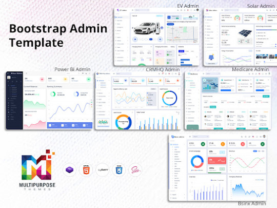
Bootstrap has become one of the most popular open-source frontend frameworks for developing responsive and mobile-first websites and web applications. Its easy-to-use grid system, prebuilt components, JavaScript plugins enable rapid UI/UX prototyping and development. Bootstrap Admin Template capabilities also make it easy to customize the look and feel of websites and dashboards.
These capabilities have made Bootstrap the go-to framework for admin dashboard templates as well. Developers can use Bootstrap to quickly scaffold admin panels and dashboards with common UI elements like navigation menus, data tables, charts, UI widgets etc.
In this article, we go through some of the best Dashboard UI collections focusing innovative designs and rich feature-sets suiting modern application requirements.
EV Admin - The Electric Vehicle Charging Station Admin Template
EV mobility and electric vehicles are becoming mainstream fast. And the EV ecosystem requires robust software infrastructure for managing charging stations, driver apps, and operational analytics. EV Admin is a purpose-built UI Dashboard for EV charging point operators.
The visually appealing and functionally rich Bootstrap Admin Panel provides all critical modules like driver and charging point management, real-time operations monitoring, analytics and reporting, billing and invoicing and lots more. The developer-friendly codebase ensures easy integration with real-time data sources and EV management APIs.
BsinX Ultimate Admin Template for Web Apps and SaaS Products
Bsinx Ultimate is one of the most versatile and complete admin template collections with 100+ ready templates suiting various industries and use cases. From web app dashboards, CRMs, Project Management tools to eCommerce Smart Sales Admin Panel, Crypto trading platforms and more, Bsinx Ultimate has pre-built templates for them all.
The Bootstrap Admin Template is based on latest Bootstrap 5 and come with gorgeous UI kits having hundreds of integrated widgets and UI components. The developer-friendly code ensures easy integration with backends. And extensive documentation guides customization and deployment. For startups and developers planning web apps and SaaS products, Bsinx Ultimate is the best Bootstrap Admin Theme available today.
Medicare Admin - Template for Healthcare and Insurance Web Applications
Healthcare web apps have complex workflows and data visualizations needs. Medicare Admin eases rapid development of such applications with its purpose-built modules for patient management, medical billing, insurance claims processing, scheduling, reporting and more.
The Medical Master Dashboard has beautiful and intuitive UI matching modern healthcare application standards. And developer-friendly code ensures easy integration with healthcare APIs and databases.
CRMHQ Admin - Admin CRM for Client Management Apps
Tailwind CSS is a versatile utility-first framework rapidly gaining developer mindshare as an alternative to Bootstrap. CRMHQ Admin leverages Tailwind CSS classes to build a superb CRM Dashboard Template with modules for account, contact and opportunity management, email integration, reporting and roles-based access control.
The customizable UI kit comprising Tailwind CSS elements streamlines branding and personalization. Scalable code and detailed documentation ensures easy deployment across devices and integration with backends. For startups planning client management apps, CRMHQ Admin is the best Tailwind CSS admin template.
Power Bi Admin - Template for Project and Task Management Web Apps
Effective project management is critical for organizations across industries. Power Bi Admin provides a readymade Bootstrap Admin Template to build feature-rich work management applications. It includes kanban boards, Gantt charts, rich text editors, calendars, messaging and other elements specifically for collaborating on projects and tasks.
Easy customization and developer-friendly code allows tweaking Power Bi Admin’s flexible design system to specific needs. The Bootstrap powered responsive template seamlessly adapts across devices and screen sizes. For SMBs, agencies and enterprises needing custom work management apps, Power Bi Admin is the perfect template for rapid development.
Final Words
The Bootstrap ecosystem offers a rich variety of Bootstrap Admin Template for quickly building dashboards across verticals and specializations. While they share the common strengths of Bootstrap's responsive grid, UI widgets and themes, the templates focus on domain-specific use cases with ready modules. For developers and businesses, opting the right template can significantly accelerate rollout of custom admin panels and web apps.
#Dashboard UI#UI Dashboard#Master Dashboard#Admin CRM#Admin Dashboard UI#Bootstrap Admin Panel#Bootstrap Admin Theme
0 notes
Text
Angular- which has emerged as a powerful framework for front-end development was designed to address the issues faced in single page application development. Currently, Angular is the best choice of most of the front-end designers for creating an interactive dynamic application. It is the crossed platform supporting language which requires Also, most of the coders prefer Angular because JavaScript is the main pillar behind its development. And, the most famous MEAN stack development requires all the JavaScript technologies to completely develop your whole application which comprised of MongoDB, ExpressJS, AngularJS, and NodeJS. Thus, they don’t need to learn various languages for the entire development. Learning AngularJS can be very beneficial for those who are willing to mark their presence in front-end or complete full stack development. Anyone can go through Angular Training for learning AngularJS so that they can create interactive designs, templates and dynamic contents for their application. The only requirement is a basic understanding of common web technologies like HTML and CSS. There are multiple AngularJS libraries freely accessible over the internet after utilizing them you can include cool and interactive features like charts, navigation, popups etc., in your web application. Here, I’m discussing a few libraries through which you can easily drive front-end development making it outstanding and effective for the end-users. Let’s explore them in-depth: PrimeNG PrimeNG has a massive collection of UI components for your Angular program. It is an open-source package registered distributed under the MIT license and created by PrimeTek Informatics. It comprised of 80+ components for promoting your UI design easily. For mobile page development, it offers enhanced user experience with touch-optimized elements fulfilling your responsive design need. Its interactive customizable templates allow you to start web designing journey in very less time. Currently, PrimeNG is used by more than one million developers. Its impressive functionalities make more than 500 government, private and other non-profitable organizations to adopt this package for the development. Material 2The material is the official component library of Google. It is developed on Angular and TypeScript. It is comprised of various components for as per material specifications. Whether it is about form-controls, navigation, layout, buttons and indicators, popups, modals, or data table- you will have a complete access to these resources. Thus, you can optimize and organize your content according to your objective. Anyone can leverage this complete package over the github with the comprehensive, modern user interface which runs across the internet, mobile phone or a desktop. NG-Lightening This package holds native angular components and directories. It is created from Scratch in TypeScript over the Lightning Design System CSS framework. If you are facing any interoperable issue like cross-domain, and you want to implement Salesforce Lightning Design System (SDLC) icons- don’t worry. It will assist you with a clone of multiple sprite files such as symbols.svg to which you can access locally on your system through the server. These stateless resources are dependent upon their input properties so that you can achieve an enhanced performance and flexibility to use. NG2 ChartsIf you are dealing with the issues for base charts, NG2 chart is the best option. It offers a complete package to serve varieties of charts including line, polar area, doughnut, pie, radar, bar. It offers various properties, events, colors to effectively include interactive charts in your Angular application. You can easily download this package from Github, here where it is registered under the MIT license. Onsen-UI Onsen-UI is another open source framework licensed under Apache 2.0 written in JavaScript. It assists developers in hybrid app development including HTML5, Cascading Style Sheets (CSS) and Javascript like web technologies.
This package comes up with tabs, side menu, navigation and bunch of other valuable components like lists and forms. It supports iOS and Android material designing with attractive styling to achieve better performance result. The best part about Onsen-UI is that it can support both iOS and Android without any trouble with same source code. Fuel-UIFor those who want new and incredible UI patterns, this library is one of the best options. Fuel-UI is one of the evolving UI components which can be implemented with Angular 2 and Bootstrap 4 project applications. It presents varieties of components, directives, and pipes to utilize your work in the easiest way. For including alert boxes, scrolling effects, popups, tags, bars, navigations, tabs etc., in your template you can simply integrate this library. It also offers directives like animations, highlighting tools, tooltips with multiple pipes to cover the most critical and technical aspects of the development.Thus, you can see how Angular is taking front-end development to another level through its massive set of libraries.
0 notes
Text
Using R Shiny to Create Interactive Dashboards for Data Insights
In the modern era of data-driven decision-making, the ability to visualize and interact with data is essential. R Shiny is a powerful tool that allows users to create interactive dashboards that transform static data into dynamic visualizations. This blog explores how you can leverage R Shiny to build interactive dashboards that provide valuable insights into your data.

What is R Shiny?
R Shiny is an open-source web application framework for R, enabling users to create interactive web applications without needing extensive web development skills. It combines the simplicity of R with the interactivity of web applications, allowing users to build engaging dashboards that respond to user inputs in real-time.
Key Benefits of R Shiny:
User-Friendly: No need for HTML, CSS, or JavaScript knowledge; you can create sophisticated applications using R.
Seamless Integration: Utilize R’s vast libraries for statistical analysis and data visualization.
Dynamic Interaction: Users can manipulate inputs (like sliders or dropdowns), allowing for real-time updates to visualizations and analyses.
Customizable: Tailor dashboards to specific needs with flexibility in design and functionality.
Creating Your Interactive Dashboard
Creating an interactive dashboard with R Shiny involves a few key steps:
Define Your Objective: Determine the purpose of your dashboard. What data insights do you want to convey? Identify the key metrics and visualizations that will be most useful for your audience.
Select Your Data: Choose the datasets you want to visualize. Ensure your data is clean and well-structured to facilitate analysis. R can handle various data formats, making it easy to import your data.
Design the User Interface: Plan the layout of your dashboard. R Shiny allows you to create a user-friendly interface with components such as:
Sliders: For adjusting values (e.g., the number of bins in a histogram).
Dropdown Menus: To select different datasets or parameters.
Buttons: For actions like generating reports or exporting data.
Tabs: To organize different visualizations or analyses.
Implement Interactive Elements: Use Shiny’s built-in features to link user inputs to visual outputs. For example, if a user selects a specific dataset from a dropdown, the dashboard should automatically update the visualizations to reflect that choice.
Visualize Your Data: Choose appropriate visualizations that effectively communicate your data insights. Options include:
Histograms: To show frequency distributions.
Scatter Plots: For relationships between two variables.
Line Charts: For trends over time.
Bar Charts: To compare categorical data.
Test and Iterate: After creating your dashboard, test it to ensure all components work as intended. Gather feedback from potential users and make necessary adjustments to improve usability and effectiveness.
Enhancing Your Dashboard
To make your dashboard even more impactful, consider the following enhancements:
Add Context: Include text descriptions, annotations, or tooltips to explain the visualizations and help users understand the data better.
Incorporate Themes: Use Shiny’s themes to apply consistent styling and improve the overall aesthetic of your dashboard.
Implement Filters: Allow users to filter data based on specific criteria (e.g., date ranges, categories) for a more tailored analysis experience.
Make It Responsive: Ensure that your dashboard works well on various devices, from desktops to tablets and smartphones, so users can access it anywhere.
Deploying Your Dashboard
Once your dashboard is ready, the next step is deployment. You can share your R Shiny application in several ways:
Shinyapps.io: A straightforward option for hosting your Shiny applications online. This service allows for easy deployment with minimal configuration.
Local Hosting: You can run your Shiny app locally for internal use, allowing colleagues to access it on a shared network.
Custom Server Deployment: For organizations needing more control, deploying on a custom server with R Shiny Server can provide greater flexibility and scalability.
Conclusion
R Shiny empowers users to create interactive dashboards that enhance data exploration and decision-making. By leveraging its user-friendly interface and powerful capabilities, you can transform your data into dynamic visualizations that provide valuable insights. Whether for business intelligence, academic research, or personal projects, R Shiny is a versatile tool that can help you communicate your data stories effectively.
0 notes
Text
Choosing the Right Gantt Chart Widget for Your Project Management Software

JavaScript Gantt widgets have become a vital component in modern project management software, offering developers and businesses the tools needed to visualize, manage, and track complex projects effectively. These widgets simplify project management by allowing teams to create detailed timelines, set task dependencies, and allocate resources with precision. With the rise of JavaScript in web development, Gantt widgets have evolved to provide seamless integration, real-time updates, and enhanced collaboration features. This article will explore the role of Gantt charts in project management software, the benefits of using JavaScript Gantt widgets for developers, and key criteria for choosing the right Gantt solution for your project.
Role of Gantt Charts in Project Management Software
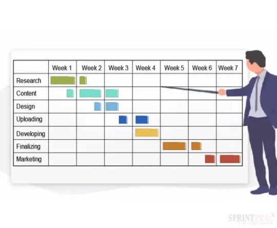
Gantt charts are essential tools in project management software, offering a clear, visual timeline of tasks, milestones, and deadlines. By illustrating task sequences and dependencies, they allow teams to understand the flow of work, identifying which tasks are critical to completing the project on time. This visual clarity simplifies the management of complex projects by breaking them down into manageable stages, enabling project managers to assign tasks efficiently. In addition to enhancing task management, Gantt charts improve team collaboration. With real-time updates and a shared view of the project's progress, team members can stay aligned on their responsibilities and deadlines. This transparency helps reduce miscommunication and ensures that everyone is aware of their contribution to the overall project. Furthermore, Gantt charts are invaluable for tracking progress. They allow managers to monitor task completion and quickly identify potential bottlenecks, helping to adjust workloads and resources as needed to keep the project on track. By making it easier to meet deadlines and manage resources, Gantt charts ensure that projects are delivered on time and within scope, improving overall efficiency in project management.
How JavaScript Gantt Widgets Simplify the Life of Developers
A proper JS Gantt chart widget greatly simplifies the life of developers by providing pre-built, customizable components that streamline the integration of project management features into web applications. These widgets come with a wide range of functionalities, such as task scheduling, dependencies, and resource management, eliminating the need for developers to build these features from scratch. Additionally, the flexibility of JavaScript allows for seamless customization, meaning developers can adapt the Gantt widget to meet specific project needs without diving into complex coding. With features like real-time updates and collaboration tools, JavaScript Gantt widgets enable developers to focus on core business logic while ensuring the project management interface remains user-friendly and efficient. Furthermore, these widgets are often optimized for performance, making it easier for developers to handle large datasets and complex project structures without slowing down the application. Integration with other technologies, such as REST APIs or third-party libraries, is also simplified, allowing developers to connect the Gantt chart with existing systems effortlessly. The broad support for frameworks like React, Angular, and Vue ensures that JavaScript Gantt widgets can be embedded in various development environments, making them highly adaptable and time-saving.
Challenges of Choosing the Right Gantt and Key Criteria to Bear in Mind
Choosing the right Gantt chart widget for your project management software can be a challenging decision, especially when several factors come into play. Here are some of the key criteria to consider when looking for such JavaScript project management tools:
- Project Complexity: The first factor to evaluate is the complexity of your projects. For simple projects, a Gantt chart with basic features like task scheduling and dependency tracking might be enough. However, for more complex projects with multiple tasks, dependencies, and resources, you’ll need a more advanced Gantt widget that can handle intricate project structures and large datasets. The widget should support resource allocation, critical path analysis, and perhaps even advanced features like project baselines or risk management. - Budget Considerations: Your budget will also play a significant role in choosing the right Gantt chart widget. Some widgets offer a wide range of features but can be costly, while others may be more affordable yet still provide the necessary functionalities. Keep in mind that while free or low-cost options might suit smaller projects, investing in a robust, scalable Gantt chart widget can save time and money in the long run, especially when managing larger projects. - Technical Skills: Consider the technical expertise of your development team. Some Gantt chart widgets offer more flexibility and customization options, but they may require advanced coding skills or familiarity with specific frameworks (like React or Angular). If your team is not well-versed in these technologies, it may be better to opt for a more user-friendly solution that offers built-in features with less need for complex customization. - Community Support and Documentation: A well-documented widget with strong community support can be invaluable during development. Look for Gantt chart widgets that have thorough, easy-to-understand documentation, along with an active community or forum where you can seek advice, share knowledge, and troubleshoot issues. A strong support system can speed up development time and ensure that any issues you encounter can be quickly resolved. Considering these criteria will help you find a Gantt chart widget that not only fits the technical needs of your project but also aligns with your budget, team capabilities, and future scalability.
Conclusion
In conclusion, choosing the right Gantt chart widget is pivotal to ensuring the success of your project management software. By carefully evaluating factors such as project complexity, budget, technical expertise, and community support, you can select a solution that best fits your team’s needs. JavaScript Gantt widgets offer a powerful tool for simplifying the development process and enhancing project management capabilities, enabling teams to visualize timelines, manage resources, and track dependencies with ease. Ultimately, the right widget not only streamlines workflow but also empowers teams to deliver projects on time and within scope, driving overall productivity and project success. Whether you’re building a new application or enhancing an existing one, investing in a robust Gantt chart widget can make all the difference in achieving your project goals. Read the full article
0 notes
Text
How Ext JS Enhances UI Design for Seamless User Interaction

The Power of Ext JS for UI Design
Comprehensive Component Library
Ext JS Offers offers a huge collection of JavaScript components, including grids, charts, forms, and menus, which make life easier when it comes to building really cool, interactive, and responsive interfaces. It allows you to concentrate on doing stuff while still looking awesome. These components are best used with Ext JS 7 and earlier models like
The dynamic capabilities of the library were kept expanding in terms of appended features and improvements. Whether the case may be work on an Ext JS dashboard or building mobile-friendly sites, pre-built components of this library are there for use in streamline development.
Themes and Customization
Ext JS is one among the plethora of features that supports the themes. For example, the developers have provided several themes for Ext JS which include Ext JS 7 themes download, and even if needed, these coders could always be referred to buying specialized themes by searching for “Buy Ext JS themes.” The theme is used for immediate organizing or aligning the appearance of your application around the brand identity.
Along with that, Ext JS offers the customization of themes. However, Sencha Ext JS framework specifically allows you to tweak with colors, layouts, and styles so that every one of your UI elements could have a unified professional appearance.
Seamless User Interaction
Interactivity is that modern Web applications need, and that is what the Ext JS examples demonstrate. Real-time data binding and advanced grid features provide intuitive, responsive applications for developers.
With drag-and-drop support, custom tooltips, and animations, Ext JS provides a very friendly user experience. So if you leverage Ext JS components, you will be delivering a unified experience that will bring users back.
Why Ext JS is a Leading JavaScript Framework
Robust Features
Ext JS represents the perfect combination of JavaScript UI framework and the JavaScript component library that brings it up at the height of popularity among the JavaScript frameworks. As a tool for developers, it offers so much: premade widgets, adaptive layouts, and cross-browser compatibility.
Scalability and Performance
Ext JS scales itself quite fine, whether you are building applications for a small business or an enterprise. The architecture of Ext JS allows applications to remain responsive and fast, even as complexity increases. You are always on the frontier of having the newest tools because you can use the latest, no matter which of the Ext JS 7 versions you are working with.
Extensive Documentation and Support
On top of that, the Ext JS comes with an abundance of resources, from demos like the Ext JS desktop demo to plugins for extending its functionality. In addition, the forums, tutorials, and updates from the Sencha community make sure that developers have every support they may need.
Versatility Across Industries
Ext JS is that flexible, as it suits various types of businesses-from enterprise dashboards to retail applications. The entire range of JavaScript UI components enables developers to create solutions specifically to their requirements. For example, grids and forms are perfect for data-intensive applications, while charts and themes are designed with the visually driven platforms in mind.
How ExtNuke Leverages Ext JS
As a brand that prioritizes innovation, ExtNuke harnesses the power of Ext JS to deliver advanced ExtJs Themes . By incorporating the Ext JS latest version, we ensure that our clients benefit from the newest features and best practices in UI design. Whether it’s creating Ext JS dashboards, utilizing Ext JS plugins, or customizing Ext JS themes, ExtNuke provides aesthetic and visually appealing Ext Js themes that enhance user experiences.
Conclusion
Sencha’s Ext JS proves to be one of the most preferred JavaScript UI frameworks. With its great toolset, customizable themes, and emphasis on interactivity, it’s not surprising that it is considered one of the most well-rounded JavaScript frameworks. Ext JS allows developers to create user interfaces that provide smooth experiences.
Get ready to jumpstart your awesome UI designs — discover ExtNuke and Ext JS today!
Originally published at https://www.extnuke.com on December 2, 2024.
0 notes
Text
Transforming Data into Insight: 4 Useful Big Data Visualization Solutions
Big data is entering people’s lives. Although obtaining data is not a big problem, many people do not know how to draw conclusions because there is too much data. Therefore, I am here to provide 4 useful big data visualization tools to help you understand the data.

Datawrapper is an online data visualization tool for making interactive charts. Once you upload the data from the CSV file or paste it directly into the field, Datawrapper will generate a bar, line or any other related visualization file. Many journalists and news organizations use Datawrapper to embed real-time charts into their articles. It is very easy to use and produce effective graphics.
Tableau Public perfectly grafts data operations with beautiful charts. Its program is easy to use, companies can use it to drag and drop large amounts of data onto the digital “canvas”, and create various charts in a blink of an eye.

Chart.js is a free open-source JavaScript library for data visualization, which supports 8 chart types: bar, line, area, pie (doughnut), bubble, radar, polar, and scatter. Chart.js renders in HTML5 canvas and is widely covered as one of the best data visualization libraries.
D3.js is a JavaScript library for manipulating documents based on data. D3 helps you bring data to life using HTML, SVG, and CSS. D3’s emphasis on web standards gives you the full capabilities of modern browsers without tying yourself to a proprietary framework, combining powerful visualization components and a data-driven approach to DOM manipulation.
0 notes