#data visualization in finance
Explore tagged Tumblr posts
Visit Tumblr Blog
Explore Tumblr blogs with no restrictions, modern design and the best experience.
Last Seen Tumblr Blogs


Fun Fact
In 2020, Tumblr had 29.4 million users in the US.
Text
Storytelling with Data in 2025: Emerging Trends Every Analyst Should Know
In an age where data is the new oil, storytelling with data has never been more critical. The year 2025 marks a tipping point for how businesses, governments, and individuals harness insights through visual narratives. As data becomes increasingly complex, the ability to distill meaningful stories from vast datasets is a crucial skill. Whether you are a seasoned data visualization specialist, an aspiring analyst, or a business executive seeking clearer insights, the trends shaping storytelling with data in 2025 are essential to grasp.

1. From Dashboards to Dynamic Narratives
Traditional dashboards are transforming. No longer are they static displays of KPIs. In 2025, they have evolved into dynamic storytelling platforms. Today’s tools leverage natural language generation (NLG), AI-driven annotations, and automated pattern detection to craft contextual narratives around data.
Modern data visualization tools integrate real-time feeds, predictive analytics, and smart visual cues that change based on the viewer's role or inquiry. For example, a marketing executive and a financial analyst accessing the same dashboard will receive different visual stories tailored to their needs.
This shift reflects a broader cultural change: people crave context, not just numbers. Dynamic dashboards serve as interactive stories, guiding users through cause-effect relationships and strategic decision points.
2. Rise of Augmented Analytics
One of the defining trends of 2025 is the convergence of AI and human cognition in analytics. Augmented analytics use machine learning algorithms to surface the most relevant insights automatically.
A data visualization specialist today isn't just a chart designer; they are a curator of augmented stories. These professionals now work closely with AI to guide data exploration, suggest optimal visual formats, and highlight anomalies.
The impact on data visualization applications is profound. Platforms now include smart recommendations, automated anomaly detection, and even sentiment analysis integration. This helps analysts quickly identify and communicate the story within the data without manual sifting.
3. Multimodal Storytelling
Data stories in 2025 are no longer confined to graphs and charts. With the rise of multimodal interfaces, data can now be presented through voice, AR/VR, and immersive experiences.
Picture a logistics manager walking through a warehouse using AR glasses that overlay real-time data about inventory, delivery schedules, and efficiency metrics. These are not science fiction but actual data visualization applications being piloted across industries.
Voice interfaces allow analysts to query data verbally: "Show me last quarter's sales dip in the Midwest region," followed by a narrated explanation with accompanying visuals. These multimodal experiences increase accessibility and engagement across diverse audiences.
4. Democratization of Data Storytelling
2025 heralds a new era of self-service analytics. With the proliferation of no-code and low-code data visualization tools, even non-technical users can now create compelling data stories.
The role of a data visualization specialist is shifting from creator to enabler. Their new mission: empower others to tell their own stories. This involves developing templates, training materials, and governance structures to ensure data consistency and clarity.
Education platforms are now incorporating data storytelling as a core competency. Expect MBA graduates, public policy students, and healthcare professionals to possess a baseline proficiency in data visualization applications.
5. Ethical and Inclusive Visualization
As data-driven decisions grow in scale and impact, ethical storytelling becomes essential. Analysts must now consider the societal implications of their visualizations.
In 2025, leading data visualization tools include bias detection algorithms, color-blind friendly palettes, and accessibility features like screen reader compatibility. These tools guide analysts in making visuals that are not only effective but also inclusive.
A responsible data visualization specialist asks: Who might misinterpret this graphic? Who is excluded from understanding this data? Inclusive visualization requires empathy, cultural awareness, and a commitment to equity.
6. Hyper-Personalization
Every user views the world through a unique lens. In response, data stories are becoming hyper-personalized. AI-driven personalization engines tailor dashboards and visuals based on user behavior, preferences, and past decisions.
Imagine a data visualization application that learns an executive's typical filters and prioritizes similar metrics in future reports. Or a tool that adapts its visualizations for different cognitive styles—presenting summaries visually for some, and text-heavy narratives for others.
Hyper-personalization doesn't mean pandering—it means relevance. By aligning data storytelling with individual needs, organizations enhance comprehension and decision-making.
7. Real-Time, Action-Oriented Insights
Gone are the days of weekly reports. In 2025, organizations demand real-time, action-oriented insights that can drive instant decisions.
Modern data visualization tools are deeply integrated with live data sources, predictive engines, and alert systems. When a key metric deviates unexpectedly, the system not only alerts the user but provides a story: why it happened, what it affects, and what action to take.
A data visualization specialist must now think like a UX designer—optimizing the experience for rapid comprehension and response. This involves focusing on clarity, hierarchy, and visual cues that direct attention to the most critical elements.
8. Emotional Storytelling through Data
One of the most profound shifts is the rise of emotional resonance in data storytelling. Human decisions are often driven by emotion, not logic. Storytellers who blend data with human narratives evoke stronger engagement and understanding.
For example, a nonprofit using a data visualization application to show refugee displacement trends can pair it with firsthand stories, imagery, and dynamic maps. These experiences generate empathy and drive action.
The future belongs to data visualization specialists who can blend the rational with the emotional—crafting stories that move people, not just inform them.
9. Cross-Functional Collaboration
Storytelling with data is no longer a siloed activity. In 2025, it is a cross-functional process involving data scientists, designers, domain experts, and communicators.
Data visualization tools now offer collaborative features: shared dashboards, comment threads, version control, and real-time co-editing. These features mirror tools like Google Docs or Figma but are tailored for data work.
A modern data visualization specialist acts as a bridge—facilitating communication between technical and non-technical stakeholders. They help teams co-create narratives that drive aligned decisions.
10. Future-Proofing Your Skillset
To remain relevant in 2025 and beyond, analysts must continuously evolve. This means:
Mastering advanced data visualization tools like Tableau, Power BI, and emerging platforms with AI integration.
Learning scripting languages (e.g., Python, R) to augment visual storytelling with automated workflows.
Understanding behavioral psychology to craft persuasive, human-centered visuals.
Developing ethical literacy around data privacy, bias, and inclusion.
Whether you are a novice or a senior data visualization specialist, your journey must include both technical and narrative growth. The most successful professionals are those who combine sharp analytical thinking with compelling storytelling prowess.
Conclusion
In 2025, storytelling with data is no longer a niche skill—it is the currency of decision-making. The convergence of AI, interactivity, inclusivity, and emotional intelligence has redefined what it means to be a data visualization specialist. With the right data visualization tools and thoughtful data visualization applications, anyone can transform raw information into actionable wisdom.
As we move further into the decade, one thing is certain: the future belongs to those who can tell stories that people understand, remember, and act upon.
#data migration services#data visualization specialist#data visualization consultant#data visualization in finance
0 notes
Text
For anyone currently in school or recently in school

I am doing a few guest lectures at some of the universities in my state and working on my presentation. Curious if anyone has any recommendations of topics they really enjoyed from a past guest speaker that isn't major/field-specific?
#college#college student#studying#studyblr#school#university#accounting#finance#consulting#data analytics#data analysis#data visualization#big data#data
22 notes
·
View notes
Text
3 Watt Strategy: Transform Your Data Storytelling Skills
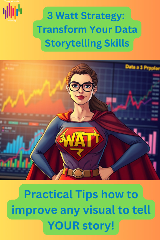
The “3 Watt Strategy”: How to Make Your Next Presentation Unforgettable

What is the “3 Watt Strategy”?
The “3-watt strategy” is a simple yet powerful way to structure your presentation. It draws inspiration from frameworks like “SCR“, which we already talked about. These frameworks are proven to make your message clear, relevant, and actionable.
Here’s how it works:
WHAT: Start by clearly explaining what you’re presenting—the facts, data, or situation.
SO WHAT: Next, answer why it matters. Why should your audience care? What’s at stake?
NOW WHAT: Finally, outline the call to action. What should we do next? What steps should leadership take?
Why Does the “3 Watt Strategy” Work?
Too often, presentations get bogged down in details, leaving leadership confused or unsure about next steps. The “3-watt strategy” forces you to be clear, concise, and compelling. It’s a storytelling framework that connects data to business impact, driving informed decision-making. By answering these three questions, you guide your audience through a logical journey. They move from understanding the facts to seeing the implications. Finally, they take action.
Practical Example: Persuading Leadership to Reduce General & Administrative Expenses

Let’s say you’re a finance leader tasked with convincing your executive team to reduce General & Administrative (G&A) expenses. Here’s how the “3 watt strategy” would work in practice:
To see the practical example, visit my blog.
0 notes
Text
The Art of Data Visualization - Building Dashboard Insights #shorts #datavisualization #finance
In this episode of FinPod, host Asim Khan sits down with data visualization expert Sebastian Taylor to delve into the world of data … source
0 notes
Text
From Data to Decisions: Empowering Teams with Databricks AI/BI
🚀 Unlock the Power of Data with Databricks AI/BI! 🚀 Imagine a world where your entire team can access data insights in real-time, without needing to be data experts. Databricks AI/BI is making this possible with powerful features like conversational AI
In today’s business world, data is abundant—coming from sources like customer interactions, sales metrics, and supply chain information. Yet many organizations still struggle to transform this data into actionable insights. Teams often face siloed systems, complex analytics processes, and delays that hinder timely, data-driven decisions. Databricks AI/BI was designed with these challenges in…
#AI/BI#artificial intelligence#BI tools#Business Intelligence#Conversational AI#Data Analytics#data democratization#Data Governance#Data Insights#Data Integration#Data Visualization#data-driven decisions#Databricks#finance#Genie AI assistant#healthcare#logistics#low-code dashboards#predictive analytics#self-service analytics
0 notes
Text
Understand the role of color theory in designing finance dashboards. This guide explains how color choices impact user experience, data comprehension, and decision-making, helping finance teams create more effective visualizations.
#color theory in dashboard design#finance dashboard design tips#financial data visualization#color psychology in finance.
0 notes
Text
What is Data Science? A Comprehensive Guide for Beginners

In today’s data-driven world, the term “Data Science” has become a buzzword across industries. Whether it’s in technology, healthcare, finance, or retail, data science is transforming how businesses operate, make decisions, and understand their customers. But what exactly is data science? And why is it so crucial in the modern world? This comprehensive guide is designed to help beginners understand the fundamentals of data science, its processes, tools, and its significance in various fields.
#Data Science#Data Collection#Data Cleaning#Data Exploration#Data Visualization#Data Modeling#Model Evaluation#Deployment#Monitoring#Data Science Tools#Data Science Technologies#Python#R#SQL#PyTorch#TensorFlow#Tableau#Power BI#Hadoop#Spark#Business#Healthcare#Finance#Marketing
0 notes
Text
Financial Analysis Dashboard
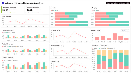
This template is from Mokkup.ai, a free dashboard wireframing tool that lets you create high fidelity dashboard wireframes in just minutes
#dashboard#data analytics#powerbi#tableau#visualization#data#dashboards#datascience#dashboard simulator#finance
0 notes
Text
Harnessing LLMs for Financial Visualization: An Experiment with Claude
(Images made by author with Copilot) INTRO TEXT Table of Contents ObjectiveMethodologyIterative RefinementVisual Feedback Loop Conclusion Building on our previous exploration of Large Language Models’ (LLMs) remarkable ability to generate detailed image descriptions, this post delves further. We’ll investigate whether these models can also extend their capabilities beyond the art world and…
View On WordPress
0 notes
Text
Explore 10 Company Financial Dashboards with Examples & Free Templates
This article presents a variety of financial dashboards, ranging from a CFO financial dashboard to a revenue overview and cashflow forecast. These dashboards are designed to assist you in comprehending your financial data effectively.
Among them, some serve as inspiration for crafting a personalized dashboard, while others are pre-made templates ready for immediate use. The latter enables you to effortlessly visualize your financial data within minutes. Additionally, we will guide you on automating your financial dashboard reporting, ensuring that your dashboards remain current and ready for analysis.
10 financial dashboard examples
1. SaaS financial dashboard + template
Utilize this dashboard to:
Discern the key drivers influencing financial outcomes
Identify current and potential obstacles
Examine the impact of sales on revenue generation
Monitor the evolving dynamics of revenue over time
Investigate the causes of revenue loss
Fine-tune your strategy to enhance financial performance
This dashboard is available as a free template for different apps:
Financial dashboard template for HubSpot
Financial dashboard template for Pipedrive
Financial dashboard template for Salesforce
2. Billing overview dashboard + template
Similar to contemporary financial reporting dashboards, this visually presented report is automatically updated, interactive, and conducive to analysis. It empowers you to:
Delve deeply into your data
Employ diverse filters and delve into specific details
Real-time monitoring of billing statuses
Recognition of top-performing projects and clients
Efficient billing management
Analysis of profits over time from different perspectives
This Billing overview dashboard is available as a free template.
3. CFO financial dashboard + template
Utilizing this template for a financial reporting dashboard, you can:
Track near-real-time revenue growth
Discern the top-performing products
Maintain a comprehensive record of invoices
Analyze financial data for actionable insights
Formulate data-supported projections and plan for the future
This Financial dashboard for QuickBooks is available as a free template.

4. Ecommerce financial reporting dashboard + template
Utilize this dashboard to:
Gain insights into the overall business performance of your store
Analyze and enhance order management for revenue maximization
Filter orders based on country and source
Filter orders according to their financial status (paid, pending, refunded, etc.)
Foster alignment among your finance, marketing, and sales teams to enhance overall strategy
This Ecommerce financial reporting dashboard is available as a free template.
5. Financial performance dashboard
Utilize this dashboard to:
Monitor revenue in relation to established targets
Swiftly observe shifts in growth trends
Compare actual revenue to your projections
Assess overall financial health at a glance
This dashboard was built in Tableau by MergeYourData and designed to serve as a cockpit, giving several graphs and multiple scorecards presenting various aspects of financial performance.
6. Cashflow tracking dashboard
With this dashboard, you can:
Track the dynamics of cashflow over time
Visualize the contribution of various products to cashflow (annual/monthly subscriptions)
Identify trends and patterns
Perform time-over-time analysis
This type of dashboard example is a Cashflow report built in PowerBI.
7. MRR breakdown dashboard
With this dashboard, you can:
Monitor and analyze Monthly Recurring Revenue (MRR) data
Uncover trends and significant factors impacting MRR
Perform month-over-month comparison analysis
Keep tabs on crucial metrics like churn or reactivation
Extract valuable insights to integrate into your strategy
Incorporate financial analytics into your regular processes
You can check this example of MRR breakdown dashboard for a better understanding.
8. Product revenue dashboard
Utilize this product Key Performance Indicator (KPI) dashboard to:
Monitor and analyze product revenue
Effectively manage churn
Gain deeper insights into Monthly Recurring Revenue (MRR) trends
Conduct financial analysis related to product performance
9. Daily cashflow forecast dashboard + template
With this template, you can:
Create forecasts for various time frames
Perform cashflow analysis
Develop strategies to attain the projected outcomes
Make well-informed decisions
This Ecommerce financial reporting dashboard is available as a free template.
10. High-level revenue and profit dashboard
Utilize this dashboard to:
Monitor essential metrics such as total revenue, gross profit margin, net profit margin, and more
Track month-to-month variations
Access the latest financial data around the clock
Maximize decision speed with effective financial dashboards. These dashboards serve diverse purposes, acting as reporting tools, KPI monitoring cockpits, and data analysis instruments. To be genuinely effective, a dashboard must be tailored to specific goals and audience preferences and live auto-updating with interactive features like filters and drill-downs. Including only relevant metrics, an excellent financial dashboard becomes a powerful tool for decision-makers, facilitating KPI monitoring, process control, progress tracking, and more.
This article showcases examples of automated finance dashboards with real-time data, providing actionable insights and encouraging a data-driven approach. Apart from financial, click here to learn how to build other types of SaaS dashboards and unlock your data’s full potential for informed decision-making.
#dashboards#dashboard templates#data analytics#data visualization#reporting#finance#financial data analytics#financial dashboards#financial reporting#financial data
0 notes
Text

Power BI is a business analytics service by Microsoft that provides interactive visualizations and business intelligence capabilities with an interface simple enough for end users to create their own reports and dashboards. It is part of the Microsoft Power Platform, which also includes Power Apps and Power Automate.
JOIN 2 DAYS WORKSHOP FOR FREE ON Power BI
As per figr.com,Average Power BI salary is 20 lakhs per annum, Mostly Ranging from ₹15.9 Lakhs to ₹45 Lakhs
Learn the #1 Business Intelligence & Data Visualization Tool - Microsoft Power BI
Build interactive & visually appealing artificial intelligence dashboards & reports from scratch
(HURRY!! Limited seats left)
Click here to Register for free: https://go.jobaaj.com/POWER-BI
Join Us on Telegram for New Updates: https://t.me/jobaajlearnings
Regards
Jobaaj Learnings
1 note
·
View note
Text
Top Data Visualization Tools for Financial Data Analysis
In the finance industry, data is everything. Making sense of complex financial metrics, stock trends, and economic indicators requires robust financial data visualization tools. These tools help analysts, investors, and business leaders make data-driven decisions quickly and accurately. But with so many options, how do you choose the right one?
In this article, we will explore the top data visualization tools for financial data analysis, discuss key data visualization components, and analyze the latest data visualization trends. Whether you’re a data visualization consultant or an industry professional, this guide will help you navigate the best tools available today.

1. What is Financial Data Visualization?
Financial data visualization refers to the graphical representation of financial metrics, stock performance, market trends, and economic indicators. It helps businesses and investors understand patterns and insights more effectively than raw numbers.
2. Why is Data Visualization Important in Finance?
Finance professionals deal with huge datasets that can be overwhelming. Data visualization tools simplify complex data, allowing quicker decision-making, risk analysis, and forecasting. Would you rather analyze thousands of numbers in a spreadsheet or quickly spot trends in a well-designed chart?
3. Key Features of Financial Data Visualization Tools
Real-time data updates for stock market tracking
Interactive dashboards to drill down into specifics
Customizable graphs and charts for deeper analysis
Integration with financial databases for seamless reporting
Predictive analytics for forecasting trends
4. Top Data Visualization Tools for Finance
Let's dive into the best financial data visualization tools that are widely used in the industry.
5. Power BI: Best for Business Analytics
Power BI by Microsoft is a top-tier tool with AI-powered insights, automated reporting, and seamless Excel integration. It is widely used for financial dashboards in enterprises.
6. Tableau: Advanced Data Exploration
Tableau is ideal for finance professionals who need interactive dashboards and in-depth data exploration. It offers drag-and-drop functionality and advanced analytics for detailed insights.
7. D3.js: Customizable and Powerful
D3.js is a JavaScript library that enables highly customized, dynamic visualizations. Financial analysts who need specific, tailored visual representations benefit the most from this tool.
8. Google Data Studio: Best Free Option
Google Data Studio offers free, real-time interactive dashboards for those on a budget. It connects easily with Google Analytics, Google Sheets, and other financial tools.
9. Python & R: Coding for Custom Visuals
For those comfortable with coding, Python and R provide advanced statistical visualization capabilities through libraries like Matplotlib, Seaborn, and ggplot2.
10. Key Trends in Financial Data Visualization
AI-driven analytics for predictive insights
Cloud-based financial dashboards for remote accessibility
Real-time visualization to track live market trends
Augmented analytics to automate data insights
11. Role of a Data Visualization Consultant
A data visualization consultant helps financial firms choose the right tools, design impactful dashboards, and optimize their data visualization process. Their expertise ensures that businesses leverage data effectively.
12. How to Choose the Right Tool?
Consider factors like:
Budget and licensing fees
Ease of use
Integration capabilities
Customization options
Scalability for large datasets
13. Best Practices for Financial Data Visualization
Use clear, simple visuals to avoid clutter
Choose the right chart types (e.g., line charts for trends, bar charts for comparisons)
Ensure real-time updates for accurate decision-making
Use interactive elements to allow deep dives into data
14. Conclusion and Final Thoughts
Selecting the right financial data visualization tools is essential for making informed decisions in the finance industry. Whether you're a data visualization service company, a financial analyst, or a business leader, using the right tools can enhance data interpretation and strategy. Tools like Power BI, Tableau, and Google Data Studio offer powerful insights tailored for different needs.
0 notes
Text
#Finance#Business#Work Meme#Work Humor#Excel#Hilarious#funny meme#funny#accounting#office humor#consulting#big data#data analysis#data visualization#data analytics#data#dashboard commentary#tableau#power bi
13 notes
·
View notes
Text
Unlock the Secret Language of Business Storytelling
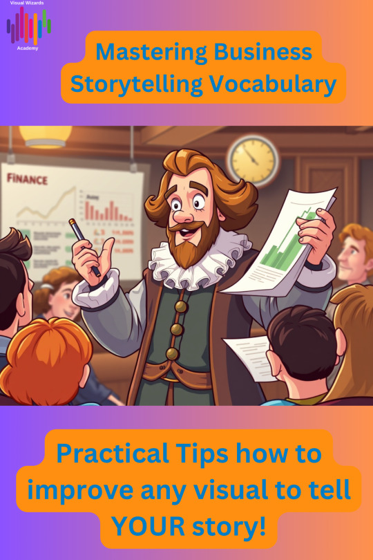
Ever listened to a presentation that felt flat—or read a report that left you wanting more? The difference between “just the facts” and a story that sticks often comes down to the words you choose. That’s right: vocabulary is your secret weapon for making your business ideas unforgettable.
Why Business Storytelling Vocabulary Matters
Whether you’re pitching an idea, presenting data, or rallying your team, the words you use shape how your message is heard—and remembered. Great business storytellers don’t just share information; they use vivid language, emotional triggers, and powerful analogies to connect with their audience and drive action.
Key Phrases That Make Your Stories Pop
Here are a few storytelling phrases and strategies you can use right away: • “Once upon a time…” — Yes, even in business! This classic opener grabs attention and signals the start of a journey. • “Picture this…” — Invite your audience to visualize the scenario, making your story more immersive and relatable. • “In the face of adversity…” — Highlight challenges and resilience, adding drama and inspiration to your message. • “To cut a long story short…” — Keep your story focused and impactful, especially when time is tight. • “To wrap up…” — Signal the end and reinforce your key takeaway.
How to Build Your Storytelling Toolkit
1. Spot Stories Everywhere: Look for real-life moments—both successes and challenges—that illustrate your point. 2. Use Emotional Language: Words like “passion,” “determination,” and “dream” make your stories more engaging and human. 3. Practice, Practice, Practice: The more you use these phrases and techniques, the more natural they’ll become—and the more your audience will connect with your message. Mastering business storytelling vocabulary isn’t just about sounding good—it’s about making your ideas stick, inspiring action, and standing out in a crowded world. Whether you’re a marketer, analyst, leader, or creative, these skills will help you communicate with clarity and confidence.
Ready to level up your storytelling?
👉 Read the full article here and start mastering your vocabulary today
0 notes
Text
Hey Tumblrverse!
If you're looking for a quick and easy way to learn about data management and compliance, look no further than Data Dynamics' QuickByte!
In just 60 seconds, this video will teach you everything you need to know about the key features of our unified data management solution, including:
MDM Precision
Blockchain and Advanced Cryptography
Policy-Driven Data Lifecycle
AI-Enhanced Data Classification
Real-Time Data Analytics and Monitoring
Machine Learning for Predictive Compliance
So what are you waiting for? Click the link below to read the QuickByte and learn how Data Dynamics can help you elevate your compliance strategy today!
#Compliance #DataManagement #Innovation #QuickByte #DataDynamics
0 notes
Text
Why Financial Data Analytics Should Drive Your Biggest Choices
Financial data analytics is the process of using data to gain insights into financial performance. By analyzing historical data, current trends, and future projections, financial data analytics can help you make better decisions about your finances.

There are many ways that financial data analytics can help you make better financial choices. Here are a few examples:
Investment decisions: Financial data analytics can help you identify investment opportunities that are a good fit for your risk tolerance and investment goals. It can also help you track the performance of your investments over time and make necessary adjustments to your portfolio.
Risk management: Financial data analytics can help you identify and manage risks to your financial well-being. For example, it can help you assess the financial impact of a job loss or other unexpected event.
Credit decisions: Financial data analytics can help lenders assess the creditworthiness of borrowers. This can help lenders make more informed decisions about who to lend money to and at what interest rate.
Fraud detection: Financial data analytics can help businesses detect fraud and other financial crimes. This can help businesses protect their assets and customers from financial harm.
These are just a few of the ways that financial data analytics can help you make better financial choices. By using financial data analytics, you can gain a deeper understanding of your finances and make more informed decisions that can help you achieve your financial goals.
Financial Analytics Solutions
There are a number of financial analytics solutions available on the market. These solutions offer a variety of features and capabilities, so it is important to choose the right solution for your needs.
Some of the factors to consider when choosing a financial analytics solution include:
The type of data you need to analyze: Some solutions are better suited for analyzing structured data, while others are better suited for analyzing unstructured data.
The level of detail you need: Some solutions offer a high level of detail, while others offer a lower level of detail.
The ease of use: Some solutions are more user-friendly than others.
The cost: Financial analytics solutions can range in price from free to thousands of dollars per month.
Data Analysis in Finance
Data analysis is a critical part of financial decision-making. By analyzing data, you can gain insights into your financial performance and identify areas where you can improve.
There are a number of data analysis techniques that can be used in finance. Some of the most common techniques include:
Descriptive statistics: Descriptive statistics can be used to summarize data and identify trends.
Inferential statistics: Inferential statistics can be used to make inferences about a population based on a sample.
Machine learning: Machine learning can be used to identify patterns in data and make predictions.
Financial Performance Analysis
Financial performance analysis is the process of evaluating a company's financial performance. By analyzing financial data, you can identify strengths and weaknesses in a company's financial performance and make recommendations for improvement.
There are a number of financial performance analysis tools that can be used. Some of the most common tools include:
Ratio analysis: Ratio analysis is the process of comparing financial data points to each other.
Cash flow analysis: Cash flow analysis is the process of evaluating a company's cash inflows and outflows.
Profitability analysis: Profitability analysis is the process of evaluating a company's profitability.
Financial Data Visualization
Financial data visualization is the process of using visual representations to communicate financial information. By using data visualization, you can make financial information more accessible and easier to understand.
There are a number of data visualization tools that can be used. Some of the most common tools include:
Charts: Charts are a popular way to visualize financial data.
Graphs: Graphs are another popular way to visualize financial data.
Dashboards: Dashboards can be used to display multiple financial data visualizations in a single view.
Conclusion
Financial data analytics is a powerful tool that can help you make better financial decisions. By using financial data analytics, you can gain a deeper understanding of your finances and make more informed decisions that can help you achieve your financial goals.
If you are looking to improve your financial decision-making, consider using financial data analytics. There are a number of resources available to help you get started, including online courses, books, and software. With a little effort, you can learn how to use financial data analytics to drive your biggest choices.
#Financial analytics solutions#Data analysis in finance#Financial performance analysis#Financial data visualization
0 notes