#Monotype Spectrum
Explore tagged Tumblr posts
Visit Tumblr Blog
Explore Tumblr blogs with no restrictions, modern design and the best experience.
Last Seen Tumblr Blogs


Fun Fact
Mobile US users spent an average of 115.8 minutes on Tumblr app monthly.
Note
Mind a little bit of a rant since I know you play Pokemon Fangames too?
Kinda dropped Pokemon Pathways cuz of the Alignment/Aura System (Good/Neutral/Evil).
Basically in addition to being heavily linked with how the story goes, it's also linked to the Roles system- Roles are basically just Classes and they give stat bonuses among other big benefits to specific types. Your Aura determines what Roles are available/accessible to you.
The problem? They made it so that certain types are heavily tied to a particular Aura. I LOVE Ghost-Types, they're my favorite, and I'm a typical neutral-to-good aligned kind of player. I'm kind of effed in this case because Ghost is very heavily tied to the Evil Aura/Alignment and I wouldn't be able to get bonuses for that type unless I got an Evil Role.
For a fangame that's about CHOICE, that's just needlessly limiting in your playstyle- especially since canon Pokemon's big thing is that you can make your party in any way you want, something other fangames have down.
Also apparently your starter is linked to your Alignment and Character Stats, which again, imo is kinda bull for literally no reason, even canon Mystery Dungeon has now allowed you to pick your pokemon.
And guess what? My fave Mimikyu is locked behind the Evil Alignment AND a stat tie.
IDK IMO it's just really not well-thought out game design locked behind factors first-time players wouldn't really be aware of without a guide.
Again, if you like Poison, Dark, and Ghost Type but lean Neutral and Good, and only find out later they're heavily tied to Evil Aura? You're kinda stuck playing catchup. Same goes if you like, Dragon, Fairy, and Psychic iirc but DO want to play Evil.
Take this with a grain of salt too btw I kinda dropped it before I got that far.
Not at all. I love the opportunity to analyze something and I'm still waiting on that mod translation.
That uh...that sounds like trying to force a class system into a game that doesn't have one nor supports one. Make no mistake, Pokemon have clear and definitive roles they're meant to fulfill. Despite the Rock-Type's issues defensively, Garganacl is defensive wall with a side of physical offense. But thing is, given these bonuses: how could they benefit Pokemon like Lycanroc or Rampardos, who are both OFFENSIVE Glass Cannons? Pokemon types do have broad roles they want to fill but specific Pokemon will outright DEFY that roles for the sake of variety and uniqueness. At this point, I feel like you should just do a Monotype mode.
And yes, similarly Pokemon types do have some general morality attached to them. Fighting Types tend to be neutral-to-good, Dark Types are literally the Evil Type in Japanese. But we have a TON of examples of Pokemon bucking this trend. Like the Mankey line being extremely violent and aggressive or Absol actually being a messanger trying to WARN people about danger. And then we have individual cases, like heroic Hyrdegidons. That just kind of makes the whole alignment system feel awkward.
... You know....I just realized. Doesn't this kind of sound like an SMT thing? Like how in Strange Journey, you're encouraged to use a team of demons who match your alignment in order to get strong Co-op attacks? Are-are we just doing SMT again? I guess it's just a fan game and everything but...damn it, this system would work SO much better for SMT since demons range all across the spectrum with various specializations among the alignments.
9 notes
·
View notes
Photo
Staff Pick of the Week
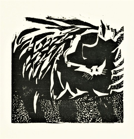
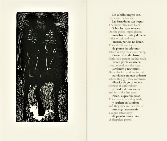
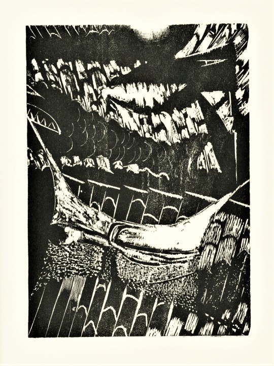
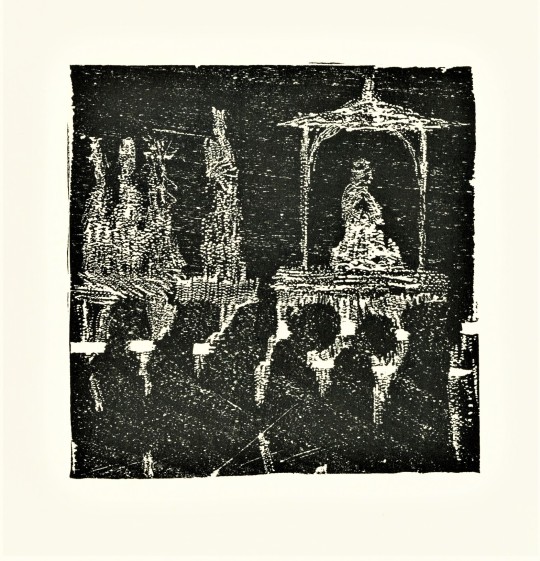
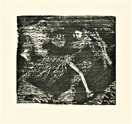
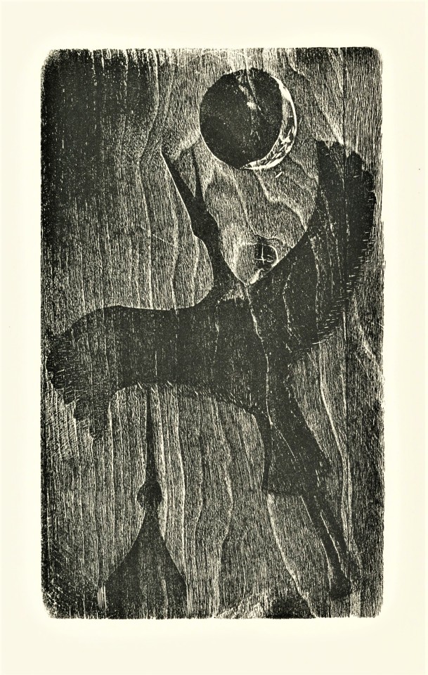
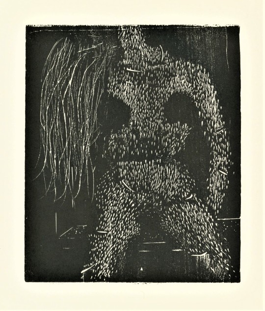
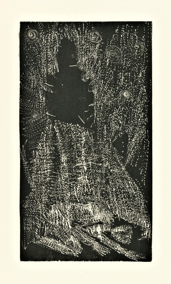
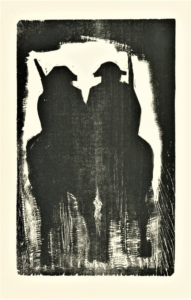
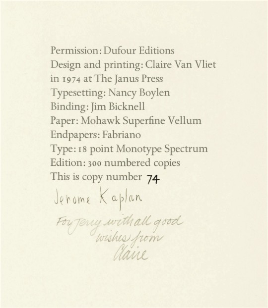
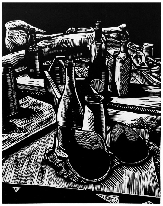
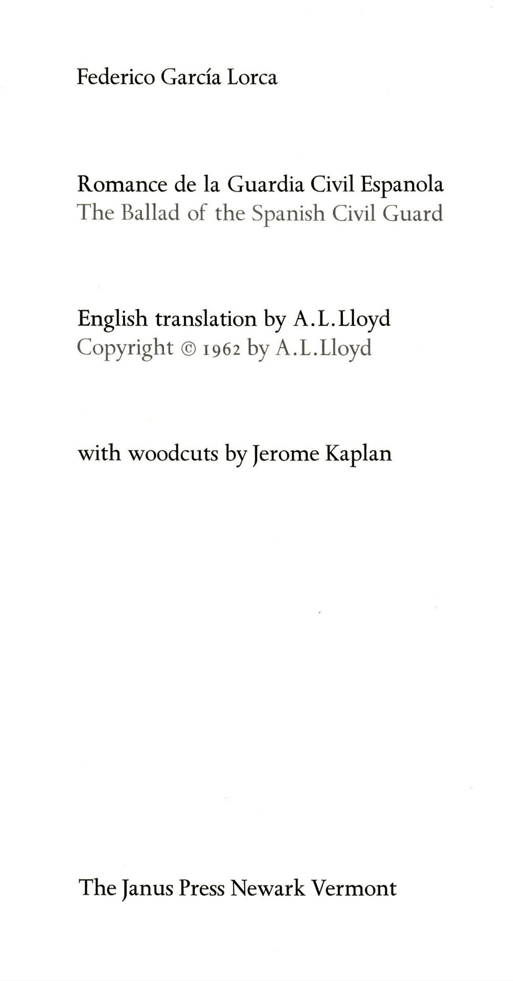
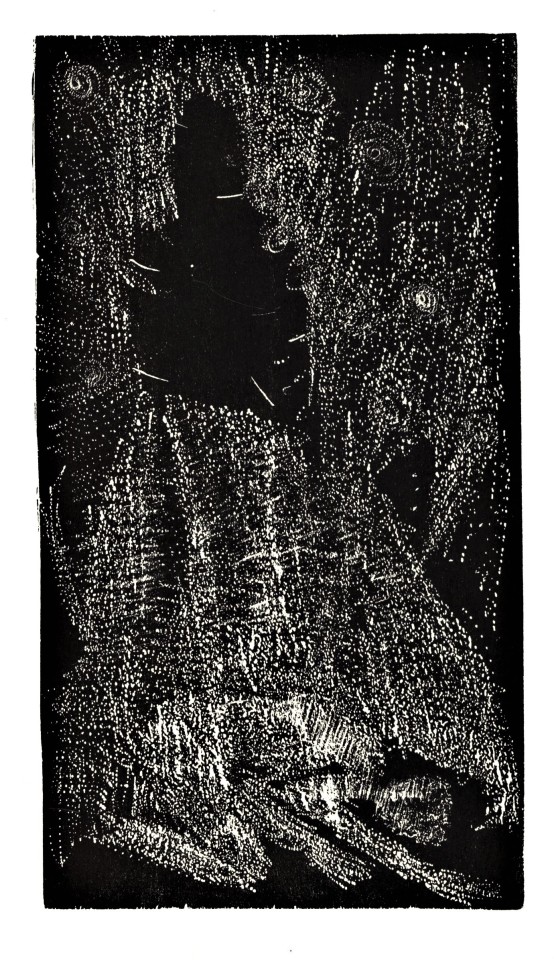
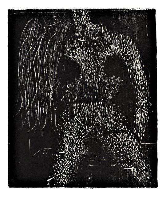
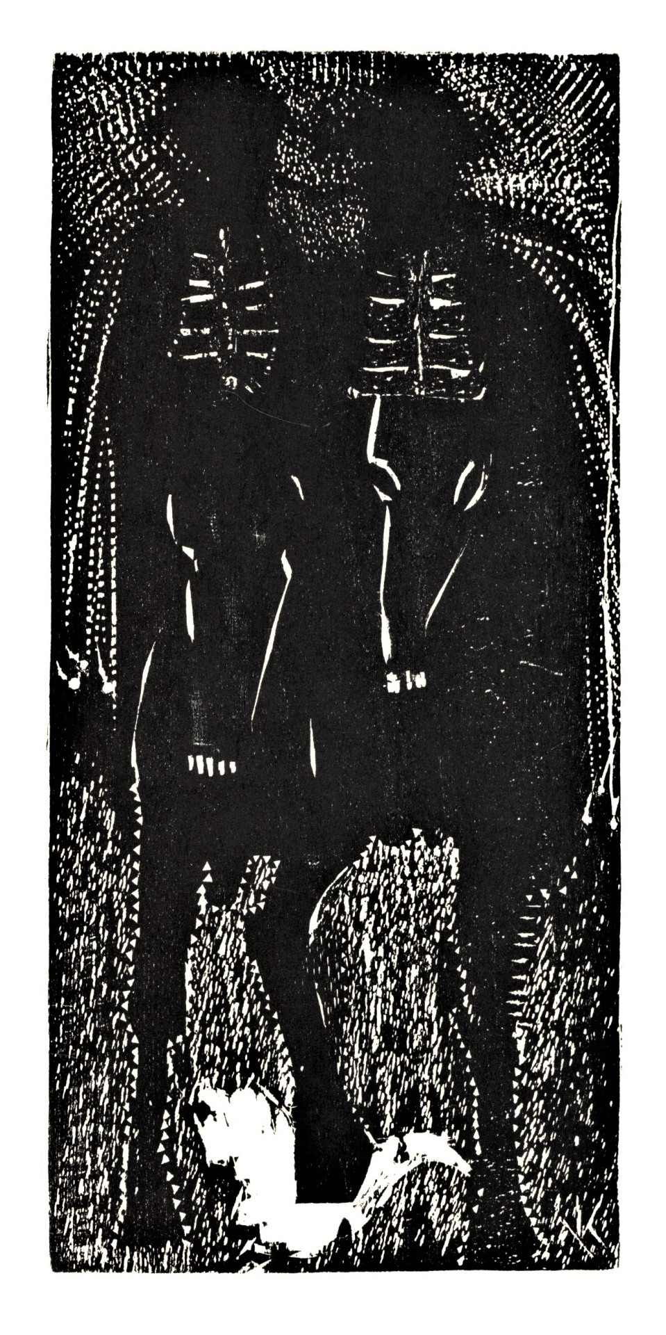
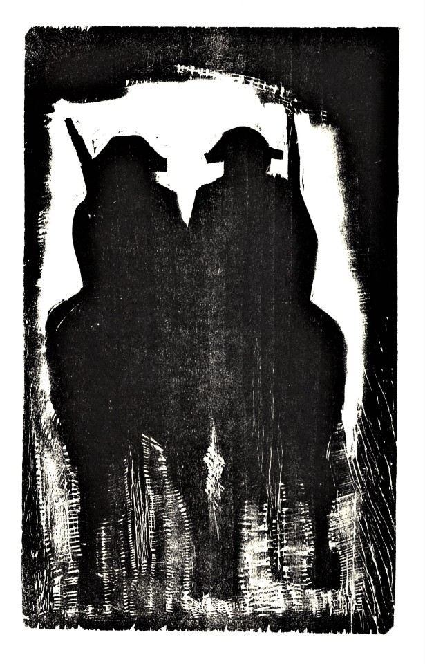
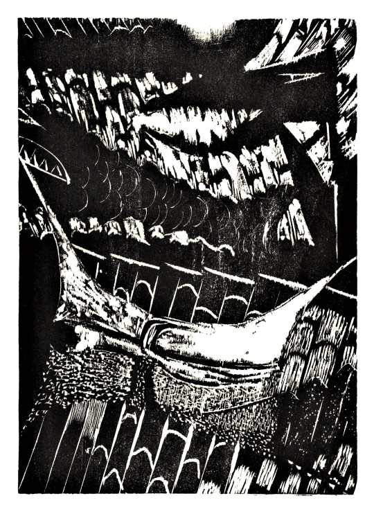
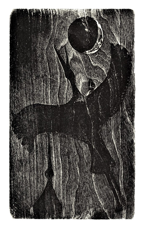
Sometimes while pulling books for a class something will catch my eye. This book Romance de la Guardia Civil Espanola or The Ballad of the Spanish Civil Guard, by Spanish poet and playwright, Federico García Lorca, published by The Janus Press, Newark, Vermont, 1974, was pulled for a upper level Spanish course. The woodcuts by American printmaker, Jerome Kaplan (1920-1997) are what caught my eye.
As an artist-printmaker I am drawn to prints that embrace the qualities of the matrix. I see Kaplans woodcuts as a celebration of the medium. He does not overpower the wood and force it to be something that it is not; the grain of the wood and the mark of the gouge are embraced. These woodcuts powerfully express the sorrow and drama of the conflict in the poem and the poems’ nocturnal motif.
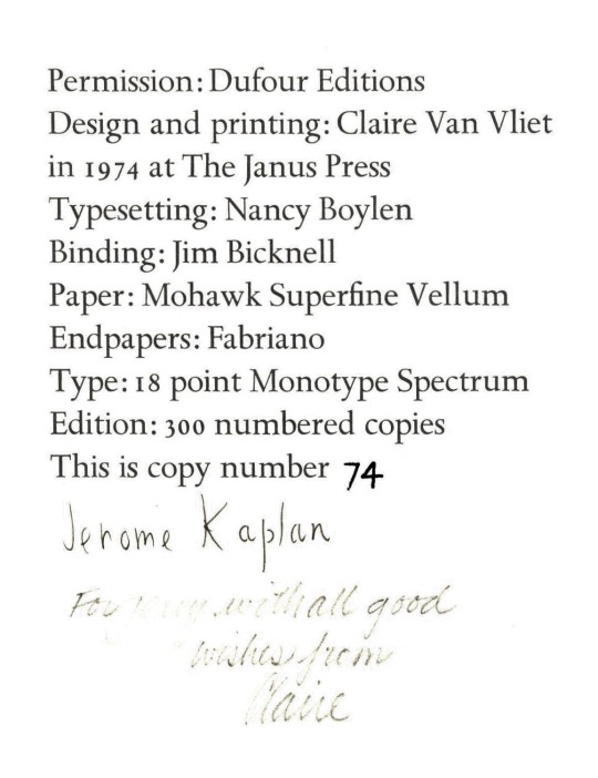
This book was designed and printed by Clair Van Vliet at her Janus Press. The type was set in 18 point Monotype Spectrum by Nancy Boylen and printed on Mohawk Superfine Vellum paper in an edition of 300 copies, and bound by Jim Bicknell. The edition is signed by the artist and our copy has a signed presentation inscription from Claire Van Vliet to our friend and benefactor Jerry Buff, who donated this book to us from his extensive collection.
View more works printed by Claire Van Vliet at her Janus Press.
View more Staff Picks.
-- Teddy, Special Collections Graduate Intern.
#staff pick of the week#Janus Press#Claire Van Vliet#Jerome Kaplan#The Ballad of the Spanish Civil Guard#Romance de la Guardia Civil Espanola#A.L. Lloyd#Federico Garcia Lorca#Printmaking#Woodcut#Letterpress#Spanish Poetry#Monotype Spectrum#fine press books#Teddy
62 notes
·
View notes
Text
hii i just spent like 2 hours classifying all the silverwing characters you should go read it all :D (disclaimer though I'm not an expert so I'd love to hear other peoples thoughts on this! and feel free to tell me if I made a mistake or missed anything!) im putting it under the cut cause its super long (not like so long it takes hours to read but its sorta lengthy)
Shade, Ariel, Cassiel, Chinook, Bathsheba, Frieda, Yorick, Icarus, Luna, Ishmael, Yara Osric, Jarod, Penumbra, Windsling, Rasha, Mercury, Aurora, Lucretia, Plato, Isis, Corona, and the rest of the Silverwings are silver haired bats (Lasionycteris noctivagans) This was stated by the author, Kenneth Oppel somewhere but I can't find the original source. Marina and Penelope are Eastern red bats (Lasiurus borealis), also stated by the Kenneth Oppel. Griffin I guess would maybe be considered a subspecies/hybrid of the two??? I'm not sure what type of bat Zephyr is, the book only says that he's albino. I think he's likely from the family Vespertilionidae, like most of the other characters though. Scirocco is some sort of big eared bat. I'm thinking possibly from the genus Corynorhinus (big eared bats), but he could also be from a monotypic genus like Idionycteris phyllotis (Allen's big eared bat), Antrozous pallidus (pallid bat), or Euderma Maculatum (spotted bat). Goth, Throbb, Phoenix, Murk, and Voxcazo are all spectral bats. The books refers to them all by their scientific name, Vampyrum Spectrum. Vampyrum is a monotypic genus known for being the largest Microbats, and having a largely carnivorous diet that includes other bats. Arcadia is a hoary bat (Lasiurus cinereus). This is said when she first appears. Caliban is a mastiff bat. It's mentioned in Sunwing. I'm not sure exactly which species but probably from the genus Eumops, which live in North America. The other genus of mastiff bats, Molossus, live in Mexico and South America. Achilles Graywing is a gray bat (Myotis grisescens). Nemo is a Greater bulldog bat (Noctilio leporinus). He's described to have strong hind claws and a bulldog like face (actually his description is really really detailed but its basically just a bulldog like face). He also eats fish. The lesser bulldog bat (Noctilio albiventris) feeds on aquatic insects, not fish. Java is a Large flying fox (Pteropus vampyrus). She's described to have dark fur and a wingspan of around 5 ft. She also says that she is small for her species. The only other species with a wingspan of over 5 ft is the great flying fox (Pteropus neohibernicus), which has lighter fur unlike Java's. Another reason I think she's a large flying fox is because Java is the name of an island in Indonesia, where large flying foxes live. great flying foxes live in New Guinea and the Bismarck Archipelago. Dante is described to have large pale ears, and his fur is streaked with light and dark fur. he also has a crest of lighter fur around his neck. His nose is described as "bulbous". It's an unusually detailed description. It's even harder to figure this one out because his species could literally be from anywhere, unlike other characters, who all come from a specific place (like North America for the majority of the characters). All we know about him is that he fell into the Underworld. To make it even more complicated, he's over 1,000 years old, so his species may not even exist anymore. I looked through the lists of extinct bats but found nothing that resembles his description. My best guess is that he's somehow related to the spotted bat (euderma maculatum), which fits most of the description except for the bulbous nose part, or maybe to one of the Phyllostomid genera such as Artibeus, Chiroderma, Platyrrhinus, Uroderma, or Vampyrodes, which all have white stripes and nose leaves. A Spotted bat seems more likely though. And Lastly, the prehistoric bats. Darkwing takes place around 65 million years ago, during the Paleocene epoch. The oldest bat fossils date back to the Eocene, only 52.2 million years ago, but Kenneth Oppel based Chiropters off of existing fossils, so the prehistoric bats are likely to be similar to one of the existing prehistoric bat genera. Dusk has two claws, like modern flying foxes, and is insectivorous. He can also echolocate, which is not a skill that has been found in prehistoric bats, but some scientists believe that Pteropodidae (flying foxes) and the other families in the suborder
Yinpterochiroptera evolved from a common ancestor that could echolocate. It's thought that flying foxes
eventually lost the ability through evolution as they developed a more frugivorous diet. It's also noted that the artwork of the Chiropters in Darkwing makes them look very similar to flying foxes with their long fox-like snouts, suggesting that Dusk is some sort of Yinptetochiropteran ancestor. It can also be noted that the island Dusk lives on is covered in Sequoia trees, though they may have grown in different places 66 million years ago, so I'm sort of ignoring that. Unfortunately, it's unlikely that Dusk can be classified in any genus of prehistoric bat, since the bats in Darkwing are the author's personal take on what these bats might have looked like, and aren't supposed to be a specific species. Dusk's anatomy is similar to that of Icaronycteris index, a 52.2 million year old species that had two claws, looked like a flying fox, and was thought to have echolocation. Palaeochiropteryx is also a contender, as it has two claws, was insectivorous, and probably had large ears and echolocation. It thought to be more closely related to the suborder Yangochiroptera, as opposed to Yinpterochiroptera. I'm not a bat expert though, so Dusk could very well be an ancestor of Yangochiroptera bats.
#PLEASE LOOK AT THIS I WORKED VERY HARD ON IT :}#silverwing#sunwing#firewing#darkwing#kenneth oppel#bats#animals#taxonomy#zoology#books#chiroptera#vampyrum spectrum#yangochiroptera#Yinpterochiroptera
73 notes
·
View notes
Note
*runs to ur front door and politely knocks on it* does your reborn ocs have a theme for their pkm teams/any reason for specific pokemon? i am v curious
pls feel free to knock the door in anytime <3
ok this is a fun one!! lemme go one at a time
Emery- (Delphox, Ninetales, Heliolisk, Volcarona, Lilligant, Espeon)
emi has a sun team! Fennekin is their starter, they love fire types and they just found it really cute (among some other reasons! it has a rlly affectionate personality yet little bit of a mischievous streak, and they just fell in love). they have some other members of their team that Don't Make It (spoilers) that aren't mentioned here as well-- this is just their final team. they prefer Fire-types but they're pretty largely sun-themed as a character and their team reflects that!
Rowan- (Gardevoir, Umbreon, Absol, Delphox, Meowstic-M, Thievul)
they're the opposite end of the spectrum as Emi-- largely moon-inspired. they specialize mainly in psychic and dark although they aren't a specialist for those types by any means, it just kind of happened to shake out that way for them. their starter was Also Fennekin (which comes in handy when they're hitchhiking with Emi when she picks a starter) and they have a really strong bond as they've been together for so long. Absol is probably her signature mon though, just as it's the one she uses most often/Mega Evolves.
-
Soleil- (Primarina, Mimikyu, Sylveon, Gengar, Togekiss, Rotom)
they're a ghost/fairy specialist! they actually originated when a friend and I picked dual monotypes for each other to do in a monorun and I decided to make an OC out of it. they're rather fond of ghosts as they love history, and ghost-type Pokemon tend to hang around those kinds of historical sites. they also found that ghosts were often pretty friendly to her and tended to be misunderstood, so she took a liking to them. fairies they just really like. it started when their Eevee evolved unintentionally into a Sylveon-- they just loved it at first sight.
-
Lyra- (Minior, Cosmog, Clefable, Beheeyem, Starmie, Musharna, Deoxys)
lyra actually originated just because I'm a really big sucker for space and galaxy themes and wanted to design an OC based on that! there's a lot of interesting space/alien/star-aligned Pokemon, so their team is based on that. they're also primarily a reserve psychic leader, so Minior and Clefable usually act as wild cards during battles. Deoxys and Cosmog xe don't get until postgame, and Cosmog eventually evolves into a Lunala (although it's just a Cosmog for a pretty long time because they don't fight with it and xe thinks it's Too Dang Cute).
Niko- (Rotom, Hoopa, Noivern, Zoroark, Polteageist, Toxtricity)
his team is largely based around theme of electricity and sound and his arcade theme rather than any one type! Noibat -> Noivern was a gift from Arc, and they often fix machinery in the nightclub together with their Rotom. Zoroark comes in handy when they have to disguise themself when going down to Seventh with Arc, and Toxtricity helps with the music in the club obviously. she has the same kinda mischievous personality as Hoopa, so that's totally something she'd pick up in postgame.
-
Shira- (Gardevoir, Sylveon, Ribombee, Alolan-Muk, Salazzle, Roserade)
shira's team has undergone a few changes since I usually update my OCs in either design or lore a decent amount, lmao-- they're largely a poison and fairy specialist now. eevee was their first Pokemon, and they barely knew anything about Pokemon at the time, so she didn't have any special stones or know about any specific evolution conditions for it, so it ended up evolving into Sylveon due to their high levels of friendship and it happened to know Baby-Doll Eyes (Shira is not immune to the puppy eyes). Gardevoir was a gift from Soren, who has Gallade-- while Roserade was a gift from Ace and Taka.
Soren- (Silvally, Porygon-Z, Gallade, Delphox, Rotom, Froslass)
their team is more based specifically on technology as it's their specialty, with a few exceptions-- Snorunt was their starter, but Type:Null is their signature mon. they ended up finding Null abandoned and hurt before they joined meteor and attempted to heal it back to health-- it just started following them around after that. Gallade is a counterpart specifically to Shira's Gardevoir, while Delphox was a gift from Ace. they're originally from Ametrine, so that's where they ended up finding Snorunt as their first Pokemon within the mountains :>
-
as for nicknames, I like it when characters nickname Pokemon, and it's in character for every one of my OCs-- just for different reasons-- so they do all nickname their team members as well. let me know if you're curious about those, I just didn't want to make the post too long :>
#ask crim#pokemon reborn#oc: emery#oc: soleil feyrinn#oc: rowan theta#oc: lyra faye#oc: niko arcatia#oc: shira wellwood#oc: soren romelia#tysm for the ask <33 this was fun#my ocs#most of the mons on their teams have specific reasoning but the post was getting long so i can elaborate on specifics if requested#gree-gon
9 notes
·
View notes
Text
digital, B&W conversion of #1, “Palm Desert” series, 4-16, 2022, Reginald Brooks
Color vs B&W
It is said that the primary office of color is to distinguish, secondarily to emote.
And the primary office of B&W is to pick out that which hides in the dark (low light). Emotion naturally follows, as well.
The former gives more information as the energy signature(s) include(s) not only the tone and density found in the B&W, but additionally a profiling footprint of the type of energy (wavelength x frequency = c the velocity of light), a.k.a. hue, or commonly as color.
Starting with one and converting to the other will almost universally illicit both “new information” and a “new response.”
The “new information” when converting from B&W to color is actually one of absence — removing the profiling footprint of color allows one to perceive the same visual field in a “new light” — now with the emphasis on the more skeletal energy relationships between the forms within.
Thus Color and B&W renderings in whatever medium — analog or digital — play upon our own visual sensing system of cones and rods to make sense of the world.
Aside from where our renderings lie on the spectrum between pure abstraction and figurative, don’t we just have so much fun tweaking them in every way imaginable!
Below is simply one such tweaking: conversion to B&W of the original acrylic, color paintings.
Those of you who enjoy old B&W movies, footage, photos, etchings, monotypes, etc. will know exactly what I mean.
Thanks for viewing!
Ongoing “Color Studies”
10 notes
·
View notes
Photo

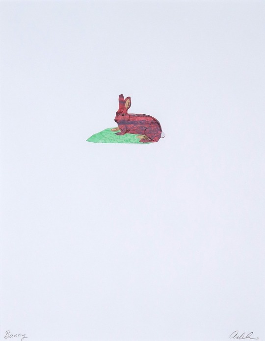
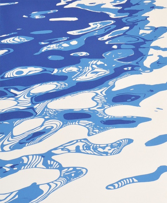
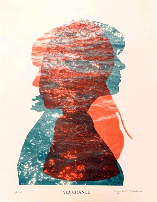
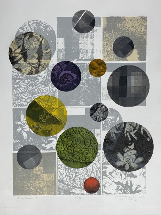
Pressing Matters 2022
Atlanta Printmakers Studio
Robert McRae - Habenero Cold, Popsicle Hot - linocuts
Ashley Schick - Bunny - hand cut monoprinted papers
Joe Sanders - Sediment II - handmade paper, embedded laser cut, monoprint
Ronald Nuse - Gloucester Water Reflections - screen print
Cynthia Lollis - Sea Change - Risograph and letterpress
Stephanie Colpy - Gordian Knot - monotype, drypoint, stencil, watercolor ink on Rives BFK
Julia Kjelgaard - Nature/Nurture - lithography & etching
Christopher Hickey - Bra and Bottles - linoleum cut
Sabre Esler - Mindcube on the Spectrum - CMYK silkscreen print
Darya Fard - Flow - etching and dry-point on copper plate, mono-print, on my hand-made paper
7 notes
·
View notes
Photo
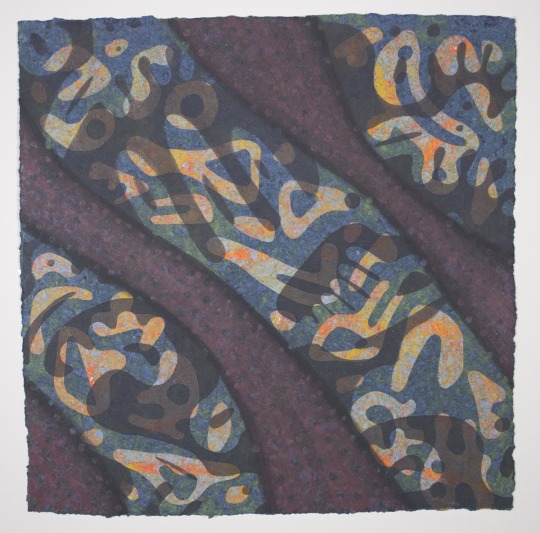
Many thanks to the Smart Museum for the acquisition of Judy Ledgerwood’s 2020 monotype “Tumbling Spectrum #1”. The print is one of a remarkable group of unique prints Ledgerwood made at Manneken Press which, due to the pandemic, we weren’t able to show publicly until this April at @expochicago. The entire series of prints, and a video on the project, can be viewed on our website (link in bio). Contact Manneken Press for current pricing/availability. @smartmuseum @judyledgerwood @chromphillia #smartmuseum #judyledgerwood #expochicago2022 #monotype #uniqueprints #worksonpaper #tumblingspectrum #chicago #mannekenpress #universityofchicago @universityofchicago (at Smart Museum of Art) https://www.instagram.com/p/CfwVN-CrYME/?igshid=NGJjMDIxMWI=
#1#smartmuseum#judyledgerwood#expochicago2022#monotype#uniqueprints#worksonpaper#tumblingspectrum#chicago#mannekenpress#universityofchicago
3 notes
·
View notes
Text
FMP
Tutorial Feedback - 21.02.23
For this tutorial we were asked to bring our learning agreement. I had written mine on behaviour and several different ways in which I could explore this topic. As this topic is so massive even the ways in which I had tried to narrow it down were too big also, as well as them being way too different to each other.
In my tutorial I got given suggestions of smaller topics within behaviour that I could look at. A project by a previous student was about the arm movements during speeches of labour and Conservative party leaders to see the difference and to map them. Handwriting also got suggested to me.
The topic of handwriting could be quite an interesting one as handwriting in itself has a personality. It also changes with age. Everyone learns to write a certain way then over time it deteriorates.
Looking at my dads handwriting;
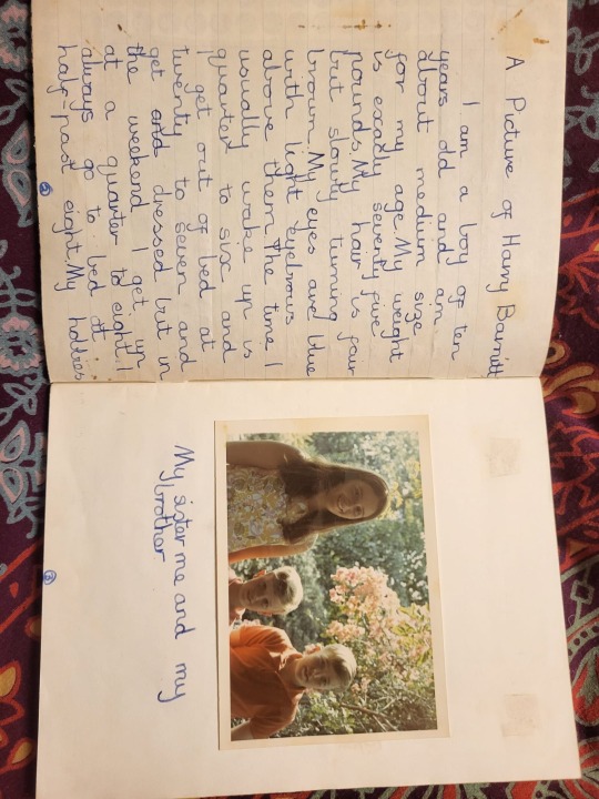
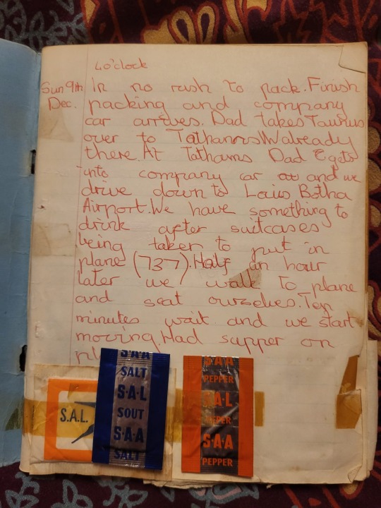
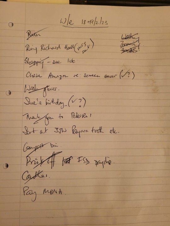
These three images show a progression of my dads handwriting from when he was as young as 7years old. I think it’s very interesting to see the difference in his handwriting now. However his handwriting looks like this in the context of writing a list. And from experience he does not write like this when writing letters of birthday cards.
Projects on handwriting:
https://www.itsnicethat.com/articles/monotype-quentin-blake-typeface-010315
Quentins playful style is particularly evident in his handwriting. With its distinctive forms and irregular placement it is very, undeniably, his, and is often just as much in demand as his illustrations, whether it’s for the cover of a book, publication, or other commercial work.
This project was a recreation of an already existing typeface of his handwriting, as it was needing to meet new demands.
“For the new typeface to be a success it would need to mimic Quentin’s own idiosyncrasies: the small and varying lowercase height, the unpredictable stroke thickness, the exaggerated crossbars and tails. It would need to be flexible too, capturing the same rhythm and spacing that he would include when laying out a piece of lettering by hand. And it would need to accommodate a demand for international languages to help meet more time-consuming challenges: “Requests for different languages can be quite difficult if he’s not familiar with them,” explains Liz Williams, Quentin’s archivist. “He has to consider each letter carefully to make sure it’s right and that can detract from the natural flow.”
https://www.itsnicethat.com/news/quid-pro-sans-rick-banks-jkr-trump-typeface-graphic-design-261119
The free typeface by Rick Banks’ F37 Foundry and agency JKR features a spectrum of Trump’s erratic approach to the same letterforms, and autocorrects up to 100 words with comically Trumpian replacements, like “nice” to “moron”, and “Trump” to “stable genius”.
https://www.itsnicethat.com/articles/the-hand-written-letter-project
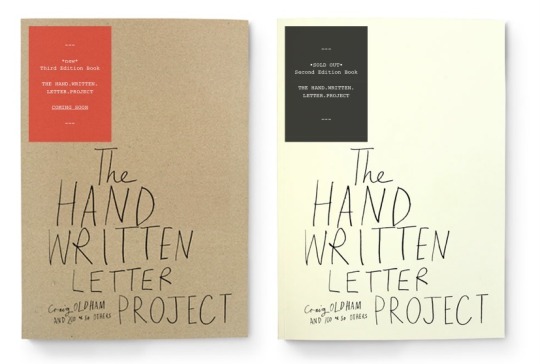
The idea that letter writing is a dying art may not seem to be the most original premise for an exhibition, but Craig Oldham’s new show at the KK Outlet in London’s Hoxton Square brings new wit and vigour to the idea.
My thoughts
Although briefly looking at handwriting has been quite interesting I have absolutely no idea of a project direction or outcome that could come from it, and I’m not sure I have the motivation to figure it out.
0 notes
Text
Specimen Books Research
As early as the beginning of the sixteenth century, type specimen books developed as a way to help type founders, typecutters, and printers establish themselves in the burgeoning markets of the early modern book trade. Specimen books typically exhibit the full spectrum of typefaces available from a particular foundry or letterpress studio.
There was a time when printers produced type specimen books as well as type founders. Such publications show what types were being manufactured and document when specific founts were released on to the market, and their design reveals as much about the printers as the typefaces they display. These specimen books designed by Herbert Spencer for the printers Lund Humphries, provide evidence of a significant period in the development of British Modernism.
Printers’ type specimen books first appeared in the 1920s, with the widespread uptake of mechanical composition. Printers set typographic trends, and any reputable press regarded type specimen books as essential. That time was a decade of typographic expansion with many new and revived types coming on to the market. Monotype composition had also become popular, and technically up-to-date printers publicised this new system through their specimen books. By the 1980s desktop publishing had hit the industry. Responsibility for composition now lay not with the printer but with the designer, and clients ceased to choose a printer by his fonts.
Specimen books were effective vehicles for a printer to demonstrate his skills in composition, presswork and binding. Early type specimens looked like books, complete with prelims and end matter, and had page proportions and bindings that followed those of book production. The early specimens merely displayed typefaces, and provided no technical information such as character-set or casting-off tables. It was not until later that specimens developed their own style, taking the form of manuals both in content and presentation.
Type specimens were expensive to produce and were only issued by those printers who saw themselves in the typographic ‘front line’.
The Curwen Press in London favoured artists’ and ornamental Continental founts, which it advertised in its 1928 Specimen book of types and ornaments. A large, self-conscious specimen, it was exquisitely designed and printed on hand-made paper with deckle edges and excessive margins. It was a conspectus of modern printing with vignettes and ornaments, forming an unrivalled collection of work by contemporary artists, but it was expensive and too precious to be useful.
Curwen’s 1931 Working handbook was more basic. Printed on a rough stock with narrow margins, it displayed a limited range of faces and was a curious attempt to produce a useful and affordable specimen. Despite its title it failed to work, as it provided no full alphabets and its small format prohibited the adequate presentation of any text setting.
Specimen books issued by the Birmingham-based Kynoch Press were about type, not art. The Press favoured English revival types and produced two prewar specimens to publicise them. Its 1934 specimen appealed to typographic connoisseurs with its attractive presentation of rare founts. The types were divided into hand- and machine-set and were shown both as complete alphabets and as text with various leadings. The specimen was clothbound with Stevens Shanks’ Elephant
face sunk deep into the cover. This innovative cover gave dimension to the type allowing it to be seen and felt. The specimen was totally dependent upon the letterforms for impact and was a typographic solution from a printer that regarded itself as a typographer’s press.
In the 1950s the Kynoch Press produced a Specimen of typefaces, a loose-leaved two-volume manual with a Mult-O binding. The measured alphabets displayed complete upper- and lowercase alphabet lengths of all founts in all sizes, set against a pale blue background with fine white vertical lines at one pica intervals. This provided a visual character-count for each face and eliminated the necessity for casting-off tables. It was a graphic solution that was adopted by a number of other printers.
Lund Humphries of Bradford was interested in Continental sans serif types. In its 1930 Lund Humphries Type, the press showed its Modernist convictions by a bold use of geometric shapes, solid tints and reversed-out type. Bound in 2mm thick red board with a squared back, and held together by two thread screws, it had the appearance of a car maintenance manual. It was a functional specimen intended for use in inky printing works, and its large format allowed for adequate typeface presentation. The printer continued its commitment to usefulness when it produced the Type index, a utilitarian specimen book austerely bound in black, with a white sans serif titling reflecting its functionality.
In 1956, Herbert Spencer designed a specimen book for Lund Humphries. It was a visual synopsis of the full range of type laid out in a grid-format with an upper- and lowercase H and M to indicate hand- and machine-set types. Spencer’s Modernist layout sought to show the available typefaces as concisely as possible, and was an inventive solution to the challenge of type specimen presentation.
In hands of Spencer, an associate of Lund Humphries from 1950 to 1975, this specimen does not strive to impress, or to dictate how any face should be used. But it functions as it is intended, as a quick reference tool that provides the required information.
Resources:
https://guides.lib.udel.edu/typespecimenbooks/collection
https://www.eyemagazine.com/feature/article/this-is-a-specimen
0 notes
Photo
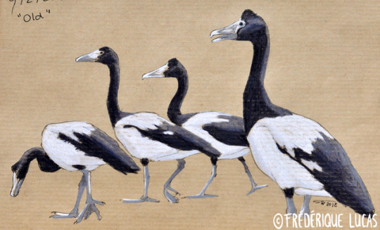
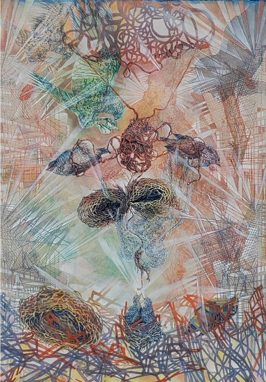
Febirdary #9 Old
Magpie geese sit at the other end of the ‘evolutionary age‘ spectrum, and are considered living fossils. Again, a strange nomer that doesn’t quite hold up to scientific scrutiny and logic, but does a perfectly good job of intuitively describing what is meant: an existing species that resembles creatures otherwise known only from the fossil record. Their superficial resemblance to geese confirms their place amongst the waterfowl, but they are not true geese. They represent a monotypic family that split off a long time ago, after the screamers, but before all other ducks, geese, and swans. Members of the family already existed in similar form some 66 million years ago.
Their ancient origins show, even today. There is something oddly reptilian about their bare triangular face. Their neck is just a tad too long and thin for what my idea of a goose is comfortable with, and seeing a flock strolling across a field, heads held high, reminds me a bit too much of some paleo artwork come to life. They are wondrous birds for sure.
#febirdary#febirdary 2018#studies#sketch#magpie goose#australian magpie goose#Anseranas semipalmata#anseranas#living fossil#goose#waterfowl#bird#bird art#traditional art#artists on tumblr
33 notes
·
View notes
Photo
It’s Fine Press Friday!
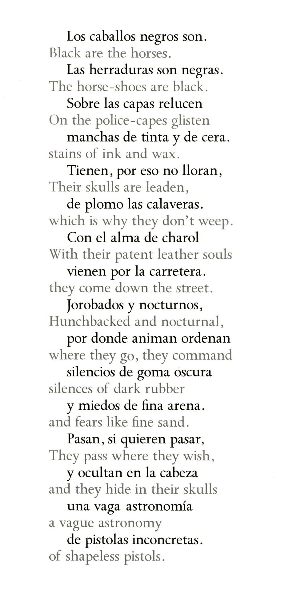
This week we present Romance de la Guardia Civil Espanola (The Ballad of the Spanish Civil Guard), a book of Spanish poetry by Federico Garcia Lorca alongside an English translation by A.L. Lloyd and accompanied by original woodcuts by Jerome Kaplan. It was designed and printed in 1974 by Claire Van Vliet for her Janus Press, in Newark, Vermont in an edition of 300 numbered copies bound by Jim Bicknell. Nancy Boylen typeset the text in 18-point Monotype Spectrum, with the bilingual text printed in alternating lines of black and gray. Our copy is a gift from our friend and benefactor Jerry Buff, and bears a presentation inscription from Van Vliet to Buff.
Printed in an inky black, the woodcuts have an almost claustrophobic, densely-packed design that evokes a formidable sense of ‘no escape’ that genuinely brought me some anxiety. As the poetry is based upon the Spanish Civil War, this is not surprising but overwhelming nonetheless. Combined with the grotesque theme of a woman having her breasts cut off, this presentation of war, love, and tragedy is incessantly menacing and sinister.
View more posts on works by the Janus Press.
View more Fine Press Friday posts.
-Emily, Special Collections Writing Intern
#Fine Press Friday#Fine Press Fridays#Janus Press#Claire Van Vliet#Federico Garcia Lorca#Romance de la Guardia Civil Espanola#Jerome Kaplan#woodcuts#A.L. Lloyd#Monotype Spectrum#spanish civil war#fine press books#Jerry Buff
41 notes
·
View notes
Photo
A shoutout to all the absolutists out there, not everything is black and white. No one MBTI type MUST do this, or MUST behave this way to be a particular type. In general, yes, but not every single individual. INFJs (for example) are not a monotype, they spread along a spectrum of behaviour. Just something to note. (at Birmingham, United Kingdom) https://www.instagram.com/p/CFqEZiVhFU4/?igshid=1d6xmf03vtuvd
0 notes
Text
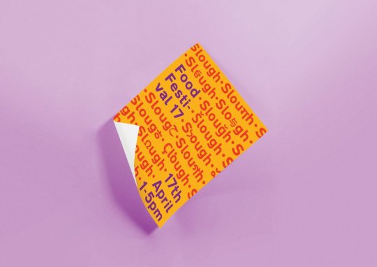
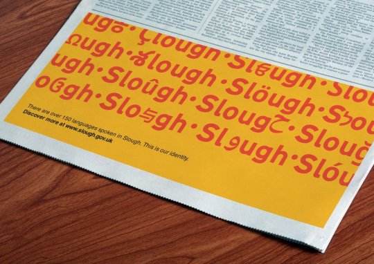
Monotype winner 2017 : ‘Immigration town’
received a yellow pencil
Taking a very hot topic in the last year and showcasing it. Celebrating the diversity through an alteration in type, its very relevant to our project and the handling of the type and visuals in the video is too. It works really nicely alongside mellow music and nice shots.
Slough was recently dubbed 'Immigration Town' by the BBC and is commonly misrepresented. There are over 150 languages spoken in Slough, with many seeing the rising rates of immigration as it losing its identity, we feel this is what gives it it's identity. With Slough being a town built along the M4 we used the typeface Transport and combined it with Google's and Monotype's Noto typeface to incorporate the different languages. We created a colourful identity showcasing the spectrum of languages by integrating them into an adaptive and responsive logo and identity, highlighting the diversity of 'Immigration Town'.
https://www.dandad.org/awards/new-blood/2017/monotype/3146/immigration-town/
0 notes
Text
Intro to Monochromatic Printmaking: Tints and Shades Using Green, Part II
Watch full video on our Akua Printshop YouTube channel here: https://youtu.be/KQuwUNZ-h08

In our “Intro to Monochromatic Printmaking: Tints, Tones and Shades, Part I” video tutorial, we focused on shades, tints and tones with the use of black, white and gray. This tutorial will cover tints and shades of green, using Akua Intaglio transparent base and black. Because printmaking is a transfer process, it is beneficial to create test charts, proof prints and draw-downs since we cannot see the final result until the plate is printed.
CREATING THE PALETTE

To start, you will mix a unique green using equal parts Akua Intaglio Hansa Yellow and Oxide Green, with a touch of Phthalo Green for depth. This will be your “baseline green”, the color which you will mix from.
From here, you will create a spectrum of transparent tints and darker shades to yield a wide range of greens by adding transparent base and black.
TINTS

Mix equal parts of your “baseline green” and transparent base to create your most transparent tint.
Then mix equal parts of your most transparent color to your baseline green. This creates a color that is twice as dark.
Continue this formula until you are back to your original, baseline green. You will have a total of four different tints.
SHADES

Going back to your baseline color, apply the same formula used to create your tints, for the shades. Instead of using Akua transparent base, use Akua Intaglio Carbon Black, working from dark to light.
ROLLING UP AND PRINTING

Once your palette is mixed and ready, roll a small amount of each color onto a small plate to create a printed chart. This will serve as a reference in addition to your draw-downs, as it is a more accurate reading of the color.
For monotype, these types of charts are especially beneficial because you only have one chance to create that exact image. You cannot proof your plate, but you can proof your colors.
For more information on Akua Inks visit https://www.speedballart.com/our-product-lines/akua-printmaking/
0 notes
Text
Call for Artists: Printmakers needed for Center for Contemporary Printmaking (Norwalk, CT)
Print your large woodcut with BIG INK at the Center for Contemporary Printmaking For National artists
Event Synopsis: BIG INK is pleased to partner with the Center for Contemporary Printmaking for two one-day large woodcut printing sessions. We’ll be utilizing BIG INK’s giant 48” x 96” mobile etching press to pull prints. If accepted, artists will have two months prior to the event to carve their image into a piece of plywood. BIG INK remains in contact with each participant providing guidance and technical support when needed. The Center for Contemporary Printmaking (CCP) is a non-profit organization dedicated to the art of the print: intaglio, lithography, monotype, silkscreen, woodblock printing, paper works, book arts, and digital arts. CCP is a unique cultural resource, a place to discover, to experiment, to learn. The entire spectrum of printmaking arts is here to be explored through workshops, edition printing with master printers, exhibitions, community programs, and an Artist-in-Residence Program.
About BIG INK: Our mission is to inspire a greater appreciation for relief printmaking and extend its practice among contemporary artists. We invite artists, via a call-for-entry application process, to submit a proposal to create a woodcut, at least 24” x 36” in dimension, through bigink.org. Approximately sixteen proposals are accepted per event and those selected are given two months to carve an image. At the end of the two months, BIG INK meets with the artists at a predetermined space, such as an art center, festival, or community print shop, and helps them print his or her woodcut onto paper. These events culminate in exhibition opportunities and potential sales for the artists who participate. BIG INK has helped hundreds of artists create new work at venues across the United States.
Event Location: Center for Contemporary Printmaking, 299 West Ave, Norwalk, CT 06850
Deadline for Consideration: Midnight, April 16th, 2018
Event Date(s): Jun 23rd & 24th, 2018
Criteria: BIG INK considers proposals based on the following:
Size: Images must be at least 24” x 36” in dimension but not larger than 40” x 96” in dimension.
Material: Artists are responsible for securing their own ½” thick plywood, 1/2" MDF or 3/8" Shina for carving and their own carving tools. The plywood or MDF must be ½” thick, the Shina must be 3/8".
Originality: The uniqueness of the design will be a major consideration. A drawing, digital graphic, altered photography, collage, sketch, painting or print are acceptable examples to include with your proposal. Images must be solely created by the applicant.
Cohesiveness: The anticipated dimensions of your woodblock should match the format of the image you submit.
Fees: It is free to submit a proposal; accepted artists pay $295 dollars to participate. This covers all consumable materials for the event including: printing ink, paper, cleaning supplies, and equipment usage. All that is required of the artist is to bring a fully carved block. Benefits: BIG INK events are best described as a concentrated burst of productive energy bringing together leading artists from throughout the region to network with each other and potential patrons. We provide the technical expertise and specialized equipment necessary to bring the artist's studio directly to the public in an engaging way. Our mobile printing press, dubbed “The Big Tuna,” has the ability to produce woodblock prints up to 48” x 96”. No other etching press of its size is used for this form of collaborative printing. In addition, selected participants also receive:
Professional Prints: BIG INK assists in the creation of three impressions from each participant's carved block.
Video Tutorials: Never made a woodcut or woodblock print? No problem! We've created step-by-step video tutorials to walk you through the whole process.
High-Res Photography: We provide a professionally photographed image of each participants work at no additional charge.
Curated Exhibits: National and international art venues curate BIG INK exhibits from our growing portfolio. Your work could be featured next!
Outreach: We create a page for each participant on our website. Our web and social outlets receive thousands of views each month and will put your work in front of a larger audience.
Commonly Asked Questions:
Q: Can two artists collaborate on a proposal?
A: Yes, list both names on the application.
Q: Can I submit an existing image with my proposal?
Q: Can I submit an existing image with my proposal?
A: Yes
Q: If accepted can I change my proposal image after the fact?
A: Yes, as long as it falls within the same aesthetic.
Q: Does my proposal image have to be a certain size?
A: Your proposal image can a small. It doesn't have to be the same size as your final carved woodblock.
Q: What time are we expected to arrive at the event?
A: 10 am sharp
Q: How long are we expected to remain after our work is printed?
A: Until 5 pm
Q: Are we expected to attend both printing days?
A: No, but you’re welcome to attend.
Q: How many prints does each artist produce?
A: Three
Q: Can I bring my own paper and print more?
A: Unfortunately, there isn’t enough time to print more.
Q: What type of paper do we use?
A: Masa
Q: What type of ink do we use?
A: Oil based relief ink, bring an apron and wear work cloths.
Q: Do I have to bring any other materials besides my carved block?
A: No
Q: Can we print in color?
A: No
Q: How do we transport the finished prints?
A: BIG INK provides newsprint to wrap the work and tubes are provided for those that are mailing work.
Q: Do you have recommendations on where to stay?
A: We use Airbnb most frequently and quality hotels are usually located a short drive away or within walking distance.
Q: What is the best way to transport the finished block if I'm flying?
A: You may be able to ship your block directly to the venue. Contact us directly to confirm. When shipping your block please include a return label in the package. This makes shipping your block back home simple.
Deadline: 04-17-2018 Center for Contemporary Printmaking Norwalk, CT Contact: Lyell Castonguay email: [email protected] Phone: Website: www.bigink.org/apply
0 notes
Photo

“Tumbling Spectrum #1”, 2020. Monotype, 13”x17”. One of more than 30 new monotypes by Judy Ledgerwood. Available now from Manneken Press. DM for pricing/availability. • • Link in bio to “Fields Of Vision:New Monotypes by Judy Ledgerwood”, online exhibition on Artsy. #judyledgerwood #mannekenpress #monotype #worksonpaper #tumblingspectrum #hahnemühle #watercolor #chicago #quilt #chicago #artista #artforsale #collectprints #artcollector #artconsultant #artsy @expochicago @judyledgerwood (at Manneken Press LLC) https://www.instagram.com/p/CMCld2uF96j/?igshid=18wf74zcu2nn3
#1#judyledgerwood#mannekenpress#monotype#worksonpaper#tumblingspectrum#hahnemühle#watercolor#chicago#quilt#artista#artforsale#collectprints#artcollector#artconsultant#artsy
5 notes
·
View notes