#RMIT LectureNotes CommunicationDesign Typography Letterforms
Explore tagged Tumblr posts
Visit Tumblr Blog
Explore Tumblr blogs with no restrictions, modern design and the best experience.
Last Seen Tumblr Blogs


Fun Fact
BuzzFeed published a report claiming that Tumblr was utilized as a distribution channel for Russian agents to influence American voting habits during the 2016 presidential election in Feb 2018.
Text
Week 5 Communication Design Studies Lecture
In this Lecture Andy and Karen were discussing about Industrialisation of Print.

Here’s an image I did in Photoshop showing the Evolution of Letterforms. It’s important to know that the transition phase was happening, where writing by hand was not the means for writing books. Instead thanks to Gutenberg, printing from press machines was the new option for creating books. Comparing the letterforms of Baskerville and San Serif, you can see that there is a differences. Baskerville is more “regularly” and “symmetrical” while San Serif is more “geometric” and “rationalise”.
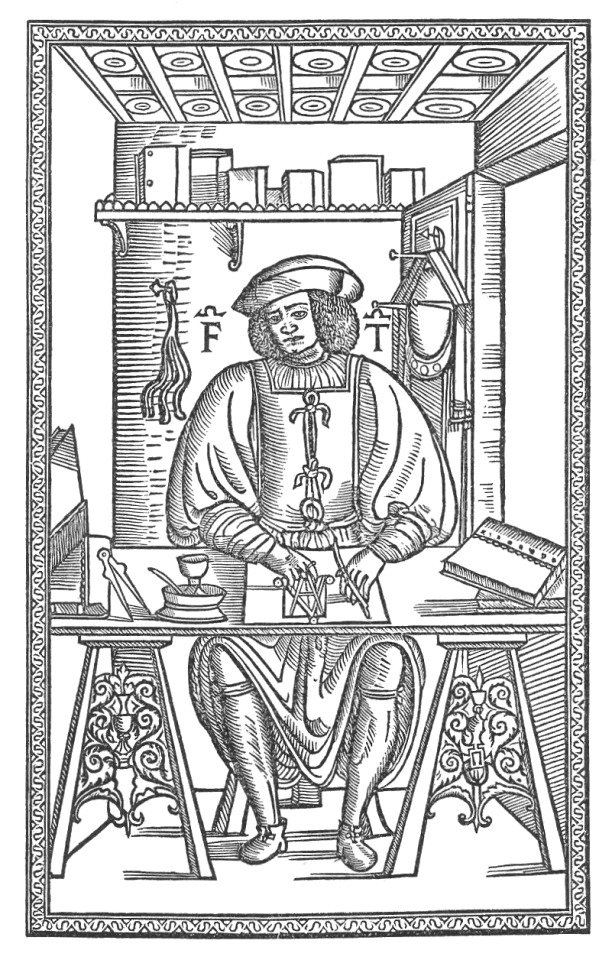
Andy talks a lot about important figures who were impacted the history of the typography as this image here is of Francesco Torniello. Here he is using a compass to draw the letter “A” and this shows the importance of geometrics in typography.
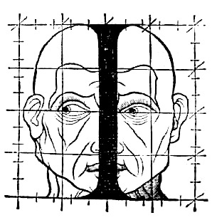
This image done by Geoffroy Tory I found interesting, while drawing the letter “I” he was using the foundations of a drawn face to determine the height and the weight of this letter. Mr Troy used mathematical and human forms for this experiment.
Overall I thought this was a good Lecture, again its interesting to know about the history of typography/letterforms and thanks to Andy I hope I can use one historic designers he mentioned in my next assessment.
6 notes
·
View notes