#Resizing Header on Scroll
Explore tagged Tumblr posts
Visit Tumblr Blog
Explore Tumblr blogs with no restrictions, modern design and the best experience.
Last Seen Tumblr Blogs


karanbhallacheatingarrestfraud11
Karan Bhalla Cheating Karan Bhalla Arrest Karan Bhalla Fraud
12 posts
Fun Fact
Premium Tumblr themes are available from anywhere between $9 to $49.
Text

Animated Sticky Navbar
#Animated Sticky Navbar#Sticky Header On Scroll#Resizing Header on Scroll#navbar#header#html css#divinector#animated#animation#css#html
1 note
·
View note
Text


XOXO - RPG THEME SET - 1k SPECIAL !!!
This theme set is completely free. It is a special thank you for 1k followers. Please support me and my work by liking and reblogging this post!
[ BLOG THEME INFORMATION ]
Option between 400px, 450px, 500px and 540px posts.
Custom Body Fonts and Body Font sizes (11px - 13px)
Two Custom Header Links
Two Dropdown Links with unlimited link options
Dropdown Links are optional
Fully supports NPF (beta editor) posts.
The theme adjusts to different screen sizes.
Visible Source Link & Scroll to top button.
A lot of the design can be changed in the editing panel. Everything else is explained in the code.
Sidebar Boxes for: Welcome, Events, Admins, Quick Links and Schedule
Quick RPG Information on the header (Member & Application count, short rp information and Plot description)
Disclaimer and further blog information in the footer.
Sticky Sidebar
Footer can be turned off.
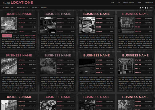
[ LOCATION PAGE ]
The Page does not contain any javascript (100% java free)
Comes in 2 versions (with and without filters)
Location picture sizes are 130 x 130. They will resize automatically.
Option for a background picture.
3 Custom Links
All colors can be easily edited on top of the css code
The theme will resize to different screen sizes.
Custom accent colors (explanation in the code)
[ CHARACTER PAGE ]
The Page does not contain any javascript (100% java free)
Comes in 2 versions (with and without filters)
Character picture sizes are 155 x 150. They will resize automatically.
Option for a background picture.
3 Custom Links
All colors can be easily edited on top of the css code
The theme will resize to different screen sizes.
Character boxes have custom links.
Custom accent colors (explanation in the code)
[ GUIDELINES ]
Do not claim as your own.
Do not remove the credit!
Do not use as a base code or take parts of this code for your theme.
Feel free to edit as much as you want!
All credits are mentioned in the code!
Static Blog Theme Preview + Page Preview Links + All Codes Location Page Preview + All Codes Character Page Preview + All Codes All codes (without preview)
#rpg theme#rp theme#free theme#non contained theme#character page#location page#page theme#rph#rpc#rp resources
918 notes
·
View notes
Text


NUCLEAR WINTER - $10
Nuclear Winter is a moody blue monotone skin that was previously made specially for and used on a post-apocalyptic Fallout roleplay a few years ago.
There are comments scattered throughout the stylesheet and written HTML to help you navigate what to edit (if you wish to use it as is) and what not to edit it.
This skin comes with:
- A pre-installed UserWay accessibility menu. - A collapsible sidebar that's easy to read and navigate with a pop-out login box. - A removable news section with a scrollable news ticker, wanted ad listings in the form of icons, and staff icons. Beneath these three columns is the navigation bar. - Trigger warning fields that, when filled out, precede a post to warn users of potentially triggering material within. - A main profile flush with customizable fields to help fit whatever genre of site you decide to use this skin on. This profile has a header, with places for a character name and face claim, links to noteworthy information, the forum avatar listed on the side, an OOC section, and an awards section that scrolls vertically upon overflow. - An isotope members row that allows you to sort by member names. Custom fields that can be found on this skin and modified accordingly are: age, gender, pronouns, residence, morality, height, faction, occupation, species, OOC alias, OOC age, OOC pronouns, OOC timezone, maturity/content rating, and OOC trigger warnings.
Graphics for this skin that will be auto-resized are: a 350x700px header image of character, a 350x200px avatar image, a 200x200px gif icon, and a 110x50px gif icon for the mini profile.
For the optional news banner on the index: 50x50px wanted ad icons and 40x40px staff icons.
#jcink#jcink rp#jcink roleplay#jcink skin#jcink codes#jcink code#jcink coder#jcink skins#jcink skin for sale
37 notes
·
View notes
Note
Prev anon here, if it isn't too much of a hassle a post about your gif settings would great! I used to make gifs years ago and every time I felt like making a set these days I just don't know what I'm doing anymore XD. Like, I forgot everything about how I used to make gifs in photoshop.
hello again!! I tried making it as comprehensible as i could for you and also to the people who wants to start making gifs :D
you can simply scroll to the ps settings if thats all you need ^^
Vapoursynth (If you don't have it, it's totally okay to just use ps because this is really just a matter of preference bcs i feel like resizing in photoshop worsens the quality)
simply drag the video(preferably 1080p or above) you want to use to the vapourscript!

3. this thing shows up, just write the timestamp and the duration (ex.if the clip you want starts at 1:24 and ends at 1:27 then the encoding duration would be 4 seconds)

4. after that, you'll be taken to the resizer and you can adjust the size of the gif here and sharpening here too. i like to add a bit of finesharp because i also feel like the processing lowers the quality a little
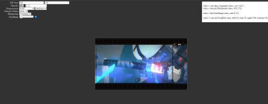
5. copy the text at the top right and paste it onto the vs editor
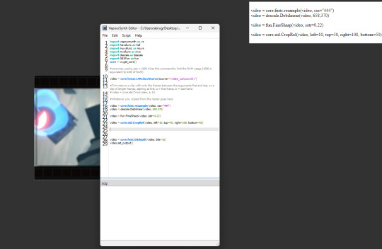
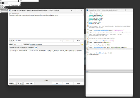
6. (forgot to take a pic but you can choose which frames you want to process by clicking script and then preview at the top) 7. click script and then encode, change preset to Export to MOV and header to Y4M and then click start
8. after that's done you can close it, and move onto photoshop! 9. once you've opened photoshop, click on file on the top left, click import and the video frames to layers 10. look for the output folder and there you can see the encoded file

11. Delete the frames you don't want and then we can start on the sharpening! 12. click on the 4 lines at the frame window and then select all frames

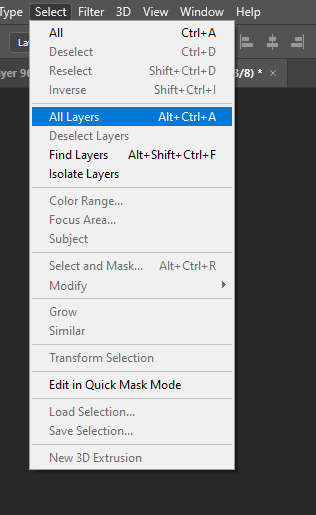
13. go to select at the top and then select all layers
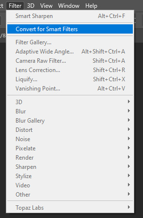
14. click on filter and then convert for smart filters
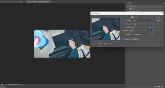
15. and now for the sharpening! click on filter, sharpen and then smart sharpen! (here are the settings<3)


(ps. the unsharp mask is simply there because i want to test it out) 17. once you're finished with the sharpening, you can now flatten it into layers
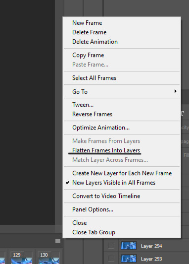
18. delete the first layer 19. click on convert to frame animation
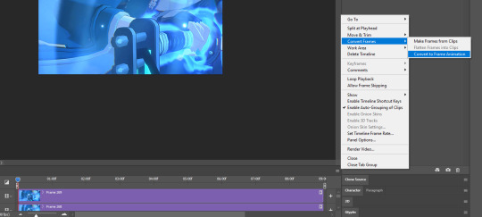
20. finally make frames from layers (you can find it above flatten into layers) 21. set the frame delay to 0.02 (for 60fps) or 0.04 (for 30fps)

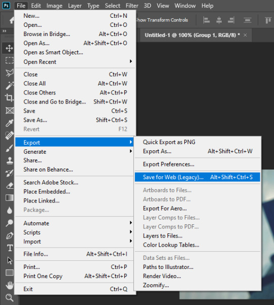
22. colouring depends on your preference, my psd can be downloaded on the source link ^^ 23. go to file, export and save for web

(my export settings) and save! miyabi gifs w/o sharpen & colour

w/ sharpen

w/ sharpen & colour

#i probably wouldn't be able to sleep if i didn't answer this firstsdhlsd#the colouring really depends on the sharpening#while psds may works for some it might not work for different sharpening settings#being a hoyo gifmaker is so fun.. i dont have to trouble myself with music show stage lightshsldls#inbox💌
15 notes
·
View notes
Text
The Woes of Formatting
I am… 22 hours into formatting ENNS for print (now ebook) and am making this post for posterity’s sake to say: Formatting is so. Tedious. I had to start over thanks to Amazon going “ha you didn’t set your margins properly,” and also some last-minute changes to the text. Yesterday (7/24/24) after a full day of work, I worked on Book from 2:30pm to 11:30pm. Today is probably going to be about the same.
My neck hurts from staring at my monitor, my pinkie hurts from the strain of holding a computer mouse in one position since 6am. I have forgotten to cook lunch and dinner, but I did have breakfast.
It doesn’t even feel real yet. I am exhausted. But you know what feels great? Eliminating widows and orphans on the pages to erase the page count only by one. If you don’t know, those are the little hanging words on the bottom line of a paragraph or the top of a page that can be resized to fit on the line above it.
Getting to the last page of the chapter and realizing there’s only 3 or 4 lines of text left eating up an entire piece of paper, and then scrolling back through the chapter like a madwoman to nudge other paragraphs around to eliminate that extra page… I was literally cheering in my room in satisfaction.
For the record it shouldn’t take you this long, but I wanted it to be pretty, and Amazon is incredibly precise with their formatting requirements down to 0.001inches. So I had to reformat the cover art, which took a while. Then I had to fix the margins at least 3 times until no more errors showed up. Then I had to reread the entire book for last-minute changes. Then I had to format the chapter header pages.
Before that, though, I had to make the art for the chapter header pages. And re-learn how to do all of the formatting on InDesign.
So here I am, 22 hours in, finally onto the ebook that will be done tonight goddamn. And I just want to say, if it’s within your power to do as much of the work yourself as you can, fucking do it.
I’d be losing my mind with stress if I was waiting for a cover artist to make adjustments whenever they deigned to find my order a priority. Or the person I’d be paying to format this book. Losing. My. Mind. Maybe after the ridiculous goose chase I have been on with editors for this book has completely murdered my faith in paid beta readers to do shit in a timely manner (ENNS' first draft was written in 31 days, it took from 2/25/24 to 6/10 for my tiny army of betas and the AWOL failed betas to deliver, then 6 weeks for the professional copy edit). Anyway.
Yeah it’s taken me a long ass time, on top of two full corporate-nonsense workdays, but the satisfaction I have felt hammering this project out isn’t comparable to paying someone to do it for me. I got the manuscript back from my copy editor and I wasn’t excited, I was like “I needed this 10 days ago thanks” (in my head) and then got right back to work. Copy editor is necessary, don’t get me wrong, it’s absolutely necessary, but the catharsis that I have now was definitely absent then.
So. Yeah. This is rambly and I’m not sorry. Even after the ebook is up for preorder there’s still work to be done and money to be spent. But I’m forcing myself to take a break, pause, breathe, appreciate the work I have already done.
I am hours away from launching my first published novel. Hours.
It doesn’t feel real. August 25th, 2024, Eternal Night of the Northern Sky's official release date. Gahhhhhhh.
—
For anyone curious:
Cover was done in Photoshop (I have the Lightroom student package for $9.99/mo)
Formatting was done in InDesign (%#&%# $35.99/mo after 7 day trial choke on rocks, Adobe)
Formatting did not need to be done in ID, but other one-time fees were either more expensive when I can cancel my subscription after the month is up, or the free versions were too limited and constricting in their capabilities.
I’m far too nitpicky to not have complete creative freedom and control over my work, with all the hours I have put in. So Adobe it is.
Back to work!
#writing#writing a book#writing tools#writeblr#editing advice#book formatting#adobe photoshop#adobe indesign#book launch
7 notes
·
View notes
Text
Top 10 AI Tools Every Digital Marketer Should Use in 2025
The digital marketing landscape is evolving faster than ever. With algorithms changing, competition growing, and customer expectations skyrocketing, marketers are turning to AI marketing tools to stay ahead of the curve. At Incinque Business Solution Pvt. Ltd., combining smart strategy with the right tech stack is the key to scaling online success. So, if you run campaigns, make content, analyse data, and personalise the customer journey, these AI marketing tools help your life easier today. Let's glimpse the top 10 AI tools every digital marketer should use to boost productivity in today's hyper-digital age.
1. ChatGPT (OpenAI)
Keyword: AI content generation tool Perfect for: Copywriting, blog posts, email campaigns, ad copy.
ChatGPT is an AI writing assistant that helps digital marketers create human-like content in seconds. Whether you’re stuck with a blank page or need a catchy CTA, ChatGPT speeds up the content creation process while keeping it relevant and engaging.
Use for: SEO blog writing, Instagram captions, landing page content.
2. Jasper AI
Keyword: AI copywriting tool for marketers
Perfect for Long-form content, product descriptions, and brand voice.
Jasper AI has become a go-to tool for marketers looking to maintain brand consistency while scaling content output. With pre-built templates and tone settings, Jasper saves hours on writing and editing.
Use for: Content marketing strategies, product pages, newsletters.
3. Surfer SEO
Keyword: AI SEO optimization tool
Perfect for: On-page SEO, content scoring, and keyword clustering.
Surfer SEO combines AI and keyword analytics to help you write content that ranks. Just paste your content into its editor, and it gives real-time SEO suggestions.
Use for: SEO blog strategy, content audits, and improving search rankings.
4. GrammarlyGO
Keyword: AI writing assistant
Perfect for Grammar checks, tone adjustments, and rewriting.
Grammarly GO goes beyond basic proofreading. Its AI features help you rewrite entire paragraphs, suggest alternative phrases, and adjust tone based on your audience.
Use for Email marketing, client proposals, and social media captions.
5. AdCreative.ai
Keyword: AI ad creation tool
Perfect for Facebook ads, Google display ads, and social creatives.
Struggling to design scroll-stopping ads? AdCreative.ai uses AI to generate ad banners, headlines, and CTAs that convert — all within minutes.
It is used for paid ads, display creatives, and A/B testing of visual content.
6. Canva Magic Studio
Keyword: AI design tool for marketers
Perfect for Designing visuals, brand kits, and presentations.
Canvas AI-powered Magic Studio can generate images, auto-fill text, and resize content for different platforms in one click. No design skills are required!
Use for Branding, social media posts, and email headers.
7. Lumen5
Keyword: AI video marketing tool
Perfect for Video content creation, YouTube Shorts, and Instagram Reels.
Lumen5 turns your blog content into professional-looking videos using AI. With drag-and-drop features and automatic scene suggestions, video marketing becomes effortless.
Use for YouTube marketing, LinkedIn video posts, and video repurposing.
8. Zapier + OpenAI Integration
Keyword: AI marketing automation tool
Perfect for Automating tasks, lead generation workflows, and chatbot replies.
Integrating Zapier with AI tools like OpenAI allows you to automate lead nurturing, follow-ups, and more. You can even auto-reply to DMs or generate personalized emails.
It is used for workflow automation, lead engagement, and time-saving hacks.
9. MarketMuse
Keyword: AI content planning tool
Perfect for Content strategy, topic research, and SEO outlines.
MarketMuse uses AI to analyze your content gaps and recommends what topics to target for better SERP visibility. It’s like having a content strategist in your back pocket.
It is used for strategic content planning, keyword research, and topic clusters.
10. Pictory AI
Keyword: AI video content repurposing
Perfect for Repurposing webinars and blog-to-video transformation.
Pictory allows you to convert long-form text or video into bite-sized social content using AI. Great for building an omnichannel presence without spending hours editing.
Use for Social media clips, video storytelling, and content repurposing. Last Thoughts As we enter the future of digital marketing in 2025, the key to keeping ahead is working smarter, not harder. These AI technologies for digital marketing aren't simply cool; they change the game. They let you automate tasks you repeatedly do, generate better content, and make real-time decisions based on data. Incinque Business Solution Pvt. Ltd. helps businesses grow using innovative marketing techniques combining AI and creativity. Adding these AI technologies to your business can boost your return on investment (ROI) and save you a lot of time, whether you're just starting or your brand is booming.
0 notes
Text
How Can “The App – Free App WordPress Theme” Help You Boost App Downloads and User Engagement?
Creating a mobile or web app is only the beginning of your digital journey. The true challenge lies in building an audience, driving downloads, and keeping users engaged. For that, you need a compelling online presence—one that combines design, performance, and persuasive messaging.
Enter The App – Free App WordPress Theme. This purpose-built theme is tailored to tech startups, app developers, and SaaS creators who want to launch a sleek, fast, and effective website without spending a fortune.
In this article, we explore how The App can significantly boost your app’s visibility, downloads, and trustworthiness.
First Impressions Matter – Make Yours Count
When users land on your website, they form an opinion in seconds. A cluttered or outdated design can instantly turn them away. That’s why The App WordPress theme focuses on simplicity, elegance, and user clarity.
The homepage features:
A full-width hero section to display your app UI
Space for an eye-catching headline and subhead
Action buttons like “Get the App” or “Download Now”
This layout ensures visitors understand what your app does and how to get it—without confusion or friction.
Highlight Your App’s Core Features Visually
One of the strongest selling points of this theme is how it lets you visually showcase what makes your app valuable. You can use built-in sections to:
List your app’s top features
Use icons and graphics to break down functionality
Display mobile device mockups with app screenshots
Rather than explaining features with long paragraphs, you can illustrate them with design—keeping visitors engaged and informed.
Mobile-First, Responsive Design
Today’s users browse and shop on their phones more than ever. If your website isn’t mobile-friendly, your bounce rate will skyrocket.
The App theme is fully responsive, meaning:
Layouts automatically adjust to screen size
Buttons are touch-friendly
Images and videos resize perfectly
Performance is smooth across mobile, tablet, and desktop
Your app is built for mobile—your website should be too.
Improve Trust with Testimonials and Reviews
People trust people. Whether your app is brand new or already has traction, showcasing reviews and testimonials adds essential credibility.
This theme includes a testimonial section where you can feature:
Quotes from beta testers or customers
Ratings from users
Endorsements from influencers or tech blogs
If you have any user-generated feedback, this is the perfect place to leverage it.
Call-to-Actions That Convert
Conversions don’t happen by accident. They require thoughtful placement of Call-to-Actions (CTAs) at the right points in your content.
The App theme uses conversion principles by:
Placing CTA buttons in every key section
Including sticky headers or footers with “Download Now”
Allowing users to act without scrolling too far
Whether you want users to download, sign up, or watch a demo—this theme makes it simple and intuitive.
Lightning-Fast Loading Speeds
Speed impacts everything—from SEO to user experience to retention. Thankfully, The App WordPress theme is lightweight and speed-optimized.
This helps with:
Faster page loading (ideal for mobile users)
Better Google rankings
Lower bounce rates
Higher conversion rates
A slow website could mean a lost user. With this theme, your app’s first impression won’t be ruined by delays.
Fully Customizable Without Coding
Want to match the look and feel of your brand? You don’t need a developer for that.
Using the native WordPress Customizer or page builders like Elementor, you can:
Change fonts and colors
Add or remove sections
Upload your logo and favicon
Replace demo content with your own images and videos
It’s as easy as drag and drop. You get full design freedom without technical barriers.
Compatible with Key WordPress Plugins
To add functionality or scale your site, plugin compatibility is crucial. The App theme supports major WordPress plugins like:
WooCommerce: Sell premium app features or subscriptions
Mailchimp: Build an email list for app updates or launch announcements
Contact Form 7: Create support or inquiry forms
Elementor: Enhance the layout with drag-and-drop design tools
This allows you to grow your app business over time without needing a full redesign.
Search Engine Optimization (SEO) Friendly
Visibility is everything. If people can’t find your app website on Google, they’ll never make it to the App Store.
This theme includes:
Clean, semantic HTML5 code
Schema markup support
SEO plugin compatibility
Fast load times for better ranking
With the right content strategy, The App can serve as a high-ranking launchpad for your app on Google.
Why It’s the Perfect Choice for App Creators
This theme is especially ideal for:
Indie developers launching their first app
Startup teams preparing for a product launch
SaaS companies needing a simple yet modern landing page
Agencies showcasing app development portfolios
If you want a functional, attractive, and cost-effective website to represent your mobile product, The App WordPress theme delivers everything you need—without a price tag.
Conclusion:
Getting users to download your app requires trust, clarity, and a compelling offer. Free App WordPress Theme helps you achieve all of that with zero cost and minimal effort.
From responsive design and visual storytelling to fast speeds and SEO support, this theme gives you the foundation to promote your app effectively. Whether you’re launching a productivity tool, game, or lifestyle app—this theme ensures your online presence matches the quality of your product.
Ready to grow your downloads? Start with this theme today and turn your app into a brand users trust and love.
#free app WordPress theme#WordPress theme for mobile apps#app showcase WordPress template#free software app WordPress theme#app landing page WordPress theme#free SaaS WordPress theme#iOS and Android app WordPress theme#tech product WordPress template#free application WordPress site theme#mobile application portfolio theme#startup app website template WordPress
0 notes
Text
hi
Scrollbar ScrollPane Type Component (a widget) Container (a container that can hold components)Scrollbar: Just the scroll bar, standalone.
ScrollPane: A container that can show scrollbars when needed for its content.
Java Swing, a Container is a component that can hold and organize other components (like buttons, text fields, etc.). It is part of the AWT hierarchy but is also used in Swing through classes like JPanel, JFrame, and JDialog, which are all containers.
Here's a simple Swing layout design using a JFrame with a combination of BorderLayout and FlowLayout. It includes a header, footer, center area, and side panel.
FlowLayout Default for: JPanel
Arranges: Left to right, wraps to next line.
BorderLayout Default for: JFrame
Divides into 5 regions: North, South, East, West, Center
GridLayout Arranges: Components in a rectangular grid.
All cells are equal in size.
BoxLayout Arranges: Components either vertically (Y_AXIS) or horizontally (X_AXIS).
Usage:
GridBagLayout Most flexible, but complex.
Allows components to span multiple rows/columns and align precisely.
FlowLayout Simple row layout Low Low BorderLayout App-like UI with sections Medium Low GridLayout Equal-sized grid Medium Low BoxLayout List-like vertical/horizontal stack Medium Medium GridBagLayout Complex form-like layout High High CardLayout Switching panels (tabs/wizards)
Using layout managers provides flexibility, portability, and maintainability when building GUIs. Here's a breakdown of their key advantages:
Platform Independence Layout managers adapt to different screen sizes and resolutions automatically.
You don't need to manually set pixel positions for components.
Without Layout Manager (using null layout): You're responsible for absolute positioning and sizing (setBounds()).
Not responsive or portable.
Breaks with different screen DPI or user settings.
Scrollbar vs ScrollPane Scrollbar:
A standalone component (widget).
Just the scroll bar itself; does not contain other components.
ScrollPane:
A container that can hold another component and adds scrollbars as needed.
Manages content overflow automatically.
Container in Java Swing A Container can hold and organize other components like buttons, text fields, panels, etc.
Examples of Containers in Swing:
JPanel
JFrame
JDialog
Containers come from the AWT hierarchy, but are heavily used in Swing as well.
Why Use Layout Managers? Platform Independence:
Layout managers automatically adjust to different screen sizes and resolutions.
Avoids Manual Positioning:
No need to manually set x, y, width, height via setBounds().
Responsiveness:
UIs adapt to font changes, screen DPI settings, window resizing, etc.
Maintainability:
Easier to modify layouts without breaking the UI across different devices.
Drawback of NOT Using Layout Managers Using null layout (no layout manager):
You must manually set component positions and sizes.
Non-responsive: Breaks on different screen sizes and settings.
Not portable: UI may look fine on one machine, but terrible on another.
FlowLayout
Arranges: Left to right, wraps to next line.
Notes: Default for JPanel.
BorderLayout
Arranges: Divides into 5 regions — North, South, East, West, Center.
Notes: Default for JFrame.
GridLayout
Arranges: Components in a rectangular grid with equal-sized cells.
Notes: Simple and uniform layout.
BoxLayout
Arranges: Components stacked vertically (Y_AXIS) or horizontally (X_AXIS).
Notes: Good for list-like or linear layouts.
GridBagLayout
Arranges: Highly flexible, components can span multiple rows/columns.
Notes: Complex but powerful for fine-tuned layouts.
CardLayout
Arranges: Allows switching between multiple panels (like cards).
Notes: Useful for building tabbed panels, step-by-step wizards.
Quick Comparison of Layout Managers FlowLayout
Use Case: Simple row layout.
Flexibility: Low.
Complexity: Low.
BorderLayout
Use Case: Application-like UI with structured sections.
Flexibility: Medium.
Complexity: Low.
GridLayout
Use Case: Uniform grid with equal-sized components.
Flexibility: Medium.
Complexity: Low.
BoxLayout
Use Case: Vertical or horizontal stacking of components.
Flexibility: Medium.
Complexity: Medium.
GridBagLayout
Use Case: Complex, form-like layouts with precise control.
Flexibility: High.
Complexity: High.
CardLayout
Use Case: Switching between multiple panels (like tabs).
Flexibility: Medium.
Complexity: Medium.
Event Dispatch Thread (EDT) in Java Swing is the special thread responsible for handling all GUI events — like button clicks, screen repaints, key presses, and mouse movements. Swing is not thread-safe — meaning you should only update the UI from one thread, and that thread is the EDT.
Key Rules: Create and update GUI components on the EDT.
Never do long-running tasks (like file or network access) on the EDT — it freezes the UI.
Creating GUI on EDT (best practice): java Copy Edit SwingUtilities.invokeLater(() -> { // Safe to create GUI components here JFrame frame = new JFrame("EDT Example"); frame.setSize(300, 200); frame.setDefaultCloseOperation(JFrame.EXIT_ON_CLOSE); frame.setVisible(true); });
EDT handles all UI updates and events.
Always use invokeLater() or SwingWorker to interact with the UI safely.
Never block the EDT — it makes your GUI unresponsive.
Using SwingWorker The built-in SwingWorker handles threading and result-passing for you.
// 1) Define a SwingWorker that returns your data type SwingWorker, Void> worker = new SwingWorker<>() { @Override protected List doInBackground() throws Exception {
Using ExecutorService + invokeLater If you need a pool of threads or more control:
ExecutorService dbPool = Executors.newFixedThreadPool(2);
Use background threads (SwingWorker, ExecutorService, CompletableFuture).
Update Swing components only on the EDT (invokeLater(), done(), or thenAcceptAsync).
Java Swing, a component's preferred size determines how much space it wants to occupy, and layout managers usually respect this when arranging components.
MVC (Model-View-Controller) – Primary Swing Pattern Swing uses a lightweight version of MVC.
Model – Holds data (e.g., TableModel, ListModel)
View – The UI component (e.g., JTable, JList)
Controller – Often combined into the View via event listeners
Observer Pattern Used in event handling — listeners observe changes and respond.
Example: ActionListener, ChangeListener, PropertyChangeListener
Composite Pattern UI components and containers follow this pattern.
JPanel can contain JButton, JLabel, etc., and be treated as a single component.
Singleton Pattern Often used for a central app window or config manager.
develop a JTable in Java Swing, you can either use:
Simple data + column arrays (quick setup), or
Custom TableModel (for more control, e.g., editable cells, dynamic data).
JTable with DefaultTableModel (editable & dynamic)
. Custom TableModel (for full control) If you want non-editable columns or custom data source (like a database), extend AbstractTableModel. Use a Custom TableModel (AbstractTableModel) This gives you full control over:
Data source (could be a list, database, etc.)
Column behavior (e.g., types, editable columns) if your table data changes frequently (like from a database, real-time updates, or user interaction), you should use a custom AbstractTableModel with a List-based backend. This approach gives you:
Clean separation of data and UI
Easy updates (add, remove, modify rows)
Fine control over column behavior (e.g., editable or read-only)
create a JTable with dynamic columns at runtime — meaning the columns can change while the application is running (e.g., based on user action or data changes).
Custom TableModel for Dynamic Columns
You can call setColumns(…) at any time to dynamically change column headers and structure.
Rows can be added using addRow(…) with values matching the new column layout.
The table refreshes itself with fireTableStructureChanged().
Cell Click / Selection Event Use a ListSelectionListener to detect row selection:
To handle mouse clicks in a JTable, such as detecting double-clicks, right-clicks, or clicks on specific cells, use a MouseListener or MouseAdapter.
display different cells in different colors based on data, you can override the prepareRenderer() method in JTable. This lets you customize cell background and foreground colors dynamically depending on the cell's content or row/column inde
What You Can Customize: c.setBackground(Color.X) – change background
c.setForeground(Color.Y) – change text color
You can also change font, borders, tooltips, etc.
Steps to Update Cell Background Based on Data and Repaint Assuming you're customizing cell colors with prepareRenderer():
Change the underlying data in your TableModel
model.setValueAt("Failed", rowIndex, colIndex);
Then trigger a repaint of the table
table.repaint();
Ensure the TableModel supports editing If you're using DefaultTableModel, editing is enabled by default.
If you're using a custom AbstractTableModel, override: Implement setValueAt() in Custom TableModel If you're using a custom model, this method must actually update the data:
sort data in a JTable, you can use the built-in TableRowSorter, which works with any TableModel (like DefaultTableModel or AbstractTableModel).
Features of TableRowSorter Click on a column header to sort ascending/descending
Can sort numerically or alphabetically
You can programmatically control sorting:
Sorting for Custom TableModel Works the same way as long as your getValueAt() returns proper data types (Integer, String, etc.) — not Strings for everything.
To implement flushing (auto-refresh) every 3 seconds in a JTable, you can use a javax.swing.Timer. This is Swing-safe and fires events on the Event Dispatch Thread (EDT).
Flush from a database query
Flush based on web API call
Conditional flushing (if flag is dirty)
0 notes
Text
```markdown
How to Optimize Google Website Code?
Optimizing your website's code is crucial for enhancing its performance, improving user experience, and boosting search engine rankings. In this article, we will explore some effective strategies to optimize the code of your Google website.
1. Minify Your Code
One of the simplest yet most impactful ways to optimize your website's code is by minifying it. Minification reduces the size of your HTML, CSS, and JavaScript files by removing unnecessary characters such as spaces, newlines, and comments. This makes your files smaller and faster to load, which can significantly improve your website's speed and user experience.
2. Use a Content Delivery Network (CDN)
A Content Delivery Network (CDN) is a system of servers distributed across different geographical locations. By using a CDN, you can serve your website's content from the server closest to your users, reducing the time it takes for data to travel from your server to the user's browser. This can greatly improve your website's loading times, especially for users located far from your server.
3. Implement Lazy Loading
Lazy loading is a technique that defers the loading of non-critical resources until they are needed. For example, images and videos below the fold can be loaded only when the user scrolls down to them. This can significantly reduce the initial load time of your website, as it doesn't have to load all resources at once.
4. Optimize Images
Images often make up a significant portion of a website's file size. Optimizing your images can greatly reduce their size without compromising on quality. You can achieve this by compressing your images, converting them to more efficient formats, and resizing them to the appropriate dimensions.
5. Leverage Browser Caching
Browser caching allows browsers to store copies of your website's resources locally so that they don't have to be downloaded again on subsequent visits. By setting appropriate cache headers, you can control how long these resources are stored in the browser's cache, which can greatly improve your website's performance for returning visitors.
Conclusion
Optimizing your website's code is an ongoing process that requires regular attention and updates. By implementing the strategies discussed in this article, you can significantly improve your website's performance, enhance user experience, and boost your search engine rankings. What other techniques do you use to optimize your website's code? Share your thoughts and experiences in the comments below!
```
加飞机@yuantou2048

EPS Machine
EPS Machine
0 notes
Text
NDIS-Friendly Website Features: Enhancing Accessibility for All Users
The National Disability Insurance Scheme (NDIS) makes available to people with disabilities the services and support they need. Organisations and companies, therefore, need to ensure that their sites are NDIS-compatible within the business and that the websites are accessible and easy to use by anyone with disabilities as the world becomes more digital. In addition to ensuring compliance, creating an inclusive online environment through a web design company in Adelaide promotes equity and improves everyone's user experience.
Accessibility Matters
Digital accessibility guarantees that people can efficiently traverse websites regardless of their cognitive or physical capabilities. Accessibility elements can make the difference between feeling included and empowered for NDIS participants. Additionally, by encouraging improved usability and seamless navigation, inclusive NDIS web design in melbourne helps all users.
Analysing from the business perspective, an accessible website leads to more engagement and more customers, and it is legal and ethical to do so. Many aspects enable a website to be easy to navigate and accessible to the target population based on WCAG.
Key Features of an NDIS-Friendly Website
Simplicity is the top priority for an Accessible Website
Complicated menus and confusing designs can present difficulties for users with disabilities. Making sure the site's navigation is simple and uniform makes it easier for users to find the information they require. Important elements include logical site organisation, descriptive headings, and clear labels.
Logical and sequential navigation improves the surfing experience for NDIS members who might use assistive devices, such as screen readers. For example, by including "skip to main content" links at the top of every page, visitors can avoid needlessly scrolling through headers and menus.
2. Alternative Text for Visual Information
The NDIS web design of websites frequently heavily relies on images, videos, and other visual components. For those who are visually impaired, this can provide difficulties. Including descriptive alternative text (alt text) for photos guarantees that screen reader-dependent users can comprehend the information presented visually.
Similarly, people who are deaf or hard of hearing can be accommodated by providing captions or transcripts for audio and video content. With the help of these tools, everyone can participate in the online discussion.
3. Accessibility of the Keyboard
Keyboard navigation is essential for people who are physically unable to use a mouse. Websites should be completely functional with just a keyboard, allowing users to easily navigate through forms, links, and other components. Usability is further improved by features like focus indicators, which draw attention to the element a user is currently dealing with.
4. Strong Contrast and Adaptable Text Choices
Text readability frequently determines visual accessibility. By using high-contrast colour schemes, content can be easily distinguished from its background by users who are colour-blind or have other visual impairments.
Giving consumers the ability to change the type and font size can also have a big impact. Users can adapt their experience to suit their needs, all due to resizable text in NDIS web design without sacrificing functionality.
5. Clear Content and Simplified Wording
For users with cognitive impairments or those who might find technical terminology difficult to understand, content clarity is crucial. A more inclusive experience is ensured by using simple language, using subheadings to organise information, and dividing lengthy paragraphs into manageable chunks. Providing text-to-speech options might further improve accessibility for NDIS members who might have different literacy levels or prefer audio content.
6. Forms That Are Accessible
Online forms are essential touchpoints for user contact as they are frequently used for registration, questions, and service reservations. For users with disabilities, however, inaccessible forms might pose serious obstacles.
Form fields that are appropriately labelled, easily comprehensible error messages, and sensible tab ordering for keyboard navigation are all features of an NDIS-friendly website. With the help of web design company in Adelaide, you can ensure that forms work with assistive technology.
7. Mobile Optimisation and Responsiveness
A large number of users—including NDIS participants—rely on mobile devices to access online services. A website that uses responsive NDIS web design is guaranteed to be fully functional and user-friendly across all screen sizes. Features like bigger touch targets, easier navigation, and layouts that adjust to multiple orientations are all part of mobile optimisation.
Going Beyond Compliance
The goal of developing an NDIS-friendly website is to create an inclusive online environment that values and empowers all users, not only to cross things off a list. Here are some more general things to think about:
1. Frequent Updates and Testing
Regular testing is crucial since accessibility requirements and technologies change over time. Screen readers, WCAG compliance checks, and user testing with people with disabilities are among the tools that can give you important information about how usable your website is.
2. The Philosophy of Inclusive Design
It is not appropriate to consider accessibility as an afterthought. From the beginning, developers may construct websites that organically accommodate a broad audience by implementing inclusive NDIS web design principles. This method produces a more seamless user experience in addition to being more economical.
3. Cooperation with NDIS Participants
During the design phase, interacting with accessibility specialists and NDIS participants can yield practical insights into user requirements. This cooperative strategy guarantees that the website is truly user-centric and satisfies the wide range of needs of its target audience.
Advantages of Accessibility
There are benefits to creating an NDIS-friendly website that goes well beyond compliance. It improves brand reputation, fosters community trust, and shows a dedication to social responsibility. Additionally, because search engines prefer user-friendly and well-structured websites, accessibility frequently boosts SEO.
Companies that put accessibility first provide themselves a competitive edge in the online market by projecting an image of inclusivity and innovation. More significantly, they help create a more just society in which all people may fully engage in the digital world, regardless of their abilities.
Conclusion
One of the most important steps in developing an inclusive digital environment is designing a website that is NDIS-friendly. Businesses may improve accessibility for all users by emphasising elements like responsive design, text alternatives, keyboard accessibility, and easy navigation. Accessibility is a social duty that empowers people with disabilities and guarantees that no one is left behind in the digital age, not just a technological necessity.
0 notes
Text
How to Optimize Your WordPress Site for Mobile in 2025
In 2025, the importance of a mobile-optimized website has only increased as more users worldwide rely on mobile devices to access online content. With Google prioritizing mobile-first indexing, mobile-friendliness is now a key factor for rankings and conversions. WordPress users have a powerful foundation for building a mobile-optimized site, but staying ahead requires adopting advanced techniques, harnessing new trends, and keeping pace with the latest best practices.

Here’s a complete guide to WordPress site for mobile optimization in 2025, covering everything from technical strategies to user experience improvements.
1. Choose a Mobile-Optimized Theme
Your theme sets the foundation for mobile responsiveness. In 2025, mobile-friendly themes are not just “responsive” in the traditional sense—they are built to prioritize mobile design and performance from the ground up.
Key Considerations:
Lightweight and Fast: Avoid bloated themes with excessive features that slow down performance.
Responsive Design: Ensure your theme dynamically adjusts to all screen sizes and device types.
AMP Compatibility: Many modern themes are compatible with Accelerated Mobile Pages (AMP), which Google prefers for faster mobile loading.
Top Theme Recommendations: Astra, GeneratePress, Neve, and Kadence all offer optimized, lightweight designs built with mobile performance in mind.
2. Optimize for Core Web Vitals on Mobile
Google’s Core Web Vitals (CWV) have become essential metrics in ranking mobile pages, with a focus on Largest Contentful Paint (LCP), First Input Delay (FID), and Cumulative Layout Shift (CLS). Ensuring your WordPress site excels in these areas is essential for ranking and retaining visitors.
Action Steps:
Use a Caching Plugin: WP Rocket, for example, reduces load times by caching and optimizing files.
Lazy Load Images and Videos: Delays loading non-visible media until the user scrolls.
Prioritize Critical CSS: Generate inline CSS for the first screen view and load the rest later.
Eliminate Render-Blocking Resources: Use a plugin like Autoptimize to defer non-essential JavaScript and CSS files.
Regularly test your site on Google PageSpeed Insights or GTmetrix to ensure it’s meeting CWV thresholds for mobile.
3. Implement Adaptive Images
Responsive images are no longer enough. In 2025, adaptive images that automatically adjust to the user’s network connection and screen size are crucial for improving mobile load times and reducing bounce rates.
How to Implement Adaptive Images:
Use a CDN with Adaptive Capabilities: Platforms like Cloudflare and BunnyCDN offer dynamic image resizing and compression.
Enable WebP and AVIF Formats: WebP and AVIF provide higher compression with minimal quality loss, ideal for mobile loading.
4. Enable Progressive Web App (PWA) Features
Progressive Web Apps are a game-changer for mobile optimization, blending the best of websites and apps. PWAs allow users to access your site offline and send notifications—perfect for re-engaging mobile visitors.
Steps to Enable PWA:
Install the PWA Plugin: Plugins like SuperPWA or PWA for WP enable your WordPress site to function as a PWA with minimal configuration.
Add Push Notifications: Use plugins like OneSignal to integrate push notifications for announcements and updates.
5. Optimize Navigation and User Interface for Mobile
Mobile users expect a streamlined, intuitive experience. Complex menus and crowded layouts can frustrate users on smaller screens. Instead, simplify navigation and employ mobile-first design principles.
Tips for Mobile-Friendly UI:
Sticky Menus and CTAs: A sticky header with essential links and buttons ensures easy navigation.
Minimalist Menus: Use a collapsible (hamburger) menu to reduce clutter.
Finger-Friendly Elements: Buttons should be large enough for tapping with a finger (ideally 48px in height).
Avoid Pop-Ups: Instead of intrusive pop-ups, consider timed or exit-intent pop-ups for a more user-friendly experience.
6. Use Schema Markup for Mobile-Enhanced SERP Results
Schema markup allows search engines to better understand and display your site’s information in rich results. Mobile search continues to drive changes in how search results are presented, including rich snippets, FAQs, and product carousels.
Key Schema Types for Mobile Optimization:
FAQ and How-To Schema: These provide quick answers directly in search results, especially useful for mobile users.
Product Schema: Essential if you have an eCommerce store on WordPress.
Video Schema: Important for content that includes video, allowing Google to display video snippets directly in results.
7. Implement Mobile-Friendly Forms
Forms are a common friction point for mobile users. Optimizing forms for mobile devices can reduce drop-off rates and improve conversions.
Best Practices for Mobile Forms:
Use Multi-Step Forms: Break long forms into steps for easier navigation.
Enable Auto-Fill and Auto-Correct: These features speed up form filling, especially on mobile devices.
Optimize Field Sizes and Button Placement: Ensure all form elements are easy to tap without requiring pinching or zooming.
Plugins like WPForms and Gravity Forms offer mobile-friendly templates and customization options.
8. Embrace Voice Search Optimization
Voice search has seen exponential growth, with more users conducting searches by speaking rather than typing. Optimizing your WordPress site for voice search is crucial to capture this audience.
Voice Search Optimization Tips:
Focus on Conversational Keywords: Use natural, question-based keywords.
Enhance Local SEO: Voice searches often have a local intent, so optimize for “near me” and geo-specific keywords.
Use FAQ Sections: These provide quick answers, and Google often surfaces them for voice search results.
9. Enable Mobile-Specific Caching
Caching strategies can be tailored specifically for mobile to avoid common issues like device compatibility and resource usage.
Mobile Caching Solutions:
Server-Side Caching: Tools like Varnish or LiteSpeed Cache can improve server response times for mobile users.
Edge Caching with a CDN: Many CDNs now offer device-specific caching, reducing load times based on the user’s location and device.
10. Leverage AI for Personalized Mobile Experiences
Artificial Intelligence (AI) offers cutting-edge tools for personalizing and enhancing mobile user experiences.
AI Solutions for Mobile Optimization:
Personalized Recommendations: Use plugins like Recombee or Jetpack AI to deliver personalized product or content recommendations.
Chatbots for Mobile Users: Plugins such as WP-Chatbot by MobileMonkey enable AI-driven chatbots that can handle customer inquiries, offering a more responsive mobile experience.
Dynamic Content Display: AI can dynamically change what’s displayed based on user behavior, ensuring each visitor sees relevant content.
11. Monitor Mobile Performance and Conduct Regular Audits
Regular monitoring and auditing are essential for maintaining mobile performance, as new updates, plugins, and themes can impact site speed and usability.
Tools for Monitoring Mobile Optimization:
Google Search Console: Offers mobile usability reports and highlights issues.
Hotjar and Microsoft Clarity: Use heatmaps and session recordings to understand how mobile users interact with your site.
Mobile-Friendly Test Tool: Google’s Mobile-Friendly Test tool offers quick diagnostics to identify any mobile usability issues.
Conclusion
Mobile optimization for WordPress in 2025 is about more than just having a responsive design; it’s about creating an experience that’s fast, interactive, and seamless on all devices. Implementing these strategies ensures your site remains competitive and valuable to mobile users. As mobile usage continues to grow, prioritizing mobile optimization will help drive traffic, increase engagement, and ultimately, improve conversions.
0 notes
Text
How to Optimize Your Website for Mobile Users: Best Practices for 2024
In 2024, optimizing your website for mobile users is more crucial than ever. With mobile devices accounting for a significant portion of web traffic, ensuring that your site performs well on smartphones and tablets is essential for user satisfaction and search engine rankings. This blog provides best practices for optimizing your website to offer a seamless mobile experience and improve overall performance. For expert assistance in implementing these practices, partnering with a reputable website design and development company in India can provide the necessary expertise to create a high-performing mobile-friendly site.
Best Mobile-Friendly Website Development Practices in 2024
1. Implement Responsive Design
Responsive design ensures that your website adapts to various screen sizes, providing a consistent user experience across devices.
Fluid Grid Layouts: Use a flexible grid system that adjusts to different screen resolutions.
Responsive Images: Implement images that scale appropriately without losing quality or affecting performance.
Media Queries: Utilize CSS media queries to apply different styles based on device characteristics, such as screen width.
2. Prioritize Fast Loading Times
Speed is crucial for mobile users who expect quick access to content. A slow-loading website can lead to high bounce rates and decreased engagement.
Optimize Images: Compress and resize images to reduce file sizes and improve loading times.
Minimize HTTP Requests: Limit the number of elements on a page to reduce load times.
Use Accelerated Mobile Pages (AMP): Consider implementing AMP to deliver lightning-fast content on mobile devices.
3. Simplify Navigation
Mobile users benefit from straightforward and easy-to-use navigation, as complex menus can be challenging to use on smaller screens.
Hamburger Menus: Use collapsible menus to save space and keep navigation accessible.
Sticky Navigation: Implement a sticky header that remains visible as users scroll for easy access to key links.
Large, Tap-Friendly Buttons: Ensure buttons and links are large enough to tap easily without accidental clicks.
4. Optimize Content for Mobile
Content should be tailored for mobile users to enhance readability and engagement.
Shorter Paragraphs: Break text into shorter paragraphs for easier reading on small screens.
Readable Fonts: Use legible font sizes and styles that are easy to read on mobile devices.
Avoid Pop-Ups: Minimize the use of pop-ups and interstitials, as they can be intrusive on mobile screens.
5. Ensure Touchscreen Compatibility
Design elements should be optimized for touch interactions to provide a smooth user experience.
Touchable Elements: Ensure interactive elements like buttons and links are easily tappable.
Gesture Support: Incorporate gesture-based interactions such as swipes and pinches where appropriate.
Avoid Hover Effects: Since hover effects are not practical on touchscreens, use alternative design methods for mobile.
6. Test Across Multiple Devices
Testing your website on various devices and screen sizes helps identify and address potential issues.
Device Testing: Regularly test your website on popular mobile devices and screen sizes to ensure compatibility.
Browser Testing: Verify that your website performs well across different mobile browsers.
User Feedback: Collect feedback from mobile users to identify areas for improvement.
7. Implement Mobile-Friendly Forms
Forms are a critical component of many websites, and they should be optimized for mobile users.
Simplify Forms: Reduce the number of fields and make forms as short as possible.
Use Mobile-Friendly Input Types: Utilize input types such as date pickers and dropdowns to streamline data entry.
Enable Autofill: Allow autofill for fields like address and email to make form completion easier.
8. Improve Mobile SEO
Mobile optimization also impacts search engine rankings, so it's essential to follow SEO best practices.
Mobile-Friendly Metadata: Ensure titles and meta descriptions are optimized for mobile display.
Local SEO: Optimize for local searches, as mobile users often perform location-based searches.
Page Speed Optimization: Utilize tools like Google PageSpeed Insights to improve mobile page speed.
9. Enhance Mobile Security
Mobile security is crucial to protect user data and build trust.
SSL Certificates: Use HTTPS to encrypt data and secure communications.
Regular Updates: Keep your website and its components updated to protect against vulnerabilities.
Secure Authentication: Implement strong authentication methods to safeguard user accounts.
Conclusion
Optimizing your website for mobile users is essential for delivering a seamless and engaging experience in 2024. By focusing on responsive design, fast loading times, simplified navigation, and touchscreen compatibility, you can significantly enhance usability and performance. Regular testing, attention to mobile SEO, and robust security measures further ensure your site meets the needs of modern mobile users. For a comprehensive approach to mobile optimization and expert guidance, consider partnering with a leading website design and development company in India. Their expertise can help you implement these best practices effectively and achieve outstanding results.
0 notes
Text
🌟 10 Must-Have Android Development Tools & Libraries That Will Revolutionize Your Coding Game! 🚀

As an Android developer, having the right set of tools and libraries can significantly enhance your productivity and the quality of your applications. In this blog post, we'll explore ten essential tools and libraries that will take your Android development to the next level.
1. Android Studio
The official Integrated Development Environment (IDE) for Android development, Android Studio is packed with features like code editing, debugging, and testing tools. With its robust IntelliJ IDEA foundation, it provides a seamless and powerful environment for building high-quality Android apps.
Key Features:
Intelligent code editor with auto-completion
Advanced code refactoring and analysis tools
Visual layout editor
Built-in emulator for testing
Support for Kotlin, Java, and C++
2. Kotlin
Kotlin is a modern, statically typed programming language that is fully interoperable with Java. It offers concise syntax, improved type inference, and enhanced null safety, making it a favorite among Android developers.
Key Benefits:
Reduced boilerplate code
Improved readability and maintainability
Fully supported by Google for Android development
3. Retrofit
Retrofit is a type-safe HTTP client for Android and Java, developed by Square. It simplifies the process of making API calls, handling responses, and parsing JSON data.
Key Features:
Easy integration with REST APIs
Supports request and response serialization
Built-in support for authentication and headers
4. Room
Room is a part of the Android Jetpack suite, providing an abstraction layer over SQLite to allow fluent database access while harnessing the full power of SQLite.
Key Features:
Simplified database operations
Compile-time verification of SQL queries
Integration with LiveData and Flow for reactive programming
5. Dagger
Dagger is a fully static, compile-time dependency injection framework for Java and Android. It helps manage complex dependency graphs in large applications.
Key Benefits:
Compile-time validation of dependencies
Reduction in boilerplate code
Improved performance with optimized generated code
6. Glide
Glide is a fast and efficient image loading library for Android. It focuses on smooth scrolling and supports fetching, decoding, and displaying video stills, images, and animated GIFs.
Key Features:
Memory and disk caching
Automatic image resizing and transformations
Simple API for loading images from various sources
7. Firebase
Firebase is a comprehensive app development platform provided by Google. It offers a suite of cloud-based tools and services to help you build high-quality apps.
Key Features:
Real-time database and Firestore for data storage
Authentication services
Analytics for tracking user behavior
Cloud messaging for push notifications
8. RxJava
RxJava is a library for composing asynchronous and event-based programs using observable sequences. It helps manage asynchronous operations in a clean and concise way.
Key Benefits:
Simplifies threading and scheduling
Composable operations for handling complex asynchronous logic
Integration with Retrofit for API calls
9. LeakCanary
LeakCanary is a memory leak detection library for Android. It automatically detects memory leaks in your app and provides detailed information to help you fix them.
Key Features:
Automatic detection and reporting of memory leaks
Easy integration and setup
Detailed leak trace to identify the source of the leak
10. Espresso
Espresso is a testing framework for Android that makes it easy to write reliable user interface tests. It provides a simple and consistent API to simulate user interactions.
Key Features:
Fast and reliable UI tests
Automatic synchronization with the UI thread
Support for writing concise and readable tests
Conclusion
Incorporating these tools and libraries into your Android development workflow will not only improve your coding efficiency but also enhance the performance and quality of your applications. Whether you're a seasoned developer or just starting, these must-have tools will revolutionize your coding game and help you build better Android apps. Happy coding! 🚀
Feel free to share your experiences with these tools or suggest any other essential tools in the comments below!
#AndroidDevelopment#CodingTools#DevLibraries#MobileDev#AndroidTips#AppDevelopment#DeveloperTools#CodeBetter#TechInnovation#ProgrammingEssentials
0 notes
Text
The Ultimate Guide to Shopify Website Speed Optimization: Boost Performance and Sales
In the fast-paced world of online retail, every second counts. Studies have shown that even the smallest delay in page loading time can significantly impact user experience and, consequently, sales. For Shopify store owners, ensuring optimal website speed is paramount to success in today's competitishove e-commerce landscape.
Shopify, a leading e-commerce platform, provides a robust framework for building online stores. However, like any website, Shopify stores can suffer from performance issues that affect loading times and user experience. That's where Shopify website speed optimization comes into play.
In this comprehensive guide, we'll explore actionable strategies to enhance the speed and performance of your Shopify website, ultimately helping you drive more traffic, increase conversions, and boost sales.
Evaluate Current Performance: Before diving into optimization techniques, it's essential to understand your website's current performance. Utilize tools like Google PageSpeed Insights, GTmetrix, or Shopify's built-in performance dashboard to assess your site's speed and identify areas for improvement.
Optimize Images: Large, uncompressed images can significantly slow down your website. Optimize images by resizing them to the appropriate dimensions and compressing them without sacrificing quality. Shopify apps like Crush.pics or Image Optimizer can automate this process for you.
Minify CSS and JavaScript: Minification reduces the size of your CSS and JavaScript files by removing unnecessary whitespace and comments. Shopify's built-in asset manager automatically minifies your files, but you can further optimize by consolidating CSS and JavaScript files and removing unused code.
Utilize Content Delivery Networks (CDNs): CDNs distribute your website's content across multiple servers worldwide, reducing latency and improving load times for users in different geographical locations. Shopify offers built-in CDN support, ensuring fast and reliable delivery of your store's assets.
Enable Browser Caching: Browser caching allows visitors to store static files from your website locally, reducing the need to download them again on subsequent visits. Shopify automatically configures caching headers for your store, but you can optimize further by leveraging Shopify apps like PageSpeed Guru.
Opt for Lightweight Themes: Choose lightweight, minimalist themes that prioritize speed and performance. Avoid overly complex themes with excessive features and functionality that can bog down your website.
Monitor Apps and Plugins: While Shopify's extensive app ecosystem offers valuable functionality, installing too many apps can weigh down your website. Regularly review and uninstall unnecessary apps to streamline your store's performance.
Implement Lazy Loading: Lazy loading defers the loading of non-essential content, such as images and videos, until the user scrolls down the page. This technique reduces initial page load times and improves perceived performance. Shopify apps like Lazy Loading Image Optimizer can automate this process for you.
Optimize for Mobile: With a growing number of consumers shopping on mobile devices, optimizing your Shopify store for mobile performance is crucial. Ensure responsive design, minimize redirects, and prioritize mobile-specific optimizations to deliver a seamless user experience across all devices.
Regularly Monitor and Test: Website optimization is an ongoing process. Regularly monitor your site's performance metrics and conduct A/B tests to identify areas for improvement and measure the impact of optimizations on user experience and conversion rates.
By implementing these Shopify website speed optimization strategies, you can create a fast, responsive, and user-friendly online store that not only delights customers but also drives meaningful business results. Remember, in the world of e-commerce, speed is not just a feature—it's a competitive advantage. Start optimizing your Shopify website today and watch your sales soar.

0 notes
Text
What are the ways in which you can Increase Web page speed by CRSPL
A Quick Guide to Increasing Web Page Speed
The speed of your website can make or break your online success in today's fast-paced digital environment, when attention spans are shorter than ever. Visitors can get dissatisfied with a slow-loading website, leading in high bounce rates and lower search engine ranks. A fast-loading web page, on the other hand, can improve user experience, SEO, and conversions. In this post, we will look at numerous strategies and techniques for increasing web page speed and keeping your website competitive in the internet world.
Image Optimization
Large, unoptimized photos are one of the most common causes of sluggish web page speed. Consider the following to increase the performance of your website:
Image Compression: Use image compression software to reduce file sizes without sacrificing quality.
Select the Correct Format: For pictures, use JPEGs, and for images with transparency, use PNGs.
Image Dimensions: To avoid excessive scaling, resize images to their display size.
Reduce HTTP Requests
An HTTP request is required for each element on your web page, including images, stylesheets, and scripts. Reducing these requests can improve loading speeds dramatically. Here's how it's done:
Combine Files: Combine numerous CSS and JavaScript files into a single file to reduce HTTP requests.
Use CSS Sprites: To decrease image queries, combine small images into a single image.
Asynchronous Loading: Load non-essential scripts asynchronously to avoid them interfering with page rendering.
Make Use of Browser Caching
Browser caching enables repeat visitors to load your website more quickly.
specific files on your computer. To enable browser caching, follow these steps:
Set Expires Headers: Specify how long browsers should cache resources before re-downloading them.
Use a Content Delivery Network (CDN): CDNs cache content on several servers across the world, which improves loading times even further.
4 Activate GZIP Compression
GZIP compression compresses files before they are sent to the browser, resulting in faster loading. To enable GZIP compression, follow these steps:
Configure Your Server: GZIP compression can be enabled on most web servers.
Use a Plugin: If you're using a content management system (CMS), think about adding a plugin to make things easier.
Minimize CSS and JavaScript
Unnecessary characters, such as white spaces and line breaks, can be removed from CSS and JavaScript files to make them smaller. This can be accomplished by:
internet Minification Tools: There are numerous free internet tools available to automatically minify your code.
Manual Minification: You can manually minify your code for more control, but this needs careful attention.
Improve Server Response Time
A poor server response time might have a detrimental impact on the speed of your web page. To improve this:
Select a Trustworthy Hosting Provider: Choose a hosting company with a reputation for speedy and dependable servers.
Reduce Server Requests: Reduce the number of database queries and requests made by your website.
Reduce Redirections
Each redirect increases the amount of time your visitors must wait. To limit the number of redirects:
Update Your Links: Check that your internal links are pointing to the correct location.
Use Permanent (301) Redirects: When possible, use 301 redirects rather than temporary (302) redirects.
8 Rank Above-the-Fold Content First
The area of your web page accessible without scrolling is referred to as "above-the-fold" information. To enhance the user experience:
Inline Critical CSS: Include critical CSS directly in the HTML to speed up the rendering of above-the-fold information.
**Slow Load *Below-the-Fold Content*: Postpone the loading of non-essential content until after the above-the-fold stuff has been loaded.
9: Use AMP (Accelerated Mobile Pages).
AMP is an open-source movement that aims to make mobile web pages load faster. To put AMP into action, do the following:
Use AMP Plugins: There are plugins available for CMS users to quickly implement AMP pages.
Think About the Trade-Offs: While AMP might help mobile pages load faster, it can also limit design and functionality options.
10 Continual Monitoring and Testing
Web page optimization is a continuous effort. Monitor and test the performance of your website on a regular basis
Google PageSpeed Insights, GTmetrix, and Pingdom are examples of such tools. Make any necessary changes to ensure a fast website.
Conclusion,
Web page speed is no longer just a matter of convenience in the digital age; it is critical to the success of your online presence. You can ensure that your website loads quickly by optimizing images, minimizing HTTP requests, leveraging browser caching, enabling GZIP compression, minifying code, optimizing server response time, reducing redirects, prioritizing above-the-fold content, implementing AMP, and continuously monitoring its performance. A quicker website means you're one step closer to online success.
For professional assistance in website development, app development, software development, digital marketing, payment solutions, e-commerce setup, and branding, we invite you to explore CRSPL Technologies. Our team is dedicated to providing expert solutions tailored to a diverse range of industries. Contact us today to leverage our expertise and innovative strategies for your specific needs.
0 notes
Photo

Resizable Header on Scroll using HTML, CSS and JavaScript
#resize header on scroll#shrink header on scroll#resizable header on scroll#javascript animation#javascript#html css#webdesign#webdevelopers#frontend#frontenddevelopment#codingflicks
3 notes
·
View notes