#The repeating patterns in circles and tiny rectangles
Explore tagged Tumblr posts
Visit Tumblr Blog
Explore Tumblr blogs with no restrictions, modern design and the best experience.
Last Seen Tumblr Blogs


Fun Fact
In 2020, 44% of users from Denmark used Tumblr daily.
Text
Will Smith Posing; just screaming


I love merformers so much! I've been missing my boys so Mermay was an excuse to draw them again and practice coloring more.
Eleven months earlier:

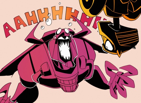

#DAT ART#Thankyou Melly for this meal I have been waiting it's time to scream in tge tags#TFA Bumblebee#TFA Blitzwing#Transformers#Blitzbee#aight screm time hhhhhhhhhhhhhhhhhhh#I saw the preview on twitter n got really excited coz ur art is always so expressive I really really adore the character you put into your#work like bruuuuh lineart takes sooooooooooooooooo long but it's so worth it these are beautiful#You draw Random so beautifully and your Bee is among my favourites#You made robo too can I just appreciate the skill involved in being able to draw the bois as non biped n still robo?#coz I know I been struggling with that but hhhhhhhhhhhhhhhh lookit them#Colors go brrrrrrrrrrr you do such nice colors#Im so hype I was so excited for this to drop#Melly this made my day n it was already good you had a high bar#Me n my friend going bonkers over murms rn this can only fuel the flames m so excited ovo#Thankyou Mellyyyyyyyyy#Aaaaah lemme add on to this cuz there's so many good little details#The reuse of their canon shapes like Bee's pelvis pattern and wheels n the shoe strap around Blitzwing's tail#Blitzwing's cockpit reminding me of some of his movie design just a bit with the more industrial look#Im curious what they transform into cuz Blitzwing is giving off submarine vibes#And I love the old diving suit look the extra chest detail gives#How he's armored but also looks a bit scrapped together#Bee has tires I'm just eeeee I wanna know about the design process so bad#All the tiny details like biolights and rivets#The repeating patterns in circles and tiny rectangles#Its recognizably your style but still pulls off a consistency with their model sheets n that's so satisfying to see
2K notes
·
View notes
Audio

[ID: A completely black image with the words “here’s the thing.” on it in purple. End ID.]

[ID: A digital drawing in a simple, lineless style of a troll from Homestuck from the neck up looking away with an unhappy expression. She has long black hair with a violet streak in the bangs, fins, and horns that curve out and then in again. Violet text to her left says “I can’t do anything right,” End ID.] (All further images are digital drawings in a lineless style.)

[ID: The same image as before, but now the troll has shorter hair (chin-length) and the text says “I can’t do anything right, try as I absolutely totally might.” End ID.]

[ID: A drawing of a troll looking directly at the camera. She has dark gray facepaint covering half her face and with a swirly pattern where it stops, long black hair, and horns that curve backwards. The same face is repeated behind her, slightly faded and with white eyes. Purple text at the top and bottom of the image says “The bones are melting, the skeleton is ash”. End ID.]

[ID: A drawing of a troll looking down with a happy expression. They have short fluffy black hair, horns that curl forward, and are wearing a blue shirt, although we can’t see past their shoulders. Black splatters are scattered across the lower half of the image, in a way that indicated the troll is looking in the direction of the splatters. Blue text says “the clavicle detaches and falls with a deafening crash.” End ID.]

[ID: The same troll as before, but now they look angry and are pointing at something off-camera. Blue text says “And I’m not your protagonist”. End ID.]

[ID: The troll with the violet in her hair from the first pictures is now shown again, with her hand on her cheek, looking thoughtful and unhappy. Violet text above her reads in parentheses “I’m not even my own.” End ID.]

[ID: A close-up of a troll’s face. Their horns go straight out and then curve up, and their hair is a short bob. Their mouth is open and their eyes have been replaced with the Void symbol, which looks like a spiral without the center. A pattern of static and blocks of color has been overlaid to give a glitching effect. Blue text at the top and bottom of the picture reads “I don’t know anything/I don’t even know what I don’t know.” End ID.]

[ID: A series of beige and light green lines indicate the shape of trees. Green text at the bottom of the picture reads “and if you look outside you’ll see disintegrating trees”, but the “disintegrating trees” has an echo effect to it. End ID.]

[ID: A purposely pixelated image of a small troll standing in front of a green background. Due to the pixels, the only details shown are a black shirt, gray pants, and short hair. Red text at the bottom reads “the artificial way the sunlight bounces off the waxy leaves”. End ID.]

[ID: A drawing of a troll standing with her hands held together in front of her. She is wearing a gray hoodie with a pink pocket, black pants, and fuchsia shoes. Her hair is about elbow-length, she has fins, and her horns curve towards each other and are decorated with gold circlets that are linked together. She has splatters of gold on her pants, hoodie, and shoes, and looks upset. Fuchsia text at the top reads “My heart catches on every thorn”. End ID.]

[ID: A drawing of a troll with horns that loop and short, messy hair smiling and looking forward. She’s wearing a purple jacket and is holding the hands of another troll, who we can only see the head of. The other troll has gold blood on them and has four horns which are curvy and black hair that covers their eyes. Stairs are outlined behind the first troll, and fuchsia text reads “You’re already halfway out the door.” End ID.]

[ID: The fuchsia troll is now looking away. Fuchsia text reads “And I have never looked so old.” End ID.]

[ID: The drawing of the troll in the purple jacket again. She is now also looking away and not smiling. Red text at the top of the image reads “and i have never been so cold”. End ID.]

[ID: A drawing showing the fuchsia troll and the one in the purple jacket facing each other in profile, not showing any of their faces. The troll in the jacket is shown to be dragging the body of another troll with four horns, a white coat, black shirt, black shoes and gray pants. There’s gold spots going from the fuchsia troll to the other two. Text fading from fuchsia to red at the top says “and it is 85 degrees.” Gold text with a drippy effect at the bottom says “I don’t know what I need.” End ID.]

[ID: A black background with a wheel of images on it. The images, going counterclockwise from the left, are a gold spiral, a teal circle with three squiggly lines extending from it, a stylized pair of wings in brown, two blue horizontal wavy lines, two vertical red wavy lines, a stylized jade green sun, a purple gear, a olive heart, a stylized fuchsia angry face, a dark blue line with three more lines extending down from it, a simplified violet skull, and a blue spiral without a middle. End ID.]

[ID: A close up of a cup of tea sitting on a bunch of gray rectangles with wavy lines coming off of it indicating steam. Blue text above it reads “There’s lukewarm mango sweet hibiscus tea” End ID.]

[ID: A drawing of a completely gray person lying on their back staring up. They have two blue antennae which form diamond shapes and a yellow stripe across their face and three gray marks on the stripe, indicating eyes. A very large orange cat is partially shown off to one side. Dark blue text at the top reads “on the hot garbage pile in which i fucking sleep”. End ID.]

[ID: A drawing of the troll with four horns, a white coat, and a black shirt, standing upright with their hands to their head and an angry expression. The place where eyes would normally be drawing is a blur of pink and bright blue, and bright pink and blue scribbles are drawn all around them. Gold text says “The walls are empty/It’s so ugly/I could burn the whole place down.” End ID.]

[ID: The troll with horns that go out and then curve up and a black bob is looking offscreen with a concerned expression. Behind them is a blue gradient and spots of blue are going across the picture. Blue text at the bottom says “It wouldn’t catch, cause all the posters are on their way to my hometown.” End ID.]

[ID: A close up of the troll with four horns. Their tongue is sticking out. Their hair covers their eyes, but a faint blue and pink glow is shown coming out from underneath it. They are surrounded by pink hearts and gold stars, some of which have bright pink or blue x’s through them. Gold text reads “And I am not your protagonist.” End ID.]

[ID: A troll with horns that curl forward, a black bob, and an orange scarf is touching a feather quill to a piece of paper. A thick yellow swirl is coming out of the paper and fading to white behind them. Brown text in the white reads “(I’m not even my own...)” End ID.]

[ID: A drawing of a troll sitting on a rooftop. The drawing is from far away, so there’s few details, but the troll is wearing a teal hat with earflaps. Teal text reads “I don’t know anything, I don’t even know, what I don’t know.” End ID.]

[ID: Black lines indicate trees with leaves falling. Gray lines of various shades are all around the black lines, giving it a blurry or shaky effect. Blue text at the top reads “And if you look outside you’ll see, disintegrating trees.” End ID.]

[ID: A picture of a leaf with several overlays and edits to make it appear glitchy. Green text reads “The artificial way the sunlight bounces off the glitching leaves”. End ID.]

[ID: A picture of a troll crying olive tears as they hold out a necklace with a silver heart pendant in front of them. Their teeth are pointy and we can’t see their horns. A pink glow comes from the silver heart. Green text reads “My wet heart catches on every thorn.” End ID.]

[ID: A troll in a purple dress with long black hair and horns that wave backwards is smiling with a sad expression as they reach up to words. Their eyes are fading to white. Their hand is covered in purple and is touching purple words on a door that read “youre already halfway out the door.” End ID.]

[ID: The drawing is divided into three parts vertically. The first shows a close up of a troll frowning. Their eyes are obscured and the background underneath their face is blue. Blue text above them says “And I’m so” and fuchsia text below them says “tiny.” The second shows a troll’s face with their eyes obscured smiling widely. The background is purple. Purple text above reads “And so” and red text below reads “old”. The third is a face with blue and pink x’s in place of eyes and a slightly open mouth. The background is blue. White ext over the face reads “and god it’s never been so cold.” (god is in green.) Gold text below reads “cold”. End ID.]

[ID: A black background with “And it is 85 degrees” in white. End ID.]

[ID: A black background. The text “I don’t know what I need” in a gradient of colors is in the middle, surrounded by hands. The hands are as follows, clockwise from left; a gray hand pointing, a red hand reaching down, streaked with gold, a fuchsia hand with gold splatters in a fist, an olive hand forming half a heart, a violet hand with black fingernails, a blue hand fading into black, a teal hand giving a thumbs up, a purple hand pointing, a green hand with a glitchy effect, a blue hand and a gold hand touching each other (the gold hand has bright blue and pink lines around it), and a brown hand that is covered in slashes of black and gray. End ID.]
PHEW this took me uhhhh literal months?? but here it is! the official Phrogstuck Lyricstuck to Sweet Hibiscus Tea by Penelope Scott!!
#mod masgor#art#in order of appearance#avrune xhedia#zinkaa ciervo#baylie aseret#achlys exdrin#luxioh viridi#phanta masgor#lillie talion#leviat typhon#zessac#kriren rhiase#camrin pyrope#airwan tigrea#and i think that's everyone!
3 notes
·
View notes
Text
Motion 4 For Mac

MotionDeveloper(s)Apple Inc.Stable release
5.4.6 / August 25, 2020; 2 months ago(1)
Operating systemmacOS 10.14.6 or laterSize2.3 GBTypeCompositing/Visual Effects/AnimationLicenseProprietaryWebsiteApple: Motion
Motion is a software application produced by Apple Inc. for their macOSoperating system. It is used to create and edit motion graphics, titling for video production and film production, and 2D and 3D compositing for visual effects.
History(edit)
Mac Motion Chairs With over 35 years of experience in the Home Furnishings Industry and several successful motion seating inventions, Mac Motion Chairs ensures quality comfort and style. With a focus on providing an innovative seating experience to North America, Mac creates European inspired designs. This is the reason that the industry still. Carbide Motion is the machine controller software for all of our Carbide 3D machines. Get Carbide Motion Here. Carbide Create is our 2D CAD/CAM program designed specifically for Carbide 3D machines. Get Carbide Create Here. If you need to download MeshCAM, click here. Carbide Motion V3. Carbide Motion V3 for OS X 10.8. Www.StanislawRobertLuberda.com Free tutorials, Professional Training. In this free tutorial- you will learn a general overview on how Apple Motion works to c.
The original product, codenamed 'Molokini,' was previewed at a NAB event on April 19, 2004.
Version 1.0 was made available on August 11, 2004.(2)
At a pre-NAB event in April 2005, Apple released Motion 2 along with new revisions of the other Pro applications, optimised for the Power Mac G5 and Mac OS X 10.4.Features introduced in Motion 2:(3)
32-bit Rendering
Replicators
New filters
MIDI behavior
After Effects integration
In January 2006 Apple stopped selling Motion as a stand-alone product. Introduced at NAB in Las Vegas on April 15, 2007, Motion 3 was included as part of the Final Cut Studio 2 suite.Features introduced in Motion 3:(4)
3D multiplane environment - 2.5D compositing
3D text behaviors
Vector-based paint strokes
Point tracking and match moving
Image stabilization and SmoothCam
Synchronized Audio behavior
Dynamic retiming behaviors
Advanced Keyframe Editor - keyframe pen tool, transform box
Final Cut Pro integration - Motion 3 master templates
Motion 4 was introduced on July 23, 2009.(5)New features included:(6)
Motion 4 For Macbook Pro
3D Shadows
3D Reflections
Depth of Field
Credit Rolls
Adjust Glyph tool
Parameter Link behavior
Camera framing
Improved Sequence Text behavior, plus new presets
New text generators
New graphics generators
New filters
Multi-touch gesture support
ProRes 4444 support
Background export
Motion 5 was introduced on June 21, 2011.(7) It is available through the Mac App Store at a reduced price of $49.99. Motion 5 is now sold as a stand-alone product.New features:
Final Cut Pro X plugin generation
Parameter rigs
New keyer
64-bit architecture
Motion 5.2 was released on April 13, 2015.New features:(8)
3D text
New generators
Improved shapes
Improved keyframing
Motion 5.3 was released on October 27, 2016.(9)
Wide colour
Improved Link parameter behavior
New Align To behavior
Improved 3D text
Motion 5.4 was released on December 14, 2017 with new features:(10)
360 VR motion graphics support
The ability to switch a current Motion document to be a Motion project, Final Cut Pro generator, Final Cut Pro title, Final Cut Pro effect, or Final Cut Pro transition
New Overshoot animation behavior
New filters for different photographic looks
Import, playback, and editing of HEVC video clips and HEIF photos.
Faster optical flow analysis
Motion 5.4.1 was released on April 9, 2018.(11)New feature:
ProRes RAW
Bug fixes
Motion 5.4.2 was released on November 15, 2018.New features:(12)
Advanced color grading
Comic filter
Tiny Planet filter - for displaying 360° spherical video in non-360° projects
Bug fixes - including use of Core Text engine for improved display of non-roman text
Motion 5.4.3 was released on March 21, 2019.New feature:(13)
Post-macOS Mojave media compatibility checker
See also a release history in context with the rest of Final Cut Studio.
Market position(edit)
Motion is a motion graphics and compositing application similar in some ways to After Effects and Nuke. With version 3, Apple added 3D compositing, vector paint, and motion tracking to Motion's toolbox. This added power, plus the GPU accelerated nature of Motion, allows it to be seen as an alternative to those packages for titling and simple animation projects.
Features(edit)
Features of Motion include the ability to create custom particle effects (as well as using pre-built ones) and to add filters, effects and animations in real time. Motion has the ability to address up to 32 GB of RAM and GPU acceleration at 8-bit, 16-bit and 32-bit float color depths. Motion 2 can also integrate with a MIDI keyboard, so that parameters can be controlled by keys or faders; this opens up the possibility of real time parameter input into Motion. In addition Motion 3 now allows for complete 2D and 3D compositing in a multiplane environment.
Behaviors(edit)
As well as supporting traditional keyframe animation, Motion introduced a system of pre-set 'behaviors' which can be combined to create realistic animations. For instance, the 'throw' behaviour will move an object across the screen. Combined with the 'gravity' behavior, it will simulate a realistic arc of motion. The effects can be tweaked utilizing various parameters, varying the strength of the bounces, the amount of gravity to apply and so on.
This is very different from traditional animation software, which requires the use of keyframes to determine the position of an object at any given time. Such software then automatically creates motion to fill the spaces between the keyframes. This makes it easy to know exactly where objects are on the screen at any given time, but it is considerably more difficult to create realistic animations that build up on different, conflicting forces.
The Replicator and Particle Emitters(edit)
In Version 2 a new 'replicator' function was introduced, which allows an object to be replicated to create a repeating pattern of a specified size and shape. With this tool, it is possible to create animations in which the elements of a replicated pattern move in sequence.
'Particle emitters' allow the user to set a pre-drawn shape to rapidly generate copies of itself and emit them across the screen. The direction and intensity can be adjusted, and combined with behaviors to create very complex animations quickly and easily. For example, a particle emitter used in conjunction with a star shape and the 'vortex' behaviour would animate a circle of swirling stars.
The H.U.D.(edit)
Motion features a floating semi-transparent window ('heads-up display', or HUD) which displays the most commonly altered parameters of the object or effect currently selected. This allows the user to make quick adjustments without having to search through palettes and menus. However, exact numerical values cannot be entered in this window. For more precise editing, consult the Inspector window.
Tools(edit)
Motion has the following tools available for the creation or manipulation of graphics on the canvas:
Anchor point - each object has an 'anchor point' that acts as the centre of rotation or enlargement.
Four Corner, which changes the perspective of objects.
Bézier curve adjustment
Rectangle, ellipse, Bézier curve and B-spline creation tools.
The text tool.
Rectangle, ellipse, Bézier and B-spline masking tools (which define the part of an object that is visible).
These tools can be accessed from the toolbar at the top of the screen or with keyboard commands.
Recording(edit)
Recording is used for adjusting an object over a specific amount of time by placing and manipulating keyframes. The recording button is a red dot button adjacent to the play/pause features. When the button is selected, it lights up red and the dot turns white. Any adjustments made when the button is selected are saved as keyframes. Keyframes act as placeholders that solidify an object's characteristics at a single frame (anything from position and rotation to cropping and size). Using multiple recordings, an object shall reorient itself between the two keyframes to match each set characteristics. Recording can act as an alternative to movement behaviors that allow more in-depth adjustments.
How Motion works(edit)
Motion uses pixel shaders which move the processing of video effects to the Graphics Processing Unit (GPU) of a modern graphics card. Motion is also compatible with Apple's Core Image technology, allowing one to use the Image Units that come standard with Mac OS X Tiger. Like pixel shaders, Core Image 'stacks' various effects, allowing a number of effects to be combined together without slow-down. A faster graphics card improves performance. Motion is also the first Pro App to introduce FxPlug Apple's plug-in architecture that allows for GPU acceleration.
In Motion, users import their own graphics files and use pre-prepared graphics such as text and shapes. Objects can be grouped into layers, but they always retain their own distinct identity. These various parts are then grouped into a single layer. Selecting that layer permits moving all of the objects as a single body..
Similar products(edit)
Nuke – The Foundry
Combustion, Toxik and Smoke – Autodesk
Fusion – Blackmagic Design
Boris RED – Boris FX
While not dedicated to compositing, the open source software Blender contains a limited node-based compositing feature which, among other things is capable of basic keying and blurring effects.(14)
References(edit)
Wiggins, P. (August 2004). Motion 1. First review of Motion'.(1)
Lindsay, A. (November 2004). Motion. DV, 12, 54 – 58.(2)
^https://support.apple.com/HT202203
^'Apple - Motion'. Archive of www.apple.com. Internet Archive Wayback Machine. Archived from the original on August 11, 2004. Retrieved May 15, 2019.
^'Final Cut Studio - Motion'. Archive of www.apple.com. Internet Archive Wayback Machine. Archived from the original on May 11, 2005. Retrieved July 12, 2017.CS1 maint: BOT: original-url status unknown (link)
^'Motion 3. What's New'. Archive of www.apple.com. Internet Archive Wayback Machine. Archived from the original on March 3, 2008. Retrieved July 12, 2017.CS1 maint: BOT: original-url status unknown (link)
^'Apple press release: 'Apple Updates Final Cut Studio with More Than 100 New Features''. www.apple.com. Apple. Retrieved July 12, 2017.
^'What's new in Final Cut Studio'. Archive of www.apple.com. Internet Archive Wayback Machine. Archived from the original on May 19, 2010. Retrieved July 12, 2017.CS1 maint: BOT: original-url status unknown (link)
^'Apple press release: 'Apple Revolutionizes Video Editing With Final Cut Pro X''. www.apple.com. Apple. Retrieved July 12, 2017.
^'Apple support page: 'Motion 5 release notes''. www.apple.com. Apple. Retrieved July 12, 2017.
^'Apple press release: 'Apple releases significant update to Final Cut Pro X''. www.apple.com. Apple. Retrieved July 12, 2017.
^'Apple Releases Motion 5.4 With Support for 360 VR Motion Graphics, HEVC, More'. www.iclarified.com. iClarified. Retrieved April 30, 2018.
^'Apple press release: 'Final Cut Pro X update introduces ProRes RAW and advanced closed captioning''. www.apple.com. Apple. Retrieved May 15, 2019.
^'Apple support page: 'Motion 5 release notes''. www.apple.com. Apple. Retrieved May 15, 2019.
^'Apple support page: 'Motion 5 release notes''. www.apple.com. Apple. Retrieved May 15, 2019.
^'Blender features page'. Retrieved March 19, 2011.
External links(edit)
Motion graphics and animation software
2D3DMixFree and open-sourceClosed-sourceFreeware
Clara.io, Daz Studio
CommercialDiscontinued / Legacy
Retrieved from 'https://en.wikipedia.org/w/index.php?title=Motion_(software)&oldid=975993759'
Motion is the powerful motion graphics tool that makes it easy to create cinematic 2D, 3D, and 360° titles, fluid transitions, and realistic effects in real time. And with its Metal engine, Motion lets you build and play back effects at incredible speeds.
Your graphics in Motion.
Designed with editors in mind, Motion’s streamlined interface and incredible performance lets you create and play back titles, transitions, and effects in real time. Take the guesswork out by seeing your designs without the need to render.
Design in a modern interface that matches the look of Final Cut Pro and puts the focus on your work. Easily locate assets using visual content browsers, then build motion graphics with a logical layers list, full-length timeline, and keyframe editor. It’s simple to customize the interface to match the way you work.
Motion is the best way to build effects for Final Cut Pro projects, including titles, transitions, generators, filters, and more. Save any effect to make it immediately available in Final Cut Pro, where you can apply adjustments right in the video editor. And instantly jump back to Motion at any time for more advanced changes.
Create Smart Motion Templates that include USDZ 3D objects and use them in Final Cut Pro. Publish any parameter to a template, or create rigs that let you control a group of parameters with a simple slider, pop-up menu, or checkbox. If you set up templates with multiple aspect ratios, Final Cut Pro automatically uses the correct layout based on your footage.
Motion boasts an enormous ecosystem of third-party plug-ins and templates that complement the power of the app. Download tools for enhanced tracking and 3D object creation, or choose from thousands of templates with gorgeous titles, transitions, and effects to use as is or customize to fit your project.
With its modern Metal architecture, Motion uses the power of today’s high-performance GPUs to speed up tasks throughout the app and play back motion graphics in real time as you create them. Combine 3D objects, cameras, lights, and emitters with other complex elements, and view your results instantly. And since Motion shares a render engine with Final Cut Pro, you’ll get consistent speed and quality across applications.
New
3D Objects
Quickly import USDZ 3D models, then easily and precisely adjust their position, rotation, and scale using Behaviors or the Keyframe Editor. For even more stunning results, add cameras to a scene or combine objects with emitters, replicators, cameras, and more.
New
Stroke Filter
Easily outline the edges of any video, image, or text element with the Stroke Filter. Create a custom look by choosing from a solid or gradient color, or add multiple strokes using a gradient outline.
Advanced Color Correction
Fine-tune hue, saturation, and brightness with the same advanced color wheels available in Final Cut Pro. Target and adjust specific color ranges by using the eye dropper with color, hue, and saturation curves. Then, view your pristine graphics in stunning HDR on Mac or Pro Display XDR.
Optimized for Mac Pro
Design and create faster than ever before with Motion on the new Mac Pro. Motion takes advantage of all the GPUs in your Mac and uses up to 28 CPU cores in processor-intensive ProRes workflows. Motion is also optimized for the Afterburner card to accelerate ProRes projects, so you can design motion graphics and watch your results instantly in groundbreaking 8K resolution.
Powerful design tools.
Motion features a real-time design engine that lets you see your work immediately, along with a deep set of tools and content for creating and animating complex motion graphics.
Build brilliant 2D, 3D, and 360° compositions by choosing from more than 1,900 Apple-designed, royalty-free graphics — including vector artwork, high-resolution images, animations, and 60 USDZ 3D models that come pre-installed in Motion.

Control the timing and position of elements in your animation using intuitive keyframe tools. Use flexible curve interpolation for smooth parameter changes. Draw curves using a freehand tool, or move, stretch, and condense groups of keyframes using the Transform box.
Create natural-looking motion without the need for complex calculations using preset behaviors like Gravity, Throw, and Vortex. Use Text behaviors that animate letters, words, or lines across the screen. Or apply the Overshoot behavior to easily create spring-loaded animations. You can even combine behaviors for more advanced motion animations.
Create high-quality animated backgrounds with built-in generators — each with parameters to customize the look and style of the animation. Choose from a collection of standard shapes or unique designs. All generators can be used as bump maps or textures on other objects — including 3D text.
A 2D and 3D view of your titles.
Easily create beautiful 2D and 3D titles that you can animate with drag-and-drop behaviors and intuitive text animation tools.
Create text using your favorite fonts and adjust its position, opacity, and rotation. Manipulate vector-based characters with pristine sharpness, and apply Text behaviors to add complex word and character animations easily. Motion is built on the CoreText engine, which ensures that glyphs, characters, and emoji render correctly every time.
Provide 100+ free templates in various styles. To DVDs. Customize DVD menu: change background image & music, adjust aspect ratio, etc. https://loginload815.tumblr.com/post/657331678346379264/mac-burner-for-free. Edit DVD with the crop, trim, rotate, add subtitle, apply effects, etc.
Build 3D titles from scratch, design them with easy-to-use templates, or instantly convert any existing 2D title to 3D. Customize your 3D text with over 90 Apple-designed organic and artificial materials — or create your own — and see your results instantly. You can even choose from a variety of lighting rigs or create depth-of-field effects to give your titles an ultrarealistic look that matches the environment perfectly.
Quickly animate text on or off the screen by choosing from more than 100 behaviors including Type On, Blur Out, and Text-on-a-Path, which sets your text in motion on a trajectory that angles, bends, or twists. You can also create unique animations by moving letters just where you want them.
With text generators you can automate tasks that would take hours to complete by hand. Count up and down in sequence, change text randomly, add a timecode sequence, and more.
Use Credit Rolls to set up a scroll in just a few steps — even for long lists of production credits. Import a text file or type the credits directly into a Motion project, then use the Scroll behavior to automatically animate the speed of the credits based on your project length.
Stunning effects.
Just drag and drop to assemble impressive animations, with a choice of more than 200 filters and effects built into Motion. Then fine-tune your work with precise controls.
Use realistic particle systems to create effects including smoke and sparkles — or add dazzling details to any animation. Choose from over 200 particle presets or design your own and see your creations in real time. Or, create stunning geometric patterns in 2D or 3D using replicators. Go to the next level by adding 3D objects to both particle systems and replicators.
Choose from over 140 paintbrush presets or design your own using color gradients or QuickTime files. Create pressure-sensitive brushstrokes that paint gradient colors or particle dabs. And easily make vector‑based strokes weave through 3D space.
Motion suggests the best tracking points so you can quickly create paths to track moving objects in any clip. You can attach images, particles, filters, paint strokes, or the control points of a mask to any tracking path.
Image stabilization lets you smooth a bumpy camera move or lock down a shaky shot, without time‑consuming setup. And SmoothCam eliminates jitters and bumps — so it looks like your footage was shot on a tripod while still retaining camera moves like pans, tilts, and zooms.
Create an accurate chroma key in a single step with the easy drag-and-drop Keying filter. If the green- or blue-screen background in your footage is unevenly lit, you can use advanced controls, including an intuitive color wheel, to fine-tune adjustments. Plus, you can play back the results without needing to render.
360° video. A new spin on your projects.
Motion features a robust 360 VR motion graphics workflow with real-time visualization for a VR headset, so you can design 360° titles, generators, and filters that perfectly map to your VR scene. Instantly apply those effects to your Final Cut Pro timeline or share to YouTube, Facebook, and Vimeo.
Create 360° titles in 2D and 3D. View them in real time with a VR headset or use the Look Around view to pan across your project in the viewer. 360° titles resize automatically when you move them within your VR scene and can be keyframed to change their look and position over time. Save your work as a 360° Motion template to access it easily in Final Cut Pro.
Design custom 360° graphics or apply bundled effects like 360° blurs, glows, and particle systems to add realism to your VR scene. You can even create 360° generators and place any graphic, still, USDZ 3D object, or video into a 360° project — then reposition and resize to fit.
Motion Controller For Mach 4
Create mind-bending effects with 360° video in non-360° projects. Adjust tilt, pan, roll, and field of view for spherical looks and animations. Then apply keyframes for perspective-inverting effects that change over time.
3D
Motion For Mac
Instantly transition from 2D to 3D space by adding a camera or cameras to any 2D project while preserving your 2D groups. Animate and adjust the cameras to create smooth, realistic 3D movement.
Shadows
Set up point lights and spot lights to cast shadows across objects. Fine-tune shadow appearance by specifying colors and edge types. When you set your elements in motion, shadows animate dynamically with the movement of objects and lights.
Reflections
Turn any shape, video plane, or paint stroke into a reflective surface. Add blur to soften reflections and use the Falloff feature to fade reflections as the object moves away from the light.
FxPlug
FxPlug is a powerful Apple‑designed plug‑in architecture for filters and effects. Choose from more than 130 built-in FxPlug filters and generators. And explore the thriving ecosystem of third‑party FxPlug effects that work in Motion and Final Cut Pro with custom interfaces and incredible real‑time performance.
Play Mario Games online in your browser. Play Emulator has the largest collection of the highest quality Mario Games for various consoles such as GBA, SNES, NES, N64, SEGA, and more. Start playing by choosing a Mario Emulator game from the list below. Nintendo Game Emulators for Mac OS & OS X: Emulate NES Mario games on Mac OS & OS X with:. NEStopia; TI-NESulator; FCEUX; Emulate SNES Mario games on Mac OS & OS X with:. ZSNES; Snes9x; bsnes; FB Alpha; Emulate Nintendo 64 Mario games on Mac OS & OS X with:. Mario emulators for mac. Play online emulators. Play More Games. This website uses cookies to ensure you get the best experience on our website. Play Super Mario Bros. Play online emulators.
Motion 4 Mac
Third-party tools to make your workflow flow.
Choose from thousands of custom transitions, titles, and motion graphics. Work directly with third-party applications through workflow extensions. Or use third-party tools for advanced tracking, EDL and AAF interchange, and more.
Five amazing apps. One powerful collection.
Unleash your creative potential with the Pro Apps Bundle for qualifying college students, teachers, and education institutions. Get all five professional applications for video and music creation at a special price — including Final Cut Pro X, Motion, and Compressor, along with Logic Pro X and MainStage.
0 notes
Text
Sanna Annukka
Growing up, British printmaker and textile designer Sanna Annukka would spend summers in Finland with her grandmother. While there she spent plenty of time outdoors. Sanna points back to these experiences as the main inspiration for her work. She is particularly drawn to culture and art of the indigenous Sami people of Lapland, an area encompassing the far north areas of Scandinavia. The patterns and mythology of other cultures around the world also make it into her designs (“About Sanna”).
Inn 1983, Sanna was born in Brighton, England. She studied illustration at the University of Brighton. The band Keane discovered her prints in a London shop and contacted her to do their album artwork. After this success, she joined the Marimekko team of designers where her work is sold as various housewares and prints. Along with Marimekko she takes on other clients and also has her own online store (“Sanna Annukka”). Despite the subject matter being nature, Sunna’s designs are generally geometric and pattern-heavy. In describing her own work, she says “My style is all about pattern. Simple, bold and folkloric” (Annukka).
“Sunset” is a screenprint. It features a thin rectangle with triangles and angular shapes that follow the edge of the rectangle, all leading up to the top of the print that has a white circle, indicating a sun. Although the patterns are geometric, there are curvilinear shapes as as well, representing hills, waves or another kind of landscape. At the bottom of the print are small triangle and circles, adding texture and detail. The colors are maroon, orange and a gold. White breaks up these colors and leads the eye back up to the sun. Overall, it is a successful, interesting design. The viewer immediately looks at the white circle at the top, then the two white curvilinear shapes directly below start the journey down to the bottom. It was a wise choice to leave the maroon area behind the sun a flat color rather than add more pattern, as it adds drama and a place to rest. My critique of this design is that the viewer isn’t sure what the area below the sun is. While I appreciate the abstraction, Sanna’s other work is a little more clear. The colors are also subdued. I think the gold could be a brighter, warmer yellow. Although the piece is entitled “Sunset,” it feels very cold. Arguably, she could be depicting the cold Arctic landscape she often does in her work, but the color choices are still dull.
“The Fir Tree” is a fairy tale written in 1845 by Danish author/poet Hans Christian Anderson. The story tells about a fir tree unable to appreciate living in the moment and always wishing for bigger and better things until it is too late (“The Fir Tree”). Sanna illustrated this entire book but unfortunately I could only find the cover artwork. The hardcover book is a solid bright green. A large and small tree stand side by side, each made out of a dark green triangle pattern. Gold foil triangles are mixed into the pattern as well, along with negative space shaped like birds’ heads. To the top right of the two trees is a gold foil sun, made out of triangles arranged around the center of the circle. The smaller tree has tiny dots making stripes horizontally along its length. The design as a whole has a limited color palette. The lighter, bright green and the dark green emphasize the story being about a fir tree, even before you read the story. The gold adds a grand, festive feel which is appropriate for a very old fairy tale. The use of any more color or anything other than green would be ineffective. Considering the brightness of the green, other colors would vibrate and clash. The gold is striking, even in its limited use as a third accent color. The sun does not have anything to do with the story but it adds another compositional element and the cover would be empty without it. The font choice for the title has interesting thick and thins that serve as a nice base to the tree illustrations, negating the need for tree trunks or a horizon line. The thin, small caps text of the author and illustrator’s name’s does not take away from the rest of the illustration or the title and was an appropriate choice. Overall, the design of the book cover is successful, with appropriate color and composition choices considering the subject matter of the story.
The album art for the British band’s “Under the Iron Sea” album kickstarted Sanna’s career. Years ago when I saw this album artwork and knew nothing about the band I was drawn to it because of the swirling, organic shapes of the sea monsters/horses and their bodies playing off the shapes of the waves. The cool ocean colors work well. The very dark blue, almost a black, represent an angry and stormy sea effectively. The smallest sea monster with its teals and greens give the entire design depth, as the larger the monsters get the darker the colors and the darker monsters are in the back. This particular creature is also closest to the front and breaks up the large, overbearing shapes of the rest of the creatures, preventing them from becoming one large blob. Three of the dark monsters have red eyes, which are distracting and my least favorite part of the design. The red, although very small parts, is still too much. It would be interesting to see the eyes be the teal or green of the smallest sea monster, which would draw the eye around the design more. The white dots for the other monsters’ eyes are repeated in the bubbles and foam of the waves. There needs to be another cluster of these dots in the bottom middle or bottom right to break up the waves a bit more. The patterning on the monsters helps make up for this. The inside sleeve of the album has an interesting pattern with the turtle/fish creatures and the missile shapes. The pattern is disconnected from the subject matter of the album cover at first glance. However, the design in the center of the record works well and connects these two elements. The viewer can imagine the fish/missiles coming from the sky and disrupting the more uniform wave pattern on the front cover and turning it into the chaos on the record itself.
“Kultakero” is a textile design created by Sanna Annukka for the Marimekko site. It features rolling magenta and red hills with the silhouettes of fir trees against a deep plum background. A gold, orange and plum stripe pattern that reflect the shape of the hills break up the dark colors. A horizontal uneven stripe pattern also breaks up the space and adds texture and interest. The horizontal stripes add contrast to the triangle-shaped fir trees. Although there is a lot of pattern and detail going on in the piece, the dark plum adds a sense of calm. As seen in her other work, Sanna doesn’t let the use of pattern make her designs cold and stiff. The imperfections in the lines and shapes give it life and add to its handmade quality, even though it is a mass-produced fabric in this case. Looking closely, each cluster of horizontal stripes is different from one another. However, the small dot pattern, gold stripes and the trees are exactly the same throughout the design. This piece would be more successful if all the elements were slightly different, like the horizontal stripe motif, and had variations instead of being exact copies.
“Nomadimaa” or “Nomad Land” is a two-color print that utilizes negative space as well as detailed patterning dark, solid shapes. The sun in the top left corner and a few hatched stripes below it is the only orange (and color besides black for that matter) in the entire design. Any other use of color, even the orange, would make break the solid composition of the piece and add confusion. While the compact design is a lot to take in at first, the more time you spend looking the more you will see the patterns and the negative space surrounding make up animals such as the horses and birds. The small trees in the top right make a horizon line with the activities of the wildlife taking place below. The small, thin hatching adds a great deal of texture, but the solid black shapes keep it from taking over. Sanna is a master of utilizing great deals of detail and texture without hindering legibility of the scene, and it is prevalent in this piece. The shapes and patterns have a combination of sharp and curved edges. The curved lines such as the horses’ necks repeat the shape of the sun throughout. This piece is successful because again, Sanna uses pattern but adds imperfections to keep it looking handmade and human. What could be a chaotic and confusing piece is expertly organized into a successful composition because of Sanna’s placement of pattern and shape.
Sanna Annukka’s illustrations are works of art on their own but also work well when applied to textiles and housewares. In each design, Sanna brings the landscape and culture of Finland and combines it with carefully-considered detail and patterning as well as interesting color palette to add life and uniqueness to any application.
Works Cited
"About Sanna." Sanna Annukka. N.p., n.d. Web. 9 Apr. 2017. < https://www.sanna-annukka.com/pages/about-us>
"Sanna Annukka." Finnish Design. N.p., n.d. Web. 9 Apr. 2017. <http://finnishdesign.com/sanna-annukka/>
Annukka, Sanna. Interview with Catherine Lazure-Guinard. Nordic Design. Nordic Design, 2011. Web. 9 Apr. 2017. <http://nordicdesign.ca/profile-sanna-annukka/>.
"The Fir Tree." Hans Christian Andersen: The Fir Tree. Zvi Har'El, 13 Dec. 2007. Web. 10 Apr. 2017. <http://hca.gilead.org.il/fir_tree.html>.

1 note
·
View note
Text
How To Create A Porsche 911 With Sketch (Part 3)
About The Author
Visual and UI/UX Designer, the author of dozens Adobe Photoshop and Sketch tutorials. Espresso addict. Watch enthusiast. More about Nikola Lazarević …
This is the third and final part of the tutorial in which we’ll create the wheels (rims and tires), and add all the final touches (including the racing decals on the car’s body). This tutorial is geared more towards experienced illustrators, but if you’re new to Sketch, you should be able to profit from it, too. As you’ll see, all of the steps are explained in great detail. Still, you may want to read Part 1 and Part 2 first before we dive into the final details of the illustration.
We continue our tutorial with the wheels of our Porsche 911 car, but before we proceed with the next steps, I’d like to shine the spotlight on the famous Fuchs wheels that were designed in the shape of a cloverleaf (or a wing). First, a bit of history:
“The Fuchs wheel is a specialty wheel made for the first Porsche 911/911S model in the early 1960’s. Designed in conjunction with Otto Fuchs KG, Porsche modeler Heinrich Klie, and Ferdinand Porsche Jr., the Fuchs wheel was the first lightweight forged wheel to be fitted to a production automotive vehicle. They provided the rear-engined Porsche 911 sports car with a reduction in unsprung mass, through a strong and lightweight alloy wheel.”
— Source: Wikipedia
We’ll start with the design of the tires first.
Tires
Un-hide the wheel base in the Layers panel. Turn off Borders and set Fills to #2A2A2A. Then, duplicate this shape, change Fills to #000000, move it behind the base wheel (right-click on it and choose Move Backward) and push it 20px to the right.
Tip: Holding Shift + → will move the selection in 10-pixel increments.
Let’s start working on the tire design. (Large preview)
Select the base wheel and add some guidelines to make alignment of all elements easier. To do this, show the Sketch rulers (press Ctrl + R). Then, add a vertical guideline at the center of the base wheel with a click on the upper ruler, and do the same for the horizontal guide on the left ruler.
Add a vertical and a horizontal guideline at the center of the ‘base wheel’. (Large preview)
Temporarily turn off the guidelines by pressing Ctrl + R on the keyboard. Create a tiny rectangle with a width of 2px and a height of 8px, with the Fills set to #000000 and the Borders turned off. This rectangle will serve as the base unit for creating the treads (a.k.a. the tread pattern). Center the rectangle to the base wheel horizontally.
Create the base unit for the treads. (Large preview)
Zoom in close enough (here, I zoomed in to 3200%), choose Transform from the top toolbar, select the top middle point and push it 2px to the right, then select the middle bottom point and push it 2px to the left to make it look slanted.
Note: If you don’t see the Transform tool in the top toolbar, you can add it there via View → Customize Toolbar… or you can use the keyboard shortcut Cmd + Shift + T.
Transform the tread base unit and make it look slanted. (Large preview)
Turn back on the guidelines (Ctrl + R) and make sure this rectangle is selected. Put the rectangle into a group by pressing Cmd + G on the keyboard. Give this group the name treads.
We will use the Rotate Copies tool to create the treads around the wheel base. Like Create Symbol, Rotate Copies can be one of those features that will save you a lot of time and effort!
Note: If you are using Sketch version 67.0 or 67.1, you may experience a bug with Rotate Copies operation. If this happens, you will need to create the treads around the wheel base manually; or (better), you should update to v. 67.2 (or later) where this issue has been resolved.
Make sure the rectangle inside the group treads is selected, then go to Layer → Path → select Rotate Copies. A dialog box that will open will let you define how many additional copies of the selected element to make. Enter 71 so that in total we will have 72 rectangles around the wheel base that will be the treads. Press Rotate in the dialog box. After you have entered this value in the dialog, you will be presented with all of the rectangles and a circular indicator in the middle.
Tip: Performing this step in Sketch is very CPU and memory intensive! If you are working on a modern machine, probably you will not experience any issues; but if your Mac is a bit older, then your mileage may vary. In general, when working with a large number of copies, try to first turn off Borders to avoid getting stuck and to achieve the result of the operation faster.
Use the Rotate Copies feature to create the treads. (Large preview)
Now, move this circular indicator down until it is located precisely at the intersection of the guides — and voilà! we have 72 rectangles evenly placed around the wheel base. When you’re done, press Esc or Enter. Note that if you miss putting the circular indicator (the center of rotation) right at the intersection of the guides, the rectangles won’t be distributed perfectly around the wheel base so be careful.
Note: The Rotate Copies tool doesn’t create a compound shape in the newer versions of Sketch (version 52 or later) and instead creates (and rotates) separate copies of the shape. By putting the first shape into a group we’ve secured that all created and rotated shapes are inside this group named treads.
The ‘treads’ group created. (Large preview)
Select the base wheel again, duplicate, position it above treads in the Layers panel list, and scale it down by 14px. Change Color to #3F3F3F and turn on Borders — set Color to #000000, Position to Inside and Width to 1px.
Continue working on the tire details. (Large preview)
Duplicate this circle, turn off Fills and set the Border Width to 20px. We only want to show 2⁄4 of the Borders — 1⁄4 on the top left side and 1⁄4 on the bottom right side. To do that, type in the Dash field r*π*0.25 where r is diameter of the circle (254px in my case), 0.25 is 25% (or 1⁄4) of the border, and π is 3.14.
So in this case enter the following formula in the Dash field: 254*3.14*0.25, and press Enter (or Tab) on the keyboard.
Note: If you enter a number in the Dash field and press Tab on the keyboard, Sketch will automatically fill the Gap field with the same number. Same thing will happen if you press Enter.
Let’s show only 2/4 of the borders. (Large preview)
Duplicate the circle, scale it down a bit, set the Borders Width to 12px and apply an Angular Gradient with the following properties:
#9D9D9D
#000000
#000000
#595959
#000000
#000000
Set an Angular Gradient on the circle shape. (Large preview)
Then, apply a Gaussian Blur effect with an Amount of 4.
Apply a Gaussian Blur. (Large preview)
Once again, duplicate the circle, turn off Gaussian Blur and scale it down. Turn on Fills, make sure it is still #3F3F3F, set the Borders to Outside position and Width to 1px. Change Color to Linear Gradient and use #000000 for the first color stop and #444444 for the last color stop.
Add Inner Shadows — for the Color use #FFFFFF at 20% Alpha and set Blur to 2; then apply Shadows — for the Color use #000000 at 90% Alpha and set Blur to 2.
The Inner Shadows effect added. (Large preview)
Now it’s the perfect time to add a bit of a texture! Select and copy the wheel base shape, paste it on top, then Move Backward once so it sits just beneath the circle we’ve just created. Set Fills to Pattern Fill, Type to Fill Image and choose the bottom right pattern. Set Opacity for this shape to 10%.
Now add a bit of texture. (Large preview)
Select the circle on top, duplicate, turn off Borders, Inner Shadows and Shadows. Set Fills to #000000 and Opacity to 100% and scale down this circle by 32px. Apply a Gaussian Blur with the Amount of 4.
(Large preview)
Push it down 3px, then duplicate and move the duplicate 6px up.
Duplicate then move the duplicate up. (Large preview)
Duplicate the last circle, turn off the Gaussian Blur, push it down by 3px and scale it down by 4px. Add a Shadows effect with the Color set to #FFFFFF at 90% Alpha and Blur set to 2.
Duplicate the circle again, push and scale it down a bit. Almost there! (Large preview)
Now, duplicate this circle, turn off Shadows and scale it down a bit (by 2px). Turn on Borders, set position to Inside, Width to 1px and apply a Linear Gradient:
#CCCCCC
#A6A6A6
#A4A4A4
#CFCFCF
Apply a Linear Gradient. (Large preview)
Change Fills to Angular Gradient with the following properties (attention! it’s a long list of color stops):
#D3D3D3
#ACACAC
#D8D8D8
#B4B4B4
#8F8F8F
#B2B2B2
#C4C4C4
#A4A4A4
#C3C3C3
#ADADAD
#ADADAD
#949494
#BBBBBB
#929292
#C2C2C2
#B4B4B4
#8F8F8F
#B4B4B4
#D8D8D8
#A9A9A9
Apply an Angular Gradient. (Large preview)
Then, add an Inner Shadows effect — set Color to #000000 at 50% Alpha and set Blur and Spread to 2.
Duplicate, scale it down by 14px, change Fills to #434343 Solid Color, Borders position to Outside, and Inner Shadows properties to: Color #000000 at 90% Alpha, Blur and Spread set to 24.
Then add two Shadows effects:
first — Color: #000000 at 50% Alpha; Y: 2; Blur: 5
second — Color: #000000 at 50% Alpha; Blur: 2
Add two Shadows effects. (Large preview)
Again, duplicate the shape, scale it down by 8px, turn off Fills, Shadows and Inner Shadow, and set Borders Color to #414141.
Duplicate and scale down the circle. (Large preview)
Switch to the Oval tool (O), and draw a circle from the intersection of the guides. Turn off Fills, set Borders Color to #575757, position to Inside and Width to 1px.
Duplicate, scale it down a bit and make sure the border Width is 1px. Repeat this seven more times, so at the end you have nine concentric circles. Make sure that all Borders Width are 1px. Use the image below as reference.
The nine concentric circles. (Large preview)
Select all the concentric circles and put them into a group.
Rims
We will start working on the rim design next.
Draw a circle from the intersection of the guides, then draw a rectangle on top and center it horizontally to the circle.
Start working on the rim design. (Large preview)
Select this rectangle, double-click on it to switch to vector editing mode and move the points until you have something like on the image below. Select the top two points and set the Radius to 20.
Set the radius of the top two points. (Large preview)
We will use Rotate Copies again to distribute this shape around the circle. Select both — circle and the modified rectangle — turn off Borders and place them into a group. Now select the modified rectangle, go to Layer → Path, select Rotate Copies, enter 4 in the dialog box (so we’ll have a total of five shapes), click Rotate, and align the circular indicator to the intersection of the guides. When done, press Esc or Enter.
Use Rotate Copies to distribute this shape around the circle. We’re getting closer to the cloverleaf design! (Large preview)
Select all shapes inside the group and apply a Subtract operation from the top toolbar. Add Inner Shadows effect — for the Color use #FFFFF at 50% Alpha and set Blur to 2. Then apply Shadows with Color set to #000000 at 70% Alpha and both Blur and Spread set to 2. Finally, change Fills to #000000.
Subtract, add Inner Shadows and Shadows, change Fills to black. (Large preview)
Draw a circle from the intersection of the guides but make it a bit bigger than the shape below, then draw a shape and center it horizontally to the circle. Select both, turn off Borders and put them into a group. Select the shape and perform a Rotate Copies operation. Enter 4 in the dialog box (so again, we’ll have a total of five shapes), click Rotate, and align the circular indicator to the intersection of the guides. When ready, press Esc or Enter.
The Rotate Copies feature is useful again. (Large preview)
Select all shapes inside the group and apply a Subtract operation from the top toolbar. Add an Inner Shadows effect — for the Color use #FFFFF at 50% Alpha and set Blur to 2. Change Fills to #131313.
Subtract, then add Inner Shadows. (Large preview)
Now, we will create one rim bolt head.
Zoom in close enough (I zoomed in to 400%) and draw a circle. Set Fills to #4F4F4F, change Borders position to Outside, Width to 1px and use #8F8F8F for the Color. Add one more border but this time use #000000 for the Color, set position to Center and make sure the Width is 1px.
Create a bolt head — first steps. (Large preview)
Draw a rectangle in the middle of the circle, turn off Borders, enter vector editing mode, hold Shift and click on the right segment to add a point in the middle, then do the same for the left segment. Push those points 2px to the left and to the right to create a hexagonal shape. Apply a Linear Gradient for the Fills — use #AEAEAE for the top and #727272 for the bottom color stop. Add Inner Shadows using #000000 at 50% Alpha for the Color and set Blur to 2, and apply Shadows using #000000 at 90% Alpha for the Color and set Blur to 2.
Continue working on the bolt head. (Large preview)
Duplicate the hexagonal shape, enter vector editing mode, select all the point on the left side and push them 1px to the right, then select all top points and push them 1px down, push the bottom points 1px up and the right points 1px left. Clear the Shadows and modify the Linear Gradient:
#8F8F8F
#979797
#A4A4A4
#636363
#4A4A4A
Now apply an Inner Shadows effect. For the Color use #000000 with 50% Alpha and set Blur to 2.
The bolt head details, now with the gradient applied. (Large preview)
Select all the shapes that we used to create the bolt head and group them into a bolt head group. We can Create Symbol out of the bolt head group and we can use it as many time as we need it.
To create the new Symbol, select the bolt head group, right-click on it, and choose Create Symbol from the menu. The dialog box Create New Symbol will appear, give a name to the symbol (bolt head) and click OK.
Now we need to distribute the bolt head symbols around the circle. Duplicate the symbol, choose Rotate from the top toolbar, drag the crosshair marker to the the intersection of the guides, and rotate it 72 degrees. Continue duplicating and rotating the symbol in 72-degree increments, without letting the selection go.
Distribute the ‘bolt head’ symbols around the circle. (Large preview)
Now select each symbol instance and adjust the angle of rotation to 0 degrees.
Tip: I’m suggesting to initially adjust the angle to 0 degrees so that you can better see the process and how the bolts will look like when placed on the rim. Once the rim bolts are in place, though, my recommendation is to experiment some more and try setting a different angle of rotation for each bolt symbol. This will make the wheels look more realistic — after all, in real life it’s much more likely to see rim bolts at random angles than aligned perfectly to 0 degrees!
Finally, select all the instances of the bolt head symbol, place them into a group bolts and perform a Move Backward once.
The group ‘bolts’ is now finished. (Large preview)
Draw a shape, set Border Color to #CFCFCF, set Width to 1px and position to Inside, and use a Linear Gradient for the Fills:
#5F5F5F
#B5B5B5
#CBCBCB
Then add Inner Shadows effect using #000000 at 30% Alpha, and Blur set to 2.
Continue working on the rim details. (Large preview)
Grab the Vector tool (V) and draw two shapes that we will use for the highlights. Use a Linear Gradient for the Fills — use for the top color stop #F3F3F3 at 100% Alpha and the same color for the bottom but at 0% Alpha. Use the same gradient settings for both shapes and also apply a Gaussian Blur with the Amount of 1 to both shapes.
Create the highlights. (Large preview)
Select all shapes that we’ve just created, group them and distribute them evenly around the rim. Use the same method that we used for the bolt heads.
Distribute the shapes around the rim. (Large preview)
Select the Oval tool (O) and draw a circle from the intersection of the guides. Turn off Borders and use Linear Gradient with colors set to #D8D8D8 for the top stop and #848484 for the bottom stop. Use Inner Shadows and Shadows to make it look slightly raised.
Let’s add a light Inner Shadows effect with the following properties:
Color: #FFFFFF at 80% Alpha
Blur: 2
Then, add a dark Inner Shadows effect:
Color: #000000 at 50% Alpha
Blur: 2
Finally, apply a Shadows effect:
Color: #000000 at 50% Alpha
Blur: 2
Spread: 1
Create the circle in the middle and apply all the styles. (Large preview)
Duplicate this circle, scale it down a bit, turn off Inner Shadows and Shadows, turn on Borders and add the first border:
Color: #B5B5B5;
Position: Outside
Width: 1px
Then add a second one on the top:
Color: #656565
Position: Center
Width: 1px
Work on the details in the center of the rim. (Large preview)
Let’s finish the wheel design by adding to the rim the Porsche emblem.
Note: Recreating the original Porsche logo for the rims, all in vectors, is outside of the scope of this tutorial. There are a few options — you can create it yourself by following the same basic principles outlined on these pages; you can download the logo from Wikipedia in SVG format and then try to modify it; or you can download a copy of the logo in vector lines from my website (porsche-line-logo-f.svg). This copy of the Porsche logo was created by me from scratch, all in vectors, and this is the variant that I recommend you to use.
After downloading the logo file (porsche-line-logo-f.svg) bring it into our design.
Switch to the Scale tool in the top toolbar, and in the dialog box enter 20px in the height field, to adjust the size of the logo. Align the logo horizontally with the circle below.
Add the Porsche logo to the center of the rim. (Large preview)
The Porsche emblem in the center of the rim (detail close-up). (Large preview)
Completing the wheels — two possible workflows
Since a copy of the front wheel (once it’s complete) will be used more than once in our illustration, we have two options now:
A. We can complete the front wheel design, duplicate the wheel, make a couple of tweaks, and use the duplicate as the rear wheel. This is the easiest variant.
B. Or, for learning purposes, we can use a workflow involving the use of nested symbols. This is the more interesting option which I’ll explore in more detail in a bit. Buckle up!
A. Workflow #1: duplicate the wheel and adjust the copy
Pick up the Vector tool (V) and draw a shape on top of the wheel. Turn off Borders and Fill the shape with black #000000 color. Apply Gaussian Blur with an Amount of 10. This way we will recreate the shadow from the car body over the wheel — just an extra bit of realism added.
Add the shadow from the car body over the wheel. (Large preview)
Select the wheel group, wheel base copy layer and the shadow shape layer and group these into a front wheel group.
Create the ‘front wheel’ group. (Large preview)
Now that the wheel is ready, duplicate the front wheel group, rename the group in the Layers panel list to rear wheel and drag it to the right to its place.
[Move the ‘rear wheel’ group to its place. (Large preview)
Select the wheel group inside and push it 20px to the right, then select the wheel base copy layer and push it 20px to the left. The rear wheel is ready.
Move the ‘wheel’ group to the right, and the ‘wheel base copy’ layer to the left. The ‘rear wheel’ group is ready. (Large preview)
B. Workflow #2: use nested symbols
Pick up the Vector tool (V) and draw a shape on top of the wheel. Turn off Borders and Fill the shape with black #000000 color. Apply Gaussian Blur with an Amount of 10. This way we will recreate the shadow from the car body over the wheel — just an extra bit of realism added.
Add the shadow from the car body over the wheel. (Large preview)
The wheel is finished. Now we’ll use a symbol and a nested symbol to create the front and rear wheels.
Select the wheel group, wheel base copy layer and the shadow shape layer and group these into a front wheel group.
Create the ‘front wheel’ group. (Large preview)
Here we’re coming to the more interesting bits! Select the wheel group and create a wheel symbol, then select the front wheel and create a front wheel symbol. The front wheel symbol is now a nested symbol!
Tip: You can learn more about nested symbols in the Sketch help pages dedicated to this topic, and in the following article written by Noam Zomerfeld.
Nested symbols are regular symbols that are made from other symbols that already exist in your Sketch file. In this case, the front wheel symbol is made from the wheel symbol, so the wheel symbol is nested inside the front wheel symbol.
What could be better than one symbol? Perhaps a symbol with another one inside it — enter Nested Symbols! This feature gives you a lot of possibilities when combining symbols together. Nesting symbols can be especially useful when you need to create variations of one symbol. — Javier-Simon Cuello, “Unleashing The Full Potential Of Symbols In Sketch”
Now, go to the Symbols page in Sketch, duplicate the front wheel symbol, select the wheel group and push it 20px to the right, then select the wheel base copy and push it 20px to the left. At the end, rename this symbol to rear wheel.
Front and rear wheel symbols. (Large preview)
Go back to our design, select and duplicate the front wheel symbol, then using the Inspector panel change the symbol to rear wheel, rename the symbol in the Layers panel list to rear wheel and drag it to the right. Done!
So far it may seem that we’ve spent more time playing with nested symbols, compared to the other workflow. That’s true. But also we have learned how to use this feature — and now if you would like to change the design of the wheels, instead of doing so in two separate groups, you’ll need to do it only once inside the wheel symbol and the changes will be automatically applied to both wheels of the car. This is why we used a nested symbol to create the front and rear wheels. (Also, imagine if you’re working on a design of a vehicle that has many more wheels visible from the side, not only two! The time saved will multiply.)
Back to the bigger picture — with the wheels complete, we are very close to the final design. Let’s take a look.
The Porsche 911 should look similar to this now. (Large preview)
The Shadow Under the Wheels and the Car Body
Pick the Oval tool and draw an ellipse under the wheels. Set Fills to #000000 with 80% Opacity, turn off Borders and apply a Gaussian Blur with an Amount of 5.
Start making the shadow below the car. (Large preview)
Duplicate the oval shape, adjust the width using Resize handles (make it smaller), and set Fills Opacity to 50%.
Add one more oval shape. (Large preview)
Duplicate this shape once again, adjust the width, and set Fills Opacity for this layer to 80%.
And one more. (Large preview)
Select the shadow ellipses and group them all into a shadows group. Move this group to the very bottom in the Layers panel list.
17. Final Touches — The Racing Decals
We are almost there! It’s time to add some racing decals to the car body and to the windshields.
Try to find some inspiration for the racing decals and stickers. (Large preview)
The Porsche sticker
Jump over to the Wikimedia Commons website and download the Porsche Wortmarke in SVG format. Bring it to our design, scale it up and position it like on the image below.
The ‘Porsche Wortmarke’ added to the door. (Large preview)
Create some rectangles using the Rectangle tool (R), set Fills to #0F0F13 and turn off Borders. Select all elements and group them into a porsche sticker group, then drag this group inside bodywork just below the door layer.
Add some decoration around the ‘Porsche’ sticker letters. (Large preview)
Shell sticker
Next, download the vintage Shell logo in SVG format and open it in Sketch. Delete the white rectangle at the bottom inside the logo group, then copy and paste it into our design. Place it just above the porsche sticker in the Layers panel list and position it like on the image below.
Add the vintage Shell logo sticker. (Large preview)
Dunlop sticker
Download the Dunlop logo in SVG format, open it in Sketch and delete the yellow rectangle. Bring it to our design, scale it down a bit and place in close to the tail light. Make sure that the logo is inside the bodywork group, right above the Shell logo in the list of layers.
Add the Dunlop logo sticker. (Large preview)
Marlboro sticker
Get the SVG version of the Marlboro logo from Wikimedia Commons, paste into our design and scale it down. Use the resize handles to squeeze the red shape, then move the letters up, close to the red shape, and finally change Fills for the red shape to Linear Gradient with the following parameters:
#E60202
#BB0101
#860000
Add and modify the Marlboro logo sticker. (Large preview)
Please make sure that this logo is inside bodywork group and above “Dunlop” logo.
Heuer Chronograph sticker
Download and open in Sketch the Tag Heuer SVG logo. Delete everything except: the rectangle with the black border, the red rectangle, and the word “Heuer”.
Select the rectangle with the black border, turn off Borders and change Fills to #CC2132. Next, select the inner red rectangle, turn on Borders, set Color to #FFFFFF, position to Outside and Width to 12px. Then use the Type tool (T) and type the word Chronograph — for the font use Helvetica Bold, with the size set to 72px.
Note: If you don’t have Helvetica Bold installed, use a font similar in appearance (for example, Arial Bold), as this scale it would be difficult to spot the differences.
Convert the text block into vector shapes, by right-clicking on it and selecting Convert to Outlines. Finally, select the bigger red rectangle, enter vector editing mode, select the top two points and push them down a bit. Select everything and place all the elements into a heuer chronograph logo group.
Create the ‘heuer chronograph logo’ group. (Large preview)
Bring this modified logo to our design, scale it down and place it onto the car body. Like before, make sure it’s inside bodywork, and it’s above the Marloboro logo.
Put the Heuer Chronograph sticker on the car, to the left of the driver’s door. (Large preview)
Porsche Crest Badge
Jump over to Wikimedia and download the Porsche logo in SVG format. We will need to modify and simplify it a bit because it’s too complex and we don’t need all of these details for the scale at which we’ll be using it in our illustration.
Open the SVG logo file in Sketch, and first delete all the groups (amw-link and d-link) inside it. Then, select the shape on top, press Enter to switch to vector editing mode, select the word “Porsche” and the registered trademark symbol and delete them as well.
Start modifying the Porsche logo. (Large preview)
Next, click on the arrow in the front second crest compound shape to reveal its components, select the four paths and drag them outside the compound path, then change their color to #B12B28. Reveal the contents of the first compound crest shape, select all the paths that form the word “Porsche” and delete them.
The Porsche crest logo is now complete. (Large preview)
Bring the modified Porsche crest logo to our design, scale it down, select the path that is the last one inside the Porsche logo group and add a Shadows effect — for the Color use #000000 at 50% Alpha and set Blur to 2.
Put the Porsche crest logo in place on the car body. (Large preview)
The Porsche crest badge should be placed inside the bodywork group just like the previous stickers that we added, above the heuer chronograph logo group.
Rallye Monte-Carlo sticker
Draw a rounded rectangle using the Rounded Rectangle tool (U), enter vector editing mode and add and move the vector points to make the shape like on the image below.
Set Color to #9C010E and turn off Borders. Duplicate this shape, change Color to, i.e., #000000 so you can see better what you are doing, enter vector editing mode, select the top points and push them down a bit. Push by the same distance the right points to the left, and the left points to the right. Then push up the bottom points a bit more.
Turn off Fills, turn on Borders with position set to Inside, Width set to 6px, and Color to #D7CB82. Convert Borders into a shape by going to Layer → Convert to Outlines.
Start working on the Rallye Monte-Carlo sticker. (Large preview)
Draw a rectangle without Borders, set Color to #D7CB82, enter vector editing mode, add points in the middle of the top and bottom segment, and push them up and down a bit. Type the words: “SIEGER, WINNER, VAINQUEUR, 1968”. For the font use Helvetica Bold (or alternatively Arial Bold) with the #9C010E Color. Add the Porsche Wortmarke (we’ve used it earlier, remember?) to the bottom, and set Color to #D7CB82.
Add the shape, text, and the ‘Porsche Wortmarke’. (Large preview)
Convert text to outlines, select the “1968” shape on the left side of the rectangle, zoom in and use Transform from the top toolbar to modify the shape:
select the middle point on the right side and push it up a bit;
select the bottom point on the right side and push it down the same amount of pixels.
Perform a similar action for the “1968” on the right side of the rectangle, but this time use the middle and bottom points on the left side.
Continue adding the details to the Rallye Monte-Carlo sticker. (Large preview)
Type “RALLYE” “MONTE” “-CARLO” as a three separate words, use the same font and change the Color to #D7CB82.
Again, do a Convert to Outlines action and use Transform from the top toolbar to modify the shapes. I won’t go much into details here, but first modify the words “RALLYE” and “-CARLO” by using the method outlined above. Then, select all three shapes (the words), invoke the Transform tool, select the middle top point and push it up a bit to make the shapes elongated, and finally scale it up a bit by holding Alt + Shift on the keyboard while dragging the top right Resize handle. Use the image below as a reference.
The Rallye Monte-Carlo sticker finished. (Large preview)
Select and group all the elements we used to create this sticker into a rallye monte-carlo group, bring it into our design, and put it on the side windshield. In the Layers panel list this sticker should be inside the windshields group on top.
Put the Monte-Carlo sticker on the side windshield. (Large preview)
Smashing Magazine Sticker
This is the last sticker we are going to put on the car. Download the Smashing Magazine logo in SVG format, open it in Sketch and draw a red (#D33A2C) rectangle below the logo. Select both, create a group Smashing Magazine sticker, copy and paste into our design. Place it next to Rallye Monte Carlo sticker and scale it if needed.
In the Layers panel list this should be inside the windshields group on top.
The Smashing Magazine sticker added. (Large preview)
I encourage you to add even more decals to the car body and the side windshield. Use the image below as a source for your inspiration.
Note: These are just examples and recreating all the decals in vectors is outside of the scope of this tutorial. You can apply the principles learned from this tutorial and tweak the decals in vector format in a similar way.
Some side windshield decals examples. (Large preview)
The Porsche 911 car body decals examples. (Large preview)
Racing Number and Drivers Names
One more important detail — since this car is a racing car we need to add a racing number to it.
Download the Montserrat font family (if you don’t have it already), install only the “Montserrat Bold” font variant, and type the racing number. Set the Size to 180px and the Color to #000000. Then, Convert to Outlines to be able to apply a gradient to the racing number, and change Fills to a Linear Gradient:
#22222B
#3E3E42
#656566
#1B1B1E
#0F0F13
Add the racing number. (Large preview)
Now add the drivers’ last names. I will add shamelessly my last name and the last name of one of my best friends, Ivan Minic. Use the Text tool to add the names, for the font use again “Montserrat Bold”, set Size and Line to 20px and Color to #2F2F2F.
Add the drivers’ last names. (Large preview)
Select the names and the racing number, and move them inside the bodywork group, just above the door layer.
Select and put all elements created so far into one group — Porsche 911. Our Porsche 911 is now officially finished!
The Porsche 911 in all its glory! Great job! (Large preview)
Finally, let’s add a background. Create a rectangle of the same size as the artboard, set the Fills to #F4F3F2, and push it below the Porsche 911 group.
Final image 3/3: Add the background and complete the Porsche 911 tutorial illustration! (Large preview)
Conclusion
We’ve put a lot of time and effort to reach the final destination and now you know too how to create all in vectors one of my favorite cars, the original Porsche 911 from 1968, in Sketch app.
The tutorial probably wasn’t too easy, but the end results were well worth it, in my opinion.
The next step, of course, is to design your own favorite car. Select a car (or another object you like) and be sure to find as many photos of it from different angles, so that you can carefully replicate all of the important details.
More car illustrations for your inspiration — these are some of other racing cars that I’ve been creating in Sketch recently. (Large preview)
As you can see, there are certain tools and features in Sketch that you can master to create similar objects — use them to speed up and simplify the whole process.
I hope you will also remember how important is the proper naming of the layers/shapes (and groups), and stacking them in the right order so that even the most complex of illustrations are easy to organize and to work with.
Finally, if you have any questions, please leave a comment below or ping me on Twitter (@colaja) and I will gladly help you.
Further Reading
“Mastering the Bézier Curve in Sketch” (a tutorial by Peter Nowell)
“Designing A Realistic Chronograph Watch In Sketch” (a tutorial by Nikola Lazarević)
“Styling — Fills” (Sketch help page)
“Harnessing Vector Awesomeness in Sketch” (a tutorial by Peter Nowell)
“Vector Editing (and Vector Editing Mode)” (Sketch help page)
“Shapes” (Sketch help page)
“Copy styles in Sketch” (a tutorial by Drahomír Posteby-Mach)
“Getting the pixels right in Sketch” (a tutorial by Nav Pawera)
“Sketch Symbols, Everything you need to know, and more!” (a tutorial by Brian Laiche)
“Unleashing The Full Potential Of Symbols In Sketch” (an article by Javier Simon Cuello)
“How to Edit Shapes with Rotate Copies tool” (Sketch help page)
“Creating Nested Symbols” (Sketch help page)
“Nested Symbols in Sketch — I you” (a tutorial by Noam Zomerfeld)
“Unleashing The Full Potential Of Symbols In Sketch: Nested Symbols” (a tutorial by Javier Cuello)
(mb, ra, yk, il)
Website Design & SEO Delray Beach by DBL07.co
Delray Beach SEO
source http://www.scpie.org/how-to-create-a-porsche-911-with-sketch-part-3/ source https://scpie1.blogspot.com/2020/08/how-to-create-porsche-911-with-sketch_8.html
0 notes
Text
How To Create A Porsche 911 With Sketch (Part 3)
About The Author
Visual and UI/UX Designer, the author of dozens Adobe Photoshop and Sketch tutorials. Espresso addict. Watch enthusiast. More about Nikola Lazarević …
This is the third and final part of the tutorial in which we’ll create the wheels (rims and tires), and add all the final touches (including the racing decals on the car’s body). This tutorial is geared more towards experienced illustrators, but if you’re new to Sketch, you should be able to profit from it, too. As you’ll see, all of the steps are explained in great detail. Still, you may want to read Part 1 and Part 2 first before we dive into the final details of the illustration.
We continue our tutorial with the wheels of our Porsche 911 car, but before we proceed with the next steps, I’d like to shine the spotlight on the famous Fuchs wheels that were designed in the shape of a cloverleaf (or a wing). First, a bit of history:
“The Fuchs wheel is a specialty wheel made for the first Porsche 911/911S model in the early 1960’s. Designed in conjunction with Otto Fuchs KG, Porsche modeler Heinrich Klie, and Ferdinand Porsche Jr., the Fuchs wheel was the first lightweight forged wheel to be fitted to a production automotive vehicle. They provided the rear-engined Porsche 911 sports car with a reduction in unsprung mass, through a strong and lightweight alloy wheel.”
— Source: Wikipedia
We’ll start with the design of the tires first.
Tires
Un-hide the wheel base in the Layers panel. Turn off Borders and set Fills to #2A2A2A. Then, duplicate this shape, change Fills to #000000, move it behind the base wheel (right-click on it and choose Move Backward) and push it 20px to the right.
Tip: Holding Shift + → will move the selection in 10-pixel increments.
Let’s start working on the tire design. (Large preview)
Select the base wheel and add some guidelines to make alignment of all elements easier. To do this, show the Sketch rulers (press Ctrl + R). Then, add a vertical guideline at the center of the base wheel with a click on the upper ruler, and do the same for the horizontal guide on the left ruler.
Add a vertical and a horizontal guideline at the center of the ‘base wheel’. (Large preview)
Temporarily turn off the guidelines by pressing Ctrl + R on the keyboard. Create a tiny rectangle with a width of 2px and a height of 8px, with the Fills set to #000000 and the Borders turned off. This rectangle will serve as the base unit for creating the treads (a.k.a. the tread pattern). Center the rectangle to the base wheel horizontally.
Create the base unit for the treads. (Large preview)
Zoom in close enough (here, I zoomed in to 3200%), choose Transform from the top toolbar, select the top middle point and push it 2px to the right, then select the middle bottom point and push it 2px to the left to make it look slanted.
Note: If you don’t see the Transform tool in the top toolbar, you can add it there via View → Customize Toolbar… or you can use the keyboard shortcut Cmd + Shift + T.
Transform the tread base unit and make it look slanted. (Large preview)
Turn back on the guidelines (Ctrl + R) and make sure this rectangle is selected. Put the rectangle into a group by pressing Cmd + G on the keyboard. Give this group the name treads.
We will use the Rotate Copies tool to create the treads around the wheel base. Like Create Symbol, Rotate Copies can be one of those features that will save you a lot of time and effort!
Note: If you are using Sketch version 67.0 or 67.1, you may experience a bug with Rotate Copies operation. If this happens, you will need to create the treads around the wheel base manually; or (better), you should update to v. 67.2 (or later) where this issue has been resolved.
Make sure the rectangle inside the group treads is selected, then go to Layer → Path → select Rotate Copies. A dialog box that will open will let you define how many additional copies of the selected element to make. Enter 71 so that in total we will have 72 rectangles around the wheel base that will be the treads. Press Rotate in the dialog box. After you have entered this value in the dialog, you will be presented with all of the rectangles and a circular indicator in the middle.
Tip: Performing this step in Sketch is very CPU and memory intensive! If you are working on a modern machine, probably you will not experience any issues; but if your Mac is a bit older, then your mileage may vary. In general, when working with a large number of copies, try to first turn off Borders to avoid getting stuck and to achieve the result of the operation faster.
Use the Rotate Copies feature to create the treads. (Large preview)
Now, move this circular indicator down until it is located precisely at the intersection of the guides — and voilà! we have 72 rectangles evenly placed around the wheel base. When you’re done, press Esc or Enter. Note that if you miss putting the circular indicator (the center of rotation) right at the intersection of the guides, the rectangles won’t be distributed perfectly around the wheel base so be careful.
Note: The Rotate Copies tool doesn’t create a compound shape in the newer versions of Sketch (version 52 or later) and instead creates (and rotates) separate copies of the shape. By putting the first shape into a group we’ve secured that all created and rotated shapes are inside this group named treads.
The ‘treads’ group created. (Large preview)
Select the base wheel again, duplicate, position it above treads in the Layers panel list, and scale it down by 14px. Change Color to #3F3F3F and turn on Borders — set Color to #000000, Position to Inside and Width to 1px.
Continue working on the tire details. (Large preview)
Duplicate this circle, turn off Fills and set the Border Width to 20px. We only want to show 2⁄4 of the Borders — 1⁄4 on the top left side and 1⁄4 on the bottom right side. To do that, type in the Dash field r*π*0.25 where r is diameter of the circle (254px in my case), 0.25 is 25% (or 1⁄4) of the border, and π is 3.14.
So in this case enter the following formula in the Dash field: 254*3.14*0.25, and press Enter (or Tab) on the keyboard.
Note: If you enter a number in the Dash field and press Tab on the keyboard, Sketch will automatically fill the Gap field with the same number. Same thing will happen if you press Enter.
Let’s show only 2/4 of the borders. (Large preview)
Duplicate the circle, scale it down a bit, set the Borders Width to 12px and apply an Angular Gradient with the following properties:
#9D9D9D
#000000
#000000
#595959
#000000
#000000
Set an Angular Gradient on the circle shape. (Large preview)
Then, apply a Gaussian Blur effect with an Amount of 4.
Apply a Gaussian Blur. (Large preview)
Once again, duplicate the circle, turn off Gaussian Blur and scale it down. Turn on Fills, make sure it is still #3F3F3F, set the Borders to Outside position and Width to 1px. Change Color to Linear Gradient and use #000000 for the first color stop and #444444 for the last color stop.
Add Inner Shadows — for the Color use #FFFFFF at 20% Alpha and set Blur to 2; then apply Shadows — for the Color use #000000 at 90% Alpha and set Blur to 2.
The Inner Shadows effect added. (Large preview)
Now it’s the perfect time to add a bit of a texture! Select and copy the wheel base shape, paste it on top, then Move Backward once so it sits just beneath the circle we’ve just created. Set Fills to Pattern Fill, Type to Fill Image and choose the bottom right pattern. Set Opacity for this shape to 10%.
Now add a bit of texture. (Large preview)
Select the circle on top, duplicate, turn off Borders, Inner Shadows and Shadows. Set Fills to #000000 and Opacity to 100% and scale down this circle by 32px. Apply a Gaussian Blur with the Amount of 4.
(Large preview)
Push it down 3px, then duplicate and move the duplicate 6px up.
Duplicate then move the duplicate up. (Large preview)
Duplicate the last circle, turn off the Gaussian Blur, push it down by 3px and scale it down by 4px. Add a Shadows effect with the Color set to #FFFFFF at 90% Alpha and Blur set to 2.
Duplicate the circle again, push and scale it down a bit. Almost there! (Large preview)
Now, duplicate this circle, turn off Shadows and scale it down a bit (by 2px). Turn on Borders, set position to Inside, Width to 1px and apply a Linear Gradient:
#CCCCCC
#A6A6A6
#A4A4A4
#CFCFCF
Apply a Linear Gradient. (Large preview)
Change Fills to Angular Gradient with the following properties (attention! it’s a long list of color stops):
#D3D3D3
#ACACAC
#D8D8D8
#B4B4B4
#8F8F8F
#B2B2B2
#C4C4C4
#A4A4A4
#C3C3C3
#ADADAD
#ADADAD
#949494
#BBBBBB
#929292
#C2C2C2
#B4B4B4
#8F8F8F
#B4B4B4
#D8D8D8
#A9A9A9
Apply an Angular Gradient. (Large preview)
Then, add an Inner Shadows effect — set Color to #000000 at 50% Alpha and set Blur and Spread to 2.
Duplicate, scale it down by 14px, change Fills to #434343 Solid Color, Borders position to Outside, and Inner Shadows properties to: Color #000000 at 90% Alpha, Blur and Spread set to 24.
Then add two Shadows effects:
first — Color: #000000 at 50% Alpha; Y: 2; Blur: 5
second — Color: #000000 at 50% Alpha; Blur: 2
Add two Shadows effects. (Large preview)
Again, duplicate the shape, scale it down by 8px, turn off Fills, Shadows and Inner Shadow, and set Borders Color to #414141.
Duplicate and scale down the circle. (Large preview)
Switch to the Oval tool (O), and draw a circle from the intersection of the guides. Turn off Fills, set Borders Color to #575757, position to Inside and Width to 1px.
Duplicate, scale it down a bit and make sure the border Width is 1px. Repeat this seven more times, so at the end you have nine concentric circles. Make sure that all Borders Width are 1px. Use the image below as reference.
The nine concentric circles. (Large preview)
Select all the concentric circles and put them into a group.
Rims
We will start working on the rim design next.
Draw a circle from the intersection of the guides, then draw a rectangle on top and center it horizontally to the circle.
Start working on the rim design. (Large preview)
Select this rectangle, double-click on it to switch to vector editing mode and move the points until you have something like on the image below. Select the top two points and set the Radius to 20.
Set the radius of the top two points. (Large preview)
We will use Rotate Copies again to distribute this shape around the circle. Select both — circle and the modified rectangle — turn off Borders and place them into a group. Now select the modified rectangle, go to Layer → Path, select Rotate Copies, enter 4 in the dialog box (so we’ll have a total of five shapes), click Rotate, and align the circular indicator to the intersection of the guides. When done, press Esc or Enter.
Use Rotate Copies to distribute this shape around the circle. We’re getting closer to the cloverleaf design! (Large preview)
Select all shapes inside the group and apply a Subtract operation from the top toolbar. Add Inner Shadows effect — for the Color use #FFFFF at 50% Alpha and set Blur to 2. Then apply Shadows with Color set to #000000 at 70% Alpha and both Blur and Spread set to 2. Finally, change Fills to #000000.
Subtract, add Inner Shadows and Shadows, change Fills to black. (Large preview)
Draw a circle from the intersection of the guides but make it a bit bigger than the shape below, then draw a shape and center it horizontally to the circle. Select both, turn off Borders and put them into a group. Select the shape and perform a Rotate Copies operation. Enter 4 in the dialog box (so again, we’ll have a total of five shapes), click Rotate, and align the circular indicator to the intersection of the guides. When ready, press Esc or Enter.
The Rotate Copies feature is useful again. (Large preview)
Select all shapes inside the group and apply a Subtract operation from the top toolbar. Add an Inner Shadows effect — for the Color use #FFFFF at 50% Alpha and set Blur to 2. Change Fills to #131313.
Subtract, then add Inner Shadows. (Large preview)
Now, we will create one rim bolt head.
Zoom in close enough (I zoomed in to 400%) and draw a circle. Set Fills to #4F4F4F, change Borders position to Outside, Width to 1px and use #8F8F8F for the Color. Add one more border but this time use #000000 for the Color, set position to Center and make sure the Width is 1px.
Create a bolt head — first steps. (Large preview)
Draw a rectangle in the middle of the circle, turn off Borders, enter vector editing mode, hold Shift and click on the right segment to add a point in the middle, then do the same for the left segment. Push those points 2px to the left and to the right to create a hexagonal shape. Apply a Linear Gradient for the Fills — use #AEAEAE for the top and #727272 for the bottom color stop. Add Inner Shadows using #000000 at 50% Alpha for the Color and set Blur to 2, and apply Shadows using #000000 at 90% Alpha for the Color and set Blur to 2.
Continue working on the bolt head. (Large preview)
Duplicate the hexagonal shape, enter vector editing mode, select all the point on the left side and push them 1px to the right, then select all top points and push them 1px down, push the bottom points 1px up and the right points 1px left. Clear the Shadows and modify the Linear Gradient:
#8F8F8F
#979797
#A4A4A4
#636363
#4A4A4A
Now apply an Inner Shadows effect. For the Color use #000000 with 50% Alpha and set Blur to 2.
The bolt head details, now with the gradient applied. (Large preview)
Select all the shapes that we used to create the bolt head and group them into a bolt head group. We can Create Symbol out of the bolt head group and we can use it as many time as we need it.
To create the new Symbol, select the bolt head group, right-click on it, and choose Create Symbol from the menu. The dialog box Create New Symbol will appear, give a name to the symbol (bolt head) and click OK.
Now we need to distribute the bolt head symbols around the circle. Duplicate the symbol, choose Rotate from the top toolbar, drag the crosshair marker to the the intersection of the guides, and rotate it 72 degrees. Continue duplicating and rotating the symbol in 72-degree increments, without letting the selection go.
Distribute the ‘bolt head’ symbols around the circle. (Large preview)
Now select each symbol instance and adjust the angle of rotation to 0 degrees.
Tip: I’m suggesting to initially adjust the angle to 0 degrees so that you can better see the process and how the bolts will look like when placed on the rim. Once the rim bolts are in place, though, my recommendation is to experiment some more and try setting a different angle of rotation for each bolt symbol. This will make the wheels look more realistic — after all, in real life it’s much more likely to see rim bolts at random angles than aligned perfectly to 0 degrees!
Finally, select all the instances of the bolt head symbol, place them into a group bolts and perform a Move Backward once.
The group ‘bolts’ is now finished. (Large preview)
Draw a shape, set Border Color to #CFCFCF, set Width to 1px and position to Inside, and use a Linear Gradient for the Fills:
#5F5F5F
#B5B5B5
#CBCBCB
Then add Inner Shadows effect using #000000 at 30% Alpha, and Blur set to 2.
Continue working on the rim details. (Large preview)
Grab the Vector tool (V) and draw two shapes that we will use for the highlights. Use a Linear Gradient for the Fills — use for the top color stop #F3F3F3 at 100% Alpha and the same color for the bottom but at 0% Alpha. Use the same gradient settings for both shapes and also apply a Gaussian Blur with the Amount of 1 to both shapes.
Create the highlights. (Large preview)
Select all shapes that we’ve just created, group them and distribute them evenly around the rim. Use the same method that we used for the bolt heads.
Distribute the shapes around the rim. (Large preview)
Select the Oval tool (O) and draw a circle from the intersection of the guides. Turn off Borders and use Linear Gradient with colors set to #D8D8D8 for the top stop and #848484 for the bottom stop. Use Inner Shadows and Shadows to make it look slightly raised.
Let’s add a light Inner Shadows effect with the following properties:
Color: #FFFFFF at 80% Alpha
Blur: 2
Then, add a dark Inner Shadows effect:
Color: #000000 at 50% Alpha
Blur: 2
Finally, apply a Shadows effect:
Color: #000000 at 50% Alpha
Blur: 2
Spread: 1
Create the circle in the middle and apply all the styles. (Large preview)
Duplicate this circle, scale it down a bit, turn off Inner Shadows and Shadows, turn on Borders and add the first border:
Color: #B5B5B5;
Position: Outside
Width: 1px
Then add a second one on the top:
Color: #656565
Position: Center
Width: 1px
Work on the details in the center of the rim. (Large preview)
Let’s finish the wheel design by adding to the rim the Porsche emblem.
Note: Recreating the original Porsche logo for the rims, all in vectors, is outside of the scope of this tutorial. There are a few options — you can create it yourself by following the same basic principles outlined on these pages; you can download the logo from Wikipedia in SVG format and then try to modify it; or you can download a copy of the logo in vector lines from my website (porsche-line-logo-f.svg). This copy of the Porsche logo was created by me from scratch, all in vectors, and this is the variant that I recommend you to use.
After downloading the logo file (porsche-line-logo-f.svg) bring it into our design.
Switch to the Scale tool in the top toolbar, and in the dialog box enter 20px in the height field, to adjust the size of the logo. Align the logo horizontally with the circle below.
Add the Porsche logo to the center of the rim. (Large preview)
The Porsche emblem in the center of the rim (detail close-up). (Large preview)
Completing the wheels — two possible workflows
Since a copy of the front wheel (once it’s complete) will be used more than once in our illustration, we have two options now:
A. We can complete the front wheel design, duplicate the wheel, make a couple of tweaks, and use the duplicate as the rear wheel. This is the easiest variant.
B. Or, for learning purposes, we can use a workflow involving the use of nested symbols. This is the more interesting option which I’ll explore in more detail in a bit. Buckle up!
A. Workflow #1: duplicate the wheel and adjust the copy
Pick up the Vector tool (V) and draw a shape on top of the wheel. Turn off Borders and Fill the shape with black #000000 color. Apply Gaussian Blur with an Amount of 10. This way we will recreate the shadow from the car body over the wheel — just an extra bit of realism added.
Add the shadow from the car body over the wheel. (Large preview)
Select the wheel group, wheel base copy layer and the shadow shape layer and group these into a front wheel group.
Create the ‘front wheel’ group. (Large preview)
Now that the wheel is ready, duplicate the front wheel group, rename the group in the Layers panel list to rear wheel and drag it to the right to its place.
[Move the ‘rear wheel’ group to its place. (Large preview)
Select the wheel group inside and push it 20px to the right, then select the wheel base copy layer and push it 20px to the left. The rear wheel is ready.
Move the ‘wheel’ group to the right, and the ‘wheel base copy’ layer to the left. The ‘rear wheel’ group is ready. (Large preview)
B. Workflow #2: use nested symbols
Pick up the Vector tool (V) and draw a shape on top of the wheel. Turn off Borders and Fill the shape with black #000000 color. Apply Gaussian Blur with an Amount of 10. This way we will recreate the shadow from the car body over the wheel — just an extra bit of realism added.
Add the shadow from the car body over the wheel. (Large preview)
The wheel is finished. Now we’ll use a symbol and a nested symbol to create the front and rear wheels.
Select the wheel group, wheel base copy layer and the shadow shape layer and group these into a front wheel group.
Create the ‘front wheel’ group. (Large preview)
Here we’re coming to the more interesting bits! Select the wheel group and create a wheel symbol, then select the front wheel and create a front wheel symbol. The front wheel symbol is now a nested symbol!
Tip: You can learn more about nested symbols in the Sketch help pages dedicated to this topic, and in the following article written by Noam Zomerfeld.
Nested symbols are regular symbols that are made from other symbols that already exist in your Sketch file. In this case, the front wheel symbol is made from the wheel symbol, so the wheel symbol is nested inside the front wheel symbol.
What could be better than one symbol? Perhaps a symbol with another one inside it — enter Nested Symbols! This feature gives you a lot of possibilities when combining symbols together. Nesting symbols can be especially useful when you need to create variations of one symbol. — Javier-Simon Cuello, “Unleashing The Full Potential Of Symbols In Sketch”
Now, go to the Symbols page in Sketch, duplicate the front wheel symbol, select the wheel group and push it 20px to the right, then select the wheel base copy and push it 20px to the left. At the end, rename this symbol to rear wheel.
Front and rear wheel symbols. (Large preview)
Go back to our design, select and duplicate the front wheel symbol, then using the Inspector panel change the symbol to rear wheel, rename the symbol in the Layers panel list to rear wheel and drag it to the right. Done!
So far it may seem that we’ve spent more time playing with nested symbols, compared to the other workflow. That’s true. But also we have learned how to use this feature — and now if you would like to change the design of the wheels, instead of doing so in two separate groups, you’ll need to do it only once inside the wheel symbol and the changes will be automatically applied to both wheels of the car. This is why we used a nested symbol to create the front and rear wheels. (Also, imagine if you’re working on a design of a vehicle that has many more wheels visible from the side, not only two! The time saved will multiply.)
Back to the bigger picture — with the wheels complete, we are very close to the final design. Let’s take a look.
The Porsche 911 should look similar to this now. (Large preview)
The Shadow Under the Wheels and the Car Body
Pick the Oval tool and draw an ellipse under the wheels. Set Fills to #000000 with 80% Opacity, turn off Borders and apply a Gaussian Blur with an Amount of 5.
Start making the shadow below the car. (Large preview)
Duplicate the oval shape, adjust the width using Resize handles (make it smaller), and set Fills Opacity to 50%.
Add one more oval shape. (Large preview)
Duplicate this shape once again, adjust the width, and set Fills Opacity for this layer to 80%.
And one more. (Large preview)
Select the shadow ellipses and group them all into a shadows group. Move this group to the very bottom in the Layers panel list.
17. Final Touches — The Racing Decals
We are almost there! It’s time to add some racing decals to the car body and to the windshields.
Try to find some inspiration for the racing decals and stickers. (Large preview)
The Porsche sticker
Jump over to the Wikimedia Commons website and download the Porsche Wortmarke in SVG format. Bring it to our design, scale it up and position it like on the image below.
The ‘Porsche Wortmarke’ added to the door. (Large preview)
Create some rectangles using the Rectangle tool (R), set Fills to #0F0F13 and turn off Borders. Select all elements and group them into a porsche sticker group, then drag this group inside bodywork just below the door layer.
Add some decoration around the ‘Porsche’ sticker letters. (Large preview)
Shell sticker
Next, download the vintage Shell logo in SVG format and open it in Sketch. Delete the white rectangle at the bottom inside the logo group, then copy and paste it into our design. Place it just above the porsche sticker in the Layers panel list and position it like on the image below.
Add the vintage Shell logo sticker. (Large preview)
Dunlop sticker
Download the Dunlop logo in SVG format, open it in Sketch and delete the yellow rectangle. Bring it to our design, scale it down a bit and place in close to the tail light. Make sure that the logo is inside the bodywork group, right above the Shell logo in the list of layers.
Add the Dunlop logo sticker. (Large preview)
Marlboro sticker
Get the SVG version of the Marlboro logo from Wikimedia Commons, paste into our design and scale it down. Use the resize handles to squeeze the red shape, then move the letters up, close to the red shape, and finally change Fills for the red shape to Linear Gradient with the following parameters:
#E60202
#BB0101
#860000
Add and modify the Marlboro logo sticker. (Large preview)
Please make sure that this logo is inside bodywork group and above “Dunlop” logo.
Heuer Chronograph sticker
Download and open in Sketch the Tag Heuer SVG logo. Delete everything except: the rectangle with the black border, the red rectangle, and the word “Heuer”.
Select the rectangle with the black border, turn off Borders and change Fills to #CC2132. Next, select the inner red rectangle, turn on Borders, set Color to #FFFFFF, position to Outside and Width to 12px. Then use the Type tool (T) and type the word Chronograph — for the font use Helvetica Bold, with the size set to 72px.
Note: If you don’t have Helvetica Bold installed, use a font similar in appearance (for example, Arial Bold), as this scale it would be difficult to spot the differences.
Convert the text block into vector shapes, by right-clicking on it and selecting Convert to Outlines. Finally, select the bigger red rectangle, enter vector editing mode, select the top two points and push them down a bit. Select everything and place all the elements into a heuer chronograph logo group.
Create the ‘heuer chronograph logo’ group. (Large preview)
Bring this modified logo to our design, scale it down and place it onto the car body. Like before, make sure it’s inside bodywork, and it’s above the Marloboro logo.
Put the Heuer Chronograph sticker on the car, to the left of the driver’s door. (Large preview)
Porsche Crest Badge
Jump over to Wikimedia and download the Porsche logo in SVG format. We will need to modify and simplify it a bit because it’s too complex and we don’t need all of these details for the scale at which we’ll be using it in our illustration.
Open the SVG logo file in Sketch, and first delete all the groups (amw-link and d-link) inside it. Then, select the shape on top, press Enter to switch to vector editing mode, select the word “Porsche” and the registered trademark symbol and delete them as well.
Start modifying the Porsche logo. (Large preview)
Next, click on the arrow in the front second crest compound shape to reveal its components, select the four paths and drag them outside the compound path, then change their color to #B12B28. Reveal the contents of the first compound crest shape, select all the paths that form the word “Porsche” and delete them.
The Porsche crest logo is now complete. (Large preview)
Bring the modified Porsche crest logo to our design, scale it down, select the path that is the last one inside the Porsche logo group and add a Shadows effect — for the Color use #000000 at 50% Alpha and set Blur to 2.
Put the Porsche crest logo in place on the car body. (Large preview)
The Porsche crest badge should be placed inside the bodywork group just like the previous stickers that we added, above the heuer chronograph logo group.
Rallye Monte-Carlo sticker
Draw a rounded rectangle using the Rounded Rectangle tool (U), enter vector editing mode and add and move the vector points to make the shape like on the image below.
Set Color to #9C010E and turn off Borders. Duplicate this shape, change Color to, i.e., #000000 so you can see better what you are doing, enter vector editing mode, select the top points and push them down a bit. Push by the same distance the right points to the left, and the left points to the right. Then push up the bottom points a bit more.
Turn off Fills, turn on Borders with position set to Inside, Width set to 6px, and Color to #D7CB82. Convert Borders into a shape by going to Layer → Convert to Outlines.
Start working on the Rallye Monte-Carlo sticker. (Large preview)
Draw a rectangle without Borders, set Color to #D7CB82, enter vector editing mode, add points in the middle of the top and bottom segment, and push them up and down a bit. Type the words: “SIEGER, WINNER, VAINQUEUR, 1968”. For the font use Helvetica Bold (or alternatively Arial Bold) with the #9C010E Color. Add the Porsche Wortmarke (we’ve used it earlier, remember?) to the bottom, and set Color to #D7CB82.
Add the shape, text, and the ‘Porsche Wortmarke’. (Large preview)
Convert text to outlines, select the “1968” shape on the left side of the rectangle, zoom in and use Transform from the top toolbar to modify the shape:
select the middle point on the right side and push it up a bit;
select the bottom point on the right side and push it down the same amount of pixels.
Perform a similar action for the “1968” on the right side of the rectangle, but this time use the middle and bottom points on the left side.
Continue adding the details to the Rallye Monte-Carlo sticker. (Large preview)
Type “RALLYE” “MONTE” “-CARLO” as a three separate words, use the same font and change the Color to #D7CB82.
Again, do a Convert to Outlines action and use Transform from the top toolbar to modify the shapes. I won’t go much into details here, but first modify the words “RALLYE” and “-CARLO” by using the method outlined above. Then, select all three shapes (the words), invoke the Transform tool, select the middle top point and push it up a bit to make the shapes elongated, and finally scale it up a bit by holding Alt + Shift on the keyboard while dragging the top right Resize handle. Use the image below as a reference.
The Rallye Monte-Carlo sticker finished. (Large preview)
Select and group all the elements we used to create this sticker into a rallye monte-carlo group, bring it into our design, and put it on the side windshield. In the Layers panel list this sticker should be inside the windshields group on top.
Put the Monte-Carlo sticker on the side windshield. (Large preview)
Smashing Magazine Sticker
This is the last sticker we are going to put on the car. Download the Smashing Magazine logo in SVG format, open it in Sketch and draw a red (#D33A2C) rectangle below the logo. Select both, create a group Smashing Magazine sticker, copy and paste into our design. Place it next to Rallye Monte Carlo sticker and scale it if needed.
In the Layers panel list this should be inside the windshields group on top.
The Smashing Magazine sticker added. (Large preview)
I encourage you to add even more decals to the car body and the side windshield. Use the image below as a source for your inspiration.
Note: These are just examples and recreating all the decals in vectors is outside of the scope of this tutorial. You can apply the principles learned from this tutorial and tweak the decals in vector format in a similar way.
Some side windshield decals examples. (Large preview)
The Porsche 911 car body decals examples. (Large preview)
Racing Number and Drivers Names
One more important detail — since this car is a racing car we need to add a racing number to it.
Download the Montserrat font family (if you don’t have it already), install only the “Montserrat Bold” font variant, and type the racing number. Set the Size to 180px and the Color to #000000. Then, Convert to Outlines to be able to apply a gradient to the racing number, and change Fills to a Linear Gradient:
#22222B
#3E3E42
#656566
#1B1B1E
#0F0F13
Add the racing number. (Large preview)
Now add the drivers’ last names. I will add shamelessly my last name and the last name of one of my best friends, Ivan Minic. Use the Text tool to add the names, for the font use again “Montserrat Bold”, set Size and Line to 20px and Color to #2F2F2F.
Add the drivers’ last names. (Large preview)
Select the names and the racing number, and move them inside the bodywork group, just above the door layer.
Select and put all elements created so far into one group — Porsche 911. Our Porsche 911 is now officially finished!
The Porsche 911 in all its glory! Great job! (Large preview)
Finally, let’s add a background. Create a rectangle of the same size as the artboard, set the Fills to #F4F3F2, and push it below the Porsche 911 group.
Final image 3/3: Add the background and complete the Porsche 911 tutorial illustration! (Large preview)
Conclusion
We’ve put a lot of time and effort to reach the final destination and now you know too how to create all in vectors one of my favorite cars, the original Porsche 911 from 1968, in Sketch app.
The tutorial probably wasn’t too easy, but the end results were well worth it, in my opinion.
The next step, of course, is to design your own favorite car. Select a car (or another object you like) and be sure to find as many photos of it from different angles, so that you can carefully replicate all of the important details.
More car illustrations for your inspiration — these are some of other racing cars that I’ve been creating in Sketch recently. (Large preview)
As you can see, there are certain tools and features in Sketch that you can master to create similar objects — use them to speed up and simplify the whole process.
I hope you will also remember how important is the proper naming of the layers/shapes (and groups), and stacking them in the right order so that even the most complex of illustrations are easy to organize and to work with.
Finally, if you have any questions, please leave a comment below or ping me on Twitter (@colaja) and I will gladly help you.
Further Reading
“Mastering the Bézier Curve in Sketch” (a tutorial by Peter Nowell)
“Designing A Realistic Chronograph Watch In Sketch” (a tutorial by Nikola Lazarević)
“Styling — Fills” (Sketch help page)
“Harnessing Vector Awesomeness in Sketch” (a tutorial by Peter Nowell)
“Vector Editing (and Vector Editing Mode)” (Sketch help page)
“Shapes” (Sketch help page)
“Copy styles in Sketch” (a tutorial by Drahomír Posteby-Mach)
“Getting the pixels right in Sketch” (a tutorial by Nav Pawera)
“Sketch Symbols, Everything you need to know, and more!” (a tutorial by Brian Laiche)
“Unleashing The Full Potential Of Symbols In Sketch” (an article by Javier Simon Cuello)
“How to Edit Shapes with Rotate Copies tool” (Sketch help page)
“Creating Nested Symbols” (Sketch help page)
“Nested Symbols in Sketch — I you” (a tutorial by Noam Zomerfeld)
“Unleashing The Full Potential Of Symbols In Sketch: Nested Symbols” (a tutorial by Javier Cuello)
(mb, ra, yk, il)
Website Design & SEO Delray Beach by DBL07.co
Delray Beach SEO
source http://www.scpie.org/how-to-create-a-porsche-911-with-sketch-part-3/ source https://scpie.tumblr.com/post/625872190547591168
0 notes
Text
How To Create A Porsche 911 With Sketch (Part 3)
About The Author
Visual and UI/UX Designer, the author of dozens Adobe Photoshop and Sketch tutorials. Espresso addict. Watch enthusiast. More about Nikola Lazarević …
This is the third and final part of the tutorial in which we’ll create the wheels (rims and tires), and add all the final touches (including the racing decals on the car’s body). This tutorial is geared more towards experienced illustrators, but if you’re new to Sketch, you should be able to profit from it, too. As you’ll see, all of the steps are explained in great detail. Still, you may want to read Part 1 and Part 2 first before we dive into the final details of the illustration.
We continue our tutorial with the wheels of our Porsche 911 car, but before we proceed with the next steps, I’d like to shine the spotlight on the famous Fuchs wheels that were designed in the shape of a cloverleaf (or a wing). First, a bit of history:
“The Fuchs wheel is a specialty wheel made for the first Porsche 911/911S model in the early 1960’s. Designed in conjunction with Otto Fuchs KG, Porsche modeler Heinrich Klie, and Ferdinand Porsche Jr., the Fuchs wheel was the first lightweight forged wheel to be fitted to a production automotive vehicle. They provided the rear-engined Porsche 911 sports car with a reduction in unsprung mass, through a strong and lightweight alloy wheel.”
— Source: Wikipedia
We’ll start with the design of the tires first.
Tires
Un-hide the wheel base in the Layers panel. Turn off Borders and set Fills to #2A2A2A. Then, duplicate this shape, change Fills to #000000, move it behind the base wheel (right-click on it and choose Move Backward) and push it 20px to the right.
Tip: Holding Shift + → will move the selection in 10-pixel increments.
Let’s start working on the tire design. (Large preview)
Select the base wheel and add some guidelines to make alignment of all elements easier. To do this, show the Sketch rulers (press Ctrl + R). Then, add a vertical guideline at the center of the base wheel with a click on the upper ruler, and do the same for the horizontal guide on the left ruler.
Add a vertical and a horizontal guideline at the center of the ‘base wheel’. (Large preview)
Temporarily turn off the guidelines by pressing Ctrl + R on the keyboard. Create a tiny rectangle with a width of 2px and a height of 8px, with the Fills set to #000000 and the Borders turned off. This rectangle will serve as the base unit for creating the treads (a.k.a. the tread pattern). Center the rectangle to the base wheel horizontally.
Create the base unit for the treads. (Large preview)
Zoom in close enough (here, I zoomed in to 3200%), choose Transform from the top toolbar, select the top middle point and push it 2px to the right, then select the middle bottom point and push it 2px to the left to make it look slanted.
Note: If you don’t see the Transform tool in the top toolbar, you can add it there via View → Customize Toolbar… or you can use the keyboard shortcut Cmd + Shift + T.
Transform the tread base unit and make it look slanted. (Large preview)
Turn back on the guidelines (Ctrl + R) and make sure this rectangle is selected. Put the rectangle into a group by pressing Cmd + G on the keyboard. Give this group the name treads.
We will use the Rotate Copies tool to create the treads around the wheel base. Like Create Symbol, Rotate Copies can be one of those features that will save you a lot of time and effort!
Note: If you are using Sketch version 67.0 or 67.1, you may experience a bug with Rotate Copies operation. If this happens, you will need to create the treads around the wheel base manually; or (better), you should update to v. 67.2 (or later) where this issue has been resolved.
Make sure the rectangle inside the group treads is selected, then go to Layer → Path → select Rotate Copies. A dialog box that will open will let you define how many additional copies of the selected element to make. Enter 71 so that in total we will have 72 rectangles around the wheel base that will be the treads. Press Rotate in the dialog box. After you have entered this value in the dialog, you will be presented with all of the rectangles and a circular indicator in the middle.
Tip: Performing this step in Sketch is very CPU and memory intensive! If you are working on a modern machine, probably you will not experience any issues; but if your Mac is a bit older, then your mileage may vary. In general, when working with a large number of copies, try to first turn off Borders to avoid getting stuck and to achieve the result of the operation faster.
Use the Rotate Copies feature to create the treads. (Large preview)
Now, move this circular indicator down until it is located precisely at the intersection of the guides — and voilà! we have 72 rectangles evenly placed around the wheel base. When you’re done, press Esc or Enter. Note that if you miss putting the circular indicator (the center of rotation) right at the intersection of the guides, the rectangles won’t be distributed perfectly around the wheel base so be careful.
Note: The Rotate Copies tool doesn’t create a compound shape in the newer versions of Sketch (version 52 or later) and instead creates (and rotates) separate copies of the shape. By putting the first shape into a group we’ve secured that all created and rotated shapes are inside this group named treads.
The ‘treads’ group created. (Large preview)
Select the base wheel again, duplicate, position it above treads in the Layers panel list, and scale it down by 14px. Change Color to #3F3F3F and turn on Borders — set Color to #000000, Position to Inside and Width to 1px.
Continue working on the tire details. (Large preview)
Duplicate this circle, turn off Fills and set the Border Width to 20px. We only want to show 2⁄4 of the Borders — 1⁄4 on the top left side and 1⁄4 on the bottom right side. To do that, type in the Dash field r*π*0.25 where r is diameter of the circle (254px in my case), 0.25 is 25% (or 1⁄4) of the border, and π is 3.14.
So in this case enter the following formula in the Dash field: 254*3.14*0.25, and press Enter (or Tab) on the keyboard.
Note: If you enter a number in the Dash field and press Tab on the keyboard, Sketch will automatically fill the Gap field with the same number. Same thing will happen if you press Enter.
Let’s show only 2/4 of the borders. (Large preview)
Duplicate the circle, scale it down a bit, set the Borders Width to 12px and apply an Angular Gradient with the following properties:
#9D9D9D
#000000
#000000
#595959
#000000
#000000
Set an Angular Gradient on the circle shape. (Large preview)
Then, apply a Gaussian Blur effect with an Amount of 4.
Apply a Gaussian Blur. (Large preview)
Once again, duplicate the circle, turn off Gaussian Blur and scale it down. Turn on Fills, make sure it is still #3F3F3F, set the Borders to Outside position and Width to 1px. Change Color to Linear Gradient and use #000000 for the first color stop and #444444 for the last color stop.
Add Inner Shadows — for the Color use #FFFFFF at 20% Alpha and set Blur to 2; then apply Shadows — for the Color use #000000 at 90% Alpha and set Blur to 2.
The Inner Shadows effect added. (Large preview)
Now it’s the perfect time to add a bit of a texture! Select and copy the wheel base shape, paste it on top, then Move Backward once so it sits just beneath the circle we’ve just created. Set Fills to Pattern Fill, Type to Fill Image and choose the bottom right pattern. Set Opacity for this shape to 10%.
Now add a bit of texture. (Large preview)
Select the circle on top, duplicate, turn off Borders, Inner Shadows and Shadows. Set Fills to #000000 and Opacity to 100% and scale down this circle by 32px. Apply a Gaussian Blur with the Amount of 4.
(Large preview)
Push it down 3px, then duplicate and move the duplicate 6px up.
Duplicate then move the duplicate up. (Large preview)
Duplicate the last circle, turn off the Gaussian Blur, push it down by 3px and scale it down by 4px. Add a Shadows effect with the Color set to #FFFFFF at 90% Alpha and Blur set to 2.
Duplicate the circle again, push and scale it down a bit. Almost there! (Large preview)
Now, duplicate this circle, turn off Shadows and scale it down a bit (by 2px). Turn on Borders, set position to Inside, Width to 1px and apply a Linear Gradient:
#CCCCCC
#A6A6A6
#A4A4A4
#CFCFCF
Apply a Linear Gradient. (Large preview)
Change Fills to Angular Gradient with the following properties (attention! it’s a long list of color stops):
#D3D3D3
#ACACAC
#D8D8D8
#B4B4B4
#8F8F8F
#B2B2B2
#C4C4C4
#A4A4A4
#C3C3C3
#ADADAD
#ADADAD
#949494
#BBBBBB
#929292
#C2C2C2
#B4B4B4
#8F8F8F
#B4B4B4
#D8D8D8
#A9A9A9
Apply an Angular Gradient. (Large preview)
Then, add an Inner Shadows effect — set Color to #000000 at 50% Alpha and set Blur and Spread to 2.
Duplicate, scale it down by 14px, change Fills to #434343 Solid Color, Borders position to Outside, and Inner Shadows properties to: Color #000000 at 90% Alpha, Blur and Spread set to 24.
Then add two Shadows effects:
first — Color: #000000 at 50% Alpha; Y: 2; Blur: 5
second — Color: #000000 at 50% Alpha; Blur: 2
Add two Shadows effects. (Large preview)
Again, duplicate the shape, scale it down by 8px, turn off Fills, Shadows and Inner Shadow, and set Borders Color to #414141.
Duplicate and scale down the circle. (Large preview)
Switch to the Oval tool (O), and draw a circle from the intersection of the guides. Turn off Fills, set Borders Color to #575757, position to Inside and Width to 1px.
Duplicate, scale it down a bit and make sure the border Width is 1px. Repeat this seven more times, so at the end you have nine concentric circles. Make sure that all Borders Width are 1px. Use the image below as reference.
The nine concentric circles. (Large preview)
Select all the concentric circles and put them into a group.
Rims
We will start working on the rim design next.
Draw a circle from the intersection of the guides, then draw a rectangle on top and center it horizontally to the circle.
Start working on the rim design. (Large preview)
Select this rectangle, double-click on it to switch to vector editing mode and move the points until you have something like on the image below. Select the top two points and set the Radius to 20.
Set the radius of the top two points. (Large preview)
We will use Rotate Copies again to distribute this shape around the circle. Select both — circle and the modified rectangle — turn off Borders and place them into a group. Now select the modified rectangle, go to Layer → Path, select Rotate Copies, enter 4 in the dialog box (so we’ll have a total of five shapes), click Rotate, and align the circular indicator to the intersection of the guides. When done, press Esc or Enter.
Use Rotate Copies to distribute this shape around the circle. We’re getting closer to the cloverleaf design! (Large preview)
Select all shapes inside the group and apply a Subtract operation from the top toolbar. Add Inner Shadows effect — for the Color use #FFFFF at 50% Alpha and set Blur to 2. Then apply Shadows with Color set to #000000 at 70% Alpha and both Blur and Spread set to 2. Finally, change Fills to #000000.
Subtract, add Inner Shadows and Shadows, change Fills to black. (Large preview)
Draw a circle from the intersection of the guides but make it a bit bigger than the shape below, then draw a shape and center it horizontally to the circle. Select both, turn off Borders and put them into a group. Select the shape and perform a Rotate Copies operation. Enter 4 in the dialog box (so again, we’ll have a total of five shapes), click Rotate, and align the circular indicator to the intersection of the guides. When ready, press Esc or Enter.
The Rotate Copies feature is useful again. (Large preview)
Select all shapes inside the group and apply a Subtract operation from the top toolbar. Add an Inner Shadows effect — for the Color use #FFFFF at 50% Alpha and set Blur to 2. Change Fills to #131313.
Subtract, then add Inner Shadows. (Large preview)
Now, we will create one rim bolt head.
Zoom in close enough (I zoomed in to 400%) and draw a circle. Set Fills to #4F4F4F, change Borders position to Outside, Width to 1px and use #8F8F8F for the Color. Add one more border but this time use #000000 for the Color, set position to Center and make sure the Width is 1px.
Create a bolt head — first steps. (Large preview)
Draw a rectangle in the middle of the circle, turn off Borders, enter vector editing mode, hold Shift and click on the right segment to add a point in the middle, then do the same for the left segment. Push those points 2px to the left and to the right to create a hexagonal shape. Apply a Linear Gradient for the Fills — use #AEAEAE for the top and #727272 for the bottom color stop. Add Inner Shadows using #000000 at 50% Alpha for the Color and set Blur to 2, and apply Shadows using #000000 at 90% Alpha for the Color and set Blur to 2.
Continue working on the bolt head. (Large preview)
Duplicate the hexagonal shape, enter vector editing mode, select all the point on the left side and push them 1px to the right, then select all top points and push them 1px down, push the bottom points 1px up and the right points 1px left. Clear the Shadows and modify the Linear Gradient:
#8F8F8F
#979797
#A4A4A4
#636363
#4A4A4A
Now apply an Inner Shadows effect. For the Color use #000000 with 50% Alpha and set Blur to 2.
The bolt head details, now with the gradient applied. (Large preview)
Select all the shapes that we used to create the bolt head and group them into a bolt head group. We can Create Symbol out of the bolt head group and we can use it as many time as we need it.
To create the new Symbol, select the bolt head group, right-click on it, and choose Create Symbol from the menu. The dialog box Create New Symbol will appear, give a name to the symbol (bolt head) and click OK.
Now we need to distribute the bolt head symbols around the circle. Duplicate the symbol, choose Rotate from the top toolbar, drag the crosshair marker to the the intersection of the guides, and rotate it 72 degrees. Continue duplicating and rotating the symbol in 72-degree increments, without letting the selection go.
Distribute the ‘bolt head’ symbols around the circle. (Large preview)
Now select each symbol instance and adjust the angle of rotation to 0 degrees.
Tip: I’m suggesting to initially adjust the angle to 0 degrees so that you can better see the process and how the bolts will look like when placed on the rim. Once the rim bolts are in place, though, my recommendation is to experiment some more and try setting a different angle of rotation for each bolt symbol. This will make the wheels look more realistic — after all, in real life it’s much more likely to see rim bolts at random angles than aligned perfectly to 0 degrees!
Finally, select all the instances of the bolt head symbol, place them into a group bolts and perform a Move Backward once.
The group ‘bolts’ is now finished. (Large preview)
Draw a shape, set Border Color to #CFCFCF, set Width to 1px and position to Inside, and use a Linear Gradient for the Fills:
#5F5F5F
#B5B5B5
#CBCBCB
Then add Inner Shadows effect using #000000 at 30% Alpha, and Blur set to 2.
Continue working on the rim details. (Large preview)
Grab the Vector tool (V) and draw two shapes that we will use for the highlights. Use a Linear Gradient for the Fills — use for the top color stop #F3F3F3 at 100% Alpha and the same color for the bottom but at 0% Alpha. Use the same gradient settings for both shapes and also apply a Gaussian Blur with the Amount of 1 to both shapes.
Create the highlights. (Large preview)
Select all shapes that we’ve just created, group them and distribute them evenly around the rim. Use the same method that we used for the bolt heads.
Distribute the shapes around the rim. (Large preview)
Select the Oval tool (O) and draw a circle from the intersection of the guides. Turn off Borders and use Linear Gradient with colors set to #D8D8D8 for the top stop and #848484 for the bottom stop. Use Inner Shadows and Shadows to make it look slightly raised.
Let’s add a light Inner Shadows effect with the following properties:
Color: #FFFFFF at 80% Alpha
Blur: 2
Then, add a dark Inner Shadows effect:
Color: #000000 at 50% Alpha
Blur: 2
Finally, apply a Shadows effect:
Color: #000000 at 50% Alpha
Blur: 2
Spread: 1
Create the circle in the middle and apply all the styles. (Large preview)
Duplicate this circle, scale it down a bit, turn off Inner Shadows and Shadows, turn on Borders and add the first border:
Color: #B5B5B5;
Position: Outside
Width: 1px
Then add a second one on the top:
Color: #656565
Position: Center
Width: 1px
Work on the details in the center of the rim. (Large preview)
Let’s finish the wheel design by adding to the rim the Porsche emblem.
Note: Recreating the original Porsche logo for the rims, all in vectors, is outside of the scope of this tutorial. There are a few options — you can create it yourself by following the same basic principles outlined on these pages; you can download the logo from Wikipedia in SVG format and then try to modify it; or you can download a copy of the logo in vector lines from my website (porsche-line-logo-f.svg). This copy of the Porsche logo was created by me from scratch, all in vectors, and this is the variant that I recommend you to use.
After downloading the logo file (porsche-line-logo-f.svg) bring it into our design.
Switch to the Scale tool in the top toolbar, and in the dialog box enter 20px in the height field, to adjust the size of the logo. Align the logo horizontally with the circle below.
Add the Porsche logo to the center of the rim. (Large preview)
The Porsche emblem in the center of the rim (detail close-up). (Large preview)
Completing the wheels — two possible workflows
Since a copy of the front wheel (once it’s complete) will be used more than once in our illustration, we have two options now:
A. We can complete the front wheel design, duplicate the wheel, make a couple of tweaks, and use the duplicate as the rear wheel. This is the easiest variant.
B. Or, for learning purposes, we can use a workflow involving the use of nested symbols. This is the more interesting option which I’ll explore in more detail in a bit. Buckle up!
A. Workflow #1: duplicate the wheel and adjust the copy
Pick up the Vector tool (V) and draw a shape on top of the wheel. Turn off Borders and Fill the shape with black #000000 color. Apply Gaussian Blur with an Amount of 10. This way we will recreate the shadow from the car body over the wheel — just an extra bit of realism added.
Add the shadow from the car body over the wheel. (Large preview)
Select the wheel group, wheel base copy layer and the shadow shape layer and group these into a front wheel group.
Create the ‘front wheel’ group. (Large preview)
Now that the wheel is ready, duplicate the front wheel group, rename the group in the Layers panel list to rear wheel and drag it to the right to its place.
[Move the ‘rear wheel’ group to its place. (Large preview)
Select the wheel group inside and push it 20px to the right, then select the wheel base copy layer and push it 20px to the left. The rear wheel is ready.
Move the ‘wheel’ group to the right, and the ‘wheel base copy’ layer to the left. The ‘rear wheel’ group is ready. (Large preview)
B. Workflow #2: use nested symbols
Pick up the Vector tool (V) and draw a shape on top of the wheel. Turn off Borders and Fill the shape with black #000000 color. Apply Gaussian Blur with an Amount of 10. This way we will recreate the shadow from the car body over the wheel — just an extra bit of realism added.
Add the shadow from the car body over the wheel. (Large preview)
The wheel is finished. Now we’ll use a symbol and a nested symbol to create the front and rear wheels.
Select the wheel group, wheel base copy layer and the shadow shape layer and group these into a front wheel group.
Create the ‘front wheel’ group. (Large preview)
Here we’re coming to the more interesting bits! Select the wheel group and create a wheel symbol, then select the front wheel and create a front wheel symbol. The front wheel symbol is now a nested symbol!
Tip: You can learn more about nested symbols in the Sketch help pages dedicated to this topic, and in the following article written by Noam Zomerfeld.
Nested symbols are regular symbols that are made from other symbols that already exist in your Sketch file. In this case, the front wheel symbol is made from the wheel symbol, so the wheel symbol is nested inside the front wheel symbol.
What could be better than one symbol? Perhaps a symbol with another one inside it — enter Nested Symbols! This feature gives you a lot of possibilities when combining symbols together. Nesting symbols can be especially useful when you need to create variations of one symbol. — Javier-Simon Cuello, “Unleashing The Full Potential Of Symbols In Sketch”
Now, go to the Symbols page in Sketch, duplicate the front wheel symbol, select the wheel group and push it 20px to the right, then select the wheel base copy and push it 20px to the left. At the end, rename this symbol to rear wheel.
Front and rear wheel symbols. (Large preview)
Go back to our design, select and duplicate the front wheel symbol, then using the Inspector panel change the symbol to rear wheel, rename the symbol in the Layers panel list to rear wheel and drag it to the right. Done!
So far it may seem that we’ve spent more time playing with nested symbols, compared to the other workflow. That’s true. But also we have learned how to use this feature — and now if you would like to change the design of the wheels, instead of doing so in two separate groups, you’ll need to do it only once inside the wheel symbol and the changes will be automatically applied to both wheels of the car. This is why we used a nested symbol to create the front and rear wheels. (Also, imagine if you’re working on a design of a vehicle that has many more wheels visible from the side, not only two! The time saved will multiply.)
Back to the bigger picture — with the wheels complete, we are very close to the final design. Let’s take a look.
The Porsche 911 should look similar to this now. (Large preview)
The Shadow Under the Wheels and the Car Body
Pick the Oval tool and draw an ellipse under the wheels. Set Fills to #000000 with 80% Opacity, turn off Borders and apply a Gaussian Blur with an Amount of 5.
Start making the shadow below the car. (Large preview)
Duplicate the oval shape, adjust the width using Resize handles (make it smaller), and set Fills Opacity to 50%.
Add one more oval shape. (Large preview)
Duplicate this shape once again, adjust the width, and set Fills Opacity for this layer to 80%.
And one more. (Large preview)
Select the shadow ellipses and group them all into a shadows group. Move this group to the very bottom in the Layers panel list.
17. Final Touches — The Racing Decals
We are almost there! It’s time to add some racing decals to the car body and to the windshields.
Try to find some inspiration for the racing decals and stickers. (Large preview)
The Porsche sticker
Jump over to the Wikimedia Commons website and download the Porsche Wortmarke in SVG format. Bring it to our design, scale it up and position it like on the image below.
The ‘Porsche Wortmarke’ added to the door. (Large preview)
Create some rectangles using the Rectangle tool (R), set Fills to #0F0F13 and turn off Borders. Select all elements and group them into a porsche sticker group, then drag this group inside bodywork just below the door layer.
Add some decoration around the ‘Porsche’ sticker letters. (Large preview)
Shell sticker
Next, download the vintage Shell logo in SVG format and open it in Sketch. Delete the white rectangle at the bottom inside the logo group, then copy and paste it into our design. Place it just above the porsche sticker in the Layers panel list and position it like on the image below.
Add the vintage Shell logo sticker. (Large preview)
Dunlop sticker
Download the Dunlop logo in SVG format, open it in Sketch and delete the yellow rectangle. Bring it to our design, scale it down a bit and place in close to the tail light. Make sure that the logo is inside the bodywork group, right above the Shell logo in the list of layers.
Add the Dunlop logo sticker. (Large preview)
Marlboro sticker
Get the SVG version of the Marlboro logo from Wikimedia Commons, paste into our design and scale it down. Use the resize handles to squeeze the red shape, then move the letters up, close to the red shape, and finally change Fills for the red shape to Linear Gradient with the following parameters:
#E60202
#BB0101
#860000
Add and modify the Marlboro logo sticker. (Large preview)
Please make sure that this logo is inside bodywork group and above “Dunlop” logo.
Heuer Chronograph sticker
Download and open in Sketch the Tag Heuer SVG logo. Delete everything except: the rectangle with the black border, the red rectangle, and the word “Heuer”.
Select the rectangle with the black border, turn off Borders and change Fills to #CC2132. Next, select the inner red rectangle, turn on Borders, set Color to #FFFFFF, position to Outside and Width to 12px. Then use the Type tool (T) and type the word Chronograph — for the font use Helvetica Bold, with the size set to 72px.
Note: If you don’t have Helvetica Bold installed, use a font similar in appearance (for example, Arial Bold), as this scale it would be difficult to spot the differences.
Convert the text block into vector shapes, by right-clicking on it and selecting Convert to Outlines. Finally, select the bigger red rectangle, enter vector editing mode, select the top two points and push them down a bit. Select everything and place all the elements into a heuer chronograph logo group.
Create the ‘heuer chronograph logo’ group. (Large preview)
Bring this modified logo to our design, scale it down and place it onto the car body. Like before, make sure it’s inside bodywork, and it’s above the Marloboro logo.
Put the Heuer Chronograph sticker on the car, to the left of the driver’s door. (Large preview)
Porsche Crest Badge
Jump over to Wikimedia and download the Porsche logo in SVG format. We will need to modify and simplify it a bit because it’s too complex and we don’t need all of these details for the scale at which we’ll be using it in our illustration.
Open the SVG logo file in Sketch, and first delete all the groups (amw-link and d-link) inside it. Then, select the shape on top, press Enter to switch to vector editing mode, select the word “Porsche” and the registered trademark symbol and delete them as well.
Start modifying the Porsche logo. (Large preview)
Next, click on the arrow in the front second crest compound shape to reveal its components, select the four paths and drag them outside the compound path, then change their color to #B12B28. Reveal the contents of the first compound crest shape, select all the paths that form the word “Porsche” and delete them.
The Porsche crest logo is now complete. (Large preview)
Bring the modified Porsche crest logo to our design, scale it down, select the path that is the last one inside the Porsche logo group and add a Shadows effect — for the Color use #000000 at 50% Alpha and set Blur to 2.
Put the Porsche crest logo in place on the car body. (Large preview)
The Porsche crest badge should be placed inside the bodywork group just like the previous stickers that we added, above the heuer chronograph logo group.
Rallye Monte-Carlo sticker
Draw a rounded rectangle using the Rounded Rectangle tool (U), enter vector editing mode and add and move the vector points to make the shape like on the image below.
Set Color to #9C010E and turn off Borders. Duplicate this shape, change Color to, i.e., #000000 so you can see better what you are doing, enter vector editing mode, select the top points and push them down a bit. Push by the same distance the right points to the left, and the left points to the right. Then push up the bottom points a bit more.
Turn off Fills, turn on Borders with position set to Inside, Width set to 6px, and Color to #D7CB82. Convert Borders into a shape by going to Layer → Convert to Outlines.
Start working on the Rallye Monte-Carlo sticker. (Large preview)
Draw a rectangle without Borders, set Color to #D7CB82, enter vector editing mode, add points in the middle of the top and bottom segment, and push them up and down a bit. Type the words: “SIEGER, WINNER, VAINQUEUR, 1968”. For the font use Helvetica Bold (or alternatively Arial Bold) with the #9C010E Color. Add the Porsche Wortmarke (we’ve used it earlier, remember?) to the bottom, and set Color to #D7CB82.
Add the shape, text, and the ‘Porsche Wortmarke’. (Large preview)
Convert text to outlines, select the “1968” shape on the left side of the rectangle, zoom in and use Transform from the top toolbar to modify the shape:
select the middle point on the right side and push it up a bit;
select the bottom point on the right side and push it down the same amount of pixels.
Perform a similar action for the “1968” on the right side of the rectangle, but this time use the middle and bottom points on the left side.
Continue adding the details to the Rallye Monte-Carlo sticker. (Large preview)
Type “RALLYE” “MONTE” “-CARLO” as a three separate words, use the same font and change the Color to #D7CB82.
Again, do a Convert to Outlines action and use Transform from the top toolbar to modify the shapes. I won’t go much into details here, but first modify the words “RALLYE” and “-CARLO” by using the method outlined above. Then, select all three shapes (the words), invoke the Transform tool, select the middle top point and push it up a bit to make the shapes elongated, and finally scale it up a bit by holding Alt + Shift on the keyboard while dragging the top right Resize handle. Use the image below as a reference.
The Rallye Monte-Carlo sticker finished. (Large preview)
Select and group all the elements we used to create this sticker into a rallye monte-carlo group, bring it into our design, and put it on the side windshield. In the Layers panel list this sticker should be inside the windshields group on top.
Put the Monte-Carlo sticker on the side windshield. (Large preview)
Smashing Magazine Sticker
This is the last sticker we are going to put on the car. Download the Smashing Magazine logo in SVG format, open it in Sketch and draw a red (#D33A2C) rectangle below the logo. Select both, create a group Smashing Magazine sticker, copy and paste into our design. Place it next to Rallye Monte Carlo sticker and scale it if needed.
In the Layers panel list this should be inside the windshields group on top.
The Smashing Magazine sticker added. (Large preview)
I encourage you to add even more decals to the car body and the side windshield. Use the image below as a source for your inspiration.
Note: These are just examples and recreating all the decals in vectors is outside of the scope of this tutorial. You can apply the principles learned from this tutorial and tweak the decals in vector format in a similar way.
Some side windshield decals examples. (Large preview)
The Porsche 911 car body decals examples. (Large preview)
Racing Number and Drivers Names
One more important detail — since this car is a racing car we need to add a racing number to it.
Download the Montserrat font family (if you don’t have it already), install only the “Montserrat Bold” font variant, and type the racing number. Set the Size to 180px and the Color to #000000. Then, Convert to Outlines to be able to apply a gradient to the racing number, and change Fills to a Linear Gradient:
#22222B
#3E3E42
#656566
#1B1B1E
#0F0F13
Add the racing number. (Large preview)
Now add the drivers’ last names. I will add shamelessly my last name and the last name of one of my best friends, Ivan Minic. Use the Text tool to add the names, for the font use again “Montserrat Bold”, set Size and Line to 20px and Color to #2F2F2F.
Add the drivers’ last names. (Large preview)
Select the names and the racing number, and move them inside the bodywork group, just above the door layer.
Select and put all elements created so far into one group — Porsche 911. Our Porsche 911 is now officially finished!
The Porsche 911 in all its glory! Great job! (Large preview)
Finally, let’s add a background. Create a rectangle of the same size as the artboard, set the Fills to #F4F3F2, and push it below the Porsche 911 group.
Final image 3/3: Add the background and complete the Porsche 911 tutorial illustration! (Large preview)
Conclusion
We’ve put a lot of time and effort to reach the final destination and now you know too how to create all in vectors one of my favorite cars, the original Porsche 911 from 1968, in Sketch app.
The tutorial probably wasn’t too easy, but the end results were well worth it, in my opinion.
The next step, of course, is to design your own favorite car. Select a car (or another object you like) and be sure to find as many photos of it from different angles, so that you can carefully replicate all of the important details.
More car illustrations for your inspiration — these are some of other racing cars that I’ve been creating in Sketch recently. (Large preview)
As you can see, there are certain tools and features in Sketch that you can master to create similar objects — use them to speed up and simplify the whole process.
I hope you will also remember how important is the proper naming of the layers/shapes (and groups), and stacking them in the right order so that even the most complex of illustrations are easy to organize and to work with.
Finally, if you have any questions, please leave a comment below or ping me on Twitter (@colaja) and I will gladly help you.
Further Reading
“Mastering the Bézier Curve in Sketch” (a tutorial by Peter Nowell)
“Designing A Realistic Chronograph Watch In Sketch” (a tutorial by Nikola Lazarević)
“Styling — Fills” (Sketch help page)
“Harnessing Vector Awesomeness in Sketch” (a tutorial by Peter Nowell)
“Vector Editing (and Vector Editing Mode)” (Sketch help page)
“Shapes” (Sketch help page)
“Copy styles in Sketch” (a tutorial by Drahomír Posteby-Mach)
“Getting the pixels right in Sketch” (a tutorial by Nav Pawera)
“Sketch Symbols, Everything you need to know, and more!” (a tutorial by Brian Laiche)
“Unleashing The Full Potential Of Symbols In Sketch” (an article by Javier Simon Cuello)
“How to Edit Shapes with Rotate Copies tool” (Sketch help page)
“Creating Nested Symbols” (Sketch help page)
“Nested Symbols in Sketch — I you” (a tutorial by Noam Zomerfeld)
“Unleashing The Full Potential Of Symbols In Sketch: Nested Symbols” (a tutorial by Javier Cuello)
(mb, ra, yk, il)
Website Design & SEO Delray Beach by DBL07.co
Delray Beach SEO
source http://www.scpie.org/how-to-create-a-porsche-911-with-sketch-part-3/
0 notes
Link
Knowing full well that it is majorly cliche to admit this, all of my dearest friends know that I am head over heels in love with New York City. I’ll save you from hearing me go on and on about every niche bit of history I know about the city (did you know there’s a secret river that runs through Manhattan?). When our Managing Editor suggested we make a taxi gift box, I was ecstatic. What better way to wrap a present for a new grad headed for NYU? Make a bunch to use as favor boxes for a kiddo’s birthday who is obsessed with cars! Read on to see how…
Materials Needed: Printable taxi template, cardstock (in yellow, white, black), scissors, x-acto knife, ruler, 3/4″ hole punch, silver mirror board, gluestick, stamp pad, pencil with eraser, hot glue gun, yellow stripe washi tape
Step 1: Print two copies of the first page of the taxi template: one on white cardstock, one on yellow. Print one copy of the second page of the template on yellow.
Step 2: Cut the cars from both yellow sheets, and all other assets from the white; following the outer most lines. Score all tabs and fold. Trace the circle and rectangle onto black cardstock, and cut out a pair of each. Then, punch two 3/4″ rounds from the silver mirrorboard.
Step 3: Gluestick the silver and black rounds, and white windows onto the face of the larger car.
Step 4: Using an x-acto knife, cut a square into the eraser on the end of your pencil. Stamp the square in a checkered pattern along the side of the car.
Step 5: Cut a sheet of yellow cardstock into three 2” by 11” strips. Hot glue the strips onto the tabs, folding at each sharp angle, until you’ve gone around the perimeter of the car. Repeat with the smaller car.
Step 6: Glue the ‘taxi’ light and black rectangle detailing to the sides of the taxi packaging. Fill with goodies, and secure with yellow stripe washi tape!
SHOP THE POST: Wooden NYC playset, tiny pencil favors, parcel tag, coffee mug
from Oh Happy Day! http://ift.tt/2pxf1fq
0 notes
Photo

6 Clever SVG Pattern Generators for Your next Design
Today I want to touch on SVG Patterns. They're not widely understood, but offer a lot of really interesting design options once you get your head around them. I'm going to start with you a crash course on how they work. Then we'll spin through 6 tools that take advantage of them.
In theory, combining the tools and what you know about patterns should open up some cool design possibilities.
How do SVG Patterns Work?
Patterns and textures have always been a super common web design element. Even if you only know a little CSS, you probably understand how easy it is to set up any image as a CSS tiling background.
[code language="css"] div { background-image: url("sitepoint-tile.svg"); } [/code]
Of course, we could use any web image format we like for that background (JPG, PNG, etc). But as SVGs are so efficient, sharp and very scalable, there are excellent reasons for choosing to use an SVG for your CSS background tiles.
However, you may be less familiar with SVG’s native way to make repeating backgrounds – SVG patterns. It is interesting because it has some special powers that regular CSS tiling can’t offer. But first, let's look at how a simple SVG pattern works first.
[code language="html"] <svg> <defs> <pattern id="myPattern" x="10" y="10" width="20" height="20" patternUnits="userSpaceOnUse" > <!-- start pattern--> <circle cx="10" cy="10" r="7" style="stroke: none; fill: magenta" /> <!-- end pattern --> </pattern> </defs> ... [/code]
In the top of most SVG files you'll find a <DEFS> code block. The <DEFS> section (or DEFinitions) is where we place item we want to re-use later. In practice, this means SVG FILTERs, SYMBOLs and PATTERNs.
[caption id="attachment_157014" align="alignright" width="236"] Simple SVG patterns - (Or as a codepen example)[/caption]
Inside our <DEFS> block, we’ve set up a 20 x 20px area of pattern. Then we’ve positioned a small magenta circle right in the center (cx="10" cy="10") of that space (though this could have been anything we wanted to tile).
But this doesn’t render anywhere – yet. It is just a pattern definition – almost like a color swatch or a CSS class. You have to call it in an SVG FILL to use it.
[code language="html"] ... <circle cx="50" cy="50" r="50" style="stroke: #ccc; fill: url(#myPattern);" /> </svg> [/code]
Here we’re creating a large circle (radius 50px) and filling it by referencing the pattern we defined above. It renders like this.
(Or as a codepen example)
Pretty simple, right? And we could scale up that container circle as large as we liked with no increase to the file size whatsoever.
So, are SVG Patterns more useful than CSS tiles?
They certainly can be.
1. SVG allows you reference one pattern from within another pattern
This allows you build-up complex, layered patterns from very simple components. For instance, how would you produce this Moiré pattern with a standard CSS tile?
SVG allows us to define a ‘base pattern’ – like the dots we created above – and then layer that pattern with different color fills, rotations and scale (like above). Tiny files, but crazy complexities.
2. SVG patterns aren’t limited to rectangular repetitions.
While CSS tiling backgrounds are always rectangles, SVG is a language of mathematics and geometry, designed to tile (or tesselate) in triangles, hexagons and even ‘Escher-esque’ multi-shape combinations.
[caption id="attachment_157006" align="alignleft" width="150"] Hexagon-based tesselations. Source: Mathstat.slu.edu [/caption]
M.C. Escher’s famous Lizard tessellation is a famous example based on a hexagonal tile – this would be tough to do with rectangular tiles. In short, SVG patterns offer all sort of interesting design possibilities if you’re ready to experiment.
I think these are two characteristics that open up lots of design possibilities – once you get a feel for the basics.
But for today, I thought we’d look at some of the ready-to-use ‘off-the-rack’ options out there. Take these as they are, or else use them as a jumping off point for more interesting creations.
1. Hero Patterns
Hero Patterns, a project by UI designer and illustrator Steve Schoger, is a good place to start.
Steve currently offers over 90 SVG patterns for free download and allows you to set the opacity, foreground and background colors of your file.
Interestingly, the samples here are not just a bunch square tiles either, which makes it a good place to get an understanding of what you can do with SVG patterns.
http://ift.tt/2dzDOMv
2. Iros Pattern Fills
In a lot of early 20th century maps and charts, you’ll see they often make up for a lack of color by using monotone pattern fills with dots, lines, and cross-hashes. Although this was a design limitation of the time, today it still presents a crisp, super-efficient option for your SVG fills.
Iros has collected a pattern book of monotone pattern fills that you can reference in your work easily. These are tiny files and you can probably afford to include them all, even if you only reference a few.
http://ift.tt/1zIpKDx
Continue reading %6 Clever SVG Pattern Generators for Your next Design%
by Alex Walker via SitePoint http://ift.tt/2su6El2
0 notes
Text
How mahjong is changing with the times in Hong Kong
Hong Kong (CNN)“The setting sun’s endlessly endearing, but the light of day is disappearing,” says Ho Sau Mei, one of Hong Kong’s last mahjong tile carvers.
The 59-year-old quotes a Chinese saying, to express a mix of sorrow and joy as she watches her industry fade.
In the 1960s, there were more than 20 mahjong tile carvers — and even an association dedicated to the industry.
Now, Ho estimates that she is among the four or five remaining tile-carving shops — the rest, she says, closed because of low sales.
Tucked away in Hung Hom — east of Tsim Sha Tsui on Hong Kong’s Kowloon peninsula — Kam Fat Mahjong shop is hardly larger than a Post-It Note.
The walls are a clutter of newspaper clippings and family photos — there’s a tiny old TV in the back corner and a glass showcase of mahjong sets.
“The shop contains my childhood memories — I grew up here,” says Ho, who has been hand-carving mahjong tiles since she was 13 years old.
“My parent raised me to do this job, so I have a very strong connection with mahjong.”
When her father retired she inherited the family shop, because none of her three siblings was interested in continuing the art.
“This industry is dying,” she says. “Even before manufactured mahjong sets (became more common), not a lot of people were buying these hand carved tiles because they last a long time.”
When you purchase a high-quality mahjong set, she says, you tend to keep it for at least 20 years — sometimes up to 50 years.
“If you need to support a family, it is impossible to survive (from this job),” says Ho. “I never did this for money. For me, I can do this for a living because my husband is also working.”
Carved into memory
Despite the industry decline, Ho is as busy as ever — the waitlist for one of her hand-carved sets is at least one month.
In the past, they were made with wood, ivory and bamboo — but now they are made of hard plastic, which lay flat and store easily.
A four-person Hong Kong mahjong set comprises 144 pieces, including the four suits — bamboo, dots, characters, directional winds — and special tiles like flowers, seasons and dragons.
“Every step is carved into my memory, so it isn’t difficult for me,” says Ho. “But due to my back and eye problems, I am slower than before.”
Ho spends four to five hours a day hunched over a small workspace, where she uses a heat lamp to soften the plastic rectangles so they can be etched.
“I actually retired for a few months last year, but my customers (and public interest) made me come back,” says Ho.
“I think it is cruel to turn down the students (for interviews) and I want to promote this art to the others. That’s why I came back.”
Ho sharpens and mills every tool herself, from an iron ruler to a Macgyver-esque circle shaper.
Once each design is etched, she uses a brush to paint the grooves red, green or blue, wiping away the excess, so only the pattern remains.
She uses the heat lamp again, this time to dry the paint. With intense concentration, she then repeats the process with the next tile, and the next, and the next.
It takes Ho roughly four to five days to complete a traditional mahjong set, which she sells for roughly US$230.
A family affair
Thought to have originated in the 1800s, China’s national game is one of the world’s most-played with an estimated 350 million players in Asia alone.
Walking through the lanes of Hong Kong, the game is ubiquitous. Day or night, you’ll hear the click-clack of mahjong tiles echoing from shops and homes.
“Every Sunday, I play mahjong with my siblings,” says Ho. “It encourages communication. When people don’t have enough communication with each other, mahjong can lighten the mood.
“Some people in the older generation will feel ill if they don’t play for a week. They’re like mahjong addicts!”
She says youngsters are more likely to play mahjong alone on their phones — or around an electric mahjong table — than with traditional tiles.
“My son is 30 years old and he plays on his electronic devices on the MTR (metro), where you don’t need someone to play with,” she says.
Elsewhere, contemporary restaurants offer upscale dim sum and cocktails to modernize the experience.
MORE: 17 beautiful reasons to visit Hong Kong in 2017
Where to play
The good news is, you don’t need to be part of a Hong Kong family to get in on the action.
Dim Sum Library — a new restaurant in the Admiralty District’s Pacific Place Mall, near Central — provides a contemporary atmosphere with cocktails and upscale dim sum.
At the back end of the restaurant, diners enter into a new-school mahjong parlor that’s outfitted with Chinoiserie-style decor and, of course, square tables for groups of four.
“Every Hong Konger grows up with mahjong tiles stuck to their fingers,” says David Yeo, founder of the Aqua Restaurant Group, behind Dim Sum Library.
“The game has been played in Hong Kong for hundreds of years and passed down from generation to generation, bringing people together over tea and snacks.”
In addition to all-day access to the restaurant’s mahjong tables, Yeo says the restaurant will soon introduce mahjong classes aimed at locals, English speakers, as well as young Hongkongers — anyone who is looking to learn.
“It’s part of the DNA of this city — it’s part of most family traditions,” says Yeo. “I really wanted to keep this tradition alive.”
Joy Luck Club 2.0
In some circles, mahjong is not just alive — but thriving.
A luxury fashion brand and marketing consultant, Caroline Roberts says she’s played with limited-edition mahjong sets from the likes of Louis Vuitton and Shanghai Tang — the latter retails for over US$5,000.
“[Playing mahjong] is actually quite a chic habit,” says Roberts, who hosts regular mahjong nights at the Dim Sum Library for her “Elite Joy Luck Club” — mainly for English speakers.
The game, she says, is popular among professionals who are looking for healthy outlets and fresh ways to exercise their brain.
Roberts started playing mahjong when she was about five years old — a favorite family pastime during weekends and holidays.
“I want to promote mahjong as an important part of the Chinese culture,” says Roberts.
“Most expats may not have time to become fluent in Cantonese, but perhaps they can learn how to play mahjong while they are living in Hong Kong.”
Mahjong basics
A more complicated version of gin rummy, mahjong sees a group of four players huddled around a table for hours at a time.
Players pick up and discard tiles to coordinate pairs, trios, and runs of a suit in sequence.
The rules vary across Asia, but in Hong Kong, each player starts with 13 tiles and the goal is to develop a 14-card hand using every tile in a combination of pongs, eyes and runs.
Specialty tiles, such as flowers and dragons, make it more complicated, but beginners can disregard these tiles until they get the hang of the basics.
When a player has a winning hand, they shout “mahjong!” — or commonly “sik woo” (meaning “eat pudding”) — to end the round and tally up points.
Read more: http://cnn.it/2olh339
from How mahjong is changing with the times in Hong Kong
0 notes
Text
New Post has been published on Myupdatestudio
New Post has been published on https://myupdatestudio.com/the-strength-of-software-program-motors-and-movement-tracking/
The strength of software program, motors, and movement tracking
Gambling darts is tough. Reliably hitting a bull’s-eye calls for exercise, ability, and some severe hand-eye coordination to drag off, something that can take a lifetime to certainly a master. Or, you could do what former NASA-engineer-grew to become-famous-YouTuber Mark Rober did, and build a custom dartboard gadget that may song a dart through the air and flawlessly position itself to allow the dart hit a bull’s-eye no matter where it’s thrown, as spotted by Gizmodo. To paraphrase Francis Publisher 1st baron Verulam: if the dart might not come to the bull’s-eye, then the bull’s-eye must visit the dart.
Software Program
Of direction, clearly constructing an appropriate computerized dartboard took Rober over three years of work to put together. In the video, Rober describes the two parts to setting the task together: tracking the darkish to expect exactly where it’s going to land and transferring the dartboard to be there to capture it.
In step with Rober, the average dart throw takes about 400 milliseconds to journey from the regulation throwing distance to the board. In that point, a six-digicam Vision movement seizes system tracks the dart the usage of IR LEDs that leap off tiny unfashionable-reflectors attached to the dart, determining the exact location of the dart in 3D area. Then, the usage of a few physics equations, the trajectory of the dart may be calculated to determine out precisely wherein the dart will hit.
Then, the board desires to move to that vicinity. To accomplish that, the dartboard is on two sliders that permit it to pan anywhere on a second plane, the usage of a device of six stepper cars to push and pull it around. Once the bull’s-eye vicinity has been located using the movement tracking gadget, a related laptop can apply some trigonometry to figure out where the bull’s-eye needs to be, and will then ship commands to the motor to transport the board there. The astonishing aspect is that the machine is continuously monitoring and updating the prediction — up to a hundred times Within the less than 1/2 a 2d it has before the dart hits.
Adobe’s movement monitoring, A Consumer Pleasant Affair
CNET Uk currently reviewed Adobe’s latest annual update to Most appropriate Factors, its simplified domestic video-editing software program. The program is catered in the direction of informal filmmakers and video hobbyists, and most of the changes and more potent capabilities mirror this demographic. Adobe has protected greater clip art, greater subject matters, extra outcomes, and more options, but the ultra-modern model showcases new additions like automated functions for enhancing and trimming poor-nice clips and introduces “smart movement tracking.”
The Elements collection Adobe designs are commonly constructed for domestic users who want an easy, uncomplicated application that’s each efficient and clean to apply. Adobe makes use of drag-and-drop surfing, composing, and exporting of home movies, and because of its ease of use, Top-rated Elements 8 has come to be the pinnacle-promoting video-enhancing software on the market. customers can trim video, upload effects, produce sound with multi-track audio modifying functions, and encompass fades, tilts, and various transitions among clips.
However, CNET’s favorite new characteristic has to do with the movement-tracking functionality of Most excellent Elements 8. Inside the modifying menu, a person can draw a rectangle over a part of a video In the preview pane, and then permit The program to music the motion of the chosen component. Say you need to track a man or woman character, you really pick their face and Most efficient Factors will comply with it around, spotting changes and following motion. customers can link a name or piece of clip artwork to a tracked object and observe it round on the screen.
Adobe suggests applying a speech bubble clip art document to diverse humans In the video, possibly a comical hat or a stupid nostril. Of direction you could observe various wacky items to the circle of relatives members and pals, however, the real triumph right here is having a Customer model of the movement tracking software program.
commonly, video motion monitoring works the usage of an algorithm primarily based on “blob monitoring” or “contour monitoring.” The set of rules analyzes the video frames after which outputs the area of moving objectives in the body. The generation, then, is capable of the song a steady photograph based on movement fashions that describe how an image of the goal may exchange for unique possible motions of the object being tracked.
Some other beneficial function included Within the latest model encompass the “clever Trim” button, which, when enabled, robotically analyzes videos for clarity. If the camerawork is overly shaky or out of cognizance, Adobe’s software acknowledges and gives the option to clip the imperfect components.
Comparing the radical Marshall Pitching movement to an elegant Traditional Pitching motion
This document compares and contrasts two one-of-a-kind baseball pitching motions as associated with their athletic fitness tiers. To clarify, those pitching motions will henceforth be known as the “Unconventional Marshall motion” and “Refined Traditional movement.” As tested through the case subject, biomechanical hallmarks of each motion and there carried out strategies can be specified in later sections Clinical biomechanical observe of baseball pitching poses a few good sized challenges. The fastest human athletic activity acknowledged elite level pitching arm accelerations take vicinity in less than hundredths of a second.
Recording body segments moving at these speeds calls for a gadget that operates at microsecond levels…gear like high-speed video, high pace film and, extra lately, movement sensors. Even though no athletes carry out the baseball pitching movement in exactly the same manner there are commonalities in deliveries. Discovering an extra green and anatomically sound manner to throw is hard because the pattern size is always one: one pitcher. This examine is precise due to the fact it’s miles the focus of an expert quality athlete who has discovered two wonderful approaches to throw.
The have a look at the situation is a 23 12 months-antique male, 6′-4, 215-pound, a left-handed pitcher, previously drafted by means of a prime League Baseball membership in 2003. From June 2004 to Might also 2007 the problem participated in 3 years of intensive bodily education at the same time as getting to know a trade mechanic underneath the direct steering and supervision of Dr. Mike Marshall. In the eighteen months previous to this study the problem reports experiencing huge pain Within the left anterior shoulder.
A medical assessment found out signs of partial shoulder dislocation that correlates with the concern’s schooling experience. Quantities of this observe were designed mainly to discover stressors Within the Unconventional Marshall Pitching movement that would have contributed to anterior shoulder pain.Method & Scientific Assumptions while analyzing the pitching movement and assessing the price of a model for the appropriate pitching motion there are character-particular issues that need to be assessed for each pitcher; they are like fingerprints and each is particular. Due to variances of an individual’s skeletal and muscular shape, his pitching approach bears a unique biomechanical signature. it’s far suggested that exams be made on each individual, that specialize in the overall strain conduit relative to their physical capability to perform, repeat, and preserve the precise movements in their technique. To say that there may be a great model for pitching is a misnomer and have to be regarded as such.
There have been cases of sturdiness among pitchers and their pitching motions through the years. maximum of the case topics has physically trained their our bodies to just accept specific amounts of pressure at certain factors of the kinetic chain series. The repetitive moves particular to their motion are very regular and preserve that consistency for the duration of their career, thus reducing the threat of mistake or damage.On this look at we’re analyzing the consistencies, sturdiness ability, pressure elements, kinetic chain sequences and overall injury parameters that might gift potential damage or reduced sturdiness to the challenged athlete, in the comparison between the Refined Traditional motion and the radical Marshall Pitching movement. The observe accrued goal records using 3-D-movement tracking sensors strategically placed on key frame segments to extract biomechanical information necessary for comparative analysis.
0 notes