#VisualQuality
Explore tagged Tumblr posts
Visit Tumblr Blog
Explore Tumblr blogs with no restrictions, modern design and the best experience.
Last Seen Tumblr Blogs


Fun Fact
Tumblr has a 66 index score for customer satisfaction in the US.
Text
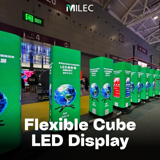
360 Flexible Cube LED Display | MILEC

📢 Prepare to be amazed! MILEC's Flexible Cube LED Display delivers a revolutionary 360° Omnidirectional 3D Visual System. Imagine seamless visuals from every angle! With four independent signal inputs, you can freely switch between single-screen and four-screen modes, and enjoy panoramic, split-screen, or linked multi-playback. Get ready for an immersive experience unlike any other!
Contact us today! WhatsApp/Mobile: wa.link/nvrepi or +65 8086 8225 Email: [email protected] Website: https://milec.co/
#LEDDisplay#3DVisuals#Innovation#ZoomVisual#Tech#SmartTech#RemoteControl#ColorAccuracy#HDR#VisualQuality#LEDTechnology#DisplaySolutions#DigitalSignage#FlexibleCubeLEDDisplay#360leddisplay#3Ddisplay#flexibledisplay#360display#cubedisplay
0 notes
Video
youtube
The Best Graphics Settings For Call Of Duty Mobile (2023)
In this video, we dive into the world of Call Of Duty Mobile and explore the best graphics settings for both low-end and high-end devices in 2023. Whether you're playing on a budget smartphone or a top-of-the-line device, optimizing your graphics settings can greatly enhance your gaming experience. Join us as we provide you with Detailed Insights and recommendations on the Ideal graphics settings to maximize performance and visual quality. We'll cover everything from adjusting frame rates, resolution, texture quality, shadows and more. Our goal is to help you find the perfect balance between smooth gameplay and stunning visuals, tailored to your device's capabilities. Don't miss out on this valuable information that can take your Call Of Duty Mobile Experience to the next level. Whether you're a casual gamer or a competitive player, optimizing your graphics settings can give you text extra edge. So grab your device, tune in and let's unlock the full potential of your gaming experience.
#youtube#CallOfDutyMobile GraphicsSettings GamingTips MobileGaming OptimizePerformance VisualQuality LowEndDevices HighEndDevices GamingExperience Ga
1 note
·
View note
Photo

<p><b>The Moon.</b></p> <p>I recently got a new camera off my girlfriend which I LOVE, and I took this picture of the moon the other night and thought I’d share it with you all.</p> <p>I know it’s not professional but I really liked it. Hope you do too!
6 notes
·
View notes
Photo

Architects :piramun architectural office Location :iran Category :houses Project year:2014 #architecture #archipedia #habitableopenspace #intenerate #compatibility #resistant #directsunlight #pedestrains #fallingplants #stairwayvoid #visualquality #criteria #skyline #spreadout #historic #constructiblespace #capitation #greenspace #archilife #architecturaldesign #architecturememes #architecturethesis (at Iran) https://www.instagram.com/p/B0BmmLWjBXC/?igshid=1fmi61evb0gnc
#architecture#archipedia#habitableopenspace#intenerate#compatibility#resistant#directsunlight#pedestrains#fallingplants#stairwayvoid#visualquality#criteria#skyline#spreadout#historic#constructiblespace#capitation#greenspace#archilife#architecturaldesign#architecturememes#architecturethesis
0 notes
Photo

#Thisfunktional #Tech: #New #LUCI #Immers and #Alyx by #LUCIHeadsets #Introduce #Unparalleled #VisualQuality and #User #Comfort at the #2018 #ConsumerElectronicsShow (#CES) in #LasVegas, January 9-12. #Technology #VR #AR #Wearables #Blog #Blogger #Blogging #Journalist
#tech#wearables#user#journalist#vr#lasvegas#comfort#luci#luciheadsets#2018#blog#alyx#visualquality#unparalleled#blogging#blogger#immers#ar#introduce#technology#consumerelectronicsshow#new#thisfunktional#ces
0 notes
Photo

PUTTING TOGETHER A WEBSITE [why it would be useful] - A more “professional” platform than Tumblr. - Easily identifiable bodies of work, links to other social media platforms. - Relatively cheap (free Wix trial, purchase domain name). - Reflection of contemporary practice. - Additional online presence, opportunity to reach a wider audience. [things to include on the website] - An eye-catching homepage / banner image, archetypal of oeuvre. - Links to current / ongoing / upcoming bodies of work. - A link to my BigCartel store, where I can sell zines and prints. - A blog? E.g. book reviews, artist interviews. - “Contact” section, with various contact details - CV / List of exhibitions & publications. - “About Me”, as I am a person as well as a photographer.
0 notes
Text
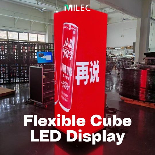
MILEC - Flexible Cube LED Display

Imagine a display that can do it all. MILEC's 360° Flexible Cube LED Display lets you switch between single and quad screens, manage everything effortlessly, and delivers a stunning 98.6% visual fusion. It's time to take your visuals to the next level.
Contact us today!
WhatsApp/Mobile: wa.link/nvrepi or +65 8086 8225
📧Email: [email protected]
Website: https://milec.co/
#LEDDisplay#3DVisuals#Innovation#ZoomVisual#Tech#SmartTech#RemoteControl#ColorAccuracy#HDR#VisualQuality#LEDTechnology#DisplaySolutions#DigitalSignage#FlexibleCubeLEDDisplay#360leddisplay#3Ddisplay#flexibledisplay#360display#cubedisplay
0 notes
Text
Appraisal
Appraisal
‘Its Grim Up North’
Initially in my research I started to look into alternative ways of living, often people find themselves house sharing and living in different ways to the conventional house, this is usually down to financial problems and a lack of support from the government. Whilst researching on the Guardian - the client for the brief - I was looking into the housing crisis and austerity measures and came across an alternative way of living which is far more affordable than the normal housing, but much more secure than renting a property. I started to research housing co-ops and got in touch with a woman who has lived in one for quite some time, I managed to build up some trust with her after meeting up and then sent of a proposal of my idea, unfortunately communications seemed to fizzle out - this meant I needed to come up with a new brief for myself.
Whilst out for a friends birth i found myself on ‘The Yorkshire Flyboat’; an events boat that cater for parties, i took some photos on my iPhone as i found it was an interesting was of using the canals, a business I would've never thought existed. After reviewing my images I started to collate some information on the canals and found that they were struggling with the upkeep and government funding had drastically been cut to the point in which the British waterways had to be rebranded as a charity to pull in more funding. Once I had some information I proceeded to contact the owner of the Flyboat; prior to me calling (this was the only way of contact on the website) I wrote down some prep notes so I covered all grounds. A successful phone-call, we arranged to meet so i could interview him and find out more information so i could come up with a solid concept. The brattish Canals are a heritage site and were one of the reasons we were such an industrial powerhouse, particularly in the north and I wanted to show the Flyboat’s appropriation of the canals in modern times. I met up with Hugh at the boat and discussed my idea and his way of life in an informal interview, at this point we look through our schedules and can up with some appropriate dates in which I could come and explore the boat whilst photographing. I felt it was appropriate to come up with dates for the 2 weeks the boat was running, this way I could get prepped for each shoot, sourcing the equipment I needed and being at the boat in time to set off up the canal. I was reading up on the guardian and came across a quote form John Gossage, he says, ���I always hated the colours when you shoot on film stock, as they are decided by the manufacturers. When I shoot colour nowadays, I use digital equipment so I can adjust the colours to the way I see them.” prior to seeing this quote I was planing on using film but I really understood what he was saying in this quote and believe that using digital would be completely appropriate for this brief, i wanted the images to have a fully contemporary and clean look in order to reflect the genre I would be working in, but also to show this new way of using the Canals. For the three dates I had chosen to photograph on a I made shoot plans. However only after each shoot did I create the next plan because it is a documentary piece its naturally explorative and for each shoot I did I became more informed and new what I was looking for. Due to me research into the issues of the canals and lack of money, I new to be looking signs of disrepair but my images were also about the boat and crew so I needed to be exploring how they interacted with the canals. Like i said previously, my choice was to work in digital. I chose a canon 5d and l series lenses in order to get the best image quality I possibly could. Due to my planning I was also aware that I would be photographing at night, this meant I had to use artificial lighting. The Metz flash seemed the most appropriate due to its size to power ratio; its powerful enough but not too bulky as I would need to be free to move around a lot. During this time I was researching the sort of imagery found in he Guardian weekend magazine, to find out if my images were appropriate for the client and viewers. The weekend magazine is factual and using images of the documentary genre, and I feel my images were also of that genre, therefore appropriate for my client. Once I had a range of images to work from I first shortlisted down to 18 which I felt worked well individually but also as as series, using Camera Raw and photoshop for post production I made small changes to the image, often things like minor colour balance but due to my choice of equipment the images were already very high quality. These images then were Printed on to a satin paper produced at the same size for continuity in the series, I wanted the boarder to be simple and nondescript in order to avoid taking visual quality away from the image, again this was something I learnt in my research on Gossage’s series ‘Pomodori a Grapolo’. Finally my layout, I cut out physical contacts of my images and put them in pairs groups or singles in order to see how they would work together, I then cut out a few of my images in order to make the brief requirement of 12-15 images. I proceeded to do experiments by hand to then apply to InDesign later on. Finally placing my images into their chosen sizes and layout. My layout was influence from the guardian weekend magazine layout thats I had primarily researched; often formal and images reproduced to the same sizing for series continuity. I have presented my final magazine layout on Issue to give see professionally what the final layouts would look like.
0 notes
Text
Final images
Below you can see the digital versions of my final images, I am extremely happy with how they have come out and look as a triptych. Each photograph features completely different objects but there is a a clear link between them all, none of them look out of place from each other. They follow an extremely minimalist style, I have tried to keep the tonal range the same between each individual photograph which did not 100% work, there is a single photograph that is slightly darker than the rest but I feel that I can alter this by having it in the middle of the triptych, both of the lighter toned photos will balance it out. I personally do feel that I have achieved what I wanted to when thinking about the concept, I have produced three strong images which display corners of the room, this is what I wanted my main focus to be from the start. It is more the thought process behind it that I want the audience to develop themselves visually. I have chosen to photograph all the areas which feature some sort of infrastructure to again reduce them looking all too similar. The addition of the pipes and metal framing add some depth to the images, without them they would appear quite flat and not as aesthetically pleasing especially being on a matte paper.
All the negatives for my finals were scanned in using a Hassleblad scanner, this was due to the fact I was blowing them up to an almost A1 size print, the Hassleblad scanner allowed me to go up to 3200dpi rather than 300dpi which is the resolution you can go up to on the scanners in the computer suites and library. Having not carried this process out my images would have been extremely pixelated, pixelated to the point where it can no longer be described as grain.
If you look closely at the photographs you can see that there white patches which are bits of dust particles and small scratches on the negatives themselves. Initially I was quite concerned about this as I feared it would disrupt the image as a whole but I feel that it is actually a positive in terms of visually. Fine art prints aren’t known to always be 100% perfect. The little scratches to me add more of a personality.
Each photograph has been chosen also on the basis of the different rooms they have been photographed in, I have chosen to include the three images that were the most aesthetically pleasing as well as meaningful in terms of my time at uni. They are the places I am in almost every single day. I think each image is unique to the other, even if they were not put as a series I still feel they have enough to stand alone as an image, this may not have supported the concept as much but it is still strong visually.
Viewing them digitally does not in my opinion give it the same effect as seeing them in person once they have been presented in my chosen way. I feel like presentation plays a really big part in how you take in a series or single image. The presentation would give the series a bit more on ideology.
It is safe to say that I am extremely happy with how my final prints came out but there is still room for improvement. I would have wanted to experiment maybe with altering the images on Photoshop or making alterations on the negatives themselves and taking a different route in terms of fine art photography. I would have also liked to photograph a few more locations within Uni to give myself more to work with when it came to printing. Carrying out another shoot may have also meant my exposures were even closer to being perfect as one or two had to have the exposure altered during post production which I didn’t want as I strongly believe in straight photography and working within the camera.
0 notes
Text
Appraisal
Throughout the Specialist Photo Practice module I have been introduced to a variety of genres of photography through the given mini briefs which have allowed me to gain knowledge for future projects and has also helped me define a path for myself within photography. At first I was torn between two different briefs: Fashion – ‘Art/Life’ and Fine Art – ‘Evidence’. The reason for this being that I enjoy taking pictures of people however I am not too comfortable with magazine layouts. After much consideration my choice my choice of brief was ‘Evidence’ with the title of my project being ‘Evidence - The Human Body’. The aim of this project was to distort our views as a society of body image and how we want our bodies to be an image of perfection. One mini brief which really linked to my main project was the Fine Art mini brief, as I used a similar theme to focus my image around and I would probably say that my project was a big influence on the mini brief even though the image was completely different.
As a whole I have put as much effort into the mini briefs as I could, as working in a group it was vital that I contributed and therefore worked effectively within the team. One main thing which I have gained from all the mini briefs would be how to work professionally as we were given a client and a deadline to adhere to. At first this was difficult however over time it was easier to treat the brief as if it was actually going to presented to an actual client. The briefs could be challenging at times due to working with other creative people who each wanted their own input into the project however this is something which I have adjusted to over the module and I can now work in a group and compromise on the decisions we make as a group. I have enjoyed the briefs as it has been good to explore other areas of photography, some such as the documentary brief have proven to be difficult to me as this is a genre which I am not particularly interested in, neither particularly good at. All in all I feel as if these mini briefs were given to us to give us an idea of how the industry works and to prepare us for working with different clients that want different things.
As for my main project, I drew a lot of inspiration from photographers such as Will Sherwood and Miguel Ribeiro as their work feature a lot of similar aesthetics to mine. While generating ideas for my project I knew that I wanted to focus on the human body and female nude however I wasn’t sure on how I was going to approach it visually until I started researching. I generated a few ideas which consisted of experimenting with digital projectors and the use of colour but after seeing Sherwood’s images and how simple but effective they were, I chose to opt for a simple use of monochrome combined with a heavy contrasted aesthetic similar to his. My aim for the images were to be of the female nude, however I wanted to abstract them so as a viewer you couldn’t really tell what part of the body the image was of. This is where the editing part of the project was really vital as this was how I was going to get my images to look how I wanted.
With this project I worked with one female model, and it was a first for me to be working with a nude model therefore this was something I had to take into consideration as well as being careful with what I did with my images. It has made it so much easier to communicate with a model after working on this project and has also increased the level of professionalism I have to have when working with one. The creative advertising mini brief also helped with this as there were a lot of people working together to get the work done, therefore I had to be organised and professional to get the brief done.
The technical aspects of the project came quite naturally to me as I was comfortable in using the studio equipment, however because I made a studio at home the shoot was even easier to organise because I had a larger time slot to work in. Through various workshops I was taught how to use the equipment effectively for what I wanted, for example the Phase One workshop was useful as it was something I hadn’t worked with before therefore it was good to gain some knowledge which will definitely be applied to projects in the future. As for the development of my project, I kept a mental image of how I wanted my work to look therefore I could make impulse decisions and experiment with lighting without worrying about how it would affect my work. Shooting digitally was also an advantage for me as I could instantly review my images and therefore make changes if I needed to.
Overall I am happy with my images and how I have decided to present them, as I feel they fit the brief. However I was given more time there are things which I would of like to experiment with more such as maybe shooting on 5x4 in order to get a better quality out of my images, as well as getting them to look different. I would also have liked to experiment more with the actual layout of my images, as I had so many to choose from I could of included more in my final selection however didn’t due to the layout I had opted for. I have enjoyed working through the module and feel as if I have got the most out of it through the completion of all the briefs given to me.
0 notes
Text
MILEC Flexible Cube LED Display
Ready to transform your visual content? Enquire about our 360° Flexible Cube LED Display today!
Contact us today!
WhatsApp/Mobile: wa.link/nvrepi or +65 8086 8225
📧Email: [email protected]
Website: https://milec.co/
#LEDDisplay#3DVisuals#Innovation#ZoomVisual#Tech#SmartTech#RemoteControl#ColorAccuracy#HDR#VisualQuality#LEDTechnology#DisplaySolutions#DigitalSignage#FlexibleCubeLEDDisplay#360leddisplay#3Ddisplay
0 notes
Text
Flexible Cube LED Display | MILEC
Transform your message with MILEC's innovative 360° Flexible Cube LED Display. Experience seamless transitions between single and quad-screen views, effortless control with intelligent cluster management, and a near-perfect 98.6% visual fusion for truly captivating displays.
Contact us today! WhatsApp/Mobile: wa.link/nvrepi or +65 8086 8225 Email: [email protected] Website: https://milec.co/
#LEDDisplay#3DVisuals#Innovation#ZoomVisual#Tech#SmartTech#RemoteControl#ColorAccuracy#HDR#VisualQuality#LEDTechnology#DisplaySolutions#DigitalSignage#FlexibleCubeLEDDisplay#360leddisplay#3Ddisplay
0 notes
Text
Immerse your audience with our 360° Flexible Cube LED Display. Experience stunning 3D visuals that captivate from every angle.
Contact us today!
WhatsApp/Mobile: wa.link/nvrepi or +65 8086 8225 Email: [email protected] Website: https://milec.co/
#LEDDisplay#3DVisuals#Innovation#ZoomVisual#Tech#SmartTech#RemoteControl#ColorAccuracy#HDR#VisualQuality#LEDTechnology#DisplaySolutions#DigitalSignage#FlexibleCubeLEDDisplay
0 notes
Photo


PERSONAL PROMOTIONAL STRATEGIES (INSTAGRAM, LINKEDIN, BIGCARTEL & ORDER FROM SUB-EDITOR OF PYLOT MAGAZINE) I try to remain active on more photography-related social media sites such as LinkedIn and Instagram, where I keep followers up to date with my work (professional) and life (personal) respectively. I also promote my BigCartel page where people can purchase a copy of my self-published zine. One morning, I woke up and shortly after received an email from BigCartel about a new order, from a “James Ross”, under the email address “[email protected]”. PYLOT Magazine is my favourite contemporary publication, and I know the editor’s name is Max (Barnett). Quickly checking an issue, I discovered James Ross is the sub-editor. So, my favourite photography publication had just purchased a zine from me out the blue, which is most likely driven from my Instagram (where I promote my work, along with Tumblr and Facebook). It was quite odd to consider that you never really know who’s looking at your work; in which case, your online presence should be the ideal of how you want to be presented. Not to quote American Beauty’s Buddy Kane, but “in order to be successful one must project an image of success at all times”. Right?
0 notes
Text
Layout Rationale
Front cover.
I chose this image of he cup of tea firstly due to the composition, i felt it would work really well with the copy a and header due to the amount of negative space. It was also chosen due to the content, like i said in a previous post, its a cliché that tea is linked with the North and hard working so i wanted to exploit this Cliché, this also makes it an easy image for the viewer to read, easing them into my series.

1st DPS
For this double page I have just put one image to go with the copy. This image is a context image and even has readable information, the text in the image gives an incite to the location (North of England) and also give context as to what the series will be about. Its full bleed so the viewer can easily read the type.

2nd DPS
This Spread has 4 images running across the page along the bottom. I bundled these images together firstly because their content all links, these are all images of either inside the boat, where the events happen or are linked with the events. The colour palette was another reason for me linking this images, i feel the it flows.
On page the left hand page, you see the chairs and table along with the image of the fire extinguisher, these images are to show features of the boat, giving context to the viewer, their colour palettes work really well together with very warm yellows and reds.
On the right hand page, there till along with the kegs outside are a reference to the boat making money through selling, this just helps show the business aspect.

3rd DPS
Full bleed image on the left gives more context of the boat and how it is run, this images works well alone and is self explanatory so the full bleed choice was intended for the viewer to be able to glance and moved on without getting close and really reviewing the Image
The right hand side has an image if the lock showing 2 perspectives, i chose to have these together as there is a visual link of the lock arm in both, which visually links the 2 together.

4th DPS
Again a full bleed on the left, this is to link to the previous page, so the viewer still views the series as a whole entity. The image was chosen at that size to also emphasise something which is clearly a problem. The 2 smaller images on the right are to go along with the full bleed image. they show one of the crew clearing the engine of rubbish, the images are produces smaller than the left to show a more intimate and detailed version of a problem in the canals that the crew have to deal with daily.

5th DPS
All there images on this page where chosen to go with one another due to their colour palette of greens, whites and blues. this will hopefully be aesthetically pleasing to the viewer but will also add and element of fluidity and formality. It shows the images are thoughtful and not just clunked together.
The images on the left of the page worked together as they show regulations and bureaucracy which wouldn't be something most would link with canal boats, this helps show the niche business being run here.
The image on the right was chosen as my final image as it was an image taken as the boat was in dock after a days work, metaphorically ending the series.

0 notes
Text
Issuu
You can find my Final Layout over on Issuu
http://issuu.com/danielsproul/docs/gaurdian_weekend_magazine_pdf
0 notes