#Volvo Design
Explore tagged Tumblr posts
Visit Tumblr Blog
Explore Tumblr blogs with no restrictions, modern design and the best experience.
Last Seen Tumblr Blogs


Fun Fact
70% of Tumblr users say the Dashboard is their favorite place to spend time online.
Text
Volvo C40 Recharge E80: Luxury Electric SUV Overview
₹62.95 Lakh The Volvo C40 Recharge E80 represents a significant step in the luxury SUV market as a fully electric, environmentally conscious vehicle. It combines high performance with advanced safety, comfort, and cutting-edge technology, making it a competitive contender in the growing electric vehicle (EV) segment. Performance and Powertrain Electric Powertrain: Equipped with a 78 kWh…
#Advanced Driver Assistance Systems#AWD Electric Vehicle#Connected Car Features#Eco-Friendly Cars#Electric Powertrain#Electric SUV#Electric Vehicle Charging#Electric Vehicle Technology#EV Interior Comfort#EV Safety Features#Long Range EV#Luxury EV#performance SUV#premium electric SUV#Sustainable Vehicles#Volvo C40 Recharge#Volvo Cars#Volvo Design#Volvo EV Range#Zero Emission SUV
0 notes
Text


Volvo P958-X2, 1958. The second of three prototypes built by Carrozzeria Frua (at the time, a subsidiary of Ghia). The car is close to the final design of the P1800 but with a number of differences. The upturned bumpers, the chrome work, the tail lights and the shape of the C pillar and rear side window were all changed for production. The car was designed by Pelle Petterson under the direction of Pietro Frua.
#Volvo#Volvo P958-X2#Volvo P1800#1958#prototype#design study#Carrozzeria Frua#Pelle Petterson#Pietro Frua#sports coupé#coachbuilt
335 notes
·
View notes
Text
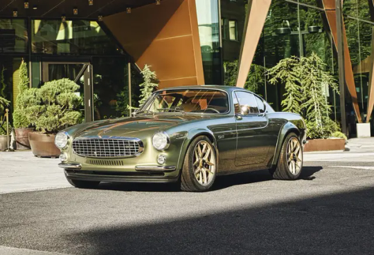

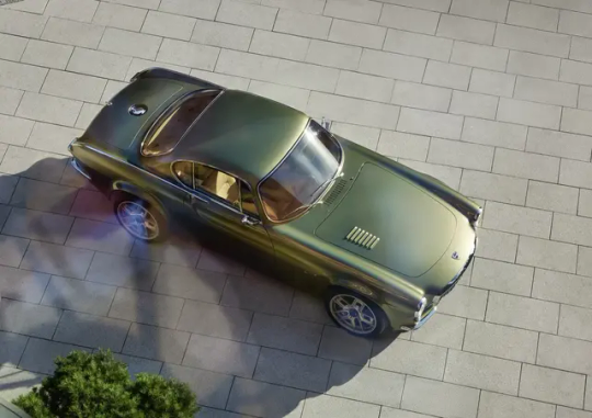
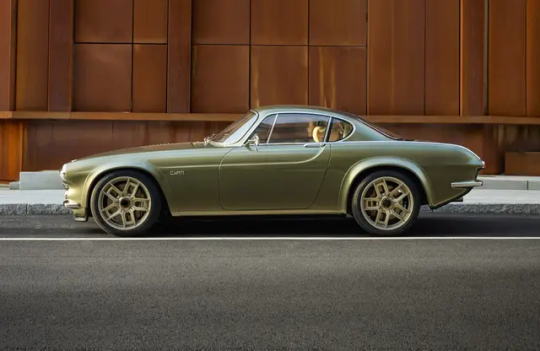
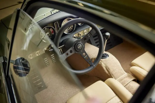
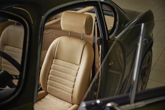
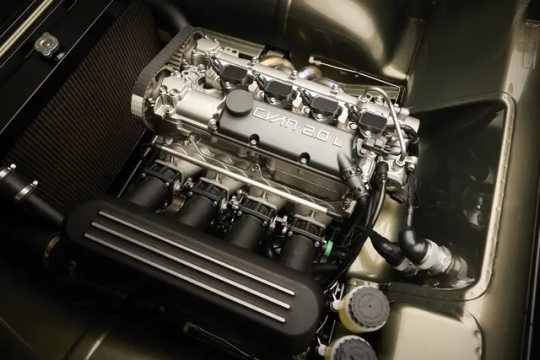
Volvo P1800 Cyan GT
#art#design#sportcars#sportcar#luxurycars#luxurycar#volvo#luxury cars#luxury lifestyle#luxurylifestyle#sport cars#supercars#supercar#cyan#gt#volvo P1800
1K notes
·
View notes
Text

#Volvo#YCC#concept car#2004#women#design#innovation#automotive#sealed hood#dent-resistant bumpers#Sources
71 notes
·
View notes
Text
Moto Vitelloni
24 notes
·
View notes
Text
This is what I'd do with a million dollars

I'm an expert artist btw (I traced all of this)
#f1#formula 1#formula one#hatsune miku#sonic the hedgehog#fernando alonso#volvo#bbs wheels#go kart#formula racing#su 27#graphic design is my passion#graphic design is my burden
21 notes
·
View notes
Text
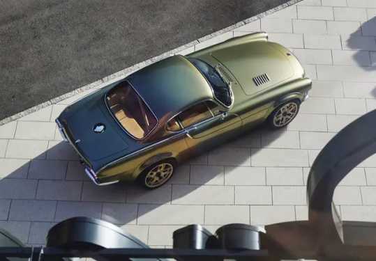
Volvo P1800 Cyan GT
45 notes
·
View notes
Note
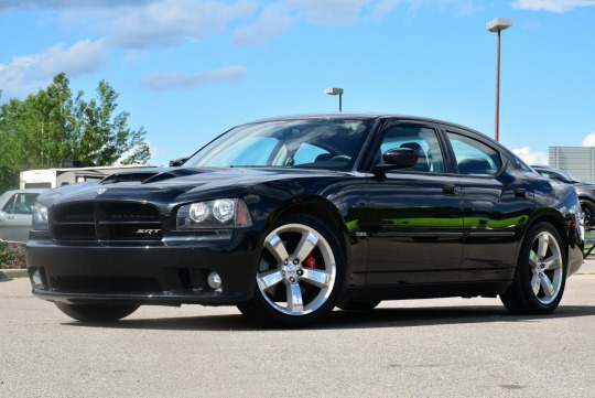
Do u know any reason why the Dodge Durango and Dodge Charger look kinda similar?
I see them on the streets all the time and I've noticed (at least the newer ones) have the same headlight and tail light design
Well, the short answer to that is "design language". The explanation of that short answer, however, is a bit more complicated than that, and is about why cars look the way they look - what makes them different, what makes them similar, what makes them change and how to tell them apart. So hop on under the Read More and come learn all that!
Design language is the sum of design rules and guidelines that make a brand's product range both distinct from others and coherent within itself. If you've ever recognized whose commercial it was, who printed the book, who manufactured the device, who designed the car, that was design language doing its job!
You know those "If [brand] made [thing]" renders you see out there? That's following a brand language: crossing what [thing] looks like, which is usually pretty well determined, with the much more nebulous concept of what [brand] looks like. Defining a design language is defining the answer to that second question.
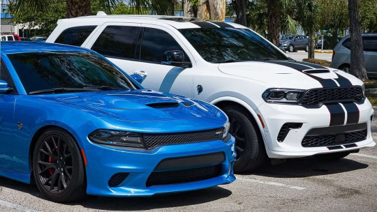
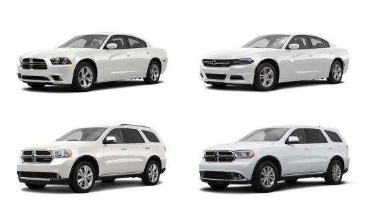
So, let's look at the Dodge lineup in 2011 (the first year with both current Charger and current Durango).
There's a couple of key shared traits: the trapezoidal grille (facing downwards in 'friendly' cars and upwards in 'aggressive' ones), the small indentation in the middle of the hood, the single angular headlight housing containing two round lighting elements, and some more minute stuff. Except one of these cars features none of that, because sometimes, when updating (and, especially, when bringing back) a model, the design traits of its ancestors are taken into account, and for the Challenger, Dodge's then-current design language was almost totally disregarded in favor of faithfulness to its 1970 ancestor.


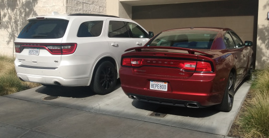
Whereas the new Charger did the exact opposite, its 2006 revival being completely based on 2006 Dodge's design language, with extremely little left of the '60s original (I see the rear window shape and the beltline if I'm being Christmas generous). Of course, this already works towards the similarity we're getting at.
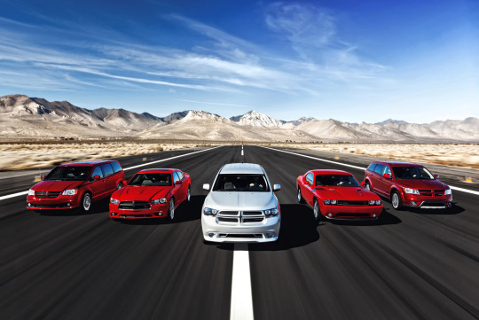
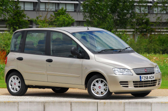
But the bulk of a car's design decisions are not about design language, but about the kind of car it has to be. A designer must contend with aerodynamics, safety requirements, customer needs and expectations, with the end result being that cars of the same segment will usually end up having the same basic proportions and largely overlapping silhouettes. See the cars below:
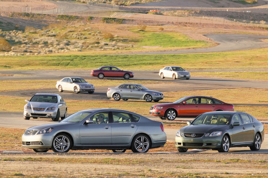
Sure, very different styles can produce a more angular or more soft outline (see the two cars in the background), but within the same era and segment many completely different cars will be almost indistinguishable between the wheels (see the two cars in the foreground). So the most design freedom is usually found in lights and grilles, since those can be quite radically altered in shape and proportions without interfering much with functionality (unlike for example window shapes or rooflines), and even slight changes in them can alter the look and perception of a car, because we parse them similarly to faces, and thus they can make a car looks angry, sad, silly, goofy, or adorably gleeful.
So most often, the most distinctive features of a car -and by extension of a design language- are found in lights and grilles (the outline of the headlights, the inside arrangement, the grille's shape, proportion, pattern, etc.), with the rest of the car being shaped by general principles like "angular design", "simple, smooth lines" or the likes. So if you want to learn to recognize cars, lights and grilles are usually what you should focus on, as you need to be an expert for your average car's overall shape to tell you much more than its segment and decade (and perhaps market, but that's a longer conversation). That does explain, doesn't it, why lights and grilles are similar in Charger and Durango, two cars in very different segments designed to look aggressive in a distinctly Dodge way.
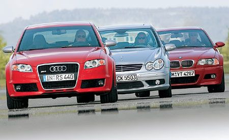
Let's exemplify this principle with three cars from the same segment, decade and country: In the mid-00s, Audi introduced a tall, chrome-lined downward trapezoid grille that contained the number plate; Mercedes had their classic grille -with the thick top chrome strip, small silver accents and the underlying middle line- and “merging circles” headlights; BMWs still had their staple "kidney grilles" and their quad circular headlights now contained in a wide, flat shape with round, downwards curving edges.
So even when these brands made different cars in different segments, those key traits kept them perfectly recognizable as theirs.
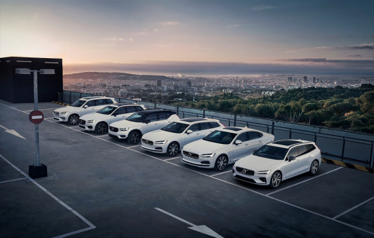
As you see, a brand's designs can get very consistent. But they can also get very inconsistent, too. For one, you don't design for a manufacturer, you design for buyers, so the design will change with who the buyers are, what they want, what they're attracted to - and when that is pretty consistent within a brand you get a lineup like Volvo's...
...whereas if you have a brand whose buyers vary wildly in all metrics that matter, you get a lineup like Kia's.
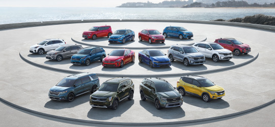
(I love this picture because you keep thinking "Well those two look similar at least" and they keep turning out to be two versions of the same car.)
The lineup's styling is also going to be more cohesive the more precious brand recognition is for it: a Ferrari needs to look like a Ferrari because that's most of why people buy a Ferrari to begin with, whereas the last time a Skoda didn't look like a Skoda it literally called for advertising.
Design languages also change and evolve with time, of course, and that's an element at play in the observation that spurred this post: Charger and Durango look similar not just because they were designed with the intention of looking similar, but also because they were updated with the goal of remaining similar, and were made even more so by the use of similar solutions to modernize their looks.
You'll notice that this was just an update of lights, bumpers and grilles - and indeed, these are what's known as "facelifts": where a new generation is usually redesigned from the ground up or retains little more than the core structure, facelifts are instead intragenerational updates that stay clear of radical changes (at most, things like hood and fenders can get updated if new headlight shapes require it).
But as we covered, those are the parts that matter - so while something as little as a facelift can be absolutely impossible to notice...

(seriously, two of my neighbors have these and it took me weeks of seeing them side by side to notice differences)
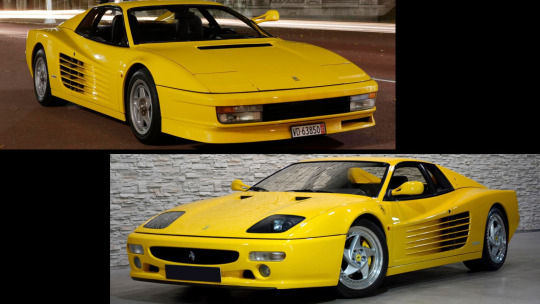
...it can also be effective enough to carry a model into a new decade...

...ore even powerful enough to completely salvage a car's design, and by extension its fortunes.

However, of course, it can wield the opposite power just as well.
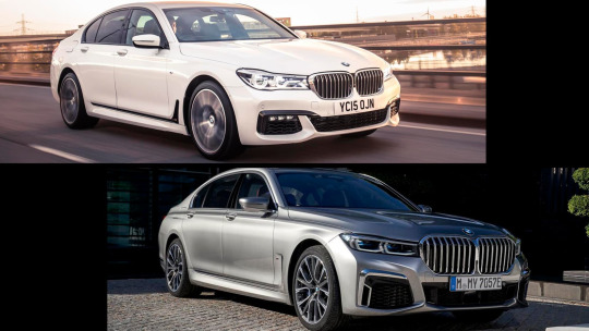
Christ. Welp, no mistaking that for not a BMW now, is there. But to be clear, while BMW's styling has completely gone down the gutter lately, don't get the impression that any brand at any time is beyond a miss in this regard.
So, to close, while there is merit to the claim that cars today seem all the same, as we've discussed that's only true -and for good reasons- when looking at them from a distance. But when a landscape seems depressingly monotonous, you just have to look closer. And so, getting closer, analyzing the traits that weren't dictated by their nature, the decisions that weren't made for them by external factors, looking at what of them was shaped by agency and not necessity, they will all reveal themselves to all be different and to all have a personality of their own (bland as it may be). And that personality will change over time: changes are normal within a life, and actually good - they're a sign that life has been long enough to outlive the trends and ideas that shaped it, and that it's open to the new ones that have blossomed since. Trying too hard to fit in or stand out or seeking change for its own sake without a clear direction can ruin something good, sure, but change can also be very positive: it can allow keeping up with the times, or even a transformation for the better that lets go of what didn't work and accentuates what was good - and often, when it's done right, the world rewards it. And none of this requires a distancing from heritage or family, or even identity. In fact, as seen with our two cars, change can make a family bond even tighter.
This year will bring lots of change. Here's hoping we all manage to make it change for the better.
So yeah, hopefully that answers your question, anonymous asker who may well have fucked off to Hollywood in the over month and a half it took me to get to this (whoopsie)! Immense thanks to @ldub0775 for the effort and thought he joined me in pouring into this post, and to all followers reading this for sticking around into 2024 to witness that effort's fruits. Trust me, you will really like what's coming.
Links in blue are posts of mine about the topic in question: if you liked this post, you might like those - or the blog’s Discord server, linked in the pinned post!
#design language#car design#dodge charger#dodge durango#dodge challenger#audi#mercedes#bmw#volvo#kia#the great catchup
42 notes
·
View notes
Text
Volvo… car for drinkers 🤣
0% for me
12 notes
·
View notes
Text
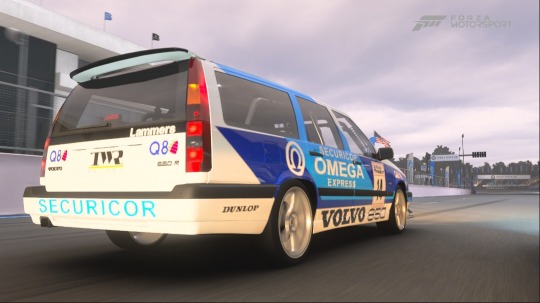
#game#video game#racing game#racing video game#superstreet#streethunters#xbox series x#xbox#motortrend#forza#forza motorsport#volvo#volvo 850#850r#volvo 850r#wagon#volvo wagon#wagon mafia#tuner#dunlop#scandinavian#scandinavian car#scandinavian style#scandinavian design#swedish#car#swedish car#sports car#omega
10 notes
·
View notes
Text
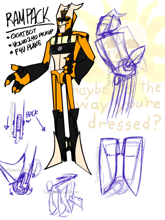
Made a transformersona some weeks ago but I redesigned it cus I didn’t like the first version
#my art stuff#transformers#OC#sona#Rampack#RP#Packer#volvo 240#vought F4U corsair#car#plane#goatbot#neutral#autobots#decepticons#digital art#sketch#character design#he has lil wheelies#and he likes to mimic flying around with his lil propeller tail#he also has a lil hoop on the back at the base of his head for attaching lil “ponytail” attachments him or others make him#also yes he has seatbelt ears.#i think that was it? I can’t think of anything else that stnds out to be mentioned#covered all normal and strange and cool things 100%#all’s been talled through.#(sarcasm - just in case)
14 notes
·
View notes
Text


Volvo P1560 Prototype, 1968, by Carrozzeria Coggiola. The first of a series of 140-series based prototypes which Volvo commissioned to develop safety systems including crumble zones, door intrusion beams and air-bags. Ten prototypes were built as possible replacements for the 140/160 series. However the P1560-project was cancelled in 1971 due uncertainty about what safety legislation was going to be passed in the US and Volvo concentrated on developing the 140/160 series into the 240/260 series (code-named P1720) instead.
#Volvo#Volvo P1560#prototype#Carrozzeria Coggiola#Coggiola#design study#1968#experimental car#test vehicle#safety car#Volvo 140 series
137 notes
·
View notes

Text
Fun logo facts!

Volvo makes dull, heavy, safe station wagons. They usually come in shades of beige, grey, and brown. Volvo is also responsible for inventing the 3-point seatbelt all cars use today!
But! the logo. It looks like the male symbol. Are Volvos only for boys?
no, that's silly.
the name Volvo comes from the Latin word "Volvere" which means "to roll" and conjugated it to Volvo for: "I roll". Not because they made cars, but because Volvo's first product was Iron ball bearings!
and in this origin, we find the origin of the Volvo logo itself.

the ancient Alchemical symbol for Iron.
In Classical Roman times, the symbol for Iron was associated with the god of war Mars.

The connection between the symbol for Mars and the symbol for male didn't come until much, much later in the 1700s when Botanist Carl Linnaeus adoped the symbols for mars and venus to denote different genders of flowers!
TL;DR:
The Volvo logo is the ancient alchemical symbol for Iron, which happens to also be the symbol for the male gender.
it’s always been crazy to me that there’s a car brand called volvo. and its logo is ♂. what if i pulled up in my fucking
215 notes
·
View notes
Text
Vehicle Recall: Polestar 2 Sedans:
#25V280000#apparent contravention of US FMVSS 111#assistive device failure hazard#crash hazard#Electronics#Geely#Geely Automotive#injury hazard#Laceration hazard#loss of vehicle control hazard#NHTSA#NHTSA Campaign Number: 25V280000#NHTSA recall designation 24V-477#Polestar Automotive USA Inc.#Rearview Camera Image#Recalls Direct RIN: 19731-2025#Software miscoding and/or malfunction#US National Highway Traffic Safety Administration ("NHTSA")#Volvo#Volvo Car USA LLC#Volvo Group#Volvo Group of Gothenburg#Zhejiang Geely Holding Group Co.
0 notes
Text
Should You Buy a Volvo C30? A Love Letter
#automotive#automotive history#automotive nostalgia#brands#car personality#cars#compact luxury#cult cars#featured#glass hatchback#P1800ES throwback#R-Design#Swedish design#unique hatchbacks#Volvo C30
0 notes