#Web UI
Explore tagged Tumblr posts
Visit Tumblr Blog
Explore Tumblr blogs with no restrictions, modern design and the best experience.
Last Seen Tumblr Blogs


Fun Fact
Premium Tumblr themes are available from anywhere between $9 to $49.
Text


#ai anime#game character#ai girl#ai babe#ai art#android 18#mitsuri kanroji#re zero#rem#stable diffusion#ai generated#ai image#ai#aiart#ai artwork#web ui#web ai
208 notes
·
View notes
Text
I love how every website and software maker are doing circle and sqircles to try and feel "natural" or whatever B.S. excuse they're trying to justify cheap, assimilative design with.
And then there's Pinterest who's just like, "Fuck it. We're doing squares again." And tbh? It's a good look for them. If only Pinterest hadn't devolved into A.I. Slop central, it would actually be a pretty nice place to use.
2 notes
·
View notes
Text

3 notes
·
View notes
Text
Versity TNC – The Ultimate Education Website Template
Hey, fellow web enthusiasts! If you’re in the education space and looking for a sleek, modern website template, Versity TNC is a game-changer. Whether you're running a university, online course platform, or coaching center, this Webflowtemplate has everything you need to create a professional and engaging online presence.
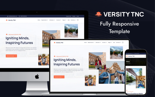
🚀 Why Versity TNC? ✔️ Fully Responsive – Your site will look stunning on desktops, tablets, and mobiles. ✔️ Pre-Built Pages – Ready-to-use layouts for Home, Courses, Events, Blog, and more. ✔️ Easy Customization – Modify fonts, colors, and layouts without coding. ✔️ SEO & Speed Optimized – Ranks better and loads faster for a smooth user experience. ✔️ CMS-Integrated – Easily manage blog posts, events, and courses within Webflow.
🎯 Who Is It For?
Universities & colleges 🏫
Online learning platforms 📚
Coaching & training centers 🎤
💡 Why Webflow? No coding required! Drag, drop, and edit elements in real-time to build your dream website hassle-free.
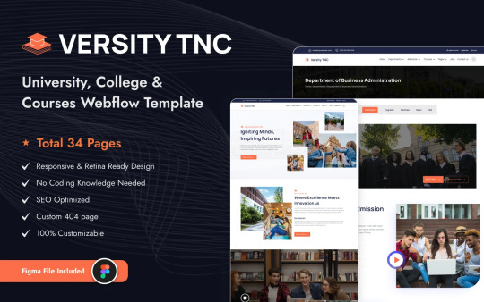
🔥 Ready to upgrade your education website? Check out Versity TNC on TNCFlow and give your institution the online presence it deserves! 🌟
#Webflow #EducationWebsite #VersityTNC #NoCode #EdTech #WebDesign
2 notes
·
View notes
Text
tumblr, im browsing my own blog. I don't need engagement drivers for retweeting things on my own blog
#yes i used that word just to make your eye twitch#web ui#tumblr#engagement drivers suck#dark patterns#engagement drivers are ableism against people with adhd
2 notes
·
View notes
Text
...Infinite scrolling; but instead of increasing the length, it automatically opens a new tab for every new page...
#bgoriginal.mel#bgthoughts.mel#infinite scrolling#pagination#web design#javascript#coding#scripting#css#web development#web programming#web ui#web ux#ui/ux design
3 notes
·
View notes
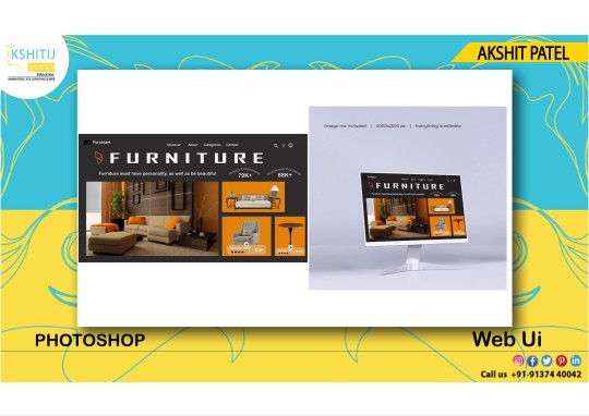
Text
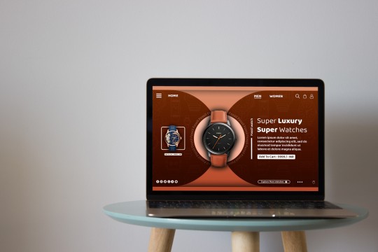
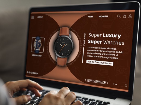


Web UI Design
#Adobe #Adobephotoshop #photoshop #kshitijvivan #sahdevvala #artwork #Photoshoptutorial #photoedit #photoediting #graphics #graphicdesigner #designer #creativegraphics #creativedesigner #creativedesign #educationvala #education_vala #parthsir #educationvala.com #educationvalanews #creativeagency #socialmediabanner #socialmediabannerdesign #webui #websiteui #uidesign #uxdesign #uiux #ui #ux #webpagedesign #landingpagedesign #homepagedesign #websitebanner #websitebannerdesign #webuiux #webux #websiteuidesign #webuidesign #landingpageui #landing page #uidesigninphotoshop #mobileappdesign #mobileui #mobileuidesign
#adobe#kshitijvivan#photoshop#sahdevvala#photoshoptutorial#educationvala#ui design#web ui#website ui#ui ux design#uidesign#ui ux company#ui ux development company#ui ux development services#ui ux course#webui#websiteui#website#landscapedesign#landscape design#landing page#website banner#banner design#web banner#web banner design#website banner ui#web banner ui#web banner in photoshop#website banner in Photoshop
4 notes
·
View notes
Text
3 notes
·
View notes
Text
I think the failure of this entire approach is stated in this passage: "the default position should always be that the user does not know how to navigate the application."
This assumes that the app is not the problem, per se, but the following points contradict or do not solve the problem introduced.
See, if a user does not have the literacy to navigate and engage on a platform then they will be less likely to want to use the platform regardless of their literacy on its use. Whereas a user that has the platform/tech literacy to use the platform will enjoy it. You don't make the platform for the lowest common denominator, because then you get a really bland platform. You make a platform the best experience for the average user. And that's a big appeal and why I've always come back to Tumblr. I've been able to understand how, mechanically, the platform works (though the social mechanics of it often allude me), and so I've been able to make the most out of the features and mechanics of it. But if you simplified the platform and made it easier to use for everyone (people with less tech literacy) I would enjoy it less because my experience would be cut down; I would be able to engage with the platform less because the platform would be too simple for me, the average current user.
Is the average user changing over time. Probably. And that's sad. But I think part of the problem with that is that younger users have less tech literacy overall because platforms continue to simplify the way that they can be interacted with. Tumblr can attempt to follow that pattern, but I think it will lose a lot of legacy users that drive popular content in the process. And I think that those big legacy users represent more brand identity for the platform than anything else.
In order to solve the problems the platform currently faces, I suggest leaning into the exist platform identity that exists outside of it's user base. Get rid of live. Improve SEO so that Tumblr becomes a higher average rank across all engines when searching content generally online. Add better methods of distinguishing content on the platform (like a core tagging system where you have to have at least two-four tags that define the principle categories of a given post and these have distinct colors or a separate distinguishing space on the UI). Consider ditching or severely altering the comment system so that comments attach to specific versions of a post rather than the post generally or where you can adjust whether the comment is general to to a specific reblogger on the reblog chain. Preserve and strengthen the custom blog creation side of the platform; we have options for making individual blogs really cool, and I think we should focus on that side of the platform more. Gut the vestigial features that are lingering from old failed changes (like dragging the post button around, or the various buttons that post different things when all types of posts can be made from essentially the same screen).
Tumblr’s Core Product Strategy
Here at Tumblr, we’ve been working hard on reorganizing how we work in a bid to gain more users. A larger user base means a more sustainable company, and means we get to stick around and do this thing with you all a bit longer. What follows is the strategy we're using to accomplish the goal of user growth. The @labs group has published a bit already, but this is bigger. We’re publishing it publicly for the first time, in an effort to work more transparently with all of you in the Tumblr community. This strategy provides guidance amid limited resources, allowing our teams to focus on specific key areas to ensure Tumblr’s future.
The Diagnosis
In order for Tumblr to grow, we need to fix the core experience that makes Tumblr a useful place for users. The underlying problem is that Tumblr is not easy to use. Historically, we have expected users to curate their feeds and lean into curating their experience. But this expectation introduces friction to the user experience and only serves a small portion of our audience.
Tumblr’s competitive advantage lies in its unique content and vibrant communities. As the forerunner of internet culture, Tumblr encompasses a wide range of interests, such as entertainment, art, gaming, fandom, fashion, and music. People come to Tumblr to immerse themselves in this culture, making it essential for us to ensure a seamless connection between people and content.
To guarantee Tumblr’s continued success, we’ve got to prioritize fostering that seamless connection between people and content. This involves attracting and retaining new users and creators, nurturing their growth, and encouraging frequent engagement with the platform.
Our Guiding Principles
To enhance Tumblr’s usability, we must address these core guiding principles.
Expand the ways new users can discover and sign up for Tumblr.
Provide high-quality content with every app launch.
Facilitate easier user participation in conversations.
Retain and grow our creator base.
Create patterns that encourage users to keep returning to Tumblr.
Improve the platform’s performance, stability, and quality.
Below is a deep dive into each of these principles.
Principle 1: Expand the ways new users can discover and sign up for Tumblr.
Tumblr has a “top of the funnel” issue in converting non-users into engaged logged-in users. We also have not invested in industry standard SEO practices to ensure a robust top of the funnel. The referral traffic that we do get from external sources is dispersed across different pages with inconsistent user experiences, which results in a missed opportunity to convert these users into regular Tumblr users. For example, users from search engines often land on pages within the blog network and blog view—where there isn’t much of a reason to sign up.
We need to experiment with logged-out tumblr.com to ensure we are capturing the highest potential conversion rate for visitors into sign-ups and log-ins. We might want to explore showing the potential future user the full breadth of content that Tumblr has to offer on our logged-out pages. We want people to be able to easily understand the potential behind Tumblr without having to navigate multiple tabs and pages to figure it out. Our current logged-out explore page does very little to help users understand “what is Tumblr.” which is a missed opportunity to get people excited about joining the site.
Actions & Next Steps
Improving Tumblr’s search engine optimization (SEO) practices to be in line with industry standards.
Experiment with logged out tumblr.com to achieve the highest conversion rate for sign-ups and log-ins, explore ways for visitors to “get” Tumblr and entice them to sign up.
Principle 2: Provide high-quality content with every app launch.
We need to ensure the highest quality user experience by presenting fresh and relevant content tailored to the user’s diverse interests during each session. If the user has a bad content experience, the fault lies with the product.
The default position should always be that the user does not know how to navigate the application. Additionally, we need to ensure that when people search for content related to their interests, it is easily accessible without any confusing limitations or unexpected roadblocks in their journey.
Being a 15-year-old brand is tough because the brand carries the baggage of a person’s preconceived impressions of Tumblr. On average, a user only sees 25 posts per session, so the first 25 posts have to convey the value of Tumblr: it is a vibrant community with lots of untapped potential. We never want to leave the user believing that Tumblr is a place that is stale and not relevant.
Actions & Next Steps
Deliver great content each time the app is opened.
Make it easier for users to understand where the vibrant communities on Tumblr are.
Improve our algorithmic ranking capabilities across all feeds.
Principle 3: Facilitate easier user participation in conversations.
Part of Tumblr’s charm lies in its capacity to showcase the evolution of conversations and the clever remarks found within reblog chains and replies. Engaging in these discussions should be enjoyable and effortless.
Unfortunately, the current way that conversations work on Tumblr across replies and reblogs is confusing for new users. The limitations around engaging with individual reblogs, replies only applying to the original post, and the inability to easily follow threaded conversations make it difficult for users to join the conversation.
Actions & Next Steps
Address the confusion within replies and reblogs.
Improve the conversational posting features around replies and reblogs.
Allow engagements on individual replies and reblogs.
Make it easier for users to follow the various conversation paths within a reblog thread.
Remove clutter in the conversation by collapsing reblog threads.
Explore the feasibility of removing duplicate reblogs within a user’s Following feed.
Principle 4: Retain and grow our creator base.
Creators are essential to the Tumblr community. However, we haven’t always had a consistent and coordinated effort around retaining, nurturing, and growing our creator base.
Being a new creator on Tumblr can be intimidating, with a high likelihood of leaving or disappointment upon sharing creations without receiving engagement or feedback. We need to ensure that we have the expected creator tools and foster the rewarding feedback loops that keep creators around and enable them to thrive.
The lack of feedback stems from the outdated decision to only show content from followed blogs on the main dashboard feed (“Following”), perpetuating a cycle where popular blogs continue to gain more visibility at the expense of helping new creators. To address this, we need to prioritize supporting and nurturing the growth of new creators on the platform.
It is also imperative that creators, like everyone on Tumblr, feel safe and in control of their experience. Whether it be an ask from the community or engagement on a post, being successful on Tumblr should never feel like a punishing experience.
Actions & Next Steps
Get creators’ new content in front of people who are interested in it.
Improve the feedback loop for creators, incentivizing them to continue posting.
Build mechanisms to protect creators from being spammed by notifications when they go viral.
Expand ways to co-create content, such as by adding the capability to embed Tumblr links in posts.
Principle 5: Create patterns that encourage users to keep returning to Tumblr.
Push notifications and emails are essential tools to increase user engagement, improve user retention, and facilitate content discovery. Our strategy of reaching out to you, the user, should be well-coordinated across product, commercial, and marketing teams.
Our messaging strategy needs to be personalized and adapt to a user’s shifting interests. Our messages should keep users in the know on the latest activity in their community, as well as keeping Tumblr top of mind as the place to go for witty takes and remixes of the latest shows and real-life events.
Most importantly, our messages should be thoughtful and should never come across as spammy.
Actions & Next Steps
Conduct an audit of our messaging strategy.
Address the issue of notifications getting too noisy; throttle, collapse or mute notifications where necessary.
Identify opportunities for personalization within our email messages.
Test what the right daily push notification limit is.
Send emails when a user has push notifications switched off.
Principle 6: Performance, stability and quality.
The stability and performance of our mobile apps have declined. There is a large backlog of production issues, with more bugs created than resolved over the last 300 days. If this continues, roughly one new unresolved production issue will be created every two days. Apps and backend systems that work well and don't crash are the foundation of a great Tumblr experience. Improving performance, stability, and quality will help us achieve sustainable operations for Tumblr.
Improve performance and stability: deliver crash-free, responsive, and fast-loading apps on Android, iOS, and web.
Improve quality: deliver the highest quality Tumblr experience to our users.
Move faster: provide APIs and services to unblock core product initiatives and launch new features coming out of Labs.
Conclusion
Our mission has always been to empower the world’s creators. We are wholly committed to ensuring Tumblr evolves in a way that supports our current users while improving areas that attract new creators, artists, and users. You deserve a digital home that works for you. You deserve the best tools and features to connect with your communities on a platform that prioritizes the easy discoverability of high-quality content. This is an invigorating time for Tumblr, and we couldn’t be more excited about our current strategy.
65K notes
·
View notes
Text
This article will guide you through all the steps necessary for installing Portainer on Debian 12.
https://greenwebpage.com/community/how-to-install-portainer-docker-ui-web-interface-on-debian-12/
0 notes
Text

#digitalart#ai art#ai generated#stable diffusion#aiart#ai#web ai#web ui#peeking#pov#office lady#ai artwork#ai image#ai illustration
286 notes
·
View notes
Text
Something weird that I've noticed about the YouTube homepage is that the video thumbnails aren't evenly spaced apart. Look:
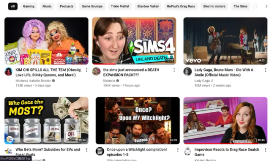
These were the first six rows of videos presented to me when I opened YouTube. Look at how inconsistent the horizontal spacing is between the videos. It drives me absolutely nuts, and I don't know if it's a me thing or a YouTube thing. Either way, it's an absolute eye sore. I mean the website is hardly usable in this state!
5 notes
·
View notes
Text

4 notes
·
View notes
Text
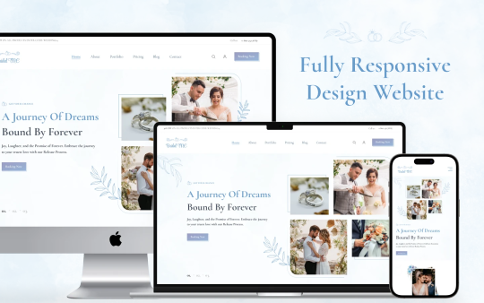
Bridal TNC: The Best Webflow Template for Weddings and Planners
A wedding is everyone’s forever dream. To turn that dream into reality, having a website for weddings and wedding planning services is very important. Whether you are a couple who wants to share your big day or a wedding planner promoting your services, Bridal TNC is a great Webflow template to help you build a beautiful and useful website.
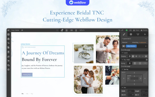
Why Pick Bridal TNC?
Bridal TNC is designed for wedding couples and professional planners. Its simple and stylish design makes it easy to use while showing important details.
For Couples:
Personal Wedding Website: Share your love story, event details, and memories with guests in a beautiful way.
Event Schedule: Keep guests informed about important wedding times.
Photo Gallery: Show your favorite pictures and videos from your journey and wedding.
Online Invitations: Send digital invites to family and friends easily.
Love Story Blog: Write about your special moments and wedding plans.
For Wedding Planners:
Service Portfolio: Show your best work and wedding planning experience to get new clients.
Package Listings: Clearly show different service packages for clients.
Client Reviews: Add real reviews from happy couples to build trust.
Contact Section: Make it easy for people to reach out for questions or bookings.
Blog Section: Share wedding tips, trends, and stories to connect with visitors.
Beautiful and Easy to Customize
Bridal TNC comes with three color choices—Blue, Pink, and Pale—so users can pick what matches their theme. The design is modern, simple, and easy to edit, allowing anyone to make changes without coding.
Pages Included in the Template
This template has many pre-designed pages to help you set up your website quickly:
Home: Three styles to choose from.
About: Share your love story or business background.
Pricing: Show wedding packages and costs clearly.
Portfolio: Display wedding highlights or past events.
Blog: Post wedding stories, tips, or news.
Contact: A simple form to help people get in touch.
Invitation & Announcement Pages: Special pages for wedding invites and updates.
Extra Templates: Includes Blog Categories, Authors, Tags, and a 404 page.
Easy to Use on Any Device
Bridal TNC is designed for a smooth experience. It looks great and works well on computers, tablets, and phones. No matter where guests or clients check your site, they will have a good experience.
Help and Customization
Since Bridal TNC is built on Webflow, users can easily change text, images, colors, and layout without coding. Also, ThemeNcode offers support to help users set up their website.
Final Thoughts
Bridal TNC is not just a template—it is a useful, stylish, and complete solution for weddings. Whether you are a couple sharing your big day or a planner wanting to grow your business, this Webflow template has everything you need. Get started with Bridal TNC today and make your wedding website easy and beautiful! For more details, visit Bridal TNC Webflow Template.
#ui ux design#web ui#webflow#ui ux company#web development#website#website development#uidesign#ui ux development services#wedding#wedding planning#marriage#bride#engagement#match making#web design#template
0 notes
Text
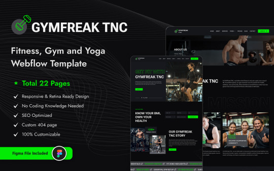
GymFreak TNC: The Ultimate Fitness Webflow Website Template for Your Gym Business
Having a strong online presence is important for gyms, fitness centers, and personal trainers. A well-designed website attracts new clients, showcases services, and builds a fitness community. If you need an easy-to-use and professional webflow website template, GymFreak TNC is a great choice.
Why Your Gym Needs a Website Before we talk about GymFreak TNC’s features, let’s look at why your gym needs a website.
Attract More Clients People search for gyms online before choosing one. A well-made website helps more people find you and turn into paying clients.
Showcase Your Services A website helps you display your services, whether personal training, group classes, or special programs.
Improve Client Engagement A website with contact forms, class schedules, and sign-ups makes it easy for people to connect with you.
Build Trust and Credibility A professional website makes your business look reliable and trustworthy, giving potential clients the confidence to join.
Why Choose GymFreak TNC? Here’s why GymFreak TNC is the best webflow website template for your gym.
Key Features
Modern and Responsive Design GymFreak TNC has a clean, professional design that works smoothly on all devices — computers, tablets, and phones.
Fast Performance A slow website can drive people away. GymFreak TNC is built for speed, so your visitors can browse without delays.
Easy to Customize You can change colors, fonts, layouts, and content to match your brand — no coding skills are required.
Eye-Catching Homepage The homepage features great images, smooth animations, and well-placed content to showcase your gym’s mission, trainers, and customer reviews.
Sections for Classes and Memberships GymFreak TNC has dedicated sections to display class schedules, pricing, and membership benefits.
Blog Section Writing blog posts helps attract visitors. GymFreak TNC includes a blog where you can share fitness tips, workout plans, and gym updates.
SEO-Friendly Structure GymFreak TNC is built to help your website rank higher on Google, increasing visibility and bringing in more potential clients.
Contact and Booking Forms Pre-built contact and booking forms make it easy for visitors to reach out or sign up for classes directly from the website.
Who Should Use GymFreak TNC? This Webflow website template is perfect for:
✔️ Gym Owners
✔️ Personal Trainers
✔️ Yoga and Pilates Studios
✔️ CrossFit and Bootcamp Gyms
✔️ Online Fitness Coaches
✔️ Health and Wellness Centers
If you fit into any of these categories, GymFreak TNC will help you create a great website that stands out in the fitness industry.
How to Get Started Setting up your fitness website with GymFreak TNC is easy:
Visit the Template Page Check out the demo to see how it looks.
Purchase and Download If you like it, buy the template and download the files.
Customize Your Website Edit the sections to add your gym’s branding, content, images, and class schedules.
Launch and Promote Once your website is ready, launch it and share it on social media, Google My Business, and fitness directories.

Final Thoughts
A great website can make a huge difference for your fitness business. GymFreak TNC gives you all the tools to create an engaging, high-converting gym website. Its modern design, fast performance, and easy customization make it perfect for gym owners, trainers, and fitness professionals who want a strong online presence.
Don’t miss out on potential clients — get a professional Webflow website template today with GymFreak TNC!
#ui ux design#web ui#uidesign#ui ux company#ui ux development services#webflow#template#web design#web development#website#website development#websitedesign#userexperience#digitalsuccess
0 notes