#WebDesignChallenges
Explore tagged Tumblr posts
Visit Tumblr Blog
Explore Tumblr blogs with no restrictions, modern design and the best experience.
Last Seen Tumblr Blogs


Fun Fact
130K people were victims of a chain letter scam that affected Tumblr in May 2011.
Text
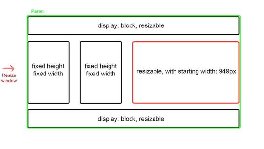
Resizing Divs with Maintained Aspect Ratio: A JavaScript Solution
Introduction
Welcome to our project where we embark on the journey of creating a user-friendly web experience. The primary goal is to empower users to seamlessly resize and relocate div elements on the website. However, this task comes with a unique challenge – maintaining the aspect ratio of these divs during the resizing process. Picture a scenario where squares need to remain squares, rectangles should stay true to their proportions, and each div should gracefully adapt to user interactions while preserving its original shape. This requirement adds a layer of complexity to our project, prompting us to explore solutions that go beyond conventional resizing techniques. Throughout this endeavor, we will delve into the intricacies of handling divs in a way that ensures not only a dynamic and interactive user experience but also respects the inherent aspect ratios of the elements. Join us as we navigate the challenges and discover effective solutions to achieve this harmonious balance between user control and design integrity.
Challenges with Aspect Ratio in CSS
While CSS provides a wealth of styling capabilities, the aspect-ratio property, unfortunately, poses certain limitations when it comes to our specific goal of maintaining aspect ratios during div resizing. Understanding these challenges is crucial as we navigate the intricacies of our project. The aspect-ratio property in CSS is a powerful tool for defining the proportional relationship between an element's width and height. However, its effectiveness becomes limited when attempting to dynamically adjust these ratios during user-initiated resizing actions. Consider the scenario where squares and rectangles are at risk of losing their carefully defined aspect ratios as users resize the divs. The straightforward application of the aspect-ratio property may not suffice in preserving the original shapes, leading us to explore alternative solutions that leverage JavaScript for a more dynamic and adaptable approach. Join us as we navigate these challenges and delve into the intricacies of maintaining aspect ratios for divs, uncovering solutions that go beyond the conventional boundaries of CSS styling.
JavaScript Solution
To overcome the challenges posed by CSS in maintaining aspect ratios during div resizing, we turn to the dynamic capabilities of JavaScript. With JavaScript, we gain the flexibility to handle user-initiated resizing events and apply logic that ensures our divs retain their original proportions. Let's delve into a straightforward JavaScript approach to address this challenge. The key lies in capturing the resize events and dynamically adjusting the div dimensions while enforcing the desired aspect ratio. Below is an example implementation: JavaScript function handleResize(event) { // Your logic to maintain aspect ratio during resizing // Example: Calculate new width and height based on the desired aspect ratio const newWidth = event.target.clientWidth; const newHeight = newWidth * aspectRatio; // Apply the new dimensions to the div event.target.style.width = `${newWidth}px`; event.target.style.height = `${newHeight}px`; } // Attach the resize event listener to your draggable divs const draggableDivs = document.querySelectorAll('.draggable'); draggableDivs.forEach(div => { div.addEventListener('resize', handleResize); }); This code snippet captures the essence of our JavaScript solution, providing a foundation for maintaining aspect ratios during div resizing. As you integrate this approach into your project, feel free to customize the logic to match your specific requirements and design considerations. Join us on this JavaScript-powered journey as we empower our divs to dynamically respond to user interactions while upholding their original aspect ratios.
Example Divs
Let's bring our JavaScript solution to life by showcasing practical examples of draggable divs with resize functionality. In this demonstration, we emphasize the significance of maintaining aspect ratios, ensuring that squares remain squares and rectangles stay true to their proportions. Consider the following HTML markup representing draggable divs: HTML Apply the JavaScript solution we discussed earlier to these divs, and witness the seamless interaction where users can resize and relocate divs while the aspect ratios are diligently maintained. As you explore these examples, observe how our solution enhances the user experience by preserving the intended shapes of squares and rectangles, even in the face of dynamic resizing actions.
Alternative Solutions
While our JavaScript solution provides a robust approach to maintaining aspect ratios during div resizing, it's essential to explore alternative solutions and libraries that may offer additional functionalities or cater to specific project requirements. Let's delve into some alternatives and highlight community recommendations: 1. Aspect Ratio CSS Library Explore CSS libraries designed specifically for managing aspect ratios. Libraries like "aspect-ratio-box" offer pre-built solutions that simplify the process of maintaining proportions during resizing. Check the documentation for implementation details. 2. ResizeObserver API Leverage the ResizeObserver API, a modern JavaScript API that notifies you when an element's content rectangle is resized. This can be a powerful tool for dynamically adjusting dimensions while preserving aspect ratios. Be sure to review browser compatibility and usage guidelines. 3. Third-Party UI Frameworks Consider integrating third-party UI frameworks that inherently support responsive resizing with maintained aspect ratios. Frameworks like React, Vue, or Angular often provide components or directives that handle these scenarios out of the box. While our discussed JavaScript solution remains a solid foundation, exploring these alternatives allows you to choose the approach that best aligns with your project's specific needs. Stay informed about community recommendations and best practices to enhance your development toolkit.
Frequently Asked Questions
Q1: Is it possible to maintain aspect ratios with CSS alone? A1: While CSS provides the aspect-ratio property, its limitations become apparent when dynamically resizing divs. JavaScript solutions offer more flexibility in handling these scenarios effectively. Q2: Can I use the aspect-ratio property in combination with JavaScript? A2: Absolutely. While the aspect-ratio property may have limitations, combining it with JavaScript allows for a comprehensive solution that ensures divs maintain their aspect ratios during resizing. Q3: Are there specific JavaScript libraries for handling aspect ratios? A3: Yes, some JavaScript libraries, such as "aspect-ratio-box," specialize in managing aspect ratios during dynamic interactions. Explore these libraries for pre-built solutions. Q4: How does the ResizeObserver API contribute to maintaining aspect ratios? A4: The ResizeObserver API notifies you when an element's size changes, making it a valuable tool for dynamically adjusting dimensions while preserving aspect ratios. Ensure compatibility and explore its usage in your project. Q5: Are there alternative solutions that don't involve JavaScript? A5: While JavaScript provides dynamic solutions, exploring CSS libraries and frameworks that inherently support aspect ratios can offer alternatives. Consider your project's requirements and choose the approach that best fits your needs. If you have additional questions or seek further clarification, feel free to reach out, and we'll be happy to assist you in achieving your div resizing goals.
Conclusion
In conclusion, our exploration has unveiled the possibilities of achieving resizable divs with meticulously maintained aspect ratios through the power of JavaScript. By understanding the limitations of CSS and leveraging the dynamic capabilities of JavaScript, we've crafted a solution that empowers users to interact with divs while preserving their original proportions. The key takeaway is clear: with the right JavaScript implementation, div resizing becomes a seamless and user-friendly experience, ensuring that squares remain squares, rectangles keep their proportions, and the design integrity of your project remains intact. As you embark on your journey of implementing these solutions, we encourage you to further explore and experiment with the presented code examples. Tweak the logic, adapt it to your specific project requirements, and discover how this dynamic approach can elevate your web development endeavors. Cheers to a future where resizable divs harmoniously respond to user interactions, maintaining their aspect ratios with grace and precision. Happy coding! Read the full article
0 notes
Text

Innovative Web Page Designing with the MCA Department's Innovation Club!
. https://www.iimtindia.net/ Call Us: 9520886860 . #IIMTNoida#IIMTGreaterNoida#IIMTIndia #MCACreativeMinds#InnovationClub#WebDesign#DigitalInnovation#FutureTechLeaders#MCAInnovationClub,��#WebDesignChallenge, #InnovateTheWeb
4 notes
·
View notes
Text
From Design Dilemmas to Digital Triumph: Solving 11 Key Challenges of Web Design
Discover 11 essential strategies to overcome common web design challenges and enhance your website's effectiveness for better conversions. #webdesign #webdesignchallenges #howtosolvewebdesignchallenges
From Design Dilemmas to Digital Triumph: Solving 11 Key Challenges of Web Design How to Rise Above the Digital Noise In today’s digital landscape, an effective web presence is crucial for businesses and professionals aiming to stand out. However, navigating the complexities of web design presents common web design challenges that can hinder progress. This blog post will explore 11 key obstacles…
0 notes