#a 9-bit RGB palette to be precise
Explore tagged Tumblr posts
Visit Tumblr Blog
Explore Tumblr blogs with no restrictions, modern design and the best experience.
Last Seen Tumblr Blogs


Fun Fact
Mobile US users spent an average of 115.8 minutes on Tumblr app monthly.
Text
i spent nearly 2 hours in ms paint drawing her and i like what i've done bc in the end i was more just practicing lmao

my friends say she looks like she's made of gelatin
#rouge the bat#sonic#the way my art style moulds and shifts depending on my mood and art program is fucking insane#this is basically baby's first rendering practice lmao (sort of)#also i used a mildly restricted colour pallete#a 9-bit RGB palette to be precise#it was fun until i had to shade her darker fur & ears lmfao
5 notes
·
View notes
Text
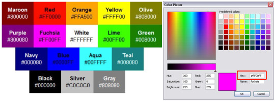
Understanding Hex Color Codes: How They Work and Why They Matter

In the world of digital design and web development, colors serve not only to enhance visual appeal but also to convey meaning, brand identity, and user experience. They play a pivotal role in shaping how information is perceived and interacted with online. Behind every vibrant website or engaging digital interface lies a sophisticated system of color representation: hex color codes.
These codes are indispensable tools that empower designers and developers to define precise color choices across diverse platforms and devices, ensuring consistency and fidelity to creative intent. This article explores the nuanced workings of hex color codes, shedding light on their intricacies, practical applications, and significance in modern digital media.
Hexadecimal Notation Explained
Hexadecimal, or "hex" for short, is a base-16 numbering system widely used in computing. Unlike our familiar decimal system (base-10), which uses ten digits (0-9), hexadecimal incorporates six additional symbols: A, B, C, D, E, and F, representing values 10 to 15. This system's utility stems from its direct correlation with binary, the fundamental language of computers. Each hexadecimal digit corresponds precisely to a grouping of four binary digits (bits), making it a convenient shorthand for representing binary values in a more manageable and human-readable format.
Components of Color: RGB Model
Colors displayed on digital screens are synthesized using the RGB (Red, Green, Blue) color model. This model operates on the principle of additive color mixing, where different intensities of red, green, and blue light combine to create a vast spectrum of colors. In RGB, each color component can independently vary from 0 (minimum intensity) to 255 (maximum intensity), allowing for precise control over the hue, saturation, and brightness of displayed colors.
Encoding Colors with Hex Color Codes
Hex color codes are a compact and efficient method of specifying colors in digital environments. Represented by a hash symbol (#) followed by six hexadecimal digits (e.g., #RRGGBB), these codes succinctly convey the intensity levels of red, green, and blue that compose a particular color. For instance, the hex code #FF0000 signifies pure red, with the red component at its maximum intensity (FF in hexadecimal) and no green or blue present (00 in hexadecimal).
Understanding Hexadecimal Conversion
Converting RGB values to hex color codes involves translating each decimal (base-10) value of the RGB components into its hexadecimal equivalent. This conversion simplifies the process of specifying colors in web design and graphic editing software, ensuring consistency across different platforms and devices. For example, the RGB value (255, 0, 0) converts directly to the hex code #FF0000, reflecting its pure red composition.
Efficiency and Range of Hex Codes
Hexadecimal notation offers significant advantages in terms of both efficiency and range. By condensing complex RGB values into a concise six-digit format, hex color codes facilitate streamlined communication and implementation of color specifications in digital media. With 16,777,216 possible combinations (16^6), hex codes encompass a comprehensive palette of colors that can be accurately reproduced on various digital screens, ensuring fidelity to designers' creative intentions.
Hex Code Abbreviations
In addition to full six-digit hex codes, abbreviated versions can be used for common colors. This shorthand notation offers several benefits:
Compactness: Reduces the code length to three digits, enhancing readability and efficiency in coding.
Performance Optimization: Helps optimize web page performance by reducing file sizes in CSS and HTML documents.
Ease of Use: Simplifies color specification and editing, particularly in large-scale web projects.
Compatibility: Widely supported across browsers and digital platforms, ensuring consistent color rendering.
For example:
#F00: Represents pure red (#FF0000).
#0F0: Represents pure green (#00FF00).
Practical Applications in Web Design
Hex color codes serve as foundational tools in web design, providing designers with a precise means to specify and manipulate colors across different digital platforms. By incorporating hex codes directly into CSS stylesheets or HTML attributes, designers ensure uniformity and coherence in color schemes, regardless of the viewing device or browser. This approach facilitates seamless adjustments and updates to color palettes throughout the development lifecycle, enhancing both aesthetic appeal and user experience.
Learning and Skill Development
Understanding hex color codes extends beyond practical application in web design, encompassing broader implications for digital media production and software development. Mastery of hex codes equips designers and developers with enhanced control over color manipulation and presentation, fostering creativity and technical proficiency across various digital disciplines. By grasping the nuances of hexadecimal notation and its relationship to RGB color encoding, professionals can elevate their capabilities in graphic design, image editing, and interface development.
Conclusion
In conclusion, hex color codes represent a cornerstone of modern digital design, enabling precise color representation and consistency in an increasingly digital world. By leveraging hexadecimal notation and its applications in the RGB color model, designers empower themselves to articulate visual concepts effectively and create compelling digital experiences. Mastery of hex color codes not only enhances technical proficiency but also enriches creative expression, underscoring their significance as essential tools for contemporary digital professionals.
0 notes
Photo

DEC PowerStorm 3D30 / TGA2 (March 1996)
PowerStorm 3D30 was an early low-cost 3D accelerator from Digital/Compaq. It cost just $795 and offered up to 1280x1024 in 256 colors (this was the maximum for all resolutions). Most of you presumably don’t know the card, because you could not find it in a standard PC. It was designed for DEC’s workstation based on Alpha CPUs. There is very little info about it (often not even correct) so I decided to consolidate all I know about it. This is what I know and what I was able to measure on a real hardware (thanks to Kyle Fox):
Basic description
The card uses the standard 32-bit PCI interface and contains three big chips. Cirrus Logic CL-GD5424 is an SVGA chipset and has its own 256kB of memory (16-bit). Its purpose is just to provide VGA compatibility during boot, before a graphic driver is loaded by the OS. There is even a switch on the card that can disable it (for multi-monitor solutions with multiple cards).
The Bt485A chip is a 170MHz true-color RAMDAC that has a standard input pixel port together with a separate VGA input port. Thus, it allows a cheap way to connect both graphics chips to a single monitor output and switch between them.
The main chip (“TGA2”) is the silver one manufactured by IBM (and designed by DEC). It’s a graphics controller with support for 2D, 3D and limited video acceleration. In this particular card (3D30), it has only 2MB of video memory, which cripples the maximum color depth to just 256 colors (PowerStorm 4D20 with the same chip supports also 12-bit and 24-bit modes).
In 2D/video, it offers standard BitBLT operations, YUV-RGB conversion and a very primitive 1-D video scaling with filtering (yes, hardware does the job only on horizontal axis; vertical scaling is handled by the CPU). There is no support for multiple 256-color palettes, which means that the video is converted to colors available for the whole desktop.
3D acceleration
The chip supports following features in hardware:
Double-buffering (contrary to SGI, the back buffer is stored in off-screen memory and copied once the frame is complete)
Z-Buffer (including the necessary depth operations)
Line and polygon drawing (wireframe, solid, smooth-shaded) ... contrary to several sources the chip is not limited to just wireframe drawing
Color dithering for 8-bit and 12-bit color modes
Fast color interpolation (for Gouraud shading)
Thus, there is no support for alpha-blending (transparency effects), fog and textures. Don’t expect playing GLQuake-like OpenGL games on this. The chip’s targets are 3D modeling/simulation and CAD/CAE.
DEC decided not to integrate geometry unit (transform & lighting) known from hi-end professional cards of the era and let the powerful Alpha CPU do the job.
We have tested the card under Windows NT 4.0 using our GPUbench program running under FX!32 emulation (fortunately, most of the tests generate very little CPU load so this doesn’t affect the results and the graphics driver runs as native code). This is one of very few cards being able to accelerate 3D in 256 colors with Windows.
The driver is limited to OpenGL 1.0.1 with extensions for vertex arrays. Unlike NT4 drivers for Matrox Millennium I/II and ATI Rage II cards, this driver is full ICD (installable client driver) so it handles the whole rendering pipeline. Early ATI and Matrox cards used MCD (Mini-Client Driver), which is basically a modification of the Microsoft’s OpenGL software renderer, where you can accelerate just the features available by the card (for example only untextured polygons). The issue with MCD is that you cannot accelerate the geometry processing. On the other side, MCD allows you to use even the features that are not supported by the card. DEC’s ICD driver completely ignores textures and does software emulation only for alpha-blending.
Having OpenGL acceleration in 256 colors brings color palette issues. The driver expects RGB 332 palette by default and if the application doesn’t handle this, colors will be wrong (OpenGL applications often didn’t care as they assumed at least 16-bit colors).
Performance
Rasterisation speed is surprisingly good with 69 Mpix/s (millions of pixels per second) with smooth-shaded (untextured) polygons. This decreases to 38 Mpix/s when Z-Buffer is enabled. This allows the card to render 60 fps in 640x480. For comparison with other cards (with enabled Z-Buffer): 50-MHz S3 Virge = 24 Mpix/s and 48MHz ATI Rage II+ = 21 Mpix/s, Matrox Millennium = 32 Mpix/s, SGI O2 = 56 Mpix/s, SGI Indy XL/XGE = 9 Mpix/s, SGI I2 Maximum Impact = 240 Mpix/s
Geometry pipeline can handle up to 606,000 vertices/second (516,000 with Z-Buffer) in a form of triangle strips or 329,000 independent triangles/second (291,000 with Z-Buffer). This is about 30-50% of UNIX hi-end and about 80% of PC workstation hi-end. Geometry performance is comparable with SGI O2(300MHz MIPS R5200 with vector units; 1998). Consumer cards in a Pentium MMX 200MHz PC could handle no more than 100,000-200,000 vertices/second and 40,000-70,000 independent triangles/s (with enabled Z-Buffer)
Alpha-blending done in software causes significant performance drops to just 1.4 Mpix/s. If it’s possible, it is better to avoid this feature and use stipple alpha instead.
Verdict
It seems that this was a good low-cost choice for powerful universal technical workstations. Geometry performance was especially good thanks to the power of Alpha CPUs, which made it a better choice over SGI’s low-end (Indy), until SGI O2 was released later that year. O2 was better was heavy 3D applications, but didn’t offer that good CPU performance.
Even with the Alpha-based workstations (like the Digital Personal Workstation 500a we used for this testing), there were other options for 3D acceleration. You could buy the same graphics chipset with 16MB ($2,495) to get full true color (32-bit or 12-bit for fast double-buffering) or go even higher for DEC’s rebranded Intergraph solutions (RealiZm Z13 with support for textures; $8,000).
In the low-end, Matrox Millennium I (MGA-2064) was a supported 3D accelerator. It offered better color precision (up to 32-bit in 3D) and 30-40% worse geometry performance.
Additional resources: Full GPUbench results, Open3D release notes, Video capabilities of TGA2 in Digital Technical Journal, Infoworld
PowerStorm 3D30 in VGA museum
#DIGITAL#DEC#PowerStorm#3D acceleration#3D#computer graphics#1996#1990s#Windows NT#workstation#VGA#graphics card#Matrox#Millennium#Intergraph#SGI#Indy#Maximum Impact
47 notes
·
View notes
Text
52 Graphic Design Terms: Learn the Lingo Like a Pro
Take a look at any company and the first thing you notice is what? The graphics, right? Whether it’s an ad, a social media picture, brochure, flyer etc. A picture is generally worth a thousand words but in this case it’s worth at least 52 graphic design terms.
These 52 graphic design terms will help you navigate through the world of graphic design with ease. Knowing which terms have what meaning and how they will apply to your digital marketing campaign are vital to any company. With so many graphic design terms out there it can all get a bit chaotic, which is why I’ve decided to separate them by four categories to make it a little easier to sift through: color, design, type and branding.
Graphic Design Terms Related to: Color
Let us get started with the first thing that draws our attention, color. As discussed in one of our recent blogs 10 creative graphic design tips for social media we mentioned how important color was in a social media campaign. Now let us get into which terms have what meanings and why it’s important to your digital marketing campaign!
1. CYMK
This is the perfect color format for your print products. CMYK is a 4-color printing process made up of cyan, magenta, yellow and black. These colors work best on print object. Ever wonder why you pick a beautiful color on the screen only to have it print in a shade other than what the screen showed? Chances are you’ve picked the wrong color format, luckily now you know the difference!
2. RGB
When dealing with anything digital RGB is the color format you need to aim for. RGB stands for red, green and blue, these three colors are perfect for any type of digital screen.

Hues, Tones, Shades, oh my!
3. Hue
Hues are the purest form of original colors. They are red, orange, yellow, green, blue, and violet.
4. Shade
Shade is the addition of black into a pure color.
5. Tint
Tint is the addition of white into a pure color.
6. Tone
Tone is known as the addition of gray into a pure color.

7. Saturation
Take a second to think of all the bright and colorful pictures that you see on websites or social media platforms. Chances are the designer behind that image saturated the picture to make it look more appealing to the eye. Saturation is the intensity and vividness of a color.
8. Gradient
Gradient is a gradual change from one color to another. This type of graphic design approach is exactly what Instagram did when they changed their logo.

9. Hex code
A hex is a six-digit number that follows a hashtag. It is used to represent colors and often what graphic designers use in computer design programs.
10. Palette
A color palette is more than just the range of colors used in a design. These are colors that work well together and will bring your brand together. Think like how Joanna Gaines has a distinct color palette she uses for her farmhouse remodels.
These next few terms can seem a little daunting and hard to understand. Don’t worry, I’ve included a nice little graph to explain visually what them mean. I mean this is a Graphic Design terms article after all.
11. Monochrome
A monochromatic color palette uses various tones with only one color.
12. Analogous
Analogous colors are known as colors that are adjacent to one another on the color wheel (Example: red violet, red and red orange).
13. Complementary
Complementary colors are opposites on the color wheel. This is almost like a contrast and will give some of your graphics that extra “POP!”
14. Triadic
Triadic colors are three colors that are spaced evenly on the color wheel. One color will be the dominate color, the second will support, and the third will be the accent color.

15. Pantone
The “Pantone Matching System” is a standardized color system, created especially for identifying each tone with exact precision. Thus, every color included in this classification is numbered with the goal of simplifying the process of using an exact color tone in designs and prints.
16. Warm Colors
Warm colors can be found on one half of the color wheel (reds, oranges, yellows and pinks).
17. Cool Colors
Cool colors occupy the other half (blues, greens and purples).
18. Color Theory
The study of how colors make people feel and their effects on a design is known as color theory. Color theory is used to explore the best types of colors to work in different design instances. For example, choosing a pastel scheme for a website that needs to feel soft. Or picking red and yellow for a magazine ad that needs to evoke energy.
Graphic Design Terms Related to: Design
Now that we have your colors fully color-ed. (see what I did there?) Let us move on to the design aspect of your digital marketing campaign. These next few graphic design terms will help bring your campaign a little closer to being the best.
19. Contrast
Contrast is when one element is completely different from another. Your designer may use color, shape, texture, size or typeface to create contrast.

20. Balance
This graphic design term is very important when keeping your audience engaged as the aesthetics of your page will either attract or repel potential consumers. Balance is the placement of elements on the page so that the text and graphics are equally distributed.
21. Mock Up
When graphic designers are creating a mock up, they are creating a realistic representation of how the design will look when full size.
22. Negative Space
Any space that surrounds the elements of your main design is called negative space. It is important to have this in order to give the eyes some “breathing room”. You’ll often notice that the most well known logos and brand designs involve a great deal of negative space. Remember, negative space doesn’t always mean white space.
23. Opacity
Opacity is when an object lacks transparency. Think of a black circle. That circle with a high percent of transparency lets you see what lies behind it. Whereas when you apply a higher opacity it is becomes more solid.
24. Rule of Thirds
The rule of thirds is a neat little technique that many designers are taught to use to determine a graphics focal point. Using a grid of three rows and columns, focal points are indicated where the lines overlap. Designers use this as a guide to determine where to place important elements in their design. This is especially important to your digital marketing advertisements because with the amount of ads out there today, you want to make sure your ads are the ones that stand out to potential customers over competitors.

25. Scale
Scale is the size of an object in relation to another element.
26. Texture
When it comes to design, texture can refer to the actual visual tactility of your design. Want your design to have a mirror or cut out effect? Texture on your graphics can do this. A texture is defined as the feel, appearance, or consistency of a surface or a substance. And in design a texture can mirror that.
27. Golden Ratio
The Golden Ratio is a common ratio that is found in life that is usually used in design to create pleasing and natural looking elements in your work. Many people use it when creating logos, graphics and even website designs.

28. Knolling
Knolling is when you arrange different elements at 90-degree angles from each other and then photograph them from above. This amazing technique creates a very symmetrical look that will give your customers a pleasing feeling.
29. Skeumorphism
Try saying that three times fast! Skeuomorphism is when a digital element is designed to look like a replica of the physical work. Think of the calculator app on your phone. It looks a lot like the real thing, right? Well, that’s Skeuomorphism. The more you use this technique, the better you can resonate with potential customers through a computer screen, phone, or tablet.
30. Image resolution
With all the graphic design terms this might just be one of the most important digital ones. The detail of an image is based on the number of pixels in the picture – which is known as resolution. When an image looks clearer then it has a higher resolution. When the resolution is lower it can become pixelated. The higher the resolution the better the image. The better the image the more likely a potential client is to stay on your page a bit longer because you look more professional and they trust you. Poor quality images immediately make your business lose credibility with anyone that sees them.
31. JPG and PNG images
These might look like the same to you but both are image formats for different purposes. A JPG format contains a plethora of colors and is great if you plan to share images on social platforms, such as Facebook, Instagram, Pinterest, etc. However, PNG is the perfect candidate for supporting better quality photos, such as logos, and great for keeping the quality of an image.
32. Vector images
Vector images are made up of points, lines, and curves using a mathematical equation which means the image can scale in size without losing any quality. Meaning they won’t get blurry when scaled.
33. Raster Images
Raster graphics are composed of pixels on a grid. They are great for special effects, color correction and manipulating photos. However, raster images are resolution-dependent, which means that images cannot be enlarged without degrading their quality.
Graphic Design Terms Related to: Typography
Ever look at a those articles that poke fun at the bad typography in logos and signs? That is why it is critical to know these graphic design terms and how to apply them to your logo – so you won’t become one of those spoofs! Below are some key terms that will help you to avoid being caught on those roast articles and score you a spot on the “Best Typography” list.. if there was one of course!
34. Typography
Typography is the visual component of a written word.
35. Kerning
Kerning is the adjustment of space between pairs of letters in the same word.
36. Tracking
Tracking is the alteration of space for entire words and blocks of text.

37. Leading
This is the space between two lines of text, also known as the “line-height”
38. Font
A font is a group of characters in a certain size and style. Think Arial Bold, Arial Italic, Arial Regular.
39. Typeface
A typeface is a family of fonts. Think Times New Roman, Arial, or Cambria.
40. Serif
Serifs are the small flourishes at the end of the strokes in some letters. (Example: Times New Roman)
41. Sans Serif
Sans means “without.” A sans serif font has no serifs, meaning no small flourishes. (Example: Arial)
42. Slab Serif
Slab serif have thick, block serifs. (Example: Courier New)
43. Script
A typeface that uses a flowing, cursive stroke.

44. Typographic Hierarchy
This is a system for organizing the texts in a web page that creates an order within the content thus allowing readers to easily scan and find what they are searching for. It guides the eyes to where each section of content begins and ends.
45. Lorem Ipsum
Lorem ipsum is dummy text used by web designers as placeholder text. This is used when the final copy is not yet ready. It has enough distribution of letters which allows it to look like readable in English language.
Graphic Design Terms Related to: Branding
On to the last section of our graphic design terms, branding. The moment we’ve all been waiting for. Learn how these graphic design terms actually pull together to help make your digital marketing campaign stand out from the rest! Keep reading for the final graphic design terms to finish fueling your brain with all the design savvy words there are to know!
46. Brand Identity
Your brand identity is a visual representation that describe the values, mission and background of your company. This will include logos, business cards, memos, packaging design, etc. This will outline your brand in its entirety. Making sure your brand has the proper, fonts, colors, emotions, logos and aesthetic will ensure that you’re building brand awareness in the best way possible.
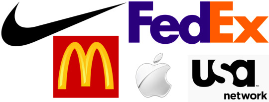
47. Logotype
A logotype is the name of a company that is designed in a visually unique way for use by that company. Most of the time when people refer to a logo, they’re referring to the brand’s logotype not the actually mark. Examples include: Google, Disney, Coca-Cola.
48. LogoMark
A logo mark usually doesn’t contain the name of the company it is more of an abstract representation that your company uses, usually in a symbol or mark. (An example would be Nike, Target, Apple)
49. Collateral
Your brands collateral pieces are the physical, visible objects that have been created to represent your specific brand. Collateral can include things like brochures, flyers, social media ads and even digital and print signs at an event.
50. Grid
A grid is evenly divided columns and rows that will arrange elements for a company in a consistent way. Whether it be for social media layouts, website layouts or just day to day activities. Grids are used to align design elements in a more efficient and accurate way.
51. Trademark
A trademark is a symbol, word, phrase, or design that you can use to distinguish your products or goods from those of competitors. Most companies will need to apply for this.
52. Mood board
Mood boards aren’t just for New Year’s Resolutions and self proclaimed goals! These boards are great when putting together images, text and other visual elements that can and will define your brand. When words simply aren’t enough to describe your brand, mood boards are perfect.
Wrapping Up
Phew, that seems like a lot doesn’t it? Don’t worry you can always come back to reference if need be. But these graphic design terms will not only help with your social media campaigns but your entire marketing campaign as well.
Now that you are design savvy in the graphics department put these graphic design terms to use and make your company’s marketing campaign outshine the rest! Don’t want to do it yourself? Consider working with one of our design professionals. Now you’ll be able to speak his/her lingo when it comes to creating designs for your digital marketing campaign. Contact us today!
Know some graphic design terms we missed? Comment below and share, let’s keep this thing going!
https://growinsta.xyz/52-graphic-design-terms-learn-the-lingo-like-a-pro/
#free instagram followers#free followers#free instagram followers instantly#get free instagram followers#free instagram followers trial#1000 free instagram followers trial#free instagram likes trial#100 free instagram followers#famoid free likes#followers gratis#famoid free followers#instagram followers generator#100 free instagram followers trial#free ig followers#free ig likes#instagram auto liker free#20 free instagram followers trial#free instagram followers no#verification#20 free instagram likes trial#1000 free instagram likes trial#followers instagram gratis#50 free instagram followers instantly#free instagram followers app#followers generator#free instagram followers instantly trial#free instagram followers no survey#insta 4liker#free followers me#free instagram followers bot
0 notes
Text
52 Graphic Design Terms: Learn the Lingo Like a Pro
Take a look at any company and the first thing you notice is what? The graphics, right? Whether it’s an ad, a social media picture, brochure, flyer etc. A picture is generally worth a thousand words but in this case it’s worth at least 52 graphic design terms.
These 52 graphic design terms will help you navigate through the world of graphic design with ease. Knowing which terms have what meaning and how they will apply to your digital marketing campaign are vital to any company. With so many graphic design terms out there it can all get a bit chaotic, which is why I’ve decided to separate them by four categories to make it a little easier to sift through: color, design, type and branding.
Graphic Design Terms Related to: Color
Let us get started with the first thing that draws our attention, color. As discussed in one of our recent blogs 10 creative graphic design tips for social media we mentioned how important color was in a social media campaign. Now let us get into which terms have what meanings and why it’s important to your digital marketing campaign!
1. CYMK
This is the perfect color format for your print products. CMYK is a 4-color printing process made up of cyan, magenta, yellow and black. These colors work best on print object. Ever wonder why you pick a beautiful color on the screen only to have it print in a shade other than what the screen showed? Chances are you’ve picked the wrong color format, luckily now you know the difference!
2. RGB
When dealing with anything digital RGB is the color format you need to aim for. RGB stands for red, green and blue, these three colors are perfect for any type of digital screen.
Hues, Tones, Shades, oh my!
3. Hue
Hues are the purest form of original colors. They are red, orange, yellow, green, blue, and violet.
4. Shade
Shade is the addition of black into a pure color.
5. Tint
Tint is the addition of white into a pure color.
6. Tone
Tone is known as the addition of gray into a pure color.
7. Saturation
Take a second to think of all the bright and colorful pictures that you see on websites or social media platforms. Chances are the designer behind that image saturated the picture to make it look more appealing to the eye. Saturation is the intensity and vividness of a color.
8. Gradient
Gradient is a gradual change from one color to another. This type of graphic design approach is exactly what Instagram did when they changed their logo.
9. Hex code
A hex is a six-digit number that follows a hashtag. It is used to represent colors and often what graphic designers use in computer design programs.
10. Palette
A color palette is more than just the range of colors used in a design. These are colors that work well together and will bring your brand together. Think like how Joanna Gaines has a distinct color palette she uses for her farmhouse remodels.
These next few terms can seem a little daunting and hard to understand. Don’t worry, I’ve included a nice little graph to explain visually what them mean. I mean this is a Graphic Design terms article after all.
11. Monochrome
A monochromatic color palette uses various tones with only one color.
12. Analogous
Analogous colors are known as colors that are adjacent to one another on the color wheel (Example: red violet, red and red orange).
13. Complementary
Complementary colors are opposites on the color wheel. This is almost like a contrast and will give some of your graphics that extra “POP!”
14. Triadic
Triadic colors are three colors that are spaced evenly on the color wheel. One color will be the dominate color, the second will support, and the third will be the accent color.
15. Pantone
The “Pantone Matching System” is a standardized color system, created especially for identifying each tone with exact precision. Thus, every color included in this classification is numbered with the goal of simplifying the process of using an exact color tone in designs and prints.
16. Warm Colors
Warm colors can be found on one half of the color wheel (reds, oranges, yellows and pinks).
17. Cool Colors
Cool colors occupy the other half (blues, greens and purples).
18. Color Theory
The study of how colors make people feel and their effects on a design is known as color theory. Color theory is used to explore the best types of colors to work in different design instances. For example, choosing a pastel scheme for a website that needs to feel soft. Or picking red and yellow for a magazine ad that needs to evoke energy.
Graphic Design Terms Related to: Design
Now that we have your colors fully color-ed. (see what I did there?) Let us move on to the design aspect of your digital marketing campaign. These next few graphic design terms will help bring your campaign a little closer to being the best.
19. Contrast
Contrast is when one element is completely different from another. Your designer may use color, shape, texture, size or typeface to create contrast.
20. Balance
This graphic design term is very important when keeping your audience engaged as the aesthetics of your page will either attract or repel potential consumers. Balance is the placement of elements on the page so that the text and graphics are equally distributed.
21. Mock Up
When graphic designers are creating a mock up, they are creating a realistic representation of how the design will look when full size.
22. Negative Space
Any space that surrounds the elements of your main design is called negative space. It is important to have this in order to give the eyes some “breathing room”. You’ll often notice that the most well known logos and brand designs involve a great deal of negative space. Remember, negative space doesn’t always mean white space.
23. Opacity
Opacity is when an object lacks transparency. Think of a black circle. That circle with a high percent of transparency lets you see what lies behind it. Whereas when you apply a higher opacity it is becomes more solid.
24. Rule of Thirds
The rule of thirds is a neat little technique that many designers are taught to use to determine a graphics focal point. Using a grid of three rows and columns, focal points are indicated where the lines overlap. Designers use this as a guide to determine where to place important elements in their design. This is especially important to your digital marketing advertisements because with the amount of ads out there today, you want to make sure your ads are the ones that stand out to potential customers over competitors.
25. Scale
Scale is the size of an object in relation to another element.
26. Texture
When it comes to design, texture can refer to the actual visual tactility of your design. Want your design to have a mirror or cut out effect? Texture on your graphics can do this. A texture is defined as the feel, appearance, or consistency of a surface or a substance. And in design a texture can mirror that.
27. Golden Ratio
The Golden Ratio is a common ratio that is found in life that is usually used in design to create pleasing and natural looking elements in your work. Many people use it when creating logos, graphics and even website designs.
28. Knolling
Knolling is when you arrange different elements at 90-degree angles from each other and then photograph them from above. This amazing technique creates a very symmetrical look that will give your customers a pleasing feeling.
29. Skeumorphism
Try saying that three times fast! Skeuomorphism is when a digital element is designed to look like a replica of the physical work. Think of the calculator app on your phone. It looks a lot like the real thing, right? Well, that’s Skeuomorphism. The more you use this technique, the better you can resonate with potential customers through a computer screen, phone, or tablet.
30. Image resolution
With all the graphic design terms this might just be one of the most important digital ones. The detail of an image is based on the number of pixels in the picture – which is known as resolution. When an image looks clearer then it has a higher resolution. When the resolution is lower it can become pixelated. The higher the resolution the better the image. The better the image the more likely a potential client is to stay on your page a bit longer because you look more professional and they trust you. Poor quality images immediately make your business lose credibility with anyone that sees them.
31. JPG and PNG images
These might look like the same to you but both are image formats for different purposes. A JPG format contains a plethora of colors and is great if you plan to share images on social platforms, such as Facebook, Instagram, Pinterest, etc. However, PNG is the perfect candidate for supporting better quality photos, such as logos, and great for keeping the quality of an image.
32. Vector images
Vector images are made up of points, lines, and curves using a mathematical equation which means the image can scale in size without losing any quality. Meaning they won’t get blurry when scaled.
33. Raster Images
Raster graphics are composed of pixels on a grid. They are great for special effects, color correction and manipulating photos. However, raster images are resolution-dependent, which means that images cannot be enlarged without degrading their quality.
Graphic Design Terms Related to: Typography
Ever look at a those articles that poke fun at the bad typography in logos and signs? That is why it is critical to know these graphic design terms and how to apply them to your logo – so you won’t become one of those spoofs! Below are some key terms that will help you to avoid being caught on those roast articles and score you a spot on the “Best Typography” list.. if there was one of course!
34. Typography
Typography is the visual component of a written word.
35. Kerning
Kerning is the adjustment of space between pairs of letters in the same word.
36. Tracking
Tracking is the alteration of space for entire words and blocks of text.
37. Leading
This is the space between two lines of text, also known as the “line-height”
38. Font
A font is a group of characters in a certain size and style. Think Arial Bold, Arial Italic, Arial Regular.
39. Typeface
A typeface is a family of fonts. Think Times New Roman, Arial, or Cambria.
40. Serif
Serifs are the small flourishes at the end of the strokes in some letters. (Example: Times New Roman)
41. Sans Serif
Sans means “without.” A sans serif font has no serifs, meaning no small flourishes. (Example: Arial)
42. Slab Serif
Slab serif have thick, block serifs. (Example: Courier New)
43. Script
A typeface that uses a flowing, cursive stroke.
44. Typographic Hierarchy
This is a system for organizing the texts in a web page that creates an order within the content thus allowing readers to easily scan and find what they are searching for. It guides the eyes to where each section of content begins and ends.
45. Lorem Ipsum
Lorem ipsum is dummy text used by web designers as placeholder text. This is used when the final copy is not yet ready. It has enough distribution of letters which allows it to look like readable in English language.
Graphic Design Terms Related to: Branding
On to the last section of our graphic design terms, branding. The moment we’ve all been waiting for. Learn how these graphic design terms actually pull together to help make your digital marketing campaign stand out from the rest! Keep reading for the final graphic design terms to finish fueling your brain with all the design savvy words there are to know!
46. Brand Identity
Your brand identity is a visual representation that describe the values, mission and background of your company. This will include logos, business cards, memos, packaging design, etc. This will outline your brand in its entirety. Making sure your brand has the proper, fonts, colors, emotions, logos and aesthetic will ensure that you’re building brand awareness in the best way possible.
47. Logotype
A logotype is the name of a company that is designed in a visually unique way for use by that company. Most of the time when people refer to a logo, they’re referring to the brand’s logotype not the actually mark. Examples include: Google, Disney, Coca-Cola.
48. LogoMark
A logo mark usually doesn’t contain the name of the company it is more of an abstract representation that your company uses, usually in a symbol or mark. (An example would be Nike, Target, Apple)
49. Collateral
Your brands collateral pieces are the physical, visible objects that have been created to represent your specific brand. Collateral can include things like brochures, flyers, social media ads and even digital and print signs at an event.
50. Grid
A grid is evenly divided columns and rows that will arrange elements for a company in a consistent way. Whether it be for social media layouts, website layouts or just day to day activities. Grids are used to align design elements in a more efficient and accurate way.
51. Trademark
A trademark is a symbol, word, phrase, or design that you can use to distinguish your products or goods from those of competitors. Most companies will need to apply for this.
52. Mood board
Mood boards aren’t just for New Year’s Resolutions and self proclaimed goals! These boards are great when putting together images, text and other visual elements that can and will define your brand. When words simply aren’t enough to describe your brand, mood boards are perfect.
Wrapping Up
Phew, that seems like a lot doesn’t it? Don’t worry you can always come back to reference if need be. But these graphic design terms will not only help with your social media campaigns but your entire marketing campaign as well.
Now that you are design savvy in the graphics department put these graphic design terms to use and make your company’s marketing campaign outshine the rest! Don’t want to do it yourself? Consider working with one of our design professionals. Now you’ll be able to speak his/her lingo when it comes to creating designs for your digital marketing campaign. Contact us today!
Know some graphic design terms we missed? Comment below and share, let’s keep this thing going!
The post 52 Graphic Design Terms: Learn the Lingo Like a Pro appeared first on Digital Marketing Blog.
from Digital Marketing Blog https://ift.tt/2Msj7RI via IFTTT
0 notes
Text
Philips 32-inch 328P6AUBREB may be my next monitor
Presented as perfect for graphic designers, CAD engineers, photographers, video editors and other professionals, the new monitor from Philips has an attractive price: $499. Can the Philips 32-inch 328P6AUBREB deliver?
At the moment I do not have an answer for you, but I may well have one soon, this soon being early next year, when the new monitor, just announced, will be available. The new monitor, added to Philips P-line of monitors, follows the logic of that line: monitors designed to deliver precise, accurate and colour-critical colour performance. Demonstrated earlier this year, the – effectively – 31.5” QHD display supports the AdobeRGB color gamut and represents, for me, a step into the future, has it offers a built-in USB-C dock that features USB ports, a gigabit Ethernet port, and conforms to USB Power Delivery specifications to support power to laptops.
Before I continue, let me say that my sudden interest on a new monitor reflects the imminent demise of my main monitor, a Dell U3011 bought in 2012, to replace another 30-inch monitor, the HP LP3065. The Dell has served me well, but a few days ago its screen started to go black and I’ve to disconnect it from the mains, wait a few seconds and reconnect it again to get it working. After checking cables, changing ports and confirming that connections are OK, there is no doubt there is a problem with the monitor. The issue is largely commented online, and apparently there are not many solutions for it, not even from Dell. I tried to get support from Dell, but getting support from the company where I am based is like a nightmare. So, instead of keep trying, I decided to look for a new monitor.
My previous experience with the HP monitor, which I sent to be repaired, only to have the technicians frying it – and I am still waiting, since 2012, for the insurance company Allianz to get back to me with an answer to that situation – makes me believe it is better to buy a new monitor than to try to get an old monitor repaired. Repairing an old monitor is a bit like trying to repair those old CRT monitors or TVs from the past: you would fix a component only for another one to break the following week. So, when looking at the price Philips asks for this new monitor, it makes more sense to buy a new one than to have the Dell repaired. $499 for a new 32 inch monitor is an interesting price, and it shows that prices keep going lower. It’s a trend I’ve written about in previous guides, so it is good to confirm it is still working.
I looked around for monitors, and there are some interesting solutions available or about to reach the market, and I will soon, before Christmas, write a guide about monitors to buy in 2018, but for now I want to look at the Philips, because it seems to fit my needs, and give me access to recent technology. According to the information provided by Philips, the 328P6AUBREB is equipped with the extremely versatile connectivity of the latest-generation USB 3.1 Type C technology. Featuring a slim, reversible connector, USB-C enables users to charge, transfer audio and video signal, and connect to the Internet – all with one single cable. Hence, the monitor instantly becomes a hub and serves as a docking station, just without using that extra space on the desk.
Consequently, USB-C extends the limited connectivity of notebooks and allows users to transfer data securely at ultra-fast speeds. USB 3.1 is 20 times faster than USB 2.0, making data transfer a breeze. And, for those whose devices seem to always be running low on battery, USB-C with power delivery can even charge notebooks. The monitor also makes it easy to link multiple monitors, which suits me as sometimes I need to have an extra monitor connected.
Why not buy a 4K UHD monitor, you’ve probably asked by now? Well, I rather have a QHD, which is suitable for my needs at the moment, and does not make me rush my building of a new computer. In fact, the problem when you go to higher resolutions is to have a computer/graphics card able to manage the extra pixels. The 2560×1440 from the Philips 328P6AUBREB gives me an excellent working space, and I will gladly trade a few pixels in resolution – remember that now I’ve 2560×1600 – for the gain in size, as this is a 32-inch against my 30-inch.
This monitor is a 16:9, against my Dell, which is a 16:10. It looks as if the 16:10 2560×1600 type monitors that some 10 years ago seemed to be on the verge of becoming common have vanished, and it is mostly 16:9 monitors you’ll find, if you’re not looking after one of those odd panoramic models. This Quad HD will offer me, according to Philips, “an excellent viewing experience with high-resolution visuals”. I’ve contacted Philips today, and now I just have to wait until the monitor is available.
The monitor also offers HDR technology, ensuring exceptional brightness and contrast, as well as a rich palette of captivating new colours never before seen on a display. Philips adds that “the 10-bit display offers 1.074 billion of them, supported by 12-bit internal processing for natural colours and smooth gradients. With 99% Adobe RGB and 100% sRGB (CIE 1973), the 328P6AUBREB offers professional colour standards and 2560 x 1440 pixels deliver crystal-clear images and make graphics come alive. Thanks to IPS technology, the monitor can be viewed from an angle of 178° without losing any of the colour accuracy or consistent brightness that professional applications demand.”
Explaining the display’s positioning, Artem Khomenko, Product Manager Philips Monitors Europe at MMD, says: “The P-line monitors are designed to deliver precise, accurate and colour-critical colour performance. We are proud to bring this new model to the market, and to meet the high standards of professionals. This model is the perfect fit for graphic designers, CAD engineers, photographers, video editors and other professionals who rely on an outstanding on-screen reproduction of fine details.”
The new 32-inch QHD display also offers features that are common on Philips monitors: the SmartErgoBase ergonomic adjustable stand enables users to tilt, swivel and raise the display for maximum viewing comfort, or the Philips LowBlue Mode which reduces potentially harmful shortwave blue light. Flicker-free technology regulates brightness and reduces flicker for even more comfortable viewing.
Although I would do without, the monitor also comes with built-in stereo speakers which, says the company, provide excellent audio reproduction while eliminating the need for peripheral speakers… I may get used to that, now I think about it! One more thing about the new monitor: Philips says it is made of 65% post-consumer recycled plastics, meaning it is a good choice for eco-friendly users. I am in… now I just need to get my hands on the monitor and see if it really lives to the promises made. Somehow, it is a return to Philips, as I’ve used their CRT monitors many years ago and remember how well they performed.
The Philips 32-inch 328P6AUBREB will be available in Europe January 2018 and there is no information, yet, when it will be available in the United States. The price, though, will be around the $499 mentioned, using the European price as reference.
The post Philips 32-inch 328P6AUBREB may be my next monitor appeared first on ProVideo Coalition.
First Found At: Philips 32-inch 328P6AUBREB may be my next monitor
0 notes