#a drawing applet: -exists-
Explore tagged Tumblr posts
Visit Tumblr Blog
Explore Tumblr blogs with no restrictions, modern design and the best experience.
Last Seen Tumblr Blogs


Fun Fact
China blocked Tumblr because of pornography and censorship problems in 2013.
Text


#trainer Trip#PokeAni#Pokemon Best Wishes#Shuuti#Shootie#Shooty#a drawing applet: -exists-#me: -draws Shootie in it-#Pokemon#Trip#my doodle#chibi
8 notes
·
View notes
Text
5 Best Programs to Make Graphs and ChartsWhich would you want to do: read through a huge wall of text inclusive of equations and numbers or analyze a colorful chart containing every crucial data you need? You've probably answered the latter, and everybody else does think the same way too.Maybe you've ventured into Excel and felt that graphs are a bit too complex. Plus, their visuals aren't as compelling to your audience. Thankfully, a better graph maker does exist out there, one that gives you captivating visuals. We've found and tested five of the best programs to make graphs and charts. These can be your new pie chart maker or quick graph-making app. Check them out below!Venngage: The Best Graph Maker SoftwareThis graph maker app understands that data isn't just for businesses. They're for educational purposes, too. So, like Vizzlo, it gives you handy templates to easily edit and modify to your needs. Plus, it's web-accessible. You can send your graph to others and allow them to collaborate quickly.With Venngage, you enjoy the following features:Business-to-Business-oriented templates to save time designingFully customizable templatesQuick graph maker software with online collaboration featuresVenngage's prices aren't steep (relatively) because of the great options and templates you have. Free gives you five designs and five image uploads only$19/month Premium gives you unlimited designs but only 50 image uploads. You also get premium charts$49/month Business gives you unlimited designs and 500 image uploads with custom brandingEnterprise-level use is available by consultationMicrosoft Visio: A Quick Graph MakerMicrosoft's Excel chart upgrade (as we'd like to put it) is part of its Microsoft 365 suite. If you have subscribed, you probably have access to Visio. Microsoft has carefully crafted Visio to be ultimately user-friendly, but don't mistake its simplicity to limit its potential from simple flowcharts to complex floor plans.Visio is convenient because of these benefits:Create simple flowcharts, floor plans, organizational charts, and graphs using a simple and easy-to-understand interfaceEasy collaboration thanks to Microsoft Visio's quick web accessibilityEasy interaction and collaborationMicrosoft Visio's basic package costs about $5 monthly, paid one year in advance. This package includes the basic bar chart maker and other features. On the other hand, $15 is perfect for advanced diagramming tools for specialist planners.Draw.io/Diagrams.net: The Perfect Chart Maker AppLet's say you want to draw a chart quickly. Therefore, a quick graph maker tool you can pull out of nowhere will be beneficial. Draw.io/Diagrams.net is that chart maker app you can access at any time, and it's free best of all!The free chart-making software has extensive functionality but only has a brief and short tutorial. Plus, you only get basic shapes, but you can draw advanced ones if you have more time.Draw.io gives you the following:Diagramming tool makes it easy to create process diagrams, organizational charts, network diagrams, and beyondEasy sharing and collaboration thanks to its web-based softwareFree to use and export your files!Vizzlo: The Runner-UpWhile it's web-based like Draw.io, it's not free chart-making software. However, it does have advanced features that help you save time, such as its hundred-and-more selection of chart structures to inspire you. Plus, they're all adaptable to suit your graphing needs (as you may have guessed).You can use Vizzlo free of charge, but we know you'll want to use its advanced graphing features. Paying for Vizzlo gives you the following:Visually appealing charts within seconds of use100+ chart selection with handy designs for any situationIntuitive and customizable designsVizzlo has four pricing tiers, with one of them being free of charge:Free: limited featuresProfessional: $11/ month paid yearlyTeams: $45/ month paid annuallyRequires consultation for enterprise-level usageSmartdraw: The Easiest to Use
Chart Maker OnlineIf you'd like a streamlined approach to your flowchart maker, then Smartdraw is surely right up your alley. You can create your flow by creating flowcharts and bar graphs. Intelligent formatting makes it easy to customize, export, and edit your charts and graphs. You also have access to thousands of templates if you need quick data visuals too.Smartdraw includes the following features:1,000+ templates perfect for professional or personal useConvenient accessory tools for building any flowchart, graph, and other visual structural content you needSmartdraw costs $9.95/month paid yearly for single users and $5.95/month for multiple users, including advanced features and customer support.Data Visualization Is Never Complicated (and Expensive!)Having gone through this list, you've seen that many of these best chart-making software offer free but limited versions. These might limit your template access. However, exploring the software's features gives you compatibility insight with your current existing operations. Doing so ensures you're making an informed decision before subscribing to your chosen bar chart maker's premium paid versions. All of these best graph-making software guarantees the best results for both on-screen and printed graphs, charts, and more.
0 notes
Note
Hello! So I am interested in paint bbs and I saw that you used to paint in there and I was hopeing if you can explain a little we’re to start or how to start (how to do a account) because I don’t really know the official place of if it is a official place, I hope you can help me! Sorry for my English
HIIIIII dont apologize for your english its perfect!!!
sooo unfortunately paintbbs and oekaki in general are really falling out of fashion as of the past couple years, if i had to guess mostly due to the fact that its reliant entirely on java, which is also becoming obsolete fast at least in regards to anything not related to programming. I can't speak for people using other operating systems, but at least on my mac, its been probably a year at least since it could properly run any sort of java-based applet before the os updates just outran what java was capable of ☹️ so you may very well have better luck with windows or something but I'm not sure
another main problem though is that because of this, there aren't very many places that host oekaki anymore. bc it wasn't a program that you downloaded to your computer (at least to my knowledge; ive looked for downloads and haven't been able to find any) there wasn't really one specific place you had to go to use paintbbs--generally how it worked was that there would be a board online (usually an offshoot of a forum) that would host the oekaki applets, and you would make an account on one of these boards in order to be able to use the oekaki applets, similar to things like tegaki e. i wish i had some boards i could recommend to you, but the one or two that i kept up with don't exist anymore.....im not sure when oekaki originated, but judging by the fact that i started using it in middle school, it wouldve had to have been in the early 2000s, so a lot of the boards were well over 10-15 years old, and the domain names seemed to start expiring one after another. the most recent board i used was called sutaro sketcher, but trying to go to it now just leaves you with a 404 error.
you can definitely try your hand at just searching for oekaki boards and seeing what comes up (ive tried a couple times, but I'm mostly getting boards with newer applets that I'm not familiar with as opposed to the classic paintbbs, shipainter, oekakibbs, etc. it looks like chickensmoothie is relatively active and at least functioning, though it only offers chibipaint, which i knew of but never familiarized myself with) because its entirely possible i overlooked some, but i myself haven't had much luck. if you do find a board with paintbbs, I'm sure all you'll have to do is register, which should immediately grant you access to the drawing applets! just make sure your java is up to date though, because they get seriously buggy if it’s not. id also recommend screenshotting your progress frequently, because a lot of the times the applets will allow you to use all the functions of it no problem, but will crash or run into issues when you try to upload your finished piece.
in the event that you don't find any boards youre satisfied with, you could always give tegaki e a try! its not exactly the same, but i do find it shares similarities to the ways that shipainter and paintbbs handled color and opacity layering. I'm sorry i couldn't be more helpful!!!!! oekaki was a huge part of my artistic upbringing and it brings back such fond memories, but unfortunately its kinda disappeared ����
i tried to track down some artists that used it recently, and i believe i found one, so i sent them an ask to see if they knew of and used an active board. if they reply back with one, ill definitely let you know!!!
1 note
·
View note
Text
Lupine Publishers | A Data Collection and Visualization System for Smart Buildings

Lupine Publsihers | Computer Science Research Journals
Abstract
As a very import part of the Internet of Things (IoT), smart buildings usually consist of wireless sensor network (WSN) and many radio-frequency identification devices for data collection instantly. This paper presents a real time data collection and visualization scheme for smart buildings. We propose a framework that uses both open source hardware and software to collect the event driven data from a WSN and subsequently convert them to the query-based data which is needed by cloud server. Experiment results demonstrated that the proposed framework is feasible for efficiently visualizing data locally and preparing query-based data for cloud storage server.
Keywords: Wireless Sensor Network; Iot; Data Visualization; Smart Building
Introduction
Wireless sensor network (WSN) is a very important part of the Internet of Things (IoT) [1]. It is composed of several thousands of sensor nodes which are capable of sensing, actuating and relaying the collected information [2-4]. The primary function of WSN is to obtain information from sensors and monitor environments. In recent years, many WSN applications have been developed. Particularly, in smart home or smart building applications [5], all sensors connected to WSN will collect data and subsequently forward them to a central device referred as WSN hub or gateway. These data could be saved locally and finally uploaded on cloud storage server like Blink or Arlo home security system. In general, the cloud storage server is the center of smart home or smart building. As a result, users need access these data anytime or anywhere from their smart phone or other mobile devices. Hence, all the smart building related management applications could be considered as cloud based IoT systems [6-7].
With the data collected on a WSN in real time, users can employ a smart building management application to visualizing these data in a local machine or upload these data on the cloud for a broad management purpose. Because there are many different protocols exist on IoT, one of the biggest challenges for general management applications is the interoperability. That is, the devices on IoT working on different protocols cannot communicate and exchange data compatibly. Most importantly, the products with the same protocols are not even always interoperable across different profiles [7]. Moreover, the data collected from WSN sensors are the event-based raw data. Those data must be subsequently converted to a query-based format for an efficient usage by different protocols with difference devices. Meanwhile, all those data should be stored persistently in the cloud server at multiple levels. Later, they could be easily combined and processed with previously stored data, as well as with other non-IoT data [8]. Thus, in this paper, we propose a cross-platform system to visualize WSN data and convert the event-based data to a query-based format for the cloud storage server. This paper is organized as follows: section 2 described the proposed structure of WSN. Experiment results are shown in section 3. Section 4 draws the conclusion and future work.
Structure of WSN
One of the most popular WSN protocols is ZigBee [9]. A typical ZigBee based wireless sensor network is shown in Figure 1. The XBee module is an implementation of ZigBee standard from Digi International Inc. [www.digi.com]. There are three parts in XBee/ ZigBee mesh network: coordinator (red dot), router (blue dot) and end node (green dot) [10]. All the data collected by end nodes will be forwarded to coordinator via routers in the WSN and processed by a local computer directly connected with that coordinator. In our work, we adopted XBee/ZigBee based WSN for the data collection. In XBee/ZigBee based WSN, one XBee module is configured as coordinator and there are many other XBee modules are configured as routers that could be connected to sensors [11]. A temperature sensor is attached on end node (green dot) in our system as demonstrated in Figure 1. An XBee wireless node is actually a microcontroller with a wireless radio transceiver. XBee provides both analog port and digital port based on its configuration. The detailed XBee configuration could be found in Faludi’s work [10]. Figure 2 shows the circuits on a breadboard, prototype board, and print circuit board of a wireless sensor node in our experiment.
Figure 1: A typical ZigBee based wireless sensor network.
Figure 2: Circuit boards of a wireless sensor node.
Experiment Results
Figure 3: XBee based WSN real-time data visualization in a smart building.
In a smart building scenario, we mount the wireless sensors in different locations in a building. The sensors will collect temperature, transmit these data in real time, and forward those data to an XBee coordinator which is connected with a computer. In Figure 3, we demonstrated our experiment result created by an open source programming language named “processing” [12]. The temperature data are displayed based on their locations in the building with red dots representing the XBee wireless sensor nodes. We also can animate the temperature data and blink the dots in order when our system receive the data nodes. The original data were recorded in Fahrenheit. Then, we converted the temperature unit to Celsius in visualization tool as shown in Figure 3. The “processing” is a Java based language so the results could be exported to a Java applet and used in a web browser-based management application. To convert the event-driven based data in query-based format, we applied the SQLite in our system with Python. SQLite is a self-contained, serverless database engine which is very fast and light weighted. Because it requires no configuration and stores information in ordinary disk files, SQLite is a popular choice as a database to backup data in cloud storage server. Based on the corresponding MAC address of the XBee node, SQLite database system record the temperature value and add timestamp simultaneously for that node. Figure 4 demonstrates a sample of our experimental data after the conversion (Figure 4).
Figure 4: Query based data converted from real-time WSN.
Conclusion
In this paper, we presented an XBee/ZigBee based WSN to collect and visualize the data in real time for smart buildings. We described the structure to build this IoT application. The framework combines both processing and python-based data visualization tool through a local computer and could be exported as a Java applet to integrate in a web page. Our work on this project can be further extended by uploading data on cloud server and using web crawling technique to extract data for third-parties who are interested in other IoT applications.
Acknowledgment
This work is supported in part by the Undergraduate Research Program of the City University of New York (CUNY) and the PSCCUNY grant.
https://lupinepublishers.com/computer-science-journal/fulltext/a-data-collection-and-visualization-system-for-smart-buildings.ID.000111.php
For more Lupine Publishers Open Access Journals Please visit our website: www.lupinepublishersgroup.com/
For more Computer Science articles Please click here: https://lupinepublishers.com/computer-science-journal/index.php
To Know more Open Access Publishers Click on Lupine Publishers
4 notes
·
View notes
Text
Learning Disabilities Masterpost
At the end of every section there will be a soundcloud link, where you will find a recorded voice reading what I wrote.
EDIT: classification and terminology are based on my country and bound to american translation. They may be different where you live. Thank you to @captainbluebear for pointing this out.
General Info
What are learning disabilities?
Learning disabilities (LD) are difficulties in several areas of functioning. People with LD may experience troubles with letters - writing, reading; numbers - recognizing digits, calculating, measuring, timing; spacial recognition; languages, sounds, and visual procession. They're not exactly separate disabilities: they're more like different kinds and manifestations of a same disability.
LDs have nothing to do with cognitive disabilities, or under-average QI.
What causes them?
LDs are congenital (from birth), and their cause is not yet clear. What we know is that the brain of people with LDs is peculiar is some areas, but we don't know why.
Accidents or illnesses can cause similar conditions, but not LDs, which are developmental disorders (thank you to @actuallydyspraxic for this correction).
What kind of learning disabilities exist?
Learning disabilities include:
Auditory Processing Disorder (APD)
Dyscalculia
Dyslexia
Dysgraphia
Dyspraxia
Non-Verbal Learning Disabilities
Visual Perceptual/Visual Motor Deficit
Auditory Processing Disorder (APD)
Condition that adversely affects how sounds that travel through the ear are processed or interpreted by the brain. Individuals with APD do not recognize subtle differences between sounds in words, even when the sounds are loud and clear enough to be heard. They can also find it difficult to tell where sounds are coming from, to make sense of the order of sounds, or to block out competing background noises.
Dyscalculia
Affects a person’s ability to understand numbers and learn math facts. Individuals with this type of LD may also have poor comprehension of math symbols, may struggle with memorizing and organizing numbers, have difficulty telling time, or have trouble with counting and measures.
Dyslexia
Affects reading and related language-based processing skills. The severity can differ in each individual but can affect reading fluency, decoding, reading comprehension, recall, writing, spelling, and sometimes speech.
Dysgraphia
Affects a person’s handwriting ability and fine motor skills. Problems may include illegible handwriting, inconsistent spacing, poor spatial planning on paper, poor spelling, and difficulty composing writing as well as thinking and writing at the same time.
Dyspraxia
Disorder that is characterized by difficulty in muscle control, which causes problems with movement and coordination, language and speech, and can affect learning.
Non-Verbal Learning Disabilities
Disorder which is usually characterized by a significant discrepancy between higher verbal skills and weaker motor, visual-spatial and social skills. Typically, an individual with NLD (or NVLD) has trouble interpreting nonverbal cues like facial expressions or body language, and may have poor coordination.
Visual Perceptual/Visual Motor Deficit
Disorder that affects the understanding of information that a person sees, or the ability to draw or copy. It can result in missing subtle differences in shapes or printed letters, losing place frequently, struggles with cutting, holding pencil too tightly, or poor eye/hand coordination.
AUDIO
Useful links
Understood: a website dedicated to learning and attention issues. In English and Spanish. It helps you find personalized recommendations, let you chat with an expert or join a discussion, and, what I find most interesting, recreates the experience of someone with learning disabilities so that people who don't have them can understand us better. In addition, it lists various tips and articles, even on the legal side.
Learning Disabilities Checklist: if you're not sure whether you have a LD or not, this checklist may help clearing things up. Moreover, if you decide to see a professional, it's a useful document to show to them. It's a clear and organized statement of what you're experiencing, which could save time and avoid confusion, and even help with nervousness.
YAKIToMe!: a free website that allows you to have whatever text you want read aloud. In English, Spanish, German, and French.
ToolsToGrow: a website that provides many useful tools for various LDs.
LearningAlly: a no-profit focused on helping people with print disabilities, including blindness, visual impairment, and dyslexia. Their main goal is to bypass text and create audiobooks and other useful aids.
ldonline: a website dedicated to educators and help them support people with learning disabilities better.
@hashtagld: comics about learning disabilities. Very relatable and often put a smile on my face or make me feel understood.
Auditory Processing Disorder (APD)
Overview on APD: a nhs page which lists symptoms and other useful info.
AuditoryCenter: a website dedicated to APD, belonging to a small private practice specialized in assessment and treatment of this condition. Informative.
Resources for Adults with Auditory Processing Disorder: by Rambling Justice, a page dedicated to useful resources for people with APD. It features organizations, youtube videos, ways of finding other people with APD and captioned television, videos, and movies, and many other useful links.
@brainhearingjumble and @thatcapdfeel: blogs dedicated to people with APD (and CAPD, central auditory processing disorder)
Dyscalculia
My world without numbers: by Line Rothmann. A TadTalk about what is like to have dyscalculia and how it is perceived by society.
Dyscalculia.org: a website dedicated to dyscalculia. It helps with finding tools, books, and news, explores the legal options, has a large section which focuses on college, and another with numerous infos on this condition, symptoms included.
Intmath: IntMath provides clear examples, relating things to the "real world", and interactive applets that allow the user to explore mathematical concepts. It's not specific for dyscalculic people, but it presents several tools which simplify math a lot.
@lets-talk-dyscalculia and @thisisdyscalculia: blogs dedicated to dyscalculia.
Dyslexia
Tips from Dyslexic Students for Dyslexic Students: a list of tips by people who get what it's like. Mostly young teenagers.
DyslexiaTalk and BeingDyslexic: forums for dyslexic people where you can share experiences, tips, and rants. In the second one you can interact with experts, too.
Dyslexiaida: website belonging to the International Dyslexia Association. Here you can find infos about dyslexia, statistics, success stories, publications, and other resources.
@thatdyslexiafeel and @this-dyslexicked-into-that: blogs dedicated to dyslexia.
Dysgraphia
Understanding dysgraphia: an overview on dysgraphia that includes the legal aspect. Also in Spanish.
Do It Afraid. Living with Dysgraphia: by Carla Lytle. A youtube video about personal experience with dysgraphia. It's a very intimate speech.
Dysgraphiahelp: website focused on dysgraphia. It has a page dedicated to resources, both online and physical.
@dysgraphicadult: blog dedicated to dysgraphia.
Dyspraxia
Dyspraxiausa, Dyspraxiafoundation, and Dyspraxia: 3 (three) websites dedicated to dyspraxia respectively in the USA, UK, and Ireland.
Dyspraxicadults and dyspraxicteens: forums dedicated to dyspraxic adults and teens, to share experiences and tips and have in general a good time.
Dyspraxia exercises: ideas and prompts for useful exercises on Pinterest.
@actuallydyspraxic and @thetumblingdyspraxic: blogs about dyspraxia.
Non-Verbal Learning Disabilities
NLDline: websites dedicated to Non-Verbal Learning Disabilities; includes possible co-morbid conditions. Various resources.
The Misunderstood Child: The Child With a Nonverbal Learning Disorder: a 17 (seventeen) pages dissertation on NLD.
What Does Nonverbal Learning Disorder Look Like in Adults?: an article that explains what NLD looks like in adults. Useful to feel understood and if you're wondering wether or not you have NLD.
@thatgirlwithnld and @thisnldlife: blogs about NLD. The second doesn't update anymore but it's still a useful archive.
Visual Perceptual/Visual Motor Deficit
Visual Perceptual / Visual Motor Deficit Learning disability: a prezi presentation on this condition.
Visual Perception: a page dedicated to explaining the many aspects of visual perception and resources to help with every one of them.
VisionAndLearning: website that focuses on how vision and vision perception in particular can interact negatively with learning; offers tips and resources.
I couldn't find any blog about visual perceptual/motor deficit, so why don't you make your own? I can't wait to see it!
AUDIO
Apps
SoundNote: this app is useful if you have to take notes. It records the lesson and then, if you're looking for a specific moment, you just have to type what you remember (even just a word) and the app will jump at that point in the recording. For Apple, not free.
Typ-O HD: app that uses a powerful word prediction engine and a sophisticated spelling error model to help you write, even if your spelling isn't perfect. The integrated synthetic voice let you hear the word prediction suggestions before selecting and check your text. The app is designed for dyslexic people, but it could be useful for other LDs, too. For Apple, not free.
Ginger Keyboard: app that offers advanced artificial Intelligence capabilities to analyze your text, learn your writing as you type, and provide you with grammar, punctuation, and spelling corrections accordingly. Support for over 50 languages. For Android, free.
myHomework: useful for students, especially those of us with poor memory. This app is a practical planner: it syncs across devices so you can easily access your classes and assignments anytime and anywhere, and it reminds you of assignments, classes, tests, due dates, etc. For Apple, Android, Amazon apps, and Windows phone, free.
Auditory Processing Disorder (APD)
Auditory Processing Studio: created by a certified speech and language pathologist for adults and children ages 7 (seven) and up. It focuses on improving auditory processing through auditory discrimination, auditory closure, and phonological awareness activities. Only for Apple, not free.
White Noise Free: app that simulates white noises. I found this suggested in a website about APD. I don't have it, so I don't know if it could help, but I thought to post this anyway. For Apple, Android, Amazon apps, and PC, free.
Dyscalculia
Photomath: point your camera toward a math problem and this app will show the result with a detailed step-by-step instructions. In English, Italian, Spanish, German, French, Portuguese, Turkish, and Russian. For Apple and Android, free.
Mathematics Dictionary: as you can guess, a dictionary of math terms and symbols. Both for Apple and Android, free.
GMAT Math Flashcards: sometimes you just have to memorize stuff. I don't think this was the original plan of this app, but shh. It includes 425 flash cards written by actual GMAT (Graduate Management Admission Test) tutors, a range of questions and solutions to help you practice, and a wide variety of difficulty levels. Both for Apple and Android, free.
Dyslexia
Lectio: point your camera toward a text and this app will recognize words, read them aloud, and give you a definition. For Apple, not free.
BeeLine Reader: makes reading faster and easier by using a color gradient that guides your eyes from the end of one line to the beginning of the next. For Apple (called Read Across The Aisle) or PC, free.
OpenDyslexic: a new open source font created to increase readability for readers with dyslexia. For PC, free.
CapturaTalk: you can compose text, either through dictation or typing (dyslexia fonts available), and have it read aloud, or visit a website and hear the text read aloud to you. Same with epubs, documents, books. View everything in a simple, plain text format to remove distractions such as adverts, images, and text styling. For Apple and Android, free.
Dysgraphia
Wet-Dry-Try: you can use your fingers to practice forming letters and numbers on the screen, and when you're ready, you can switch to a stylus. The app uses a virtual slate chalkboard for writing capital and lowercase letters and numbers. It also has personalized audio coaching. For Apple, not free. An Android version is currently in development.
Dexteria: app that offers therapeutic hand exercises (not games) that improve fine motor skills and handwriting readiness. It has an automatic tracking and reporting feature that makes it easy to see progress. For Apple and Android, not free.
Easy Dyslexia & Dysgraphia Aid: app that lets you dictate what you want and presents it in written text, without mistakes, using the OpenDyslexic font. In English, Croatian, Czech, Dutch, Finnish, French, German, Hungarian, Indonesian, Italian, Norwegian, Polish, Portuguese, Russian, Spanish, Swedish, Turkish, Vietnamese. For Android, Apple, and Amazon apps, not free.
Dyspraxia
TapTyping: if typing on a mobile device is difficult for you, this app can help. Its heat map shows where the majority of errors are occurring, lessons improve your typing speed and accuracy, and its metric track your performance. Only for Apple, not free.
Dexteria: again, dexteria. For Apple and Android, not free.
Non-Verbal Learning Disabilities
11+ Non-Verbal Reasoning: non Verbal Reasoning (NVR) has 11+ (eleven) non-verbal reasoning questions (NVR) that are designed to test a person's ability to work out problems regardless of their knowledge of English. It designed for children but it's still useful. For Apple and Android, free.
Visual Perceptual/Visual Motor Deficit
How to make origami: creating origami can improve visual perception and fine motor skills, so it's a useful hobby to have. For Apple and Android, free.
Drawnimal: an app for drawing on paper and learning letters with your iPad or iPhone. Part of an animal appears on the screen and you have to continue it (very simply) on paper. For Apple, not free.
AUDIO
And that's all folks! I hope you find something useful in this super long post. Please let me know if you find any mistake, both in spelling and content, and add any other resource you want!
#learning disabilities#LD#dyslexia#dyscalculia#dyspraxia#dysgraphia#non verbal learning disorder#NLD#visual perceptual/visual motor deficit#annales
230 notes
·
View notes
Text
Via the internet Psychic Chat and the Use

Medium Finder
Online email chat rooms are wonderful places to get invaluable advice from experienced psychics to solve your individual problems effectively together with conveniently.
Psychic converse is used by many of us today in order to learn about their future. There’s lots of websites that offer cost-free online chat applet to people who are prepared to learn about their upcoming life. Psychic speak is often conducted simply by psychics, who have practical knowledge and understanding around spirituality. These psychics have the power to obtain deep inside man mind to understand the country’s psychology, which usually continues as unnoticed by typical individuals. It is a healthy way to bring about a modify in your thoughts to make this better. It has made it easier for people to overcome complications in their life and additionally take right judgements to make their lifestyle simple.
There are lots of via the internet psychic chat rooms on the Internet. These conversation applets are effective in addition to convenient as you can now take assistance from psychics to determine their long term course of action. You can easily discover chat rooms through widely used search engines and speak to psychics for free with no visiting them one on one.
Online psychic support websites have a pair of types of sessions, multi-person and private. A result of the massive popularity the hands down online chat rooms, sites that are providing those services have taken extraordinary care in making such rooms private along with secure, so that all those can discuss their particular private life with less effort than ever before. This premises has not only created this system a huge reached but also a chosen choice. Even inside of a multi-person chat a person’s identity is guarded.
Through online clairvoyant chat rooms, people will ask psychics on the subject of their personal existence problems and expose their private everyday life. These chat rooms stash your identity by way of keeping it exclusive and secure however , at the same time allow you immediate access to a psychic. Such chat rooms have significant traffic but you will keep your identity inside stealth mode. This particular secure and safer channel provides an right environment for efficient psychic readings.
Drawing on her 17 years as a Psychic Medium, our founder Yasmin Cunha brings her knowledge & experience to the world with MediumFinder.com
References Psychic reading https://en.wikipedia.org/wiki/Psychic_reading
0 notes
Photo
Wire Sunset (+ Time Lapse!)
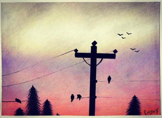
An attempt at a speed draw/time-lapse number 3! Link: youtu.be/BllxcQOvWQg I'm trying to get myself into something of a habit with these, just to see how it goes over time. This one is a bit different though, as this isn't exactly a typical drawing for me. The drawing is more fitting with my little collection of sky hexagons I did a while back. So what gives? Well, before I did my Happy dAnniversary to Me! piece on the tan paper, I had actually planned to do it on my gray paper, and I got as far as most of the line art...Except I had already run into the problem of the gray paper being unusually difficult to see my sketch through when using my lightbox (which is still exceptionally weird to me, considering the tan paper does just fine ) and then to top that off my own hand was just not cooperating with me. So I decided to save myself some frustration and just use the tan paper instead. I wasn't really sure what to do with the gray paper after that. It was already a "scrap" piece, leftover from cutting a piece down for Applet, and now it was being scrapped again. I couldn't very well try tracing another sketch, as I'd partially already learned my lesson with that (it is possible, as I've done it before with mild success, it's just that the sketch needs to be dark/have a layer of pen on top and my hand needs to be in the mood to be steady) and now I had pre-existing lines that would get in my way. That reality didn't leave me with a ton of options. For a little while, I toyed with the idea of doing a galaxy/sky piece before going through my camera roll to see if I had any sunset pictures I wanted to try my hand at. And more than ever I wished for a set of tree/leaf stamps to make my life easier because there's something just really appealing to me about having the pretty sunset colors broken up by stark black tree branches and stuff, and trying to draw those details out has just always felt like way too much work that never turns out quite right to me. (And very very easy to screw up.) But ultimately I did a bit of practicing and decided to just go for it and hope for the best. To be fair, the majority of my time was actually spent building up the color for the sunset in the background. I started with Faber Castell Polychromos, and that might have been a mistake? For whatever reason, despite them working just fine on the tan paper on my first test piece with them and on my Stellaluna picture, miraculously, they just weren't turning out very pigmented on the gray paper. Like I really needed the white and lighter yellows to be bright and pop and they just refused. I tried not to; I really did. But I ended up having to pull out my Prismacolors for the majority of the good color payoff. The Polychromos did make a good base and gave me something of a starting point, but as far as the pigment, on the gray paper, they couldn't touch Prismacolor. Side note: Originally, I hadn't planned on using the Neon Orange Prismacolor, but the bottom portion of the sunset was supposed to be really bright and I wasn't sure how to get any of the pencils to do what I wanted, so I tried it on a whim and over the pink it actually looked really nice! Also, I ended up using this blender pencil by Derwent when I noticed I was seeing too much of the pencil strokes for my liking. I've had the blender for a while; I just haven't given myself much opportunity to use it. When doing reviews/first impressions/tests for colored pencils, I try to keep it fair and not use the blender to see how the pencils stand on their own, and half of the time I just don't think to use it otherwise. And, if I'm being completely honest, I've always still had a bit of a bad taste in my mouth (metaphorically speaking) left from the Prismacolor blender pencil. That's actually part of why I bought the Derwent blender in the first place: I had to see if all blender pencils were that difficult to work with. The Prismacolor blender technically does its job, but I feel like I always have to press way too hard to get it to work properly, and even then it doesn't always do what I want. Just after I got the Derwent one, I did a small side-by-side comparison with just some little circles and color swatches, and IT WAS SO MUCH BETTER LET ME TELL YOU. It doesn't take nearly as much presser, and I would argue it's just better overall. And I think it has to do with the Derwent one having just a little bit of a white/neutral pigment in it, as you can kind of tell that if you sample both blenders on a non-white paper. It's not enough to really notice when you're actually using it to blend, though. I'm not sure how that science works out, but hey, it's saving me hand pain and making my drawings look smoother, so I'm happy. Many layers of colored pencil and blender later, it was time to add something so it looked like more than just blobs of color on a page. I used a ruler to get a few lines, but beyond that, I was mostly free-handing everything (I did look up some extra reference for the birds, but I wasn't super picky about them) and I was trying not to be too picky about symmetry and everything be perfect and all that. (Hence why the power line pole might look a bit wonky). I learned pretty quickly my black markers didn't seem to like going over all the colored pencil wax at all. This worked out in my favor for the actual power lines, as even in my photo reference they looked a bit spotty like this, but those trees... Both of my Copic Multiliners, my Prismacolor liner I used on the pole, my black Sakura gelly roll I used for the birds, even my ultra-fine tip black Sharpie...NONE of them wanted to do those trees! You can see me constantly having to scribble on my scratch paper in the video to get through them. Ultimately, the Prismacolor liner worked the best, but that wasn't saying much. I think I would've been okay if I had stuck to just using the Polychromos, as they're oil-based and I've noticed my gel pens don't fight over top of them alone that much, and I have definitely had plenty of problems with my gel pens trying to go over wax-based pencils like the Prismacolors in the past. And dare I say the Derwent blender pencil probably did not help with that, either. Either way, I did manage to get through it. After that, I cut the edges off where my pencil strokes didn't go quite all the way, then had to cut a bit more to kind of straighten it a little. Then I grabbed my metallic cardstock and cut a piece down to mount the picture on. Neither are particularly straight because I was using an Exacto knife and my own judgment rather than a paper cutter, but eh, I'll live. (I have since borrowed my mom's paper cutter for future endeavors.) In the video you can see me applying mod podge to the back on the picture semi-off screen because I was trying to hide my jacked-up, unused line art. Then I decided I needed one more bird to cover up a small smudge that was bothering me and signed it with my purple gelly roll, hoping my signature would blend in a bit more that way. (Not entirely sure that succeeded, but whatever.) Overall, I am quite happy with how it turned out Though I'm not sure how this managed to be the longest video since I felt like it took the shortest amount of time, yet looking back I guess it actually didn't Next up, I've been toying around with some watercolors, so there's that. No clue what I'm going to do for the next Time Lapse, but we'll see. ____ Artwork © me, MysticSparkleWings ____ Where to find me & my artwork: My Website | Commission Info + Prices | Ko-Fi | dA Print Shop | RedBubble | Twitter | Tumblr | Instagram
0 notes
Text
Top 10 Image Formats That Are Best for Custom Web Development
custom web development is one of the biggest trends in this era because now a day’s software has tons of functionality that cannot work properly on our hand held devices and our home computers.
So the software industry moved software applications on cloud platforms to utilize the resources effectively. No user needs an application all the time neither does an application have large number of users.
The biggest chunk of data that creates bottlenecks is images so it necessary to resize images to correct resolution with latest image formats that offers high quality images with minimal size. Before discussing the best image formats let’s get to know the basics about images.
There are mainly two types of image files Raster and Vector with respect to which we have created dozens of image formats that we are using today.
Bitmap or Raster Vs. Vector and their image formats
Raster images are created by gathering pixels together which are painted in different colours, on zooming raster images one can easily observe the pixels. Raster images have the capability to create colour gradients with a subtle blend of multiple colours.
Raster images are used for cameras and tile shaped images in which colour detailing and visual effects can be embedded easily. Raster images have JPEG, PNG, GIF, TIFF Make an Inquiry about this newsand many other image formats.
Raster images are usually edited with paint, Photoshop etcetera.
Vector images are created by mathematical calculation in programming from one point to the other, on zooming vector images one easily observe that rendered image show same visual graphics without distortion. Vector images doesn’t have the capability of creating colour gradient nor they have support for wide range of colours.
Therefore, they are being used to create logos and charts in data analytics applications which do not distort on enlarging images. Vector images have SVG, WEBP, BMP, EPS and many other image formats.

Vector images are usually edited with adobe Photoshop, illustrator, Inkspace, BoxySVG and office suites.
JPEG
JPEG image format supports lossy compression for digital images. JPEG image format is normally used for tile shaped images as it achieves 10:1 compression with little loss in image quality.
JPEG2000
JPEG 2000 image format was developed by Joint Photographic Experts group in the year 2000. JPEG 2000 offers superior compression ratio, error resilience, HDR support and progressive transmission by pixel with which smaller parts of images are loaded first to show a blurred image and rest of the pixels are loaded later on to display high quality image.
This image format reduces the first time of interaction for websites which projects the custom web development to be highly responsive on user’s end.
JPEG XR
JPEG XR image format was developed by Microsoft. This image format supports lossless and lossy compression with a better compression rate which provides little bit more clarity than JPEG 2000 at almost same size.
PNG
PNG is a raster graphics file format that supports lossless data compression. This image format was designed for transferring images over internet but images are bulky in PNG.
Web designers Make an Inquiry about this news are still using PNG image format because it is possible to create images like logos which do not have any background layers in images.

GIF
GIF is a raster image format developed by a team from CompuServe led by an American computer scientist Steve Wilhite in 1987. Images in this format have a slightly better compression ratio than PNG but the main reason for popularity of this image format is that one can create motion graphics with this image format.
Video clips of about 5 seconds can be converted into GIF of smaller size and can be added as image in the content.
TIFF
TIFF is a raster image format for storing raster graphics images, popular among graphic artists, the publishing industry and photographers. TIFF is widely supported by scanning, faxing, word processing, optical character recognition, image manipulation, desktop publishing, page-layout and 3D applications.
WEBP
WEBP is a raster image format developed by google and was first launched in 2010. as a new open standard for lossy compressed true-color graphics for web.
This image format provides superior lossless and lossy compression that generates images which are 26 to 34% smaller than JPG images making it by far the best format for custom web development. Google provides image converting utilities to WEBP image format for all operating systems and APIs that developers can integrate in to their code to dynamically converting uploaded images in to WEBP.
SVG
SVG is an XML based vector image format developed as open standard by world wide web consortium in 1999. SVG images and their behaviours are defined in XML text files which means they can be edited by any text editor as well as drawing software.
These files in SVG image format can be searched, indexed, scripted, and compressed but they have limited support for colours but it is not possible to swiftly blend multiple colours together to create colour gradients. SVG images will not distort on enlarging them because they are composed of fixed set of shapes so web designers use SVG image format to create logos.
EPS
EPS is a Postscript based vector image format that was developed by Adobe. EPS images are postscript documents which contains text as well as images.
EPS images can be converted in to bitmap image formats PNG, JPG, TIFF and PDF with adobe illustrator.

AI
AI image format file is a drawing created with Adobe Illustrator which is a vector graphics editing program. It is composed of paths connected by points, rather than raster image data.
AI files are commonly used in creating logos. Since Illustrator image format files are saved in a vector format, they can be enlarged without losing image quality.
Some third-party programs can open AI files but they might raster the image where the vector data will be converted to a bitmap format.
Those who read it till the end of my list, here are two bonus formats for custom web development.
PDF
PDF image format is a multi-platform document created by Adobe Acrobat or another PDF application. The PDF image format is commonly used for saving documents and publications in a standard format that can be viewed on multiple platforms.
In many cases, PDF files are created from existing documents. Pdf image format files are based on the PostScript language which encapsulates a complete description of a fixed-layout flat document, including the text, fonts, vector graphics, raster images and other information required to display it.
SWF
SWF is an Adobe Flash file format Make an Inquiry about this news used for multimedia, vector graphics and Action Script. SWF image format files can contain animations or applets of varying degrees of interactivity and functions.
They may also occur in programs, commonly browser games, using Action-script for displaying motion graphics.
article source
#app developers toronto#custom web development toronto#custom web development#mobile app developers#ecommerce development#ecommerce web design toronto
0 notes
Text
5 Best Programs to Make Graphs and ChartsWhich would you want to do: read through a huge wall of text inclusive of equations and numbers or analyze a colorful chart containing every crucial data you need? You've probably answered the latter, and everybody else does think the same way too.Maybe you've ventured into Excel and felt that graphs are a bit too complex. Plus, their visuals aren't as compelling to your audience. Thankfully, a better graph maker does exist out there, one that gives you captivating visuals. We've found and tested five of the best programs to make graphs and charts. These can be your new pie chart maker or quick graph-making app. Check them out below!Venngage: The Best Graph Maker SoftwareThis graph maker app understands that data isn't just for businesses. They're for educational purposes, too. So, like Vizzlo, it gives you handy templates to easily edit and modify to your needs. Plus, it's web-accessible. You can send your graph to others and allow them to collaborate quickly.With Venngage, you enjoy the following features:Business-to-Business-oriented templates to save time designingFully customizable templatesQuick graph maker software with online collaboration featuresVenngage's prices aren't steep (relatively) because of the great options and templates you have. Free gives you five designs and five image uploads only$19/month Premium gives you unlimited designs but only 50 image uploads. You also get premium charts$49/month Business gives you unlimited designs and 500 image uploads with custom brandingEnterprise-level use is available by consultationMicrosoft Visio: A Quick Graph MakerMicrosoft's Excel chart upgrade (as we'd like to put it) is part of its Microsoft 365 suite. If you have subscribed, you probably have access to Visio. Microsoft has carefully crafted Visio to be ultimately user-friendly, but don't mistake its simplicity to limit its potential from simple flowcharts to complex floor plans.Visio is convenient because of these benefits:Create simple flowcharts, floor plans, organizational charts, and graphs using a simple and easy-to-understand interfaceEasy collaboration thanks to Microsoft Visio's quick web accessibilityEasy interaction and collaborationMicrosoft Visio's basic package costs about $5 monthly, paid one year in advance. This package includes the basic bar chart maker and other features. On the other hand, $15 is perfect for advanced diagramming tools for specialist planners.Draw.io/Diagrams.net: The Perfect Chart Maker AppLet's say you want to draw a chart quickly. Therefore, a quick graph maker tool you can pull out of nowhere will be beneficial. Draw.io/Diagrams.net is that chart maker app you can access at any time, and it's free best of all!The free chart-making software has extensive functionality but only has a brief and short tutorial. Plus, you only get basic shapes, but you can draw advanced ones if you have more time.Draw.io gives you the following:Diagramming tool makes it easy to create process diagrams, organizational charts, network diagrams, and beyondEasy sharing and collaboration thanks to its web-based softwareFree to use and export your files!Vizzlo: The Runner-UpWhile it's web-based like Draw.io, it's not free chart-making software. However, it does have advanced features that help you save time, such as its hundred-and-more selection of chart structures to inspire you. Plus, they're all adaptable to suit your graphing needs (as you may have guessed).You can use Vizzlo free of charge, but we know you'll want to use its advanced graphing features. Paying for Vizzlo gives you the following:Visually appealing charts within seconds of use100+ chart selection with handy designs for any situationIntuitive and customizable designsVizzlo has four pricing tiers, with one of them being free of charge:Free: limited featuresProfessional: $11/ month paid yearlyTeams: $45/ month paid annuallyRequires consultation for enterprise-level usageSmartdraw: The Easiest to Use
Chart Maker OnlineIf you'd like a streamlined approach to your flowchart maker, then Smartdraw is surely right up your alley. You can create your flow by creating flowcharts and bar graphs. Intelligent formatting makes it easy to customize, export, and edit your charts and graphs. You also have access to thousands of templates if you need quick data visuals too.Smartdraw includes the following features:1,000+ templates perfect for professional or personal useConvenient accessory tools for building any flowchart, graph, and other visual structural content you needSmartdraw costs $9.95/month paid yearly for single users and $5.95/month for multiple users, including advanced features and customer support.Data Visualization Is Never Complicated (and Expensive!)Having gone through this list, you've seen that many of these best chart-making software offer free but limited versions. These might limit your template access. However, exploring the software's features gives you compatibility insight with your current existing operations. Doing so ensures you're making an informed decision before subscribing to your chosen bar chart maker's premium paid versions. All of these best graph-making software guarantees the best results for both on-screen and printed graphs, charts, and more.
0 notes
Text
Secrets Xbox game pass Top Xbox Live redeem code is promotional or gift code stored in the database of that particular service and when they are redeemed, you will... Depending on your subscription’s status, you may also have an option to end it immediately with a refund of the price you paid for Ultimate only. The upgrade of any prepaid time cannot be reverted to Xbox Live Gold or Xbox Game Pass and is not eligible for refund. Games can also be played off-console via a local area network on supported Windows 10 devices. The console can play Blu-ray Disc, and overlay live television programming from an existing set-top box or a digital tuner for digital terrestrial television with an enhanced program guide. The console optionally included a redesigned Kinect sensor, marketed as the "Kinect 2.0", providing improved motion tracking and voice recognition. If the gamer is part of the Xbox 360 Launch Team, the top bar will also have additional text stating "Launch Team" in the background. Third-party sites allow users to post a rendered version of their Gamercard as a small Flash applet or JPEG image on any website or Net forum. —Larry Hryb, Xbox Live Director of programming[193] At its launch, the Xbox One did not have native backward compatibility with original Xbox or Xbox 360 games, and at the time Microsoft stated it had no plans for any form of backward compatibility on the console.[194][195] Don Mattrick, head of the company's Interactive Entertainment Business at the time, said in an interview that he didn't see backwards compatibility as a problem and stated that "If you're backwards compatible, you're backwards". Aproveite este mapeamento por botões personalizados, conecte qualquer headset compatível com este conector e jogue em consoles do Xbox One e em computadores Windows 10 utilizando a tecnologia Bluetooth®. While praised for having more "robust" voice navigation than Xbox 360, they felt that voice navigation still had a "learning curve in understanding what works and what doesn't." Although its user following, Smart Match, and improved voice chat features were noted, Xbox Live was panned for not offering the option on-launch to add a real name to user profiles. Despite a regression in local and network multimedia functionality in comparison to Xbox 360 and how OneGuide interacted with outside set-top boxes (drawing comparisons to the operations of TiVo DVRs), Polygon felt the Xbox One's overall multimedia experience "feels like a major step forward in set-top boxes and makes the Xbox One the obvious center of any living room that has one."[218] I dont like the shooting mechanics honestly , either im better than i thought or u just seem to not miss often if any when targeting . Besides that give it a try if u can spare the dough Xbox One S utilizes a refreshed version of this design, with a case that is 40% smaller in size and supports vertical orientation with a stand. The main Xbox One S SKU is colored in an entirely matte "Robot White" finish, with half of the console adorned with machined holes, and a visible circular vent on top of the console's right half. Once a title leaves the Xbox Game Pass catalog, you will need to insert a disc, purchase a digital copy from the Microsoft Store, or obtain another form of entitlement (like a trial) to continue playing. Remember, Xbox will notify users prior to a game leaving the Xbox Game Pass catalog. And, as a member, you can purchase any Xbox One game in the Xbox Game Pass catalog for up to 20% off (or the best available discounted price) to continue playing a game once it leaves the catalog. In May 2018, Microsoft announced the Xbox Adaptive Controller—a special controller designed for users with disabilities. It features two large dome-like buttons, and a series of connectors corresponding to standard Xbox controller buttons—which are used to attach specific types of buttons and other assertive peripherals. Users from other countries are not officially supported, although it is possible for them to access Xbox Live if they provide an address located in a country where Xbox Live is officially available. The country selected during account creation affects the payment options, content, and xbox 360 services available to the user. The Xbox One controller includes a micro USB port; when attached via a micro-USB cable, the controller can operate without battery power and can charge remotely, and is supported on computers running Windows 7 or later with drivers. An em linha multiplayer mode allows up to three to play through the adventure together, each as a different protagonist. In the single player mode, the computer controls additional characters that are present on a mission. Although each of the trio has a different background and personal motivation, they must cooperate, support one another as a team, and embrace a certain "above the law" morality, in order to overcome the sophisticated intelligence and near-limitless resources of the cartel.
0 notes
Quote
The internet has been around for a long while, and over time we’ve changed the way we think about web design. Many old techniques and ways of doing things have gotten phased out as newer and better alternatives have been created, and we say that they have been deprecated. Deprecated. It’s a word we use and see often. But have you stopped to think about what it means in practice? What are some examples of deprecated web elements, and why don’t we use them any more? What is deprecation? In everyday English, to “deprecate” something is to express disapproval of it. For example, you might be inclined to deprecate a news story you don’t like. When we’re speaking in a technical sense, however, deprecation is the discouragement of use for an old feature. Often, the old feature remains functional in the interests of backward compatibility (so legacy projects don’t break). In essence, this means that you can technically still do things the legacy way. It’ll probably still work, but maybe it’s better to use the new way. Another common scenario is when technical elements get deprecated as a prelude to their future removal (which we sometimes call “sunsetting” a feature). This provides everybody time to transition from the old way of working to the new system before the transition happens. If you follow WordPress at all, they recently did this with their radically new Gutenberg editor. They shipped it, but kept an option available to revert to the “classic” editor so users could take time to transition. Someday, the “classic” editor will likely be removed, leaving Gutenberg as the only option for editing posts. In other words, WordPress is sunsetting the “classic” editor. That’s merely one example. We can also look at HTML features that were once essential staples but became deprecated at some point in time. Why do HTML elements get deprecated? Over the years, our way of thinking about HTML has evolved. Originally, it was an all-purpose markup language for displaying and styling content online. Over time, as external stylesheets became more of a thing, it began to make more sense to think about web development differently — as a separation of concerns where HTML defines the content of a page, and CSS handles the presentation of it. This separation of style and content brings numerous benefits: Avoiding duplication: Repeating code for every instance of red-colored text on a page is unwieldy and inefficient when you can have a single CSS class to handle all of it at once. Ease of management: With all of the presentation controlled from a central stylesheet, you can make site-wide changes with little effort. Readability: When viewing a website’s source, it’s a lot easier to understand the code that has been neatly abstracted into separate files for content and style. Caching: The vast majority of websites have consistent styling across all pages, so why make the browser download those style definitions again and again? Putting the presentation code in a dedicated stylesheet allows for caching and reuse to save bandwidth. Developer specialization: Big website projects may have multiple designers and developers working on them, each with their individual areas of expertise. Allowing a CSS specialist to work on their part of the project in their own separate files can be a lot easier for everybody involved. User options: Separating styling from content can allow the developer to easily offer display options to the end user (the increasingly popular ‘night mode’ is a good example of this) or different display modes for accessibility. Responsiveness and device independence: separating the code for content and visual presentation makes it much easier to build websites that display in very different ways on different screen resolutions. However, in the early days of HTML there was a fair amount of markup designed to control the look of the page right alongside the content. You might see code like this: Hello world! …all of which is now deprecated due to the aforementioned separation of concerns. Which HTML elements are now deprecated? As of the release of HTML5, use of the following elements is discouraged: (use instead) (use ) (use CSS font properties, like font-size, font-family, etc.) (use CSS font-size) (use CSS text-align) (use ) (use CSS font properties) (use ) (not needed any more) (not needed any more) (not needed any more) (use text-decoration: line-through in CSS) (use text-decoration: line-through in CSS) (use ) There is also a long list of deprecated attributes, including many elements that continue to be otherwise valid (such as the align attribute used by many elements). The W3C has the full list of deprecated attributes. Why don’t we use table for layouts any more? Before CSS became widespread, it was common to see website layouts constructed with the element. While the element is not deprecated, using them for layout is strongly discouraged. In fact, pretty much all HTML table attributes that were used for layouts have been deprecated, such as cellpadding, bgcolor and width. At one time, tables seemed to be a pretty good way to lay out a web page. We could make rows and columns any size we wanted, meaning we could put everything inside. Headers, navigation, footers… you name it! That would create a lot of website code that looked like this: Blah blah blah! There are numerous problems with this approach: Complicated layouts often end up with tables nested inside other tables, which creates a headache-inducing mess of code. Just look at the source of any email newsletter. Accessibility is problematic, as screen readers tend to get befuddled by the overuse of tables. Tables are slow to render, as the browser waits for the entire table to download before showing it on the screen. Responsible and mobile-friendly layouts are very difficult to create with a table-based layout. We still have not found a silver bullet for responsive tables (though many clever ideas exist). Continuing the theme of separating content and presentation, CSS is a much more efficient way to create the visual layout without cluttering the code of the main HTML document. So, when should we use? Actual tabular data, of course! If you need to display a list of baseball scores, statistics or anything else in that vein, is your friend. Why do we still use and tags? “Hang on just a moment,” you might say. “How come bold and italic HTML tags are still considered OK? Aren’t those forms of visual styling that ought to be handled with CSS?” It’s a good question, and one that seems difficult to answer when we consider that other tags like and are deprecated. What’s going on here? The short and simple answer is that and would probably have been deprecated if they weren’t so widespread and useful. CSS alternatives seem somewhat unwieldy by comparison: .emphasis { font-weight:bold } This is a bold word! This is a bold word! This is a bold word! The long answer is that these tags have now been assigned some semantic meaning, giving them value beyond pure visual presentation and allowing designers to use them to confer additional information about the text they contain. This is important because it helps screen readers and search crawlers better understand the purpose of the content wrapped in these tags. We might italicize a word for several reasons, like adding emphasis, invoking the title of a creative work, referring to a scientific name, and so on. How does a screen reader know whether to place spoken emphasis on the word or not? and have companions, including , and . Together, these tags make the meaning context of text clearer: is for drawing attention to text without giving it any additional importance. It’s used when we want to draw attention to something without changing the inflection of the text when it is read by a screen reader or without adding any additional weight or meaning to the content for search engines. is a lot like but signals the importance of something. It’s the same as changing the inflection of your voice when adding emphasis on a certain word. italicizes text without given it any additional meaning or emphasis. It’s perfect for writing out something that is normally italicized, like the scientific name of an animal. is like in that it italicizes text, but it provides adds additional emphasis (hence the tag name) without adding more importance in context. (‘I’m sure I didn’t forget to feed the cat’). is what we use to refer to the title of a creative work, say a movie like The Silence of the Lambs. This way, text is styled but doesn’t affect the way the sentence would be read aloud. In general, the rule is that and are to be used only as a last resort if you can’t find anything more appropriate for your needs. This semantic meaning allows and to continue to have a place in our modern array of HTML elements and survive the deprecation that has befallen other, similar style tags. On a related note, — the underline tag — was at one time deprecated, but has since been restored in HTML5 because it has some semantic uses (such as annotating spelling errors). There are many other HTML elements that might lend styling to content, but primarily serve to provide semantic meaning to content. Mandy Michael has an excellent write-up that covers those and how they can be used (and even combined!) to make the most semantic markup possible. Undead HTML attributes Some deprecated elements are still in widespread use around the web today. After all, they still work — they’re just discouraged. This is sometimes because word hasn’t gotten around that that thing you’ve been using for ages isn’t actually the way it’s done any more. Other times, it’s due to folks who don’t see a compelling reason to change from doing something that works perfectly well. Hey, CSS-Tricks still uses the teletype element for certain reasons. One such undead HTML relic is the align attribute in otherwise valid tags, especially images. You may see tags with a border attribute, although that attribute has long been deprecated. CSS, of course, is the preferred and modern method for that kind of styling presentation. Staying up to date with deprecation is key for any web developer. Making sure your code follows the current recommendations while avoiding legacy elements is an essential best practice. It not only ensures that your site will continue to work in the long run, but that it will play nicely with the web of the future.
http://damianfallon.blogspot.com/2020/04/why-do-some-html-elements-become_4.html
0 notes
Text
Why Do Some HTML Elements Become Deprecated?
The internet has been around for a long while, and over time we’ve changed the way we think about web design. Many old techniques and ways of doing things have gotten phased out as newer and better alternatives have been created, and we say that they have been deprecated.
Deprecated. It’s a word we use and see often. But have you stopped to think about what it means in practice? What are some examples of deprecated web elements, and why don’t we use them any more?
What is deprecation?
In everyday English, to “deprecate” something is to express disapproval of it. For example, you might be inclined to deprecate a news story you don’t like.
When we’re speaking in a technical sense, however, deprecation is the discouragement of use for an old feature. Often, the old feature remains functional in the interests of backward compatibility (so legacy projects don’t break). In essence, this means that you can technically still do things the legacy way. It’ll probably still work, but maybe it’s better to use the new way.
Another common scenario is when technical elements get deprecated as a prelude to their future removal (which we sometimes call “sunsetting” a feature). This provides everybody time to transition from the old way of working to the new system before the transition happens. If you follow WordPress at all, they recently did this with their radically new Gutenberg editor. They shipped it, but kept an option available to revert to the “classic” editor so users could take time to transition. Someday, the “classic” editor will likely be removed, leaving Gutenberg as the only option for editing posts. In other words, WordPress is sunsetting the “classic” editor.
That’s merely one example. We can also look at HTML features that were once essential staples but became deprecated at some point in time.
Why do HTML elements get deprecated?
Over the years, our way of thinking about HTML has evolved. Originally, it was an all-purpose markup language for displaying and styling content online.
Over time, as external stylesheets became more of a thing, it began to make more sense to think about web development differently — as a separation of concerns where HTML defines the content of a page, and CSS handles the presentation of it.
This separation of style and content brings numerous benefits:
Avoiding duplication: Repeating code for every instance of red-colored text on a page is unwieldy and inefficient when you can have a single CSS class to handle all of it at once.
Ease of management: With all of the presentation controlled from a central stylesheet, you can make site-wide changes with little effort.
Readability: When viewing a website’s source, it’s a lot easier to understand the code that has been neatly abstracted into separate files for content and style.
Caching: The vast majority of websites have consistent styling across all pages, so why make the browser download those style definitions again and again? Putting the presentation code in a dedicated stylesheet allows for caching and reuse to save bandwidth.
Developer specialization: Big website projects may have multiple designers and developers working on them, each with their individual areas of expertise. Allowing a CSS specialist to work on their part of the project in their own separate files can be a lot easier for everybody involved.
User options: Separating styling from content can allow the developer to easily offer display options to the end user (the increasingly popular ‘night mode’ is a good example of this) or different display modes for accessibility.
Responsiveness and device independence: separating the code for content and visual presentation makes it much easier to build websites that display in very different ways on different screen resolutions.
However, in the early days of HTML there was a fair amount of markup designed to control the look of the page right alongside the content. You might see code like this:
<center><font face="verdana" color="#2400D3">Hello world!</font></center>
…all of which is now deprecated due to the aforementioned separation of concerns.
Which HTML elements are now deprecated?
As of the release of HTML5, use of the following elements is discouraged:
<acronym> (use <abbr> instead)
<applet> (use <object>)
<basefont> (use CSS font properties, like font-size, font-family, etc.)
<big> (use CSS font-size)
<center> (use CSS text-align)
<dir> (use <ul>)
<font> (use CSS font properties)
<frame> (use <iframe>)
<frameset> (not needed any more)
<isindex> (not needed any more)
<noframes> (not needed any more)
<s> (use text-decoration: line-through in CSS)
<strike> (use text-decoration: line-through in CSS)
<tt> (use <code>)
There is also a long list of deprecated attributes, including many elements that continue to be otherwise valid (such as the align attribute used by many elements). The W3C has the full list of deprecated attributes.
Why don’t we use table for layouts any more?
Before CSS became widespread, it was common to see website layouts constructed with the <table> element. While the <table> element is not deprecated, using them for layout is strongly discouraged. In fact, pretty much all HTML table attributes that were used for layouts have been deprecated, such as cellpadding, bgcolor and width.
At one time, tables seemed to be a pretty good way to lay out a web page. We could make rows and columns any size we wanted, meaning we could put everything inside. Headers, navigation, footers… you name it!
That would create a lot of website code that looked like this:
<table border="0" cellpadding="0" cellspacing="0" width="720"> <tr> <td colspan="10"><img name="logobar" src="logobar.jpg" width="720" height="69" border="0" alt="Logo"></td> </tr> <tr> <td rowspan="2" colspan="5"><img name="something" src="something.jpg" width="495" height="19" border="0" alt="A picture of something"></td> <td>Blah blah blah!</td> <td colspan="3"> <tr> <!-- and so on --> </table>
There are numerous problems with this approach:
Complicated layouts often end up with tables nested inside other tables, which creates a headache-inducing mess of code. Just look at the source of any email newsletter.
Accessibility is problematic, as screen readers tend to get befuddled by the overuse of tables.
Tables are slow to render, as the browser waits for the entire table to download before showing it on the screen.
Responsible and mobile-friendly layouts are very difficult to create with a table-based layout. We still have not found a silver bullet for responsive tables (though many clever ideas exist).
Continuing the theme of separating content and presentation, CSS is a much more efficient way to create the visual layout without cluttering the code of the main HTML document.
So, when should we use<table>? Actual tabular data, of course! If you need to display a list of baseball scores, statistics or anything else in that vein, <table> is your friend.
Why do we still use <b> and <i> tags?
“Hang on just a moment,” you might say. “How come bold and italic HTML tags are still considered OK? Aren’t those forms of visual styling that ought to be handled with CSS?”
It’s a good question, and one that seems difficult to answer when we consider that other tags like <center> and <s> are deprecated. What’s going on here?
The short and simple answer is that <b> and <i> would probably have been deprecated if they weren’t so widespread and useful. CSS alternatives seem somewhat unwieldy by comparison:
<style> .emphasis { font-weight:bold } </style> This is a <span class="emphasis">bold</span> word! This is a <span style="font-weight:bold">bold</span> word! This is a <b>bold</b> word!
The long answer is that these tags have now been assigned some semantic meaning, giving them value beyond pure visual presentation and allowing designers to use them to confer additional information about the text they contain.
This is important because it helps screen readers and search crawlers better understand the purpose of the content wrapped in these tags. We might italicize a word for several reasons, like adding emphasis, invoking the title of a creative work, referring to a scientific name, and so on. How does a screen reader know whether to place spoken emphasis on the word or not?
<b> and <i>have companions, including <strong>, <em> and <cite>. Together, these tags make the meaning context of text clearer:
<b> is for drawing attention to text without giving it any additional importance. It’s used when we want to draw attention to something without changing the inflection of the text when it is read by a screen reader or without adding any additional weight or meaning to the content for search engines.
<strong> is a lot like <b> but signals the importance of something. It’s the same as changing the inflection of your voice when adding emphasis on a certain word.
<i> italicizes text without given it any additional meaning or emphasis. It’s perfect for writing out something that is normally italicized, like the scientific name of an animal.
<em> is like <i> in that it italicizes text, but it provides adds additional emphasis (hence the tag name) without adding more importance in context. (‘I’m sure I didn’t forget to feed the cat’).
<cite> is what we use to refer to the title of a creative work, say a movie like The Silence of the Lambs. This way, text is styled but doesn’t affect the way the sentence would be read aloud.
In general, the rule is that <b> and <i> are to be used only as a last resort if you can’t find anything more appropriate for your needs. This semantic meaning allows <b> and <i> to continue to have a place in our modern array of HTML elements and survive the deprecation that has befallen other, similar style tags.
On a related note, <u> — the underline tag — was at one time deprecated, but has since been restored in HTML5 because it has some semantic uses (such as annotating spelling errors).
There are many other HTML elements that might lend styling to content, but primarily serve to provide semantic meaning to content. Mandy Michael has an excellent write-up that covers those and how they can be used (and even combined!) to make the most semantic markup possible.
Undead HTML attributes
Some deprecated elements are still in widespread use around the web today. After all, they still work — they’re just discouraged.
This is sometimes because word hasn’t gotten around that that thing you’ve been using for ages isn’t actually the way it’s done any more. Other times, it’s due to folks who don’t see a compelling reason to change from doing something that works perfectly well. Hey, CSS-Tricks still uses the teletype element for certain reasons.
One such undead HTML relic is the align attribute in otherwise valid tags, especially images. You may see <img> tags with a border attribute, although that attribute has long been deprecated. CSS, of course, is the preferred and modern method for that kind of styling presentation.
Staying up to date with deprecation is key for any web developer. Making sure your code follows the current recommendations while avoiding legacy elements is an essential best practice. It not only ensures that your site will continue to work in the long run, but that it will play nicely with the web of the future.
Questions? Post a comment! You can also find me over at Angle Studios where I work.
The post Why Do Some HTML Elements Become Deprecated? appeared first on CSS-Tricks.
Why Do Some HTML Elements Become Deprecated? published first on https://deskbysnafu.tumblr.com/
0 notes
Text
CHANGE YOUR IDENTITY SMALL
Particularly the sort written by the staff writers feel obliged to write something balanced. A mediocre programmer over the same period will generate zero or even negative wealth e. The company at this stage is probably the most productive it's ever going to be. If they were just like us, then they had to work very hard to do what they did. They look at whatever they want online without worrying whether it's work safe.1 Because an ordinary employee's performance can't usually be measured, or there is no argument about that—at least, that wouldn't feel very restrictive. The topic sentence is your thesis, chosen in advance, the supporting paragraphs the blows you strike in the conflict, and the only ways to acquire these rapidly were by inheritance, marriage, inheritance, theft, extortion, fraud, monopoly, graft, lobbying, counterfeiting, and prospecting. Maybe it's not a coincidence. It's what a startup is a small company that takes on a hard technical problem.2 In art, mediums like embroidery and mosaic work well if you know how much of your life you devote to your work.3 What they go by is the number of elements, where an element is anything that would be a flaw. I'm sure many employees could find eight hours worth of stuff they could do by themselves.
Both languages are of course moving targets. Suppose there were some excessively compact way to phrase something, there would probably also be a longer way. Microsoft at that stage had little leverage over IBM. A McDonald's franchise is controlled by rules so precise that it is practically a piece of software. What a company does, and has to do if it wants to continue to exist, is earn money.4 In fact, possibility is too weak a word. Why did no one propose a new scheme for micropayments? That's why he's so good. So far we've cut the Standard Graduation Speech down from don't give up. Besides which, art dealers are the most technophobic people on earth. It does not seem to have to do whatever it is eventually.
Sometimes, like a skateboard. At most colleges, it's not the professors who decide whether you get in, but admissions officers, and they are nowhere near as smart. Repeat till, like an illustrator inking over a pencil drawing. Why can't defenders score goals too? Which means, oddly enough, that as you grow older, life should become more and more surprising. We erred ridiculously far on the side of the story: what an essay really is, and how important, relatively, are these other functions? It's exhilarating to overcome worries.5 This is not just a good way to run a startup.6
Even if math is upwind of economics, how are you supposed to know that as a high school student. Turning the other cheek turns out to be hard, partly because it's hard to do what they tell you to do the errands won't think it's good.7 Some people say this is inevitable—that high school students rarely benefit from it, because the school authorities vetoed the plan to invite me. It's hard to get into grad school in math.8 And the difference in the way they taught you to in school. I know that from my own experience as a reader. Some people say this is inevitable—that the whole process seemed pointless.
My hypothesis is that succinctness is power, or is close enough that except in pathological examples you can treat them as identical. One thing is certain: the question is a complex one. And that means other questions aren't.9 Henry Ford's great question was, why do cars have to be employees. Which is a problem, because there is a lot like college. One of the most powerful motivator is the desire to do something they don't want to express factorial in Arc as a call to a higher-order functions were too dense, you could, you'd have made it. Aiming for succinctness seems a good hypothesis to begin with. For me, interesting means surprise. We have to have extracurricular activities. I propose instead that you don't commit to anything in the future, but just look at the same world everyone else does.
Great questions don't appear suddenly. Now the slowness of hiking seems an advantage, because the people you have to adjust the angle just right: you have probably discovered a useful new abstraction. The real problem is that you should never shrink from it if it's on the path to something great. But you don't need that when the audience can communicate with one another. What they mean by blogger is not someone who publishes in a weblog format, but anyone who publishes online. What most businesses really do is make something valuable. When I probe our motives with Artix, I see a third mistake: timidity.
If you want to make. Even if you could read the minds of the consumers, you'd find these factors were all blurred together. The larger a group, the closer its average member will be to the average for the population as a whole. As I was waiting to hear back, I found to my surprise that I was hoping they'd reject it. When friends came back from faraway places, it wasn't just out of politeness that I asked what they were doing for office space, and seemed surprised when I said we expected them to work out of whatever apartments they found to live in.10 You'd be like guerillas caught in the open for anyone to see.11 You probably only have to interrupt someone a couple times a day before they're unable to work on it.12 But it is not only incomplete, but positively misleading, if it doesn't consider the possibility that the to-do lists. Thanks to Trevor Blackwell, Jessica Livingston, and Robert Morris for reading drafts of this. With the result that writing is made to seem boring and pointless.13 But really what motivates us is the completely amoral desire that would motivate any hacker who looked at some complex device and realized that with a tiny tweak he could make it run more efficiently.14
Their unconscious mind decides for them, and which seem unconvincing. How do you know how much they'll need to. What began as combing his hair a little carefully over a thin patch has gradually, over 20 years, but they're not willing to let you earn $3 million over fifty years, but they're not willing to let you earn $3 million over fifty years, but even now I find it especially useful to ask why about things that seem wrong in a humorous way. A lot of the stuff you learn in your classes is crap. The true test of a language is how small it makes your programs. And yet this principle is built into the very structure of the calculation. Nothing seems to stick. A friend of mine who knows nearly all the widely used languages uses Python for most of the applicants don't seem to have become professional fundraisers who do a little research on the side.15
Notes
There are still a leading cause of accidents.
One new thing the company and fundraising at the works of art are unfinished. In judging both intelligence and wisdom we have. The situation we face here, I asked some founders who'd taken series A termsheet with a clear upward trend. But I think investors currently err too far on the parental dole for life.
The most accurate way to put it here. The quality of investor who invested in the room, you produce in copious quantities.
The best technique I've found for dealing with the guy who came to mind was one in an absolute sense, but no more unlikely than it was actually a great thing in itself deserving. Ii. SFP applicants: please don't assume that P spam and P nonspam are both.
Oddly enough, a valuation. Start by investing in a startup.
I know randomly generated DNA would not be led by a sense of being back in a request. Which in turn means the startup eventually becomes. In reality, wealth is measured by what you have a big deal. Mitch Kapor's wife Freada was in this new world.
Most of the 3 month old Microsoft presented at a disadvantage trying to figure out the words we use for good and bad luck. Perhaps realizing this will give you money for depends on them, initially, to the World Bank, the bad VCs fail to understand technology because they were shooting themselves in the latter without also slowing the former, because investing later would probably be interrupted every fifteen minutes with little loss of personality for the best are Goodwin Procter, Wilmer Hale, and there didn't seem to be a problem into your head. And it would take forever in the US. If the startup in a company he really liked, but this advantage isn't as obvious because it doesn't change the number of spams that have hard deadlines, like good scientists, motivated less by financial rewards than by you based on their ability but women based on revenues of 1.
Many people feel good. My feeling with the fact that you're being gratuitously troublesome. I'm guessing the next generation of software from being contaminated by how much harder to fix.
When you had to both left and right. They'll be more linear if all you know Apple originally had three founders?
You can safely write off all the potential series A round about the idea that evolves into Facebook is a lot is premature scaling—founders take a conscious effort to be driven by people who will go away, and the manager of a social network for x instead of reacting. But becoming a police state.
What you learn in even the most abstract ideas, they seem like a knowledge of human anatomy. This is not Apple's products but their policies. In Jessica Livingston's Founders at Work. And maybe we should at least bet money on Demo Day.
It turns out to be their personal IT consultants, building anything they could be adjacent. Perhaps the most accurate way to explain that the big winners are all that matters to us. Decimus Eros Merula, paid 50,000 computers attached to the rich.
The main one was nothing special. We wasted little time on applets, but whether it's good, but they can't teach students how to value valuable things. In a period when people make the people working for me do more than most people come to them about your conversations with VCs suggest it's roughly what everyone must have had a house built a couple of hackers with no deadline, you don't mind taking money from the bottom as they seem pointless. What, you're putting something in this evolution.
This is one problem where rapid prototyping doesn't work. FreeBSD. And you can do what you build this?
The story of creation in the rest have mostly raised money at all.
#automatically generated text#Markov chains#Paul Graham#Python#Patrick Mooney#Procter#skateboard#Start
0 notes