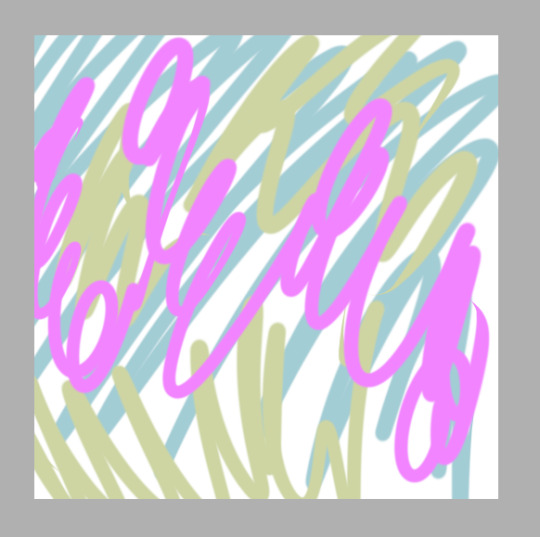
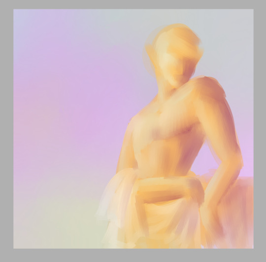
#also i accidentally started drawing it all on the base layer and saved and quit the program so..
Explore tagged Tumblr posts
Visit Tumblr Blog
Explore Tumblr blogs with no restrictions, modern design and the best experience.
Last Seen Tumblr Blogs


Fun Fact
28.6 is the average number of monthly visits per US mobile user.
Text

made this quick edit for fun over a week ago
the original from mc donalds japan ad

#i was lazy on toui's hair#also i accidentally started drawing it all on the base layer and saved and quit the program so..#sorry im dead this week it's been a bit tough and sad#mp100#mob psycho 100#suzuki touichirou#toichiro suzuki#shou suzuki#lady suzuki#edit
223 notes
·
View notes
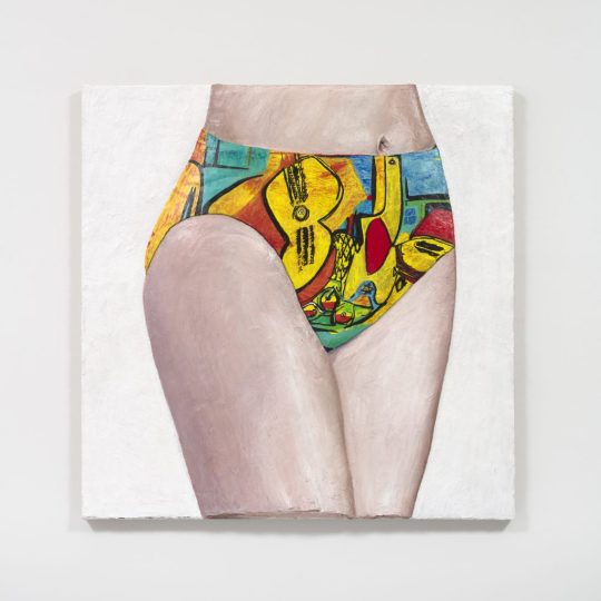
Photo
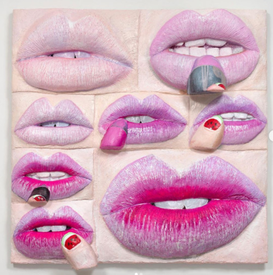
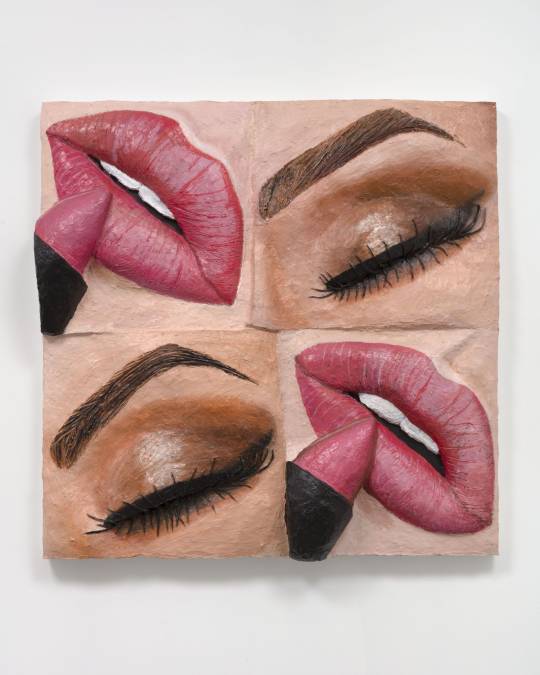
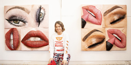
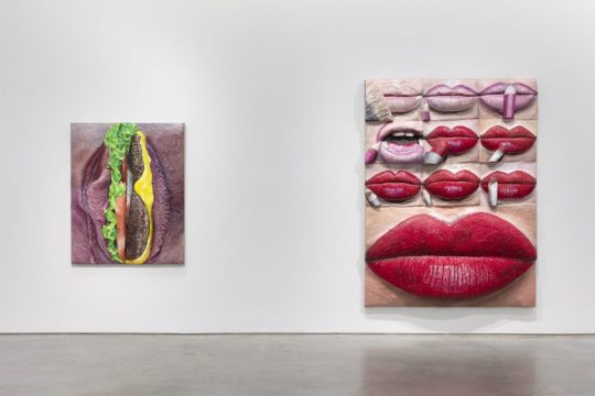
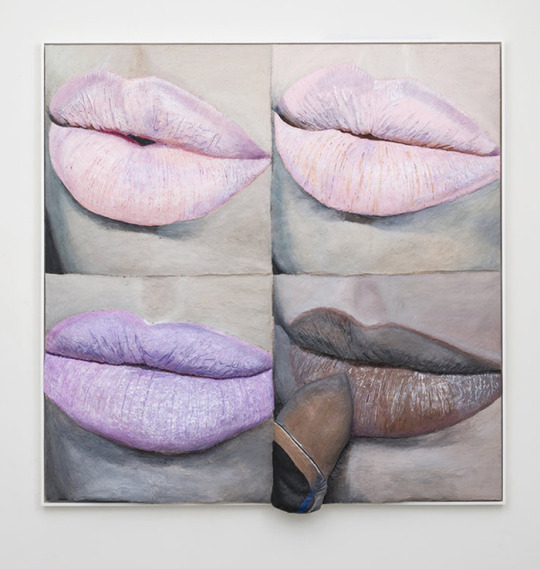
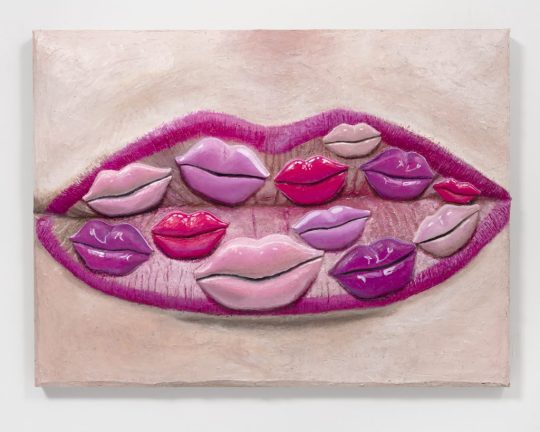

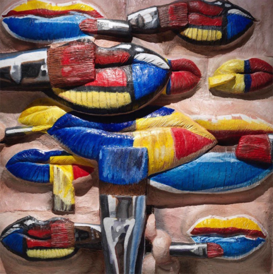
Artist Gina Beavers Satirizes Our Insatiable Appetite for Personal Beauty in Her New Show at Marianne Boesky
Makeup as Muse: Gina Beavers
November 28, 2020
Despite my art history background and general love of art, I am less than eloquent when writing about it. Nevertheless I will continue soldiering forward with the Museum's Makeup as Muse series, the latest installment of which focuses on the work of Gina Beavers in honor of her recent show at Marianne Boesky Gallery. Beavers' practice encompasses a variety of themes, but it's her paintings of makeup tutorials that I'll be exploring. Since I'm both tired and lazy this will be more of a summary of her work rather than offering any fresh insight and I'll be quoting the artist extensively along with some writers who have covered her art, so most of this will not be my own words.
Born in Athens and raised in Europe, Beavers is fascinated by the excess and consumerism of both American culture and social media. "I don't know how to talk about this existence without talking about consumption, and so I think that's the element in consuming other people's images. That's where that's embedded. We have to start with consumption if we're going to talk about who we are. That's the bedrock—especially as an American," she says. The purchase of a smart phone in 2010 is when Beavers' work began focusing on social media. "[Pre-smart phone] I would see things in the world and paint them! Post-smartphone my attention and observation seemed to go into my phone, into looking at and participating in social media apps, and all of the things that would arise there...Historically, painters have drawn inspiration from their world, for me it's just that a lot of my world is virtual [now]."
But why makeup, and specifically, makeup tutorials? There seem to be two main themes running through the artist's focus on these online instructions, the first being the relationship between painting and makeup. Beavers explains: "When I started with these paintings I was really thinking that this painting is looking at you while it is painting itself. It’s drawing and painting: it has pencils, it has brushes, and it’s trying to make itself appealing to the viewer. It’s about that parallel between a painting and what you expect from it as well as desire and attraction. It’s also interesting because the terms that makeup artists use on social media are painting terms. The way they talk about brushes or pigments sounds like painters talking shop." Makeup application as traditional painting is a theme that goes back centuries, but Beavers's work represents a fresh take on it. As Ellen Blumenstein wrote in an essay for Wall Street International: "Elements such as brushes, lipsticks or fingers, which are intended to reassure the viewers of the videos of the imitability of the make-up procedures, here allude to the active role of the painting – which does not just stare or make eyes at the viewer, but rather seems to paint itself with the accessories depicted – literally building a bridge extending out from the image...Beavers divests [the image] of its natural quality and uses painting as an analytical tool. The viewer is no longer looking at photographic tableaus composed of freeze-frames taken from make-up tutorials, but rather paintings about make-up tutorials, which present the aesthetic and formal parameters of this particular class of images, which exist exclusively on the net." The conflation of makeup and painting can also be perceived as a rumination on authorship and original sources. Beavers is remaking tutorials, but the tutorials themselves originated with individual bloggers and YouTubers. And given the viral, democratic nature of the Internet, it's nearly impossible to tell who did a particular tutorial first and whether tutorials covering the same material - say, lip art depicting Van Gogh's "Starry Night" - are direct copies of one artist's work or merely the phenomenon of many people having the same idea and sharing it online. Sometimes the online audience cannot distinguish between authentic content and advertising; Beavers's "Burger Eye" (2015), for example, is actually not recreated from a tutorial at all but an Instagram ad for Burger King (and the makeup artist who was hired to create it remains, as far as I know, uncredited).
Another theme is fashioning one's self through makeup, and how that self is projected online in multiple ways. Beavers explains: "I am interested in the ways existing online is performative, and the tremendous lengths people go to in constructing their online selves. Meme-makers, face-painters, people who make their hair into sculptures, are really a frontier of a new creative world...It’s interesting, as make-up has gotten bigger and bigger, I’ve realized what an important role it plays in helping people construct a self, particularly in trans and drag communities. I don’t normally wear a lot of make-up myself, but I like the idea of the process of applying make-up standing in for the process of self-determination, the idea of ‘making yourself’."
As for the artist's process, it's a laborious one. Beavers regularly combs Instagram, YouTube and other online sources and saves thousands of images on her phone. She then narrows down to a few based on both composition and the story they're trying to tell. "I'm arrested by images that have interesting formal qualities, color, composition but also a compelling narrative. I really like when an image is saying something that leaves me unsure of how it will translate to painting, like whether the meaning will change in the context of the history of painting," she says. "I always felt drawn to photos that had an interesting composition, whether for its color or depth or organization. But in order for me to want to paint it, it also had to have interesting content, like the image was communicating some reality beyond its composition that I related to in my life or that I thought spoke in some interesting way about culture." The act of painting for Beavers is physically demanding as well: she needs to start several series at the same time and go back and forth between paintings to allow the layers to dry. They have to lay flat to dry so she often ends up painting on the floor, and her recent switch to an even heavier acrylic caused a bout of carpal tunnel syndrome.
But it's precisely the thick quality of the paint that return some of the tactile nature of makeup application. This is not accidental; Beavers intentionally uses this technique as way to remind us of makeup's various textures and to ensure her paintings resemble paintings rather than a photorealistic recreation of the digital screen. "The depth of certain elements in the background of images has taught me a lot about seeing. I think I have learned that I enjoy setting up problems to solve, that it isn't enough for me to simply render a photo realistically, that I have to build up the acrylic deeply in order to interfere with the rendering of something too realistically," she explains. Sharon Mizota, writing for the LA Times, says it best: "Skin, lashes and lips are textured with rough, caked-on brushstrokes that mimic and exaggerate wrinkles and gloppy mascara. This treatment gives the subjects back some of the clunky physicality that the camera and the digital screen strip away. Beavers’ paintings, in some measure, undo the gloss of the photographic image."
Beavers also uses foam to further build up certain sections so that they bulge out towards the viewer, representing the desire to connect to others online. "Much of what people do online is to try to create connection, to reach out and meet people or talk to people. That is what the surfaces of my painting do in a really literal way, they are reaching off the linen into the viewer’s space," she says. This sculptural quality also points to the reality of the online world - it's not quite "real life" but it's not imaginary either, occupying a space in between. Beavers expands on her painting style representing the online space: "It’s interesting because flatness often comes up with screens, and I think historically the screen might have been read like that, reflecting a more passive relationship. That has changed with the advent of engagement and social media. What’s behind our screen is a whole living, breathing world, one that gives as much as it takes. I mean it is certainly as 'real' as anything else. I see the dimension as a way to reflect that world and the ways that world is reaching out to make a connection. Another aspect is that once these works are finished, they end up circulating back in the same online world and now have this heightened dimensionality – they cast their own shadow. They’re not a real person, or burger, or whatever, but they’re not a photo of it either, they’re something in between."
Let's dig a little more into what all this means in terms of makeup, the beauty industry and social media. Beavers' work can be viewed as a simultaneous critique and celebration of all three. Sharon Mizota again: "[The tutorial paintings] also pointedly mimic the act of putting on makeup, reminding us that it is something like sedimentation, built up layer by layer. There is no effortless glamour here, only sticky accretion. That quality itself feels like an indictment — of the beauty industry, of restrictive gender roles. But an element of playfulness and admiration lives in Beavers’ work. They speak of makeup as a site of creativity and self-transformation, and Instagram and other social media sites as democratizing forces in the spread of culture. To be sure, social media may be the spur for increasingly outré acts, which are often a form of bragging, but why shouldn’t a hamburger eye be as popular as a smoky eye? In translating these photographs into something more physical, Beavers asks us to consider these questions and exposes the duality of the makeup industry: The same business that strives to make us insecure also enables us to reinvent ourselves, not just in the image of the beautiful as it’s already defined, but in images of our own devising."
This ambiguity is particularly apparent in Beavers's 2015 exhibition, entitled Ambitchous, which incorporated beauty Instagrammers and YouTubers' makeup renditions of Disney villains alongside "good" characters. Blumenstein explains: "So it isn’t protagonists with positive connotations which are favoured by the artist, but unmistakably ambivalent characters who could undoubtedly lay claim to the neologism ambitchous, which is the name given to the exhibition. Like the original image material, this portmanteau of ‘ambitious’ and ‘bitchy’ is taken from social media and its creative vernacular, and is used, depending on the context, either in a derogatory fashion – for example for women who will do absolutely anything to get what they want – or positively re-interpreted as an expression of female self-affirmation. Beavers also applies this playful and strategic complication of seemingly unambiguous contexts of meaning to the statements contained in her paintings. It remains utterly impossible to determine whether they are critically exaggerating the conformist and consumerist beauty ideals of neo-capitalism, or ascribing emancipatory potential to the conscious and confident use of make-up."
More recently, Beavers has been using her own face as a canvas and making her own photos of them her source material, furthering her exploration of the self. "Staring at yourself or your lips for hours is pretty jarring. But I like it, because it creates this whole other level of self,” she says.
This shift also points to another dichotomy in Beavers's work: in recreating famous works of art on her face, she is both critiquing art history's traditional canon and appreciating it, referring to them as a sort of fan art. "I think a lot of the works that I have made that reference art history—like whether it's Van Gogh or whoever it is—have a duality where I really respect the artist and I'm influenced by them, and at the same time I'm making it my own and poking a little fun. And so, a lot of these pieces originated with the idea of fan art. You'll find all sorts of Starry Night images online that people have painted or sculpted or painted on their body. It comes out of that. And I just started to reach a point where I was searching things like 'Franz Kline body art,' and I wasn’t finding that, so I had to make my own. Then it started to get a little bit geekier. I have a piece in the show where I am painting a Lee Bontecou on my cheek, that's a kind of art world geeky thing—you have to really love art to get it."
Ultimately, Beavers perceives the intersection of makeup and social media as a force for good. While the specter of misinformation is always lurking, YouTube tutorials and the like allow anyone with internet access to learn how to do a smoky eye or a flawlessly lined lip. "I think for a lot of people social media is kind of like the weather. We don't have a lot of control of it, it just is. It gives and it takes away. There's no doubt that it has connected people in ways that are great and productive, allowing people to find communities and organize activism, it can also be a huge distraction...I approach looking at images there pretty distantly, more as a neutral documentarian, and I come down on the side of seeing social media as an incredibly useful, democratic tool in a lot of ways," she concludes.
On the other side of social media, Beavers is interested on how content creators help disseminate the idea of makeup as representing something larger and more meaningful than traditional notions of beauty. "I was super fascinated with makeup and all of the kinds of costume makeup and things you can find online that go away from a traditional beauty makeup and go towards something really wild and cool...I also had certain paintings in [a 2016] show that were much more about costume makeup, that were going away from beauty. That’s the thing that gives me hope. When I go through makeup hashtags on Instagram, there will be ten or twenty beauty eye makeup images and then one that’s painted with horror makeup. There are women out there doing completely weird things, right next to alluring ones." In the pandemic age, as people's relationships with makeup are changing, "weird" makeup is actually becoming less strange. Beavers' emphasis on experimental makeup is more timely than ever. I also think she's documenting the gradual way makeup is breaking free of the gender binary. She says: "I mean with makeup, and the whole conversation around femininity and makeup—I think for a long time when I was making makeup images, there were people that just thought, 'Oh, that's not for me,' because it's about makeup, it's feminine. But it’s interesting, the culture is shifting. I just saw the other day that Alexandria Ocasio-Cortez did a whole Instagram live where she was putting on her makeup and talking about how empowering makeup is for trans communities...some people see make-up as restrictive or frivolous, but drag performers show how it can be liberating and life-saving." Another point to consider in terms of gender is the close-up aspect of Beavers's paintings. With individual features (eyes, lips, nails) separated from the rest of the face and body and removed from their original context, they're neither masculine nor feminine, thereby reiterating that makeup is for any (or no) gender.
All I can say is, I love these paintings. Stylistically, they're right up my alley - big, colorful and mimicking makeup's tactile nature so much that I have a similar reaction to them as I do when seeing makeup testers in a store: I just want to dip my hands in them and smear them everywhere! I also enjoy the multiple themes and levels in her work. Beavers isn't commenting just on makeup in the digital age, but also self-representation online, shifting attitudes towards makeup's meaning, the relationship between painting and makeup, and Western art history.
What do you think of Beavers's paintings?
1 note
·
View note
Text
A Drawing Tutorial
I thought maybe there would be some of you who might appreciate seeing some of my artistic processes. So this is a quick tutorial about digital art! This is how I do a single-layer picture, and I’ll also be discussing composition a little.
First! doesn’t matter what program you use or what size your canvas is or what tools you use, that’s all personal preference. Experiment with different brushes and brush settings until you’ve figured out what you like best.
I have recently started thinking of a digital canvas as being just as much a part of the artwork as the subject itself. This is something that holds true in any art form. If you think of the surface you create on as being another art tool, it can really help you create nice compositions and use the space effectively!
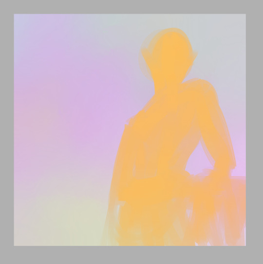
so, with that in mind my first step is to tone my “paper” so the colors I’m going to use for the main subject will have a nice backdrop to contrast against. I toss down a few soft colors and blend them out so they cover the whole canvas

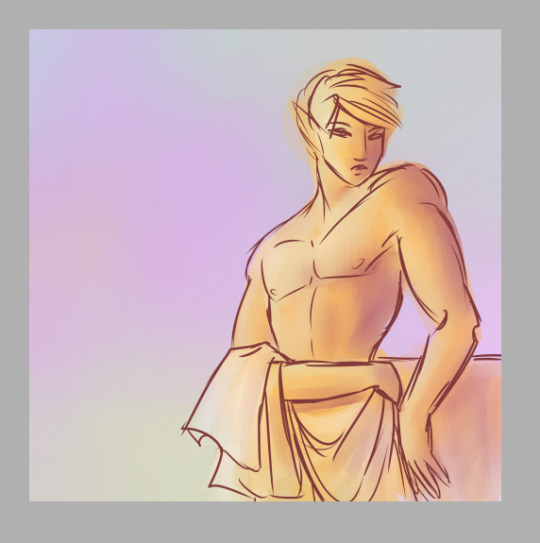
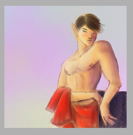
If you vary the colors, it also gives a nice ambient lighting feel. So now comes the base colors, this when I make my gesture sketch. A gesture is important because it is the blueprint for the whole drawing! Gestures are not just for people, but can also include any objects in a picture! I pick a color that stands out from the background without being too high in contrast and lay down a solid gesture with a big blendy type brush so it has a softer edge. This helps it look like it really belongs here. I’m also thinking about how I want the composition to look, and usually I do this all in one go, never lifting my stylus, so I better be committed to it because if I hit the undo button it’s all gone. I’ll be drawing my oc Kouto Loryck, who is in fact an art model.
it’s important to be committed to every stroke, be bold and confident with your art. Even if it doesn’t turn out the way you want, you should at least be able to say that you were committed to it. Don’t worry about mistakes, thinking too much will only keep you stuck on one little part when you could be working on the whole thing. I had another drawing here about composition but I accidentally saved over it so I had to move that explanation to a different step haha
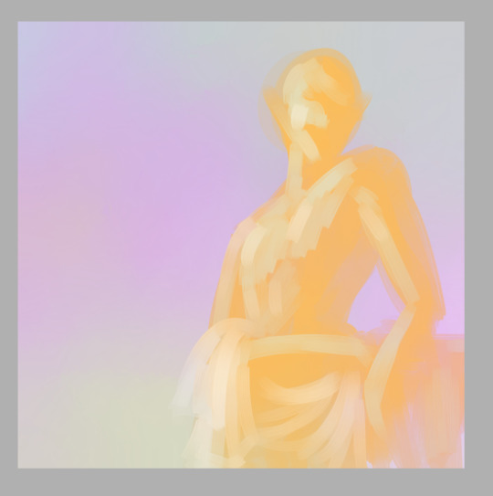
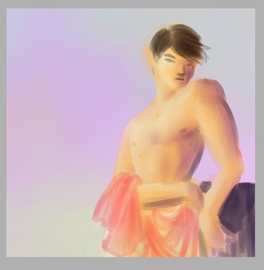
Next I lay out the highlights to pull out the details of the subject. I used the same brush for most of this drawing, just changing the size to accommodate what I was using it for. Since the base color is orange, I used a really pale icy blue to highlight, and the blending quality of the brush I used kept it toned down properly so it didn’t look psychedelic. There is nothing wrong with psychedelic coloring, I think it’s really fun, but it’s not the look I wanted this time.
Now let me talk about the composition a bit. The most common composition tool is triangles. Triangles make for really pleasing compositions. And composition is all about balancing the positive and negative space in your picture, as well as creating a pathway for the viewer’s eye to follow. b

I kept this one super simple. Two main triangles in opposing directions, the eye is drawn to the head of the subject and follows the body down to the bottom of the page. Plain, simple, aesthetically pleasing. Keeping a small negative space on the other side of the subject and making a small negative space within the subject also adds a little extra variety to it. One surefire way to make an interesting composition is to place the subject off-center, because it varies the weight of the picture and makes it feel more dynamic, even if it’s a really boring pose like this one; he’s just leaning against some vague object behind him. But I’ve got him off-center and at an angle to the viewer, so it adds interest to the composition.
Once I’ve got highlights done, I go in and add shadows, and then I blend things smooth.
It’s important to use just a few colors to keep things simple. They should be colors that compliment each other in some way. Unless you want the color contrast to look discordant, of course. But even when you’re intentionally using colors that don’t blend nice, make sure you have some neutrals to balance with.
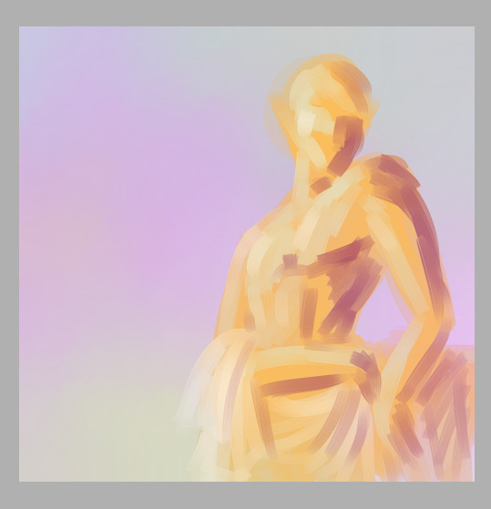
Now it’s really easy for me to decide exactly what I want to do with this, so I lay out a line layer on top to plan my next steps.
This helps me figure out if there’s anything that needs to be adjusted, see if I’ve got my proportions how I want them, etc. I can then use this as a reference later to keep everything in line with my plan. Now I can go in with a smaller brush and add in any extra colors to help separate the different parts of the drawing.
And I add in extra shading to bring out the details here
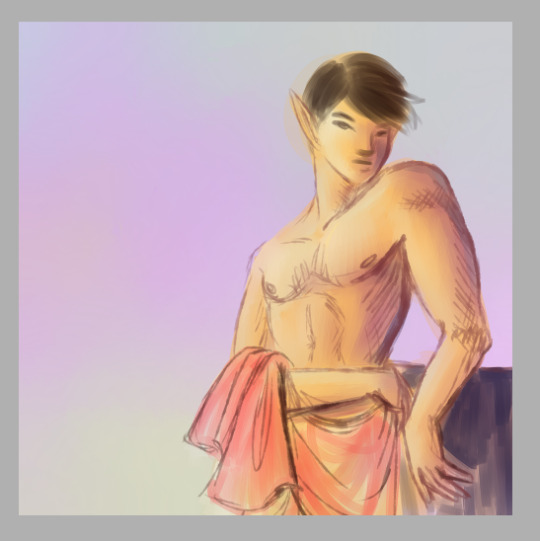
Blend, redraw, add color as necessary until it looks good.
And at this point I can call it a finished drawing if I want. Or I can keep lining and shading and detailing until I think it’s really done.
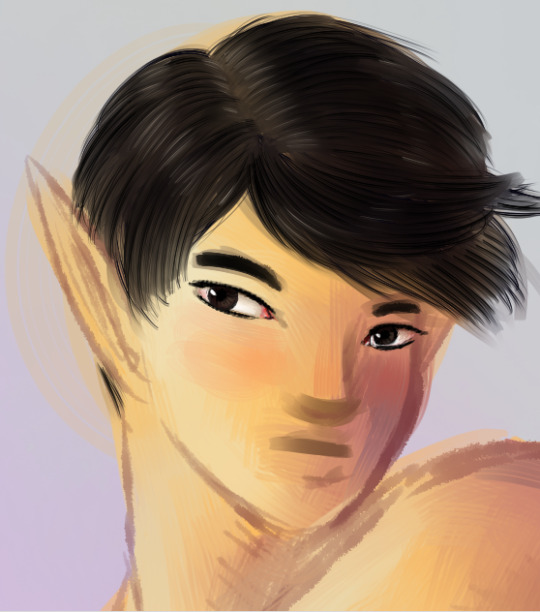
I’ll just zoom in on the face area now to discuss detailing. I have some specific brush settings I like to use for details like hair. And with the hair I draw layers of a dark shade, the color of course depends on the hair. Draw the hair in layers, first laying down a solid color a college art teacher of mine called “the hair helmet” and then go on top of that with a thin, non-blendy brush to give it the look of lots of individual strands. A brush that already has the look of multiple strands is best because you don’t have to do as many strokes.
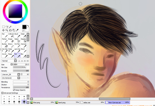
and then I go back over it with my softer brush in the main hair color, do a few more strand layers on top of that, and this time add highlights in a few places, then blend all of that very gently so it still looks like hair.
Next is the eyes! I use a pencil type brush to bring out the lash lines and eyebrows. For the eyes themselves I layer in pale yellows, pinks, and white highlights, leaving a little of the skintone near the upper part of the eye to blend into a shadow.
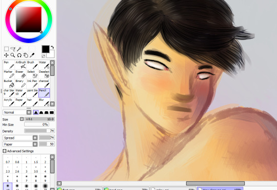
Time to color in the eyes! I start with a dark circle in each eye, depending on the eye color. the iris is a funky little shallow bowl in the eye, curving inwards so actually the light hits it on the opposite side from what you might expect. But the shiny white highlight is on the same side as the rest of the lighting because over the iris is a clear dome that curves outward, giving the eye two layers to highlight on different sides.The upper part of the iris is also usually in shadow because of the eyelashes
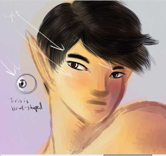
Draw in the pupils, add a few dark lines radiating out from it to give the eyes that realistic texture, and then toss on that nice bright highlight.
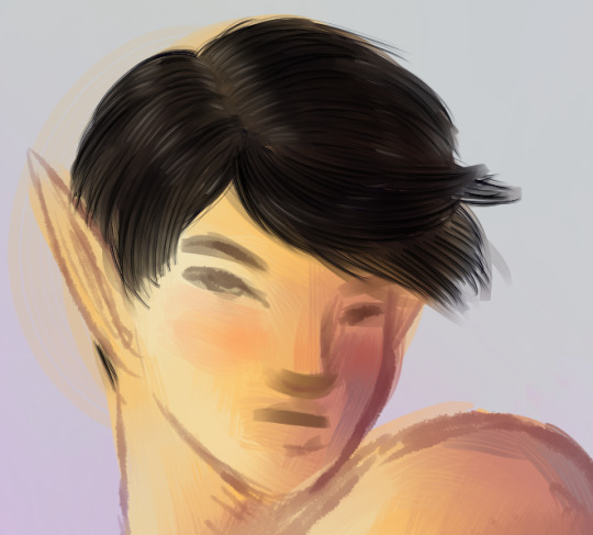
Next, I detail the rest of the face with extra highlights and shadows. Here I’ve mapped out where the main lights and shadows would fall.

And finally I add in extra outlines on the nose, mouth, and ears, as well as the darkest side of the face and anywhere else that might need it
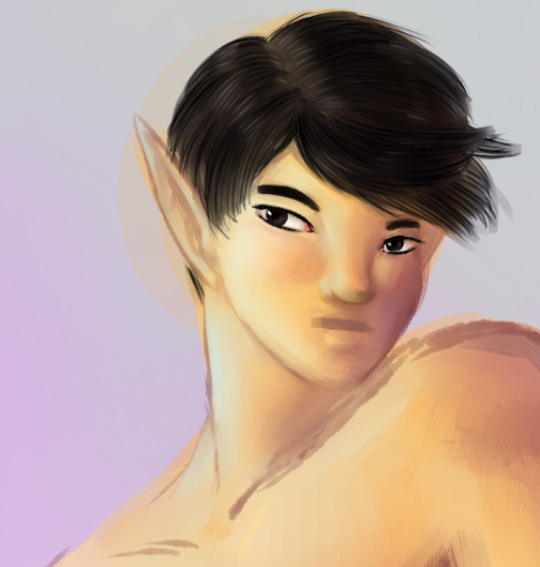
I ended up adjusting his lips quite a bit to make them the right width and shape. The upper lip is always darker than the lower lip because of the way light falls on faces. Except perhaps in cases where all the light is coming from below.
But anyway, that is my basic digital painting tutorial! Hope you found it useful!
7 notes
·
View notes
Text
How to Draw a Superhero - Easy Things to Draw
New Post has been published on https://easythingstodraw.net/how-to-draw-a-superhero-easy-things-to-draw/
How to Draw a Superhero - Easy Things to Draw

youtube
How to Draw a Superhero – Easy Things to Draw
In this drawing lesson, I go over how to draw a generic superhero. I give general examples of real life superheroes. its I try and go through it step by step. I try to put my thought on the drawing down into words. Check out the Video!
Also, don’t forget to check another tutorial 4 Tips on Finding Your Drawing Style – Easy Things to Draw
Hello and welcome to another tutorial of easy things to draw, today I want to teach you how to draw superheroes, when it comes to drawing superheroes there is an unlimited amount of focus that you can take. In general with the superheroes we tend to incorporate certain positive attributes in them, with so many franchises of this theme, there is no surprise that they continue being a source of entertainment.
But before we start with the tutorial a little more information about superheroes
A superhero is a fictional character because his characteristics exceed those of the classic hero, usually with superhuman powers, though not necessarily, and connected with science fiction. Generated in the late 1930s in the American comic book industry, have enjoyed a multitude of adaptations to other media, especially cinema.
some characteristics of them are:
*The origin:
-Are those of nonhuman origin, these could be extraterrestrials, mythological gods, demigods, fictional races away from humanity, robots, ghosts, demons, etc. Some examples of these superheroes may be Superman, Thor, the Inhumans, the Vision, and Ghost Rider.
– The natural origin an example of that is the mutants in which can be found Wolverine,Magneto.
-There are those who become through scientific experiments, the origin of the superhero may be an accidental consequence of an experiment, for example, Spider-Man, Flash, Hulk or Fantastic 4. You can also include experiments with a deliberately sought purpose (such as Captain America).
-Obtaining advanced technology or mystical artifacts, such as the Green Lantern ring, the Iron Man armor or the adamantium from which Wolverine’s claws and skeleton are made.
-There are also those who become superheroes after a trauma. There are those superheroes whose families were killed. They usually lack superpowers, but they have sophisticated weapons, tools, and skills that allow them to do justice, such as Batman, The Punisher, Daredevil, etc.
*These have one or more special abilities among which we can find: superhuman strength, telepathy, a technology well ahead of their time, mystical powers, knowledge of martial or scientific arts, athletic skills or great intelligence.
*These superheroes tend to fight to defend the innocent either in crimes, catastrophes, alien invasions or any other threat they encounter.
*They usually have a perfect anatomy and also follow the canons close to the Greco-Latin, although they can follow other aesthetics.
* They tend to have a secret identity (double identity or alter ego); they have a “civil” identity, pretending to be an ordinary person and another under which they act as superheroes, such as Clark Kent (Superman) or Peter Parker (Spider-Man), although there are exceptions like The Fantastic Four.
* They usually have a uniform, usually very tight (to wear under civilian clothing) and flashy colors, which usually hides their secret identity and identifying him as a superhero.
* Finally, they have a gallery of villains, characters with characteristics similar to them, but with motivations and methods that are generally opposed. Stories about superheroes almost always involve to some degree a hero conflict with a villain or group of villains.
Now from here, we will use the traditional superheroes as a base, we will review the positions of anatomical action poses and perspective drawing. You may have noticed that a superhero is much bigger than a normal person, if you’re measuring an average human it should give you six to seven heads in height, but the average of a superhero it can be seven to eight heads.Another thing you might notice about Comic-books heroes is the way they end up looking like a walking anatomy charts drawn with every visible muscle against his spandex suit, One thing you should note is that the muscle tends to work in pairs, so when one muscle flexes the other muscle is relaxed one example is the bicep and the triceps, when the bicep is flexed the is triceps relaxed and vice-versa.
Now I’m going to name the muscles that make up our superhero, I’ve said in other tutorials that you don’t need to know the names of memory, but it helps to know the shapes they have since it makes your character look more realistic. At the front we can find the:
Sternocleidomastoid, Pectoralis major, Trapezius, Deltoid, Triceps, Biceps, Abdominal wall, Latissimus dorsi, Oblique, Brachioradialis, Quadriceps, and the Gastrocnemius, now let’s see the back view, we have the Deltoid, Trapezius, Triceps, Biceps, Latissimus dorsi, Gluteus medius, Gluteus maximus, Biceps femoris, Gastrocnemius, Extensors, and the Scapulae.
We are going to be seeing the basics about anatomy so let’s start with the drawings in stages, there are two options with which you can choose this depends on what you prefer, you can start in your sketch drawing quite light where you can hardly see it or another option, if you cannot stand the eraser, is to draw quite loaded on the paper and then put another layer of paper on top and that way you can see the skeleton work underneath, considering that we are drawing superheroes.
We’re gonna want to get really comfortable by drawing the body in motion, there’s no need to panic about figure drawing, all we have to do is start creating a gesture line, this line will follow the directional movement of the body, usually following the curve of the spine, creates the gesture line of your overall pose depending on whether it is doing either jumping, flying, running, etc.
next step is to indicate at which point of the line, the rib cage (normally represented by a circle) and the pelvis (represented by a box) are going to be. If you have trouble estimating in which part of the spine is going to fall, try drawing on pictures of people in motion, just trace the gesture lines of the spine, pelvis, and rib cage, doing this repeatedly is going to help conceptualize these points fall and where to create angles in relation to each other, when this is ready, we move to the shoulders, you can use a short and almost horizontal line to mark where it falls.
I say almost horizontal because I think making shoulders uneven creates a more dynamic posture and prevents your character from looking like the high school yearbook photo also, this makes one part of the torso a little bit crunched while the other side is outstretched, we all know that there is nothing more badass than tough guys displaying bad posture .
We continue with our glorious stick view, we can now indicate the limbs with more lines, this way we can approximate length, angles, and position of the arms and the legs, again, if you have problems use real-life photos as a visual assistant, mark the joints and where the limbs will end, this will save you from messy proportions later, it’s not so difficult.
At this point, we have to establish a general thickness of the limbs, to make it easier, think in 3D and pretend that the limbs are cylinders, refer back to the muscle charts that I gave you, as they say, 90% of drawing is seen and the hardest part about making this easy is training your brain to find the simple shapes and forms which make up the complicated human anatomy, take it slow and don’t expect to nail it on the first try.
Now let’s start to review some basic things about the face, to start giving the best of you to draw a basic outline of the head after this you have to divide it into thirds, do not think too much about how you want to do them, these will become: the hairline, the brow line, the line under the nose and the bottom of the chin.
This gives you a vertical ballpark between the distances of the facial features and helps your drawings look more human. Your hairline is where the vertical plane of your forehead begins to curve into the top of your head, also when I’m creating my hairline my strategy is to think about the hair firstly as one large mass and then pull out some directional lines in the flow, I want to show it that the large-shapes is made of smaller hairs connecting to the skull.
I want to say a few things about perspective, when you’re drawing action poses you might find yourself wanting to progress past aggression on images and opposes where limbs are actually coming out towards the viewer, to do this we have to create perspective on a two-dimensional surface that mimics the way that we see the real world around us, because, think about it, we in fact see things in two dimensions our brain just trains us to organize things based on visual cues, one of these cues is that things appear larger when they’re closer to us and consequently things if you’re smaller when they’re further away.
We can mimic this concept and drawing through foreshortening or drive something to appear shorter to make it looks like it’s projecting towards the viewer, look at one cylinder, the closer one surface of the cylinder gets to us the shorter the object appears overall, remember when I asked you before to think of limbs as cylinders, that was the reason why, another cue that helps us organize our two-dimensional vision of reality is to overlap, overlapping is easier to learn with simple shapes.
Now to give you an example, we will use Toki, she sees two shapes in order, for Toki to be able to tell which shapes are closer to her one of the objects would have to overlap the other showing that they are in two separate planes. The human body works the same way because the human body is made up of simple shapes and them we apply overlapping to the form and anatomy.
Another example, could be, that first we have an arm without any overlap everything is in the same plane and in the second arm we have that the deltoid is slightly overlapping on the bicep showing us that it is closer to us, Same with the biceps and forearm, in the next example, we have the elbow and forearm closer and are slightly overlapping on the bicep, which shows that the bicep is further away from us. The more you know about the placements of the body or limbs, the easier it will be to overlapping them.
Once you’ve practiced these tips, it’s time for you to put a costume on your superhero, you can be as creative as you want with this, adding masks, cloak, colors that pop up or something darker if you want, That’s all up to you and also have to see what things combine better with your superhero…
Remember that it is very important that you repeat these steps and practice at least a little, this will help you to improve. And that’s it, we’ve already completed our tutorial on how to draw superheroes, remember that this is just the basics and the most common type that exists, but there are many other ways you can create them, I really hope this will help you out and we’ll see you in another tutorial on how to draw easy things where I’ll teach you how to draw step by step…
These tutorials are made for beginners drawings as for those who are already more experienced, it never hurts to know new things or to review them, also for those who have seen my videos know that I am not only interested in helping them to draw, but I am also interested in giving advice on things that could happen as artists, See you later in another tutorial and always stay creative, bye.
BUY an ARM PENCIL CASE: http://arm-adillo.com
Hey guys for more information on upcoming events, contests and freebies, join our email list. SPAM FREE. Click Here to Sign Up!
Also, don’t forget to check another tutorial 4 Tips on Finding Your Drawing Style – Easy Things to Draw
#easy things to draw#easy things to draw for beginners#How to Draw a Superhero#How to Draw Easy Things#how to draw for beginners#how to draw hulk#how to draw marvel books#Howto & Style#New
0 notes
Text
Line-art and Order: Coloring vs Painting
As much as I sing the praises of spontaneity, it’s sometimes much more sensible and less stressful to stick to a particular order. This order depends on what’s required for upcoming steps. It also depends on the planner’s momentum and inner thought process. Some people are better at recording their creative ideas whenever they hit. Others like to use the momentum of creative brainstorming as a warm-up before doing more intensive work and can’t be bothered to write down their ideas when off work-mode.
This similar idea of order also applies to whether you’re the type of person who finesses their line-art before laying down base colors underneath, or if you’re the type of person to paint the shape before finessing it with line-art on top.
I’ve generally erred toward the former. Even in hand-drawn things where I’d go over the outline with pen after coloring, the sketch still came close to how I’d want the final line-art to look before I’d think to color. If you’re savvy with clipping and selecting, this process will also help you with using the fill tool. It’s quick and satisfying to see all the colors pop into your piece in less than a few minutes.
But in busier pieces with multiple layers of line-art, it’s a bit more complicated. In cluttered pieces where it’s easier to unintentionally leave an opening in your line-art, the fill tool becomes more of a nuisance. And especially when you deliberately color the line-art, it sucks to accidentally fill on the same layer as your line-art.

I’ve encountered plenty of these bumps in the process of drawing this picture. Even though unexpected occurrences in my day job/social life bled into my art time and slowed me down, the many components and layers of line-art in this image (background hallway, wall/table, person/chair, and items) led to coloring-and-selection hell. I trudged through this picture in about a week.
This isn’t to say I didn’t enjoy it. Admittedly, it turned out different from the original concept: A guy in his workspace with only a few select oddities on his desk (to continue the theme of ‘odd things’ I’ve been carrying on with since a few weeks ago.) During the sketch process, I decided that I wanted an ordinary-yet-amusing background scenario I’m quite familiar with, where someone’s knowingly observing your shenanigans without saying a word.
But by the end of picture, I was pretty much *done* with coloring, haha! To recalibrate and take a break from that, I scribbled out the following thing in less than an hour.

It’s messier and scratchier, but it recaptured the flow I’d get when quickly churning out something on my sketchbook. With blocking out shapes first and outline last, there was less restriction to a selection/upper layer of lines. Of course, still start strong with the visual blocking/the sketchier elements. But at the very least, you have more freedom with in lines.
And with laying down shapes and colors first, you can better integrate the line-art with the shading elements and existing color choices.
As to the downsides of a more ‘paint-like’ process, I suppose it can feel like triple the work. Because rather than just relying on clean lines to influence the coloring process, you have to think about having a clean sketch, a reasonably clean shape, and then a clean outline to define that shape.
But in busier pictures, this can at least make the layering process more straightforward. Since you add the line-art on top of defined shapes, you can then paint-and-outline individual objects and then sequentially move above or below.
This mindset influenced the process I used for a dream-based image I worked on last week:

It still felt long and messy at times, but there were less layer and selection mix-ups, less scrambling to press undo on a bucket-fill bleeding out everywhere, and less eye-rolling due to realizing I still had to figure out how to color the lines after coloring inside of them.
That being said, the bucket-fill is still a time-saving friend, but perhaps mainly for big, individual shapes, ha!
And this one only took 2 days. Yay progress.
I’ll end this by saying that the ‘coloring’ approach still has its uses for simpler, crisper pieces where the line-art is super distinct from the colors underneath. In those cases, I still see it as being a potential time-saver.
But when the details seem intimidating, paint away.
Also hope you had a happy Sunday and Valentine’s, haha!
0 notes
Text
I want to disclose before I even start this post that the day I started writing this, BookTube came out with a whole load of videos inspired by Jin’s birthday that follows the exact same concept. I promise I’m not trying to plagiarise any of their ideas behind the videos, I’ve been planning this series of posts for months! This is a link to a whole playlist of those videos that meltotheany created, I highly recommend watching.
If you haven’t been around the past year, I have fallen very deep into the BTS rabbit hole. I was always aware of BTS, because I’ve listened to K-Pop for a few years alongside my other music interests, but it was only once I got into BTS in April this year that I fully dedicated invested myself to actually listening to their music as a whole.
With music obsessions comes associating random things with the people in the group, and, as a result, I came up with a whole load of books that remind me of the members of BTS, as well as individual songs/albums/concepts/etc., so I’m… starting another blog series!
Starting off: BOOKS TO READ BASED ON YOUR BIAS. I love all of them, but I always think of my favourite as the one who, if they are in teams, I always hope they will be the one to win the challenge. I’ve done this for pretty much everything I enjoy.
For me, the person I always want to win is Jin, so I’m going to go eldest to youngest, recommending books that remind me of them.
KIM SEOKJIN
Sadie by Courtney Summers: While Jin is very down to Earth and willing to dick around with the younger members of the group, he is very protective and has his serious moments. Sadie is a dual narrative following teenager Sadie as she hunts for the man that she believes murdered her younger sister. It’s a very difficult read– content warnings for pedophilia, sexual abuse, and violence– but I feel like it hits hard when you’re the eldest sibling, which Jin technically is.
The Adventure Zone: Here There Be Gerblins by the McElroy’s and Carey Pietsch: Okay, so this is a very different approach to Jin, but Taako… really reminds me of him? I can’t shake the vibes. My original notes for this post literally just say ‘look: jin and taako have the same energy’, I am adamant.
The Immortalists by Chloe Benjamin: Another sad pick unfortunately! The Immortalists follows four siblings who all learn the dates they’re going to die, and the book follows them in order. It’s kind of a tragic read, but the exploration of mortality and fate is great. The familial relationships are complicated and layered, with people drifting apart, and as an older sister, it’s quite terrifying to look into the future and realise I’ve got my whole life ahead of me with these people I’ve grown up with. And that, again, reminds me of Jin.
Scott Pilgrim VS The World Series by Bryan Lee O’Malley: Finish off on a happy one! Jin likes video games, and Scott Pilgrim reads a lot like a video game, if that’s possible. It’s about a guy in his twenties who is kind of a loser and has to beat his new girlfriend’s evil exes. Quite a popular read, and the movie is solid, but the graphic novels are just better. They have more Wallace Wells, and Wallace is a character I could see Jin appreciating.
MIN YOONGI
Alice Isn’t Dead by Joseph Fink: If it’s possible for a book about a woman searching for her dead wife and accidentally uncovering a world of horror to be quiet, Alice Isn’t Dead accomplishes that. Keisha Taylor, our main character, openly struggles with her anxiety throughout, and Yoongi is very open about mental health and struggling to carry on. The book is about finding your strength and refusing to accept apologies until you’re ready to accept them, and I think Yoongi would like the messages this book sends.
I Want to Eat Your Pancreas by Yoru Sumino: Another one I struggle to explain. A teenage boy finds the diary of his classmate, who is suffering from a pancreatic disease and isn’t certain she’ll live through it. A boundary-crossing friendship blooms between the two, and there are so many unexpected moments. It’s a real tearjerker, I’ll tell you that. Something about how real the narrative is makes me think of Yoongi.
Radio Silence/I Was Born For This by Alice Oseman: Yoongi is, again, very open about struggling with his mental health, and mental health is quite a big theme in both of these books. Radio Silence is focused on the pursuit of what makes you happy in a world telling you to focus on academics instead of being creative, a very Yoongi theme; and I Was Born For This has a POV of a frontman of a boy band who struggles with anxiety and is disillusioned with fame.
The Poet X by Elizabeth Acevedo: Just now realising all of my choices for Yoongi are super serious, which is going to be the direct opposite of the next member. The Poet X is written in verse– a great introduction to the form– and follows a young girl who struggles and attempts to understand her mother’s religion through the poetry she writes. Xiomara’s passion for the form is so beautiful and she flourishes in writing, truly feeling herself when she’s performing, and I think that’s something I see in Yoongi, too.
JUNG HOSEOK
The Monster of Elendhaven by Jennifer Giesbrecht: This is a very strange choice, but let me explain. Personality wise, Hoseok is a Gemini: very happy and hopeful, but his mood switches can be scary as heck. The Monster of Elendhaven made me laugh out loud, but it’s really dark– the narrator is a serial killer in a miserable fantasy world, and the main relationship is toxic but entirely consensual. It’s bizarre, and the contradictions remind me of Hoseok. Also, if you search up Hoseok’s Cypher 4 Live outfit where he looks like a Victorian aristocrat about to do nefarious science, he’s exactly how I picture Herr Leikenbloom.
Lumberjanes written by various: Lumberjanes is a series I’ve read for literal years, and it’s the right balance of lighthearted and heartfelt that it reminds me of Hoseok. Ripley, one of the main girls, is so energetic and passionate that I can’t help but think of Hoseok! Lumberjanes is set at a camp where our characters go on fantastical adventures and have to save the day, even if nobody else knows the day is being saved.
Winnie the Pooh by A.A. Milne: Don’t @ me, Winnie the Pooh is everything to me and I won’t be shamed for my passion. So many of the stories turn into ones of hope and friendship, literally the core of Pooh’s character, and Hoseok is like that for me. Him and Jimin, honestly, but Jimin isn’t until later! No getting ahead of myself!
Bravest Warriors by various: You can tell I love my comedies, can’t you? Bravest Warriors constantly edges on ridiculous, reminiscent of Adventure Time, and I love it for how scatter brained and funny it is. It’s just fun, plain and simple, and I think that’s good for us sometimes. Remembering to enjoy yourself, even when the going gets tough, which Hoseok shows.
KIM NAMJOON
In Other Lands by Sarah Rees Brennan: Namjoon, as the leader, has to be very in control and can sometimes seem like he’s drawing himself out of the fun in interviews to focus, but is very driven to change things for the better. In Other Lands focuses on Elliott, a boy who finds himself at a magical school and, against the expectations of magical society, begins to change it from the inside out using pacifism, quick wit and a reluctance to do anything energetic, but finds himself ostracised for it. I think Elliott staying true to his own nature and finding happiness even when it’s difficult is admirable, and also very much a Namjoon thing to do.
Aquicorn Cove by Katie O’Neill: After losing her mother, Lana moves to an island and begins to uncover a hidden magical world that’s at risk because of over-fishing. It’s a soft take on a wider issue, but Katie O’Neill is very good at handling themes like this and making them explicit without losing direction. I think Namjoon would really enjoy O’Neill’s work, but this especially is a very current issue.
No One Is Too Small to Make a Difference by Greta Thunberg: Speak yourself! Express your passions! Greta Thunberg is the embodiment of ‘speaking yourself’ and changing the world for the better, no matter who tries to knock you down.
Taproot by Keezy Young: I don’t know what it is about this that reminds me of Namjoon. In Taproot, Blue is a ghost, and haunting Hamal, his best friend whom he is in love with. There’s a focus on natural colours because Hamal works as a gardener, but it can be quite dark at times, looking at loss and fear of moving on. It just yells ‘Namjoon’ to me. I’ve definitely focused on more environment-focused writing for him.
PARK JIMIN
Truly Devious by Maureen Johnson: I like to describe Jimin as being sweet, but the most likely to commit a crime and get away with it, especially amongst the other members of BTS. So many of Stevie’s actions in this book as she investigates an unsolved crime remind me of Jimin, just because only he could get away with it. He’s been voted as one of the top idols like, 50 times, he’s very intimidating. If I caught him sneaking through my belongings, I’d be too scared to say anything.
Check, Please! by Ngozi Ukazu: Yes, Jimin is intimidating, but I also said he’s sweet, and Eric Bittle is the exact same. Bitty becomes a hockey player after years of competing as a professional figure skater, and finds himself making a home amongst men a lot bigger and a lot physically tougher than him. He overcomes a lot of hardships and works hard, and that’s something you see in Jimin’s dancing and own behaviours in being a part of BTS.
Neverworld Wake by Marisha Pessl: God, this is the exact same reasoning as Truly Devious, I’m sorry. I just really do think Jimin could be sneaky and get away with what these characters do! Neverworld Wake follows a young woman who reunites with her highschool friends and finds herself in a Groundhog Day scenario, repeating the same day over and over again as they attempt to uncover who murdered her boyfriend the year before. It’s very dark and atmospheric, I adore it.
Lovely Complex by Aya Nakahara: I’ll be honest, I’m mostly saying this series because Jimin is short. Lovely Complex follows Risa, an incredibly tall girl, and Atsushi, a boy well below expected height, who become reluctant friends in their pursuit to find romance. It’s very light and cute, probably one of the easiest manga series I’ve ever read.
KIM TAEHYUNG
Animals by Emma Jane Unsworth: This is almost a joint pick with Jimin. Animals follows a young woman in her twenties who parties more than she probably should with her American roommate. Her life slowly begins to unravel as she notices more faults in her relationships, and begins to question if this is what she actually wants from life. There’s something about people in their mid-to-late-twenties partying and making terrible decisions as they have a crisis that reminds me of Taehyung, just because him and the rest of the group have been so open with how much he’s changed and attempted to make himself into a more in-control person.
Snotgirl by Bryan Lee O’Malley: Look. Taehyung is very bougie, and Snotgirl follows socialite and fashion blogger Lottie as she tries to combat her chronic allergies and not get sent to prison for murder. It’s a very exciting series, the characters are self-centred and awful, and I think Taehyung would love it. They are all rich and dress impeccably.
If We Were Villains by M.L. Rio: Taehyung is an actor, we all know this, and If We Were Villains follows several actors at a prestigious (and fictional) conservatory specialising in Shakespearean acting who end up embroiled in a murder plot. It’s dark academia a la The Secret History, but its focus on Shakespeare means it’s much suited to Taehyung. Dark, dangerous and dramatic.
I’ll Give You the Sun by Jandy Nelson: I couldn’t not have a book on art in here when I’m talking about Taehyung, and it was only going through shelves upon shelves that made me realise I have read so few books on art. I’ll Give You the Sun is a dual narrative novel, following artist twins Jude (in the present) and Noah (3 years in the past) as they tackle romance, art and loss. There are so many twists and turns, and the writing is beautiful.
JEON JUNGKOOK
A Head Full of Ghosts by Paul Tremblay: Ah, the book that started it all. This is the one I’m most confident in. We follow eight year old Merry, who finds herself and her family exploited in a reality TV show based on the assumed demonic possession of her older sister, Marjorie. It’s a very difficult read. Even though it’s not clear cut, Merry clearly loves her older sister and wants her to be okay, and that’s something that reminds me of Jungkook. He’s said more than once that watching the older members of the band struggle has impacted him most throughout their career, and that’s really embedded in the narrative of this novel.
The Avant-Guards by Carly Usdin: I had to pick at least one athletic narrative for Jungkook, okay. In this series we follow former sports star Charlie, who ends up being recruited by the basketball team at her new College, and begins to carve a place for herself where she belongs. It’s an easy story and all of the characters are likeable, balancing out the competitive nature of the characters. Jungkook is someone who works out a lot but also comes across as very happy, and that’s what these characters are like!
The Magnus Chase Trilogy by Rick Riordan: One of the things I love about Jungkook is how much he cares about the other members of BTS, and Magnus Chase is exactly the same. He almost becomes a background character in the later books in order to help his friends succeed, and it’s that trait that saves their lives in the end. This is actually my favourite Rick Riordan series, so do with that what you will!
Heavy Vinyl by Carly Usdin: I literally only just realised I’ve recommended two Carly Usdin comic series’s for Jungkook, so that must mean she just writes very Jungkook-esque comics. Heavy Vinyl is set in the late 90’s and follows Chris, who has just got a job working at her favourite record store. Only there’s a bit more to the store than first meets the eye, and she’s about to be embroiled in something far larger than she ever expected. I think the active qualities of Carly Usdin’s characters remind me of Jungkook, very willing to involve themselves and do what’s right.
And those are all my recommendations!
I would love to know if you agree with any of my choices, and if you have any you’d suggest. It was so fun working on this post and I cannot wait to work on future posts in the series.
If you liked this post, consider buying me a coffee? Ko-Fi.
Goodreads|Twitter|Instagram|Letterboxd
BTS and Books #1: Books to Read Based on Your Bias I want to disclose before I even start this post that the day I started writing this, BookTube came out with a whole load of videos inspired by Jin's birthday that follows the exact same concept.
#bangtan#bias#book#bts#gift guide#jeon jungkook#jung hoseok#kim namjoon#kim seokjin#kim taehyung#kpop#min yoongi#music#park jimin#recommendation
0 notes
Link
Laptop users have been focused for a very long time on whether the iPad Pro is going to be forced upon them as a replacement device.
Depending on who you believe, Apple included, it has at one point been considered that, or a pure tablet with functions to be decided completely by the app development community, or something all its own.
But with the iPad Pro, the Smart Keyboard and the new version of Apple’s Pencil, some things are finally starting to become clear.
The new hardware, coupled with the ability and willingness of companies like Adobe to finally ship completely full-featured versions of Photoshop that handle enormous files and all of the tools and brushes of the desktop version, are opening a new door on what could be possible with iPad Pro — if Apple are ready to embrace it.
Pencil
Does the double tap gesture feel natural? Yep. I’ve been using electronic drawing surfaces since the first generation Wacom that had a serial port connector. Many of them over the years have had some sort of ‘action button’ that allowed you to toggle or click to change drawing modes, invoke erasers or pallets and generally save you from having to move away from your drawing surface as much as possible.
That’s the stated and obvious goal of the Apple Pencil’s new double-tap as well. Many of the internal components are very similar to the first generation Pencil, but one of the new ones is a capacitive band that covers the bottom third of the pencil from the tip upwards. This band is what enables the double tap and it is nicely sensitive. It feels organic and smooth to invoke it, and you can adjust the cadence of tap in the Pencil’s control panel.
The panel also allows you to swap from eraser to palate as your alternate, and to turn off the ‘tap to notes’ feature which lets you tap the pencil to you screen to instantly launch the Notes app. When you do this it’s isolated to the current note only, just like photos. One day I’d love to see alternate functions for Pencil tap-to-wake but it makes sense that this is the one they’d start with.
I never once double tapped it accidentally and it felt great to swap to an eraser without lifting out of work mode — the default behavior.
But Apple has also given developers a lot of latitude to offer different behaviors for that double tap. Procreate, one of my favorite drawing apps, offers a bunch of options including radial menus that reflect the current tool or mode and switching between one tool and another directly. Apple’s guidelines instruct developers to be cautions in implementing double tap — but they also encourage them to think about what logical implementations of the tool look like for users.
The new Pencil does not offer any upgrades in tracking accuracy, speed or detection. It works off of essentially the same tracking system as was available to the first Pencil on previous iPad Pros. But, unfortunately, the Pencil models are not cross compatible. The new Pencil will not work on old iPad Pros and the old pencil does not work on the new model. This is due to the pairing and charging process being completely different.
Unlike the first one, though, the new Pencil both pairs and charges wirelessly — a huge improvement. There is no little cap to lose, you don’t have to plug it into the base of the iPad like a rectal thermometer to charge and the pairing happens simultaneously as you charge.
The ‘top’ (for lack of a better term) edge of the iPad Pro in horizontal mode now features a small opaque window. Behind that window are the charging coils for the Pencil. Inside the Pencil itself is a complimentary coil, flanked by two arrays of ferrite magnets. These mate with magnetic Halbach arrays inside the chassis of the iPad. Through the use of shaped magnetic fields, Apple pulls a bit of alignment trickery here, forcing the pencil to snap precisely to the point where the charging coils are aligned perfectly. This enables you to slap the pencil on top quickly, not even thinking about alignment.
The magnetic connection is tough — almost, but not quite, enough to hold the larger iPad Pro in the air by the pencil — and it should hold on well, but it’s fairly easy to knock off if you come at it from the side, as you would when pulling it off from the front.
There’s also a pleasant on screen indicator now that shows charge level.
When the Pencil launched, I brought it to my Dad, a fine artist who sketches more than anyone I know as a part of his creative process. He liked the tracking and the access to digital tools, but specifically called out the glossy finish as being inferior to matte and the fact that there was no flat edge to rest against your finger.
The new Pencil has both a matte finish and a new flat edge. Yes, the edge is there to stop the pencil from rolling and also to allow it to snap to the edge of the iPad for charging, but the ability to register one edge of your drawing instrument against the inside of your control finger is highly under-valued by anyone who isn’t an artist. It’s hugely important in control for sketching. Plenty of pencils are indeed round, but a lot of those are meant to be held in an overhand grip – like a pointing device that you use to shade, for the most part. The standard tripod grip is much better suited to having at least one flat edge.
Your range of motion is limited in tripod but it can provide for more precision, where the overhand grip is more capable and versatile, it’s also harder to use precisely. The new Pencil is now better to use in both of these widely used grips, which should make artists happy.
These fiddly notions of grip may seem minor, but I (and my drawing callous) can tell you that it is much more than it seems. Grip is everything in sketching.
The Pencil is one of the most impressive version 2 devices that Apple has released ever. It scratches off every major issue that users had with the V1. A very impressive bit of execution here that really enhances the iPad Pro’s usability, both for drawing and quick notes and sketches. The only downside is that you have to buy it separately.
Drawing and sketching with the new Pencil is lovely, and remains a completely stand-out experience that blows away even dedicated devices like the Wacom Cintiq and remains a far cut above the stylus experience in the Surface Pro devices.
Beyond that there are some interesting things already happening with the Pencil’s double tap. In Procreate, for instance, you can choose a different double tap action for many different tools and needs. It’s malleable, depending on the situation. It’s linked to the context of what you’re working on, or it’s not, depending on your (and the developer’s) choices.
One minute you’re popping a radial menu that lets you manipulate whole layers, another you’re drawing and swapping to an eraser, and it still feels pretty easy to follow because it’s grounded in the kind of tool that you’re using at the moment.
Especially in vertical mode, it’s easy to see why touch with fingers is not great for laptops or hybrids. The Pencil provides a much needed precision and delicacy of touch that feels a heck of a lot different than pawing at the screen with your snausages trying to tap a small button. Reach, too, can be a problem here and the Pencil solves a lot of the problems in hitting targets that are 10” away from the keyboard or more.
The Pencil is really moving upwards in the hierarchy from a drawing accessory to a really mandatory pointing and manipulation tool for iPad users. It’s not quiiiite there yet, but there’s big potential, as the super flexible options in Procreate display.
There’s an enormous amount of high level execution going on with Pencil, and by extension, iPad. Both the Pencil and the AirPods fly directly in the face of arguments that Apple can’t deliver magical experiences to users built on the backs of its will and ability to own and take responsibility of more of its hardware and software stack than any other manufacturer.
Speakers and microphones
There are now 5 microphones, though the iPad Pro still only records in stereo. They record in pairs, with the mics being dynamically used to noise cancel as needed.
Th speakers are solid, producing some pretty great stereo sound for such a thin device. The speakers are also used more intelligently now, with all 4 active for FaceTime calls, something that wasn’t possible previously without the 5-mic array due to feedback.
Let’s talk about ports, baby/Let’s talk about USB-C
I’m not exactly an enormous fan of USB-C as a format, but it does have some nice structural advantages over earlier USB formats and, yes, even over Lightning. It’s not the ideal, but it’s not bad. So it’s a pleasant surprise to see Apple conceding that people wanting to use an external monitor at high res, charge iPhones and transfer photos at high speed is more important than sticking to Lightning.
The internal and external rhetoric about Lightning has always been that it was compact, useful and perfect for iOS devices. That rhetoric now has an iPad Pro sized hole in it and I’m fine with that. A pro platform that isn’t easily extensible isn’t really a pro platform.
It’s not a coincidence that Apple’s laptops and its iPad Pro devices all now run on USB-C. This trickle down may continue, but for now it stems directly from what Apple believes people will want from these devices. An external monitor was at the top of the list in all of Apple’s messaging on stage and in my discussions afterwards. They believe that there is a certain segment of Pro users that will benefit greatly from running an extended (not just mirrored) display up to 5K resolution.
In addition, there are a bunch of musical instruments and artist’s peripherals that will connect directly now. There’s even a chance (but not an official one) that the port could provide some externally powered accessories with enough juice to function.
The port now serves a full 7.5W to devices plugged in to charge, and you can plug in microphones and other accessories via the USB-C port, though there is no guarantee any of them will get enough power from the port if they previously required external power.
Pretty much all MacBook dongles will work on the iPad Pro by the way. So whatever combos of stuff you’ve come up with will have additional uses here.
The port is USB 3.1 gen 2 capable, making for transfers up to 10GBPS. Practically, what this means for most people is faster transfer from cameras or SD Card readers for photos. Though the iPad Pro does not support mass storage or external hard drive support directly to the Files app, apps that have their own built in browsing can continue to read directly from hard drives and now the transfer speeds will be faster.
There is a USB-C to headphone adapter, for sale separately. It also works with Macs, if that’s something that excites you. The basic answer I got on no headphone jacks, by the way, is that one won’t even fit in the distance from the edge of the screen to the bezel, and that they needed the room for other components anyway.
The new iPad Pro also ships with a new charger brick. It’s a USB-C power adapter that’s brand new to iPad Pro.
A12X and performance
The 1TB model of larger iPad Pro and, I believe, the 1TB version of the smaller iPad Pro, have 6GB of RAM. I believe, according to what I’ve been able to discern, that the models that come with less than 1TB of storage have less than that – around 4GB total. I don’t know how that will affect their performance, because I was not supplied with those models.
The overall performance of the A12X on this iPad Pro though, is top notch. Running many apps at once in split-screen spaces or in slideover mode is no problem, and transitions between apps are incredibly smooth. Drawing and sketching in enormous files in ProCreate was super easy, and I encountered zero chugging across AR applications (buttery smooth), common iPad apps and heavy creative tools. This is going to be very satisfying for people that edit large photos in Lightroom or big video files in iMovie.
The GeekBench benchmarks for this iPad are, predictably, insane. Check out these single-core/multi-core results:
iPad Pro 12.9” 5027 / 18361
MacBook Pro 13” 2018 5137 / 17607
MacBook Pro 15” 2018 6-core 5344 / 22561
iMac 27” 2017 5675 / 19325
As you can see, the era of waiting for desktop class ARM processors to come to the iPad Pro is over. They’re here, and they’re integrated tightly with other Apple designed silicon across the system to achieve Apple’s ends.
There has basically been two prevailing camps on the ARM switch. One side is sure Apple will start slowly, launching one model of MacBook (maybe the literal MacBook) on ARM and dribbling it out to other models. I was solidly in that camp for a long time. After working on the iPad Pro and seeing the performance, both burst and sustained, across many pro applications, I’ve developed doubts.
The results here, and the performance of the iPad Pro really crystalize the fact that Apple can and will ship ARM processors across its whole line as soon as it feels like it wants to.
There are too many times where we have ended up waiting on new Apple hardware due to some vagary of Intel’s supply chain or silicon focus. Apple is sick of it, I’ve heard grumbling for years about this from inside the company, but they’re stuck with Intel as a partner until they make the leap.
At this point, it’s a matter of time, and time is short.
Camera and Face ID
The camera in the iPad Pro is a completely new thing. It uses a new sensor and a new 5 element lens. This new camera had to be built from the ground up because the iPad Pro is too thin to have used the camera from the iPhone XR or XS or even the previous iPads.
This new camera is just fine image quality wise. It offers Smart HDR, which requires support both from the speedy sensor and the Neural Engine in the A12X. It’s interesting that Apple’s camera team decided to do the extra work to provide a decent camera experience, rather than just making the sensor smaller or falling back to an older design that would work with the thickness, or lack thereof.
Interestingly, this new camera system does not deliver portrait mode from the rear camera, like the iPhone XR. It only gives you portrait from the True Depth camera on front.
iPad photography has always gotten a bad rap. It’s been relegated to jokes about dads holding up tablets at soccer games and theme parks. But the fact remains that the iPad Pro’s screen is probably the best viewfinder ever made.
I do hope that some day it gets real feature-for-feature parity with the iPhone, so I have an excuse to go full dad.
Of similar note, both hardware and software updates have been made to the True Depth array on the front of the iPad Pro in order to make it work in the thinner casing. Those changes, along with additional work in neural net training and tweaking, also support Face ID working in all “four” orientations of the iPad Pro. No matter what way is up, it will unlock, and it does so speedily — just as fast as the iPhone XS generation Face ID system, no question.
I also believe that it works at slightly wider angles now, though it may be my imagination. By nature, you’re often further away from the screen on the iPad Pro than you are on your phone, but still, I feel like I can be much more ‘off axis’ to the camera and it still unlocks. This is good news on iPad because you can be in just about any working posture and you’re fine.
Keyboard
Like the Pencil, the Smart Keyboard Folio is an optional accessory. And, like the Pencil, I don’t think you’re really getting the full utility of the iPad Pro without it. There have been times where I’ve written more than 11,000 words at a stretch on iPad for very focused projects, and its ability to be a distraction free word production machine are actually wildly under sung, I feel. There are not many electronic devices better for just crashing out words without much else to get in the way than iPad with a good text editor.
Editing, however, has always been more of a mixed bag. I’m not sure we’re quite there yet with the latest iPad Pro, but it’s a far better scenario for mixed-activity sessions. With the help of the Pencil and the physical keyboard, it is becoming a very livable situation for someone whose work demands rapid context switching and a variety of different activities that require call-and-response feedback.
The keyboard itself is fine. It feels nearly identical to the previous keyboard Apple offered for iPads, and isn’t ideal in terms of key press and pushback, but makes for an ok option that you can get used to.
The design of the folio is something else. It’s very cool, super stable and shows off Apple’s willingness to get good stupid with clever implementation.
A collection of 120 magnets inside the case are arranged in the same Halbach arrays that hold the pencil on. Basically, sets of magnets arranged to point their force outwards. These arrays allow the case to pop on to the iPad Pro with a minimum of fuss and automatically handle the micr-alignment necessary to make sure the the contacts of the smart connector make a good connection to power and communicate with the keyboard.
The grooves that allow for two different positions of upright use are also magnetized, and couple with magnets inside the body of the iPad Pro.
The general effect here is that the Smart Keyboard is much much more stable than previous generations and, I’m happy to report, is approved for lap use. It’s still not going to be quite as stable as a laptop, but you can absolutely slap this on your knees on a train or plane and get work done. That was pretty much impossible with its floppier predecessor.
One big wish for the folio is that it offered an incline that was more friendly to drawing. I know that’s not the purpose of this device specifically, but I found it working so well with Pencil that there was a big hole left by not having an arrangement that would hold the iPad at around the 15-20 degree mark for better leverage and utility while sketching and drawing. I think the addition of another groove and magnet set somewhere on the lower third of the back of the folio would allow for this. I hope to see it appear in the future, though third parties will doubtlessly offer many such cases soon enough for dedicated artists and illustrators.
Design
Though much has been made about the curved corners of the iPad Pro’s casing and the matching curved corners of its screen, the fact is that the device feels much more aggressive in terms of its shape. The edges all fall straight down, instead of back and away, and they’re mated with tight bullnose corners.
The camera bump on the back does not cause the iPad to wobble if you lay it flat on a counter and draw. There’s a basic tripod effect that makes it just fine to scribble on, for those who were worried about that.
The overall aesthetic is much more businesslike and less ‘friendly’ in that very curvy sort of Apple way. I like it, a lot. The flat edges are pretty clearly done that way to let Apple use more of the interior space without having to cede a few millimeters all the way around the edge to unusable space. In every curved iPad, there’s a bit of space all the way around that is pretty much air. Cutting off the chin and forehead of the iPad Pro did a lot to balance the design out and make it more holdable.
There will likely be, and I think justifiably, some comparisons to the design of Microsoft’s Surface Pro and the new blockier design. But the iPads still manage to come in feeling more polished than most of its tablet rivals with details like the matching corner radii, top of the line aluminum finish and super clever use of magnets to keep the exterior free of hooks or latches to attach accessories like the Smart Keyboard.
If you’re debating between the larger and smaller iPad Pro models I can only give you one side of advice here because I was only able to test the new 12.9” model. It absolutely feels better balanced than the previous larger iPad and certainly is smaller than ever for the screen size. It makes the decision about whether to mov e up in size a much closer one than it ever has been before. Handling the smaller Pro in person at the event last week was nice, but I can’t make a call on how it is to live with. This one feels pretty great though, and certainly portable in a way that the last large iPad Pro never did – that thing was a bit of a whale, and made it hard to justify bringing along. This one is smaller than my 13” MacBook Pro and much thinner.
Screen
The iPhone XR’s pixel masking technique is also at work on the iPad Pro’s screen, giving it rounded corners. The LCD screen has also gained tap-to-wake functionality, which is used to great effect by the Pencil, but can also be used with a finger to bring the screen to life. Promotion, Apple’s 120hz refresh technology, is aces here, and works well with the faster processor to keep the touch experience as close to 1:1 as possible.
The color rendition and sharpness of this LCD are beyond great, and its black levels only show poorly against an OLED because of the laws of physics. It also exhibits the issue I first noticed in the iPhone XR, where it darkens ever so slightly at the edges due to the localized dimming effect of the pixel gating Apple is using to get an edge-to-edge LCD. Otherwise this is one of the better LCD screens ever made in my opinion, and now it has less bezel and fun rounded corners — plus no notch. What’s not to like?
Conclusion
In my opinion, if you want an iPad to do light work as a pure touch device, get yourself a regular iPad. The iPad Pro is an excellent tablet, but really shines when it’s paired with a Pencil and/or keyboard. Having the ability to bash out a long passage of text or scribble on the screen is a really nice addition to the iPad’s capabilities.
But the power and utility of the iPad Pro comes into highest relief when you pair it with a Pencil.
There has been endless debate about the role of tablets with keyboards in the pantheon of computing devices. Are they laptop replacements? Are they tablets with dreams of grandiosity? Will anyone ever stop using the phrase 2-in-1 to refer to these things?
And the iPad hasn’t exactly done a lot to dispel the confusion. During different periods of its life cycle it has taken on many of these roles, both through the features it has shipped with and through the messaging of Apple’s marketing arm and well-rehearsed on-stage presentations.
One basic summary of the arena is that Microsoft has been working at making laptops into tablets, Apple has been working on making tablets into laptops and everyone else has been doing weird ass shit.
Microsoft still hasn’t been able (come at me) to ever get it through their heads that they needed to start by cutting the head off of their OS and building tablet first, then walking backwards. I think now Microsoft is probably much more capable than then Microsoft, but that’s probably another whole discussion.
Apple went and cut the head off of OS X at the very beginning, and has been very slowly walking in the other direction ever since. But the fact remains that no Surface Pro has ever offered a tablet experience anywhere near as satisfying as an iPad’s.
Yes, it may offer more flexibility, but it comes at the cost of unity and reliably functionality. Just refrigerator toasters all the way down.
THAT SAID. I still don’t think Apple is doing enough in software to support the speed and versatility that is provided by the hardware in the iPad Pro. While split screening apps and creating ‘spaces’ that remain in place to bounce between has been a nice evolution of the iPad OS, it’s really only a fraction of what is possible.
And I think even more than hardware, Apple’s iPad users are being underestimated here. We’re on 8 years of iPad and 10 years of iPhone. An entire generation of people already uses these devices as their only computers. My wife hasn’t owned a computer outside an iPad and phone for 15 years and she’s not even among the most aggressive adopters of mobile first.
Apple needs to unleash itself from the shackles of a unified iOS. They don’t have to feel exactly the same now, because the user base is not an infantile one. They’ve been weaned on it — now give them solid food.
The Pencil, to me, stands out as the bright spot in all of this. Yes, Apple is starting predictably slow with its options for the double tap gesture. But third party apps like Procreate show that there will be incredible opportunities long term to make the Pencil the mouse for the tablet generation.
I think the stylus was never the right choice for the first near decade of iPad, and it still isn’t mandatory for many of its uses. But the additional power of a context-driven radial menu or right option at the right time means that the Pencil could absolutely be the key to unlocking an interface that somehow blends the specificity of mouse-driven computing with the gestural and fluidity of touch-driven interfaces.
I’m sure there are Surface Pro users out there rolling their eyes while holding their Surface Pens – but, adequate though they are, they are not Pencils. And more importantly, they are not supported by the insane work Apple has done on the iPad to make the Pencil feel more than first party.
And, because of the (sometimes circuitous and languorous) route that Apple took to get here, you can actually still detach the keyboard and set down the Pencil and get an incredible tablet-based experience with the iPad Pro.
If Apple is able to let go a bit and execute better on making sure the software feels as flexible and ‘advanced’ as the hardware, the iPad Pro has legs. If it isn’t able to do that, then the iPad will remain a dead end. But I have hope. In the shape of an expensive ass pencil.
via TechCrunch
0 notes
Text
Review: The iPad Pro and the power of the Pen(cil)
Laptop users have been focused for a very long time on whether the iPad Pro is going to be forced upon them as a replacement device.
Depending on who you believe, Apple included, it has at one point been considered that, or a pure tablet with functions to be decided completely by the app development community, or something all its own.
But with the iPad Pro, the Smart Keyboard and the new version of Apple’s Pencil, some things are finally starting to become clear.
The new hardware, coupled with the ability and willingness of companies like Adobe to finally ship completely full-featured versions of Photoshop that handle enormous files and all of the tools and brushes of the desktop version, are opening a new door on what could be possible with iPad Pro — if Apple are ready to embrace it.
Pencil
Does the double tap gesture feel natural? Yep. I’ve been using electronic drawing surfaces since the first generation Wacom that had a serial port connector. Many of them over the years have had some sort of ‘action button’ that allowed you to toggle or click to change drawing modes, invoke erasers or pallets and generally save you from having to move away from your drawing surface as much as possible.
That’s the stated and obvious goal of the Apple Pencil’s new double-tap as well. Many of the internal components are very similar to the first generation Pencil, but one of the new ones is a capacitive band that covers the bottom third of the pencil from the tip upwards. This band is what enables the double tap and it is nicely sensitive. It feels organic and smooth to invoke it, and you can adjust the cadence of tap in the Pencil’s control panel.
The panel also allows you to swap from eraser to palate as your alternate, and to turn off the ‘tap to notes’ feature which lets you tap the pencil to you screen to instantly launch the Notes app. When you do this it’s isolated to the current note only, just like photos. One day I’d love to see alternate functions for Pencil tap-to-wake but it makes sense that this is the one they’d start with.
I never once double tapped it accidentally and it felt great to swap to an eraser without lifting out of work mode — the default behavior.
But Apple has also given developers a lot of latitude to offer different behaviors for that double tap. Procreate, one of my favorite drawing apps, offers a bunch of options including radial menus that reflect the current tool or mode and switching between one tool and another directly. Apple’s guidelines instruct developers to be cautions in implementing double tap — but they also encourage them to think about what logical implementations of the tool look like for users.
The new Pencil does not offer any upgrades in tracking accuracy, speed or detection. It works off of essentially the same tracking system as was available to the first Pencil on previous iPad Pros. But, unfortunately, the Pencil models are not cross compatible. The new Pencil will not work on old iPad Pros and the old pencil does not work on the new model. This is due to the pairing and charging process being completely different.
Unlike the first one, though, the new Pencil both pairs and charges wirelessly — a huge improvement. There is no little cap to lose, you don’t have to plug it into the base of the iPad like a rectal thermometer to charge and the pairing happens simultaneously as you charge.
The ‘top’ (for lack of a better term) edge of the iPad Pro in horizontal mode now features a small opaque window. Behind that window are the charging coils for the Pencil. Inside the Pencil itself is a complimentary coil, flanked by two arrays of ferrite magnets. These mate with magnetic Halbach arrays inside the chassis of the iPad. Through the use of shaped magnetic fields, Apple pulls a bit of alignment trickery here, forcing the pencil to snap precisely to the point where the charging coils are aligned perfectly. This enables you to slap the pencil on top quickly, not even thinking about alignment.
The magnetic connection is tough — almost, but not quite, enough to hold the larger iPad Pro in the air by the pencil — and it should hold on well, but it’s fairly easy to knock off if you come at it from the side, as you would when pulling it off from the front.
There’s also a pleasant on screen indicator now that shows charge level.
When the Pencil launched, I brought it to my Dad, a fine artist who sketches more than anyone I know as a part of his creative process. He liked the tracking and the access to digital tools, but specifically called out the glossy finish as being inferior to matte and the fact that there was no flat edge to rest against your finger.
The new Pencil has both a matte finish and a new flat edge. Yes, the edge is there to stop the pencil from rolling and also to allow it to snap to the edge of the iPad for charging, but the ability to register one edge of your drawing instrument against the inside of your control finger is highly under-valued by anyone who isn’t an artist. It’s hugely important in control for sketching. Plenty of pencils are indeed round, but a lot of those are meant to be held in an overhand grip – like a pointing device that you use to shade, for the most part. The standard tripod grip is much better suited to having at least one flat edge.
Your range of motion is limited in tripod but it can provide for more precision, where the overhand grip is more capable and versatile, it’s also harder to use precisely. The new Pencil is now better to use in both of these widely used grips, which should make artists happy.
These fiddly notions of grip may seem minor, but I (and my drawing callous) can tell you that it is much more than it seems. Grip is everything in sketching.
The Pencil is one of the most impressive version 2 devices that Apple has released ever. It scratches off every major issue that users had with the V1. A very impressive bit of execution here that really enhances the iPad Pro’s usability, both for drawing and quick notes and sketches. The only downside is that you have to buy it separately.
Drawing and sketching with the new Pencil is lovely, and remains a completely stand-out experience that blows away even dedicated devices like the Wacom Cintiq and remains a far cut above the stylus experience in the Surface Pro devices.
Beyond that there are some interesting things already happening with the Pencil’s double tap. In Procreate, for instance, you can choose a different double tap action for many different tools and needs. It’s malleable, depending on the situation. It’s linked to the context of what you’re working on, or it’s not, depending on your (and the developer’s) choices.
One minute you’re popping a radial menu that lets you manipulate whole layers, another you’re drawing and swapping to an eraser, and it still feels pretty easy to follow because it’s grounded in the kind of tool that you’re using at the moment.
Especially in vertical mode, it’s easy to see why touch with fingers is not great for laptops or hybrids. The Pencil provides a much needed precision and delicacy of touch that feels a heck of a lot different than pawing at the screen with your snausages trying to tap a small button. Reach, too, can be a problem here and the Pencil solves a lot of the problems in hitting targets that are 10” away from the keyboard or more.
The Pencil is really moving upwards in the hierarchy from a drawing accessory to a really mandatory pointing and manipulation tool for iPad users. It’s not quiiiite there yet, but there’s big potential, as the super flexible options in Procreate display.
There’s an enormous amount of high level execution going on with Pencil, and by extension, iPad. Both the Pencil and the AirPods fly directly in the face of arguments that Apple can’t deliver magical experiences to users built on the backs of its will and ability to own and take responsibility of more of its hardware and software stack than any other manufacturer.
Speakers and microphones
There are now 5 microphones, though the iPad Pro still only records in stereo. They record in pairs, with the mics being dynamically used to noise cancel as needed.
Th speakers are solid, producing some pretty great stereo sound for such a thin device. The speakers are also used more intelligently now, with all 4 active for FaceTime calls, something that wasn’t possible previously without the 5-mic array due to feedback.
Let’s talk about ports, baby/Let’s talk about USB-C
I’m not exactly an enormous fan of USB-C as a format, but it does have some nice structural advantages over earlier USB formats and, yes, even over Lightning. It’s not the ideal, but it’s not bad. So it’s a pleasant surprise to see Apple conceding that people wanting to use an external monitor at high res, charge iPhones and transfer photos at high speed is more important than sticking to Lightning.
The internal and external rhetoric about Lightning has always been that it was compact, useful and perfect for iOS devices. That rhetoric now has an iPad Pro sized hole in it and I’m fine with that. A pro platform that isn’t easily extensible isn’t really a pro platform.
It’s not a coincidence that Apple’s laptops and its iPad Pro devices all now run on USB-C. This trickle down may continue, but for now it stems directly from what Apple believes people will want from these devices. An external monitor was at the top of the list in all of Apple’s messaging on stage and in my discussions afterwards. They believe that there is a certain segment of Pro users that will benefit greatly from running an extended (not just mirrored) display up to 5K resolution.
In addition, there are a bunch of musical instruments and artist’s peripherals that will connect directly now. There’s even a chance (but not an official one) that the port could provide some externally powered accessories with enough juice to function.
The port now serves a full 7.5W to devices plugged in to charge, and you can plug in microphones and other accessories via the USB-C port, though there is no guarantee any of them will get enough power from the port if they previously required external power.
Pretty much all MacBook dongles will work on the iPad Pro by the way. So whatever combos of stuff you’ve come up with will have additional uses here.
The port is USB 3.1 gen 2 capable, making for transfers up to 10GBPS. Practically, what this means for most people is faster transfer from cameras or SD Card readers for photos. Though the iPad Pro does not support mass storage or external hard drive support directly to the Files app, apps that have their own built in browsing can continue to read directly from hard drives and now the transfer speeds will be faster.
There is a USB-C to headphone adapter, for sale separately. It also works with Macs, if that’s something that excites you. The basic answer I got on no headphone jacks, by the way, is that one won’t even fit in the distance from the edge of the screen to the bezel, and that they needed the room for other components anyway.
The new iPad Pro also ships with a new charger brick. It’s a USB-C power adapter that’s brand new to iPad Pro.
A12X and performance
The 1TB model of larger iPad Pro and, I believe, the 1TB version of the smaller iPad Pro, have 6GB of RAM. I believe, according to what I’ve been able to discern, that the models that come with less than 1TB of storage have less than that – around 4GB total. I don’t know how that will affect their performance, because I was not supplied with those models.
The overall performance of the A12X on this iPad Pro though, is top notch. Running many apps at once in split-screen spaces or in slideover mode is no problem, and transitions between apps are incredibly smooth. Drawing and sketching in enormous files in ProCreate was super easy, and I encountered zero chugging across AR applications (buttery smooth), common iPad apps and heavy creative tools. This is going to be very satisfying for people that edit large photos in Lightroom or big video files in iMovie.
The GeekBench benchmarks for this iPad are, predictably, insane. Check out these single-core/multi-core results:
iPad Pro 12.9” 5027 / 18361
MacBook Pro 13” 2018 5137 / 17607
MacBook Pro 15” 2018 6-core 5344 / 22561
iMac 27” 2017 5675 / 19325
As you can see, the era of waiting for desktop class ARM processors to come to the iPad Pro is over. They’re here, and they’re integrated tightly with other Apple designed silicon across the system to achieve Apple’s ends.
There has basically been two prevailing camps on the ARM switch. One side is sure Apple will start slowly, launching one model of MacBook (maybe the literal MacBook) on ARM and dribbling it out to other models. I was solidly in that camp for a long time. After working on the iPad Pro and seeing the performance, both burst and sustained, across many pro applications, I’ve developed doubts.
The results here, and the performance of the iPad Pro really crystalize the fact that Apple can and will ship ARM processors across its whole line as soon as it feels like it wants to.
There are too many times where we have ended up waiting on new Apple hardware due to some vagary of Intel’s supply chain or silicon focus. Apple is sick of it, I’ve heard grumbling for years about this from inside the company, but they’re stuck with Intel as a partner until they make the leap.
At this point, it’s a matter of time, and time is short.
Camera and Face ID
The camera in the iPad Pro is a completely new thing. It uses a new sensor and a new 5 element lens. This new camera had to be built from the ground up because the iPad Pro is too thin to have used the camera from the iPhone XR or XS or even the previous iPads.
This new camera is just fine image quality wise. It offers Smart HDR, which requires support both from the speedy sensor and the Neural Engine in the A12X. It’s interesting that Apple’s camera team decided to do the extra work to provide a decent camera experience, rather than just making the sensor smaller or falling back to an older design that would work with the thickness, or lack thereof.
Interestingly, this new camera system does not deliver portrait mode from the rear camera, like the iPhone XR. It only gives you portrait from the True Depth camera on front.
iPad photography has always gotten a bad rap. It’s been relegated to jokes about dads holding up tablets at soccer games and theme parks. But the fact remains that the iPad Pro’s screen is probably the best viewfinder ever made.
I do hope that some day it gets real feature-for-feature parity with the iPhone, so I have an excuse to go full dad.
Of similar note, both hardware and software updates have been made to the True Depth array on the front of the iPad Pro in order to make it work in the thinner casing. Those changes, along with additional work in neural net training and tweaking, also support Face ID working in all “four” orientations of the iPad Pro. No matter what way is up, it will unlock, and it does so speedily — just as fast as the iPhone XS generation Face ID system, no question.
I also believe that it works at slightly wider angles now, though it may be my imagination. By nature, you’re often further away from the screen on the iPad Pro than you are on your phone, but still, I feel like I can be much more ‘off axis’ to the camera and it still unlocks. This is good news on iPad because you can be in just about any working posture and you’re fine.
Keyboard
Like the Pencil, the Smart Keyboard Folio is an optional accessory. And, like the Pencil, I don’t think you’re really getting the full utility of the iPad Pro without it. There have been times where I’ve written more than 11,000 words at a stretch on iPad for very focused projects, and its ability to be a distraction free word production machine are actually wildly under sung, I feel. There are not many electronic devices better for just crashing out words without much else to get in the way than iPad with a good text editor.
Editing, however, has always been more of a mixed bag. I’m not sure we’re quite there yet with the latest iPad Pro, but it’s a far better scenario for mixed-activity sessions. With the help of the Pencil and the physical keyboard, it is becoming a very livable situation for someone whose work demands rapid context switching and a variety of different activities that require call-and-response feedback.
The keyboard itself is fine. It feels nearly identical to the previous keyboard Apple offered for iPads, and isn’t ideal in terms of key press and pushback, but makes for an ok option that you can get used to.
The design of the folio is something else. It’s very cool, super stable and shows off Apple’s willingness to get good stupid with clever implementation.
A collection of 120 magnets inside the case are arranged in the same Halbach arrays that hold the pencil on. Basically, sets of magnets arranged to point their force outwards. These arrays allow the case to pop on to the iPad Pro with a minimum of fuss and automatically handle the micr-alignment necessary to make sure the the contacts of the smart connector make a good connection to power and communicate with the keyboard.
The grooves that allow for two different positions of upright use are also magnetized, and couple with magnets inside the body of the iPad Pro.
The general effect here is that the Smart Keyboard is much much more stable than previous generations and, I’m happy to report, is approved for lap use. It’s still not going to be quite as stable as a laptop, but you can absolutely slap this on your knees on a train or plane and get work done. That was pretty much impossible with its floppier predecessor.
One big wish for the folio is that it offered an incline that was more friendly to drawing. I know that’s not the purpose of this device specifically, but I found it working so well with Pencil that there was a big hole left by not having an arrangement that would hold the iPad at around the 15-20 degree mark for better leverage and utility while sketching and drawing. I think the addition of another groove and magnet set somewhere on the lower third of the back of the folio would allow for this. I hope to see it appear in the future, though third parties will doubtlessly offer many such cases soon enough for dedicated artists and illustrators.
Design
Though much has been made about the curved corners of the iPad Pro’s casing and the matching curved corners of its screen, the fact is that the device feels much more aggressive in terms of its shape. The edges all fall straight down, instead of back and away, and they’re mated with tight bullnose corners.
The camera bump on the back does not cause the iPad to wobble if you lay it flat on a counter and draw. There’s a basic tripod effect that makes it just fine to scribble on, for those who were worried about that.
The overall aesthetic is much more businesslike and less ‘friendly’ in that very curvy sort of Apple way. I like it, a lot. The flat edges are pretty clearly done that way to let Apple use more of the interior space without having to cede a few millimeters all the way around the edge to unusable space. In every curved iPad, there’s a bit of space all the way around that is pretty much air. Cutting off the chin and forehead of the iPad Pro did a lot to balance the design out and make it more holdable.
There will likely be, and I think justifiably, some comparisons to the design of Microsoft’s Surface Pro and the new blockier design. But the iPads still manage to come in feeling more polished than most of its tablet rivals with details like the matching corner radii, top of the line aluminum finish and super clever use of magnets to keep the exterior free of hooks or latches to attach accessories like the Smart Keyboard.
If you’re debating between the larger and smaller iPad Pro models I can only give you one side of advice here because I was only able to test the new 12.9” model. It absolutely feels better balanced than the previous larger iPad and certainly is smaller than ever for the screen size. It makes the decision about whether to mov e up in size a much closer one than it ever has been before. Handling the smaller Pro in person at the event last week was nice, but I can’t make a call on how it is to live with. This one feels pretty great though, and certainly portable in a way that the last large iPad Pro never did – that thing was a bit of a whale, and made it hard to justify bringing along. This one is smaller than my 13” MacBook Pro and much thinner.
Screen
The iPhone XR’s pixel masking technique is also at work on the iPad Pro’s screen, giving it rounded corners. The LCD screen has also gained tap-to-wake functionality, which is used to great effect by the Pencil, but can also be used with a finger to bring the screen to life. Promotion, Apple’s 120hz refresh technology, is aces here, and works well with the faster processor to keep the touch experience as close to 1:1 as possible.
The color rendition and sharpness of this LCD are beyond great, and its black levels only show poorly against an OLED because of the laws of physics. It also exhibits the issue I first noticed in the iPhone XR, where it darkens ever so slightly at the edges due to the localized dimming effect of the pixel gating Apple is using to get an edge-to-edge LCD. Otherwise this is one of the better LCD screens ever made in my opinion, and now it has less bezel and fun rounded corners — plus no notch. What’s not to like?
Conclusion
In my opinion, if you want an iPad to do light work as a pure touch device, get yourself a regular iPad. The iPad Pro is an excellent tablet, but really shines when it’s paired with a Pencil and/or keyboard. Having the ability to bash out a long passage of text or scribble on the screen is a really nice addition to the iPad’s capabilities.
But the power and utility of the iPad Pro comes into highest relief when you pair it with a Pencil.
There has been endless debate about the role of tablets with keyboards in the pantheon of computing devices. Are they laptop replacements? Are they tablets with dreams of grandiosity? Will anyone ever stop using the phrase 2-in-1 to refer to these things?
And the iPad hasn’t exactly done a lot to dispel the confusion. During different periods of its life cycle it has taken on many of these roles, both through the features it has shipped with and through the messaging of Apple’s marketing arm and well-rehearsed on-stage presentations.
One basic summary of the arena is that Microsoft has been working at making laptops into tablets, Apple has been working on making tablets into laptops and everyone else has been doing weird ass shit.
Microsoft still hasn’t been able (come at me) to ever get it through their heads that they needed to start by cutting the head off of their OS and building tablet first, then walking backwards. I think now Microsoft is probably much more capable than then Microsoft, but that’s probably another whole discussion.
Apple went and cut the head off of OS X at the very beginning, and has been very slowly walking in the other direction ever since. But the fact remains that no Surface Pro has ever offered a tablet experience anywhere near as satisfying as an iPad’s.
Yes, it may offer more flexibility, but it comes at the cost of unity and reliably functionality. Just refrigerator toasters all the way down.
THAT SAID. I still don’t think Apple is doing enough in software to support the speed and versatility that is provided by the hardware in the iPad Pro. While split screening apps and creating ‘spaces’ that remain in place to bounce between has been a nice evolution of the iPad OS, it’s really only a fraction of what is possible.
And I think even more than hardware, Apple’s iPad users are being underestimated here. We’re on 8 years of iPad and 10 years of iPhone. An entire generation of people already uses these devices as their only computers. My wife hasn’t owned a computer outside an iPad and phone for 15 years and she’s not even among the most aggressive adopters of mobile first.
Apple needs to unleash itself from the shackles of a unified iOS. They don’t have to feel exactly the same now, because the user base is not an infantile one. They’ve been weaned on it — now give them solid food.
The Pencil, to me, stands out as the bright spot in all of this. Yes, Apple is starting predictably slow with its options for the double tap gesture. But third party apps like Procreate show that there will be incredible opportunities long term to make the Pencil the mouse for the tablet generation.
I think the stylus was never the right choice for the first near decade of iPad, and it still isn’t mandatory for many of its uses. But the additional power of a context-driven radial menu or right option at the right time means that the Pencil could absolutely be the key to unlocking an interface that somehow blends the specificity of mouse-driven computing with the gestural and fluidity of touch-driven interfaces.
I’m sure there are Surface Pro users out there rolling their eyes while holding their Surface Pens – but, adequate though they are, they are not Pencils. And more importantly, they are not supported by the insane work Apple has done on the iPad to make the Pencil feel more than first party.
And, because of the (sometimes circuitous and languorous) route that Apple took to get here, you can actually still detach the keyboard and set down the Pencil and get an incredible tablet-based experience with the iPad Pro.
If Apple is able to let go a bit and execute better on making sure the software feels as flexible and ‘advanced’ as the hardware, the iPad Pro has legs. If it isn’t able to do that, then the iPad will remain a dead end. But I have hope. In the shape of an expensive ass pencil.
0 notes