#been having a hard time visualizing poses lately without a reference
Explore tagged Tumblr posts
Visit Tumblr Blog
Explore Tumblr blogs with no restrictions, modern design and the best experience.
Last Seen Tumblr Blogs


Fun Fact
Tumblr has 4 main sources of revenue.
Text

Gonna draw this man in everything but his main canon outfit kinda day
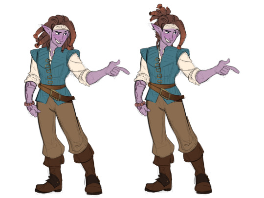
Flynn Rider Reth was colored by @hannahstumble
#art#artists on tumblr#palia reth#palia fanart#palia game#digital art#the modern setting and flynn rider poses were both heavily referenced from his source image and andrew garfield lmao#been having a hard time visualizing poses lately without a reference#i feel my mind slipping awaaaay#that modern college au Reth belongs to my friend Mito/Izuriel#i am just a vessel for creating art of him
535 notes
·
View notes
Note
for the art questions thing: what’s your process for shading? how do you come up with drawing / animation ideas? how do you sketch / how does a sketch differ from a complete piece for you?
Oh boy thank u for the questions! Uhh i ended up writing a lot w these so I'll throw this under a cut. I added pictures too. We'll call this a first draft for whatever I end up doing for my class assignment.
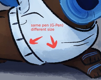
My process for shading changes pretty dramatically between if I'm doing my easy cel shading or my fancy soft shading. Lately, if I'm doing cel shading, I'll just come up with colors straight off the color wheel (colorpick and move it darker, more saturated, cooler/warmer depending on the material). OR, one trick I like, I'll draw where I want the shadows all on their own layer, THEN copy my color layer, mask n merge it on top the shading, and multiply that onto the actual layer. So it's the same colors for each exact section multiplied on top of itself? If that makes sense? Does nothing for the Atmosphere but it is Darker, and if I'm drawing them in a void anyways, it works fine. Sometimes I like to just slap a random tilted rectangle on it like its a garfield background. My soft shading is much more trial and error; for those fancy Xiph pin-ups I've been doing, I'll have like 30 different layers going, all doing different shit. Multiply mostly for shading, then for highlights I'll just try overlay/screen/soft light/hard light until something Works. A fun thing I do on these too: To get that "painted" look without adding a bunch of random texture, I use my default lining pen sized WAY up with the opacity WAY down and just go ham. Close up of robot ass for reference.
For ideas: I'd say the majority of the art I put out is "inspired" from something else, like memes or songs or tiktok audios. Honestly, I'd say every piece of information I receive has to pass through a "could this be about my ocs" filter in my brain, and if the answer is even kind of yes, I Will Make It So. Everything is ocs to me <3 and sometimes I inflict those oc thoughts on everyone else :3 For actual Original stuff though? Most of my ideas come about as a natural result of trying to figure something out with my characters. How would they respond to this, how would they do that, how does that work? The whole reason I started doing art is cause I have such a hard time with words, and sometimes drawing it out is just the only way I can communicate a thought. Expressions, camera angles, visual gags, subtle details, timing, those are things I could never figure out in writing. So I make comics and animations!
Sketching, what can I say about sketching. My sketches are very messy because I try for a Zero Erasing method like I do in real life (<- enjoys drawing in pen). If I sit there overthinking every line of a sketch, I get too caught up in the details before I've figured out the full picture. Sketching is for blocking/framing/posing ONLY, clean up is for lineart. I do sketch in only black/grays if that's a thing people care about, but that's because I have very strong thoughts on color, again it's too distracting. The main difference to me (that im sure no one else notices) is I let my sketches get fuzzy from resizing. I'm very particular about my art having NO anti-aliasing/transparent pixels. Crisp and clean, and VERY easy to color. Sketches I have on hand for example. Lil preview of smthin im working on :3c

Actually, sometimes I don't do sketches at all ? Like I go straight to clean lines. Only for certain characters, like LEDD and the lab rats, and if it's not a crazy angle or something. I can just draw them on command at this point. Very handy.
Thank you again for questions ^^ I am. slowly figuring this assignment out.
#chayos speaks#im not gonna tag this oc talk cause Technically thats for Lore. I did mention ocs tho :]#ask#tumblr keeps wanting to move my read more. keep it where i put it Please
4 notes
·
View notes
Text
Friday 8th January 2021
Travis and The Girls


When the sun shines on a bird’s feathers it’s sometimes hard to believe how intricate the shades and patterns can be. But the same can be true on a dull or wet day too.

This male is the one who’s in the garden most often of late. He’s a very handsome chap.

(Common) Pheasant
Male: Copper coloured with long tail.
Female: Drab brown with long tail.
That’s a very simplistic description and I’d hardly call them ‘drab’ as we shall prove below.
Pheasant is a non-native bird that was first introduced by the Normans in the 11th century as a game bird.
Male Pheasants are unmistakable with their iridescent copper-coloured plumage. The head, small ear tufts and neck are green, though the throat and cheeks are glossed purple. Their face and wattle are red. The tail is paler and has broad barring. Some races (P. torquatus) have a white neck band.
We usually refer to them as the ‘Vicars’
The female Pheasant is buff coloured with dark brown markings.
Juvenile Pheasants are similar to females with shorter tails.
That description is from garden birds uk.

Without a doubt the male colours fit a dictionary definition of iridescent
1 : a lustrous rainbowlike play of color caused by differential refraction of light waves (as from an oil slick, soap bubble, or fish scales) that tends to change as the angle of view changes. 2 : a lustrous or attractive quality or effect.
But like all brown birds, the girls’ more understated beauty seems sadly overlooked


It’s true that you can’t tell so much on dull days, when only a slight glint of lilac is to be seen around their neck, then they do seem to fade into the background, but the females have a huge variation in their individual tones and markings, so it’s easy enough to recognise some by eye and by the characteristics of their behaviour too. I’ve often said to Crow that it’s a bit like keeping chickens, except you’re not responsible for their safety and welfare and they don’t give you any eggs. What they do give is a wrecked lawn and hours of entertainment. As I’m writing this there’s a bit of a Hoo Haa going on outdoors. His Lordship is crowing like an old creaky gate and now one of the girls has taken to the air.

I guess I’m kidding myself about looking after them too, as many times I’ve told them off for wandering out to the lane, when they should know it’s easier and safer to fly.

Thinks he’s undetected!

Fabulous markings

We had one female visiting who is quite golden coloured, really pretty. I haven’t seen her for a while though and despite having so many Girls around, we’ve never seen any chicks or very young juveniles here.
Pheasants eat seeds, berries, leaves and insects; they roost in trees and can form flocks in winter. During the breeding season, one male may mate with many females, who then raise the chicks alone


Two photos credit to Bartholomews agri feed site


It’s quite funny to see them toddling around the garden as though they own the place, making free with all the outdoor furniture and letting us know when service at the café is rather too slow for their liking.


I’m not entirely sure if this pose was a result of the chilly weather, or a comment on how he feels about the current state of play in the wider world.
Although the latter is probably better represented by this


Either way it was nice to see that the loungers came in useful to host an extended grooming session. Not that he left us any feathers for rental payment. He really is a marvel of nature though, so thanks Normans from the 11th Century, I’m really glad you brought them over here.
♦ as a Game Bird, Pheasants are protected outside of the shooting season which runs September - February. However, in our garden they’re not only protected, but pretty well pampered
Good link for more about Pheasants and some really lovely photos.
NOTES FROM THE KITCHEN:
I think it’s a consequence of not getting out and about but I’ve been in a bit of a slump. Feeling, not under the weather, just somewhat bleurgh and so as such, not had much of an appetite. We didn’t gorge over Christmas and New Year so it’s not that, but I guess food has become something of an occupation during lockdown. What can we get? what are we going to eat? Anyway, last night we just had some simple fishcakes and salad and that was plenty.
Quick Nature/Biology Lesson Suggestion:
Link to Why Birds Have Feathers
What I Learned Today:
You know I love a coincidence, well this morning on Twitter, after seeing our first ever Redwings a couple of weeks ago and after mentioning Cannock Chase only yesterday, look what cropped up

and for a bit more visual context Wow. 2,421 miles away.

1 note
·
View note
Photo
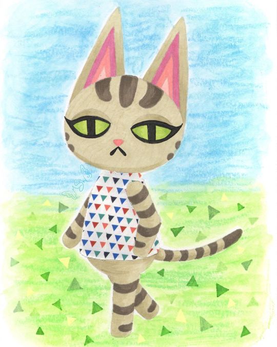
Ziggy Crossing
Still not quite sure I'm 100% back into the swing of things (posting regularly and being more present) yet, but time will tell. For now I'm testing the waters. Anyway. In the time I've been away, I ended up talking to some friends about (to the surprise of absolutely no one) Animal Crossing, and in that conversation, the idea of drawing my cat, Ziggy, as an Animal Crossing villager came up. I'd toyed with it before after seeing some other people draw their pets as villagers, and that conversation more or less sealed the deal for me to at least try it, even if my attempt didn't pan out and see the light of day. Obviously, things went pretty well because here I am posting this. The first step, as it is 90% of the time for me, was to come up with a sketch and go from there. I primarily used Olivia and Lolly [pre-existing Animal Crossing cat villagers] as my references--Olivia for the pose and eyes, Lolly for the stripes and some details regarding the ears and face--but I also checked certain things across the various cat villager models so that details could be consistent where they needed to be. I think if I missed the mark anywhere, it's probably in the proportions. Namely the size of the head and length of the body. But I think it's close enough that unless you compare it directly to Olivia's model that I referenced for the pose, the proportions aren't so off that it's distracting or off-putting. I did originally have trouble figuring out what pattern to put on her shirt though because the real Ziggy doesn't really have anything I could pull a pattern from. These days she does wear a white and silver collar, but that's not a whole lot to work with. So I left that alone while I pondered how I wanted to go about coloring the whole thing. My plan at the beginning was to use this sketch as a test piece for some acrylic paint markers I recently acquired (which you will be seeing me talk about in the future), but once the sketch was finished and I went back to check the colors I had (you know me; gotta have a swatch chart for everything), it was pretty obvious that if I want this to be my dear Ziggy and not just a random tabby cat, I needed to figure out a different coloring method. I could have just done regular acrylic paint, but that sounded like a chore and thus I was not interested. Same with gouache. Colored pencils were on the table, but the main problem I have with those is that they can be pretty slow and personally I think their texture really lends them better to replicating the 3DS/Animal Crossing: New Leaf style, as opposed to the look of New Horizons, and that's not what I was going for here. That left me with two main options: Watercolor, which was a hard pass for this kind of art (at least for Ziggy herself), and alcohol markers, which I did use quite a bit on the last Animal Crossing artwork I made, and they had worked out fairly well. Alcohol markers it was! Of course, even after that decision was made, there was the issue of how to handle the lines of the drawing. When I was planning on using the paint pens/acrylic markers/whatever, that seemed a lot simpler because, in theory, I could just use the same pen I wanted to color with to do the outlines and then fill them in. And because that would be using mostly opaque paint, if I needed to I could just cover up any overlap with relative ease. Alcohol markers don't play by the same rules though, so I had to re-think all that. In the end, I pulled out a pale warm gray Polychromos pencil close to the main color of alcohol marker that I had picked out that I figured would also be light enough to blend in everywhere else. That way I could have the defining lines that I needed without having to worry too much about them being visible in the final product. [For clarification: I picked a Polychromos because once sharpened they tend to hold a point longer and better than the other colored pencils at my disposal and I really needed to keep a sharp point as long as possible to do the lines here.] In retrospect, I do think it might have been to my benefit to pick out a pink for doing the inner ear lines, but the end result there isn't so awful that it single-handedly (paw-ed-ly?) ruins the drawing for me. It's just something to take note of for next time if there is a "next time." Once I had my lines (including doing the eyelashes and mouth with one of my usual black fineliners), the next challenge was the actual coloring. Mostly because I had to be very careful around the edges so that the marker ink didn't feather out too far (as alcohol markers do on any paper that isn't marketed as "bleed proof" because that's what bleed proof in paper actually means--not that it won't bleed through to the other side, though that is less common with that kind of paper, but that it won't "bleed" across the page), and I also had to be a little careful and choosy about how I did any blending or shading. Again, my blending and shading plan was going to be different had I used the acrylic markers. The main thing I ended up doing here was trying to find areas that needed to be layered so that the one-color shading could act as a line/barrier between sections. Best example: Where the ears meet the head, I shaded the bottom portion of the ears. You can also see this a little bit where Ziggy's tail meets her body and where the legs intersect at a few different points. By no means did this turn out perfectly, considering that I really wanted to stick to use as few colors as possible (which means pretty much all the shading is just layers of one color to darken it) which means there isn't as much distinction or variation as there could be. And I feel it necessary to note here that I was worried when I first finished the lines that the eyes looked wonky, but after coloring pretty much everything else in that concern dissolved because 1. It's harder to tell and 2. Even if they aren't exactly the same, it makes visual sense because it looks like her head is slightly turned, meaning the eyes wouldn't be identical anyway. Never underestimate the power of coloring your work in! Speaking of which, you might be wondering about her shirt by now. Well, after toying around with some ideas I got it in my head that a good way to tackle that problem might be with washi tape, as I've used it in this manner before and worked out pretty nicely. Even though it wasn't a lot to work with, I did like the idea of the base color for her top being white like the real Ziggy's collar, and that narrowed down my tape options considerably. Of the options I had that I thought would be suitable, I ended up having a choice between one with small rainbow-colored polka dots and the decidedly less vibrant small triangles that you see here. The polka dots seemed a little too peppy for Ziggy, so I went with the triangles. And this, I must say, is one of those artistic decisions that I feel even better about the longer that I see the end product. The main issue I have with using washi tape, and thus why I don't use it in this way that often, is because cutting the washi tape to fit a specific shape is a process that doesn't get much easier even with practice. And even if it did, that wouldn't eliminate the very real possibility of cutting or indenting the paper underneath while you're cutting the tape. Of which, I have not yet figured out how to totally avoid short of forming the washi tape on a separate piece of paper, cutting it there, and then moving it to the final piece. But that method comes with its own problems too, so... Still, I made the decision to go through with it here and just accept the rough edges/lack of precision and all that. Before I put the tape down though, I did do a little shading with some light gray markers that I was counting on showing through the tape to give it a little more dimension. Seeing it now, I do think I could've stood to go a little darker, but again this isn't something that totally ruins the end result for me. Just something worth noting. After all of the above, I was left with one lingering problem: The background. Which I've noticed seems to normally be a "problem" area for me in that I don't always have a solid idea for what to do with it. I did consider what exactly I wanted to do earlier on in the process, before I started on Ziggy on the final paper, even. Briefly, I thought I might cut her out and put her on a separate background as is sort of a go-to background method for me. Something just didn't feel right about doing that here though and it feels like I've done that a lot lately (you know, when I've not been drowning in mandalas for NaPoWriMo...). So it was at this early stage that I locked in the idea of adding in the background in later, probably doing something kind of loose to give a general idea that hopefully wouldn't take too much time or effort. We've already established that I wasn't super keen on the idea of using acrylic paints or gouache for this drawing, and that remained true for the background too. Although, I don't really like using alcohol markers for backgrounds either because it can be tricky to keep things smooth and consistent. That left me with colored pencils and watercolor. Colored pencils are usually hard pass for backgrounds for me for a number of reasons. So! Watercolor, hmm... I drew Ziggy here on my darling Strathmore 400 series mixed media paper because I love how it handles markers and it has enough weight and texture to it that it handles a lot of my other go-to options with little fuss. Watercolor is really the only thing I have trouble using on it, the main problem being that sometimes (not always) the paint doesn't like to blend out super smoothly and certain watercolor techniques don't work the same on it. This doesn't mean it's useless for watercolor (at least not for me), that just means I have to be more careful about how I choose to work with watercolor on it. In this case, the blending issues lined up with the idea I had of letting the background have more texture since Ziggy came out a lot smoother by the very nature of alcohol markers. Somewhere in all this, the idea struck me to use my Gelatos to leave behind some crayon-like texture. That idea seemed fitting to me since Animal Crossing is a fairly light-hearted and child-friendly game, themes that crayons go along with. The gelatos are water-soluble but not every color dissolves completely when activated with water. This should be pretty evident here because I didn't try to hide it. I wanted quick and easy, and without a doubt just letting the texture do whatever it wants is the quick n' easiest method to use with the gelatos. Once I'd done a bit of back and forth with two greens and two blues to give me the solid suggestions of a sky and ground, it still felt like it was missing something. Ultimately, it seemed like a good idea to me to try and mimic the triangle pattern/texture that New Horizons features. (In past games you could get squares or circles for a grass pattern at random.) And while I as per usual I had to think on how to go about this, in the end, the best solution I could come up with turned out to be drawing the triangles in with alcohol markers. Truly, I'm surprised to be reporting this because I fully expected the creamy nature of the gelatos to make using alcohol markers on top feel disguising and unproductive. But not so! At least not with the limited gelato use here. The creamier areas do soften the color of the marker, but I think that worked to my advantage. Although, I did end up using a little bit of my yellow Moonlight gel pen because I felt like I needed some yellow triangles for balance and I knew transparent yellow markers wouldn't do what I wanted. But that brings us to the final product. I'm happy with it. And I do really like how the grass ties in with Ziggy's green eyes. It's just a nice little touch of visual cohesion in my book. As I always say, I'm sure it's not perfect and there are some missteps here and there or things that could be improved. Nevertheless, it was a fun experiment and serves as good encouragement for me to continue playing with the lineless look, among other things. I do have to note though that it feels super weird to just leave the eyes like this with no indication of shine on them! I made the choice not to since it's not a common trait with the official character models (at least not for eyes in this same style) but part of me still feels like it's incomplete. As I've said before recently and I'll probably say again, I can't promise I'll be getting back to a regular upload schedule now, but it's on my mind. I want to get to that point soon. I do have the acrylic markers I mentioned to talk about and another supply in the mail, and some other art in my backlog. So if you can be patient with me a while longer, there will be more from me to look forward to. In the meantime, please be kind to yourself and others. ____ Artwork © me, MysticSparkleWings ____ Where to find me & my artwork: My Website | Commission Info + Prices | Ko-Fi | dA Print Shop | RedBubble | Twitter | Tumblr | Instagram
2 notes
·
View notes
Photo
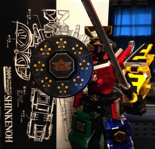
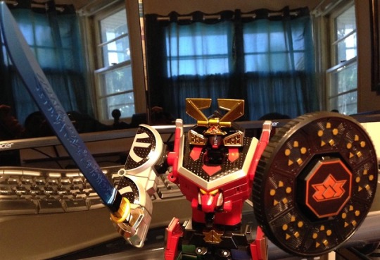
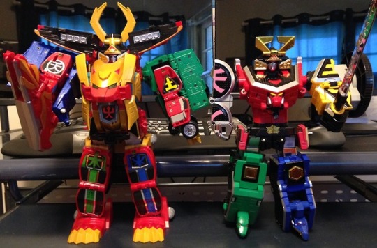
Super Sentai Artisan Shinken-Oh
I’ve alluded to it before, but Samurai Sentai Shinkenger was the first season of Super Sentai I ever watched. I stopped watching Power Rangers about half-way through Mystic Force. It’s not that I wasn’t enjoying the show anymore or had grown out of it, but as a teenager sleeping in late on Saturdays trumped getting up early to watch cartoons and such. On a related note, I had this one girl in my Sophomore English class who came in every day before the bell with a story, and one day she came in saying there wasn’t going to be a next season of Power Rangers because the theme from the source material was too Japanese. We all know now that that wasn’t the actual reason, but at the time I was insanely curious and looked it up online.
And of course that series was Shinkenger, and if you’ve ever seen it you’d know it’s a very good series (or at least I enjoyed it). I was immediately pulled back in, and thanks to the crossover episodes with Kamen Rider Decade I discovered Riders as well. When Goseiger started, despite its more childish nature and green agenda I still enjoyed it, and over 10 years later I’m still watching the show, checking out the toys on both sides of the pond, and reading the comics.
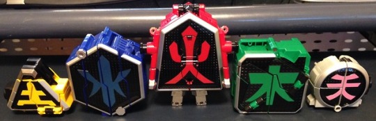
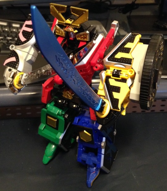
The Good: The SSA version of Shinken-Oh is built off the original DX toy, but with a high level of spit and polish. Several plastic parts have been replaced with Diecast ones, most notably in Shishi Origami. There are enough transformation joints in weird places to get the toy into a few poses, including a thigh swivel. It comes with two different colored swords, its Hi-Den Disk Shield, and adapters to attach the sword to the waist and stack the non-leader Origami together like that one time. They even have the correct kanji for each Origami on them to make it easy.

I’m surprised by how much I like this toy. I think it has something to do with the two alternate modes, just like with Jyuohger. It’s like each toy is an individual puzzle that come together into a greater one, and that definitely adds to my enjoyment. I only wish the rest of the line was like that.
The Bad: All my complaints are very minor, but mostly align with either release from what I’ve seen. Firstly, the shield is always free-spinning, and I wish there was some way to lock in in place to display it better. And there are a few places where things like to slide and flip around very loosely until you get that one lock into place. This is in reference to the Kuma Origiami and Shinken-Oh’s head.
The only other worry I have is that this release is heavily painted and chromed. I'm concerned about eventual scuffs and chips, especially on the kanji since that’s a huge part of this toy’s visual identity.
Overall, this toy is fantastic and I’m glad I waited for the SSA version rather than settling for the DX one, if only for the hat. If you’re interested in this version, this is the first one I’d seen not immediately sold out since I started looking in March. You’re going to have to be patient if you don’t want to pay eBay scalper mark-ups.
The only other Origami I’m interested in is Kyoryu (the big sword), which is another hard find I have alerts for. After that, it’s on to Go-Onger... where, again, I’m only looking for the Q1 and the movie toy. While I think it’s cool both seasons can pull off a Q1-4, being the first to do so since Hurricaneger initiated the idea, and going one step further without the use of a Carrierzord, their combinations are comically messy. Maybe if I find them on the cheap...
#super sentai#Power Rangers#Samurai Sentai Shinkenger#power rangers samurai#shinken-oh#samurai megazord#Super Sentai Artisan#Review
13 notes
·
View notes
Text
Ski’tar and Friends part 9: From Frying Pan to Fryer
This week, Ski’tar, 6, and Vemir finish the Dataphile job and get started on the next faction’s task.
Premiere part
Antecedent part
Our meeting place for swapping the old hacker’s new identity for the data she unwittingly stole was Zetembi Park, a public space in the Eye that has been carefully groomed to resemble a natural forested area from lost Golarion. It’s full of trees, meandering paths, a couple of small rivers, and other details that serve equally well to help one forget they’re on a giant space station and to create plenty of places for clandestine meetings. Old Lady Hacker was waiting for us at the end of a bridge over one of the rivers, and everything seemed fine until we were about halfway across the bridge. Then, Vemir and my drone both noticed unexpected movement in the bushes, and as we continued our approach with heightened vigilance, three goonish-looking humans appeared and started threatening the old lady. The Bluerise Tower corporations had finally tracked her down and sent these three mercenaries to reclaim their data.
Since we also had a vested interest in obtaining that data, we trotted up and challenged the goons. At first we put on the act of simply being concerned citizens stepping in to help a poor old lady who was being harassed, but the goons were not to be intimidated. Their orders were clear and their paychecks plenty high enough to make them confident they could handle a three-armed Kasantha, a robot man, and a little rat. Our group and theirs traded insults and threats until the goons finally decided to make a real fight of it.
After a brief opening salvo of missed pistol shots from Sixer, my drone, and one of the goons, I tried to lob a grenade behind the goons to frag them without hurting any of us, only to fumble and drop the ‘nade off the bridge. The explosion of water was pretty, but harmless. One of the goons grabbed Old Lady Hacker and started to drag her off, while Vemir and Sixer engaged the other two in melee combat. Vemir tried to do some fancy knife trick, but only managed to score a light hit on his opponent and took a baton to the face for his trouble, which cracked one of his goggle lenses. Vemir did not like that at all; he’s got a Tradition about hiding his eyes on top of the species-wide habit of covering his mouth. Covering his exposed eye with one hand, Vemir forwent trickery and focused all his efforts on stabbing his guy with his recently acquired venom spur. Sixer took a sword to his opponent, who responded with trying to shoot Sixer at close range. I shot Sixer’s target a couple times to keep him off-balance while I circled around to get at the goon dragging Old Lady Hacker away. My drone tried to contribute, but its aim continued to prove faulty.
One tactical knife to the arm was enough to convince the hostage-taker that he had a higher priority than getting Old Lady Hacker away. His counter-attack was pitifully easy to duck under.
Sixer’s opponent decided at this point that the risk to his life was not worth the money he’d been paid, so he disengaged and started to run off. A moment later, Vemir succeeded in stabbing his guy with the venom spur, and that goon also decided enough was enough. Sixer pointed out the risk of the goons going for reinforcements, so I backed off from my opponent just enough to toss a second grenade into the path of the escaping goons. The explosion was marvelous; the two runners were reduced to bloody gibs, and the shrapnel spread far enough to cut the third guy’s arm off and blow out a kneecap along with other serious wounds. I called my drone over to point its gun threateningly at the remaining goon as I posed with a third grenade and offered the guy a chance to leave and seek medical attention if he promised not to go crying back to his bosses. He gladly took up the offer and crawled away in the most tortuous scene ever. I almost considered putting him out of his misery despite my promise, but he was out of sight before I made up my mind.
Aside from some blood splatter, Old Lady Hacker was in perfect shape and in surprisingly high spirits. She waxed nostalgic a bit about how the fight reminded her of similar encounters back in her youth, until I handed over her new ID to get her back on track. Once we’d finished briefing her on the details of her new life and the circumstances of her false death, she declared that she would stay at the Lorespire Complex for a couple of days to let the heat die down.
So, after all the work she put us through because she didn’t trust the Starfinders to keep her safe, she ends up doing exactly that.
We escorted her back to the Complex and presented her and her data to Historia-7. Historia recognized Old Lady Hacker’s name instantly, and the two hit it off like old friends. They downloaded the stolen data to the archive computers, and after looking through it all Historia declared it was exactly what she needed for some mystery she was working on. We couldn’t get her attention long enough to have her elaborate, so we just left. Vemir bought some sunglasses from the Lorespire Gift Shop to wear until I could take the time to repair his goggles, and then we went off to Guidance to get our next assignment.
For our third initiation task, we would be working for the Exo-guardians, the military branch of the Starfinders and the faction most heavily hurt by the Scored Stars Disaster. They didn’t have any kind of headquarters on Absalom Station, but their current leader, a Shirren named Zigvigix, did live on-station in the Down-low. We were instructed to meet with him in a park near his neighborhood, but there wasn’t as serious a time constraint as there had been for our previous two missions. We decided to take a bit of downtime to evaluate our conditions, and so I could fix Vemir’s goggles. Once I’d done that, I made some modifications to my drone, replacing its visual sensors with a new set that could broadcast what it saw to my rig and re-calibrating its aiming algorithms from the ground up along with reinforcing its outer plating a bit. Hopefully the drone will shoot better in the future, but the only real test of that is to get into an actual fight.
Once we all felt ready to take on whatever monsters the Exo-guardians would inevitably sic us on, we met up and prepared to head to the Down-low. Just before left, however, a courier drone rolled up to us with a message of belated thanks from Historia-7 and a box containing 200 credits and a frostbite zero rifle. Feeling comfortable with my finances, I let Vemir take all the creds while Sixer claimed the rifle, since he was the only one of us with any long-arm skills at the moment.
Zigvigix’s neighborhood was a “poor but trendy” location – the kind of place that attracts people by playing up the aesthetic of the eccentricity of its inhabitants. The “park” we headed to was more of an art installation, full of weird metal sculptures and absolutely ripe with garbage and graffiti of cute but off-putting animals. Zigvigix was sitting on a cement bench munching on some rice candy, and he offered us some as he introduced himself through telepathy. Right off the bat, he gave us permission to refer to him as “Ziggy,” which I would likely have chosen to be his nickname anyway. He seemed like a typically gregarious Shirren, but that friendly attitude was undercut by a serious case of survivor’s guilt for not being a casualty of the Scored Stars Disaster.
At any rate, Ziggy actually had two jobs for us. The first was to help secure a new headquarters for the faction on Absalom Station. The Stewards had gifted the Exo-guardians an old warehouse that they no longer needed, but the place had a bad case of deadly alien monster hiding inside it, so we had to go kill the thing and clean the warehouse out a bit in preparation for refitting it as a headquarters. The second job… Ziggy wanted us to go buy a copy of the new Strawberry Machinegun album as a gift for Historia-7. Ziggy thought the Dataphile leader seemed a depressed lately, and had noticed that Strawberry Machinegun seemed to be quite good for raising android spirits. The problem was, Strawberry Machinegun was only the biggest name in sugar-pop music, so the lines to get an album were more than Ziggy could deal with.
Sixer and I volunteered to go get the album right away, while Vemir opted to stay behind and keep Ziggy company. Ziggy gave us a cred stick to use to purchase the album, and off we went. While we were gone, Vemir got Ziggy to open up a little about the Scored Stars Disaster. He didn’t learn much except that there wasn’t much known for sure about what happened. Most of the Society had gone off to wherever the Scored Stars were, and then their drift beacon had suddenly gone dark and there had been no contact since. There were rumors about the Disaster, but Ziggy didn’t feel up to relating them and Vemir didn’t press.
At the music shop, Sixer and I found ourselves caught up in a six-hour long queue, with people pressing about on all sides. As Sixer dealt with the brunt of the pushing, I took up a perch on my drone to both make myself more visible (and thus less of a trip hazard) and so the drone would take most of the abuse from the mob pushing and shoving. As we got near the front of the line, I was feeling smug in my position because while Sixer looked exhausted, I was still fresh as a moonflower.
And then someone stumbled into my drone hard enough to knock me off, bruising my nose on impact with the floor.
Maybe I should have gone for the riding saddle mod…
When we made it to the front of the line, Sixer and I both decided that after enduring six hours of that, we deserved to get something for ourselves, so we bought three copies of the album in all and went back to the park. I’m not sure what Sixer was thinking on the way, but I was plotting ways to force Vemir to join us in listening to Strawberry Machinegun. Possibly in double-stereo.
We handed over Ziggy’s copy of the album, and after thanking us for our heroic standing-in-line efforts, he showed us some security footage from the warehouse so we could get an idea of what we’d be dealing with. The footage showed a worker moving a crate, and then something feathery bursting out of the crate and quickly devouring the poor sap. There wasn’t much footage, but after watching it several times I realized I knew what the creature was: a feather stalker. It’s an exceptional ambush hunter, quite dangerous even when you know one’s about. Vemir and Sixer were confident we could handle the beast, but as for me, I’d rather stand in that line at the music store again.
1 note
·
View note
Text
10 months ago, I decided to make a game.
10 months later, I have a bunch of art and a bunch of interface code and a whole pile of design notes, and not much game.
This is my story.
(Now in bullet point form so that I can stop redrafting it >.>)
I have a treatment-resistant anxiety disorder which significantly interferes with my ability to work - both on my own projects and other things that might be called 'gainful employment'. (I still feel some shame at admitting this so bluntly, even though I feel ideologically that there should be no more shame in this than any physical impairment that resulted in the same. Fuck mental health stigma, defining self-worth by employment is toxic capitalist dogma, etc, etc.)
In part because of this, I had been effectively unemployed and living with my mother for a number of years. (I still did my best to hammer out projects, but nothing, y'know, actually PAID anything... >.>)
Then in late 2017, my mother died (somewhat unexpectedly) of cancer, which left me with no home (we'd been sharing an apartment that she had been covering most of the rent on) and literally zero income. Obviously grief and upheaval did not help with any of my prior difficulties managing employment, either.
After some debate, I decided to combine the savings I had left over from my last stint as a network administrator with a (modest) inheritance from my mother and try to actually make a living at making games. This is something I had always theoretically wanted to do, but never put actual money on the line for. (Okay, in a perfect world, I'd happily give all my work away for free and live on some minimum guaranteed income, but we do not yet live in such a world).
One of my historically biggest gamedev weaknesses was a lack of artistic ability, so this seemed a perfect thing to put money towards. I could hire an artist, which would not only allow me to make a more commercially appealing product, but would also free me up to focus on the mechanical and writing aspects of gamedev, which are the areas I most wanted to be working on and also consider myself best at. (Any followers that remember my work on ToK may recall me complaining there about how it seemed I spent my time on nothing but graphics? >.>
This was shortly after Touhou fangames had been given the official blessing to be sold on Steam, and some had already achieved great success there, so this seemed like a good way to create some instant appeal and interest in my game, while working with a franchise that I already loved to death and had written hundreds of thousands of words of fanfiction for (eg: This or that or this other thing)
And so Chronicle of False History was born!
...and yet I somehow still spent most of my time working on art. You see, having never worked with an actual artist before, I underestimated a number of things:
1) I underestimated how much work it would be to find a suitable artist in the first place (though at least this part is done)
2) I gravely underestimated how much of my time would be spent on 'art direction' or 'project management' or whatever you want to call it.
Every sprite that is created, even for canonical character designs, requires making a large number of decisions regarding:
What attack and spell poses it will have (and how to cover the broadest range of signature abilities with just two 'frames', for budget reasons)
Which of enumerable (and sometimes mutually-exclusive) costume details from canon (and fanon) should be selected (and do you have any idea just how many variations there are on things as straightforward as 'the hilt of Miko's sword'?)
Gathering a pile of reference images that clearly detail every element of the character (and action poses) to be drawn (which is also harder than you might think; a lot of art is sufficiently suggestive of details to view without actually being a good reference to reproduce and anything that isn't exactly what I'm looking for risks my artist misunderstanding my request entirely)
Designing alternate-history variants of this character in a way that can be clearly conveyed with minimal costume and color changes alone (as any significant redrawing would cost far more and the cast of the game is so large already) and doing so before the part of the game they would appear in is even written.
Gathering reference images for all of those things
Writing up a detailed description of all the decisions listed above (and often drawing actual diagrams of action poses and projectile overlays that are ambiguous to express with just words) and handing it over to my artist
Waiting a while, then getting sketches back and finding out that there is inevitably a whole pile of things that need changing (either because the artist misunderstood my request entirely - despite all that previous effort - or because an idea of mine looked far better in my own head than it does, or just the usual 'incremental improvements' to something that is on the right track but not quite there - like a sort of collaborative redrafting.)
Spending hours poking at these sketches in an image editor, testing how well individual details resolve at in-game size, how well the action frames snap together, and how I feel about each questionable element. This often extends to (crudely) adjusting and readjusting the position and angle of individual limbs and eyebrows and projectiles that feel 'off' so that I can figure out what I would like her to do with them (and whether it's even worth making her take the effort to do anything with them at all)
Finally, summarizing that feedback into a detailed list of change requests (often with new diagrams to clarify my words) and repeating the last two steps over and over and over again.
Like, she does great work - don't get me wrong. I'm very pleased with the end results and this is just an inevitable part of the process of making something professional. But it does also mean that my original idea that paying an artist would free me up to work on things other than art has been... laughable in retrospect, to say the very least. In fact, it's very possible that a greater percentage of my dev time is spent on art-related tasks than on previous projects where I was doing all the art myself - I just get better art for my trouble (and money....)
This is especially true given that:
3) I underestimated just how much art work I would still need to do completely independently of her
Raven is doing character sprites. These are arguably the most individually important art content in the game, and certainly the ones that give it the most screenshot appeal, but that has left me to do everything else. Which has included:
Figuring out how to make battle backgrounds that passably match the art style of the game (since commissioning enough of these to fill all the locations needed would absolutely blow my budget)
Designing the entire look and feel of the combat screen to mesh well with Raven's sprites while also being something I am personally capable of making (using only cheap/free resources)
Creating all tweened animations and particle effects
Designing every single little UI element that exists in the game:
Elemental symbols
Dialogue boxes
Spellcard icons (and the entire menu design that requires them in the first place)
Combat action menus
Icons to indicate spellcard usability
Spellcard tooltips
Targeting overlays
A turn order bar
Spellcard availability reminders
Font choice for damage/healing numbers, spellcard names,
More cursors that you can shake a stick at
Lots more stuff, I'm sure
And even the completed sprites I get from Raven still need multiple hours of processing each to split them into component parts with sufficient information to re-composite and animate in-game. (If you've ever wondered why my screenshots seem to only involve Nazrin while I've already shown sprites for multiple other characters, this is why)
It never ends!!
...which is a fact that has been extremely draining. Like, it is probably difficult to overstate just how demoralizing it has been to pay this much money and work this hard and long and still somehow be mostly doing art (or visual-related coding) when I naively thought this project would offer some freedom from this after the endless, endless hours I spent doing this for ToK.
And it has also revealed a very tangible (and extremely stressful and troubling) fact about this game's development:
I am going to run out of money before I am remotely close to having a saleable product
When I first laid out plans for this project, I ballparked a modest but realistic budget for the artwork. I chose an art style that could provide pleasing visuals for a very large cast of characters at a cost-effective rate (for a game, at least). I deliberately limited my cast size based upon the agreed-upon cost per character with my artist (and have repeatedly held myself back from various fun ideas because I felt I simply could not afford to make a habit of such things). I studied sales figures for comparable games to aim for a target that had a reasonable probability of sufficient return (or at least breaking even). Game development is always a gamble, of course, but I felt (and still feel) that I made a sensible budget call and it was an amount I was fully able to pay.
But in all this, I neglected to factor in what has been, by far, my most costly development expense: remaining alive.
You see, at the rate my artist is able to produce work, the cost of retaining her is utterly dwarfed by such banal things as food and rent and not freezing to death in the winter. I live about as modest a lifestyle as possible - a one-room apartment, no car, no eating out, nothing in the way of luxuries (I don't even own a cell phone) - but that is still awfully expensive when you have no income and no prospect of it in the immediate future either.
It's a vicious cycle. The less work I get done, the more I feel future financial pressures breathing down my neck, the less work I'm able to get done (due to stress and general demoralization), the more I feel future financial pressures, etc, etc, etc.
And there's a logistical problem even outside of my own stress and anxiety and being damnably human in my need for actual rest: I've spent nearly 10 months working together with my artist and thus have a pretty good sense of how fast she's able to get character art done. And unless something changes dramatically, the time required for her to finish the art assets for the game will be several years longer than I will have any savings left to pay for them - because, as it turns out, hiring an artist is actually a tiny expense compared to merely continuing to exist.
I... don't really have a good answer for this problem and I've spent a lot of time consumed by it at this point. I have faith that Chronicle of False History can be a great game... eventually. But that does no one any good if I can't stay afloat long enough to make it. I've considered pivoting to another smaller-scope game project in the meantime, in the hopes of generating some modest influx of cash that could be used to fund the rest of CoFH's development, but there are a whole slew of reasons this is dicey (not least of which is that small-scope projects have a tendency to not be nearly as small as one anticipates...)
I've also thought about exploring Patreon, but like... I'm fully aware that I don't currently produce nearly enough interesting content for people to just want to throw money at. Tantalizing glimpses of it, perhaps. The promise that in the future I might. But what do I really have to show for this at the moment?
And so, here I am, exhausted by a marathon of work I did not properly anticipate and without the tangible reward I'd expected to have by this point (not a finished game, by any means, but like... much more of one than I actually have). And every month that passes by in which I get less done on my game than anticipated is yet more cash bleeding out of my bank account, like I'm trapped on a badly leaking boat with no shore in sight. I need a rest from all these stressors (and some more personal ones not described here), but when time spent not working has itself become a stressor these days, where can I even find it?
...wow, this sure sounded upbeat, huh?
In any case, I still care a lot about CoFH and have no intention of stopping work on it. I just... need to figure out some way to allow myself to continue to do so without this enormous capitalist behemoth crushing me beneath it.
(I had originally intended to provide more of an overview of the useful work accomplished over these past 10 months here, with mockups showing the evolution of the game's visual design, but clearly that goes into a future post at this point).
#Chronicle of False History#Gamedev#Game Development#CoFH#Personal (Kinda)#What; surely posting a massive wall of text at 5 in the morning is _completely sensible_#And not at all inane#I am... tired#But these sure are words#So many words#I apologize if I drown anyone in them
5 notes
·
View notes
Text
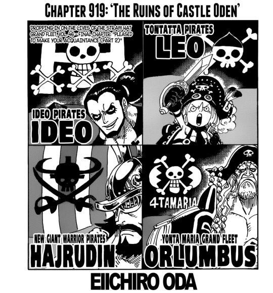
OP chapter 919 time!
No idea why I sporadically do this
......is this the final one? Or is there gonna be a Bellamy one next week? This cover arc really drags on and on without it really feeling like it’s doing anything.
Seriously, it’s been going on since chapter 864! Is this a record??
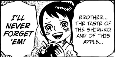
she’s so cute!!!
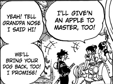
“Grandpa Nose”
I love Luffy
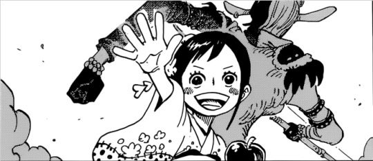
They’re so fucking cute!!
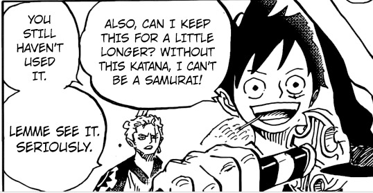
this is still so funny omg. I wonder how long it’s gonna take before Zoro gets a proper look at that sword
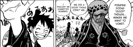
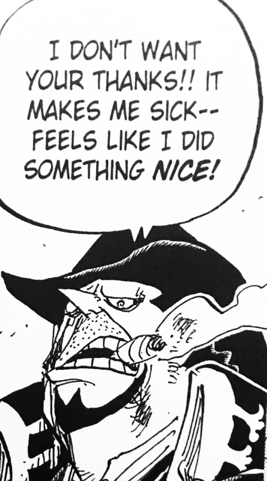
pffft, Law acting like a moody, “edgy” teen as always. The fact that his disguise is even worse than Luffy’s despite all his posturing is also pretty great. His attitude reminds me of Bege during WCI:
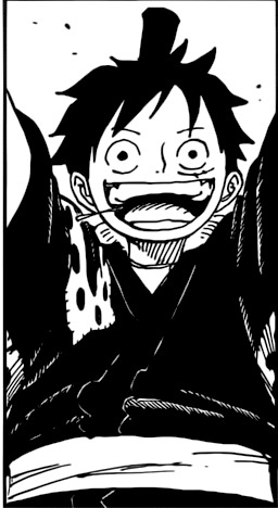
Also. That tiny Luffy and O-Kiku convo is some fun shit
I wonder if Luffy is ok with being a “hero” because they didn’t actually call him that, or because he’s not “Luffy” right now, but “Luffytaro”. Or because he actively did want to help the villagers, and it wasn’t really just collateral (well...Tama was the main reason, but still).
That is a good grin from Zoro. Also, please, O-Kiku...you were not exactly great at acting “normal”.
so she totally has a snake SMILE....makes me wonder if she has a personal connection to the shogun, since his name is snake themed...
So he works for the shogun, but doesn’t respect him very much?
This certainly parallels Pedro and the Nox pirates, but in that case it felt like it was more of a world-spanning “dawn” they were talking about (considering the connection to Roger). Though maybe (by extension) this refers to more than just Wano as well?
My girl!!
nine samurais....well, excluding Jinbe (damn you, Oda, bring the fish uncle back), there are nine SHs. But it could also mean the Kozuki clan members at the end of the chapter + some SHs/allies (Law being a swordsman, for instance. And then there’s Luffy playing at “being a samurai” by carrying that sword around). Oh well, doesn’t really matter. Time will tell.
I wonder if that’s what happened (which would be hilarious), or if Zoro purposely went somewhere
pffffft
aaaw, cute. I wonder if she’s like this with all of them, or if she’s especially fond of Kin’emon? their heights definitely match, if nothing else
.....this feels a little weird. Maybe it will expanded upon in the coming chapters, but the fact that we don’t actually get an answer regarding Inuarashi feels off. Wasn’t Momo gonna get to Wano with Zunesha? And wouldn’t a giant elephant appearing have been noticed by the citizens?
My lovlies!!!
why did Zoro have to walk off, damn it! This way the crew is still not any more reunited than it’s been lately.
I love them all...this is so sweet. They’re so relieved. The visual story telling of Sanji not wearing his shirt because he was swimming looking for Luffy is A++
(for some reason Brook looks extra cool/creepy in this panel. The pose feels extra old man skeleton-y, somehow?)
Very interested in seeing how this is gonna be explained/expanded upon. It seems connected to Momo’s mom’s “curse”, but whether that’s literal or she had a DF power (seems more likely considering Kin’emon’s phrasing, but the official translations may differ).
I recently re-read Dressrosa and Zou, and this scene really made me ponder that something along these lines might be going on:
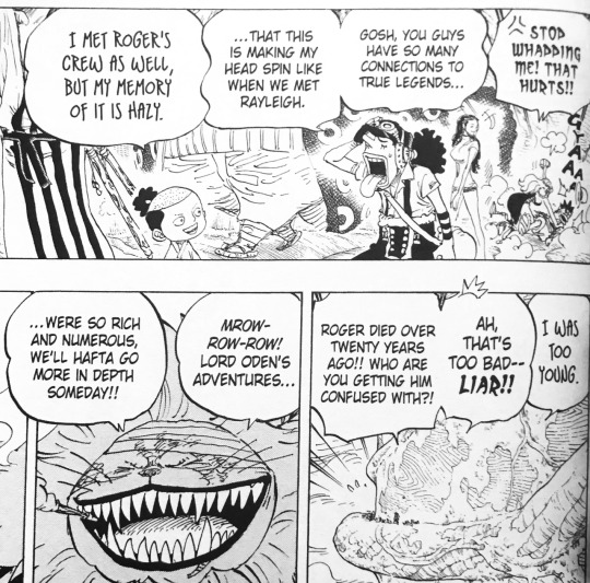
Like, it is totally possible to read it as Momo just lying to appear cool or whatever, but it also could be read as a hint about something. And it appears that was the case. I assumed it was more of a “stuck not ageing”-thing, or something along those lines, but if it’s more literal time travel and that’s a power that someone can have.....idk, it may end up being a little like Pudding’s DF powers (by which I mean, having huge, overpowered potential that’s sort of glossed over because it’s just there as a minor plot device and we shouldn’t think to hard about the imaginable possibilities).
8 notes
·
View notes
Photo

NOTE: The following contains full spoilers.
Solo (2018)
Officially entitled Solo: A Star Wars Story, Solo is the second Star Wars anthology film to be released by the Walt Disney Company after their acquisition of Lucasfilm. It is an origin story for the character of Han Solo – who has been played by Harrison Ford until now. The Star Wars franchise is increasingly being treated like the Marvel Cinematic Universe (MCU) with its release dates planned years in advance, short and rigid production schedules for astronomically-budgeted movies, the studio’s growing dependence on these franchise films for profits at the expense of smaller projects, and the interconnectedness with other corners of the franchise. Yet I admit a bias: Star Wars – and Solo, by extension – has already proven its cinematic legacy (which is mostly distinct from popularity); I predict the verdict on the MCU will be quite unkind in several decades. Thus, I can tolerate the frequency of Star Wars films for now. But my patience here is not unconditional.
A rollicking space Western adventure picture, Solo is not without sizeable weaknesses – potentially exacerbated by the fact that the last Star Wars film was released less than a half-year ago and that Ron Howard had to replace co-directors Phil Lord and Christopher Miller (the Jump Street series, 2014′s The Lego Movie) late into principal photography. Lord and Miller were dismissed by producer Kathleen Kennedy (president of Lucasfilm and co-founder of Amblin Entertainment) after creative differences with co-writer Lawrence Kasdan (1980′s The Empire Strikes Back, 2015′s The Force Awakens). Hiring the capable Howard steadies the film, even if it means this is the one Star Wars film that takes the least amount of artistic risk.
Beginning thirteen years before the events of Star Wars (1977), Han (Alden Ehrenreich; who plays the role with some youthful hesitation appropriate to this version of the character) and lover Qi’ra (Emilia Clarke) are attempting to escape their home planet of Corellia. They are separated in their escape attempt, and he promises to find her again by joining the Imperial Navy. Three years later, Han has been expelled from the Imperial Flight Academy and find himself an infantry grunt. Here, he befriends the Wookiee Chewbacca (Joonas Suotamo) encounters a band of criminals posing as Imperial soldiers who are interested in a shipment of coaxium (a substance that enables faster-than-light travel): leader Tobias Beckett (Woody Harrelson), his partner Val (Thandie Newton), and Rio Durant (voiced by Jon Favreau). Fleeing from the Imperial Army, Beckett’s gang attempts a train heist, only to be fatally thwarted by another criminal gang – the Cloud Riders, led by Enfys Nest (Erin Kellyman). Afterwards, Han and Chewie will follow Beckett to see Dryden Vos (Paul Bettany) – who masterminded the operation. Vos requests another heist, but not before Han reunites with Qi’ra, who has become Vos’ assistant.
There is also the matter of charmer/pilot/smuggler/cheater-cheater-pumpkin-eater Lando Calrissian (Donald Glover), his droid L3-37 (Phoebe Waller-Bridge), and a piece of garbage christened the Millennium Falcon. After nineteen years since The Phantom Menace, Ray Park returns as Darth Maul with Sam Witwer (reprising from Dave Filoni’s two animated Star Wars television series) voicing the character in a late MCU-esque cameo.
The screenplay is co-authored by Lawrence Kasdan and his son, Jonathan (2007′s In the Land of Women, 2012′s The First Time). Before Disney’s purchase of Lucasfilm, the Kasdans had been working with George Lucas on a young Han Solo film since at least 2012. Lawrence had to depart early to finish the script to The Force Awakens, and it is unknown how much of Lucas’ influence is in the final product. Nevertheless, Solo is a movie that is running through a checklist of references it must include. That pair of dice Han Solo keeps on the Millennium Falcon? Yup. Befriending Chewbacca and establishing a complicated relationship with Lando? Of course. Explaining Lando’s fashion sense that would make him a bête noire to Edna Mode? Fashionistas rejoice! The Kessel Run? Oh yes – if the Imagineers at the Disney parks ever decide to include the Kessel Run as a Star Tours option, prepare for the most whiplash-inducing amusement park ride ever! It is the moments in between these scenes – scenes with characters we are less familiar with – that leave the greatest impressions.
Of interest is scene-stealer Tobias Beckett (Harrelson has played roles like this for ages now, and he might give the best performance other than Glover here), who is to Han as Obi-Wan was to Luke Skywalker. For literary types, imagine Long John Silver from Robert Louis Stevenson’s Treasure Island if Long John Silver treated Jim Hawkins more like an adult. Beckett has lived his life looking out for himself, disallowing himself to put complete trust (and, as a result, love) in anyone – including his partner, Val. There are layers upon layers to his personality, to whatever Beckett might show up on a given day to an employer or client. He is not cynical for the sake of being cynical; the least interesting people in the world are cynical for the sake of being cynical. Circumstance and horrible luck has made him the way he is, as he passes along the lessons he has learned to a young kid who is walking down the same hard-nosed path he has chosen.
Compared to most other popular Western media franchises, Star Wars has handled major character deaths with sensitivity – in peace or through trauma, death is shown as disruptive, eventually strengthening, to the consciences of the living. Solo may be the first film in the franchise that does not adhere to any of that. Death is a regular part of life to these outlaws and the deaths of Rio, Val, and L3-37 in the opening and middle third of the film registers no impact. Perhaps their deaths are shocking to some, but we have not learned enough about these characters (even if they were established in other Star Wars media, these moments will not have worked for a general audience) to care. I cannot decide if Val or L3 has the most mishandled death. Where the former’s death should cut Beckett to emotional pieces, it is but a momentary setback to him and the film refuses to more fully explore why his reaction is as cold as it is (trust is a part of love). For the outspoken L3 (and love interest to the recently-established pansexual Lando Calrissian), she has raised points about droid enslavement that Star Wars rarely acknowledges. Her beliefs are treated like miscalculated comedy, with only the droids in the movie taking her seriously. When Lando weeps over L3, the comedic framing of his beloved droid renders the scene either uncomfortable or unintentionally funny. Deaths of major characters should not be funny nor should they leave audiences perhaps even without sympathy. Following Snoke’s shocking, almost decontextualized killing by Kylo Ren in The Last Jedi and the numerous deaths in Solo, Star Wars is in danger of cheapening the value of life. To do so profanes cinema.
Inconsistent performances plague Solo. Ehrenreich, who looks nothing like Harrison Ford nor acts anything like him, is fine in the role – to imitate Ford’s take on the character would only set himself up for failure. The performance is his, although his vocal inflections are too distracting to forgive. Emilia Clarke is no disaster, but her failing performance is scattered. She is unconvincing in the many roles the screenplay is calling her to be: femme fatale in space, lover, ruthless killer, backstabber. Clarke herself claims that she was confused on set because of Lord and Miller’s ineptitude as directors. As that cannot be independently verified, all I can say for now is that Clarke should sack her agent and find some smaller-budget movies to work on. Seriously. Paul Bettany, as Vos, may be the first Star Wars villain that I forgot about hours after seeing the movie. Donald Glover is not in the film long enough to save it from mediocrity (and his Lando is, like Billy Dee Williams’, too reactive a character because of the screenplay), but from what he is able to do his comedic timing and charm is exactly what Solo needs. Glover’s starpower has progressed rapidly in the last several years, and one suspects he is not slowing down soon.
Earlier I mentioned Solo’s lack of artistic risk. Much of that conservative filmmaking comes from not only from Ron Howard, whatever Phil Lord and Christopher Miller contributions remained in the film, the Kasdans, and Kathleen Kennedy, but cinematographer Bradford Young (2014′s Selma, 2016′s Arrival) and editor Pietro Scalia (2000′s Gladiator, 2015′s The Martian). Young’s camera moves too much in quieter moments and he uses close-ups and medium-close shots to excess in both interior and exterior environments – this is Star Wars and this is Bob Iger’s money you are using, so embrace the darn landscapes you are blessed with. Solo feels drained of color and the cameras seem to have brown or black-ish filters applied at the brightest moments, making it the least interesting film in the franchise to look at. For Scalia, the transition from Han and Qi’ra’s separation to trench warfare is baffling. Did the film projectionist make a mistake and put in a reel of an All Quiet on the Western Front (1930) remake with laser guns? Equally poor is Scalia’s handling of Han’s confrontation with Vos and the aftermath. Only twice does Scalia prove himself: the train heist (Young’s most glorious moments) and the Kessel Run (itself a visual effects wonder... now if only Young could stop it with all the close-ups).
John Williams provided the main theme for Han Solo (which contains a noble fanfare dueling with syncopations suggesting his criminal side), but it is Englishman John Powell (his stupendous How to Train Your Dragon scores are some of the best compositions of this decade), who scores the film with a ninety-eight-member orchestra assembled at London’s Abbey Road Studios. Powell will use Williams’ theme quite often, but will add a liberal amount of percussion (an aspect of film scoring from the mid-2000s onward I am not a fan of, but that I accept given this unpolished origin story far from the operatic orchestras of the main Star Wars saga) from the opening moments, setting all this up with “Meet Han”. The score truly shines during the action sequences. “Train Heist” begins during a campfire scene as Han, Chewbacca, and Beckett’s gang reminisce about past adventures and imagine their futures, accompanied by lush string and wind melodies. By 1:30 in the cue, the scene has cut to the heist itself. The percussion sounds like something out of Hans Zimmer’s Remote Control Productions, but the orchestration keeps the action closer to the John Williams tradition. This scene makes way for the Cloud Riders’ arrival – heralded by “Marauders Arrive”. This motif features a thirty-six-voice Bulgarian women’s choir, and according to John Powell, they contributed, “an aggressive, exotic sound... to feel like a different culture had arrived on the scene.” That effect is accomplished wonderfully.
The Kessel Run scene is strengthened by “Reminiscence Therapy”. Despite initial listens, the cue is more than just a regurgitation of two disparate moments from the fourth and fifth episodes. The grinding strings, the pounding percussion, and the occasional rhythmic anarchy that would give anything less than a tested, played-it-all orchestra night terrors combine to throttle the Kessel Run into one of the most exhilarating space pursuits seen in cinema. My second-favorite moment in the score occurs at 2:55 when Chewbacca’s theme is heard as he takes the pilot’s seat of the Millennium Falcon for the first time and, twenty seconds later, Powell transitions to the most shameless quotations of Williams’ Star Wars theme.
Many motifs other than Han’s theme are present throughout the score, including the Han-Qi’ra love theme – most notably in “Lando’s Closet” and “The Good Guy”. Though their romance, like Anakin and Padme’s, might not be convincing, they receive a hell of a motif. Using some chord progressions hinting at the Han-Leia theme (because Han will fall in love again), the theme begins with woodwinds or brass immediately repeated by the strings, and in later iterations (as they realize their romance cannot continue) taken by solo trumpet and harp. Perhaps for many this following statement will not mean much, but permit this classic film buff to wax even more about Powell’s score. The love theme in Solo feels like something Erich Wolfgang Korngold (who scored many 1930s-1940s Warner Bros. swashbucklers featuring Errol Flynn) would have written had he lived to score Star Wars. Korngold may have been an exciting action composer, but his love themes are also stuff of legend – listen to this from The Adventures of Robin Hood (1938). For Powell, he has composed the best film score of the year so far. Star Wars’ tradition of musical mastery continues.
youtube
With eighty percent of the film reshot after the dismissal of Phil Lord and Christopher Miller, Solo is as good as can be expected from such a tortured production history. Adjusted for inflation, the vast amount of reshoots has made it the second-most expensive Star Wars film of all time (behind The Force Awakens) – tied with Wild Wild West (1999) and The Fate of the Furious (2017), and just ahead of the infamous Cleopatra (1963). Where Cleopatra nearly bankrupted 20th Century Fox, something tells me Disney will survive Solo (which has especially tanked in Asian markets where Star Wars is less ingrained into cinematic culture and is disappointing in North America as this review is being written).
Call me a traditionalist (in many ways, I am), but Star Wars movies are cinematic events – nothing else can attract the genuine attention of those who breathe cinema (supposedly, they hate having a good time at the movies) and those who want to go see the movies they want to see (supposedly, they are ignorant of what is good cinema). Solo – in its flawed construction and its ultimate function in the Star Wars franchise – does not feel like an event. It is a fun romp through space that introduces new characters and enriches older ones, but little else. An eighteen-month wait for the ninth episode in the main saga does not seem that long at all anymore.
My rating: 6/10
^ Based on my personal imdb rating. My interpretation of that ratings system can be found here.
#Star Wars#Solo#Ron Howard#Alden Ehrenreich#Woody Harrelson#Emilia Clarke#Donald Glover#Thandie Newton#Phoebe Waller Bridge#Joonas Suotamo#Paul Bettany#Jonathan Kasdan#Lawrence Kasdan#Bradford Young#Pietro Scalia#John Powell#John Williams#Kathleen Kennedy#My Movie Odyssey
1 note
·
View note
Text
On ‘The Moth Apocalypse’, by Joseph Turrent (2020)
(Disclosure: I don’t personally know Joseph Turrent. I do know Haverthorn/HVTN Press, which is run by Andrew Wells and Iris Colomb (I’m familiar with Andrew). They both seem to have an interest in interdisciplinary practice, and they do some really interesting things with form and language, kind of messing with the dimensions of how we receive language on the page, how we receive language as performance. I think those values are synonymous in the work HVTN publishes. It’s not about work that can be classified, rather the unclassified. It’s been a really beautiful thing to watch Haverthorn grow. I was published in the first issue of Haverthorn Magazine, that must’ve been about 5 years ago, maybe longer (I was a completely different writer back then, I was 17). Back then it was just a tiny collective of poems and fictional pieces. Now they’re a press, they’ve got multiple different platforms including Haverthorn Magazine, they also run Interruptions and Correspondences. Their identity is much more streamlined. Thematically I would say that the publications are varied, but I think they’re all united by a common interest in intertextuality, or multidisciplinary influences. I think it’s rare to find publishers which are so openly into the “uncategorised” in the UK. I think the UK is still publishing a lot of writing which yanks itself into a genre, like the industry is still bound by a lot of traditional canonical stuff... I think it is changing a bit, but it is refreshing and comforting to know that Haverthorn have been thinking and publishing this sort of stuff for a while.)
This debut collection from Joseph Turrent is like a fever dream. The relentless doom of oncoming death in a cyclonic-tidal-wave-storm where God is a 58-year-old man and Elon Musk is singing baby shark. How do we continue to forge and define our self-identity when the end of everything is so near? When our inevitable mortality is met by storms we can’t weather? How do we drive that message home without flying off the handle?
What I’m most flummoxed by is this text’s use of layering, and the multiplicity of that “layering”, textually, structurally... (something I’ll unpack in a while). It plays on ambiguity in words, it cracks open these weird, beautiful dualisms mirrored between reality and irreality, sort of echoing Charlotte Geater’s poems for my fbi agent except the relationship here is not a coexistence between I and the agent. Rather this is a relationship with the world, felt all over the whole world. It’s our binding relationship with the very public disintegration of our existence in a world which never fails to learn from its mistakes, from a species whose errors seem to forever *glitch*. It’s a huge headache, but it’s also crystal clear in its admonition to us, and yet it articulates the world’s end in a beautiful, complicated, mesmerising way (certain lines make me think of Crispin Best). And in its prescience, Joseph really underlines how much of this is already happening before it has happened, in analogies both profound and absurd.
So again, I thought because of some of the interesting pop-culture references and crossovers with poems for my fbi agent I decided to talk to my mother about the complexities that this collection poses, and jostle with its meaning. I think we both felt really weird reading this swirl of a text (it’s literally swirling down the page), I likened it to feeling ‘car sick’ at times, so I’m gonna start with the way the poetry is structured because I think it’s the first layer to this collection, which you need to pick at before you can bridge all this amazing, convoluted imagery.
For the sake of keeping the poetry’s structure intact, I’m going to screenshot sections from the review copy HVTN generously sent me. This way I’m not spending ten years typing it out carefully (which I usually do cos I’m normally quoting from ze printed matter), and I want people to see how Joseph works with form and shape. It’s not obvious from the first poem in the collection, ‘Moths’, what the structure is because it’s a short opening piece, but begins to imply some sort of outline, or perhaps a disintegration, where line breaks leave words hanging. I begun thinking about what moths are in this scene, their presence, when do they come awake? Part of the collection’s thematics takes it focus from “darkness”, literal and figurative, the darkness of day, the “grimdarkness” (as Joseph puts it in ‘one rain drop falls out the sky’) of a summer in February and these gruesome, seasonal abnormalities which are set to interrogate us and make us feel uncomfortable. (Let’s face it, it’s uncomfortable when there’s daffodils in January). Beginning with ‘Ending Scene’:

All the way through, Joseph’s poems zigzag and swirl down the page like this ^. I enjoy Joseph’s, I’m assuming intentional irony here, in beginning the collection at the end. He’s intimating the symmetry of our present-day predicament: living in the beginning of our world’s end. That first line propels us to our future: ‘it’s 2030, the wind is so strong it’s a geometrical pattern’. Now take a look at this extract again, look at it as a whole image. Joseph is playing out that image of a geometrical pattern through line breaks and alignment. It’s so deliberate, so exact. It feels engineered. And it’s this powerful wind, winding its way down and down the pages, which embodies a resemblance to a natural form, like the way you think of clouds travelling across a digitised map of the world on a weather channel. Half of this collection situates itself amongst ramifications of climate change, the erratic change in weather, the sky’s putrid colour, threatening and sick. We’re seeing a storm unwind in words. But when you take a look at the other references Joseph wields in his writing, you can begin to see that this visual structure intimates more subtle connotations.
Remember how I said that the collection is exploring the errors of our species which forever seem to glitch on themselves? We keep repeating the same history which evidences our end? I think this is implied by the way the text swirls, and eats on itself. Joseph says at one point, ‘this glitch is hilarious’ (one rain drop falls out of the sky), opening us up to this denial, like “the apocalypse is happening, this is surreal” laughter, but it’s also kind of like, we’re losing our minds, we’re laughing because we’re bridging the insanity of everything dissolving before us, endlessly replaying itself, over and over. I’m kind of reminded by that scene in ‘The Midnight Gospel’ from Episode 6, ‘Vulture With Honour’, when Clancy and Captain Bryce (the guy that comes to fix Clancy’s simulator), tells him his list of rules when navigating these dangerous different coloured wobbles to get to Sparkle (a cow-like creature who makes green oil which is used to preserve and keep the lantern part of a simulator healthy I guess, hard to explain if you’ve not watched the series). Anyway so they come across this little weird man creature with a hoopla head holding onto a rocket or bomb-like thing, stuck inside purple wobble, which Captain Bryce explains: that’s the kind of wobble that locks you in time. And this little man stuck inside the purple wobble is glitching like:

And then Captain Bryce says: “it’s too late for this guy, his mind is pickled” because he’s been stuck in the same second forever. And I got to thinking about how, the more acutely aware we become as a species of how we’re repeating the same mistakes, facing the same consequences, extinguishing the same forest fires, over and over, the more riddled the mind becomes, and anguished I guess. So the poetry here isn’t just like a cyclonic pattern depicting a natural form; the strange, violent weather tearing up the planet’s astro turf and rainforests. It’s also a visual representation of history’s rhythm. This glitch, this error that remains eternally stuck, jolting on itself. It really gives weight to the series of images in this writing, which repeatedly hit you in the face, but it also compounds the repetition in the writing. In ‘this is the sadness’, (and pretty much all of the poems), Joseph keeps coming back to lines like ‘I can’t stop thinking about’ and ‘I’m writing a’ pegged by a series of repetitive motifs, butterflies, 58 year old men as God, airplanes, butterflies, horror show, airplanes, horrow movie’... That repetition is attached to this glitch-affected way of writing. It’s clever and unusual, and when I started reading the structure as a message in its own right, I was amazed by how things suddenly started to make sense in terms of the writing. I could see all this incredible dualism which Joseph plays with and writes about.
So I went back and refreshed the first poem in this collection, ‘Moths’.
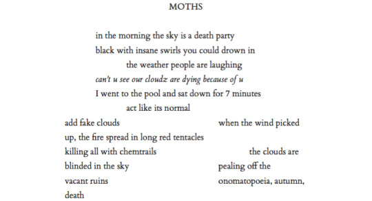
I’m thinking of terms like ‘cloudz’, and what clouds are, how they move, what they mean in this day and age. The obvious dualism here is the physical clouds we see and study in the sky, their changeability as they move across throughout the day, carrying rain or snow, whatever. And then there’s this more enigmatic weird concept of ‘The Cloud’ in computing, which is a homonym in and of itself. You have Sky’s WiFi ‘The Cloud’, where anyone can make an account and sign into their WiFi and they have hotspots called ‘The Cloud’ all over the UK. You’ve got ‘cloud computing’ which is this method of data storage, normally created by a single provider. They manage the data and how it’s processed/stored/encrypted and users can upload or save information there. Anyone with an Apple product automatically gets an ‘iCloud’ account where their data is automatically backed by Apple’s cloud software. This means you never have to sync up your devices with wires or buy extra USB sticks/external hard drives to back up your data. You can just set a timer on your phone, link it to your iCloud account and it’ll automatically back up whenever you want. People think of this accumulation of data in one place, (without having to personally manage it) as being an “amorphous cloud”. I’m seeing this as a poem which introduces this element of denial about our surroundings. We’re pretending its normal and trying to squish out the reminder of these seasonal abnormalities. Even if it’s stripped across the sky, ‘black with insane swirls you could drown in’ (alluding to the writing on the page itself), our denial tells us to talk us away from the indefinite scream that it’s not okay. ‘Our cloudz are dying because of u’—the way Joseph intersperses Internet vernacular/text-speech/shorthand here introduces the Internet’s presence, and our tensions between our physical reality and our artificial one. We transcribe events into our phones. We see something, we talk about it in on an online platform. The way we transfer reality from a physical realm to a virtual realm is an exchange which happens so regularly and with such rigour that it’s an indented feature to 21st century society. Every time Boris Johnson makes an announcement in real-time, journalists flock to Twitter to unpack it in an online arena which stays up for the rest of time. The fact that language is swamped by Internet culture and adopts terms once pertaining to more physical objects or tangible sensations sensations, renders language more faceted and multiplicitous than ever before. Such ambiguousness in what we mean and how we mean it, contributes to this acute confusion and fear, which compounds contemporary culture.
Other homonyms:

I’m thinking of dark as in ‘dark mode’ and ‘dark’ as in ‘disturbing’. ‘I regret not running through Wheat’ I think is a reference to that Theresa May interview where she said the naughtiest thing she ever did was run through fields of wheat with her friends, (as opposed to increased austerity and fucking up Brexit + various other shit).

‘accidentally deleting the human race’ makes a mockery of the way the world is ending, which is by no means, “an accident”. I also wonder about the dualism in ‘A tornado touched my heart & I’m crying’, is it that we’re seeing the destruction a tornado unleashes as a perturbance? Sometimes Joseph writes like the way emojis sound, does anyone get that? Sort of like a staccato, plain-text way of articulating emotion. Did an emoji tornado touch his emoji heart?
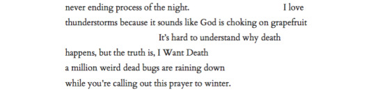
Such an incredible line: ‘I love / thunderstorms because it sounds like God is choking on grapefruit’. I’m not even going to unpack that. I’m going to leave that one to simmer. But that’s not an example of an homonym here, in this section I was looking more at the part about ‘a million weird dead bugs’. There’s the bugs that come to eat us as we decompose. And then there’s “computer bugs”. Just a few examples where Joseph’s playing on words here.
I think of these homonyms as alluding to our inability to discern between reality and virtuality. We’re unable to understand our reality as it is now, I mean if you discard the Internet and technology, we already struggle with deciphering between our own perception to another’s perception. What one perceives as being red, another might call pink, or orange, or green. The additional threat that Internet culture imposes is that, our language eventually becomes swamped by the technological vernacular of computers, of online-existence. And yet it’s inevitable, and it’s already happening. It’s interesting—Elon Musk said in 2016 about whether he thought humans were living inside a computer simulation— ‘The strongest argument for us probably being in a simulation I think is the following: 40 years ago we have Pong [the Ping Pong video game]—two rectangles and a dot. That’s where we were. Now 40 years later we have photorealistic, 3D simulations with millions of playing simulatenously and it’s getting better every year. And soon we’ll have virtual reality, we’ll have augmented reality. If you assume any rate of improvement at all, then the games will become indistinguishable from reality, just indistinguishable.’What Joseph’s showing here is the multiplicity and changeability of language, how technology burrows into its sinews, transforming terms we use to describe our tangible, physical realities into ones which you can hold in your hand and scroll down with your thumb. Language is the currency of culture which is being endowed to technology. But that’s not abnormal of language per se, I mean it’s symptomatic of how language and meaning evolve simultaneously, language’s multiplicity. Rather what Joseph is saying that it’s bridging a confusing gap, how can you tell between the tears streaming down your face and the ones streaming from your television? His poetry seems to breed flesh and wire together, forge them as inextricably bound entities of today. We can’t distinguish ourselves from our flesh to our wired online flesh.
But although set it in the future, you can tell that this collection is entirely rooted in the now, even when it oscillates between different years in the near and distant future, from 2030, to 3042, to 2076. It reads like a series of tweets, but it appears like scan-lines coursing down the page, so Joseph’s really capturing a generational voice here, that “online” voice which is stripped and clipped, where it feels squeezed into 100-odd characters. The poetry is peppered with well-known, familiar references pertaining to our present-day. And I think year dates are an artifice in this collection. The world’s end is so resolutely close to us that we can taste it in images like Elon Musk singing baby shark, Lana del Rey as the saddest superhero, David Hasselhoff eating the white wine emoji... It’s laughable. It’s funny. It’s hard. I think part of the way I read into this mesh of pop-cultural references was down to its implied superficialism. Y’know, we sort of think of our extinction as being a distant probability, but we can’t think about it without losing our minds. We barely accept the inevitable truth of our own mortality, we just can’t come to terms with the reality that someday we will sip our last cup of coffee, hug a friend for the last time. And we won’t necessarily know it’s the last time, until it’s the last time. This fear is particularly prevalent in Western culture, so we’ve barricaded ourselves with our egos, and constructed this site which vows to distract us from that not-so-terrifying revelation, that we’re all going to die. Death is natural. But we think it’s so unnatural and upsetting, that we’ve invented celebrity culture, make-up tutorials, 100K followers, emoji reactions, opinion polls, status updates, likes, Facebook algorithms, botox and red shoes as part of a sequence to distract us from the eventuality of death, thinking that these things will sustain us. It’s all artificial, it’s all blue-light, it’s all moths ever gravitate towards. Joseph humours it, (I wonder if he’s jaded at times) with a sigh:

‘There’s all sort of thunder & / lighting and it is Fantastic and important tv.’ Me and my mother both laughed when we read this, it’s more mockery of the kind of vapidity in contemporary culture. Just endlessly being like: ‘oh watch this, oh I’ll link you the video, this is so funny watch it, look at this, this is my fav clip’, it’s nauseating. And you get this nauseating feeling when you’re reading this collection as it continues, it begins to make less sense, it begins to glitch and unravel to the point where you don’t really understand what’s going on. It’s bombardment, and the struggle in making sense of what’s going on typifies the way the ‘I’ is struggling to hold onto sanity. And while the dystopia of The Moth Apocalypse makes for a terrifying read, it’s also met with such beauty, I don’t think I’ve ever read a more beautifying approach to apocalyptic writing. You can take deep pleasure in the way Joseph articulates natural disaster. From ‘one rain drop falls out of the sky’: ‘I went to see the cherry blossoms in the glowing forest / [...] / THE SKY IS PURPLE LET ME SLEEP / [...] it smells like strawberry / pop tarts outside’. This “glowing forest” alludes to a forest fire, the purple sky alludes to light pollution, making it hard to sleep. Strawberry pop tarts goes without saying really, probably one of the best examples of describing consumerist culture in a nutshell: pre-cooked, chugging in artificial colours and flavours. But when you read these sentences alone, you don’t get the impression that the world is dying awash in blood and fire, rather the violence is extinguished. It reads and feels more like a painting, this gradual description of shades and experiences. There’s something kind of Eva Figes-esque about his writing style, just the way he colours in scenes. I wouldn’t go so far as to say it’s glamorised, but rather, the apocalypse is beautified.
I want to bring this review full circle and come back to the collection’s title: The Moth Apocalypse. By the end, I came to think of humanity, us as being the moths, here, roused by darkness and addicted to rectangular devices emanating blue-light. We frantically flap around its notification, its constant stream of information as the world around us is plunged into dark mode. The points where you’re thinking that the collection is relenting and giving up, are actually the most profound moments where it gets up. Joseph writes it best in ‘Everything Is Peachy’: ‘if you’re / looking for a sad and hopeful story / just sit / back and watch this rain.’ This collection begs us to be present, to consider and amend, and if nothing else, to laugh wildly as you don’t remedy it. It is an incredibly self-aware read, an invaluable perception of the “way things are heading”. The composition and structure of the poetry is masterful, art in its own right. The Moth Apocalypse is a promising and brave debut from Joseph Turrent.
If this review’s piqued your interest, you can purchase The Moth Apocalypse from HVTN Press here but they have stopped postal orders for a while due to Covid-19, so you may have to hold on. In the mean time you can find more of Joseph here on Twitter.
#themothapocalypse#hvtnpress#haverthorn#press#smallpresses#ukpoetry#debutcollection#2020#release#litbitch#currentreads#review#books#josephturrent#poetry
0 notes
Photo


almost got ‘em all! thanks everyone for asking! answers are below~
1. What age did you begin getting into art? Why did you get into it? hmmmmm im gonna try to answer this as interestingly as i can. so ive been drawing all my life and i think it was just bc a) there was always art supplies lying around and b) i just had so many things in my head and wanted a way to express them or just get them out. like when i played with my toys i was always completely quiet bc i was imagining everything in my head. sound/speech/words just weren’t as interesting to me as a way to put my thoughts out there as visuals were. also i rly liked ranma 1/2 and wanted to draw it.
4. Do you make merchandise? Favorite kind of merch to make? i don’t. i did think about making charms once, even if just for myself. you know, those cute, chibi-esque ones everybody makes? then i remembered i couldn’t draw sth cute if you put a gun to my head.
5. Who/what are your art inspirations? I listed some of my favorite artists the last time i answered questions like this so i guess this time i’ll go with the ‘what’ rather than the ‘who’. to me, the most inspiring thing are atmospheres. it could be a garbage container with 1000 stickers stuck and half-way teared down on it. the way the colors and rips in the stickers look and how it adds to the mood of the location. or sometimes it’s listening to a certain song at a certain time in a certain place that creates a unique mood and inspires you. but looking at art has never been an inspiration. so there’s that.
6. What is something (a technique, behaviorism, etc.) that you do with drawing that you think is unique to you?
ok but in seriousness, i don’t think there’s anything. any uniqueness comes from a lack of skill and knowledge so i don’t think it’s worth mentioning. like what do you even want me to say?? that i edit pictures i drew in clip studio in ms paint?? bc i do.
7. Describe your style. What would you change? neither here nor there. i feel like you can tell i’m a bit scatterbrained bc my drawings always look like they were done without any kind of direction lmao.. in general, i’d like to draw more realistically. i’d like to look at my own drawings and think ‘this pose looks rly natural, the way the clothes fit, the way the face looks, the perspective, the way this character interacts with the environment; it all looks right’. i’d also like to be able to use colors better but it’s hard when you struggle to name more than 3.
8. How do you get out of an art block? well, usually, I don’t. i’m pretty sure i’ve been in one for the past 3 years or so lmao (lamenting my anguish online) but i’ve been told that just working through it is the best way to go. just drawing. even if you hate everything. future you will thank you for it, bc you’ll probably be learning things while doing so, even if you can’t see it at that moment.
9. Does your style reflect who you are visually or your personality? both tbh. if you saw a pic of myself next to a drawing of proto danny you’d definitely see a resemblance in a way. (things like the clothes i draw him in are a given i think. ive probably drawn 90% of my wardrobe at this point) but my personality too. the things i spend more time on while drawing, the colors i choose, the mood in my drawings. that’s all a part of me. im pretty sure my oc tags are fairly accurate documentation of my mood swings and general attitude towards life throughout time lmao also, this thing i summed up in my tags a few years ago

10. What do you find easiest about drawing? getting the ideas for it
11. What do you find hardest about drawing? actually drawing said ideas. look, the moment i sketch the idea down it’s already 50% worse than i imagined it, then when i go to actually draw the thing it turns into sth so bad that i can’t even come up with a forced joke about the scenario. but anyway, lately the thing that scares me the most about drawing (and why i can hardly do it) is heads. heads heads heads. faces faces faces. i just cant do it man lmao
12. Is art part of your career or a hobby? What is your goal with art in life? my goal is to get a better hobby and to never have to return to drawing ever again. but that’s wishful thinking. i guess it’ll always stay my biggest hobby but i’d consider my life a failure if it ever turned into a career.
13. Advice to give to beginning artists? draw your ideas. never limit your creativity bc you don’t have the skill to express it to its full extent. a crappily drawn picture that conveys a cool idea or creates a cool atmosphere is just as good as an expertly crafted painting that has a lame subject. there’s a reason ppl admire the mona lisa but would rather read 90s manga than stare at that portrait all day. god. i guess motivational speaker is another career that’s out of the question lmao but you get what i mean!!
14. Advice to give to your artist peers?

also don’t take advice from me.
15. What have you drawn recently that you are proud of? ‘recent’ is relative, and so is ‘proud’, but i still rly like how this pic turned out. i just feel like it looks very decided, like i knew what i wanted to do and did it (i didn’t)
16. Show something you drew in the past that shows your improvement. 2017 - 2011
ahh tbh.. looking at this i don’t feel like i’ve improved a lot at all lmao..
17. Show something you drew in the past you’re still proud of. this pic might just be one of my favorites i’ve ever drawn. it’s still alright art-wise and it’s probably the most from-the-heart thing i’ve drawn so obviously, i have a soft spot for it lmao but i also just found this again and i still love it, even tho it’s ugly. also this bone which, infamously, is my crowning achievement
you know what i find funny rn? that it’s hard for me to decide which pic to choose for this question. i mean i went through my old art and cringed a LOT but there’s so many pics that im rly fond of, now that i’ve gained some distance to them. i wonder if it’ll be like that with the stuff i draw now, too.
19. Share a tutorial or reference that helped you. nothing concrete but i’ll mention ‘blind drawing’ again. it helped me get a different feel for the lines i’m drawing and, theoretically, would have made me better at drawing from life too
20. Plug time! Where else can followers find you? in the woods around 3am. don’t make eye contact.
#buff arms reply#no proofreading. also as always: good luck reading this on my blog theme lmfao#(highlight the text)#(then curse me under your breath)
14 notes
·
View notes
Photo
I will be with You
When you go, just know that I will remember you If living was the hardest part, we'll then one day be together And in the end we'll fall apart, just as the leaves change in color And then I will be with you, I will be there one last time now --My Chemical Romance, "It's Not a Fashion Statement, it's a Deathwish" ____ It's rare that I'm this proud of an artwork I've created. ^_^ Usually, there's some glaring issue or just an assortment of small things I'd still change if I had the patience and/or artistic ability to do it. Or even just some things that I feel like could've been done better, even if I know it did the best I could. This time? No. Not right now, shortly after it's been completed, anyway. I'm sure years down the line from now I'll look back and feel at least slightly different. But as it stands now, while I'm sure it has its faults, I am truly happy and truly proud of what I've created here and whatever faults are there aren't bothering me at all. So what then is this, exactly? This my dear Sparklers is a visual love letter to the band I discovered just a little too late but was still there for me when no one else was all the same. Earlier this month, I uploaded a different piece of art to celebrate the announcement of My Chemical Romance's Return, but even when I uploaded that one I was already thinking of doing another one, this time something that was more obviously fan art. But not just fan art as I've done for them in the past (Exhibit A, Exhibit B, and Exhibit C), but something extra-special and fun. I really did go into creating this wanting it to be as I described it above; a visual love letter to this band that I love so much and could not be happier that they're back. As such, I've squeezed in as many references as I could: 1. The female figure is molded after Helena from the album Three Cheers for Sweet Revenge 2. The male/skeleton figure is supposed to be Pepe (that's what Google said his name was, anyway), the icon and seemingly marching band conductor from The Black Parade album 3. On Pepe's hat, I replaced the usual symbol with the Candle symbol that's been featured in the band's Return artwork 4. They fade into leaves based on the line from It's Not a Fashion Statement, It's a Deathwish (a song from Three Cheers) that I quoted at the top of the description 5. behind them is Party Poison's mask, as featured in the Danger Days music videos 6. on the mask, I replaced one of the black triangle shapes with the hanging man silhouette from I Brought You My Bullets, You Brought Me Your Love 7. The rest of the background is inspired by the covers for the Conventional Weapons releases (which in my mind I count as essentially an unofficial fifth album) (Debatable) 8. Their touching hands could be an indirect reference to the line "And as we're touching hands, and as we're falling down" from Demolition Lovers, a song from Bullets. That's at least one reference each (Three Cheers technically got two) for each of the main releases, plus one directly related to this new era we don't know much about yet. It's not an exhaustive "spot the reference" game, but I'm glad I was able to incorporate as many as I did. Now that I've explained them, maybe I can talk about my process without having to stop to re-explain each reference as they come up. After some brainstorming, I got this image in my head of Helena and Pepe in this pose (inspired at least partially by this pre-existing fanart I've seen many times before) , which to me is a "renaissance dancing" pose but I'm sure there's some other better way to describe it I haven't thought of. I tried for a very long time to find a reference image of this exact pose to help me get the proportions and general anatomy right within my own stylization, but for the life of me, I couldn't find anything close enough to suit me and I really didn't want to have to settle for something else. As such, I'm sure the proportions and anatomy are off, but even so, I think I did pretty good considering. The main issues I ran into during sketching were mainly balancing the energy between the two characters--which I do think I managed in the end--Helena's skirt, as she's supposed to be holding onto it with that hand you can't see, and Pepe's torso. Originally, I was planning on doing this piece traditionally, but once the sketch was finished it almost immediately clicked into place that I'd be better served to do it digitally, considering what I wanted to do with the mask in the background already, as well as the leaf-fade. (The Conventional Weapons reference hadn't been planned yet, and it was technically only made possible later on by this piece being digital.) Luckily, doing things digitally meant that Pepe's torso was fixed pretty easily. It was too thin in the sketch, but all I had to do was select the right lines and move them out a bit in Photoshop. He's still a bit thin and not super buff, but personally I'm letting that go because...I mean, he's at least part if not all skeleton. If anyone's going to be too thin, wouldn't it make sense that it's him? Helena's skirt I did end up happy within the sketch but...we'll come back to the skirt in a moment. Pepe's...face? looked a bit odd in the sketch, but other than that, once I was happy with that foundation, I scanned it in and got to work on digitizing everything. I went over my lines for Helena and Pepe the way I normally would for something like this if a little intentionally messy instead of trying to get them super clean--as I thought that might be appropriate here--and then I paused with them to work on the mask behind them. The mask admittedly came out very poorly in the sketch, just because I bothered to look up no references for it whatsoever once I decided I was going to make this digital and I knew I could just draw half of it and flip it over. And I'm glad I didn't start trying to follow my sketch lines for it at all because looking up actual references showed me that would've been way off. While I had my reference up, I ended up going in and basically full-coloring and detailing the mask right then. That's the beauty of digital work; a lot of steps can be done basically out of order from how you'd have to do them traditionally and it doesn't matter because you can just move layers around and adjust effects later. I went with this pseudo-soft shading based on the colors and shadows I was seeing in my references, even though I wasn't sure yet exactly how I was going to shade Helena and Pepe. I figured that even if I used a different method for them that I could either go back and adjust the mask as necessary or that it wouldn't matter since the mask was part of the background anyway. Once that was done, I went back to ponder my two figures and the leaf effect that I wanted to do with them. And again, I went a little out of order here, as I ended up filling in the silhouette of Helena and Pepe with a blanket layer of gray so I could see how them blocking the mask was going to look (and I figured based on past experiences I might need the blanket layer in white later). From there, I went into working on the fading-to-leaves effect. My logic was that I'd need mostly the silhouettes of the leaves and then I'd get what I wanted after playing with layer effects or something. This assumption ended up being correct, but we're not there yet. As I worked, I kept looking at my "finished" messy lines. Something just didn't feel right. Honestly, I couldn't tell you where the idea to do this lineless look came from, but it got in my head as I was working and I kept looking at the lines I had and not being happy to just color those in as I normally would, shade it, and call it a day. I tried. I tried really hard to ignore the urge to at least try it and carry on as I was. I'd already come this far, and I'd be done so much faster if I stuck to the plan...But!! Clearly I lost that argument with myself. You know what though? I'm glad I did! I don't think I've ever done lineless art like this before, not counting my watercolor work where that's just part of the process to me. But digital? Certainly not. Human figures? Also no. I've come close in the sense that I've shaded my art before, turned off the line layers before, and thought, "oh hey that almost works without the lines because of the shading," but not much farther than that. Naturally, I wasn't even sure how or where to begin, so I went with what came naturally to me. I started by just filling in the lines as I normally would have, and then I went back layer by layer and went back and forth between having the line layer (with the opacity brought down somewhat already so I could sort of see what I was doing) on and off to try and balance the shapes between what they looked like with and without the lines. It's weird because if you ever try this, it's a little like having to figure out a bunch of individual silhouettes that make one whole one, except you need them to be a little more defined if you want them to make visual sense. That step and the next one, the shading, are tied in my mind for which one took me the longest. For the shading, I really just went in blind, using hard-edge cell shading, though originally I planning to come back with some soft shading in certain areas later. The soft shading ended up not happening partly because I liked it much better than I thought I would without it, and I thought the hard-edge shading made the figures pop a little more compared to the background. The thing about this was the same issue I run into with my lines nowadays; to get smooth shapes I spend a while going back and forth between putting color down and erasing it, and sometimes undoing and redoing the same line a dozen times to get it right in one stroke. But that's really my own fault for being stubborn and trying to work solely within Photoshop and not use other programs, as I know good and well I'd have less of that issue if I'd hop into Paint Tool Sai and use the linework layers in there. What can I say? I live up to my Capricorn sign by being as stubborn as a goat. Anyway. The biggest challenge to figure out the shading for was Helena's skirt. I think I would've still had issues with that though even if I colored and shaded my normal way, with the lines and everything. It's just the position it's in that complicates things. I actually did a good amount of shading in reverse here, where I'd make the base layer the shadow color and then the layer on top would be the regular color, as in some cases it just seemed easier to do that than the other way around. The part of Helena's dress around the top, for example. Or Pepe's pants (what little you can see of them). Additionally, I ended up leaving the feather attached to Pepe's hat alone and not really smoothing it out, as I thought the roughness and inconsistencies worked really well to make it seem more feathery. With enough patience and persistence and much back and forth among the various layers, I made it through all of that. I was a little concerned at first about some of my color choices and if the shading was too harsh in some places or not, but I mellowed out as I worked and ended up not making make adjustments after the fact. For instance, originally I thought I'd go back and make Pepe's...skin? closer to a true white and this fleshy off-white color was more of a placeholder, but the longer I worked with it, the more I didn't want to change it. It actually makes sense, given that his hands are normal (as they are presented in official artwork and other fan art not made by me) and that bones usually are naturally more of an off-white color. And I also think it just looks really good next to Helena's pale skin. The hands were a special challenge in regards to both shading and coloring, as hands like to be the more complicated part of a drawing more often than not, but even that I managed to get through with a lot more ease than I would've bet on. The other thing about that is that I was surprised once I got through the steps at how much better Pepe's face looked in comparison to the rest of the drawing. As I mentioned before, it looked odd in the sketch. But one I had most of the colors for him and Helena filled in digitally, the contrast or something just made it look infinitely better. (Combined with a hefty dose of earlier back-and-forth making adjustments to his jawbone area.) Originally, I thought I might use the same cell shading for Helena's eyeshadow. However, while I was still thinking of adding some selective soft shading, I added it using one of the brushes I'd used on the mask earlier. It looked so good to me that even after I tried added the soft shading with it like I planned and decided I didn't want/need it anywhere else, I kept it. And for the record, Helena's hair is kind of the wrong texture (it's officially more straight than this) and she's missing this little netted veil thing she's supposed to have, but I had a very specific vision in mind, so those were the two creative liberties I took with her design. I say it's fair game since I took a liberty with Pepe's hat to get the Return reference in. And besides, those two details being off doesn't make her totally unrecognizable if you know who Helena is in the first place. Once they were done, I spent longer than I bothered to document playing with the leaf layer I'd made earlier to try and figure out how to get the effect I wanted. Sparing you the boring details of my trial error, as I'm sure this description will be long enough without them, I eventually determined the best thing to do was to have one layer of the leaves on top set as an "overlay" layer, and another behind/beneath Helena and Pepe. Then I went back and extended my color and shading layers to extend down over the leaves, and I arranged and clipped the layers accordingly. Technically, the overlay layer wasn't necessary, but it added a little extra dimension that I really liked. By that point, it was my second day of working digitally and getting late, but I had to do one more thing before I could go to bed with my mind at ease that night. With Helena and Pepe done, I turned the mask back on (I'd turned it off so I could focus on them without it distracting me or otherwise getting in the way) and I felt like they weren't standing out enough against it. The bright yellow color was competing too much for my eyes' attention. So, after trying the "stroke" blending option in white and that looking God-awful, I added a new layer between them and the mask and manually gave them a white outline. It wasn't a perfect solution, and I knew that even then, but it was enough that I could sleep soundly knowing how far I'd gotten with the artwork. The next day I had to take a break from working on this to bust out a painting for the challenge I decided to take on this month, but I went back to this as soon as I could after that was taken care of. When I came back to it, I acknowledged that I technically could've left it as it was and call it finished. But I still didn't like how obnoxious the mask seemed for a background piece and it felt...I don't know. Almost hollow, in a way. It was a cool graphic, sure, but I wanting something more than that. Again, I'll spare you most of the nitty-gritty details. But long story short, I played around with layer effects and filters for a while until I had blurred the mask out just enough that it wasn't so obnoxious but also so looking at it directly didn't make me nauseous, and the edges were softened so it felt more like a true background piece and not just an accessory that had been plastered carelessly back there. It was only after I started saving off versions with different backgrounds--one with no background, one with white, one with black--that I realized I was missing a golden (semi pun intended) opportunity to incorporate a Conventional Weapons reference/allusion. Which was exciting because I'd previously been disappointed that I couldn't think of a good way to do that. I went back and forth on layer styles and adding texture with brushes and things for a while on that too, but you can see what I ultimately settled on. It's not a 1:1 to the CW covers, but I'm really pleased with it anyway. I did end up adding a bit more to the white outline in a few places and adding a drop shadow to Helena and Pepe so they'd pop a bit more (it almost makes them look like paper cutouts to me!), but really the only other thing I had to do after that was add my watermark. It took roughly 3 days of work from start to finish, but I was honestly surprised by how fairly smooth the process went. Especially considering the new things I'd tried along the way. I can only assume it's because of just how much my heart was really into making this piece. As I said before, I am truly proud of how this piece turned out. I love it. I love it, and I love the band that inspired its creation. Even the title says a lot here, I think. I picked this line that's repeated at the end of It's Not a Fashion Statement, It's a Deathwish, as it was a leading inspiration with the leaves and everything, and after looking at the lyrics I realized how fitting that line is for this. I discovered My Chemical Romance two years too late, two years after they broke up in 2013, but I've stuck by them ever since, and I will continue to do so, with whatever the unwritten future holds. They've changed, as anyone would over the course of six years, but they came back anyway. Even if it's just for a few shows and they're gone again. Or if it's going to be so much more than that. They. Came. Back. And that's not an easy thing to do a lot of the time. And so, I show my solidarity. I will be with you, MCR, no matter what comes next. You were there for me, and now it's my turn to be there for you, even if it as just another fan among the crowd. And that's really all I have to say on the matter. ____ Artwork © me, MysticSparkleWings ____ Where to find me & my artwork: My Website | Commission Info + Prices | Ko-Fi | dA Print Shop | RedBubble | Twitter | Tumblr | Instagram
#mcrmy#mychemicalromance#mcr#helena#the black parade#three cheers for sweet revenge#danger days#thetruelivesofthefabulouskilljoys#killjoys make some noise#conventional weapons#return
7 notes
·
View notes
Note
What do you think of the Kanker's presence in Jingle Jingle Jangle? How is it different from their other appearances?
OKAY I FINALLY DID IT! Step right up and see analysis of the Kankers’ parts of Jingle Jingle Jangle! Only 3 or 4 weeks late!
First of all, in case I never analyze this special in full, I want to call out that this whole way of connecting the Eds’ A Plot to the Kankers’ B Plot is complete nonsense.... randomly discarded and forgotten flashlight + conveniently placed mirror = reflection of light pointed at the sky = Star of Bethlehem that uses Godlight to deliver sexual harassment to the main characters??? It is a purely visual idea, and what’s worse it seemingly has no meaning.... is it punishment for wasting a battery?? Then what was the point of the special’s other Chekhov’s lightbulb!?
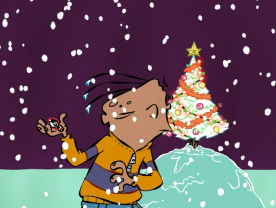
Was that just a spiritual redemption, but not an escape from his punishment?
Is it punishment for breaking his parents’ trust?
Is it just to say the Kankers’ lives are sadder and this universe’s god prioritizes them above the Eds or anyone else?
Or is the Snow itself an entity, like the Static? Both are terms to refer to television fuzz….
Is Evil Tim in control of the holidays, with all the magical Santas and Elves and Monsters that get to appear in these episodes???
The Snow is even the first thing to appear, in detailed close-up for one time, before the rest of the universe fades into existence, ushering Plank (and Jonny) into the digital era before the Eds OR the Kankers get to appear at all, and scenes where the snow is coming down are markedly more abstract and focused on the characters being quiet and internalizing their emotions.
Is supernature itself overwhelming the characters at will and leading them to cruel fates!?
Is the supersnow meant as a warning of the literal and figurative after-effects bound to invade any show switching to digital!?
SOMEBODY STOP ME!


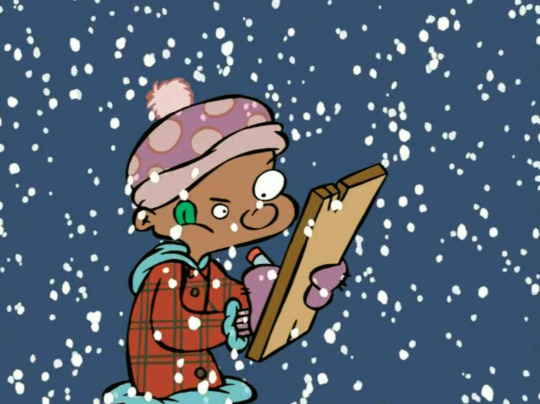

The snow even just fades out when Eddy’s light starts glowing.

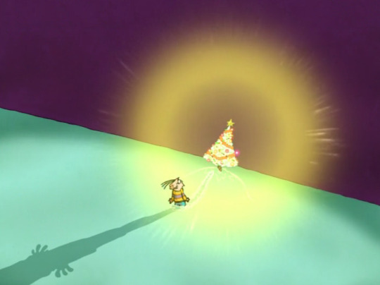
I’m sorry to begin with a whole silly rant. It’s just that Christmas specials are normally the one episode of any show that can be counted on to let the main characters have a win. The show was set to end with its stagnant nihilistic 4th season, so it was a miracle to get the holiday specials or digital era at all... So this Kanker ending stung more than usual.
That said, this special has won me over as an adult! The series’ first foray into digital animation looks really gorgeous and it’s such a visually driven special, you can’t look away. The animation is unfortunately a little better than the digital era could make consistent, but it’s close enough to feel like the same show as everything that came before and after it. Definitely some of the most experimental style choices the show ever made. I’m always so glad the backgrounds are still hand-painted throughout Jingle Jingle Jangle.
I’m fascinated by the way this star is clearly a digital effect, but at the same time it avoids being too high quality for EEnE by mostly looking like a dry brush (like when they do those paint-blurs when the characters move fast), and animating the star as white outlines with no color inside when they could easily do a real light effect is an interesting choice. It captures the eery prettiness the star’s role demands without betraying the show’s sketchiness.
I really like the music direction this whole special, but this opening to the Kankers’ Christmas is one of my favorite parts. It is about a minute long and starts 2 and a half minutes into the special.
As we start hearing dialogue from Lee, the camera whips down to the trailer park and the Kankers’ theme music drums in. This is the one time the show really made me aware the Kankers have a theme so now I always keep an ear out for that music cue. I know it fills most of their appearances in Big Picture Show.
Inside, the Kankers sit and squabble as always, playing with a box of Krazy Krackers. Apparently Christmas Crackers are a more popular thing in the UK (the show had a lot of UK influence around this time, with Rachel Connor joining as head writer in the next season), but I think it’s been confirmed to be a Canadian thing too now.
Room analysis! The Kankers seem to have to make do when it comes to decorations… They have lights on the staircase and around the windows, and a cute wreathe with a red light on top of their TV, but their tree is a lone stick that has 7 branches if it’s lucky, it’s plugged into the wall yet the one light on it isn’t working, and most of the ornaments seem to be recyclables, barbed wire, or orbs that have fallen from the tree. Oven mitts have been hung from the wall in place of stockings and rather than garland, they’ve trimmed their living room with chains, fishing lures and… are those shower curtain lines?
This is probably the most the show really gets across how big of an economic difference there is between the cul-de-sac and the trailer park. The kids, even Ed and Eddy (unfortunately we see little of Edd’s family’s Christmas traditions), seem to have very gaudy and extravagant decorations, most of them appear to be expecting family or coworker Christmas parties later in the evening. The Kankers’ trailer is sparse by comparison.
Marie being the least cheery at Christmas is probably the most punk thing about her..
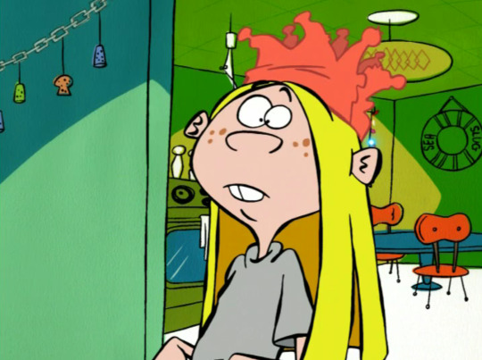
Focusing Kanker scenes on May is pretty typical of this point in the series, but I like how infallibly nice May is in this one. Marie tries to blow the Christmas cracker up in May’s face, and yet May barely reacts to the threat level here as anything out of the ordinary. Then again, this scene likely exaggerates how much these things are like firecrackers.
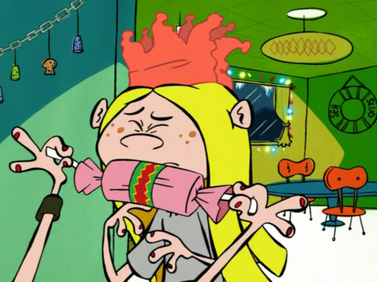
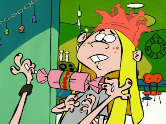
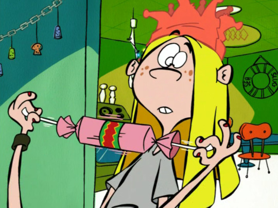
May calls the cracker a dud, so of course Lee razzes her, “just like you, huh, May?” This moment has a good undertone of Lee trying to readjust Marie’s negativity to more of a light ribbing, to fit the season.
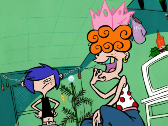
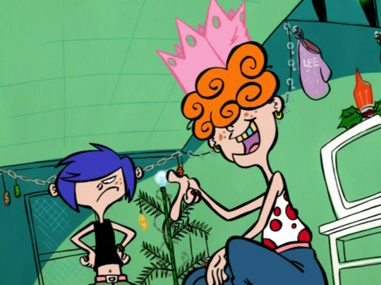
REALLY COOL DIGITAL DRYBRUSH EXPLOSION EFFECTS…
What’s the deal with this eyepatch on Marie though? Is this just a “under the bangs” teaser gag like the one frame three-eyed Lee in BPS? The artists don’t try nearly as hard to hide Marie’s full face as they do Lee’s…. Is it just an unexplained one-episode injury like Jimmy’s?
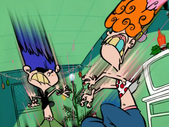
so glad even the digital X-mas special gets inverted frames, one of the most interesting visual features of the series’ early episodes
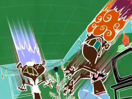
Good honest reactions of concern for May from Marie and Lee..
WHAT IS THIS A HALLOWEEN SPECIAL!?
“Look, Lee, May got a makeover~!”
….how desensitized have they become to slapstick!? Sarah and Jimmy react to a similar gag with Eddy casually decapitating Ed next season with utter horror and confusion!
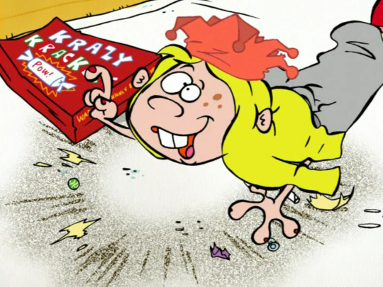
Apparently the most important thing here is that Marie wasn’t left out of getting a crown.
5 fingers on her right hand for one pose…
Note that the Kankers have replaced their wall unit’s knick knacks with Christmas cards from their invisible friends and family!
“Joy”
“HAVE A XMAS”
“From Your Father” (please appreciate this rare acknowledgement of the likelihood of a preferred Kanker dad)
“Ho Ho Ho”
“Happy Kwanza” (also the one acknowledgment of other winter holidays in this Christmas special and I don’t think it’s even spelled correctly… I thought for sure at least JIMMY would celebrate Hanukkah or something…)
“[doodle of a candy cane]”
“DO YOU SEE WHAT I SEE?”
one of this special’s many references to classic holiday staples, in this case the song, ‘Do You Hear What I Hear?’ https://en.wikipedia.org/wiki/Do_You_Hear_What_I_Hear%3F
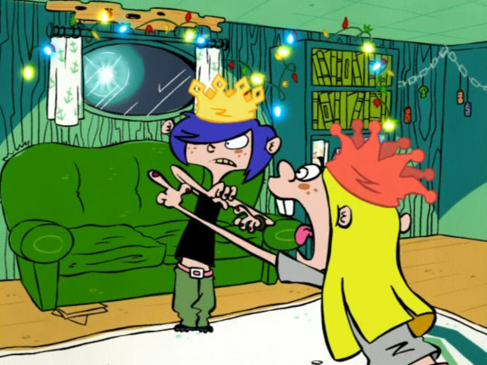
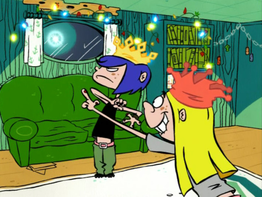
“Something twinkling in the sky!”
This opening scene to their plot starts the Kankers off as unusually innocent and naive, seemingly motivated only by an attraction to light, like moths. Lee even has to ask “where is it?” to which Marie correctly points out that May already said the star was in the sky.
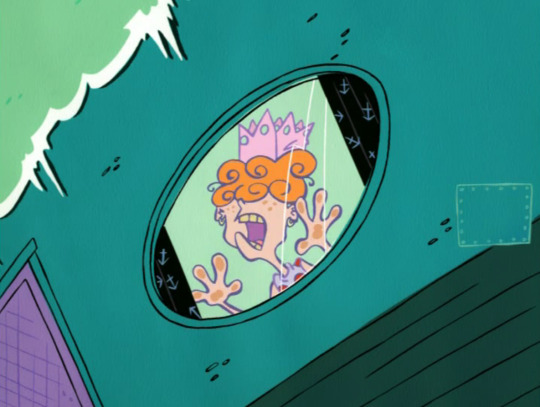
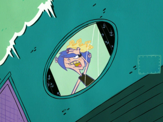
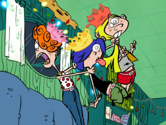
To be fair, Lee’s hair was blocking her eye, and we finally get to see her eye for the first time since season 1!
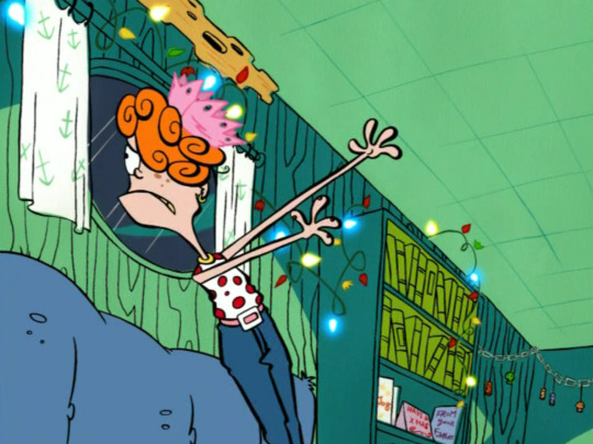
I LOVE this little detail of Lee twirling her foot before skipping out of frame.
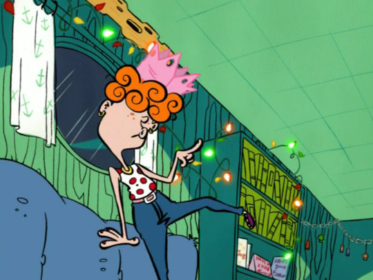
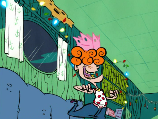
Marie rises, embarrassed to have been choked and dropped so carelessly.
She tries to save face by telling May to come on.
May’s Christmas cheer will not be defeated!
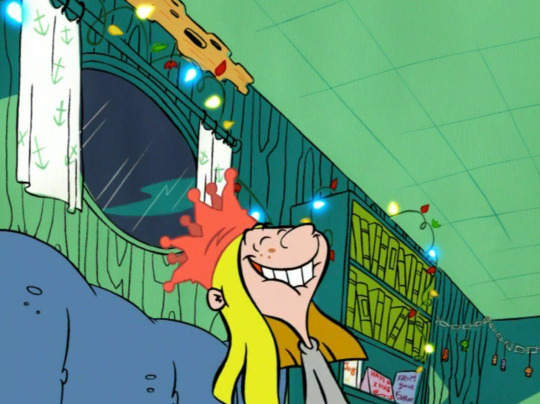
She teases Marie by giving Marie the same “come on” command.
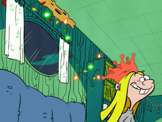
Iconic!! Doesn’t this shot kinda make you think of the night scenes in Disney’s Aladdin?
10 minutes later, we get another minute of Kanker B-plot. I don’t think any other episode ever gets this close to the super-geometric outline-eradicating Samurai-Jack-esque style Rod Filbrandt uses in concept art for his backgrounds..
Such background porn… I’m really unsettled by the weird abandoned signs of life this God Light takes the Kankers to… It’s like a trail of death leading to the Eds’ bad ending and the Kankers are too desensitized to pick up on that.
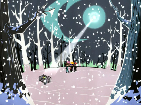
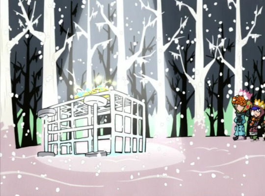
Lee gives her sisters a quick glance as they approach.
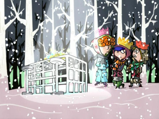
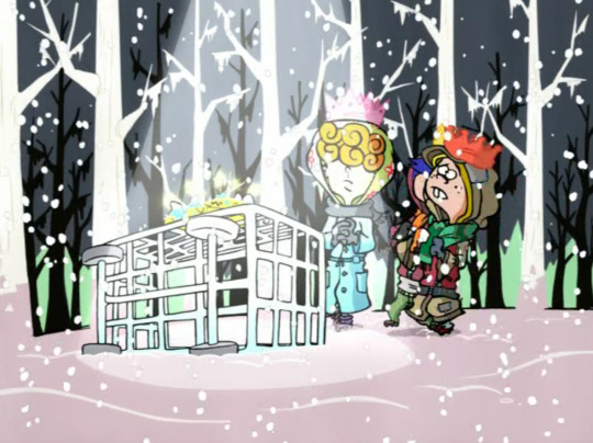
Lee and May unintentionally shut Marie out and she steps around.
Also, I’ll give them points for the “gold, frankincense and myrrh” = “mold, franks and cents, and fur” rhyme gag, but only because I wasn’t aware of that part of the nativity scene until this special aired. I was 13 when this came out, which means I’d already done like 8 grades of Catholic school, how did they fail to make any impression on me!? But honestly, that’s a weird punchline to try and use as a button on this bit. And as much as I love the art in that montage, it seems like it would’ve worked even better as a mood-setting detail if they found each gift separately between each house Eddy visited.
“What the heck is it?“ Pretty sure her mouth colors are mismatched.
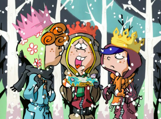
“It’s a sign, stupid.“ Touching.
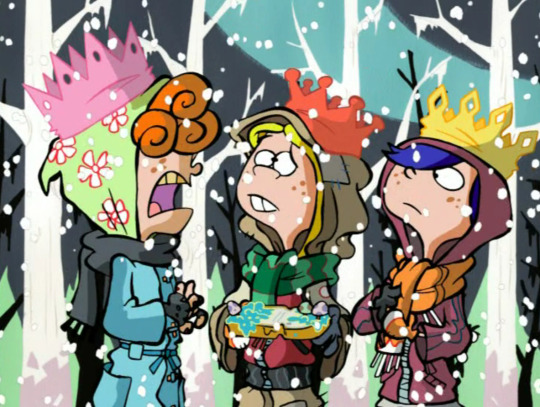
I love when they all look up in unison.
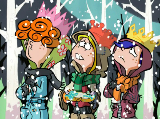
They look more confused as they walk away.
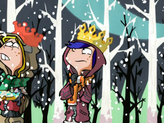
I’m really interested in how extra moody Marie seems in this montage. I also noticed that their frostbitten walk through the snow seems to be slightly foreshadowing of the walk Eddy goes on in the climax.
This is a really iconic shot and camera direction for me too, and it’s the one appearance of the junkyard at night in the whole show (as a setting, there’s at least one episode that shows it from overhead at night). It’s also one of like 3 uses of the junkyard as a setting in the digital era. And here you can barely even recognize it under the snow. Still looks great, though!
They are SO introspective over this star… what are they contemplating? Should we retroactively assume they’re regretting their situations with the Eds post-Fistful, or accept that this special wasn’t made in chronological order and think of something less specific, like family troubles or… just not thinking anything particular at all???
Lee and May stare dumbfounded at their lost-in-thought sister.
Very cute Maries.
Love that unoutlined background pipe.
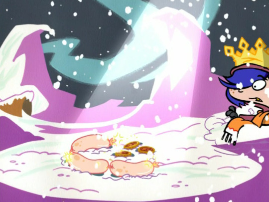
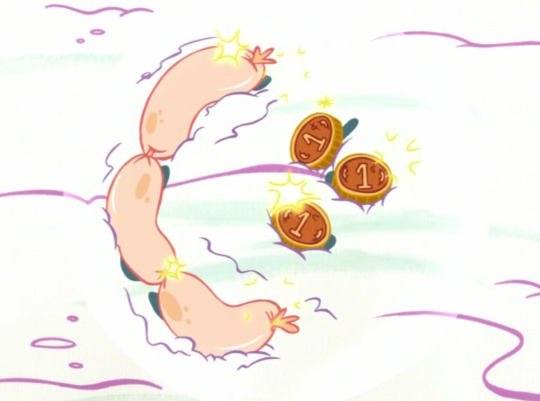
This glow effect seems.. broken.
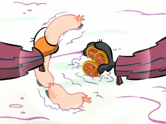
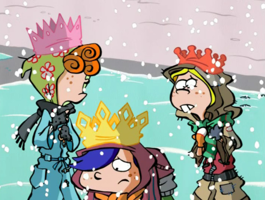
“weiners and pennies!?“
Wait… …Are you kidding me? I just noticed that May and Marie are each wearing one half of the same pair of gloves and the same pair of mittens….
Oooh look at this goregous postcard-ready background of the construction site! The construction site only has one other night scene I can think of that isn’t just an overhead shot, and it’s only one shot of Ed running there to grab a cement mixer during his fight with Nazz in Boo Haw Haw.
I really love how these gradient-silhouettes with blobby purple outlines look. Their progression through the show’s locations reminds me of the EEnE video games (mainly Jawbreakers! for the GBA because that was the only game they had at this time)… I think they also used this silhouette style for the kids on the Scam of the Century DS game cover.
i love EEnE vehiclessssss
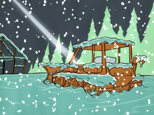
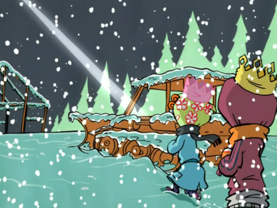
I love wondering whose coat this is and why it’s been left here… Also, do the rust and torn seat imply this construction site is officially abandoned? Or is this one of only a few vehicles that got left behind right before Christmas break and is now being ravaged by the elements?
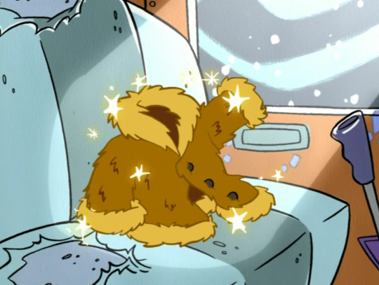
This frame always makes me yearn for a future where Lee is a construction worker. Or demolition!!!
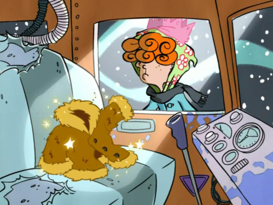
“It’s a coat. Come on, we’re getting close.“ Oh sure fine, makes sense to me.
We then cut one street over to Eddy in Plot A, where it isn’t snowing, reinforcing the idea that the Kanker’s story is not chronologically synced up to Eddy’s story.
Anyway, another 10 minutes later, we get a final Kanker scene!
The Snow is strong enough to smack Eddy with a door (UNINTENTIONAL BRO FORESHADOWING?). Eddy is also not very good at boarding a door, apparently.

On a scale of 1-10, how blasphemous is this shot?
The Snow encroaches upon the Eds
“Could it be!? Three kings who have traveled afar!?“
How serious is that question, Edd.... why would there be three real-ass monarchs in Rolf’s shed in the middle of an American blizzard???
I feel real weird about Edd being so religious in this episode, it’s too soon after season 4 made such a point of Edd not believing in things that cannot be proven…
I like that the special is religious. As agnostic as Catholic school made me, Christmas specials that get sentimental about the Christian traditions get the most nostalgia out of me. But this special and series clearly revels in sin and hopelessness, so I found it kind of jarring how much of this special lets the Bible references be played straight. Making Edd super religious just so he can continue to be fanserviced as an angel felt a little cheap, and I feel like it creates an undertone that Eddy is being punished for not being as religious as the others around him.
But take my complaints there with a grain of salt, it’s impossible to understand X-mas Special Logic, where it’s not quite Christianity, just some sort of TV-safe offshoot with elves and magic and a generally more fantastical mythology.
Hey the silhouettes are back!
I already spoiled this joke...
I do really like this shot… Nice to see Rolf’s animals get a Christmas cameo.
I do entertain the idea that the Kankers really think these gifts will warm the Eds’ hearts and earn their admiration. But we all know this will be a short lived moment.
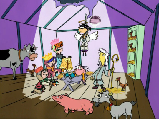
“This image certainly has the Christmas spirit…“
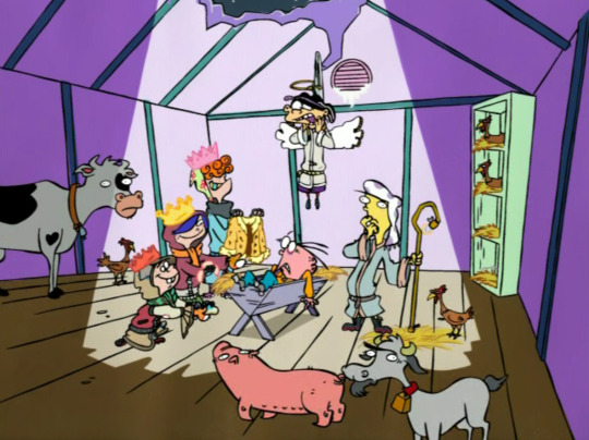
And now that there’s been a beat of peace, the Kankers reveal their true intention of pressuring the Eds into gifting them some kisses. The way they trap them in the shed and suggest it’ll last a whole year is really one of the creepiest approaches to a Kanker ending in the whole show. Obviously it’s not likely it would really last that long, and imo if it’s just kisses it’s not really new or surprising... but it’s still a pretty damn meanspirited ending for a beautifully-crafted holiday special that very easily could have been scrapped by the show’s season 4 cancellation.
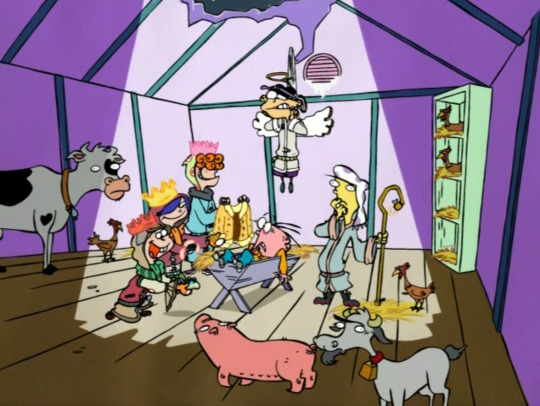
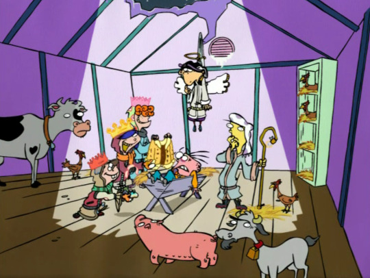
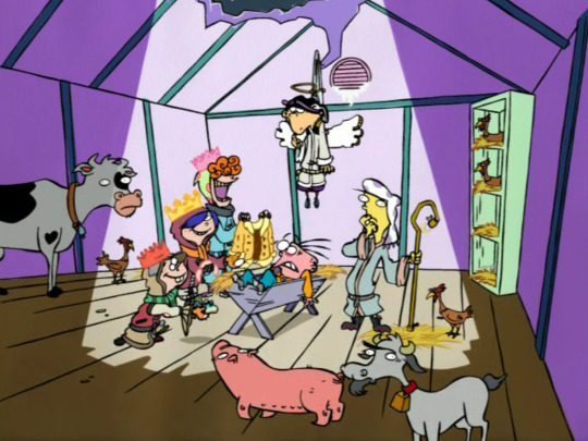
I do love the fur coat being draped over the cow’s face, though.
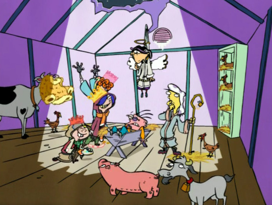
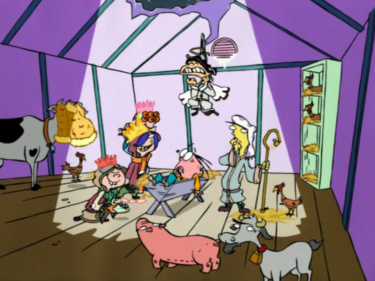
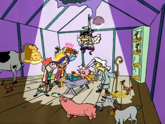
And it is honestly important to know the Eds can still do well drawn group scream takes in digital.
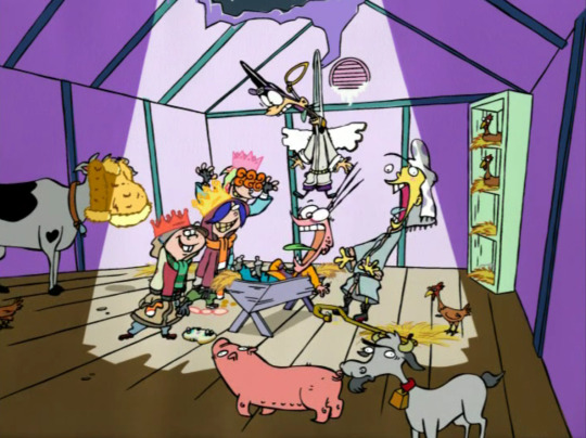
May and Ed scaring the animals is a nice touch, but I hate how we hear May going “oink” during this walla.
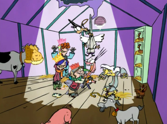
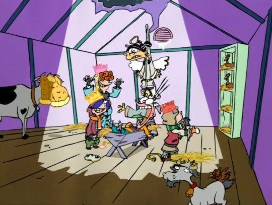
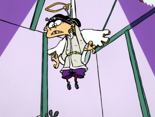
“WAIT”
“I’M AN ANGEL”
“STOP!!!!”
kiiiinda scary
I hate Eddy almost getting away but kinda love this rare separation of his eyes.

At this point my brain dies and I just go “aw the kids are so cute this is the only thing going on look how cute jonny is and kevin is being so nice and rolf is such a killyjoy i love this i love their group what a great xmas special nothing went wrong everyone is singing”
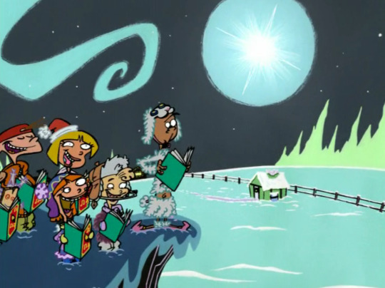
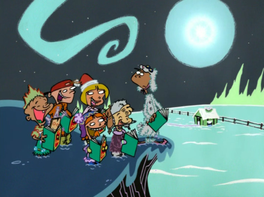

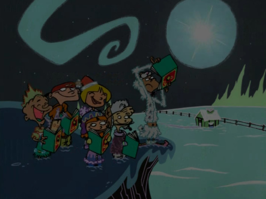
hope you had a good Kanker appreciation month!
*cries*
#not to seem mean though i'm gonna miss these!#ed edd n eddy#kanker sisters#kanker sisters appreciation month#kankers#Jingle Jingle Jangle#special#christmas special#scene analysis
38 notes
·
View notes
Text
The Great Huangshan Loop

Date of hike: September 22, 2019
Country: China
Region: Huangshan
Trailhead: Xihai Hotel
Hike Destination: Same (loop trail)
Distance: 15 km (10 miles)
Elevation difference: ca. 900 m gain
Difficulty: Tough
I jokingly refer to 2019 as my “Huangshan year.” Indeed, I was lucky enough to go to China’s “Yellow Mountains”—Huangshan—no less than THREE times in one year, in three different seasons. In total, I have hiked Huangshan 5 times now, and from the accumulated experience of all those trips, one hike has emerged as the all-around, undisputed, greatest favorite. I am referring to the great loop from Xihai Hotel down to the bottom of the West Sea Grand Canyon, continuing down to Sanxi Bridge, and then climbing up on the other side of the canyon, via Fairy Walking Bridge, to BaiYuan hotel, and from there via Bright Peak and Flying Rock back to Xihai hotel. This is the mother of all loop hikes in the area, clocking in at 10 miles and involving close to 1000 meters in uphill climbing (as well as the same in descending) over steep and partly crumbling steps. But the best part of this hike—aside of the usual stunning scenery—is that it takes you away for hours from the insane crowds that make enjoying Huangshan not always easy! I had scouted out this route during my previous visit to Huangshan last May; but at that time I’d gone about it awkwardly, descending to the bottom along the regular trail, then taking the funicular up to the rim of the canyon, hiking up to Bright Peak, then reversing direction, and descending all the way back down to the bottom of the canyon, only to ascend the same steps I had taken down in the morning to go back to the canyon rim on the Xihai side, thus not completing the circle and also backtracking a significant portion of the route… a mess. So, here I was now with Liang, to do it right this time.
But before we tackled the great loop trail, we planned do some conventional sightseening in the wider Huangshan area. This involved returning to a scenic village called Hongcun where we had visited back in 2015. This is one of the insanely popular AAAAA tourist destinations in Anhui Province, a picturesque gem that is almost made unpicturesque by being so overrun by tourists. At our first visit, we had been too rushed to truly appreciate what the place had to offer. Liang invited her parents along for this trip, giving them the chance to experience those touristic hotspots and classics of the Chinese cultural heritage, which they’d not previously explored. We met up with Liang’s parents at the high-speed railway station in Huangshan City. From there, we took the public bus to Hongcun. This bus ride reminded me of how much China had changed in one generation. When I went to Huangshan for the first time, back in 1987, the buses were dilapidated, missing entire window panes, the gears grated, the road itself was potholed and not paved throughout, with stretches of unsecured dirt road beside a raging river or zig-zagging over dizzying abysses without guard rails, making it a rather hazardous experience. But now, we were sitting in an all-electric bus that silently glided over well-paved roads, equipped with USB outlets in the back of the seat. And there now was an elaborate safety protocol, and buckling in was mandatory. If you did not follow this safety precaution, a beeping sound would instantly alert you to not being buckled in. But although everybody was following instructions in that regard, there still was incessant beeping left and right: Turns out that as soon as you put a piece of luggage on a seat, the sensors embedded in the seat assume that somebody is sitting in it, and the alarm goes off. So, one by one, the passengers had to strap either pieces of luggage with the seatbelt to stop the annoying beeping. Talk about overdoing it. The scenic town of Hongcun had already been crowded with tourists when we first visited it in 2015, but four years later, the situation had become even more drastic. In addition to tourists, there were now literally thousands of students from all over China practicing painting and drawing, trying to master perspective and scene. Liang’s mom kept asking them where they came from. Turns out, these youngsters were from all over the nation--practically all provinces were represented among the participants of these artistic field trips. During our first pass through the town, under the eye of a hot sun glaring down from the cloudless sky, we could not quite connect with the town. Nothing really stood out, and the general feeling was of being underwhelmed. So, we returned to our hotel about a mile outside the village to spend the rest of the afternoon relaxing. Then, we all returned at dusk when the crowds had began to thin out; there was some breathing room now, and when we stumbled upon the large circular pond in the center of town, which we somehow managed to miss during the afternoon outing, we were quite enchanted by the scene, marveling at the clear reflection of the whitewashed buildings and bright red lanterns in the body of water.

Then we stopped at a tea shop and tasted the local specialties of green tea—including wild green tea—served by a chatty lady who was both knowledgeable and passionate about her product, and it began to be really fun. After purchasing a few bags of the local green tea varieties, we returned to the mirroring pond and sat down at a restaurant table for dinner, directly overlooking the whole scene. The next morning, we returned one more time to the town to watch the first sun rays caress the village and see the sky reflected in the outer pond.

When we had had our fill of this lovely scene, we return to the central pond, and this time we were fully convinced that the AAAAA rating of this town was well deserved. The scene was so picturesque that it really gave rise to the impression that one was stepping into a picture, a painting, a little piece of fairy landscape.

After a Chinese breakfast consisting of congee, steamed bread buns, and deliciously preserved raddish, we boarded the bus to Tangkou, setting off to the base of Huangshan.
After the usual formalities, which I had grown to know so well during my previous trips (i.e. the entrance ticket booth, the shuttle bus to the cable car station, the gondola ride to the top), we arrived on top of the mountain at 3 pm. The density of the crowds was beyond my expectations for late September, and so the walk to Xihai hotel was not the most pleasant. I thought it was a pity for Liang’s parents to have this particular introduction to the fabulous scene, with all the shuffling and squeezing and jockeying for position on lookouts, but I had forgotten that this was what they were likely used to at all the other tourist spots they had gone to. In order to get away from the crowds, which sometimes may seem impossible, you need to be a little ingenious as well as enterprising. For one thing, timing the outing to the very beginning and end of the day makes a difference because the day-trippers are gone by then; also, traveling in off-season (which here means the dead of winter) is a nice crowd-avoidance technique; but the best year-round crowd-dissolving strategy is doing something that requires greater than normal endurance and basically just means to hike away from the beaten tracks, something most Chinese tourists don’t do. Chinese tourist crowds are the embodiment of conformity: they will go to a particular lookout which is already overcrowded, only because it is “the” famous scene that people can reasonably be expected to recognize if shown a picture of it with you proudly posing in front of it; another lookout nearby goes almost unvisited simply because it does not have the official seal of approval and is not, therefore, “important,” although it may well offer even better views than the one validated by the “wisdom” of the crowd.
After our arrival at Xihai hotel, toward evening we ventured out to see the sunset. On a spot high above the valley ground, we huddled down in our hotel-supplied parkas (it had gotten very chilly) to wait for the moment of sunset. It was spectacular: the sun, which had been blocked by a layer of cloud, emerged from underneath that grey shield just before it touched the horizon, bathing the scenery in bright orange and yellow hues for a short space of time.

We had planned to begin our big hike, the Huangshan Grand-Canyon loop, early in the morning. But since it was cloudy and windy in the morning, we delayed the start of our 7-hour hike as long as we could, i.e. until noon. Finally, just as predicted by the forecast, the clouds began to disperse, and the sun came out just as we set out at 12 pm. As can be expected in the middle of the day, the steep steps down to the bottom of the ravine were pretty crowded now, and every once in a while people were bunched up at the steepest and narrowest portions. Still, we decided to just go with the flow and not be too anxious, which is the only recipe for enjoying the great scenery along this trail. The steps here twist down an almost vertical mountainside, and they are a true marvel of engineering, as they had to be built by hand. The steps here often protrude perpendicularly from vertical walls of rock, and it is hard to imagine how workers had installed the fastening bolts and poured the concrete, all the while suspended from ropes and working with hand-held tools. In addition to the challenging nature of the trail building, it is astonishing how much effort was lavished on details here: every once in a while, a tree would protrude from the platform on which one walked because rather than cutting it down, the engineers built the trail around the tree trunk; also, the railing on the side of the steps was made from concrete in a way that mimics wooden branches being intertwined, thus making for a seamless visual effect. The Chinese really do master the high art of extreme trail building. Now that we had exchanged a hiking mindset, properly speaking, with a leisurely sight-seeing mindset, we actually enjoyed the scenery, together with hundreds of fellow tourists. We beheld soaring walls of reddish rock, boulders impossibly balancing on tapering pillars, twisted umbrella pines dotting every geological protrusion in sight, while the occasional man-made structure, like a pavilion, provided just the right balance to complete an almost artistic composition of the landscape.

We arrived at the bottom of the canyon one hour after the start of our hike, and here I proudly took over as guide for the next, most demanding portion of the tour. We used the bathroom at the funicular station to change into lighter clothes (it was getting quite hot at the bottom of the ravine), and then, we struck out happily again, leaving the bustling crowds behind at the funicular station, while we had the trail all to ourselves. This next long stretch of trail sees very few hikers because it is basically a large detour that requires a high level of fitness and quite a bit of endurance to make it through. The original trail, leading directly up to the Fairy Walking Bridge along the near vertical wall of the canyon, had been destroyed by rockfalls. So, now instead of reaching the Fairy Walking Bridge in about one hour from the funicular, one has to detour at least three hours to get to the bridge by an indirect route, and hardly anybody is willing to do that. But for us, this was exactly where the fun began. We reached Sanxi Bridge, the lowest point of the hike, about 30 minutes later and here supplied our liquid reserves by buying a few more bottles of water. Then, after a short picnic, we set out on the serious portion of the trail: a few miles of steep uphill climb on steps with treads so narrow that even a number 7 size shoe does not fit on it, requiring one to walk upstairs at an angle so as to place the whole foot on the step. The raisers are often higher than the tread is deep, and the edges of the steps are frequently eroded, creating a slope rather than discretely molded steps. These difficulties of the trail were partly compensated for by the rails that were constructed all along it—indeed, I found welcome purchase to pull myself up with one hand, while the other arm was pushing the hiking pole for additional support. After a while of this, I almost entered a hypnotic state of slow, methodical, rhythmic movement: right foot, left foot, hand pulling, other hand pushing with pole….

Sweating profusely, we quickly gained altitude and soon saw the valley ground recede below us. We met only about two or three other hikers coming down toward us on this stretch (as well as, incongruously, one police officer stationed at a lonely outpost where he’d watch a handful of hikers pass all day). Approximately two hours later, we arrived at the Fairy Walking Bridge and shot a number of pictures there, as it was such a marvelous spot. The bridge is another triumph of Chinese trail building, as the path spans a deep chasm, beginning and ending in a tunnel dug through the rock. Standing on this bridge, one really feels like being part of a fantasy movie set.

After the Fairy Bridge, my most favorite part of the trail begins. Here the scenery turns from nice to awesome, both in terms of the charming details like a little fir tree that found a foothold of life in the midst of a smooth slab of rock, and in terms of the grand amphitheater of the West Sea Canyon that lay spread out in front of our eyes.

Straining our eyes, we could even see in the far distance the twisting line of the trail that we had descended to the canyon floor earlier. The trail now follows the knife edge of a long ridge, delicately perched between two valleys with great views on either side. Here also is the place where I had taken the picture last May that now hangs in Liang’s office. That picture is focused around a bright red wild azalea shrub growing on a narrow ledge in the rock. The new one is focused on another beauty.


When we arrived at Baiyun hotel, which is also the top station of the funicular, we were four and a half hours into the hike and started to feel a little tired. Also, truth be told, it felt strange to be back in the hustling and bustling crowds after having traversed a long stretch of pristine nature in almost complete silence and blessed solitude. At this point we decided to make a little detour: instead of heading directly to Bright Peak and thus making our way back home by the most direct, efficient way, we proceeded toward Turtle Peak, in the opposite direction of our loop. This was a good decision because the scenery subtly changed to reveal the yellowish, rounded boulder piles which are Lotus and Celestial peaks bathed in the late afternoon sunlight, truly a privileged view to behold.

The sun was sloping toward the horizon now, and we calculated that if we made our way home directly, we’d arrive at the sunset lookout place at about the right time. Bright Peak, which we reached about 40 minutes later, was bustling with people and echoing with blaring loudspeakers, and we did not dwell there. Instead, we headed toward Flying Rock to watch the sunset from that perch. We picked a spot just a few hundred meters above Flying Rock and had the pleasure of being only in the company of a group of birds that excitedly hopped around on the ground and flew back and forth, while the silence was broken only by the most beautiful bird song. The birds looked a bit like blue jays, except larger and with longer tails. The sun was slowly dipping into a blueish haze now, and as it did, it changed color to become a dim reddish disc, so that one could look directly into it. The whole view was framed by the descending skyline of a nearby ridge and encircled by branches of long-needled pine trees. Marvelous.

As soon as the sun hit the horizon, it got instantly chilly and the wind picked up. This was our signal to head down the last bit of trail and make our way quickly to Xihai in the remaining daylight, while the sky above us lit up in intense hues of orange-yellow afterglow. We arrived at the hotel at 6:30 pm, just in time for an early dinner that we were more than ready for.
0 notes
Text
WEEK 16_ MEDIA and IMAGES : shaping the modern woman
London, 12 February 2019
This week the theme is media. More currently we see the effects of social media in shaping our desires and ideas. It's been -and will continue to- be mentioned in many of my interviews both with the models and the artists. Not only that but, the different types of media that transcend the technological era. As a body artist, ORLAN expresses that beauty ideals can be traced back to classical and renascence art. That was a source of inspiration to her work that deals with BODY MODIFICATION.
Also, the topic of eating disorders will be a bit present in both this week´s reading as well as the interview with Joana. We will mention some negative parts but also how someone can take something as concerning and serious and take positive action in their lives.
Finally, we see the effect of traditional media such as magazines and television. And the ongoing desire that humans have to improve themselves aesthetically. I guess what we are really looking at is the way IMAGES inspire and shape beauty ideal throughout the years.
STRIP DOWN FOR A MOMENT with Joana Silva
" My favourite part about my body is my BUM!"

"...it´s big. I worked hard on the gym to have this body that I love". Joana explains to us that is something that she feels proud off not only because it makes her feel beautiful and sexy but it comes from a place of hard work and self-love. "It´s also something that people notice on my appearance and compliment me on". She explains that is a good thing to feel good about your self though compliments and its a boost in your confidence and "there is nothing wrong with that".
She tells us that the part of the body she is more SELF CONSCIOUS of are her breasts. "I think they are a bit small but I don’t see them as a bad thing anymore". She has learnt to love this trade of hers and ignore beauty stereotypes and what is considered proportional by beauty standards. Once she even pierced her nipple as a way of self-expression. She explains that it was "just for fun" at the time and she didn't do it as an affirmation or anything. But looking back she recognised that experience made her feel good about this part of her body she didn't like as much. " Now I look back and see this moment as a way to embellish and give a purpose to that conflicted area of my body”.

"I grew up being a very underweight both as a child and a teenager. I would go as far as to say I had anorexic behaviour. But one trade that I always had was my big booty. No matter how skinny I was. I think it´s just genetics. Only in my late teenage years, I become a bit more chubby. At that point, people were commenting a lot about it because they were not used to it. And I wasn’t either. So I started to be very self-conscious about it".
At this point, she started to embrace a lot of dietary practices to cope with her lack of self-love to the way she looked. She tried veganism and is now a vegetarian for a few years. Joana decided to embrace a very healthy lifestyle and eating habits because it also promotes self-love and "makes us feel good from within".
Joana and I are very close friends and shared a lot of time and space with each other. By knowing her and living with her it really shows her passion for exercise and good eating habits. Also, she shows a big devotion to the gym and having an active life. She tells us how she really likes it and says it helped with a lot of thing in life. Both overcoming health problems and loving her body but also mentally. "It’s a space I go to reflect, almost like meditation". It helps to stop her busy life and have a break. It also a place to socialise and create a community. Many of her friends back home come from gym life. They met there and had become close friends and it’s a thing to bound over.
Her family is also very supportive of her diet which is good surprising in a way. She explains that in Portugal vegetarianism is not very well embraced lifestyle at times. Only recently there are more options for vegans and vegetarians as MEAT is a big part of our culture. Her mother and brother have also embraced a healthy lifestyle. She was a great and positive influence on her family and to be fair she was also the reason I started my vegetarian diet too.

She says that even with all the positive changes that her habits have had on her health "people still like to find a reason to criticise her lifestyle". That might be by commenting on her vegetarianism, or thinking that she might be obsessed with her figure and gym life. Or maybe they just think she is superficial.
"I enjoy posting on social media about my lifestyle. I like to take pictures in the gym and showing my beautiful body". She says this is very empowering and helps her express self-love.
" It comes from a place of hard work and pride".
"But sill people will always twist it and think I am showing off or I am vain". She strongly believes we need to stop caring about what other people say. "They will always find something to criticise. At the end of the day if you are not hurting anyone and you are being good to your self that’s all it matters".
To FINALISE we talk about her experience in this project. Joana was the very first guinea pig for this whole project as she participated as a model in my very first test photoshoot.
"In the first shoot, I really didn’t like it. We took some pictures where you could really see my belly rolls. When we take pictures of our selves for Instagram for example, we are used to posing or bodies in a certain way that is more flattering. So when we see our selves in another angle or different from what we are used to it, looks BAD".
Maybe also the factor of exposure. After all, is a nude shoot. Truth be told clothes help accentuate thing we like about our selves and hide other things.
"It was a shock for me. But its really a matter of self-acceptance. And also, I got used to the idea and the concept".
The second time we shoot, the final shoot, was a lot more professional- with all the lighting and camera. "It was better. The professional atmosphere and now knowing what the project. Also seeing how other people had done it as well helped me feel more comfortable".
" The pictures where now a lot more meaningful and I liked that they had a point. We worked with different angles and close shots. That makes it feel less personal and less intimidating. It's not about me as a person but is now about this story and to sharing my experience to maybe make other people feel good".
VISUAL REFERENCES work of French artist ORLAN
My father introduced me to her in a conversation about my project. I was updating him on this project and talking about some artists I have come across in my research. When talking about Body Image the topic BODY MODIFICATIONS came to my dad´s mind and he told me to explore the works of ORLAN. He told me her work was very diverse but she was famously known for her performative works that revolve around body modification and surgery.
Born Mireille Suzanne Francette Porte, the French artist first adopted the name ORLAN in 1971. Although ORLAN is best known for her work with PLASTIC SURGERY in the early to mid-90s, she does not limit herself to a specific medium and in her website, you can find photography, sculpture, installations and other types of art.
She was credited with great importance in art history as a body artist. Her work explores themes related to IDENTITY and TECHNOLOGY. Also, the rediscovering of the poetics of the body: the REAL body and IMAGINARY body, the LIVED and EMOTIONAL body, the MYSTIC and SOCIAL body and the DIFFUSE and HYBRID body.
The Reincarnation of Saint-ORLAN
This is her most remarkable work related to self-MODIFICATIONS. Started in the 1990s involves a series of plastic surgeries through which the artist transformed herself into elements from famous paintings and sculptures of women. As a part of her "Carnal Art" manifesto -and related to contemporary performative and artistic movements- these works were filmed and broadcast throughout the world.
Her goal with this series of cosmetic modifications is to acquire the IDEALS of female beauty- depicted by male artists though out art history. When complete ORLAN will have Venus chin from Botticelli's, Psyche nose from Jean-Léon Gérôme's, Europa lips from François Boucher's, the eyes of Diana -as depicted in a 16th-century French School of Fontainebleau painting- and the forehead of Mona Lisa from Leonardo da Vinci's masterpiece.
ORLAN explain that the reason behind her references is “not for the canons of beauty they represent... but rather on account of the stories associated with them." ORLAN chose Diana because she is inferior to the gods and men, but the leader of the goddesses and women. Mona Lisa, because of the standard of beauty, or anti-beauty, that she represents. Psyche, because of the fragility and vulnerability within her soul. Venus, for carnal beauty and Europa, for her adventurous outlook on the future.
Entre-Deux, a self-portrait inspired by Venus, by ORLAN in 1994.
"When I embarked on my project The Reincarnation of Saint ORLAN in 1990, I had a series of operations that had never been done before. I wasn’t using plastic surgery to bring me closer to the norm of beauty. I wanted a procedure that would disrupt the very idea of what beauty is." (The Guardian, 2016)
"People often focus on the implants I had put in on my temples in 1993. They’re meant to permanently heighten the cheekbones, but I had them inserted on each side of my forehead. When people describe me without seeing me, I sound like an undesirable monster. But when they see me it’s different" (The Guardian, 2016).
Occasional Striptease with linen from the trousseau, 1974-1975
Études Documentaries, LE DRAPÉ BAROQUE 1978
"All through time, civilisations have re-imagined the body, through tattoos, scarring, modifications to the skull. Now, we can replace teeth when they fall out or fix a cleft lip and other deformations – nature’s horrors. Nature shows us what a complete transformation looks like: a baby’s head becomes a teenager’s and an adult’s head becomes that of an old woman or man. To transform one’s body, to cross-dress, to change the colour of one’s hair, to me doesn’t seem so different (The Guardian, 2016).
It was very hard for me to look into her artwork, especially her The Reincarnation of Saint-ORLAN work. I really struggle with the topic of surgery and it was very squeamish for me. I couldn’t make myself look at one of her performances so I asked people around me to describe it to be.
It's so interesting to me because even ORLAN herself recognised how her appearance can be compared to much as a monstrosity - due to all these unnatural pressures. Her appearance is a LIVING PARADOX. All here references are this beautiful creature but in the end, she becomes this self-made Frankenstein like Alien-like CREATION.
READING book by Wykes and Gunter
This week´s reading on The MEDIA and Body Image by Meggie Wykes and Barrie Gunter was very informative. In it, you can find detailed text full of facts and scientific and historical research. It also references a lot of other writers, studies and surveys.
The chapters I was the most interested -and focused my lecture on- we about themes such as different Body Shapes and Ideals, Locating a source for this issue to blame, Gender and Body, Body Matters and Selling the body. Also, other chapters such as From Representation to Effects, the Prevalence of Concerns About Body Image and Mediated Bodies (Wykes and Gunter, 2005).
Each chapter and title were very complex and extensive. Although I found myself further reading about the topic I find difficult to analyse and comment on this content due to its factual nature. However, it's very noticeable for me the connection with these texts and the subject matter addressed in the interview with my models. A current theme in the interviews I made for this project is the effect puberty has on US. This is not new information, as we learn from an early age that this stage of our life provides loads of emotional, hormonal and physical change. Nonetheless, this was a statement and further affirmation of how these issues are not just abstract concepts and topics we read in books, but real stories that affect REAL PEOPLE in their lives.
In the book, the authors mention and comment on studies that show that these obsessions with body image develop from ages 13 to 18. After it's development these OBSESSIONS, most of the time, continue to evolve and lead to eating disorders. It just comes to show that these changes impact our lives dramatically and permanently (Wykes and Gunter, 2005).
There are a lot of parallelisms between the information found in this book and the events portrait on the interviews.
I will not be focusing too much on this review as I prefer to develop in better detail my own research with the model and artists interviews. Still, this reading was very important and enriching for my project in a more factual way. I think it is important to back up some of the experiences you and the people around you been through with some information that is available in studies.
REFERENCES
Orlan.eu. (n.d.). Artiste transmédia et féministe. Météorite narratif du BIO ART. Son oeuvre questionne le statut du CORPS dans la société. Ses sculptures, HYBRIDATIONS et autoportraits réinterprètent le rôle des nouvelles technologies.. [online] Available at: http://www.orlan.eu/ [Accessed 14 Mar. 2019].
The Guardian. (2016). Beauty reimagined: 500 years of Botticelli. [online] Available at: https://www.theguardian.com/artanddesign/2016/feb/14/what-is-beauty-botticelli-art-victoria-and-albert-exhibition [Accessed 14 Feb. 2016].
Wykes, M. and Gunter, B. (2005). The Media and Body Image.
0 notes
Text
HOOOOOWOWOAH BOY
ART ASKS

when i walk into a building i get to eat everybodys pencils and they cant say no

do it
( also thanks for asking ! )

itd bother me a lot less if everybody came to my apartment and took one of these beautiful eggs


YEAH UNFORTUNATELY IM STILL..... WORKING THROUGH THE SAME WAITLIST but im comparatively REAL CLOSE to being done with it and i should be opening up sometime later in...... the Year

Boy Have I
theres This messy thing from a while back and then also
THIS, from even FURTHER back, when i didnt realize how fucking RED all the outlines on my things were because of the monitor i was using, two for the price of one

why not both


i do Not but it you ever see me walking on the street please throw handfuls of teeth at me theyre the only things my wretched body can digest and im always hungry

OH MAN ok so, an art telephone game is based on, of course, the game telephone, where one person says a phrase and then whispers it to the next person, and so on and on until the person at the very end says whatever they heard and if its done right the final sentence is wildly different than what you started with
an ART telephone game is the same kind of concept, except one person draws out a scene or character, and then other artists draw THEIR interpretation of whats going on, and so forth until the last person can end up with something COMPLETELY different than what the first scene was
youd think thered be less room for error with drawings, but as each person ONLY sees what the person ahead of them has made, they can get PRETTY OUT THERE - im gonna be a part of pythosarts game, and theyve done a couple of em before - for example one round started with THESE as the first two drawings
and then fourteen interpretations later, ended up with these as the final two
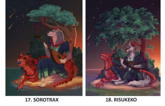
its good its real good


I Cant Control Where Bigfoot Goes, I Can Only Take Note Of Where Hes Been

YEAH, sort of ! on the main, iguanamouth, i have a bunch of different tags for art depending on what they are but not really a catchall one, BUT i do have an art only blog where everything gets tossed over !


HONESTLY THE ADVICE i got is basically what all art advice is gonna boil down to eventually - you gotta just. do it. you gotta DO it
absolutely nobody you know who draws things well started out at the level theyre currently at, and putting down the things youre visualizing onto paper is a combination of getting the the technical aspects down as much as getting the idea in your head
and that goes with figuring out anatomy and how bodies are put together ! ive got to use references for a Million things,. especially the dragon hoards - theres absolutely nothing wrong with using references for your drawings ! and being able to create accurate representations of things without looking is something that comes more with drawing something over and over and memorizing the body shape more than just, feeling like you should KNOW how to do something
so dont beat yourself up for needing references. if youre trying to shy away from them a little bit but still cant make something look nice without em, try using several different reference photos to put together an entirely different pose ?
theres ALSO the SHRIMP METHOD, which is great for practicing and getting good at one particular thing - this probably isnt SUPER HELPFUL but good luck !


god i tried. exactly ONCE maybe fourish years ago but it wasnt art, i was trying to stream the lion king movie and i had no idea what i was doing, i didnt realize i needed to wear headphones so the sound wouldnt snowball into a feedback loop of my own voice that never ended but i kept laughing and it kept distorting worse and worse, like the audio version of saving and resaving something as a jpeg
it was just me and my friend ronni in the stream and ONE other person who never left and never said anything and i kept addressing them out loud like WHO ARE YOU and that only compounded the noise problem and eventually i gave up
anyway i havent tried since

i uhhhhh dont think i COULD, really - fear especially is something thats kind of subjective and one persons Big Terror could be neutral or even cute to another person
like for me i used to have a lot of childhood fears about the ocean, and how deep and dark and vast it was, to the point where i couldnt play a lot of water levels in video games, even ( but i had almost drowned several times when i was Very young which probably had, a little somethin to do with that )
maybe sometime ill try to explore things IM afraid of, but its hard to encompass a psychological response in an image !! could be a fun experiment, though ! !

a few PLANT ANIMAL AZKZ, HUH, DONT HAVE A WORKING Z KEY


SHIT DUDE THESE ARE... SO GOOD thats the official name EVEN IF i didnt use. a daffodil as the flower base. it doesnt matter

yes

i got A BUNCH of flower and plant themed suggestions and theyre all REALLY GOOD ( way more than these ) but straight up im taking a break from em for a while - if anybody is else is reading this though you should definitely tackle one of em
WASABI ASKS
Do Not Feed Animals The Paste


i keep going back to read this ask because you could replace wasabi with my name and its the exact same. its the same. i feel like i have to hide somewhere


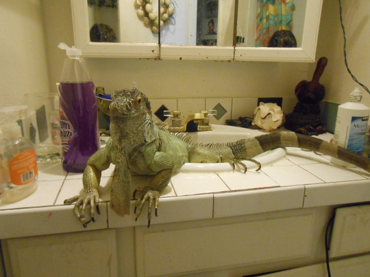

this was real and this is the award they gave us

there were other awards but the judges refused to give them out. they burned them in front of the other dogs. we won

it depends on the age ! wasabis pretty much an adult, so her sheds are pretty infrequent ( usually once every 7-8 months ) BUT when she was still growing back like 6 years ago, she would do a full-body shed every other month !


wasabi accepts tokens of appreciation in the form of : fruit, green beans. No Exceptions

i would never seperate wasabi from her hands

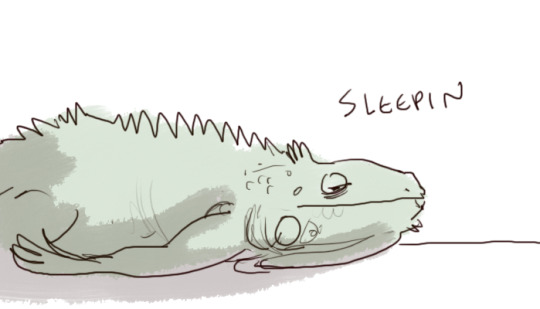
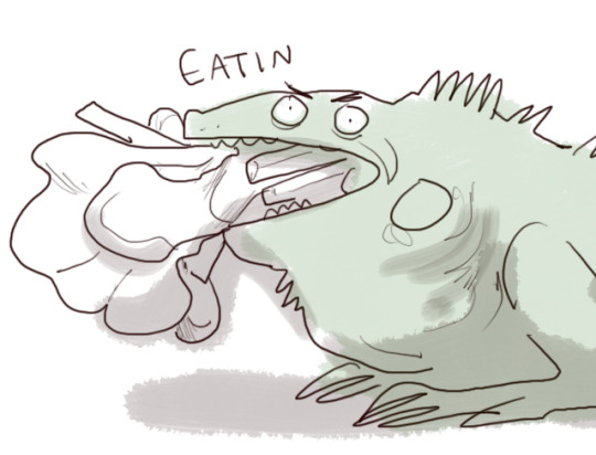
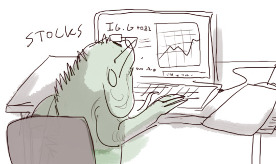


absolutely..... not. not even a little bit h h hh a this isnt a disney animal companion, i dont even know what “kind of like a dog” means with , a lizard who cant make any vocalizations or get up on their hind legs or NOTHIN sometimes if i hold a piece of fruit on my hand and she reaches for it she gets confused on whats what and tries to bite my fingers instead
ONCE WHEN SHE was attacking her reflection in a mirror i put my hand in front of her face to break eye contact and she SUNK HER TEETH RIGHT IN THERE but immediately let go like “oh whoops”

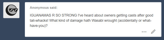
lissten . . . wasabi is so sharp, just absolutely everywhere, and these are the sharpest. the grabbers
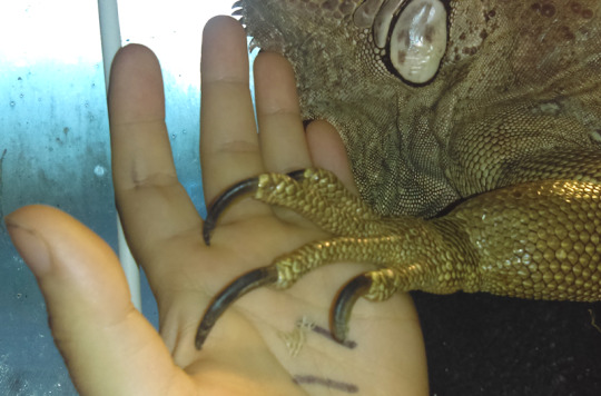
heres a lil battle damage from earlier today actually
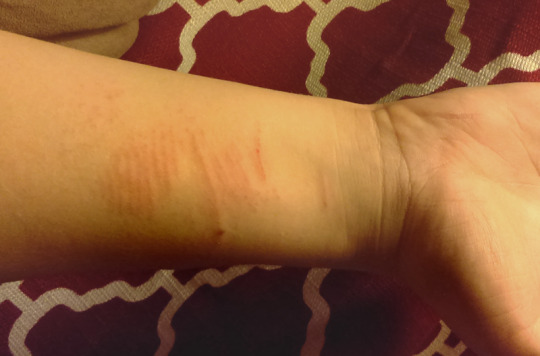
this is pretty tame BUT the long long lines are from claws, and the thinner, closer together ones are from holding her and her scales scraping against the skin. so not even just the Body is completely safe ! this is not an animal youre gonna wanna get your face real close to if theyre in a walkin mood
she doesnt even MEAN to scratch the shit outta me, its just kind of a byproduct of being a big tree lizard. her tail is absolutely the worst thing to get hit by though. the WORST. lucky me she doesnt attack anything that isnt a dog or a vacuum cleaner or her own reflection


ahhh i got her when i was 16 ! and i dont know her exact age but she was somewhere between 3-6 months when i get her - SHES probably closer to 9 years, but ive had her for about 8
LENGTH THOUGH...... the last time i measured her she was just barely under four and a half feet, but that was a few months ago and its possible shes. Just Slightly larger. shes currently sleeping as i type this so i guess we will never know

duel me

too late for coats..... its all tail action now


ROCK ASKS AND ALSO ASKS ABOUT PUTTING ROCKS IN YOUR MOUTH
oh MAN i feel you . . . . . . . . . . i dont think i could actually Bear To Eat any for real but some of em. just. they. i gotta. just. bite on em a LITTLE just a little bit, a tiny bit, a nibble
when i was real young i used to tap things against my teeth to tell what kind of substance they were made of based on the feeling/hardness/density WHATEVER and i still sometimes do it when im checking stuff out and. it uhhhhh sure is interesting finding out not a lot of people did that


a handful of these delicious raw agates, just for you
please stop spying on me

i DO NOT but you may eat this piece of bornite


meet me at the airport and ill cover your bus fair

theres a lotta different ways to figure out what kind of rocks you got but when you have absolutely no clue on where to start your best bet is to search for the biggest distinctive features of it, and try to narrow it down based on the results

like for something like these pieces of chalcedony, you could try “waxy green translucent mineral”, and from the search results find a few candidates that might be what you have on hand, and then look into each one to see if you can get a definite answer
ive got a handful of rock and mineral guide books that i always pick through whenever i snag something im not sure of, and if youre REAL into it those are always something you could start keeping an eye out for
now this is a REAL superficial way to telling what something is and wont be useful for a good chunk of minerals ( as a lot of samples can look really close to something else ) and THIS is a much more in depth way of telling something apart, but its also a lot more time consuming ! so good luck. and good eating.

Just Try And Fucking Stop Me
ANIMAL ASKS THAT ARENT............ ABOUT MY LIZARD


im married to this one actually

fuck. ok. heres. a secret. a In the ask Post secret. wasabi goes through a period that lasts a month every single year where she carries eggs in her gut, and spends that month not eating and digging around in everything, trying to find the right spot to lay these eggs. and. when it happens i never know what to do with them, and i dont want to just THROW THEM AWAY so i. eat them. i eat the eggs. i fuckin eat the eggs dude

Theyre All Goddesses

unless you plan on having your lizard roam around outside whenever they want, the outside environment doesnt really matter much for most reptiles as long as you set their habitat up right ! BUT i do know that australia has bans on certain reptiles ( iguanas are one of them ) and so youre gonna have to look up whats actually available in that area
bearded dragons are native and those are always a good option, but so are a lot of geckos - its really gonna depend on what youre into ( but i dont really recommend anoles if thats an option, because theyre fast as Hell and dont like being handled )

what the fuck is a bee
oh geez im sorry ! i remember going through this with spiders a lot when i was younger to the point where looking at photos of em used to be a fuckin, TRIAL
you could try a really gradual exposure deal, where you start off with getting comfortable with just images, and slowly working your way to dealing with one in a controlled setting ( like a petstore, maybe ? not HANDLING em or anything, but just being near one in a way where its absolutely impossible for them to touch you )
the shitty thing about this kind of phobia is that even if you KNOW its irrational theres sometimes not a lot you can do about it, but if you can stand looking at photos of them you could try learning up about them, and finding out the types of species youre likely to encounter around your house, and seeing how many ( if any ) are ones you should avoid ?
i know some people that have major problems with snakes are because theyre unsure if the ones they find are poisonous or not, and it might go a long way to confirm that the reptiles you meet wont be able to harm you even if they TRIED ( which is gonna be the case with a lotta house geckos, they cant do SHIT youre a GIANT )
very VERY few lizards have venomous bites, and the worst most of em can do is give you a bloody finger if theyre large enough, and even then its usually not much worse than a cat scratch !
still though, if youre really serious about trying to get past this, dont force yourself too quick into what you think you SHOULD be, and take tiny steps outta your comfort level when you can
this probably isnt uhhh SUPER helpful hh hhah but good luck ! shit im going through this post and its like ALL reptile photos. im sorry

i feel about them, with my hands

MMM it shouldnt HURT them unless theres something Really wrong, considering its a natural procession of growth, BUT its definitely itchy as hell, to the point where reptiles trying to remove it will drag their bodies over stones or walls tryin to get it off
sometimes wasabi drags her whole hind foot over her head like a dog to get it off and it is. a Sight

ahhh honestly there arent a lotta reptiles thatre gonna do much more than TOLERATE the touch and not really, enjoy it, like a dog or cat or bird
but speaking from experience with wasabi, youll probably want to avoid most the head and stick with the top of the back near the sides - wasabi doesnt enjoy having her tail messed with much either, but shes ok with her dewlap and feet being touched
the most important thing to keep an eye out for when youre touching one is their body language, because THATS gonna be a dead giveaway for whether you need to back off or not
closing their eyes is a sign of stress, not enjoyment ! same with tilting the head back, but if thats ALL theyre doing then youre probably not gonna face any retaliation

B U T if theyve got an extended dewlap with a raised body or tail off the ground, not a good idea to interact with em ! thats a defensive posture, and you risk getting hit with a tail or even bitten if your hand gets too close
youve got more to risk with males, who are way more territorial and generally larger, but if they seem pretty chill when you approach and dont stand up and stare at you, youre probably in the clear

COCK of the ROCK


I HAVE im so jealous of anybody whos got to see one in person - actually handling one is a level beyond that which i could even comprehend
OTHER THINGS.....


no but i was bit by a pigeon once

this is the only joke i know


i fuckin WISH !!!!!!!!!!!!!!!!!!!!!!!!

ayy im into it - honestly i havent been following the band so much as just kinda, picking up whatever anybody else mentions and so my knowledge on Gorillaz Lore is pretty uhhhh h hh h scattered but im definitely interested in seeing where this goes

i remember watching the first and second season and it being pretty good - some of the episodes and jokes are hit and miss but you absolutely got me with the creature and alien design


havent seen any of the third season yet though !

i mean the fruit ones could be pretty up there
how bout. an abstract concept. who cares about physical forms wheres the dragon of melancholy

why come theres nothing to eat in my apartment but bread. im good otherwise but its all just bread

i havent watched either of em in YEARS and YEARS but i distinctly remember. these lil dancing mushrooms

oh wait FUCK
FUCK !!!!!!!!!

no... NO.... she is not allowed to eat ANYTHING from the plan shelf, try as she MIGHT
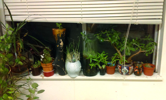

im a little mad that this sill isnt bigger because the only other one that gets sun is in my room and wasabi WIll... absolutely eat those. no doubt. a convenient and expensive salad, for my awful gremlin
god im looking at these and its all jade plants isnt it

little golden books taste the best but they can make you sick if you have too many at once. my favorite genre for snacking is sci fi fantasy but anything over 300 pages tends to get a little tough if you dont break it up with smaller chunks. non fictions always a gamble because the taste is wildly different each time but you can usually tell how ripe it is by the cover color

ayy im already a big fan of some of their stuff, ive got a couple songs from them in my music tag - im especially into i miss you and their shut up and bring it here remix

TOP FIVE THINGS
1

2

3
4

5

this is barely related but once i filled up a bathtub with water and then dumped about ten bags worth of mint tea into it and then just. soaked around in the tea. listen it was really nice. id try the cheese

i dont have any ships but i was on one of those model pirate boats once for a school trip. our boat was named naruto and the other one was named sasuke and the captains shouted “make them kiss” and ran them into each other. everybody on board drowned
youre trying to trick me into googling yoshi without shoes and its not going to work

me reading this message from the safety of my apartment :
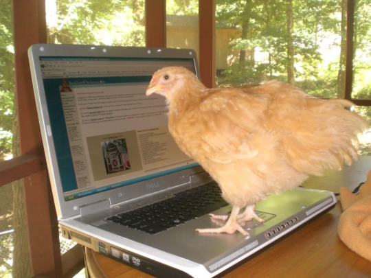
nice try, but wrong again ! : )


THIS IS GOOD info, thank you


oh SHIT the other side of paradise, take a slice, life itself, and season 2 episode 3 are all my Big Faves

the way you phrased this makes me think you already have a strong opinion on it
hey uh. coming from a person who was absolutely CONVINCED that theyd be dead in the future when they were 12, a not insignificant part of that was me feeling that there was something irreversibly wrong with me for not behaving or acting in certain ways based on what was going downstairs
and obviously im still HERE but it means i can understand how devastatingly terrible it can feel when youre that young and it seems like the way you behave and feel are flawed, or dirty, and anything that can lessen that feeling and make you comfortable in your own body is huge, can save your life
not that im saying its always a LIFE OR DEATH decision !
i guess if youre viewing it as adults forcing a child into making decisions that you dont think theyre capable of understanding its easy to be hesitant about getting behind it, but nobody is forcing a child to be trans. nobody has tricked them into feeling this way. you cant just walk in and get started on treatment on an immediate whim - some programs require 2 YEARS of concrete evidence before theyll even consider it
i feel like you should try speaking to the parents of trans children before you really put down a concrete opinion on whether this is a good or bad thing, and seeing the difference ( if any ) its made in their lives
people whove detransitioned, or found they had ultimately a different identity than the one they were exploring could also be an avenue to look intto ! i have several acquaintances who, after a period of years, found they werent trans but wouldnt take back the time where they were figuring out if they were, and i know this doesnt invalidate the friends i have who ARE
ultimately this is what it boils down to for me : Its Sure Gotta Beat Being Dead


i WILL give you that ive definitely seen a lot of overreactions to seemingly innocuous topics on this website
but youve also got to keep in mind that everybody who is saying these things MEANS them, and to them theres a completely reasonable explanation to why they feel that way
im not saying you should blindly accept any criticism you get, but to instead try to get a grasp on WHY theyre responding the way they are instead of immediately dismissing it
its because i cant drive and they wont let me sit in the front on account of the smell
NICE THINGS


AHHHH I GOT.. a bunch of other really sweet messages to the point where id feel weird about putting em ALL UP BUT... IF YOU SENT ME SOMETHING i can promise i absolutely saw it and it made my day better and just, holy shit, thank you for taking time out of your life to say anything to me at all
because you didnt have to, even a little bit
youre all beautiful and im kissing you on the mouths all at once. no take backs
63 notes
·
View notes